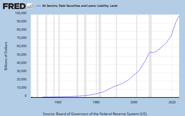
Friday, September 30, 2011

What's the difference?


Financial:


Graph #1

Financial debt looks to run about ten percent below trend until 1967 or so. Then it trends upward, peaking around 1988. After that, it falls to the crisis, then falls faster.


Government:


Graph #2

Government debt declines markedly, relative to trend, until 1974, then rises to about 1993. Then it falls (during the "Macroeconomic miracle"), then trends flat until the crisis.


Household:


Graph #3

Household debt is all over the place. It rises to trend by 1955, then stays on-trend until 1966. Then it falls until 1971. Then it trends upward until 1989 or 1990. Then it falls, to the end of the millennium. Then it rises, until just before the crisis.


And, to repeat a graph and summary from yesterday...

Business:


Graph #4

Business debt grew more slowly than I would expect until about 1964. Then it grew faster than I would expect, until about 1989. Then it grew slower again.


The exponential trends are all different, of course. So these four graphs cannot be compared directly. But the trends and turning points are significant, and the timing of the turning points -- though I have only eyeballed them here -- could be important to an analysis of debt and the economy.

If we have too much debt today (as I always say), then the graphs show actual debt growth compared to too much debt growth (increasingly as we move to the right on the graphs). And perhaps they show actual debt growth relative to too little debt growth toward the left.

That said, it appears that business and financial debt both began increasing (relative to trend) in the mid-1960s and continued to do so until the late 1980s. After that, both started falling behind their debt-growth paths.

Household debt follows a similar history, but slightly delayed and with substantially more variation.

Government debt goes its own way, sometimes similar to, sometimes different from the paths of other debt. As you would expect to be true if the nature of government debt is wholly different from that of private-sector debt. Which I think it is.

Finally, all of these graphs show a general downtrend, from the late 1980s or early 1990s to the onset of crisis. But remember, this is a downtrend relative to the exponential growth curve. The graphs do not show that debt growth was slowing. What they show is that debt growth had already become unsustainable by 1990.


Convergence:


Set the dates aside. Set the explanations aside. Look at the point of agreement. In remarks yesterday, one finds the following...

From Jazzbumpa:

What is unmistakable is that growth has slowed dramatically since the 1982-ish peak. This is the inevitable failure of exponential growth.

From Clonal:

In the graph you show on the business debt, the trend is definitely not exponential. It is growing, but not exponentially - the divergence is too great since 2000.

From Liminal Hack:

The exponential prior to 2000 is still remarkable though... The post 2000 behavior is much more about mature economies reaching peak debt and then hunting for some kind of equilibrium.

And from my conclusion, above:

... this is a downtrend relative to the exponential growth curve. The graphs do not show that debt growth was slowing. What they show is that debt growth had already become unsustainable by 1990.

Maybe, since 1982. Maybe, since 1990. Maybe, since 2000. But without doubt, the exponential growth of debt could not continue. It had to fail.

Economic policy built on the growth of debt was doomed from the start.

F G H


Yesterday we looked at NonFarm Corporate Business debt:

Graph #1: NonFarm Corporate Business Debt

Today, we look at other debt: Financial debt (blue), Government debt (red), and Household debt (green).

Graph #2: Financial, Government, and Household Debt

To be clear, "Government" debt here refers to Federal government debt and excludes internally-held government debt (because TCMDO excludes it).

First: None of these three debt series has flat spots at recessions since 1990. On the other hand, all three of them show a major change at the time of the 2008 recession.

In fact, the three debt trends, since the wilt began, look as though they are converging to a common point. That's just bizarre. But it might be interesting to look at, every six months or so.

In the meanwhile, a look at these three components of debt along with their exponential trend curves:


Financial debt is the fastest-growing, with the steepest exponential. But the actual numbers fall behind the calculated curve some years before the peak.

In yellow, household debt shows the second-fastest growth on this graph and, until the wilt began, the actual debt numbers kept up with the exponential trend.

In last place, debt of the Federal government. Government debt growth was significantly ahead of its exponential trend there for a while, but curved back down below the trend during the "macroeconomic miracle," then ran below-trend until the crisis.

Thursday, September 29, 2011

And it took a while...

I did the exponential trend (see previous post) so I could compare the actual path of debt to the exponential path. But it took me a while to figure out how to use the trend formula generated by OpenOffice. The problem was what to use for the X-values. It's not date-formatted numbers. It's not year-values, four-digit nor two.

It's simple: the first X-value is number one, the next is number two, and like that. Here is the result:

Graph #1: Variance from the Exponential Trend

The path varies as much as 40% from the "perfect" trend. But that's not what interests me. Interesting, I think, is that there are three general trends within the variance.

First off, this graph shows actual debt varying from the exponential curve. So, below the zero level means debt is growing more slowly than we might have predicted. Above the zero level means debt is growing faster than we might have predicted. A downtrend means debt growth is slowing, relative to the prediction. And an uptrend means debt growth is increasing, relative to the prediction.

Second, the debt we're evaluating here is Domestic Nonfinancial Corporate (Nonfarm) Business Debt Outstanding.

Now, the trends. Business debt tended to slow until about 1964. Then it changed direction. From 1974 to 1992 (give or take) debt growth was above trend. But after 1988, debt growth tended to slow, relative to its exponential trend.

//

The Google Docs spreadsheet

But who's counting?


The third graph from my four o'clock, repeated here as Graph #1:

Graph #1: Corporate Debt 1949-2011

Quarterly data from FRED, fed into OpenOffice, plus an exponential trend...

Graph #2: Same debt, with an exponential trend line

... with an R-squared greater than 0.9899, for the record.

Suddenly remembered


I suddenly remembered Noah writing this:

The recessions of the early 1980s were very short and "V-shaped," despite the extremely low rate of TFP growth at the time... By contrast, the early-2000s recession, though shallow, was much longer and "U-shaped", despite the recovery in TFP growth.

"TFP" being "Total Factor Productivity" which doesn't matter at the moment.

Noah's evidence was this graph:

Graph #1

Apparently, we can be quite literal here and look at the white space under the blue data line at the peaks. The tallest spike on the graph comes at the 1982 recession and that spike is very narrow indeed, compared to the two lesser spikes that follow it. Those lesser spikes occur at the 1990 recession and the 2001 recession.

Thus, not only "the early-2000s recession" but recessions since 1990 have been much longer, and U-shaped: 1990, and 2001, and 2008. Dunno where I read that; Krugman or somebody pointed it out before. However...

Graph #2

...by the time the Civilian Unemployment Rate gets back down to the "natural" rate of unemployment, all the recessions since 1974 have spikes that widen out quite a bit. But let's set this objection aside for now.

Let's assume the Noah/Krugman/Arts-bad-memory analysis is correct. Let's assume it's true that recessions since 1990 have been longer and U-shaped and different than recessions before 1990.


I suddenly remembered Noah writing that, because I saw this:

Graph #3: Corporate Debt 1949-2011

Flat spots in business debt following the 1990 recession, the 2001 recession, and the 2008 recession. Flat spots like that don't show up after earlier recessions, even in close-up:

Graph #4: Corporate Debt 1949-1993
The slightest wiggles appear after the 1974, 1980, and 1982 recessions. Bare hints of what was to come. Y'know, I'm thinkin, Graph #3, with the flat spots after the last three recessions, this is better evidence than Noah's graph for the claim that recovery no longer follows quickly on the heels of recession.

Wednesday, September 28, 2011

And I'm gonna keep saying it until you start to think there might be something to it.


This one, again:

Graph #1

After interest rates peaked, around 1980 (see yesterday's Graphs #2 and #3) net interest flattened as a percent of Gross Domestic Income. After a few years net interest dropped significantly. Then it flattened again (though it would not be right to call it "stable").

I want to look at the drop. Zoom in once...

Graph #2
...and it appears that the drop begins around 1990 and ends around 1996. Zoom in again...

Graph #3

...and those dates are pretty well confirmed. 1989 to 1996, maybe. The drop doesn't look so significant, stretched out like this. But it is the same drop, and the same significance as before.

Suppose we look at TCMDO (Total Credit Market Debt Owed) for the same period. It goes up, of course. Graph #4 shows how much it went up, as a percent change from the year before:

Graph #4
The growth of debt was relatively low in the 1989-1996 years, the same years that Net Interest dropped so fast.

Graph #4 looks at growth of accumulating debt. Increases of debt. But what is an increase in debt? It is more credit use, the record of more credit use. When I borrow a dollar, my debt increases.

When I borrow a dollar, it's likely because I plan to spend it.

Spending. We can only spend money we borrowed, or money we didn't borrow. Two kinds of money. How much of each there is in the economy, is a big deal:

Graph #5
Graph #5 adds money to picture #4. M1 money, annual data, percent change from previous year, shown in red. From 1989 to 1996 there is a good big bump in the growth of money. We have looked at this before.

When the quantity of money rises faster than the accumulation of debt, the factor cost of money is reduced. This is the reason we saw a significant drop in Net Interest relative to GDI in Graph #1 above.

Oh, and for the record: The two data series shown in graph #5 are the two components of my Debt-per-Dollar ratio.  It looks like this:

Graph #6

For the 1986-2000 period it looks like this:

Graph #7

That big drop in the ratio was created by faster growth of money and slower growth of debt. That big drop started around 1990 and ending around 1994. Immediately after that big drop, we had an economic boom. This is no coincidence. The reduced factor cost of money was the necessary precondition for growth.

This is not the first such drop that I know of. The first occurred after the onset of the Great Depression. It occurred during the years of the FDR presidency. Immediately after that big drop, we had an economic boom that lasted two decades or more.

That was no coincidence, either.

Tuesday, September 27, 2011

Nobody Looks at the Macro


From yesterday, this one:

Graph #1: Since 1992 the trend is horizontal

Here are four different interest rates, all quite similar:

Graph #2

Here (from Graph #2) is FRED's "3-Month Treasury Bill: Secondary Market Rate" -- very similar to the Federal Funds rate, but it goes back to the 1930s -- together with Net Interest from Graph #1. Both series use annual numbers:

Graph #3
Why does interest cost rise more slowly than interest rate, up to the peak? Dunno. Maybe the question is irrelevant. It's just a graph. But what I would like to say, what I can't argue yet, is net interest income understates interest cost.

Graph #4: With each series on its own vertical axis,
interest cost does not rise more slowly than the interest rate.
But it does fall more slowly.

Why does interest cost trend horizontal rather than falling with interest rates? This, I know the answer to: As time goes by, more and more of our spending makes use of credit. More and more credit-use is embedded in the average transaction as time goes by.

If interest rates fall by half while embedded credit-use doubles, there is no decline of interest cost. But nobody thinks of it that way.

I've been looking a little at a speech by Ben Bernanke, from June 15, 2007: The Financial Accelerator and the Credit Channel. In the conclusion of the speech, Bernanke says:

I have taken you on a whirlwind tour of several decades of research on how variations in the financial condition of borrowers, whether arising from changes in monetary policy or from other forces, can affect short-term economic dynamics. The critical idea is that the cost of funds to borrowers depends inversely on their creditworthiness, as measured by indicators such as net worth and liquidity.

"The cost of funds to borrowers depends inversely on their creditworthiness..." Everybody looks at the individual borrower. Everybody looks at the micro. Even Ben Bernanke. Even when his topic is macro.

Nobody looks at the reliance on credit, overall in the economy. Nobody looks at the macro.

Monday, September 26, 2011

Jackpot


I've run across Gross Domestic Income once or twice before.

GDI is a different way of accounting GDP. A measure of the income side. I thought it might be useful as a way to look at factor costs -- land, labor, and capital costs, as Adam Smith broke them down.

I googled Gross Domestic Income and 3 or 4 items down on the list was a hit for BEA. BEA does stats. And there ya go. Quarterly data from 1947 to 2011. Annual data from 1929.

It downloads as a CSV file, which Excel can read fine. But if you want to get all the data, Excel cannot import it all. Too many columns, if you can believe that. BEA lists the years across (in a row) not down (in a column) and there's just too many years to get all the quarterly data. Gotta do it in pieces. Oh, well.

For this post I downloaded the annual data CSV. OpenOffice opened the file, no trouble at all. I took a quick look:

Graph #1

Graph #2

Graph #3

Graph #4

Sunday, September 25, 2011

Diary with a Twist


Lets not forget how we got here into this global mess - globalization, banking deregulation, privatization and free market capitalism as the cure for everything.

Agreed. But let's also not forget the prior problems that left us looking for the cure for everything.

Saturday, September 24, 2011

Andrei... you've lost another submarine?


Another government shutdown??

I'll tell you the problem:

1. Republicans think the Federal debt is a result of Federal spending.
2. Democrats think the Federal debt is a result of Federal spending.
3. And you think the Federal debt is a result of Federal spending.

That's the problem. That, and the Federal debt is not the result of Federal spending. Debt is not the result of spending.

Debt is the result of credit use.

I'll tell you the problem:

1. U.S. economic policy fights inflation by removing money from circulation.
2. U.S. economic policy induces growth by encouraging the use of credit.
3. U.S. economic policy removes money from circulation and encourages credit use. And debt is the result of credit use.

We don't have all this debt because of spending. We have all this debt because of stupid ideas about money and stupid ideas about credit.

Yup, a Pacer.


The first thing I ever put on a credit card was back in the 1970s, I got new tires at Sears for our AMC Pacer.

Yup, a Pacer. I liked the thing.

Anyway, we can assume I've always had a credit-card balance since that day. So if we look at it LIFO -- Last In, First Out -- then I guess I'm still paying for those tires. 18% annual interest... 33 years... $1188 just in interest for tires for that car long gone.

This is what happens when there are no tax incentives to accelerate the repayment of debt. If I was the only one, I'd say forget it. But it's not just me.

Friday, September 23, 2011

Pink and Blue Wilt


Liminal Hack asks: "Why can debt growth be described by a mathematically perfect exponential...?"

The word "perfect" bothers me a little. However...

Source: 1000 Memories
via Gene Hayward


These are almost perfect. Except for those endings, of course.

Thursday, September 22, 2011

The Twist

For some reason, nine readable lines from a PDF turns into interminable fine print on the blog. I have taken one paragraph and an afterthought Eric Swanson's paper, and put a little breathing room between thoughts.

From:

Let’s Twist Again: A High-Frequency Event-Study Analysis of Operation Twist and Its Implications for QE2

Eric T. Swanson
Federal Reserve Bank of San Francisco
March 14, 2011
(PDF, 34 pages.)
John F. Kennedy was elected President of the United States in November 1960 and inaugurated on January 20, 1961. The U.S. economy had been in recession since April of 1960 and the recession was ongoing (it would ultimately end in February 1961, although the level of economic activity would remain low for several months into the recovery).

The incoming administration wanted to stimulate the economy with easier monetary as well as fiscal policy, but European interest rates were higher than in the U.S., leading to substantial flows of dollars and gold to Europe under the Bretton Woods fixed exchange rate system. The Federal Reserve was very reluctant to lower short-term interest rates for fear of worsening the U.S. balance of payments and the outflows of gold to Europe.

The Kennedy administration’s proposed solution to this dilemma was to try to lower longer-term interest rates while keeping shorter-term interest rates unchanged. The idea was that business investment and housing demand were primarily determined by longer-term interest rates, while the balance of payments and gold flows were determined by cross-country arbitrageurs who act on the basis of short-term interest rate differentials.

Swanson's story continues:

If longer-term Treasury yields could be lowered without affecting short-term Treasury yields, the reasoning went, then investment could be stimulated without worsening the balance of payments and gold outflow.

Thus, on February 2, 1961, Kennedy announced to Congress a policy...


I was almost 12 years old. Mom had gone back to school to become a nurse. The daily paper cost 5 cents.

I went with her to some event at the college. People there were doing the Twist.

M1 and M2 (2008)


Source: The New York Fed

Wednesday, September 21, 2011

...and deeper in debt.


Suppose I have a mortgage payment that's equal to my weekly paycheck. But then after a few years of 1970's style inflation, my paycheck has doubled. Well, the mortgage payment is still the same. So now it only costs me half a week's pay.

Existing debt comes to look smaller as a result of inflation.


If I may paraphrase Jazzbumpa:

Art wants to tell a story where debt growth has been on a continuously increasing trajectory through the entire post WW II period. Clearly this was the case, until the onset of the recent recession.

Jazz disagrees, showing this graph:

Graph #1: Household Credit Market Debt Outstanding
relative to Wages & Salary Accruals

Of this graph, Jazz writes:

The graph above shows there was an actual decrease in debt burden in the 60's, then only a slight increase during stagflation and the moribund Carter administration.

I responded to that, as follows:

True enough. BUT... (and I didn't figure out how to look at this yet)... there was Big Inflation in those years where debt does not rise a lot. I'm thinking, wages went up a lot and maybe additions to total debt went up a lot, but existing debt shrank probably a lot relative to the inflation of the time... and this is probably why the graph flattens out in those years.

This is what I want to look at: What does inflation do to accumulating debt?


I worked it out in an OpenOffice spreadsheet:

Suppose I start with debt equal to 50% of my income. And suppose I borrow an amount equal to 3% of my income each year, allowing this debt to accumulate. But beginning in year 5 and lasting to year 10, there is inflation and my income increases at 5% per year. Note that my new borrowing increases with my income, but my existing accumulation of debt is reduced by inflation.


Inflation reduces the burden of pre-existing debt. So even with new borrowing that increases in proportion to rising income, accumulated debt stabilizes as a portion of income.

If new borrowing increases at a slower rate than inflating income, accumulating debt will decline as a portion of income. This is the reason Jazzbumpa's graph shows "an actual decrease in debt burden in the 60's, then only a slight increase during stagflation".


The OpenOffice spreadsheet (download)
The Google Docs spreadsheet (view)

Face it... I can't stop!


Tuesday, September 20, 2011

Who's pissin me off now


Anomaly


In mine of the 10th I showed Federal Deficits relative to Base Money. Here is that relation again, omitting this time other data-lines:

Graph #1: The Federal Deficit relative to Base Money

Deficits relative to base money seems to me a meaningful ratio. It is a comparison of two ways money comes into our economy.

It looks disorderly at first. So I eyeballed in some trend lines to show the trends I see. Hover the mouse over the graph to see the trend lines.

To my eye, the trends are these:
1. Flat, until the early 1960s.
2. Rising sharply then, through the 1980s.
3. Falling sharply through the 1990s.
4. Rising even more sharply since 2000.

We could quibble about turning points, especially the transition at the end of the 1980s. Perhaps the change came immediately after the 1982 recession, where the blue line shows a high point.

Or perhaps the change came about halfway between the 1982 and 1991 recessions, where the decline suddenly becomes more rapid.

Or perhaps, as I show, the change came just after the 1991 recession. Or perhaps it came two or three years after that with the obvious wiggle one-third of the way down my "Falling sharply through the 1990s" trend.

We could quibble. But obviously there's a turning point in there somewhere.

The sharp drop of the 1990s, or since the early 1980s, says that Federal deficits fell relative to Base Money. Deficits fell. Now, that's not surprising for the Clinton years when the budget came briefly into balance. But it's not what we typically think of, when we think of the Reagan years!

This sharp downtrend, wherever it starts, whatever its cause, I am calling an "anomaly". I think the anomaly is related to the widening of the gap visible on Graph #2, expanding all through the 1990s:

Graph #2: The Federal Debt, and the Gross Federal Debt

Graph #2 is a log graph. The blue line is the Federal Government debt that is part of TCMDO debt, credit market debt. The red line is the Gross Federal Debt. The space between them is internally-held Federal debt.
// If that's not right, please let me know!
The space between them widens from almost nothing after the 1982 recession, to a pretty good gap by the 2000 recession.

While the Federal budget was by all accounts coming into balance, more and more of the Federal debt was moving to internal government accounts.

A Pebble in the Shoe


Back on 1 June 2011 I showed this graph:

Graph #3
And I wrote:

[Graph #3] shows each year's change in the Gross Federal Debt. Basically, this is like showing federal deficits, except it never goes below zero. You can see the anomalous decline from 1992-2001 on Graph #2, while the federal budget was approaching balance and briefly achieved a surplus. But when the budget is in surplus, you'd expect to see the annual increase in debt go negative. In this graph it doesn't. It approaches zero but never falls below that magic number.

I tried not to make a big deal of it at the time, but it bothered me. Why didn't the additions to debt go negative when the budget was balanced? At the time, the best I could say was "I don't really know." I'm not saying that, now.


Graph #4
Graph #4 is a close-up of Graph #3. The blue line on Graph #3 is repeated on Graph #4 and you can see that it comes close, but never reaches zero. The year-to-year change in the Gross Federal Debt did not reach zero. The Federal budget was never balanced.

The blue line is the one people speak of now as $14 trillion-plus, and what we see on debt clocks. The red line is the Federal part of TCMDO debt, credit market debt. The gap between the two lines is internally-held Federal debt -- what the Treasury owes to the Social Security Administration and stuff like that.

In 1993 the gap was about $100 billion. At the low point (end of September 2000) the gap was something over $300 billion. That's a $200 billion increase of internally-held Federal debt, which helped to make the Federal budget look vigorously balanced:


If the gap that represents internally-held debt stayed the size it was in 1993, it would have pushed $200 billion of the Federal debt onto the credit markets. The Federal budget would still have been "balanced" but only just barely. "Balanced" in quotes.

But if *all* of the internally-held debt was pushed onto the credit markets (where it seems to count for balancing) the Federal budget would not been balanced at all.


Or, I don't know, maybe I have the whole thing wrong.