Saturday, June 30, 2012
 What utter self-serving drivel, Brad Delong!
I don't often read Steve Keen, but I'm calling attention to this one. It's not even economics, really.
It's outrage.
Throw everything, see what sticks
Not exactly at random, but a selection of data sets that I find generally useful. I put them all together in a spreadsheet. Then, since they were all together, I graphed them.

Everything has a hump in it, everything but real output.
Friday, June 29, 2012
Randall Wray
From Gang8, debt forgiveness or 20 years of surplus:
In US i agree we need debt relief on mortgages and student loans.
Agreed.
Stephen Cecchetti
From Norma Cohen, "Global economy is stuck in a vicious cycle, warns BIS," Financial Times, June 25, 2012. Via Gang8:
Stephen Cecchetti, chief economist of the BIS often referred to as the bank for central banks said five years after the financial crisis engulfed the global economy, the world appears no closer to finding a sustainable economic model...
Every additional year that policy makers fail to get to grips with long-term fiscal consolidation makes the recovery period even longer, he warned.
Agreed.
Just Looking
I like to look at these things sometimes, not because they have any discernible value, but just to see what they look like.
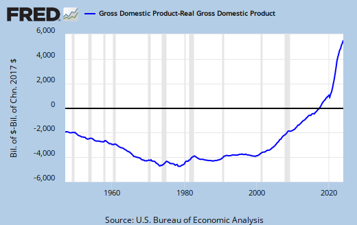 |
| Graph #1: Nominal GDP less Real GDP |
Thursday, June 28, 2012
Inflation and Real Growth
What increases faster, prices or real output?
 |
| Graph #1: Real Output relative to the Consumer Price Index |
From the late 1940s to the mid-60s, real output increased a lot faster than prices. Then, until the early 1980s, prices went up a lot faster (so the line on the graph goes down). Since then, they change at about the same rate.
This graph fascinates me because the trend-changes are so distinct.
// related post: Another look at prices and output, 1 June 2012
Wednesday, June 27, 2012
Sucker!
Random Eyes #2Yc:

Oh, that's interesting, I thought. I wonder how far back the two lines match up so well...

Not so much.
Tuesday, June 26, 2012
Logical Conclusions
The three graphs in yesterday's post all consider that the Great Moderation ended in 2007, and ignore the economy's performance after that year. I've seen data analyzed that way, as a sort of benefit-of-the-doubt gesture.
I don't think it is the right approach. I think the years after 2008 demonstrate a logical conclusion to Great Moderation policies. I think the third period should not stop with 2007, but should run to the most recent data.
I present the graphs again.
Growth

Growth was best in the Golden Age, middling during the Great Inflation, and worst during the Great Moderation.
Unemployment

Unemployment was lowest in the first period, highest in the second, not very good in the last.
Inflation

Inflation was lowest in the first period. Not quite so good in the last.
The first period was best in every category. The second period was logical conclusion to the first. The third period tried to fix the second-period problems but overlooked the first-period policies that created those problems. The post-2007 problems are the logical conclusion to the third period.
I don't know now. Maybe the Great Moderation does end in 2007, and Period Four begins in 2008.

The first-period policies that led to the second-period problems? Excessive accumulation of debt. Excessive reliance on credit. Excessive cost of finance.
By the end of the first period, that cost was dealt with by increasing the growth rate of money. But then, credit use was allowed to grow even faster. In period two we had inflation as a result.
In period three the cost was dealt with by letting credit-use grow and regularly reducing the rate of interest until it could fall no further. In period four we have depression.
No one yet sees that the solution is to increase the growth of money and *decrease* the growth of credit.
The solution is to reduce our reliance on credit. People often react negatively when I say that. As if it would be impossible to fix the economy by using less credit and more money, as we did in the Golden Age.
Monday, June 25, 2012
Ellipsis
I've been trying for a while to find stats that show whether the economy since Reagan was as good, or better, or worse than other periods. Convincing stats.
At last it occurred to me to take advantage of the time periods economists use: the Postwar Golden Age, the Great Inflation, and the Great Moderation. I decided to look at economic performance in these three periods.
Meltzer identifies the Great Inflation as the years 1965-1984.
Annual data from FRED show US economic performance since the late 1940s. For this post I divide the FRED data into three periods: before 1965, 1965-1984, and after 1984.
Growth
 |
| Graph #1 |
Growth was best in the first period, worst in the last.
Unemployment
 |
| Graph #2 |
Unemployment was lowest in the first period, highest in the second, not very good in the last.
Inflation
 |
| Graph #3 |
Inflation was lowest in the first period. Not quite as good in the last.
The first period was best in every category.
The claim to fame of period three is its victory over period-two inflation. Fair enough. However, control of inflation in period three was not as good as during period one. Meanwhile, period three performance in the growth and the unemployment categories just plain stinks.
// Notes
FRED's unemployment data came as annual percentages. The Deflator and Real GDP numbers did not. This allowed me, for the latter two, to calculate compound growth rates by period. For the unemployment graph I simply averaged the given numbers; compounding is not figured in.
To figure the compound annual growth rates I wrote a function in the Visual Basic that comes with Excel. This function is in this Excel file along with the graphs and data.
Sunday, June 24, 2012
Shove it
I use Firefox. Rarely, when I want to test something, I use MSIE. I don't like MSIE because Microsoft tries to shove it down my throat. Makes me want to abandon Windows and adopt Linux or something.
Twice now in MSIE I got messages like this (the other one was for Blogger):
Your browser does not support all features of Google Docs. If you are having problems, try Google Chrome.
So now Google is trying to shove it down my throat.
Now I'm looking for an alternative to Google that's sweet, like Google used to be.
A pretty massive inflation
Following up on the two previous posts...
It took a pretty massive inflation to keep Debt/GDP running flat. The mountain shown here, from the mid-1960s to the early 1980s, that's what did it.
It took a pretty massive inflation to keep Debt/GDP running flat. The mountain shown here, from the mid-1960s to the early 1980s, that's what did it.
 |
| Graph #1: GDP Deflator, rate of change |
Saturday, June 23, 2012
By the numbers (2): History is different
Debt Relative to GDP, Nonny's graph from yesterday:
 |
| Graph #1: Total Debt as a Percent of GDP |
Nonny's graph is duplicated as the red line in Graph #2 below. In blue, Graph #2 shows inflation-adjusted debt relative to inflation-adjusted GDP:
| Graph #2: TCMDO/GDP and Real Debt / Real GDP |
The first thing to notice is that the red and blue lines are not identical. Inflation does not "come out in the wash". This is because there are two different calculations for the inflation adjustment. That is because total debt at any given point includes debt from previous years when the price level was lower. GDP does not include production from previous years.
The second thing to notice is that most of the separation between the red and blue lines occurs during the Great Inflation of 1965-1984. So, intuitively, the graph makes sense.
Third, the two lines start at the same level. This is because we don't have information on earlier years, so no inflation adjustment can be done on prior debt.
Finally, note that the blue region above the red is a measure of "the erosion of debt by inflation". Observe the period from 1966 to 1991. During this period, the blue growth of debt was very nearly as rapid as in the years after 2000, and for twice as long or more. This rapid blue period includes basically the entire "Great Inflation" when the red debt was flat, plus the rising red debt of the Reagan years, plus part of the slowdown in debt growth after 1986.
When we take the erosion of debt into account, there is no flat spot during the Great Inflation. When we take erosion into account, there is no unusual increase between 1980 and 1986. When we take erosion into account, history is different.
// The Google Docs spreadsheet
// See also Debt and Inflation (4): Recalculating
Friday, June 22, 2012
By the numbers
Here's how to take inflation out of GDP: Divide each year's GDP number by the same year's price-level number.
That's it. That's the whole calculation.
When you've done all the years, a graph of your numbers takes on a different shape. That's because you have removed the inflation from the numbers.
Usually, we do a second step: We multiply all the values by 100, or we pick a base year and multiply all the values by the base year price-level.
The second step scales the numbers up, so you can visually compare your results to the numbers you started with. But this "scaling up" really has nothing to do with removing inflation from the numbers. That all happens in step one.
To make an inflation-adjustment of debt, we should do exactly the same thing: Divide each year's debt by the same year's price number. The trouble is that when you take any one year's total debt, it is not the debt of just one year. It is the debt of many years.
If we take the GDP number for 1980 and divide it by the price number for 1980, that's fine. But if we take total debt for 1980 and divide it by the price number, our answer is wrong. Total debt for 1980 includes debt from 1979 and 1978 and 1977, and even some left over debt from 1965 when prices were much lower. Our calculation does not allow for that. So our answer is wrong.
If you are taking the price level out of debt, the 1980 price level only applies to 1980's additions to debt. To remove the price level from the debt that still remains from 1965, you have to divide it by the 1965 price level. For all the years, you have to do this.
But nobody does this.
If you're looking at debt for 1980 and you divide the total debt by the price level for 1980, the adjustment of left-over debt from 1965 is understated. This understatement changes the shape of the graph. When you make the graph, the old debt is shown falsely low. And then, the "erosion of debt by inflation" appears to be less than is actually the case.
Every year's debt has to be figured separately, just as every year's GDP is figured separately. What you have to do is start at the beginning, adjust each year's addition to debt separately, and total up the adjusted numbers as you go.
A few days back Nonny presented this graph, which is not adjusted for inflation:
|
| Graph #1: Total Debt as a Percent of GDP |
Nonny said one can use the graph to "pinpoint the timing" of the big changes. Jazz responded: "Yep - Reagan and Bush, Jr." Jazz refers to the big increase from 1980 to 1986, and the big increase after the year 2000.
There is nothing wrong with the graph, except that it includes the effects of inflation. If inflation was always the same, it wouldn't matter. But inflation is not always the same. Therefore, inflation changes the shape of the graph. So we don't really know if the big increase from 1980 to 1986 was due to a big increase in debt, or if it was due to the ending of the Great Inflation.
What's missing from Nonny's graph -- or not missing, but hidden within it -- is inflation. When we look at this graph we are not so much seeing the relation between debt and output as we are seeing the different effects of inflation on debt and output.
Nonny says:
The plots of debt/gdp or debt/income are all time plots of the nominal measures of both components, combined into a ratio at the time of collection; that is, inflation (or deflation) comes out in the wash.
Yes, it is true there is inflation in the numerator and denominator both. So you would think the inflation gets divided out of the picture, or "comes out in the wash" as Nonny says. But the the size of the effect of inflation is greater for debt than it is for output, because today's total debt includes debt from a time when prices were lower.
For any given year, there must be two different inflation adjustments: one for GDP, and another for debt. Because the two calculations differ, inflation does not simply "come out in the wash" when you look at debt relative to GDP.
Thursday, June 21, 2012
On the meaning of "two goals"
Persistent attempts to expand the economy beyond its long-run growth path will press capacity constraints and lead to higher and higher inflation, without producing lower unemployment or higher output in the long run. In other words, not only are there no long-term gains from persistently pursuing expansionary policies, but there's also a price—higher inflation.
What strikes me immediately is the absolute assurance of that statement. It is by no means offered as an economic theory, but as certain beyond doubt.
What strikes me next is that I don't like the statement. I still want to get the economy growing. I want to get around the obstacle that FRBSF puts in my way.
But, you know, it has to be true: Persistent attempts to expand the economy beyond its long-run growth path will press capacity constraints... Even if we don't know what "the long-run growth path" is. Actually, I'm thinking they meant "the long-run potential growth path". Yeah, that's what I was thinking.
I'm going with it. If I'm putting words in FRBSF's mouth, so be it.
Persistent attempts to expand the economy beyond its potential will press capacity constraints and lead to higher inflation.
Tautology, isn't it? Repeating the same thought in different words, no?
The quote sets up potential output as a standard by which perfection is measured, sorta like the model Hollie Witchey or the phrase "Don't mess with Mother Nature".
You can't do anything about inflation, the quote tells us. You can't do anything about unemployment. And you can't do anything about capacity constraints -- except, of course, you can make demand-side sacrifices to a supply-side god.
But you know, we've been pressing capacity limits and getting inflation at lower and lower levels for two generations now. So FRBSF's analysis is iffy.
And, you know, we don't really know the true path of potential output. Yes, without doubt, there is one. And that fact adds strength to FRBSF's claim. But don't let them fool you. Just because there *is* a true path of potential output, doesn't mean we're on that path.
And it doesn't mean, if we're not on it, that we know *why* we're not on it.
From the same article:
Monetary policy has two basic goals: to promote "maximum" sustainable output and employment and to promote "stable" prices...
Are the two goals ever in conflict?
Yes, sometimes they are. One kind of conflict involves deciding which goal should take precedence at any point in time... Another kind of conflict involves the potential for pressure from the political arena.
Wrong answer.
Hey, I know they dumb this stuff down so that people like me can "get" it. But the second kind of conflict they describe has nothing to do with economic analysis. And the first one is just a bad answer.
If you have two goals, you're supposed to have two goals. You're not supposed to have one goal for a while, and then switch off and have the other goal for a while. If that is your strategy, you failed from the start.
Despite what everyone says, though, the Federal Reserve is not a complete and utter failure. There was a time there, after the second World War, when inflation and unemployment were both pretty low for a spell.
Two goals: To control inflation by limiting demand, and to control unemployment by unleashing demand. Are the two goals ever in conflict?
The two goals are always in conflict.
It is a beautiful day. There is a magnificent, wide boulevard with fields of flowers left and right. We put the top down. We drive.
When there is inflation, there is too much spending, the road is too wide on the right. Policy makes a correction, and the pavement narrows a bit.
When there is unemployment, we need more spending, the road is too wide on the left. Policy makes a correction, and the road narrows a bit.
We drive. The road occasionally narrows a bit. We drive.
The road narrows. We find ourselves coursing a mountain, with solid rock on the one side and sheer drop on the other. We drive. The road narrows.
There is inflation, and the rock face comes closer to us. There is unemployment, and the sheer drop comes closer to us. We drive. Suddenly we realize there is no guarantee that the road will always be as wide as our vehicle. Then it starts to snow.
The economy of the 1950s provided a wide boulevard for policy actions. But the road narrowed substantially by the 1970s. And it has continued to narrow while both the terrain and the weather became less accommodating. Our own policy choices narrow the options left open to us and put us on a path we cannot navigate, going to a place we do not want to be.
The problem is not the Federal Reserve. The problem is that we do not know how to deal with the fact that our goals are always in conflict.
We want to be moving full speed ahead, but policy has created a narrow, washed-out, dangerous dirt road that leads up a mountain to nowhere.
We know there is a true path of potential output, just as there is a median family income, and just as there is a "best case" in any set of options. There is some dispute over what that true path is. So policymakers work backwards, believing that if there is too much inflation we are pressing the limits of capacity, and the road must be narrowed further.
But it is our make-the-road-narrow policy that undermines and reduces the long-run potential growth of output.
When their concern is inflation, policymakers raise interest rates and take money out of circulation. When their concern is unemployment, they reduce interest rates and encourage the use of credit.
But our concern, really, is always inflation and unemployment. Two goals. To honor these goals, policymakers raise and lower interest rates. And they take away money but encourage the use of credit.
They take away money but encourage the use of credit: They make using money more costly, and they leave us with nothing but debt.
Making money more costly is an unintended consequence of policy. It arises from the effort to meet goals that are always in conflict.
And debt? Debt is not the consequence of government spending or prodigal consumers or bad business practice. Not the massive debt we have. Our debt is an unintended consequence of policies that remove money from circulation and encourage the use of credit.
It is all just one big mistake.
Wednesday, June 20, 2012
Second Thoughts
From Gene Hayward, whose posts have the best long titles on the web:
A quick reference visual of Federal Govt spending. Another reminder of the failure of the political class and the public that enables them...
Easy reference visual that shows current Federal government spending in the broad budget categories. Healthcare (includes Medicare, Medicaid), Social Security, and Interest on the National Debt are areas of mandatory spending---must be carried out regardless, whether the govt has the money or not. Some would say that Defense should be in that category as well. The "Safety Net" contains unemployment compensation, food assistance and other income support programs. This is considered (for the most part) a Mandatory part of the budget too.
The Mandatory items mentioned above are the "biggies" in terms of serious budget issues, but are "smalls" in terms of political emphasis. The powers that be are feasting on the "everything else" in the budget in which each item represents a tiny part of the whole.
 |
| Source: Christian Science Monitor |
So of the six categories shown, as many as five (everything except "Everything else") are mandatory. That leaves 20 cents on the dollar from which to make cuts. That can't be good, if we are trying to cut spending and balance the budget.
I followed Gene's link to the Christian Science Monitor, where Peter Grier writes:
There's a lot of talk about cutting the US deficit but very little actual cutting of deficit. One reason? There's not much easy to cut.
Oh sure, you know generally that Social Security is expensive and the Pentagon isn’t cheap, and so on. But ... despite what you may hear on cable news shout shows, there is no magic fount of wasteful spending the elimination of which will put the US budget in the black. Lazy bureaucrats? Too few. Foreign aid? Too small. Military bands? Please.
Where’s the FBI? Where’s the EPA, the Interior Department, and so on? What about scientific research?
That comes under the miscellaneous category known as “stuff we haven’t mentioned so far because it’s not very big, relatively speaking.” All together it accounts for the last 20 percent of US spending.
That’s why it’s hard to reduce the deficit by cutting nondefense bureaucracy. You can’t balance the budget by squeezing only one-fifth.
It almost sounds like the CSM wants to call defense spending discretionary rather than mandatory. That would double the cut-able part of the budget to two-fifths. I don't have a political or military opinion on cutting defense, just an economic one. I think, if you want to cut the military you should want it out of some sense of what's right and wrong. Not just because we can't afford it.
And that gets me to my post title, short as it is.
According to Gene, we can't cut 80% of the budget. And the 20% we can cut includes the FBI and the EPA and stuff like that, which probably should be bigger, not smaller. This need we have, to cut government spending, is a real problem. You know, people say it all the time: There are no easy answers.
So, to the people who think we need to make those cuts, to you I say this: Second thoughts, anyone? Maybe the economy is trying to tell us something. Maybe we're going about this all wrong. Maybe austerity in government budgets is not the solution it is cracked up to be.
That sounds like I think the government should spend more. That's not what I think.
Me, myself, I like to say we have to stop spending so much time focused on the solution, and spend lots more time on analysis of the problem. We have to figure out what the problem really is, and we have to be careful in our figuring.
There has been none of that, as long as I have been watching.
Here's my analysis. We don't have the debt and deficits because the government is spending too much. We have the debt and deficits because we use credit for money. When you use credit for money, it becomes literally impossible to reduce debt.
Literally impossible to reduce debt. Not because of how much we spend, but because of what we use for money.
Tuesday, June 19, 2012
The Misery Index
Nice graph, from InflationData.com:
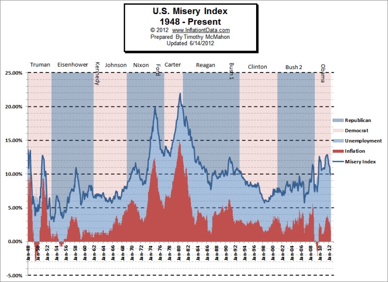
Except for brief spikes early on, the Misery Index before 1970 was low.
Also, it reached a low around 1998, but the low was not sustained.
Monday, June 18, 2012
Some are happy with the status quo
From a recent post at Asymptosis:
Recessions Are Nature’s Way of Keeping the Little Guy Down
Here’s a picture...

The well-off have done fine. In the greatest economic downturn in eighty years, their median net worth went up.
That red line there, the one that goes up, that shows income of the top 10%.
Reminds me of my definition of recession:
A recession is a time when fewer people do well.
Sunday, June 17, 2012
"Real" Flatulence
(Following up on this morning's post.)
I refigured "real debt" using the formula I figured out some weeks back, which allows for the fact that debt is a stock, not a flow.
Using these corrected debt numbers, this morning's graph now looks like this:
| Graph #1: Inflation-Adjusted Debt relative to Nominal GDP |
I suppose it just shows that prices are higher than they used to be.
// The Google Docs spreadsheet
Fisher dynamics and brain farts
Well this is weird:
 |
| Graph #1: Real Debt relative to Nominal GDP |
It runs flat, except during the Great Inflation.
Even more weird:
The mind goes where it will. Responding to comments, I looked at maybe half a dozen FRED graphs. Stopped when I got to the one above because I thought it interesting. Wrote the first part of this post easily, and looked at it on my test blog, as usual.
Then I realized what I had done: I used the standard inflation-adjustment calculation.
I am still in the middle of arguing that the standard inflation-adjustment calculation works correctly for a flow like GDP, but gives incorrect results for a stock like accumulated debt.
(But I didn't even think about that when I did this graph.)
Saturday, June 16, 2012
The Hollow Men
In mine of the 12th, I quoted from a PDF by three guys from the Bank of International Settlements:
Debt is a two-edged sword. Used wisely and in moderation, it clearly improves welfare. But, when it is used imprudently and in excess, the result can be disaster. For individual households and firms, overborrowing leads to bankruptcy and financial ruin. For a country, too much debt impairs the government’s ability to deliver essential services to its citizens.
Doesn't this imply that the "overborrowing" is a recent phenomenon? It is not.
For me, the cost of excessive credit use was already a problem by the latter 1960s. In the 1970s, it was creating cost-push pressures. Those cost pressures created our "productivity slump", caused our loss of competitive advantage, and led to the major changes in policy that we still think of as Reaganomics.
The problem goes a long way back.
Data bear out these concerns – and suggest a need to look comprehensively at all forms of non-financial debt: household and corporate, as well as government. Over the past 30 years, summing these three sectors together, the ratio of debt to GDP in advanced economies has risen relentlessly from 167% in 1980 to 314% today, or by an average of more than 5 percentage points of GDP per year over the last three decades.
Yes, and over the past 30 years debt has grown much more rapidly than before. Perhaps you think this is the cause of the problem.
Let me remind you that Reaganomics was a solution. Apparently, Reagan's people thought that accumulating debt even faster would solve our economic problems. What this tells me is that we didn't really think of accumulating debt as a problem.
And what that tells me is: When the problem arose in the 1960s and became pressing in the 1970s, we did not think accumulating debt was the cause of the problem.
From the Abstract of that BIS paper:
When does debt go from good to bad? ... For government debt, the threshold is around 85% of GDP... When corporate debt goes beyond 90% of GDP, it becomes a drag on growth. And for household debt, we report a threshold around 85% of GDP...
Now, doesn't this imply that the "overborrowing" is a recent phenomenon?
Taking the US Federal debt as the "Gross Federal Debt" (FYGFD), the Federal debt reached 85% of GDP in 2009. (But one year earlier, this debt was only 70% of GDP. Did the BIS think it a problem, then?)
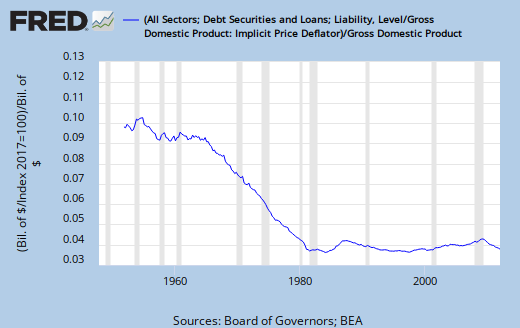
Household debt. FRED has a time series on that -- HDTGPDUSQ163N -- but it only goes back to 2009. So I used the household sector debt from the TCMDO series, and looked at that relative to GDP. Not a perfect match, but fair.
Anyway, household debt went above 85% of GDP in 2004 apparently. Maybe a couple years earlier if we imagine the blue line running parallel to the red one, on this FRED graph.
Finally, setting Financial debt aside (as BIS does) I looked at "Nonfinancial Corporate Business" debt as a percent of GDP. This peaks below 55% and (according to the PDF) must be no part of the problem.
For the hell of it then, I looked at "Total Credit Market Debt Owed by Domestic Financial Sectors" as a percent of GDP. This one reaches 85% already by the 2001 recession, and peaks at 120% during the crisis. I should point out, however, that the BIS PDF does not identify a problem level for Financial debt.
The earliest of these trouble points appears before 2004, but not much before. Still, if debt is accumulating, if it is heading for a benchmark, shouldn't we be able to say there are prior benchmarks at lower levels that ought to have been taken as some sort of warning? That might not take the BIS guys all the way back to the 1960s, but it would point them in the right direction.
But I don't think they're going that way. The question they ask is "When does debt go from good to bad?" They want to know how long they can wait before calling debt a problem. They want to know how close they can get to the edge. Because when a bank steps back from the edge, it makes less money.
This is not how the problem gets solved. This is the way the world ends.
Places I go (no. 1 in a series)
Perhaps it's the early hour. But this made me laugh out loud:
What's the difference between "eligible employees" and "employees eligible to participate"? Only an unnecessary sort of zeal, as if those who cannot participate are strictly forbidden to try.
From Michael Leddy's How to improve writing (no. 1 in a series).
Friday, June 15, 2012
Chasing down Nordhaus
Wanted to confirm that there is a Nordhaus at Yale who is the source of that macromath PDF I used in my 4AM today.
There is a William Nordhaus at Yale. And I'm satisfied he's the source of that PDF. Here's his home page.
This is kinda neat. He has this "G-Econ" project going:
The G-Econ research project is devoted to developing a geophysically based data set on economic activity for the world... The basic metric is the regional equivalent of gross domestic product. Gross cell product (GCP) is measured at a 1-degree longitude by 1-degree latitude resolution at a global scale.
He shows the globe, but ignores national boundaries. Instead he divides the surface of the Earth into small squares, and shows an output stack in each square, representing the GDP (or, GCP) of that small region. Four globes are available on his sidebar.
I started with the Large pixeled contour globe.
Wow.
Hey, thanks for the MacroMath PDF, Professor.
For example...
Not sure who I have to thank for this. I Googled graph of US real output since 1800 and turned up macromath_v2.pdf. The URL includes the words "nordhaus" and "yale.edu" so, Professor Nordhaus maybe.
Let’s graph US real GDP since 1800 using an arithmetic scale and a logarithmic scale. Also show a constant growth curve in the log scale. Which is more useful?
From this example, you can see why economists like to put log(xt) on the vertical axis for output, prices, and other trended variables. Because a series with a constant growth rate is a straight line!
|
|

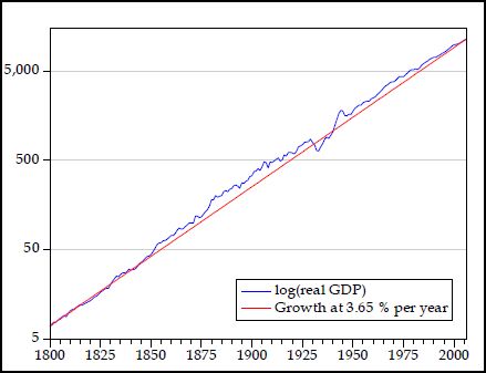
Because a series with a constant growth rate is a straight line!
Yesterday I said
It is always an unwavering path, a straight line on a log chart. This straight-line path is the universal, fundamental assumption, whether we think it exists or not.
The straight line is the wrong picture. The long-term trend looks like a sine curve. It looks like a business cycle, only longer than the normal business cycle. Longer than a Kondratieff wave. Longer than David Hackett Fischer's Great Wave. I'm looking at a really long business cycle, what we normally think of as civilization, the rise and fall of civilization.
The Log Graph above shows the "straight line" that economists always assume. But the logged data shows a curve that, relative to the straight line, is high in the center and low at the ends. It is some kind of curve. A sine curve, maybe.
The graph runs 200 years, from 1800 to 2000. That is one-tenth of a 2000-year cycle.
No, I don't call this evidence. But I do call it interesting.
Thursday, June 14, 2012
The "unit root" thing (arcane:)
Unit root? No, I don't understand. Wikipedia says:
In time series models in econometrics (the application of statistical methods to economics), a unit root is a feature of processes that evolve through time that can cause problems in statistical inference if it is not adequately dealt with.
If a "linear stochastic process" has a "unit root" the process is "non-stationary". Otherwise it is "stationary". Something like that (based on the Wikipedia article). Apparently it is something that can be calculated. Sometimes. Maybe.
This rang a bell. From the same article:

The diagram above depicts an example of a potential unit root. The red line represents an observed drop in output. Green shows the path of recovery if the series has a unit root. Blue shows the recovery if there is no unit root and the series is trend stationary. The blue line returns to meet and follow the dashed trend line while the green line remains permanently below the trend. The unit root hypothesis also holds that a spike in output will lead to levels of output higher than the past trend.
Okay: The dotted line is Potential GDP. The red line is actual GDP. The blue and green lines are two possible post-crisis paths. We seem to be on the green path.
This is exactly what James Bullard was talking about, what John Taylor worked out and John Cochrane showed, what David Andolfatto presented, and what I reviewed a few months back. (See especially Cochrane's presentation of Taylor's graphs.)
I was totally fascinated by Bullard's approach. I didn't know it had all this backstory.
Among the ending thoughts of the Wikipedia article:
The issue is particularly popular in the literature on business cycles.
Research on the subject began with Nelson and Plosser whose paper on GNP and other output aggregates failed to reject the unit root hypothesis for these series. Since then, a debate—entwined with technical disputes on statistical methods—has ensued.
While the literature on the unit root hypothesis may consist of arcane debate on statistical methods, the implications of the hypothesis can have concrete implications for economic forecasts and policies.
Arcane debate, indeed.
Paul Krugman (the Wikipedia article links to him) provides a relevant example, which I've highlighted:
March 3, 2009, 9:06 pm
As Brad DeLong says, sigh. Greg Mankiw challenges the administration’s prediction of relatively fast growth a few years from now on the basis that real GDP may have a unit root — that is, there’s no tendency for bad years to be offset by good years later.
I always thought the unit root thing involved a bit of deliberate obtuseness — it involved pretending that you didn’t know the difference between, say, low GDP growth due to a productivity slowdown like the one that happened from 1973 to 1995, on one side, and low GDP growth due to a severe recession. For one thing is very clear: variables that measure the use of resources, like unemployment or capacity utilization, do NOT have unit roots: when unemployment is high, it tends to fall. And together with Okun’s law, this says that yes, it is right to expect high growth in future if the economy is depressed now.
But to invoke the unit root thing to disparage growth forecasts now involves more than a bit of deliberate obtuseness. How can you fail to acknowledge that there’s huge slack capacity in the economy right now? And yes, we can expect fast growth if and when that capacity comes back into use.
Roots of evil (wonkish)
As Brad DeLong says, sigh. Greg Mankiw challenges the administration’s prediction of relatively fast growth a few years from now on the basis that real GDP may have a unit root — that is, there’s no tendency for bad years to be offset by good years later.
I always thought the unit root thing involved a bit of deliberate obtuseness — it involved pretending that you didn’t know the difference between, say, low GDP growth due to a productivity slowdown like the one that happened from 1973 to 1995, on one side, and low GDP growth due to a severe recession. For one thing is very clear: variables that measure the use of resources, like unemployment or capacity utilization, do NOT have unit roots: when unemployment is high, it tends to fall. And together with Okun’s law, this says that yes, it is right to expect high growth in future if the economy is depressed now.
But to invoke the unit root thing to disparage growth forecasts now involves more than a bit of deliberate obtuseness. How can you fail to acknowledge that there’s huge slack capacity in the economy right now? And yes, we can expect fast growth if and when that capacity comes back into use.
Kling responds:
But the unemployment rate is not trend-stationary either--the "natural rate" tends to wander around.
This all comes up because I came upon a link from besttrousers at Reddit (Reddit links to a PDF, 50+ pages), a paper dated 1989, written by Lawrence J. Christiano and Martin Eichenbaum. From a time before computers, by the look of it.
From the opening of the paper:
Macroeconomists have traditionally viewed movements in aggregate output as representing temporary fluctuations about a deterministic trend. According to this view, innovations [shocks] to real gross national product (GNP) should have no impact on long-run forecasts of aggregate output. Increasingly, however, this view of aggregate fluctuations has been challenged. Following the important work of Nelson and Plosser (1982), numerous economists have argued that real GDP is best characterized as a stochastic process that does not revert to a deterministic trend path.
Let me ask a question: What is this trend that may or may not exist?
It is always an unwavering path, a straight line on a log chart. This straight-line path is the universal, fundamental assumption, whether we think it exists or not.
The straight line is the wrong picture. The long-term trend looks like a sine curve. It looks like a business cycle, only longer than the normal business cycle. Longer than a Kondratieff wave. Longer than David Hackett Fischer's Great Wave. I'm looking at a really long business cycle, what we normally think of as civilization, the rise and fall of civilization.
The cycle of civilization. Change that dotted line to a sine wave with a 2000-year period, and all your assumptions about stationary, non-stationary, and unit root go out the window.
Wednesday, June 13, 2012
If you have to have a metaphor
I really liked the opening of the Cecchetti/Mohanty/Zampolli PDF:
Debt is a two-edged sword. Used wisely and in moderation, it clearly improves welfare. But, when it is used imprudently and in excess, the result can be disaster.
I liked the "two-edged sword" metaphor all the while I was writing yesterday's post. Soon as I finished, I had another thought.
Perhaps our troubles with debt arise from the ambiguity of the double-edge: Debt is good, and debt is bad. Perhaps if we only thought of debt as bad, we would stay out of trouble. Or if we only thought of debt as good, we'd never think ourselves in trouble.
Nah. It's good and bad, and we just have to deal with our confusion on the matter. Oh, there are explanations, sure. The PDF opens with one. From the Abstract:
At moderate levels, debt improves welfare and enhances growth. But high levels can be damaging.
So: It's not the debt that gives us trouble, but the level of debt. Low levels of debt (or, moderate levels, as the bankmen say) are not problematic; but high levels of debt are a problem. I agree; my key phrase is "excessive debt".
But remember how it was when you were a kid? When you are little, everything is out of reach. When income is little, even "moderate" debt can be insurmountable.
Low and high, big and small: These are relative terms. That's how we get into trouble. We don't see the debt as too high until we're in trouble.
Then it is obvious. But then it is too late.
We need a better way to look at debt. "The double-edged sword" is a useless metaphor that does not keep us out of trouble. To make it right, we need an extra word: credit.
Debt is always bad. Credit is always good. But using credit creates debt!
Before you use it, OPM -- other people's money -- is credit. It is credit until you use it. But the moment you spend a borrowed dollar, all that's left is debt. You don't have the money anymore. After that, you just have the debt.
Debt is the record of credit we have put to use, a record of money borrowed and not yet paid back.
Credit is always good because it is available for use, or because you're using it, adding to aggregate demand, boosting the economy, keeping somebody working. It's all good.
Debt is always bad, because you don't have the money anymore. You don't have the credit anymore. You just have the obligation to pay back money you no longer have.
Let me revise the bit I quoted from the PDF: Debt is not a two-edged sword. Debt is one edge, perhaps the sharper edge. The other edge is credit-money.
The sword is finance. If you have to have a metaphor, the sword is finance.
Tuesday, June 12, 2012
Where the Supply Side does not matter
The Rex Nutting post links to The real effects of debt, a 34-page PDF by Stephen G Cecchetti, M S Mohanty and Fabrizio Zampolli. Just a brief look:
At moderate levels, debt improves welfare and enhances growth. But high levels can be damaging. When does debt go from good to bad? We address this question using a new dataset that includes the level of government, non-financial corporate and household debt in 18 OECD countries from 1980 to 2010. Our results support the view that, beyond a certain level, debt is a drag on growth.
Debt is a two-edged sword. Used wisely and in moderation, it clearly improves welfare. But, when it is used imprudently and in excess, the result can be disaster. For individual households and firms, overborrowing leads to bankruptcy and financial ruin. For a country, too much debt impairs the government’s ability to deliver essential services to its citizens.
High and rising debt is a source of justifiable concern. We have seen this recently, as first private and now public debt have been at the centre of the crisis that began four years ago.
Data bear out these concerns – and suggest a need to look comprehensively at all forms of non-financial debt: household and corporate, as well as government. Over the past 30 years, summing these three sectors together, the ratio of debt to GDP in advanced economies has risen relentlessly from 167% in 1980 to 314% today, or by an average of more than 5 percentage points of GDP per year over the last three decades.
When debt ratios rise beyond a certain level, financial crises become both more likely and more severe (Reinhart and Rogoff (2009)). This strongly suggests that there is a sense in which debt can become excessive. But when?
We take an empirical approach to this question. Using a new dataset on debt levels in 18 OECD countries from 1980 to 2010 (based primarily on flow of funds data), we examine the impact of debt on economic growth. Our data allow us to look at the impact of household, non-financial corporate and government debt separately.
We take an empirical approach to this question. Using a new dataset on debt levels in 18 OECD countries from 1980 to 2010 (based primarily on flow of funds data), we examine the impact of debt on economic growth. Our data allow us to look at the impact of household, non-financial corporate and government debt separately.
In this section, we briefly review trends in household, non-financial corporate and government debt. In what follows, we will refer to the total combined debt of these three sectors as the total non-financial debt.

As shown in Graph 1, from 1995 to the middle of the last decade, public debt had been relatively stable as a percentage of GDP. But this period of relative public sector restraint was accompanied by a rapid rise in household and non-financial corporate debt. The righthand panel of Graph 1 makes the rather stark point that real household debt tripled between 1995 and 2010, dwarfing the accumulation of debt in other sectors of the economy.
The place that Supply is deemed not to matter? Finance.
Here's a older graph, from a Seeking Alpha post of January '09 by ContraHour:
 |
| SOURCE: CONTRAHOUR AT SEEKING ALPHA |
The highest line there, the pink one, is the total of all the other lines. That's the problem, yeah, total debt. But just look at the components. Just look at one of them. On the right side, the second highest line -- highest among the components -- is Financial debt. "Domestic Financial" debt.
On the left side, at the start, Financial debt is the lowest.
In other words, Financial debt was the fastest growing component of Total debt. Not household debt or any of the others. Financial debt.
Oh, by the way, they're all bankmen:
Cecchetti is Economic Adviser at the Bank for International Settlements (BIS) and Head of its Monetary and Economic Department; Mohanty is Head of the Macroeconomic Analysis Unit at the BIS; and Zampolli is Senior Economist at the BIS.
Maybe they have a vested interest in failing to see financial debt as a problem. That would be like me saying household debt does not matter, something I do not say.
And yes: It would be like the private sector pointing the finger at public debt.
Monday, June 11, 2012
David Brooks: The Debt Indulgence
From the Opinion Pages of the New York Times, by David Brooks, 4 June 2012:
Every generation has an incentive to borrow money from the future to spend on itself. But, until ours, no generation of Americans has done it to the same extent. Why?
Why? Because policy does nothing to prevent it. Policy only encourages it. Still today, Federal Reserve policy is to grow the economy by getting everyone to borrow more. This must change.A huge reason is that earlier generations were insecure. They lived without modern medicine, without modern technology and without modern welfare states. They lived one illness, one drought and one recession away from catastrophe. They developed a moral abhorrence about things like excessive debt, which would further magnify their vulnerability.
Try to focus, David Brooks. You are not doing economics here. Your stories are irrelevant.In case you didn't notice, in the 1990s and 2000s we had a growth industry dedicated to making money by helping people out of debt. So even then, we had "a moral abhorrence about things like excessive debt". Some kind of abhorrence, anyway.
Our character is not the problem. Our policies are the problem.
Recently, life has become better and more secure. But the aversion to debt has diminished amid the progress. Credit card companies seduced people into borrowing more. Politicians found that they could buy votes with borrowed money. People became more comfortable with red ink.
It is policy, David, plain and simple. There is no need to make up these stories.Today we are living in an era of indebtedness. Over the past several years, society has oscillated ever more wildly though three debt-fueled bubbles. First, there was the dot-com bubble. Then, in 2008, the mortgage-finance bubble. Now, we are living in the fiscal bubble.
Wait a minute -- the fiscal bubble? No, you misuse the word "bubble".
In this country, the federal government has borrowed more than $6 trillion in the last four years alone, trying to counteract the effects of the last two bubbles. States struggle with pension promises that should never have been made. Europe is on the verge of collapse because governments there can’t figure out how to deal with their debts. Nations around the globe have debt-to-G.D.P. ratios at or approaching 90 percent — the point at which growth slows and prosperity stalls.
It all goes back to the increase in the tolerance for debt.
No, David. As Rex Nutting says, excessive private debt created the problem. But what it all goes back to is policies that encourage credit use and the accumulation of debt. It all goes back to the increase in the tolerance for debt.
Private debt and public policy. Focus on these two things. Everything else follows.
Democrats and Republicans argue about how quickly deficits should be brought down. But everybody knows debt has to be restrained at some point. The problem is that nobody has been able to find a political way to do it.
No, David. The problem is that nobody considers the economic way to do it. What about private debt, Brooks?
1. Excessive private debt leads to inadequate growth.
2. Inadequate growth leads to excessive public debt.
What about private debt?
The era of indebtedness began with a cultural shift. It will require a gradual popular shift to reverse. Today’s Wisconsin vote might mark the moment when the nation’s long debt indulgence finally began to turn around.
What about private debt, fool?Sunday, June 10, 2012
Rex Nutting: U.S. debt load falling at fastest pace since 1950s
From MarketWatch at the Wall Street Journal, by Rex Nutting:
If you want to know why economic growth has been so tepid, here’s your answer. Four years after the storm hit, the economy is still deleveraging. And it’s very hard for any economy to grow when everyone is focused on increasing their savings.
The rapid rise in federal debt over the past four years has distracted us from the big picture. The level of public debt is indeed worrisome, but it’s not as big a worry as the economy’s total level of debt — public and private.
As much as we hear politicians, pundits, tea-party patriots and the Congressional Budget Office obsessing about government debt, it was excessive private debt — not public debt — that caused the 2008 financial meltdown. And it was private debt — some of it since transferred to the public — that lies behind the current European debt crisis.
Economists who have studied the impact of indebtedness have found that low levels of debt are essential to growth, but that high levels of total outstanding debt can hurt an economy. Beyond a tipping point, adding on more debt will reduce growth over the long run, even if it inflates a bubble in the short run.
“At low levels, debt is good. It is a source of economic growth and stability,” concluded Stephen Cecchetti, M.S. Mohanty and Fabrizio Zampolli, economists for the Bank of International Settlements, in a paper presented at the Federal Reserve’s Jackson Hole conference last August. “Beyond a certain point, debt becomes dangerous and excessive,” and can lead to increased volatility, financial fragility and slower growth. It can even bring down the real economy with it, as we have seen. Read the BIS paper, “The Real Effects of Debt.”
According to a study by McKinsey published earlier this year, U.S. households may have two more years of deleveraging left before their debts are sustainable again.
If McKinsey is right, the U.S. economy may have to endure a couple more years of slow growth.
Why wait? Fix the problem!
HT: The Dixie Dove
Saturday, June 9, 2012
Who cares what Reagan was?
Paul Krugman, from Reagan Was a Keynesian
As many economists have pointed out, America is currently suffering from a classic case of debt deflation: all across the economy people are trying to pay down debt by slashing spending, but, in so doing, they are causing a depression that makes their debt problems even worse.
Yes.
This is exactly the situation in which government spending should temporarily rise to offset the slump in private spending and give the private sector time to repair its finances.
No.
In this situation, the government should admit it made policy mistakes that led to the creation of all this debt, that "people are trying to pay down" today.
In this situation, the government should "repair" those finances itself. The Federal Reserve should take the responsibility, and pay down private debt. This way, people wouldn't have to be "slashing spending" and "causing a depression".
There is no link between decisions to increase government spending and decisions to reduce personal indebtedness. Having the government spend more does nothing for people's debt. We need direct policy action to reduce the problem: Reduce private sector debt. Do it now.
Friday, June 8, 2012
Creative Destruction: Romney's jobs record
From Char Weise at Creative Destruction:
Here's total private sector jobs in Massachusetts and the US from 1990 to 2012, from the BLS. The shaded area is Romney's term as governor, 2003-06.

Clearly Massachusetts' economy underperformed in the Romney years: private sector employment rose by 1.5% in Massachusetts versus 5.7% in the US overall.

Clearly Massachusetts' economy underperformed in the Romney years: private sector employment rose by 1.5% in Massachusetts versus 5.7% in the US overall.
Thursday, June 7, 2012
Likewise
If you mow the lawn often enough it looks good. But put the mowing off a day, and clippings will clump up like a hayfield in need of baling. So then you have to go and mow sooner the next time. And higher than you want. And you have to be inventive with the mowing pattern so the clumps get smaller instead of bigger.
And then you have to mow it again, sooner, and again, and then maybe you can cut it a little shorter.
If you wait until it looks like you need to mow the lawn, you waited too long.
If you wait until it looks like debt is creating problems, you waited too long.
Wednesday, June 6, 2012
"One for You, Three for Me"
It is true, to follow up on yesterday's post, that for Nonfinancial Corporations the share of real assets has been falling, while the share of financial assets has been rising:
 |
| Graph #1: Financial (red) and Nonfinancial (blue) shares of total Nonfarm Nonfinancial Corporate Assets |
It is also true, as we observed some time ago, that the profit to Nonfinancial Corporations has been falling as a share of Total Corporate Profits, while that of Financial Corporations has been on the rise:
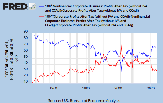 |
| Graph #2: Financial (red) and Nonfinancial (blue) shares of total Corporate Profits |
This gets me wondering about what is left as the profit from real assets to Nonfinancial Corporations, if we take their profit from Financial assets and count it with the profit of Financial Corporations.
I suspect the profit from real assets has been falling and is rather low. Why do I think this? Because economic growth is not good, and because profit is the engine that drives enterprise.
I'm gonna assume that the split between Financial and Nonfinancial profit of NNCB, Nonfarm Nonfinancial Corporate Business, follows the same pattern as the split between assets shown on Graph #1 above.
Starting with Graph #1, and factoring in FRED's Nonfinancial Corporate Business: Profits After Tax shows us the profit to Nonfinancial Corporations arising from Financial and Nonfinancial sources, in billions:
 |
| Graph #3: Financial (red) and Nonfinancial (blue) Profits arising from Nonfarm Nonfinancial Corporate Assets |
Profits from the two sources have become nearly equal. But I remind you that Graph #3 shows the profit of Nonfinancial corporations only. Now we shall add the profit of Financial corporations. I add it to the red line -- to the Financial profit of Nonfinancial corporations:
 |
| Graph #4: Total Corporate Profits from Financial sources (red) and Productive sources (blue) |
It may clarify the picture, to see this profit breakdown expressed as percent of total corporate profits:
 |
| Graph #5: Percent of Corporate Profits from Financial sources (red) and Productive sources (blue) |
In the 1950s, about 60% of corporate profits came from real production, and the rest from finance. During most of the Great Inflation, the ratio was 50-50.
Today, about 25% of corporate profits come from real production. Three quarters comes from finance. From other people's debt.
Tuesday, June 5, 2012
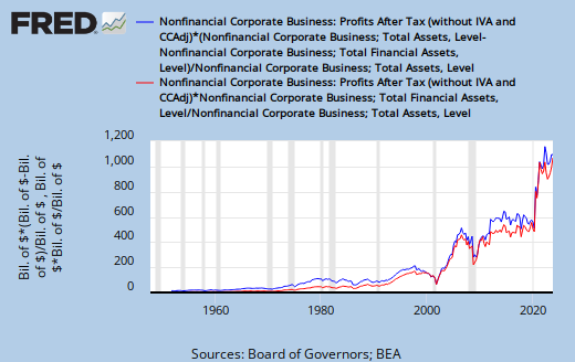
FRED at Random: #3AO
The Random Eyes sidebar link turned up a comparison of two items from Nonfarm Nonfinancial Corporate Business balance sheets: Totals Assets, and Total Financial Assets:
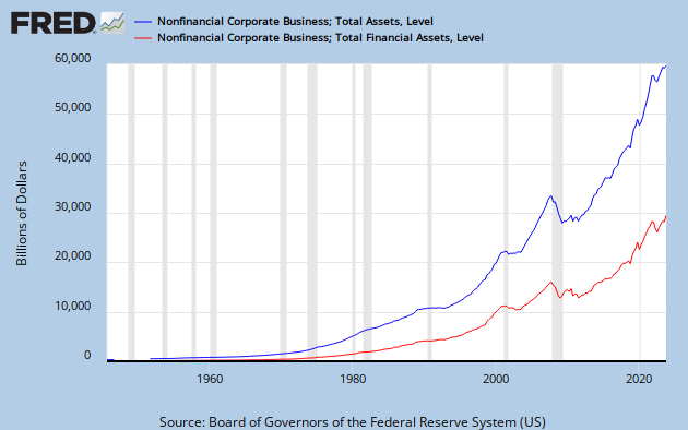 |
| Graph #1: FRED's #3AO |
Everything below the red line (down to the zero line) is financial assets; everything above it, up to the blue line, is productive assets.
If I divide the red line values by the blue line values, and multiply by 100 to convert to percent, I get to look at the history of financial assets as a percent of total assets, for Nonfarm Nonfinancial Corporate Business:
 |
| Graph #2: Financial Assets as a percent of Total Assets |
Half the assets of non-financial corporations are now financial assets.
Tax law made that happen. I'm sure of it.
Monday, June 4, 2012
A Beautiful Mind
The reasoning is from Marcus Nunes:
One of the effects of the ongoing crisis, characterized by an abrupt and steep fall in AD [Aggregate Demand] ... was to bring back the discussion of what should be the target of MP [Monetary Policy]. To the proponents of the view that the Central Bank should have as its objective the stability of AD, this is the “key” to macroeconomic stability – national or global.
(Marcus seems to be one of those proponents.)
For this group, shocks to AD are the true source of macroeconomic volatility while inflation is just a symptom of those shocks. Just like in medicine, symptoms may be related to different causes, so that prescribing the correct treatment is not trivial.
(I like that: Inflation is a symptom.)
Marcus sets up an example: an economy with "nominal expenditures growing at the rate of 5%" and "an RGDP growth of 3%" per year. The difference leaves us 2% annual inflation. Then he introduces a change:
Let us suppose that the economy experiences a real, or productivity shock that permanently raises the level of potential RGDP (fig. 8). In this case ... RGDP growth increases to 4% and inflation falls to 1% with AD growth remaining at 5%.
Tidy and simple and easy to understand: RGDP -- real output -- increases by 1%, inflation decreases by 1%, and the total remains the same.
 |
| Marcus Nunes' Figure 8 |
The red line shows the effect of the change. The slope of the line is steeper and the rate of growth is more: 4% during the change, rather than 3%. But once the new, higher level is achieved, the rate of growth returns to 3%. So we see that the new, higher green line runs parallel to the original green line.
It is significant that Marcus supposes a change "that permanently raises the level of potential RGDP" -- the level, not the rate of growth. If it was a change to the rate of growth, the new green line would show a steeper slope, like the red line. This is not the argument. As Nunes puts it:
Note that in time the economy returns to point a with growth falling back to 3% and inflation moving back to 2%. The level of RGDP is permanently higher and the price level will be permanently lower.
The orange and purple lines on Figure 8 show what happens with inflation, during the changes to output described here.
Marcus continues:
This will be the outcome if the Fed keeps the growth of AD at 5%. However, if it strives to keep inflation at 2% after it falls to 1% as a result of the positive supply shock, increasing AD growth [implies that] the economy will be growing above its potential...
We begin with 5% AD realized as 3% real growth and 2% inflation. A new technology or something suddenly means we can have a higher (though not faster-growing) level of output. The economy temporarily grows at a faster rate to reach the new target level. The economy grows 1% faster, and prices go up 1% slower. So temporarily, we have 4% real growth and 1% inflation. The growth of AD remains at 5%.
But, Nunes says, suppose Monetary Policymakers rely on "Inflation Targeting". They see the decline of inflation from 2% to 1% and they are concerned that the economy is slowing. So they boost Aggregate Demand to compensate. As a result, RGDP growth increases from 4% to 5% and inflation increases from 1% to 2%. Total AD growth rises from 5% to 7%. (My numbers.)
Now, Nunes says, "inflation pressures will appear". "AD will have to be constrained". Policymakers will reduce interest rates and boost growth "in order to keep inflation on target. In this case RGDP and employment volatility will certainly be higher than if the Fed had operated to keep AD growth stable."
Rather than relying on inflation targeting, with Fed officials scurrying to outguess the economy's performance, Nunes would target NGDP on a reasonable path, and let economic forces duke it out to divvy up the spoils between inflation and real growth.
Marcus Nunes makes an awesome argument.
In his post, Nunes shows several graphs of US economic data, and ties the argument back to actual events:
AD instability after 1998 is associated with Fed actions. First the Fed reacted to a below target rate of inflation and then, in the opposite direction, reacted to an exuberant RGDP growth rate. This is indicative that an IT regime has an important flaw that manifests itself when the economy experiences supply shocks...
He summarizes:
[If monetary policy] is successful in keeping AD growth stable, the system adjusts while volatility remains low. If the Fed manipulates AD, influenced in turn by an inflation below target and then influenced by RGDP growth above potential, the system also adjusts – in the sense that inflation returns to target and growth to potential – but the shocks to AD resulting from these manipulations impart an undesired high level of volatility to the system...
In other words: Rather than relying on inflation targeting, with Fed officials scurrying to outguess the economy's performance, Nunes would target NGDP on a reasonable path, and let economic forces duke it out to divvy up the spoils between inflation and real growth.
Marcus, it's a great argument. Maybe I will stop saying NGDP Targeting does nothing for growth. Maybe I have to state my objection more clearly.
For the record, I really like the idea to let market forces determine the split between real growth and inflation, within the AD growth window that the Fed provides. I do like it. But the split will not be good, Marcus, until the cost push pressures are dealt with -- cost push pressures arising from the excessive reliance on credit.
Resolve those pressures, and your market forces will treat us well. Fail to resolve them, and we will find ourselves in the midst of another Great Inflation. We will find ourselves once again adopting Inflation Targeting as the more effective strategy. And this time it will be an argument with 30 years of evidence supporting it.
Marcus, the problem is that our economy is distorted by the costs arising from excessive debt, excessive reliance on credit, and excessive growth of finance. Those costs must be reduced.
We obviously cannot reduce those costs any longer by reducing interest rates. The only remaining option is to reduce accumulated debt, reduce our reliance on credit, and reduce the size of finance as a share of GDP.
Subscribe to:
Posts (Atom)
