Normalized data can be deceiving.
 |
| Graph #1: Wow! Look how big the Public debt is! |
 |
| Graph #2: Wow! Look how big the Private debt is! |
 |
| Graph #3: In fact, Private debt is substantially bigger. |
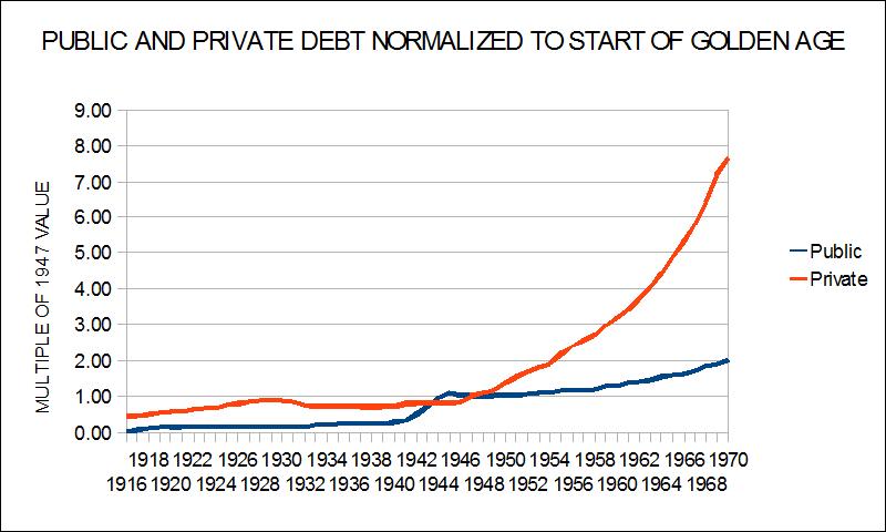
All three graphs show that total U.S. Public debt approximately doubled between 1947 and 1970.
All three graphs show that total U.S. Private debt increased more than seven-fold during that time.
Only Graph #3 shows that Private debt was almost $1000 billion more than Public debt, already in 1970.
No comments:
Post a Comment
The spam filter's been acting up again lately. I'm aware, and checking it often.
Oh, what fun they must have with this at Blogger!