Among the popular series listed at FRED at the moment:
M2 Money Stock 7 hours ago
M1 Money Stock 7 hours ago
So, I clicked M1.
 |
| Graph #1: M1, the quantity of spending-money or money in circulation |
 |
| Graph #2: Rate of change of M1 money, near 20% for some time now |
Hey, I don't make predictions. I'm not saying we *won't* get inflation. I'm not saying we will. What I am saying is that I think it's silly to grab one fact and start drawing conclusions.
One fact: M1 money has been going up.
So it has. Now, let's go get one more fact. Let's get GDP, and compare M1 money to the size of the economy, like this:
 |
| Graph #3: The size of circulating money, relative to the size of the economy, since 2008 |
Not yet. Because we're just looking at the crisis years. The unusual circumstances. Maybe this increase is altogether unusual. I need to know more.
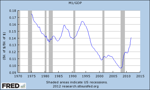
I want to look at M1/GDP for all the years that FRED will show:
 |
| Graph #4: The size of circulating money, relative to the size of the economy, since 1975 |
And if you look back to the left along the 14-cent line, you can see that we were at this level before. We were at this level in 1990, and also in the early 1980s just as Paul Volcker was bringing inflation down from those double-digit increases of the 1970s.
And then as inflation came down in the 1980s, the money/output ratio shows a small hump (before 1985) and a big hump (between 1985 and 1990) and another big hump starting around 1990 and peaking around 1994. And then the really big decline that takes us to the year 2000.
That big decline occurs at exactly the same time that the Federal budget came into balance during the Clinton years. Money was taken out of circulation by the Federal government, and used to pay down debt. So there was less M1, so the line goes down.
Before the early 1980s, the graph shows a decline from something over 17 cents of money per dollar's worth of output. But this graph only goes back to 1975.
To see farther back in time, I had to switch to a different data series. The M1NS series takes us back to 1959. And you can see that from 1959 to the early 1980s, there was a more or less continuous decline in the quantity of money relative to output -- 28 cents in 1959, half as much twenty years later:
 |
| Graph #5: The size of circulating money, relative to the size of the economy, since 1959 |
 |
| Graph #6: The size of circulating money relative to the size of the economy, and prices |
And over there on the far right, in the bottom corner, the money ratio finally fell below ten cents, and then we had the sudden crisis that nobody saw coming. And then policymakers decided to push the quantity of money back up to about where it was in 1980, apparently.
And despite all that, for the whole time, prices kept going up.

No comments:
Post a Comment