Well this is weird:
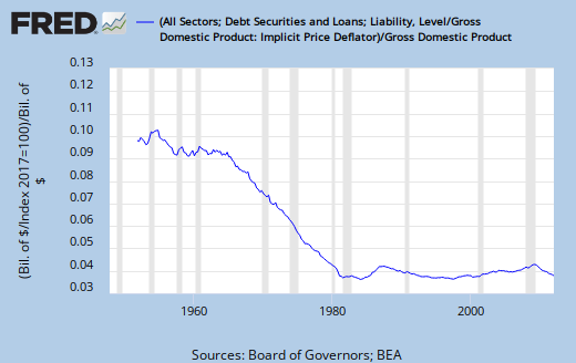 |
| Graph #1: Real Debt relative to Nominal GDP |
It runs flat, except during the Great Inflation.

Even more weird:
The mind goes where it will. Responding to comments, I looked at maybe half a dozen FRED graphs. Stopped when I got to the one above because I thought it interesting. Wrote the first part of this post easily, and looked at it on my test blog, as usual.
Then I realized what I had done: I used the standard inflation-adjustment calculation.
I am still in the middle of arguing that the standard inflation-adjustment calculation works correctly for a flow like GDP, but gives incorrect results for a stock like accumulated debt.
(But I didn't even think about that when I did this graph.)
No comments:
Post a Comment
The spam filter's been acting up again lately. I'm aware, and checking it often.
Oh, what fun they must have with this at Blogger!