Showed this Quandl graph the other day,
the Real interest rate:
 |
Graph #1: Real Interest Rate
SOURCE: Quandl |
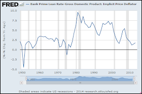
As I discovered when I tried to duplicate their graph at FRED, They don't specify the interest rate used in their calculation. I took a shot and guessed the prime rate. For the inflation I subtracted the GDP Deflator, which they specified; I used percent change
from year ago of the Deflator, which they didn't specify.
Then, as my graph turned out much more jiggy than theirs, I specified
annual frequency for the data on my FRED graph:
That's a pretty good match for the Quandl data. Theirs starts in the early 1960s, and lacks the rounded tops the FRED graph shows before 1960. And my FRED numbers may be a little higher -- but not much. Anyway the trends are similar, and that's the main thing.
Here's the jiggy one:


.PNG)
No comments:
Post a Comment
The spam filter's been acting up again lately. I'm aware, and checking it often.
Oh, what fun they must have with this at Blogger!