Take the Employment/Population graph from 21 December and show all the years:
 |
| 1 |
Compare it to the picture of inflation-adjusted GDP:
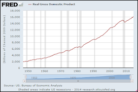 |
| 2 |
There's not much similarity to write home about. However... Take those two series, put 'em together on the same graph, and look at "percent change from year ago":
 |
| 3 |
The employment-to-population ratio runs generally lower. But the two lines are similar now.


No comments:
Post a Comment
The spam filter's been acting up again lately. I'm aware, and checking it often.
Oh, what fun they must have with this at Blogger!