Saturday, April 30, 2011

Playtime!


I visited News from 1930 a while ago, where ikedim has a nifty sidebar graphic that changes when you move the mouse over it. So I looked at his page source to see how he did it. And now I finally found a use for the technique, as a way to compare graphs.

DESCRIPTION
At right is John Taylor's graph. (I got it from Krugman.) It shows an "inverse" relation -- downsloping to the right -- between investment and unemployment. Unemployment is high when investment is low, unemployment is low when investment is high; thus, an inverse relationship. Just like the Phillips curve.

At Noahpinion, Noah doesn't think Taylor's graph is like the Phillips curve. He thinks it is a Phillips curve. Part of Noah's evidence is that, like a Phillips curve, when you enhance the graph by adding dots for more years, the dots on Taylor's graph are widely scattered, just like the dots on a Phillips curve.

Below is the first enhancement of the graph, showing red and blue dots. The blue are the same as in the graph I got from Krugman. The red dots show additional years. Most of those red dots are within or well above the blue band of dots.

When you put the mouse over this graph, it changes to show the second enhancement. Both enhancements, by the way, are from Justin Wolfers at Freakonomics.


What catches the eye first is red dots changing to blue. It's nifty, all right. But what I want you to see is down near the bottom, about in the middle of the graph. A whole blue cluster appears and disappears as you hover the mouse over the graph and move it off again.

When the graph is red-and-blue, the blue are the same as in the first graph above, showing points for the years 1990-2010. The red dots are points for the years 1970-1989. The red dots are much less orderly, and generally much higher, than the trend of the blue band.

When you move the mouse onto the graph, the blue dots remain, the red dots turn blue, and more blue dots appear. These new dots are points for the years 1948-1969. Most of these dots show investment in a mid-range, 14 to 16, and unemployment low, around 3 to 5 percent.

These new dots, showing low unemployment despite middling investment, are from the "golden age of postwar capitalism."

So good, or not so good, that is the question:


Back early April I came upon John Taylor draws a Phillips Curve at Noahpinion. I had already noticed for myself that Taylor's graph looked much like the Phillips curve. So I did like Noah's post. Of course, I liked my own analysis better.

But Noah also provided a graph that woke me up early the next day, ready to write.
It took until now, however, for my thoughts to come together.
From Noah's post:
And then I remembered something else about Phillips curves - they shift over time. Policy shifts and structural shifts in the economy will, over time, change the tradeoff between inflation and unemployment. If you look at data over more than a decade, you see a series of different curves for different time periods:


I never saw a graph like this before. I knew it should look like this, because the curve "shifts over time." And I always thought this shifting significant. But Noah's graph is the first time I saw it plotted out.

In his post, Noah goes on to say that Taylor's ratio, too, shifts over time. But he says no more about reasons for the shifting. As an explanation of the Phillips shifts, we are left with only five words: "Policy shifts and structural shifts". Isn't that inadequate?

The question is: Why does the Phillips Curve shift? Noah doesn't really address the question. Milton Friedman, if I have it right, said people anticipate policy changes and they change their behavior, and this disrupts the curve. I find that unsatisfactory.

Check out the labels on Noah's graph. The longest (lowest and leftmost) curve represents the Phillips tradeoff of the 1960s and the late 1990s. The shortest curve (in the upper-right corner) represents the tradeoff during two very severe recessions.

Growth was particularly good in the 1960s, and again in the late 1990s. Growth was particularly bad during those recessions. The placement of the curve is related to economic performance. Not "structural" shifts, but performance shifts. A healthy economy puts the tradeoff low and left on the graph; a sickly economy puts the tradeoff high and to the right.
Compare that to what Friedman said.
So the question, really, is not "Why does the Phillips curve shift?" The question is: What makes growth so good in some periods, and not so good in others?

Friday, April 29, 2011

Two points


In my "last free article this month" from the Times, Krugman writes:
(And yes, nonfinancial: banks lending to other banks isn’t inflationary unless the credit somehow moves out into the rest of the economy)

Point 1: Krugman says: Yes, credit out in the economy does contribute to inflation.

I would suggest that credit that fails to move out into the rest of the economy, raises costs in the financial sector.

Point 2: Oh, yeah, nonfinancial debt -- productive-sector debt -- is a problem. But so is financial debt. When we had the "financial" crisis, didn't it arise in the financial sector?

The problem, really, is excessive debt. This problem is hidden but not solved by distributing total debt into many different and smaller subtotals.

Same moment, same magic

The Quantity of MZM money relative to GDP

The Magic of Policy


At the same moment that interest rates started tumbling from peak, the rate of debt growth shot up. What magic is this?


TOTAL CREDIT MARKET DEBT OWED per GDP

Andy Harless


In a comment at Noahpinion, Andy Harless writes:

If reductions in taxes and regulation increase the incentive to invest, that's very much like reducing the cost of capital by cutting interest rates...

Yes. Yes. Very much like reducing cost by cutting interest rates. Let me broaden that: very much like reducing the factor cost of money by cutting the reliance on credit.

Not only the rate of interest, but also the reliance on credit (or the general level of indebtedness) contributes to the "cost of capital" and to costs in general in our economy -- to the cost of living, the cost of doing business, the cost of running a government. And it puts us at disadvantage in foreign markets.

I'm sure Andy Harless is not the first to say such a thing; but he says it clearly.

Since the late 1970s in the U.S. we've been fixing the economy by reducing taxes and reducing regulation and by lowering interest rates. After 35 years of lowering these costs, our success has been questionable at best. Why? Because all the while, policy has been increasing costs by increasing the reliance on credit.

Thursday, April 28, 2011

One more for the collection

SOURCE: GAO via Wikipedia

The Fascinating Oscar Wilde


"It is better to have a permanent income than to be fascinating." - Oscar Wilde

Wednesday, April 27, 2011

And that was the end of The New York Times


What do they think, I'm gonna pay to read Krugman's blog?

Point of Interest


It is a big deal among MMT people, that the purpose of taxes is not to fund government spending, but rather to induce growth or to inhibit inflation.

MMT to Obama- Taxes Function to Regulate Aggregate Demand, Not to Raise Revenue per se (The Center of the Universe, 4-15-2011):
Federal spending is NOT inherently dependent on revenues from taxing or borrowing... Nor is there any inherent financial risk posed by foreigners or anyone else buying or not buying US Treasury securities... Additionally, the risk of federal overspending relative to taxation, as available labor and materials become fully employed, is higher prices, and not insolvency or any kind of funding crisis.

Taxes In The MMT Perspective (Yglesias, 4-21-2011):
The government funds purchases by creating financial assets and it manipulates aggregate demand by threatening to throw people in jail unless they turn financial assets over to the government.

What are taxes for? (Rogue Economist Rants, 4-22-2011):
The fox hunt is important because this is how the nation procures the population's meat supply... Tax is important because this is how a sovereign, fiat-issuing nation pays for its spending.

Krugman says MMT again (Winterspeak.com, 4-22-2011):
Taxes, first and foremost, are a manifestation of sovereign power and thus lay the groundwork for fiat money. By draining the private sector of the funds it needs to purchase it's own output, they create room for the Government to take that output without generating inflation.

UPDATE 6:48 AM 4/28/2011:

Who Really Pays Taxes (Another Amateur Economist, 23 April 2011):
A point of MMT, however, if I have it correct, is that the purpose of taxes is not to raise revenue. The government can spend its currency as it wishes. (Nominal) taxes are to maintain a demand for that currency, and to destroy excess demand in that currency, that is, to maintain the value of that currency, ie fight inflation. According to MMT, then, the real cause of inflation is a lack of political will.


Once again, I don't claim to have the greatest understanding of MMT. I'm neither an economist nor an accountant. I just try to fit things people say in with things I already know, like putting a puzzle together.

But it seems to me that MMT sees "government" as separate from the economy, ready and willing to do what needs to be done to improve the economic environment. (That's how I see it, anyway.)

And it seems that MMT understands government demand as a tool, or the main tool, to be used to make those improvements. For example, when things are slow the government should spend more and tax less; when there is inflation the government should spend less and tax more. That seems rather Keynesian to me, so maybe I don't have it right.

But anyway, one of the things they say is they would raise taxes to fight inflation.
There are lots of potential arguments here that lots of people might want to start, about why MMT is wrong or something. I don't care to get involved in any of those arguments.
I just want to point out that in my earlier post today, I said:

We have to keep interest rates low, as Keynes said. And we have to fight inflation by having everybody pay off debt faster. Mostly the private sector.

If you take the MMT view and express it in mainstream words, it comes out like this: MMT would fight inflation by raising taxes and reducing the public debt. (MMT people don't care much about the public debt and they don't think of taxes as money the government actually receives, so they wouldn't say it this way. But that's how you have to say it in not-MMT.)

So then again: MMT would fight inflation by raising taxes and reducing the public debt. Now it is in a form that I can compare to my idea, to show how I differ.

My idea to fight inflation is to use tax policy to help and to encourage people to reduce their own debt. In other words, I want to reduce private-sector debt.

To fight inflation MMT would reduce government debt; I would reduce private debt.

money equivalents, and other things


From an old (pre-crisis) post by Mish --

For starters MZM and M3 contain credit transactions and money equivalents, not money.

And the distinction between money and credit is a crucial issue. A rapid increase in money supply leads to a Weimar Republic or Zimbabwe hyperinflationary scenario, while a rapid increase in credit eventually leads to a Great Depression or Tulip Bubble collapse endgame.

That last paragraph is a little too cut and dry for me, but only just a little. We have an imbalance between money and debt. If we correct the imbalance by printing money, we get inflation. If we correct it by letting debt collapse, we get depression.

It's why I want to call this monopoly game over, print money, destroy that money by using it to pay off debt, and start a new game ASAP.


From The General Theory:


I am not one to disagree with Keynes. But we went with the lower-interest-rate solution, and all we got for it was debt. Well, it did keep the economy going beyond the 1987 end that Steve Keen points out (see mine of the 25th). And it kept the economy going (if not golden) beyond 1973. That's almost 40 years now of keeping the economy going by accumulating debt. And that's on top of all the debt we accumulated during the golden years, 1947-1973 -- which itself was enough to kill off the golden age.

Ouch.

Oh yeah: Not government debt. Total debt. Mostly private debt, in fact.

We have to keep interest rates low, as Keynes said. And we have to fight inflation by having everybody pay off debt faster. Mostly the private sector.

When we fight inflation by paying off debt faster, we correct the imbalance between money and debt. As opposed to making the imbalance worse by fighting inflation the old-fashioned way. The old-fashioned way: you know, by jacking up interest rates. We'll be doing it soon, again. Making things worse, instead of making things better.

Tuesday, April 26, 2011

had too much wine to think up a title for this post


Bill has it right: "The problem lies in the starting premise – the blind pursuit of the budget surplus. All the rest of the nonsense follows from that ill-conceived goal."

I think people don't really care about the federal budget. I think people want things to be better again, like things used to be. I think people have been convinced that cutting government spending will get us there.

It won't.

I think people think that if we cut government spending then we can cut taxes, and if it doesn't make things better at least it gives us lower taxes. It doesn't. What it gives us is the Fall of Rome.

Monday, April 25, 2011

Endogenous credit expansion


From the interview with Steve Keen at ACEMAXX-ANALYTICS. Keen says:

In my opinion this tendency to more and more Ponzi financing would have reached a natural peak in 1987 and led to a mild Depression then, were it not for the interventions of the Federal Reserve, which encouraged the Ponzi behaviour to recommence in a new sector. So once lending to commercial real estate failed in the 1980s, lending shifted to the Savings and Loans; then from there to the DotComs; and from there to the Subprimes. Each time it was a continuation of the capacity of the financial system to endogenously expand credit leading it to give credit to whichever social group it could entice to take it on, with them being seduced into debt by the prospect of leveraged gains.

Commercial real estate... Savings and Loans... DotComs... Subprimes...


Credit expansion, if we don't pay it off, becomes debt accumulation.

Sunday, April 24, 2011

A Keen Easter


From Steve Keen's Debtwatch post of 11 April 2011:
Keen provides several graphs which I am omitting.
But then the so-called “stagflationary” breakdown occurred: unemployment and inflation both rose in 1974. Neoclassical economists blamed this on “Keynesian” economic policy, which they argued caused people’s expectations of inflation to rise—thus resulting in demands for higher wages—and OPEC’s oil price hike.

The latter argument is easily refuted by checking the data: inflation took off well before OPEC’s price hike.

The former has some credence as an explanation for the take-off in the inflation rate—workers were factoring in both the bargaining power of low unemployment and a lagged response to rising inflation into their wage demands.

The Neoclassical explanation for why this rise in inflation also coincided with rising unemployment was “Keynesian” policy had kept unemployment below its “Natural” rate, and it was merely returning to this level. This was plausible enough to swing the policy pendulum towards Neoclassical thinking back then, but it looks a lot less plausible with the benefit of hindsight.

Though inflation fell fairly rapidly, and unemployment ultimately fell after several cycles of rising unemployment, over the entire “Neoclassical” period both inflation and unemployment were higher than they were under the “Keynesian” period. So rather than inflation going down and unemployment going up, as neoclassical economists expected, both rose—with unemployment rising substantially. On empirical grounds alone, the neoclassical period was a failure, even before the GFC hit.

Table 1

Policy dominance Keynesian Neoclassical
Years 1955-1976 1976-Now
Average Inflation 4.5 5.4
Average Unemployment 2.1 7

There was a far better explanation of the 1970s experience lurking in data ignored by neoclassical economics: the level and rate of growth of private debt.

Three graphs

Australia, Europe, the United States


First, one of Steve Keen's graphs, presented by Geoff Davies. The Australian government debt is a tiny fraction of private debt:


Next, one from Paul De Grauwe © voxEU.org. In the Eurozone, government debt is a small fraction of combined private-sector debt:


Finally, one of mine. U.S. Government debt is roughly stable around 50% of GDP for half a century, while private debt expands relentlessly:

Saturday, April 23, 2011

"Social Currency"


There's a new advertisement from American Express that uses the catch-phrase "social currency." It is another small step in the evolution away from the sort of money one must have, to have a sustainable economy.

The forest for the trees


From The Wall Street Journal, November 22, 2010:

If the European crisis has shown us anything, it’s that, after a certain point, private and public debt are indistinguishable.

What this means is that investors who have focused on measures of sovereign indebtedness in weighing the riskiness of “risk free” yields are missing the full story.

Dunno about "indistinguishable." But certainly, anyone who focuses on government debt and ignores private debt is ignoring the bigger part of the problem.

Friday, April 22, 2011

The wrong enemy


From Fighting the wrong enemy by Paul De Grauwe © voxEU.org, 19 May 2010:

Those who say that it is government profligacy that is the source of the debt crisis are mistaken. They also fail to see the inevitable connection between private and public debt.

Thursday, April 21, 2011

The rise of 'neo-feudal' society

Building on your notion, Jazzbumpa.

Below is an excerpt from Interfluidity. I have divided the one paragraph into three to make it easier (for me) to read.

Before you read it I want to suggest simply that you consider the "employer of last resort" idea it presents, coupled with privatization:

... As far as I know, they have mostly converged upon the institution of a “job guarantee (JG)” or an “employer of last resort (ELR)”, whereunder the size and wage of a “buffer stock” of public labor would become the economic instrument of macro stabilization.

This is an ambitious idea, both politically and technically. Not only must one develop appropriate policies for stabilizing the economy on the fiscal side (i.e. the equivalent of a Taylor Rule for ELR wage levels), but one must also plan and implement real-world projects for a variable-sized pool of (hopefully) transient workers. These projects should usefully employ and develop the productive capacity of ELR participants, while remaining distinct from and and not interfering with the ordinary private and public sector workforces.

(As I understand the proposal, ELR employees would be distinct from other public employees, in that they’d be paid a standard, low but livable, package of wages and benefits. ELR employment would always be viewed as a backstop that individuals would be encouraged to transition out of, rather than as permanent employment.)

Wednesday, April 20, 2011

One more time


I showed one of my debt graphs to my conservative friend R. Full of confidence and yap, he explained it to me for ten minutes straight. It was all Clinton this and Democrats that and yadda-yadda-oh-my-god.

"What we're worried about now," he said, "is the public debt. It's going up like crazy." I drew a black circle around it, so you can see what concerns the guy.


I put a black rectangle around the part that concerns me.

Tuesday, April 19, 2011

Explaining the growth of private-sector debt


I've done several posts lately on the same theme and largely all showing the same graph of public and private debt.

I've tried to suggest that private debt is the big debt, and that the big debt is the big problem.

Before I get too far off that topic I want to restate my thinking on the reason private debt grew so large.

Debt is not the result of spending, nor of excessive spending. Debt is the result of credit-use, plain and simple.

All of our economic policies encourage the use of credit, because we think we need credit for growth. None of our policies encourage the repayment of debt.

So we accumulate debt, and we just let debt accumulate. It's policy.

Meanwhile, on the other hand, and at the same time we think that printing money causes inflation. So (despite what you've heard from everybody else on the planet) our economic policy has reduced the quantity of money relative to GDP.

So we have less spending-money, and we use more credit. That is my explanation of the growth of debt. Simple, right?

It's all policy. We think we need to use more credit for growth (no matter how much debt we have). And we think printing money causes inflation (and using credit doesn't). It's all just bad policy.

And apparently almost nobody realizes that the cost of all that debt is the cost that drives prices up and living standards down, and hinders economic growth besides.

We see what we want to see

No videos here. Just screen captures. When I want video I watch Bourne movies.

On the Daily Show of 12 April Jon Stewart did a bit on Paul Ryan...


That graph there, in the Paul Ryan inset, is this graph...


Ryan shows that the public debt today is 70% of GDP. He shows that in four decades it will be approaching 350% of GDP. That's funny, because if you look at total U.S. debt, we were already at 350% of GDP in 2008 when the financial crisis hit the fan. Ryan's concerns are seriously misplaced.

SOURCE: CONTRAHOUR

Even funnier, in a sad way, is that all this concern over the federal debt is not about the debt now, but about how big we think we know the debt will be, forty years from now. I'm not impressed by economic fortune-telling. But I do collect it for amusement.

SOURCE: Perot Charts

SOURCE: Peter G. Peterson Foundation

SOURCE: Jeff Gundlach via BusinessInsider

SOURCE: Noahpinion


Here's the Paul Ryan graph, showing where we are today:


The sharp peak there by Ryan's tie is the federal debt of World War II. The long smooth decline that stretches out about as far as Ryan's left hand is the "golden age of postwar capitalism." The little flat that comes next is the 1970s, a crappy time for the U.S. economy. The next hump is the Reagan years and the next one (right under the 70% number) is the Clinton years. The Clinton hump curves down when the federal budget was briefly balanced (at the end of the 1990s). Then there is the tiny Bush II hump, and the Obama increase at the tail end of the graph.

Almost all of that -- everything since 1952, anyway -- you can see in my graph below. You have to look, though, because it disappears down near the bottom of the big sorry redness of private debt.


The federal debt -- actually, federal plus state plus local government debt -- shows up as the blue bars, down near the bottom of my graph here. Compare that blue to the Ryan graph. All the humps and bumps I pointed out are there in my graph, too.

But don't miss the big picture. Don't miss big red. Don't miss private debt. That's the real problem today, today and since the 1970s. That's what holds our economy down.

Monday, April 18, 2011

Inflation Watch


From the blog of the same name:

As more and more headlines in the media are joining us and catching up to the inflation story, the pressure builds on policymakers to keep the lid on inflation even as they continue to try to stimulate the economy.

So I will add a new line to my CAPUT graph:


The green line shows where we are when we start to get serious about "keeping the lid on inflation."

A big drop from the previous peak.

The thing of it is... If we start jacking up interest rates again, we're not doing anything different. Yes, we need to prevent inflation. But we need to do it a better way.

So, start with the problem. The problem is we have too much private-sector debt.
Okay, so suppose we pay off some of that debt. That takes money out of circulation.
That fights inflation. That's what we want.

So this is what we need: We need to encourage people to pay off their debt a little faster. Or we need to help people pay off their debt a little faster.

Or, we can just admit that this whole bad-economy thing is the result of misguided economic policy. And then we have the Federal Reserve just pay off debt for people. And then we can start over, and maybe do it right this time.

As greg-with-a-small-g so clearly put it:

Borrowing is a boost. It’s inflationary, because it creates money. Paying back is a drag. It’s deflationary, because it destroys money.

Paying down debt destroys money. So, what happens if the Fed prints money and uses it to pay off debt for people? The new money is destroyed, that's what.

It's not inflationary.

What happens to that money? It goes back into savings accounts from which it was lent, so that creditors get their money back. Nobody gets screwed.

What happens to the banks? They have fewer assets and fewer liabilities and less risk, because all that debt is getting paid off. So the banks want to expand again.

What happens to debtors? We get some of our income freed up, because a lot of our debt just goes away. So the pressure's off. And we can go out once in a while and have dinner, like in the old days. And maybe we can buy that new computer, that new car that we've been wanting. And maybe we help the economy recover.

Hey, I don't know if the Fed can do that, just pay off debt for people. I don't pretend to know that. But I know what needs to be done: We need to reduce private-sector debt.

Sunday, April 17, 2011

Another good one


From Interfluidity:

Note that a government’s “political capacity to levy and and enforce payment of taxes” depends first and foremost on the quality of the real economy it superintends.

Money is equity


From Interfluidity:

Governments are special. Their core asset is their taxing power. Their liabilities, whether notionally bonds or money, are best understood as preferred equity rather than debt.

A dog's life


We have three dogs. Two alphas and one whatever-is-farthest-from-alpha. Time was, we had just the two dogs, the dominant one and the follower, and that worked out okay. Then we got the puppy, the second alpha.

Now the follower won't even eat her breakfast. She won't go near the bowl until after the other two are done eating. And, since we put a little cheese on top of their kibble, this means she never gets any cheese. That ain't right.

So I started feeding her the cheese by hand, a few feet from the other dogs. But then she gave up the idea of eating altogether and now she goes into the living room. So I've been giving her a little cheese in the living room, then putting her bowl down where we feed the dogs and they can work out the rest themselves.

Okay.

Now the first dog, the old alpha, he sees what's going on, and he decides the follower is getting some kind of special treatment. So now he won't come to the bowl, either. Now I have to feed the both of them their cheese by hand.


People are like that alpha, I think. Everybody wants special treatment.

Saturday, April 16, 2011

Tiptoe through the tulips...


"Last I heard," Mosler writes...

...Congress agreed cut $38 billion in spending from this year’s budget as a ‘down payment’ on reducing the federal deficit.

The proposals are now to get to work on more serious deficit reduction- maybe $5 trillion over the next 10 years, or about $500 billion or so per year.

In other words, maybe 10 years of negative growth, unless private sector (including non residents) spending somehow increases at least by that much.

For domestic sector spending to increase to fill what my mate Bill Mitchell likes to call the spending gap, there would need to be an increase in private sector debt (which is likewise measured as a drop in private sector savings).

So far, so good. But so far this is only a news report, plus one small bit of theory, the sectoral balances bit, the one little bit of MMT that makes sense to me and that I have already adopted.

The money has to come from somewhere. If not from government, then from us. So, Mosler says, it must come out of savings. That, or the money will not come, and the economy will continue to fall.

Makes sense to me, what Mosler says above. But then, this:

With today’s credit conditions, I don’t see where that could possibly come from. Borrowing to spend on houses and cars- the traditional engine of consumer growth- rising to levels sufficient to close the output gap seems highly unlikely.

Agreed. But let me not assume too much. What does Mosler mean by "today's credit conditions"? I think he means (1) conditions since the financial crisis. But maybe he means (2) we rely excessively on credit.

But (2) is not so much "today" as it is "the way we do things". (2) is always the one that concerns me. (2) is the one that must change if we are to solve the economic problem. Maybe Mosler means (2), but I don't think so, because to me it seems that nobody else ever says the things that I say. So I think Mosler means (1).

If Mosler means (1) conditions since the financial crisis, then he's not looking at the big picture. He's only looking at the mess we ended up with after we broke the economy. He's not looking at the things we did that broke it. He's not looking at the excessive reliance on credit.

Anyway, he's talking about the chances of restoring the economy by "borrowing to spend on houses and cars- the traditional engine of consumer growth." He does say the chances are not good that this will work. But it's not a thing I even consider, because it is the "traditional engine" -- because it is the way we do things.

The way we do things is what got us into this mess. The way we do things is the thing that has to change. I'm not talking about going back to horse-and-buggy days. I'm talking about reducing our reliance on credit.

So why is this happening? Why are we drinking the hemlock?

Because both sides- Democrats and Republicans- have it all dead wrong.

They both agree the federal deficit is too large and is a dire threat to our well being.

When, in fact, the exact opposite is the case- the output gap/unemployment is telling us- screaming at us- that the federal deficit is too small...

See, now I don't agree with this. First of all, it isn't government debt that's the problem. The problem, the big problem, is private debt. Anyway, Mosler is positioning himself in direct opposition to basically everybody. "The federal deficit is too small." Who says that? Nobody says that. Only the tulips.


If you look at the history of it, private-sector debt has been growing relentlessly since the end of the Second World War.

That is the problem.

Mosler's solution is to achieve some kind of balance between public and private debt by increasing public-sector debt. I think that's just silly: The problem is not that public-sector debt is too low. The problem is that private-sector debt is too high.

Still, Mosler's plan should restore balance. But Reagan already tried it. Reagan tried increasing the federal debt, and it didn't work so well. It didn't work because as soon as the public debt increases, the money that was put into the economy that way gets churned up into 35 times as much private-sector debt.

If we are successful in restoring growth that way, the churn number will go up to 40.

During the Great Depression FDR did something like what Mosler wants to do, increasing the public debt. It worked for FDR because the economy had already tanked and private-sector debt was dropping. (Yes, that's happening now; but that's what Bernanke is trying to stop.) The only reason FDR's public-debt increase worked was that the private-sector mechanism had failed, and new money didn't get immediately churned into oppressively high levels of private-sector debt.

I don't like the idea of trying to solve the excessive-private-debt problem by increasing the level of public-sector debt. If the problem is too much debt, then the problem is too much debt. The solution is to reduce debt, to reduce the big debt: to reduce private-sector debt.

If this can be done without increasing public debt, so much the better.

Friday, April 15, 2011

Saying the same thing, badly


From the Inaugural Address:

And so, my fellow Americans: ask not what your country can do for you - ask what you can do for your country.

From the deficit speech:

We believe that in order to preserve our own freedoms and pursue our own happiness, we can't just think about ourselves. We have to think about the country that made those liberties possible.

Oft repeated

A clip from President Obama's speech, from the Maddow blog:

"Our debt has grown so large that we could do real damage to the economy if we don't begin a process now to get our fiscal house in order."


He's talking about the blue part, there on the graph.

For what it's worth...


I took the numbers used to create the first graph from this morning's 4 o'clock and made up a trend-line for them. I used the first value (first quarter 1952) and the highest value (fourth quarter, 2007) and ran a straight line through those points.


You can see a departure from trend running from fourth quarter 1981 to fourth quarter 1993, give or take, and from there a return to trend by first quarter 2001.

Before Reagan, private debt grew more quickly than public debt, at a consistent rate. Then for 12 years, beginning with Reagan, private debt grew very slightly less than public debt. Then, with timing to match the start of the "golden decade", private debt again grew more quickly than public debt and, in fact, made up for lost time.

For what it's worth.

Seeing Red

For the source of my debt numbers, see the previous post.


A similar graph from yesterday's post starts in 1979. That's well after the so-called golden age, well into the problem economy, and well-nigh upon the Reagan solution.

This graph looks farther back in time, to the first quarter of 1952, back to near the beginning of that golden age.

Yesterday's graph showed private debt from 1979 to 1993 drifting slowly down, slowly enough that I called it roughly stable. Today's graph puts that "stable" time in context. Today you can see the strong and steady increase from 1952 to 1975. After that steady increase you see a period of choppiness. That choppiness is the "stable" time.

The strong and steady increase of private-sector debt (relative to public-sector debt) occurred during the golden age, when our economy grew comfortably. Economic growth, of course, was accompanied by the growing use of credit and by the growth of private-sector debt you can see on the graph.

It is interesting I think that the strong uptrend continued until 1975. The severe recession that occurred at that time ran from the fourth quarter of 1973 to the first quarter of '75 (based on NBER dates), so the trend didn't change until the end of that recession.

Even before the uptrend had given way to choppy stability, people were saying Keynesianism had failed. In 1971, Peter Drucker would write of Keynes and his theory:

His conclusions from this analysis proved wrong...; the economic policies which gave him his reputation and influence have failed.

The same year, New Republic would report:

The fatal flaw of the new economics, whatever its merits may be, is its inability to provide full employment and stable prices at the same time.
A quarter-century later, the analysis essentially unchanged, The Wall Street Journal recalled that Keynesianism "expired from an inflationary overheating."

In 1970 and '71 inflation in the U.S. was around 5%. Not good by any standard, but nowhere near the double-digit inflation that was to come. In hindsight, given what we know now of price trends since that time, one might ask: Were these critics prescient? Or were they perhaps only critics?

At the time, 5% inflation was outrageous and unacceptable. The critics, I think were neither prescient nor unjustified.


At any rate, we were not long into the '70s before questions were raised about Keynesian policies. And not much longer before satisfactory growth became a thing of the past. And not much longer yet before double-digit inflation arose. Choppy times.

"By 1980," Krugman writes, "the postwar system was clearly failing." Oh, it isn't his own view he expresses with those words; it is a view he attempts to undermine by showing that the '70s were no worse than the 2000s.

His argument is most unsatisfactory. It does not satisfy me to know that neither the Keynesians nor the Reaganomists can solve the economic problem. It will only satisfy me when the problem is solved.

Anyway, the choppy stability lasted some twenty years, from the mid-1970s to the mid-1990s. For those two decades they alternated, but public and private debt grew at roughly the same rate. After the double-digit thing, inflation hovered around half the 5% rate -- not as bad as it had been, but still not good. Economic growth was sustained at a "full employment" level only by redefining that level higher. And unemployment was brought down by redefining how we count the unemployed.

Reagan may have been great, but the economy was not.

So it was a significant change when private debt again took off for the sky in the 1990s. As in the golden age, this debt is a record of private-sector credit-use that worked its way through the economy and came out the other end as "remarkable performance of the U.S. economy"

Unfortunately, when private debt increases, the cumulative cost of that debt goes up. And that cost that hinders growth. It was that cost that stopped growth in the golden age and gave us twenty years of choppy stability. After twenty years some tweak worked and the economy started to grow again. But so did the cost that hinders growth. The economy was weak, because the level of private-sector debt was so high.

Growth in the 2000s was not great. As Krugman said. And the graph shows the start of another period of choppy stability then. But all the while, debt was accumulating. And one day, it was suddenly too much.


My graph shows periods of good growth as uptrend. It shows periods of so-so growth as choppy stability. And it shows periods of decline, since 2008 for example, as downtrend.

The graph displays economic performance. Why? Because we use credit for growth, and the graph shows it.


I also got quarterly GDP numbers from the BEA, so I could duplicate the second graph from yesterday's post.

(I tried getting 1947-2010 and it gave them to me. But when I opened the file in Excel I got an error: There were too many columns of data to fit the spreadsheet. Good grief!)

This graph shows more years than yesterday's graph. But it also shows quarterly data, so there are four times as many bars-per-decade as yesterday's. I had to stretch the graph out wide, so I could see the blue bars through the red.

Seeing Red (predux)


On the FRB Z.1 Release page there is a link to Historical data. This link provides annual data filed by decade -- not the most useful form if you want to see several decades. They also link to quarterly data that goes back to the early 1950s. That's my style.

Notes on that quarterly page say

The debt growth file (gtabs.zip) contains data from 1953 forward; the data corresponds to tables D.1, D.2, and D.3 in the release.

I've been using the D3 (debt outstanding) table. So I got GTABS.
Turned out, the data went back to 1952.
I changed the filename gtab3d.prn to gtab3d.txt and inspected it with Notepad. Okay, the data looks to be delimited by SPACEs, so it should import into Excel easily. But there is gobbledygook where I need column headers.

Oh! ...What was that other note on the Historical data page?

The series code (in quotes) is at the top of each column of data.

Yes... and

Flow of Funds codes have the following elements:

a two-letter code (FA, FU, or FL), which identifies whether the series is a seasonally adjusted flow, an unadjusted flow, or a level
a nine-digit code, which represents sector; type of transaction; and type of adjustment, data source, or calculation
a one-letter code, which indicates the frequency (.q or .a).

For example, the code FA313161105.q identifies the quarterly seasonally adjusted flow (at an annual rate) for federal government Treasury issues...
An unadjusted flow is FU. I'll have to remember that.
Yeah... and

The data series in the compressed ASCII files of quarterly data are organized in the same way as in the releases and in the Flow of Funds coded tables.

Okay, I will look at the coded tables...

I got it! In Excel I can replace the ugly codes with column title text. Okay.

Thursday, April 14, 2011

Not like Krugman


A graph like this (from Krugman) can be striking...


The big decline is all I can see. Lucky for you, though (ha-ha), I like to take a second look at these things. (And a third, and so on.) Krugman's graph is the EMRATIO from FRED. Below is the default EMRATIO graph from FRED:


It shows a lot more years, and it is zoomed-in to show all the detail that fits.

The next graph shows the same data, cropped to start at 2006 and end at 2012, just like Krugman's graph:


Looks like Krugman's, except he stretched his up-and-down, turning the default rectangle into a square. By doing that, he made the big decline look even bigger.

In the cropped graph, the lowest value on the Y-axis is 58. On the default graph, the lowest value on the Y-axis is 54. In the next graph, I re-do the cropped graph using the default Y-axis minimum of 54:

[NO GRAPH]

Well, no, I don't see how to do that in the FRED. Okay, I'll grab the data and do the graph in Google Docs.

Jeeze... Ever since I installed the Microsoft Office Excel Viewer on this computer, Neither Google Docs nor Microsoft Works will open Excel-format downloads from FRED.

Okay, I opened the file with the Viewer, used CTRL-A, CTRL-C to copy the whole thing, then jumped to Google Docs, opened a spreadsheet and pasted it all in. Here's the graph I made from it. Looks like Krugman's:


This has a minimum Y-axis value of 57, the default used by Google Docs. And now I can change that minimum value to zero and show you how it really looks:


So much for the big decline.


Now, here's the debt graph from my earlier post this morning, which always had the Y-axis starting at zero:


The increase shown on my debt graph is a real increase, not magnified by chart effects.


Update for Jazzbumpa

From How to Lie with Statistics by Darrell Huff:


Jazz, the ratio of private-to-public debt doubled in the decade after 1993. Nothing doubled or fell by half on Krugman's graph. Statistically, the change that I show is far more significant than the change Krugman shows. That is not to say it is far more significant in people's minds or in their lives, as far as they can tell.

Update #2


Well, gee, nobody on the graph makes less than thirty dollars, so we don't really have to show much less than that, I guess.


Wow! Looks like we make four times what those other guys make!

Big Red


When your memory is as short as mine, sometimes it is easier to start from scratch than to figure out what you did and where you got your data. So I went to Federal Reserve Statistical Release Z1 to get fresh data on debt.

Clicked the link for the current release (March 10, 2011). Downloaded the CSV file for the "Debt growth, borrowing and debt outstanding tables." Imported the D3 file to an Excel file and made it downloadable via Google Docs: D3 of 3-10-2011.xls.

I was going to do the same with the oldest available file. But there was no CSV, and the PDF was uncooperative. (There was a problem with my first-use of the Adobe Reader X, I think.) So I decided to work with just the one file.

The debt numbers run from 1979 to 2010. The file breaks total debt into several categories. I grouped them to get totals for private-sector debt (including household, business, and financial debt) and public-sector debt (including federal, state and local).

Private debt was roughly stable at about $3 per dollar of public-sector debt through the 1980s and early 1990s. But from 1992 to 2000 there was a continuous reduction in federal deficits. And from 1995 to 2004, more or less, the economy was particularly "good" for a while. (No relation.)
Other factors caused both those results, I think.
We use credit for growth in this country, so when the economy is "good" you expect to see the expansion of private-sector debt. This expansion, coupled with falling federal deficits and the briefly balanced federal budget (the denominator here) resulted in a jump you can see on the graph.

Private-sector debt rose rapidly from $2.50 (per dollar of public-sector debt in 1993) to more than $5 (in 2001). By 2007, private-sector debt rose to over $5.50 per dollar of government debt. Then everything fell apart.

Here is another look at the same source numbers. The red bars are total private debt; the blue bars are total government debt. In the blue you can see the debt growth of the Reagan years, and declining federal deficits in the latter '90s. You can also see an up-trend during 2008-2010, a result of stimulus spending and other policy responses to the financial crisis.

The red bars are total private debt.

Wednesday, April 13, 2011

Character


Personal debt increased because we thought things would get better.

Things came up. The water heater sprang a leak. We needed tires for the car. We needed heating oil. So, we put it on the credit card. We thought we'd get past the rough spots. We thought things would get better.

We had faith in the American dream.

Words I'm unlikely to use


greed
morality
consciousness
character

Tuesday, April 12, 2011

Oh, look at that


In Navigating the Turning Point, Perry G. Mehrling writes:

By the evidence of the recent IMF conference, there is apparently now consensus that the global financial crisis has killed--“shattered” (David Romer), “destroyed” (Stiglitz)--pre-crisis academic economic orthodoxy. But that orthodoxy had many dimensions, and there is no consensus on where repair efforts are most immediately necessary.

Pre-crisis academic orthodoxy was organized around the DSGE model and its variants, which suggested a minimal role for macroeconomic management, more or less limited to monetary policy at the level of the nation-state.

Wikipedia fills in a blank for me, on DSGE:

Dynamic stochastic general equilibrium modeling (abbreviated DSGE or sometimes SDGE or DGE) is a branch of applied general equilibrium theory that is influential in contemporary macroeconomics. The DSGE methodology attempts to explain aggregate economic phenomena, such as economic growth, business cycles, and the effects of monetary and fiscal policy, on the basis of macroeconomic models derived from microeconomic principles.

DSGE is the product of the "methodological revolution" set off by Robert Lucas.


DSGE has been shattered, according to Romer; destroyed, according to Stiglitz; killed, according to Mehrling. And I -- calling it Wanniski-nomics or Reaganomics -- I agree it has failed. Stephen Williamson understates it nicely: "There are parts of the theory that we don't like so much now..."

As Perry Mehrling puts it: there is apparently consensus.

Mehrling puts together "A map of current turnings" showing changes he sees arising since the economic crisis. Under the heading "economic theory" he notes the pre-crisis view that "DSGE is enough" but post-crisis, "Banking and finance needed." Pre-crisis, "Monetary analysis is enough" but post-crisis, "Credit and finance needed." I don't quite know what he means by this.

If he means we need a better understanding of finance and banking and credit, then I can help him out: The problem is excessive reliance on credit. But if he means what many people at the top seem to mean, that we need to find a way to allow the growth of finance to continue, then all I can say is: Perry, it ain't gonna work.

Using credit in the economy is like using fertilizer in the garden. Using a little gives much better results than using none. Using too much is a problem.

Monday, April 11, 2011

Why


From my four o'clock:
Anyway, Robins. He says, "Getting less and less economic benefit from each dollar of new debt is becoming an enormous and onerous problem for the US." That's the debt productivity thing. Robins quotes Grandfather Hodges:

“In 1957 there was $1.86 in debt for each dollar of net national income, but in 2006 there was $4.60 of debt for each dollar of national income – up 147%. It also means this extra $2.74 of debt per dollar of national income produced zilch extra national income. In 2006 alone it took $6.32 of new debt to produce one dollar of national income.”

Why is debt less productive?

Because debt is NOT productive and it never was. Credit-use is productive.

When you go to the bank for a loan, it's because you want to spend some extra money on something. The extra spending you do will help the economy grow. Productive.

When the bank gives you a loan, you and the bank (together) put credit to use. I assume that if you borrow a dollar, you're gonna spend it. So, a dollar of credit put to use is a dollar of boost for the economy. Productive.

When you pay back your loan, you do it by taking money out of circulation and giving it back to the bank. Because the money comes out of circulation, it creates a drag on the economy. Counter-productive.

There is no magic in this. The dollar of "boost" and the dollar of "drag" have to balance out.

//

The use of credit is a boost for the economy. Debt is a record of how much boosting we have done. This record of boosting is not "productive."

Or if you prefer: Debt is the obligation to pay back what is borrowed.
Well, sure. Why else bother to keep track of it??
But in any case, debt is a DRAG on the economy, that counterbalances the BOOST that comes from using credit. Credit-use is productive; debt is not.

//

Nobody goes to the bank to accumulate debt. People use borrowed money -- credit -- because it suits their needs. But nobody says, "Gee, I think I'll borrow some money because I want to add to my debt today." Nobody says that. Debt is not the driving force. Debt is just a record of the borrowing. Debt can never be "productive."

Why is credit-use less productive than formerly?

Because there is so much to be paid back, so much drag. Because our debt is so vast. That's why.

Accumulation

UPDATE 5/4/2011 -- Gene Hayward has recently convinced me there is a problem in my breakout of public and private debt. I have to look at the numbers again, enough to get it right. Meanwhile, I am scratching out phrases like "only one-sixth the size" when I come across them.


Remember how it was after the towers fell? Immediately, it seemed, everyone recognized the world was different. For years, it seemed, people spoke of pre-9-eleven and post-9-eleven. Still do. That day -- that moment -- was a turning point.

The financial crisis of 2008 was a comparable turning point; bigger, I think. For me, the "moment" was Treasury Secretary Henry Paulson's speech of 19 September 2008.

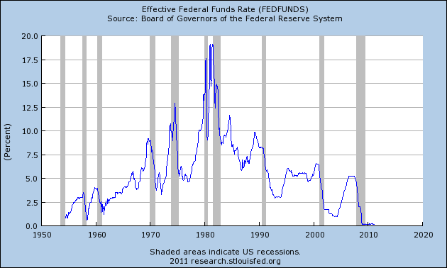
To put the moment in context, check out Bill Luby's graph in Another Friday of Testing VIX Lows?. It shows a huge run-up in the Volatility Index against a background that shows a huge drop -- at the same moment, September '08 -- in the Dow (I think).

"From July 2007 to September 2008," Luby writes, "volatility was elevated, but seemingly contained." September '08 was the volatile moment, the moment of crisis.


An old post from January, 2008: Ron Robins' Is the Amazing US Debt Productivity Decline Coming to a Bad End? Robins writes:

For decades, each dollar of new debt has created increasingly less and less national income and economic activity. With this ‘debt productivity decline,’ ...

Now, see, I like that: "debt productivity." It's wrong, of course. Debt cannot be productive. Credit-use can be productive. Debt is only the record of credit-use. But let's be flexible and go with common usage, for now.

The "productivity of debt" has been in decline for decades, Robins says. Agreed. It is an extremely important point, far more important, anyway, than media-people seem to think. I want to come back to this topic.

But first, let Ron Robins finish his thought:

...With this ‘debt productivity decline,’ new evidence suggests we could be near the end-game in this economic cycle. American collective consciousness will need to change to accept the new reality.

Yeah, I don't know about any "end-game" or what Robins may mean by that. And I don't know which cycle he's thinking of; the long-wave, I would guess, the one that ends in Great Depressions.
So then the end-game would be the depression.
I also don't know about "collective consciousness." Consciousness is a concept, like "moral argument," that is difficult for me to grasp. Kinda like the difficulty other people have to distinguish between "debt" and "credit."


Anyway, Robins. He says, "Getting less and less economic benefit from each dollar of new debt is becoming an enormous and onerous problem for the US." That's the debt productivity thing. Robins quotes Grandfather Hodges:

“In 1957 there was $1.86 in debt for each dollar of net national income, but in 2006 there was $4.60 of debt for each dollar of national income – up 147%. It also means this extra $2.74 of debt per dollar of national income produced zilch extra national income. In 2006 alone it took $6.32 of new debt to produce one dollar of national income.” (Underlining added.)

"According to Dr. Kurt Richebacher..." Robins writes, "in 2005 ... [there was] $4.43 in new debt for each dollar of GDP growth. In 2006 ... it took $5.68 of new debt for each dollar increase in GDP."
The exact numbers differ, depending who reports them. But the numbers are close, and big, and increasing. On that, there is resounding agreement.
Yeah. Declining credit efficiency or, as Robins calls it, declining "debt productivity." Some people may relate that concept to the observation that federal deficit spending doesn't do much to stimulate the economy.

Eh. Yes and no. The decline in debt productivity affects government debt as well as private debt. And though government policy is responsible for this whole mess, that is not to say it is government debt that is responsible.

President Obama's large increases in federal deficits didn't happen until after the crisis, so clearly they didn't cause it. And if we look at accumulated debt, federal debt total combined debt of U.S. federal, state, and local government is small potatoes compared to total private-sector debt, only one-sixth the size.

Moreover, total government debt was roughly stable in the U.S. from 1960 to 2008, relative to GDP, while total private-sector debt did nothing but increase. So lets jump away from any conclusions about government debt being the cause of the problem, and maintain for now a focus on total debt.


Ron Robins focuses on total debt. He has a good feel for the problem. But in my view he has no understanding of the cause, and no understanding of the solution.

Americans have gotten to this point as they sought fulfillment almost exclusively in the material world around them.

Robins blames... character, I guess. Another word I don't rely on. There is some kind of pathetic irony in blaming people rather than policy for the economic environment we're in. Some holier-than-thou superiority that interferes with reasoned discussion, and supersedes evidence.

The problem is not bad character. The problem is bad policy.

It is possible that the US Federal Reserve and the financial system will continue to produce ever increasing amounts of debt relative to national income and GDP...

Well Robins is right about this. In fact, I'd say that continuing to produce ever-increasing amounts of debt is the only plan that makes sense to Ben Bernanke and other policymakers. Curse the luck.

In the years ahead many Americans will need to look more within themselves, rather than to material goods, to find personal fulfillment.

Yeah, the character thing again. The problem is debt, Ron. And the cause of the debt problem is policy. You know: "We need credit for growth." That policy. And: "Since growth is so hard to obtain, we need even more credit for growth." That.

Stop, Ron. Take a step back. Look at the insanity in those policies. They create debt.

The policies create the problem.


Robins does not answer the question why we are "getting less and less economic benefit from each dollar of new debt." He does not even ask this question.

It is the total accumulation of debt that makes new debt less productive.

Existing debt creates a drag on the economy. New additions to debt don't boost the economy unless they are more than big enough to offset the drag created by existing debt. And every new addition to debt creates more drag, making the problem worse.


We use credit for growth, but credit-use creates debt, and debt hinders growth. So we use credit, and we grow, and we let debt accumulate, and we repeat the process until the accumulation kills off the golden goose age.

And then we need a President like Reagan, bold enough to vastly increase federal deficits, to generate enough new credit-use to compensate for accumulated debt. But that solution is unsustainable, for it makes the accumulation bigger. Today, as a result of past policy, even Obama-size deficits cannot offset the accumulated debt.

It becomes a pointless exercise.

As long as people think we need to use more credit and accumulate more debt to make the economy grow, our policies are bound to fail. The more debt accumulates, the more it contributes to credit inefficiency and debt productivity decline.