Saturday, August 31, 2013

FPI and Christensen-Fitted Debt


Couple weeks back I looked at the calculations behind Lars Christensen's Market Expectations Index. He did some nifty stuff with averages and standard deviations, to "fit" one line to another on a graph, to make visual comparison easier.

I saw an opportunity to practice that calculation, to compare the movements of TCMDO debt to Fixed Private Investment.

But first I took the easy way out, and in Graph #3 of the 25th I "fitted" TCMDO to FPI by eye. After looking at the unfitted graph, I wanted to scale the debt numbers up by a factor of 3. Then after seeing the result of scaling, I decided to subtract 20 from the debt numbers to shift the debt line down and get it close to the FPI line.

But it was all just ballpark.

So I downloaded the numbers from FRED for Graph#2 of the 25th, sat down to work, and applied Christensen's calculations to the debt numbers.

Graph #1: TCMDO Debt (red) Christensen-Fitted to Fixed Private Investment (blue)

For comparison, here's the "no finesse" graph I showed on the 25th:

Graph #2: TCMDO Debt (red) Fitted by Eye to Fixed Private Investment (blue)

Pretty good, for no finesse.

Funny thing. When I was doing the "no finesse" graph and writing that post, I was careful not to talk about the one line being "higher" than the other. It's okay to talk about something happening first in the one line and later in the other. And it's okay to observe the one line changing more rapidly than the other. But you can't say one is "higher" or "lower" or even that it changes from higher to lower (or the reverse) because the relative positions, higher and lower, depend on how much you subtract as part of the "Christensen Fit" calculation.

Actually I was disappointed when I sat down to do the calculation Lars's way. I had forgotten that Christensen's calculation includes an arbitrary up-and-down adjustment term. That term puts the same ambiguity into his calc that I had in my finesse-free version: It makes the relative positioning of the two lines completely arbitrary.

That may be necessary when the calc combines two datasets for comparison to one, as Christensen's does. I don't know. But intuition tells me that if I take just one dataset (like TCMDO) and tweak it by the average and the standard deviation values for that dataset, then I shouldn't also need an arbitrary up-and-down adjustment.

I'm not linking to my spreadsheet this time, because the calc isn't clear in my head. Maybe I've got a mistake in it, that looks okay because of the up-and-down adjustment I made. I have to work through this calc and get more familiar with it.

Meanwhile, I still think it's an interesting technique.

Friday, August 30, 2013

Which one is not like the others?


Earlier this week I showed the shocking decline of Fixed Private Investment relative to total accumulated debt:

Graph #1: Fixed Private Investment relative to Total Debt
It shows significant changes before the 1980 recession, after the 1990 recession,
before the 2001 recession, and toward the end of the 2007-2009 recession.

Today, we look at Fixed Private Investment relative to components of the total debt:

Graph #2: Fixed Private Investment relative to Nonfinancial Debt
It shows significant changes before the 1980 recession, after the 1990 recession,
before the 2001 recession, and toward the end of the 2007-2009 recession.

Graph #3: Fixed Private Investment relative to the Publicly Held part of Federal Debt
It shows significant changes before the 1980 recession, after the 1990 recession,
before the 2001 recession, and toward the end of the 2007-2009 recession.

Graph #4: Fixed Private Investment relative to Non-Federal Non-Financial Debt
It shows significant changes before the 1980 recession, after the 1990 recession,
before the 2001 recession, and toward the end of the 2007-2009 recession.

Graph #5: Fixed Private Investment relative to Household Debt
It shows significant changes before the 1980 recession, after the 1990 recession,
before the 2001 recession, and toward the end of the 2007-2009 recession.

Graph #6: Fixed Private Investment relative to Financial Debt
It seems to show a trend change toward the end of the 2007-2009 recession.

Which one is not like the others?

Thursday, August 29, 2013

Log of Real Fixed Private Investment (and Trends)


Hover the mouse over the graph to see the trend lines I sketched in...

Graph #1: Fixed Private Investment, Deflated, Log of it.

Looks like investment growth trended at one rate right up to 1980, and at a slower rate thereafter. I don't imagine I'm the first guy to say that. But I do want to point out that the growth of Real GDP shows a similar slowdown right around 1980.

Of course. It makes sense that if economic growth slowed in 1980, the driver of economic growth also slowed around that time. It makes sense. The thing is, nobody says it. No. For example, Scott Sumner says this:

growth was slowing almost everywhere in the 1970s and 1980s

and this:

growth in US living standards slowed after 1973

After 1973? Yeah, about seven years after 1973.

Between the 1974 recession and the 1980 recession, Graph #1 shows FPI increasing faster than at any other time since 1960. Growth was strong after the 1974 recession. Growth didn't slow, then. Growth didn't slow until Paul Volcker suppressed inflation and disposed of the corpse of vigor.

Wednesday, August 28, 2013

Just by eye


Continuing our look at Fixed Private Investment and Total Debt. The growth of fixed private investment peaks before the growth of total debt:

Graph #1: Fixed Private Investment (blue) and Total Credit Market Debt (red) on Log Scales
The values are shown on a log scale to make growth rates visually evident.

Investment (the blue line) appears to curve gradually upward until 1980, then trends upward at a slower pace, on a straight rather than upcurving path.

Debt (the red line) appears to curve gradually upward until around 1986, then trends upward at a slower pace on a path that displays little if any upward curve.

The upward curve of the blue line appears to run from 1960 to 1980; that of the red line from 1970 to near 1990. Either (or both) of these upcurves might be related to "the Great Inflation" -- and they probably are. But it is difficult "by eye" to imagine why inflation would appear first in the investment numbers, and later in the debt numbers.

Tuesday, August 27, 2013

A Barometer of Growth


A search for PFI at FRED turned up plenty of results but only one containing the word "investment":

Purchasing Power Parity Converted GDP Per Capita (Laspeyres), derived from growth rates of Consumption, Government Consumption, Investment for Finland

I didn't go there.

That search also turned up one result containing the word "private":

Nonfarm Private Financial Activities Payroll Employment

I didn't go there.

It turned up no result containing the word "fixed".

A search for FPI at FRED brings you immediately to the Fixed Private Investment graph. There, the notes tell us
Notes:
BEA Account Code: A007RC1

A Guide to the National Income and Product Accounts of the United States (NIPA) -
(http://www.bea.gov/national/pdf/nipaguid.pdf)

At the nipaguid PDF -- a name that satisfies the 8-character limit of MS-DOS file names, in case you haven't yet upgraded -- we find the phrase private fixed investment on page 5 and in a table on page 7, and on page 14:

Gross domestic investment (6-1) measures the total investment in the United States in fixed assets (that is, the structures, equipment, and software that are used in production) and in inventories (change in private inventories). It is the sum of private fixed investment (see 1-20), government fixed investment (see 1-29), and change in private inventories (1-25).

I quit looking for PFI at that point. I like that definition. It reminds me of something I once knew: that change-in-inventory counts as part of investment. That's an important bit of trivia which explains the "S=I" thing people are always talking about. Not relevant to this post, but worth remembering, certainly.

There were no occurrences in the nipaguid of the phrase "fixed private investment".

So what FRED calls FPI and what BEA calls PFI are the same thing. I can talk of Fixed Private Investment and Private Fixed Investment interchangeably, with impunity.

Good. Because in a different PDF from BEA -- or actually in Chapter 6 of what looks like the same nipaguid, but in a different file -- we find this:

Private fixed investment (PFI) measures spending by private businesses, nonprofit institutions, and households on fixed assets in the U.S. economy. Fixed assets consist of structures, equipment, and software that are used in the production of goods and services. PFI encompasses the creation of new productive assets, the improvement of existing assets, and the replacement of worn out or obsolete assets.

The PFI estimates serve as an indicator of the willingness of private businesses and nonprofit institutions to expand their production capacity and as an indicator of the demand for housing. Thus, movements in PFI serve as a barometer of confidence in, and support for, future economic growth.

A barometer of growth. (I said that yesterday.)

(Neither of those PDFs plays nicely with CTRL-C cut and CTRL-V paste operations.)

This post resolves two issues. First, that PFI and FPI are two names for the same thing. Second, what is measured by FRED's FPI.

Monday, August 26, 2013

Looks like a Measure of the Economy's Performance


Yesterday I concluded

So we see that when debt is relatively low, economic growth (or in this case, Fixed Private Investment) is relatively high. But when debt is relatively high, investment doesn't run higher, and sometimes it runs low.

So the next thing I want to see is Fixed Private Investment relative to Total Debt:

Graph #1: Fixed Private Investment relative to Total Debt
It looks like a measure of the economy's performance for the last 60 years.

It is.

Sunday, August 25, 2013

Fixed Private Investment


Random Eyes showed me Fixed Private Investment relative to GDP:

Graph #1: Fixed Private Investment relative to GDP
Low in the early years, then three humps in the middle years, then a significant decline corresponding to the decline in total debt growth, 1986-1992. Then a couple high points that I don't recognize. But the pattern reminded me of total debt growth. So I compared the growth of Fixed Private Investment to the growth of total debt:

Graph #2: Growth Rates of Fixed Private Investment (blue) and Total Debt (red)
Low together in the early years... Rising together... Humping together... And declining together. There even seems to be similarity in the years after 1990, though the red line rides a little higher on the blue.

Definitely noticeable in the hump years, 1970-1985, the blue peaks lead and the red peaks lag. Investment seems to spike up, dragging debt along behind it. But maybe that lag was related more to inflation than to investment, for in the years before 1970 the lag is less obvious. Or maybe the debt humps were just smaller, in the early years.

I can use a little multiplication to make the up-and-down variations in the red line bigger... And then a little subtraction to bring the whole red line down and position it atop the blue line again:

Graph #3: The Red Line from Graph #2 (Debt) Scaled Up and Shifted Down for Comparison
No finesse was involved; "3" and "20" were the first numbers I tried. But multiplying to scale things up, and subtracting to line things up, are the same techniques used by Lars Christensen for his market index calculation, which I looked at here.

In the early years on Graph #3 debt (the red line) runs low relative to Fixed Private Investment (blue). They run neck-and-neck through the first two humps but in the third hump investment peters out early while debt continues to increase to the mid-1980s.

When debt growth reaches a low in the early 1990s, investment rockets up and stays relatively high for most of the decade.

In the late 1990s debt (blue) spiked up to meet investment, then fell, then investment fell. In the 2000s again debt growth rose to meet investment -- and both collapsed.


I realize that rates and levels are not the same thing. A low level of debt and a high level of debt, both growing at the same rate, may have significantly different effects on the economy. However, a low level of debt becomes a high level sooner at a high rate of growth. So rates and levels are related. We've been looking at growth rates in the graphs today, and now I will conclude by talking about levels. They're related.

What I think is, creating debt creates new money which lets spending expand; this is necessary for growth, at least under existing policy.

But creating debt also adds to the total accumulation of debt and increases the cost associated with that accumulation. This cost can hinder growth.

So we see that when debt is relatively low, economic growth (or in this case, Fixed Private Investment) is relatively high. But when debt is relatively high, investment doesn't run higher, and sometimes it runs low.


Related posts:


Saturday, August 24, 2013

The Components of Base Money (3)


Graph #1
Not sure if these two lines belong on the same graph. The red line shows total reserves as a percent of the monetary base, same as yesterday. The blue shows total reserves as a percent of "Note and Deposit Liabilities" for an earlier time.

Sure looks to me like the two lines fit together.

Friday, August 23, 2013

The Components of Base Money (2)


Graph #1: The Currency Component of Base Money (blue)
and the Reserves Component of Base Money (red)

Just before the problems of 2008, total reserves (red) had fallen to about 5% of base.

Thursday, August 22, 2013

Neil Irwin can't be right


Neil Irwin in the Washington Post:

The U.S. economy has been growing glacially for the last four years. And, by almost all tellings, the overhang of debt from the pre-crisis years is a big part of the reason why.

By almost all of *my* tellings, yes. But I rarely see it anywhere else.

Anyhow, if Neil Irwin is right and people *do* generally say the "overhang" of debt is the reason economic growth is "glacially" slow, then why is no one saying we must reduce private debt? Oh, people were saying that, in the early months of the crisis. But that's all forgotten now. I've not seen the word "deleveraging" probably since 2009.


If it were true that everyone says the overhang of debt is the reason growth remains slow, shouldn't we see the blue line stuck at a high level on that graph?

Wednesday, August 21, 2013

Openness of Economic Data and Code


From The RePEc Blog:

Openness of Economic Data and Code

The publication of an article or a working paper is only part of the scientific process. Scrutiny by the scientific community during the peer-review process and later through replication attempts and extensions of the original work should be part of it. Unfortunately, very little of that is happening in economics. Indeed, a significant hurdle is that very often the computer code and/or the data used for the analysis are not disseminated. While some journals now make this a requirement for publication, there is otherwise very little incentive for researchers to make this available. In part, this is also a question of culture, as we are not used to cite datasets, for example, and prefer to acknowledge their use in a footnote.
To change this culture and push for making code and data more readily available, the Open Knowledge Foundation and put together a set of Principles on Open Economics. Read them and sign on if you think to are willing to endorse them.
On the RePEc front, we are working to get datasets indexed as well. If interested in participating in this, contact me.

The Nobel Prize for Ego


Paul Krugman:
I like to think that if I had been proved as utterly wrong as Meltzer ... I’d have had the strength of character to admit it and question my premises. But I don’t know for sure, and with some luck I’ll never find out.

Tuesday, August 20, 2013

Don't Rush Me


From rushlimbaugh.com:
How to Argue with Skeptics
August 13, 2013

RUSH: Let me give you a little hint, next time you find yourself talking to one of these skeptics and people who have adopted skepticism as a legitimate intellectual position to take. One of the most effective ways of dealing, not just with people like that, but really anybody, is never answer their question. Always respond with a question, which puts them on the defensive. Even if the answer's a slam dunk, even if they ask you a question that's a hanging curveball that you could knock out of the park, return it with another question, questioning them, questioning their honesty, questioning their intelligence, because that's what they're doing with their skepticism. They're really challenging you and your mind and your IQ, your knowledge, your belief system.

It's amazing. It's hard to do because most people think that the honorable thing to do, somebody asked you a question, answer it. And it is, in most cases, but it's fun. Just never answer question. Your answer is always another question back at them. And therefore reverse the skepticism on 'em. And you become skeptical of them. You adopt what they think is the lofty perch, you take it from them, you become a skeptic right back at them. You're skeptical of them, just skeptical of their question. Instead of deigning to answer.

This is the mistake I made when I was first being interviewed. When this program was very young, and I'd be interviewed buy a journalist, I made the incorrect assumption that they really wanted to know the answer they were asking me. They really wanted to know what I thought about something. And I thought it was an opportunity to really have them get to know me. That wasn't what it was about. It was about them asking questions, trying to pigeon hole me so that they could structure me to their audience in ways they wanted.

Monday, August 19, 2013

Disastrous, cumulative and far-reaching repercussions of saving


From the Marxists Internet Archive...

John Maynard Keynes
The General Theory of Employment, Interest and Money
Chapter 12. The State of Long-Term Expectation
From Section VI:

The only radical cure for the crises of confidence which afflict the economic life of the modern world would be to allow the individual no choice between consuming his income and ordering the production of the specific capital-asset which, even though it be on precarious evidence, impresses him as the most promising investment available to him.

To consume, or spend on capital assets, with "no choice between". The only solution Keynes can see, for the problem he is considering, would be to disallow saving. To let the income-holder choose whether to spend on consumption or to spend on the production of future consumables, but not to allow money to be endlessly stashed away in savings.

Keynes continues:

It might be that, at times when he was more than usually assailed by doubts concerning the future, he would turn in his perplexity towards more consumption and less new investment. But that would avoid the disastrous, cumulative and far-reaching repercussions of its being open to him, when thus assailed by doubts, to spend his income neither on the one nor on the other.

Under such constraints the income-holder might prefer consumption, Keynes says, but that's not a problem. The problem, he says, is the failure to spend.

Why would Keynes say such a thing? I don't know; you'd have to ask him. But I know why I would say such a thing. This is the technologically current version of one of the graphs I was looking at back in the 1970s:

Graph #1: The Non-Circulating Part of M2 Relative to the Circulating Part of M2
Savings increased rapidly before the Great Depression.
Savings fell rapidly during the Great Depression.
Savings resumed a path of increase in the midst of World War Two.
The turning points are highly significant.

The Great Depression was a disastrous and far-reaching repercussion of the excessive accumulation of savings.


Here's the Debt-per-Dollar graph, in red, added to the graph above:


Graph #2: The Non-Circulating Part of M2 Relative to the Circulating Part of M2 (blue)
and Total Public and Private Debt Relative to the Circulating Part of M2 (red)
The two lines move together, with debt slightly lagged. Everything I have ever said about the Debt-per-Dollar graph applies equally to the "Savings per Circulating Dollar" graph. Interesting that the numbers on the right scale are just ten times the value of those on the left scale. (That wasn't my doing.)


The crisis economy is different. But in the normal economy, there is a certain window that money must stay in, for prices to remain stable. If money grows too fast or too slow it goes out of the window and prices get unstable. This is the reason nations have central banks, to keep money in the window.

You might say it differently. You might say central banks target interest rates, not the quantity of money. Well yeah, they say that, don't they. But the way they keep interest rates in the certain window is by buying and selling securities and such, to adjust the quantity of money we call bank reserves. That's what open market operations are.

In the normal economy there is a certain window that something must stay in, for prices to remain stable. Central banks keep this "something" in the window by making adjustments to the quantity of the kind of money that central banks issue.

So there is some stable relation between the Q of M and the size of GDP in the normal economy. What this relation is -- a stable ratio, for example, or a stable rate of change in the ratio -- is not yet clear.

Here's what I think, something like this. The concept is yet crude, so I need you to try to understand what I'm trying to say:

If M1/M2 is stable then a stable money/output ratio is probably what's needed.
But if M1/M2 is falling -- if circulating money is falling (and savings is increasing) relative to the total stock of money -- then a stable ratio won't do the trick. If the M1/M2 decline is stable, then a stable increase in the ratio might work. But if the M1/M2 is not stable, then all bets of stability are off.

Maybe M1 and M2 are out of date. I won't even argue the point. I'm just talking about circulating money and total (circulating plus uncirculating) money, and I'm using two-character shorthand. Feel free to pick better data for "circulating" and "total" money, and get back to me with a graph.

If the total quantity of money is kept in a window, but the circulating portion of it is declining as part of the total, then the quantity of money needed available for transactions is declining relative to GDP. That's a problem.

Maybe it's not a problem for the people with most of the savings. But it's a problem for everybody else, and it's a problem for the economy. That's why the first turning point on Graph #1 comes just as the Great Depression begins. Too much money in savings, and not enough money circulating to sustain the transactions needed for GDP growth.


If there is any chance that I am right in saying that excessive savings is the problem, any chance that Keynes and I and a handful of others since the dawn of civilization are right about this, then I can tell you why civilizations die by suicide. Civilizations die by suicide because excessive savings is a problem, and most people refuse to accept the fact. Most people refuse even to consider the possibility.


Graphs and data can be visited at my Savings and DPD Google Drive spreadsheet.

Related Post: The Desire to Save

Sunday, August 18, 2013

What else could we reasonably do?


On expectations, from Unlearning Economics:

Any attempt at a serious discussion of transmission mechanisms is met with ‘expectations!‘ as if expectations are a magic wand and not simply a reflection of the actual behaviour of the economy.

It's awkward when a great line is buried in such a way that when you quote it, it seems something is missing and you ought to include the part that came before. But anyway what UE says is: Expectations are a reflection of the actual behavior of the economy. Expectations depend on economic conditions. If you want to improve expectations, you have to improve the economy.

I do think it can temporarily work the other way. I think the big boom we had early in the Reagan years was partly expectations-driven. People had big hopes:

Graph #1: The Red Spike Early in the Reagan Years -- A "Brief Interval of Excitement"
It didn't last. And it didn't happen again. Expectations were disappointed because the economy wasn't as good as Reagan promised it would be. As the graph shows. But a lot of economists seem to remember the one impressive aberration and base too much of their work on the presumed power of expectations.


Two paragraphs from Chapter 12 of The General Theory of Employment, Interest and Money by John Maynard Keynes, The State of Long-Term Expectation:

It would be foolish, in forming our expectations, to attach great weight to matters which are very uncertain. It is reasonable, therefore, to be guided to a considerable degree by the facts about which we feel somewhat confident, even though they may be less decisively relevant to the issue than other facts about which our knowledge is vague and scanty. For this reason the facts of the existing situation enter, in a sense disproportionately, into the formation of our long-term expectations; our usual practice being to take the existing situation and to project it into the future, modified only to the extent that we have more or less definite reasons for expecting a change.

In practice we have tacitly agreed, as a rule, to fall back on what is, in truth, a convention. The essence of this convention — though it does not, of course, work out quite so simply — lies in assuming that the existing state of affairs will continue indefinitely, except in so far as we have specific reasons to expect a change.


Expectations are a reflection of the actual behavior of the economy. We assume that the existing state of affairs will continue indefinitely, except in so far as we have specific reasons to expect a change.

What else could we reasonably do?

Saturday, August 17, 2013

When hope interferes, science turns to alchemy.


As I see it:

There's no clear connection between increasing the Q of M and increasing real output.


As Lars Christensen sees it:

... easier monetary conditions mean higher nominal GDP growth (remember MV=NGDP!) and with sticky prices and excess capacity that most likely also mean higher real GDP growth.

"Most likely," he says.

Friday, August 16, 2013

The Key Discovery, the One Success


What caused the Great Inflation? According to Arthur Burns, the Fed Chairman who presided over much of that inflation, cost-push pressures caused it. In a post I return to again and again, Marcus Nunes summarizes that other Arthur's view:

According to Robert Hetzel, during the period of the Great Inflation, the prevailing view, and the one embraced by Arthur Burns, Fed chairman from 1970 to 1977, was that inflation was a real (cost-push), and therefore non-monetary, phenomenon.


Nick Rowe writes

I know what it's like to live in a demand-side world, because I used to live in one....

I left that world: when I discovered we lived in a monetary exchange economy (like a fish discovering it swims in water); when I saw the Phillips Curve shift in the 1970's; when I discovered Milton Friedman, and learned not only that units didn't matter but that the rate of change of units didn't eventually matter either.

In comments, Scott Sumner responds:

I remember those days. The key discovery was that changing the trend rate of inflation (within reason) had no impact on the average rate of unemployment.

I cropped a "But mostly..." sentence from Nick, to focus on Phillips and Friedman. That's the part Sumner calls the "key discovery". Obviously, it is pretty important to Nick Rowe, as well.


Let me re-summarize a little history from Stephen Williamson, some U.S. macroeconomic economic history starting with the 1960s:
Let's review that.
(i) Samuelson/Solow and others think that the Phillips curve is a structural relationship - a stable relationship between unemployment and inflation that represents a policy choice for the Fed.
(ii) Friedman (in words) says that this is not so. There is no long-run tradeoff between unemployment and inflation. It is possible to have high inflation and high unemployment.
(iii) Macroeconomic events play out in a way consistent with what Friedman stated. We have high inflation and high unemployment.
(iv) Lucas writes down a theory that makes rigorous what Friedman said...
(v) Paul Volcker takes Friedman seriously.

Nothing technical. There's never anything technical. There is only a sort of reverence, a kneeling before the great and wonderful Oz.

Since that Friedman thing, his 1968 speech to the AEA and its aftermath, since it is "the key discovery" and all, shouldn't there be a bit of technical presentation somewhere that lays it out like science? Don't you think? Not too technical, or I would fail to understand. But something more than a blind, religious embrace would be nice.

Religious, yeah. Nick Rowe's post, linked above, is a story of his conversion to the new faith. That's what bothers me. That is what I had in mind when I wrote to Marcus,

It seems people say he [Friedman] predicted the high-inflation-high-unemployment combination that showed the mis-use of the Phillips curve.

It seems the Friedman event brought “expectations” into economics. But I never see any but non-technical acceptance of what Friedman [supposedly] said.

Nothing technical. Perhaps this is what Williamson meant when he wrote "Friedman (in words)". Mark Thoma lays it out well:

Estimates of the Phillips curve that produced stable looking relationships were based upon data from time periods when inflation expectations were stable and unchanging. Friedman warned that if policymakers tried to exploit this relationship and inflation expectations changed, the Phillips curve would shift in a way that would give policymakers the inflation they were after, but the unemployment rate would be unchanged... When subsequent data appeared to validate Friedman's prediction, the New Classical, rational expectations, microfoundations view of the world began to gain credibility over the old Keynesian model...

The subsequent data appeared to validate Friedman's prediction.


At Angry Bear, back in May 2012, Robert asked a question:

Did Samuelson and Solow claim that the Phillips Curve was a structural relationship?

Did they claim that it showed a permanent tradeoff between inflation and unemployment.

James Forder says no.

This is an important post for me, Robert's post. Nick Rowe and Sumner and Williamson and Nunes and many others point to Milton Friedman's put-down of the Phillips curve. That put-down, it seems, was the birth of an alternative to Keynesian economics. That alternative was based on Samuelson and Solow being wrong about the trade-off.

But there are doubts about that. That's what Robert's post is about. And that's why his post is important. Robert writes:

Paul Krugman, John Quiggin and others (including me [Robert writes]) have argued that the one success of the critics of old Keynesian economics is the prediction that high inflation would become persistent and lead to stagflation.

That's the key point, for me: one success, parlayed. Friedman predicted stagflation, and when his prediction came true, Friedman became like a religious icon. But, see, I have a different explanation of stagflation than Friedman. So if Friedman is right, I must be wrong.

I don't think I'm wrong.

Thursday, August 15, 2013

Outperforming our Potential


Andrew Bartels shows that the 2013 Comprehensive Revision didn't have much effect on RGDP:

Source: Andrew Bartels

I look at it this way:

Graph #2: Real GDP (red) and Potential GDP (blue)
A Tale of 2009 Dollars versus 2005 Dollars
Real GDP after the revision is better than Potential GDP before the revision. Now that's one helluva change!


How much inflation did it take to push real GDP above potential like that?

Graph #3: 2009-Based Deflator Converted Back to 2005=100
Shows Prices Almost 9% Higher by 2009
Between 8 and 9 percent.

Maybe tomorrow they'll revise Potential GDP to the 2009 base.

Wednesday, August 14, 2013

Going thru the motions


This is the graph I created at FRED to gather the data I needed in order to duplicate Lars Christensen's simple index calculation:

Graph #1: The FRED Source Data, from mine of the 12th

To simplify my life I'll chop off all the years before 1990 and just look at data since 1990 the same as Christensen did.

Graph #2: Same Data, Since 1990 Only

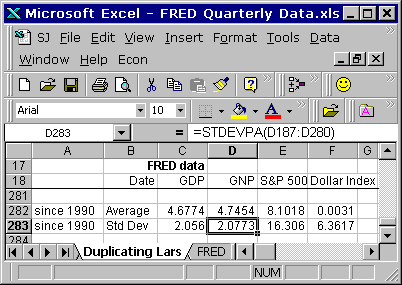
Now I can apply the calculations that Lars applied to the data. I have the average value for each series and the standard deviation for each series in the Excel file I've been using for the past few posts.


The first step of Christensen's calculation was to subtract the series average value from each data value, for all the datasets. I'll just do that in FRED:

Graph #3: For Each Series, Subtract the Series Average Value
The most obvious change on Graph #3 is that the white plot window is not as wide as on Graph #2. There's a lot more description for the vertical axis, and it crowds the plot window. But the relevant change is that each line is now centered on the zero level. And that means all the lines are centered on each other.

They're all a little lower as a result. You can tell, because the highest value on the vertical axis is now 40 instead of 50.


The second step of Christensen's calculation is to divide by the standard deviation of each series. This is where the amplitude, the up-and-down variation of each series gets reduced, and they all get similarized.

This impresses me. The greater the amplitude variation of a line, the greater the standard deviation, and the more the variation is reduced by the division. You can tell by the way people use standard deviation all the time, that it must be pretty important. But this is the first time I ever saw it used in a significant way ...that I could understand, anyhow.

Graph #4: For Each Series now, Divide by the Standard Deviation

Now the vertical axis values have been reduced to a high of 3 and a low of -5. That is far less than in the previous graphs. The orange and green lines no longer travel to the extremes we saw in the previous graphs. The lowest value on Graph #4 is actually in the red line. Quite a difference.

Tuesday, August 13, 2013

I have to look at the spreadsheet (2)

Picking up where we left off yesterday...

I wanted to use a Zoho spreadsheet, so you could click on cells in the sheet and look at the formula bar to see what the calculations are. But the Zoho sheet makes the Blogger screen jump down to the spreadsheet, and as a blogger I won't stand for that.

My next choice was to use Google Drive. But the series values are quarterly, and that sometimes means there are too many pieces of information for the Google Drive spreadsheet to handle. The graphs don't come out right.

So Excel it is. That means I can show you the graphs, and I can show you images of cell calculations if it comes to that, but if you want the live-action of a spreadsheet, you'll have to download the Excel file and get into it yourself.

Or you can read the story I tell here and take my word for it.


I don't have Excel on the computer where I do my blogging. I've been using Open Office Calc, which can read and write Excel files. But Open Office messes up the x-axis labeling on Excel graphs, and I prefer not to manipulate Excel-created graphs on this computer because of it.

And I have some nice Visual Basic routines I've been developing to format my Excel graphs, to standardize the size and appearance of those graphs. But those routines don't work in Open Office. I don't know how to make them work in Open Office.

So again, Excel it is.

Working in Excel on the old computer, I tried to duplicate Lars Christensen's graph from memory. From the FRED data, using what I understood of Christensen's calcs from looking at it on the blogging computer.

In Excel, my first step was to look at the FRED data. It should look the same as the FRED graph in yesterday's post:

Graph #1

If it didn't, I would want to check my work for errors. I was happy with it. So the next step was to duplicate Lars Christensen's graph:

Graph #2: Lars Christensen's Graph

Graph #3: My Version of Christensen's Graph
Oh, I should make my horizontal gridlines faint.

The two graphs are a pretty good match. Christensen gets more vertical than I do -- the space between his horizontal gridlines is near twice what mine is. Mine got squeezed between the title and legend, above, and the x-axis labels, below the plot area. No amount of multiplying by the series standard deviation can make up for that. But you can see, on both graphs, the one line is pretty well centered upon the other. And the overall up-and-down offsetting is about the same, red versus blue, on both graphs.

But I'm leaving things out of the story. The first time I tried to duplicate Christensen's graph I was way off. For some reason I thought I had to "standardize" the NGDP values the same way Christensen was standardizing the other values. So all my lines were centered on the zero level. And that didn't look like the graph I was trying to duplicate. So I had to go over it again before I got it right.

I had to do it on the old computer. I had to look at Christensen's file in Excel and see which numbers he used in the graph, before I got it right. He takes his "index" value -- "standardized" S&P 500 less "standardized" Dollar Index -- and to it adds the average value of the NGDP series. This brings the index numbers up, centering them on the NGDP numbers. It gets the numbers away from the zero level.

There are additional adjustments: Christensen subtracts 1.5 from the index-plus-NGDP-average, for even better vertical alignment of the two series. Then he multiplies this centered number by the NGDP standard deviation and divides by the "index" standard deviation, to scale the index numbers to about the same size as the NGDP numbers.

He ends up with an index he calls the NGDP Market Indicator, which has about the same up-and-down range of values as NGDP and is centered on NGDP, for greatly improved visual comparison.

Okay, I get it. Lars is centering and scaling his index numbers, so that he may better see similarities and differences between the index and the NGDP numbers. He sees the size and the location of the up-and-down pattern as separate from the pattern itself.

And you know what? I did have to look at the spreadsheet!

Monday, August 12, 2013

I have to look at the spreadsheet.

Picking up where we left off yesterday...

UE links to an article by Lars Christensen. "To try to illustrate the connection between the markets and NGDP," Christensen writes, "I have constructed a very simple index to track market expectations of future NGDP." He describes the index, shows a graph, and links to a spreadsheet.

The spreadsheet is great. For me, if I want to understand what the calculation is, I have to look at the spreadsheet. (So you know where this post is going.)

Christensen's spreadsheet is a FRED download Excel file containing "percent change from year ago" values for GNP, for the S&P 500 Stock Price Index, and for the Real Trade Weighted U.S. Dollar Index.

Oh that's funny, he used Gross National Product instead of GDP -- but labels it Nominal GDP. I wonder if that affects his graph. Shouldn't be much difference, but it might be worth a look. If I get to it.

Anyway, the first four columns of the spreadsheet look to be direct from FRED. Christensen has relabeled the columns, which makes sense: "USD Index" does sound a lot better than "TWEXMPA_PC1". And it's clear (at least, if you're familiar with the FRED Excel format, it is clear) which data is which.

I like it. Maybe I'll start relabeling that way. Thanks, Lars!

Down at the bottom of those first four columns, except the date column, Lars figures the average value for each dataset, and below that, for each dataset the Standard Deviation, using the STDEVPA() worksheet function. That function "Calculates the standard deviation based on the entire population," according to the OpenOffice help.

I found myself checking the range of values provided to the AVERAGE( ) and STDEVPA( ) functions, doing the Thomas Herndon thing, making sure there were no obvious dumb errors on the sheet. Christensen's spreadsheet looks okay to me.

In the next three columns Christensen calculates "standardized" values. (This is what interests me. How these calcs are done, what effect they have, and why I might want to do the same thing sometimes.)

Lars figured each standardized value as the original value less the dataset average value, with the difference divided by the dataset standard deviation value.

If I have the dataset [1,2,3] the average value is 2. If I subtract 2 from each value in the dataset I get [-1,0,1] and I have centered the dataset on the zero level.

(I'm wondering why Christensen's graph doesn't show values that are centered on the zero level. Maybe that will become clear later on.)

If I then divide each number in [-1,0,1] by some value, I make the numbers in the dataset smaller, but they stay in proportion. (They also stay centered on the zero level, unless I'm having a brain fart.)

That's Lars Christensen's standardization calculation. Pretty simple. I can remember it. But what does it look like? ...I'm getting to that.

I assembled the data for download from FRED. All quarterly data.

Graph #1: The FRED Source Data
The red line is percent change from year ago, GNP. All of 'em are percent change from year ago. The red line almost entirely hides the blue line, which is GDP. Yeah, not much difference there.

The green line is the S&P 500. The orange line is the Dollar index. The GNP and GDP values start in 1948. The S&P 500 values start in 1958. The Dollar Index values start in 1974. Christensen's graph starts in 1990. (If I have the chance to victimize Christensen for anything, it will likely be for chopping off the early years.)

Actually I'm always on the lookout for changed behavior on graphs. For if finance was once small but is now large, one ought to be able to see evidence of that change and its consequences on lots of graphs. And as Christensen's graph in particular shows "a very simple index to track market expectations of future NGDP" -- and as expectations are perhaps a more significant force now than in the past -- we might be able to see the rise of expectations as a transition toward greater similarity in more recent times. This would be a neat thing to see.

You can see on Graph #1 that the green line has about twice the up-and-down spread that the orange line has; and that both have a great deal more spread than the red and hidden blue lines. I think dividing these series, each by its own standard deviation, will similarize the up-and-downs of the different series. I think that was Christensen's reason for dividing by the standard deviation number.

So I have some things to look at, and some things to look for. Tomorrow, we look.

Sunday, August 11, 2013

The crisis is results.


UE has a brief criticism of NGDP Targeting and links to the article at Pieria. Too many wrong vowels in that name, somehow.

In the Peoria article UE writes that "the theoretical case behind NGDPT is quite weak". I agree. UE writes:

NGDPT could be vulnerable to a ‘Lucas Critique’ style criticism, where an attempt to exploit the observed relationship between RGDP and NGDP results in a breakdown, as happened in the 1970s, and we create stagflation. In other words, an increase in MV may just lead to an increase in P, not Y.

Yeah, that's my objection. Not the "lucas critique" part, screw that. The we just get inflation part. There's no clear connection between increasing the Q of M and increasing real output. These market monetarists must have Milton Friedman turning in his grave. The Sumnerian thought is that real growth is always and everywhere a monetary phenomenon.

That's my objection, not UE's. UE thinks "It may simply not be the case that an increase in the ‘available’ stock of money translates into an increase in income at all ... [A]ttempts to increase the quantity of money in circulation will simply end up increasing bank reserves."

Okay, that's a good argument, supported by the evidence. But UE's objection is relevant only to the time of crisis. Mine is relevant to the time we're NOT in crisis. UE recognizes the difference. He writes:

In normal times, the central bank can influence the cost of money and therefore indirectly affect PY (by affecting which activity is profitable or feasible), but in times of crisis, monetary policy cannot ‘flog a dead horse’ and resurrect a stagnant economy.

I always argue from the normal economy, not the crisis economy. Everybody else always argues from the crisis economy. I know, it's the crisis that brought the economy to everyone's attention. But you can't look at the crisis and solve the problem, because the problem existed before the crisis. The problem created the crisis. The crisis is results.

Saturday, August 10, 2013

10,181 World Bank Series Added to FRED


This is one of them:

In the third white space from the bottom, halfway between 80 and 120, draw a horizontal line. That's GDP.

I don't know what to say


Friday, August 9, 2013

Suddenly, everything is different


Bill C reviews the new revisions to GDP at Twenty-Cent Paradigms:

The interesting thing in the release was not the second-quarter numbers, but rather the "comprehensive revision" of all the past data that came with it. The BEA does this about every 5 years to incorporate changes in definitions and methodology. By its new reckoning, US GDP is about $550 billion (3.4%) larger.

Thursday, August 8, 2013

Corporate extinctions


From Discover magazine, September 2013: 20 Things You Didn't Know About ... Failure, by Jonathon Keats
7. On average, 10 percent of U.S. companies go out of business annually.

8. And corporate extinctions follow a pattern: A low-level attrition rate is occasionally punctuated by many companies failing at once. The economist Paul Ormerod has found that the relationship between severity and frequency follows a power law -- mass failure is exponentially rarer than everyday attrition.

9. The pattern seems to be natural. Over the past half-billion years, the extinction of species has followed the same power law.

Wednesday, August 7, 2013

FWIW: Labor and NonLabor Unit Costs


From Chapter 10 of the BLS Handbook of Methods:
Unit labor and nonlabor costs
The Bureau also prepares data on labor and nonlabor costs per unit of output for the business sector and its major components. Unit labor costs relate hourly compensation of all persons to output per hour and are defined as compensation per unit of real output. Nonlabor payments are the excess of current-dollar output in an economic sector over corresponding labor compensation, and include nonlabor costs as well as corporate profits and the profit-type income of proprietors. Nonlabor costs include interest, depreciation, rent, and indirect business taxes.

So at FRED I found something on nonlabor costs:

Graph #1: Unit NonLabor Cost
This series is specific to nonfinancial corporate business. So I looked for a matching (nonfinancial corporate) series on Unit Labor Cost. In red on the next graph:

Graph #2: Unit Nonlabor Cost (blue) and Unit Labor Cost (red)
The blue line is the same here as on graph #1, but squished down by the higher red line and also by three extra lines of title above the plot area.

Okay, according to the BLS Productivity and Costs PDF ("First Quarter 2013, Revised", 13 pages, "embargoed until" date 5 June 2013; Table Footnote 7 on page 13):

Total unit costs are the sum of unit labor and nonlabor costs.

So we can add the two numbers together to get the total, and look at each as a share of the total:

Graph #3: Unit Labor Cost (red) and Unit NonLabor Cost (blue) as portions of their sum
These two seem both to run flat until around the year 2000. This seems a little odd to me. But the unit labor cost used for this post is limited to nonfinancial corporate business. That's not the ULC we were looking at for several days running. Below, Graph #4 shows the "nonfinancial corporate" ULC we're looking at today (blue) and the "nonfarm business" ULC of the previous posts (red).

Graph #4: Two Measures of Unit Labor Cost
Hm, closer than I thought, till the early 1990s. (The units are different for the two data series; I binary-guessed a multiplier value that would line up the blue with the red for the maximum period.)

Hm again. The blue line is Unit Labor Cost for nonfinancial corporate business. The red line is Unit Labor Cost for the nonfarm business sector.

The difference? Largely finance, I suspect.

Tuesday, August 6, 2013

I’d also like to see more work done on the transfer of incomes to different fractions of capital.


In an old post at Rortybomb, Mike quotes Arjun Jayadev:

I’d also like to see more work done on the transfer of incomes to different fractions of capital. My belief is that there is an untold and complex story of financialization and transfers of income from labor to finance and not to industrial capital.

Maybe not complex, and certainly not untold, but sure a story that wants telling.


When a business sees its financial investments outperform its productive investments, smart business decisions move more money toward the greater return.

You would do the same or your business would not survive. But it's not good for output. It's not good for employment. What stands in the best interest of any one firm does not stand in the best interest of all. This is a "fallacy of composition" problem.

The solution requires a policy hard on finance.

// Related posts:
Land, Labor, Capital, and Finance
Factors (2)
The Factor of Facilitation