This is the graph I created at FRED to gather the data I needed in order to duplicate Lars Christensen's simple index calculation:
 |
| Graph #1: The FRED Source Data, from mine of the 12th |
To simplify my life I'll chop off all the years before 1990 and just look at data since 1990 the same as Christensen did.
 |
| Graph #2: Same Data, Since 1990 Only |
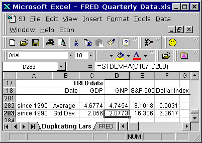
Now I can apply the calculations that Lars applied to the data. I have the average value for each series and the standard deviation for each series in the Excel file I've been using for the past few posts.
The first step of Christensen's calculation was to subtract the series average value from each data value, for all the datasets. I'll just do that in FRED:
 |
| Graph #3: For Each Series, Subtract the Series Average Value |
They're all a little lower as a result. You can tell, because the highest value on the vertical axis is now 40 instead of 50.

The second step of Christensen's calculation is to divide by the standard deviation of each series. This is where the amplitude, the up-and-down variation of each series gets reduced, and they all get similarized.
This impresses me. The greater the amplitude variation of a line, the greater the standard deviation, and the more the variation is reduced by the division. You can tell by the way people use standard deviation all the time, that it must be pretty important. But this is the first time I ever saw it used in a significant way ...that I could understand, anyhow.
 |
| Graph #4: For Each Series now, Divide by the Standard Deviation |
Now the vertical axis values have been reduced to a high of 3 and a low of -5. That is far less than in the previous graphs. The orange and green lines no longer travel to the extremes we saw in the previous graphs. The lowest value on Graph #4 is actually in the red line. Quite a difference.

5 comments:
Wow. What version of Excel is that?
Ha! 97 I think. From the old computer that runs on Windows 98.
I got some custom menu items & toolbar buttons visible there.
Now that you've duplicated Christensen's indicator, what do you intend to do with it?
Reading his paper, I see a lot of market monetarist dogma.
At the end he hints at an NGDP futures market, which I think is Scott Sumner's touchstone.
But there's an implicit assumption that correlation is causation, so that inflating the asset markets will lead to NGDP growth.
Plus, how well does the correlation work in a liquidity trap? The correlation seems to be breaking down since 2010, and getting worse recently. This is easier to see in your graph #3 of 8/13 [i have to look at the spreadsheet (2)] than in Chistensen's, which is now almost a year old. This is the first liquidity trap 80 decades.
Of course, market monetarists don't believe in a liquidity trap.
Are you going to examine the pre-1990 correlation? I'm suspicious of cherry-picking.
Cheers!
JzB
80 decades? Wow! :)
Actually I did look at the whole period since 1974 But the results were so unlike the "since 1990" results that I figured I probably made a mistake. Then, instead of checking my work, I just didn't make the extra post showing the "since 1974" graph.
Where Lars subtracts 1.5 in his Market Indicator calc, I have to subtract 4 to bring the two lines together in the 1990s. That's fishy. But like I said I didn't check my work. I was also disappointed that the numbers don't go any further back than 1974.
What will I do with his indicator? Nothing! In the Unlearning Economics post the indicator is used to reach a conclusion opposite to what Lars reaches. How good an indicator can it be?
But the calc was simple enough that I could figure it out before I sat down to figure it out, and the manipulation of data was interesting and likely useful for other purposes, I thought.
The S&P 500 and the Dollar Index that Lars uses are not things I ever look at. It's not his indicator that interested me, but his techniques for manipulating the numbers.
Only 8 decades. Sometimes I over achieve.
He also says it's only for illustrative purposes, and a real, accurate indicator would have a few more factors.
But I'm curious to see what you have to say about the pre-1990 results.
To really grock it, I'd probably have to download his file and go through it all myself, and somehow, I don't see that happening.
Cheers!
JzB
Post a Comment