Showing posts with label Growth-phase growth. Show all posts

Sunday, March 5, 2017

"Growth Phase" growth

This post is a companion to About that slow growth in the 1970s.

I gathered up the full set of RGDP quarterlies, 1947Q1 thru 2016Q4. Wrote up some VBA code to change Excel graphs. Set up a graph like I had for James Harrison's "good" and "slow" decades that we saw last time. And added recession bars to the graph.

(Later, I noticed the recession bars disappeared when I made gifs of the graphs. Oops.)

My intent is to examine business cycles one at a time, separate out the "growth phase" from the rest of the cycle, determine the growth rate for the growth phase, and consider the growth-phase growth rates for all the cycles together. I put a graph of the first business cycle on the worksheet and tweaked it to my heart's content.

Then I made a copy of the worksheet and started setting things up for the second business cycle. For each change I wanted to make, I figured out a way to do it in VBA. When the second graph was done, I had the code I needed to make the third graph, and the fourth, and the rest. I put a button on the worksheet to run the code.

Here is the process: I make a copy of the worksheet, rename the copy, click the button to run the code, and then erase a few "growth phase" values. That's all I have to do, and I have another graph done. Oh, plus I may have to revise the max and min values shown on the Y-axis. But that's it.

The trick is naming the sheet. My VBA code expects the worksheet name to be two four-digit-year values separated by a dash. When I click the button, the code uses the two dates to determine which data to show on the graph. It changes the title of the graph. And it initializes the "growth phase" column of the sheet.

All I have to do then is erase the first few "growth phase" values, and the last few, to shorten the red line on the graph until it shows only the growth phase. While erasing values, I watch the graph to check my work. Excel changes the graph automatically.

The growth-phase dates are self-revising. A worksheet calculation watches as values are erased from the "growth phase" column, and the dates adjust automatically. Those dates, and the RGDP dates taken from the worksheet tab, generate the graph title automatically. This prevents a lot of mistakes of a kind I'm very good at making.

(The recession bars, visible in Excel, make it easy to decide which values to erase and which to keep. Dunno why those gray bars disappeared from the gifs. The gray was too faint, maybe.)

My selection of the "growth phase" is seat-of-the-pants. There is nothing scientific about it. But with the way I have it set up, I could create all the graphs with the growth phase ending at the first possible moment, say, and create them all again with the growth phase ending at the last possible moment. Or whenever: Creating the graphs is not a stumbling block.

I get to think about the years I want to look at. And I get to decide what should be included in the growth phase. Excel and VBA between them take care of just about everything else.


Eleven graphs:


Taking the growth rate from each of the exponential trend equations...

Gathering the growth rate data, I was surprised to see a low number for the 1980s. I gave the graph a critical look, but everything was okay. And then I got a low number for the 1990s, too.

These are quarterly rates. Annual rates would be higher. That would help. But my growth rates for the 1980s and '90s are still lower than I expected, compared to rates in the 1970s.

Oh, yeah! That's what my previous post was about: If you only look at the growth phase of the business cycle, economic growth was strong in the 1970s. I didn't learn that lesson yet, apparently.

Here are all eleven "growth phase" growth rates from the tiny graphs above:

Graph #12
Wow! Look at that spike for 1980-1982. And the ungainly low at 1953-1958. Other than that, I see an accelerating downhill trend. Hmm.

Here is the 1980-1982 graph, showing a trend of 1.94% growth per quarter:

Graph #13
The 1980 recession was followed almost immediately by the 1982 recession. There was only one year between the two. And this was back when interest rates and inflation were at peak. Here is the same 1980-1982 period at FRED, showing RGDP (blue) and the Fed Funds interest rate, the policy rate:

Graph #14
Interest rates (red) started going up as soon as the 1980 recession ended. There was no time for growth to moderate normally. Six months of rising interest rates put a sudden end to the growth phase. Six months after that, another recession was upon us.

So the growth phase coming out of the 1980 recession was very short: just six months. The growth-phase growth rate is high because there was no period of moderating growth. After a six-month burst of growth the business cycle was suddenly in its transition phase, between growth and recession.

There was no period of gradual moderation after the initial burst of growth. As a result, the growth phase has a very high growth rate. We end up with a high point on the bar graph. So it looks like some kind of error.

Okay. Well, that accounts for the oddly high growth rate. But how about the low of 1953-1958?

It's a similar problem. There was a brief, sharp increase in RGDP coming out of the 1953-54 recession, and then, before long, a flattening. This time, though, the change was gradual rather than sudden. The change on the graph is not a sharp corner.

Originally, I thought about stopping the growth phase short. But I rejected the idea, assuming the flatness was moderating growth. So I included some of the "flat" growth in the data used to figure the exponential trend. That data is shown in red on this graph:

Graph #15
Including those several quarters of "flat" growth brought the growth rate down to 1.04%, as the trend line exponent shows.

Looking at the bar graph, I now see that the 1953-1958 growth rate should have been higher. So I realize that the flat growth must have been part of the transition phase between growth and recession. I should have excluded it from the growth phase. Here's the revised graph, with the red line appropriately pruned back:

Graph #16
The shorter red line produces a steeper trend line. It shows a growth rate of 1.89%.

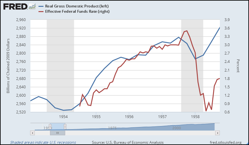
Here is RGDP (blue) for the same period (1953-1958) from FRED, along with the Federal Funds interest rate:

Graph #17
Growth definitely slowed when the interest rate went up. Growth slowed because the interest rate went up. The slowdown in growth was a result of anti-inflation policy. The slowdown is therefore part of the transition phase, not the growth phase. So I will use the 1.89% growth rate from the revised graph, rather than the 1.04% growth rate of the original graph.

Here is the bar graph, revised to show higher growth in the 1953-1958 period:

Graph #18
The 1953-1958 value is higher now, more in line with the other data.

The 1980-1982 value remains high, because I didn't change it. I don't know what would have happened if the Fed hadn't created the 1982 recession. (Well I do know: Growth would have tapered off gradually. The growth phase would have been longer, and the growth rate lower. But how much lower, I cannot say. I can only guess that it would fit the trend of decline visible in the other data on this bar graph.)

I won't revise the graph based on a guess. Nor will I consider the high value of the 1980-82 growth phase to be valid. In other words, I won't consider 1980-82 at all. I'll just omit it.

Given that, then, and converting quarterly growth rates to annual rates, this is the result:

Graph #19
For what it's worth.

Myself, I would argue that growth-phase growth rates are a more telling indicator of economic health than business cycle growth rates. The growth-phase growth rate is growth at its best in each business cycle.

Coming out of recession, interest rates are low. Demand awaits fulfillment. And productivity is typically high, coming out of recession. These are features of the growth phase. So it provides a pretty good measure of the economy's "potential" (though that word has already been taken). Growth-phase growth shows our economy's performance is declining, and has been for a long time.

I bet you didn't see that coming.


Files:
RGDP & USREC (quarterly).xls (contains VBA code)
RGDP & USREC error checking & revisions.xls (contains VBA code)
Growth Phase Growth Rates.xls

Wednesday, March 1, 2017

About that slow growth in the 1970s


I'll begin by repeating what I quoted a few days ago.

Back in 1983, in Oil and the Macroeconomy since World War II, a young James Hamilton opened with these thoughts:
The poor performance of the U.S. economy since 1973 is well documented:

    1. The rate of growth of real GNP has fallen from an average of 4.0 percent during 1960-72 to 2.4 percent for 1973-81.
    2. The 7.6 percent average inflation rate during 1973-81 was more than double the 3.1 percent realized for 1960-72.
    3. The average unemployment rate over 1973-81 of 6.7 percent was higher than in any year between 1948 and 1972 with the single exception of the recession of 1958.

This decade of stagnating economic performance ...

The Federal Reserve dealt with high inflation (Hamilton's #2) by raising interest rates until recession resulted. The low output growth (#1) and high unemployment (#3) noted by Hamilton were consequences of the Fed action.

"Recession per year" was higher in the 1970s


Year RGDP
19603108.7
19704722.0
19806450.4
A quick check shows an RGDP increase of about 51.9% during the 1960s versus 36.6% during the 1970s. The 1960s were easily the better years for RGDP growth. So we could jump to the conclusion that Hamilton is right: The 1970s were a "decade of stagnating economic performance". But I'm not much of a jumper.

Hamilton really wasn't comparing decades. He compared the years from 1960 to 1972 to the years from 1973 to 1981. This graph shows 1973 to 1981, his "slow" years:

Graph #1: RGDP During James Hamilton's "Slow" Years, 1973-1981
I see three recessions in those nine years. No wonder he finds the economy slow.

This next graph shows 1960 to 1972, the "good" years that Hamilton compares to the "slow" years:

Graph #2: RGDP During James Hamilton's Good Years, 1960-1972
Two recessions this time. There's less "slow" time in these thirteen years than in the nine years Hamilton calls slow. There are more "good" years in Hamilton's good years than his bad years.

Well, that makes sense, I guess.

Okay, but look at it this way: In the 13 years of Hamilton's good decade, there are 21 months of recession. That works out to about 1.5 months of recession per year. In the 9 years of Hamilton's bad decade, there are 28 months of recession. That's about three months of recession per year. Twice as much. His bad decade has twice as much recession per year as his good decade.

Sure. It makes sense that the slow decade would have more recession and less growth.

Okay, okay, but think about it this way: More than 86% of the months in Hamilton's good decade are good months. But less than 75% of the months in his bad decade are good. And almost 26% of the months in his bad decade are bad, but only about 13% of the months in his good decade are bad. No matter how you count 'em, his bad decade has more bad months than his good decade, and his good decade has more good months than his bad decade.

You know, it does make sense when you look at it that way.

Yeah, but it just doesn't sit right. James Hamilton appears to be comparing growth in two time periods and finding that one period had far better growth than the other. But we really can't tell how good the growth was, because the mix of growth and recession in the two periods is so different.

Hamilton is not comparing growth to growth. He's comparing arbitrary chunks of the business cycle -- growth, recession, transition phases, everything.

Have you ever seen one of those graphs that show a comparison of recessions? Those graphs align recessions on their start dates, and compare the length and depth of the downtrends. A good comparison of growth would use a similar methodology.

"Recession per year" was higher because of policy


Hey, the economy is the economy. You take one chunk of years and compare it to another chunk of years. The one with more growth and less unemployment is the winner.

Yeah, but no. James Hamilton's slow decade has more recession per year because of policy. It's not that the economy was slow in the 1970s. It's that policy made it slow intentionally.

When a good economy gets to be too good it starts to show inflation. Policymakers respond to inflation by raising interest rates to slow the economy. If the inflation is intractable or unusually high, policy might easily slow the economy enough to create a recession. When that happens, the high unemployment and slow growth that result are consequences of policy.

To point out such a time and call it a "decade of stagnating economic performance", as if the problem was slow growth, is just plain wrong. We have seen slow growth in the years after the 2008 recession. It is nothing like the stop-and-go economy of the 1970s. When it was "go" in the 1970s, growth was strong. The problem in the 1970s was not that growth was slow. The problem was that policy caused a doubling of the "recession per year" number, and did so because growth was too good.

The economy was good in the 1960s, and inflation arose. Policy put a stop to that in the 1970s. In the 1970s, Hamilton's slow decade, recessions were created by policy. Knowing this, you cannot compare the 1970s to the 1960s and announce that growth was slow in the 1970s. It doesn't do justice to the facts.

If you want to evaluate growth, you ought not compare arbitrary chunks of years. When you're evaluating recessions you don't use arbitrary chunks of years. You use the recessions. This is obviously the correct approach when comparing recessions. How is it not obviously correct to use the times of growth when one is comparing times of growth?

Remember, too, the recessions of Hamilton's slow decade were created on purpose to slow inflation. Or, created by accident maybe, but created by policy nonetheless, in order to slow things down.

If and when recessions are natural phenomena, rather than imposed by policy, maybe it would make sense to compare arbitrary decades of economic history. But recession is a policy tool and, in the battle against inflation, slow growth is the policymaker's weapon of choice.

It may be informative to compare growth of a healthy economy to growth in a period when the intent of policy is to reduce growth. But to conclude from such a comparison that the latter period shows "stagnating economic performance" is surely without justification.

Evaluating Growth


Why were there more recessions in James Hamilton's slow decade? Because there was more need to fight inflation in James Hamilton's slow decade. Why was economic growth (on average) slow in that decade? Because it was policy to slow things down.

The question that must be asked is: How good was the growth?

I want to answer that question by looking at the growth phase of the business cycle:

Graph #3: Growth during the sparse Good Years of Hamilton's Slow-Growth Period
The blue line (which is partially hidden by the red line) shows Hamilton's slow-growth decade, from 1973 to 1981. I show in red the part of that period that I evaluate for growth. It runs from the start-of-increase on exit from the 1974 recession to the start-of-slowdown before the 1980 recession. The recessions are visible on Graph #1.

I put an exponential trend line on the red data. The exponent of the trend line formula indicates a growth rate of 1.25% per quarter for the period. The growth rate for the full 1973-1981 period would, of course, be less.

On the next graph we see in blue (again, partially hidden by the red line) Hamilton's decade of good growth, from 1960 to 1972. In red is the part of that period for which I evaluate growth. It runs from the start-of-increase coming out of the 1960 recession to the start-of-slowdown before the 1970 recession. The recessions appear on Graph #2.

Graph #4: Growth During the Good Years of Hamilton's High-Growth Period
The exponential trend line fitted to the red data shows a growth rate of 1.28% per quarter for the trend period. This is slightly more than the trend growth rate observed for Hamilton's slow decade.

I made a copy of Graph #4 and added the slow-decade growth trend from Graph #3. The growth-phase trend of Hamilton's good decade, shown in black, and the growth-phase trend of his slow decade, shown as dashed green, are compared on Graph #5:

Graph #5: The Trend Growth for Hamilton's Good Decade (black) and his Slow Decade (green)
Comparisons of recession align the recessions at their start points. This comparison of growth aligns the trends by using the value 2953.4544 in the equations for both lines.

Comparisons of recession examine differences in depth. Here there is no "depth" to consider, for we are looking at growth, not recession. But there is little difference in trend growth between Hamilton's two periods, anti-inflation policy notwithstanding.

Comparisons of recession also examine differences in length. The trend period for Hamilton's slow decade includes 16 quarters. The trend period for his good decade covers 36 quarters. The growth phase of the good decade is more than twice as long.

Remember, though, that the recessions of the 1970s were created by policy, and that growth fades before recession starts. In the 1970s, policy made growth fade.

Conclusion


I often look at aggregate numbers. People tell me information is lost by looking at aggregates. Important details are lost. This is no doubt true.

Until I was writing this post, I thought about economic growth as it seems everyone does, without regard for the phases of the business cycle. Now I think that to look at growth, one needs to look at growth.

Figuring growth for a period that includes more than one phase of a business cycle is like looking at aggregate numbers. Information is lost. The growth rate of a business cycle is not equal to the growth rate of the growth phase of the cycle. And outside factors, such as policy (fighting inflation by slowing the economy) can reduce the growth rate, shorten the growth phase, and lengthen other phases of the cycle.

In the years since 2009 we have seen slow growth. Growth in the 1970s was slow, but not in the same way. In the '70s growth was slow on average. But in the growth phase, growth was rapid in the 1970s.

Today it is policy to increase growth. In the 1970s it was policy to reduce growth. And policy in the 1970s reduced average growth. But for the growth phase of the business cycle, growth rates in the 1970s were comparable to growth rates in the 1960s.

Memory is short, and recent experience counts for much in our thinking. It would be a mistake to look back to the 1970s and think of growth in that era as comparable to the past few years. Growth in the 1970s was good. There just wasn't very much of it.


RGDP 1960-1972 (FRED cPsD).xls
RGDP 1973-1981 (FRED cPsp).xls