Wednesday, July 31, 2013

Arithmetic and Integrity


These are the relations between GDP, inflation-adjusted GDP, and prices:


That is a fact. So, what does the arithmetic tell us? It says

1. If you divide "nominal" GDP by "real" GDP, you get "prices".
2. If you divide "nominal" GDP by "prices", you get "real" GDP. And
3. If you multiply "real" GDP by "prices" you get "nominal" GDP.

The three series of numbers considered here are more closely tied than braided hair. You can always convert nominal GDP values to real, by dividing prices out. You can always convert real GDP values to nominal, by multiplying prices in.

Again: The relations between these series is such that if you divide NGDP by RGDP it gives you prices; if you divide NGDP by prices you get RGDP; and if you multiply RGDP by prices you get NGDP. These are the relations, and nothing can be done about it.


On Sunday I wrote:

Unit Labor Cost is Employee Comp multiplied by the price level...

They take numbers like Employee Compensation going down relative to GDP. They times it by prices to make the numbers go up. They say Look, look! Labor costs are going up! And they claim that rising labor costs are pushing prices up.

I don't know which employee cost data is used to figure Unit Labor Cost. I know I'm in the ballpark because the lines on the graph were very close. But that's not the point. The point is, they multiply the employee cost numbers by the price level to get the Unit Labor Cost numbers.

It is a point I've made before. In mine of 6 October 2012, I wrote:

Kaminska seems to think the graph shows labor cost. How does she describe it? "The labour cost attached to the production of one unit". Oh right, right: "One unit".

As I showed the other day, the Unit Labor Cost plot is almost identical to the price level plot:

Graph #2: Unit Labor Cost (blue) and the price level (red)

The similarity between ULC and the price level is so remarkable as to inspire disbelief. And well it should, for the red line is used to calculate the blue line. To calculate Unit Labor Cost, labor costs are multiplied by prices.

And then the graph is used to claim that Labor cost makes prices go up.

The first comment on that old post disputes my view:

I'm afraid you've got everything upside down. Unit labour costs are exactly as described, the cost of one unit of output. Normally when we say this, we mean nominal unit costs. Since labour costs account for most costs, as labour costs go up so do prices. It is therefore not remotely surprising that the labour cost line and the price line move together.

Labour costs are NOT multiplied by prices. They are a nominal variable which at least partially drive prices.

There is nothing about multiplying by prices involved. Nominal gdp does go up as prices go up or or as real gdp, which is nominal gdp divided by prices, goes up. It is the nominal gdp which is the directly observed measure.

The similarity between the two lines is "so remarkable as to inspire disbelief," I said. My anonymous commenter's view is that the similarity is not remotely surprising because "labour costs account for most costs". I had to laugh at the difference of opinion. I do think that someone with enough knowledge of math and economics could determine with certainty which view is closer to the truth. This one has an answer.

Meanwhile, I stand by my view. The two lines are inordinately, unjustifiably similar. More similar than can be accounted by labor's share of cost which, unlike prices, has been falling for 30 years. The similarity is artificial.

The similarity is created when labor costs are multiplied by prices.

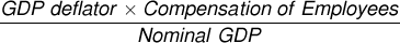
That brings me to the second point in the comment: "There is nothing about multiplying by prices involved," my anonymous friend writes. "Nominal gdp does go up as prices go up or or as real gdp, which is nominal gdp divided by prices, goes up."

Real GDP is Nominal GDP divided by prices, he says. He's right about that. So if we are dividing something by Real GDP, we can instead divide by "Nominal GDP divided by Prices" and get the same result. The same result, and better transparency:


But we're dividing by a fraction here. Do you remember how to do that? "Invert and multiply." To divide by a fraction, invert the fraction and multiply. We can do that:


The fraction "Nominal GDP over Prices" becomes "Prices over Nominal GDP", and the "divided by" symbol gets replaced by a multiply. But now that we're multiplying, we can rearrange the calculation a bit more:


Now it is obvious that we are dividing our original number by Nominal GDP and multiplying by prices. This is the arithmetic: You can divide something by Real GDP, or you can divide it by Nominal GDP -- actual GDP -- and multiply by prices. Either way you get the same answer.

Either way, you get the same answer.

For figuring unit labor costs, the commenter says, "Labour costs are NOT multiplied by prices ... There is nothing about multiplying by prices involved." But Unit Labor Cost is total labor compensation divided by real GDP. And dividing by "real GDP" gives the same answer as dividing by actual GDP and multiplying by prices.


Actual GDP is GDP at the prices we actually paid to buy it. They call it "nominal".


If Real GDP was "the directly observed measure" then there would be nothing wrong with the Unit Labor Cost calc. But that's not the case. Real GDP is an artificial measure, created by stripping price changes out of actual GDP.

Or if they didn't multiply prices into labor cost, and compare the resulting numbers to prices (and discover an unbelievable similarity) then what they are doing might be okay. But the arithmetic is not okay, because they multiply prices into labor cost and create the similarity they pretend to discover.

When they choose to divide labor costs by "real" GDP rather than actual GDP, they are choosing to multiply labor costs by prices. So doing, they create the appearance of similarity between Unit Labor Cost and prices. To use this artifice as evidence that labor costs have been pushing prices up is an abomination.

Tuesday, July 30, 2013

Ohm's Law


"Eee equals eye are". That's it. That's Ohm's law. Or this way:

E=IR

Voltage equals current times resistance. It's the law.

If you take Ohm's law and divide both sides by R, this is what you get:

E/R=I

So if you know the voltage and the resistance, you can figure the current.

Or instead, if you take Ohm's law and divide both sides by I, you get this:

E/I=R

So if you know the voltage and the current, you can figure the resistance.

The nice thing is, you don't have to remember three different formulas. You only have to remember Ohm's law and be able to rearrange formulas. Pretty neat.

But you do need to know how to rearrange formulas. Maybe that escapes people, I don't know. It's not hard; you just have to do it a lot to have confidence in it. I did.


Here's another formula you can rearrange, from Tejvan Pettinger:


Take GDP at the prices we pay to buy it (that's called "nominal" GDP, for some reason) and divide it by what economists call "real" GDP (which is what GDP would have cost if prices never went up at all). You're left with a measure of the change in prices. (Then multiply by 100 so the numbers are not so tiny.)

Let me translate Pettinger's formula into the terms that FRED uses:

  • For "Nominal GDP" use GDP
  • For "Real GDP" use GDPC1
  • For the "GDP deflator" use GDPDEF

When I replace Pettinger's values with FRED's values, the formula looks like this:


The FRED graph of it looks like this:

Graph #1
The first title across the top of the graph is GDPDEF, which we have on the left side of the equal sign in the formula above. That's the blue line on the graph.

I made that blue line extra-wide, because FRED draws it first. So, when it draws the second line, the red line, you can still see the blue line behind it. You can see the two lines follow the same path. The two lines -- as our formula says -- are equal.

The second title across the top of the graph is same the calculation we have on the right side of the equal sign in the formula above.


We can rearrange the formula to get GDP ("nominal GDP") all by itself on one side of the equal sign, and all the calculation on the other side. Multiply both sides by GDPC1 ("real GDP"), and divide both sides by 100, to get GDP:


The FRED graph:

Graph #2
The expression on the left side of the equal sign in our formula is restated in the first title line of the graph, and appears as the blue line on the graph. The expression on the right side of the equal sign is restated in the second title line , and appears as the red line on the graph.

Again you can see the two lines are identical, confirming what the equal sign in the formula tells us.


So we've looked at the "GDP Deflator" by itself, and "nominal GDP" by itself. All that's left is "real GDP" or GDPC1. Again, we can rearrange the formula to get it. Starting with the formula just above Graph #2, to get GDPC1 by itself on the left side of the equal sign, we have to divide by GDPDEF. To make sure things left and right of the equal sign stay equal, we have to divide stuff on both sides of the equal sign by GDPDEF. Then, to get rid of the 100 and get GDPC1 by itself, we have to multiply both sides by 100. That gives us this:


And again, at FRED that looks like this:

Graph #3
The graph shows that our rearranged formula is correct. The two identical lines indicate that the quantity on the left of the equal sign is equal to the quantity on the right.


By convention, usually the complex calculation is shown on the right side of the equal sign, and the simple variable is shown on the left. It's sort of like the final step, when you're rearranging formulas. But it's not just a convention. It helps you understand what you're looking at, when you're figuring it out for yourself. I left it out, above. So really, the formula just above Graph #2 should look like this:


Rearranging formulas isn't hard. You just have to do it a lot to have confidence in it.

Monday, July 29, 2013

Real Output versus Real GDP


Real output is cars and houses and cups of coffee, and apples, and oranges. The stuff we produce is output, and it is real.

But it is stuff. Things. Goods and services. It's not money, and you can't add it all up and get a total number. It's stuff.

Real output is stuff. Real GDP is an attempt to put a monetary value on the stuff. An attempt, I say, because they try to imagine what the monetary value would have been if there was no inflation. What the value of the stuff would have been, if prices never went up.

"... if prices never went up." And for that, they use the word real.

Sunday, July 28, 2013

It's cheating, but nobody seems to notice.


From yesterday's post, Employee Compensation relative to GDP:

Graph #1: Employee Compensation as a Share of GDP

If Employee Compensation is falling, how can Unit Labor Costs be rising?

Graph #2: Comparing Employee Compensation as a Share of GDP (blue) to Unit Labor Cost (red)

It's because Unit Labor Cost is Employee Comp multiplied by the price level:

Graph #3:  Multiply "Employee Compensation as a Share of GDP" by the GDP Deflator
and it starts to look just like Unit Labor Cost

Oh, they're not so blatant about it, of course.


The calculation for Graph #3 is crude. You can see that the GDP deflator is multiplied in. The deflator is a measure of prices, so you can see that prices are multiplied in. That's crude. But you can rearrange the formula and still get the same graph:

Graph #4: Divide "Compensation of Employees" by "GDP divided by the GDP Deflator"
and we get the same picture as in Graph #3

In this version, we don't multiply prices into the "Employee Compensation/GDP" ratio. Instead we divide prices out of GDP, and divide Employee Compensation by the result.


But the calculations are equivalent, so Graph #4 looks just like Graph #3.

But once we have the formula arranged this way, you might notice that the denominator, the Nominal GDP divided by GDP deflator part, is the calculation that gives what economists call "Real GDP". So you can use that instead:


It's shorter and cleaner, and it has the word "real" in it so everybody likes it. When you make the graph using Real GDP, it still looks just like Graph #3 and Graph #4:

Graph #5: Divide "Compensation of Employees" by "Real GDP" and we get the same picture again
because Real GDP is equal to "nominal" (actual price) GDP divided by the GDP Deflator

It's still the same picture. It's still the same calculation. It still has prices factored in, but now not even an economist can see it.

They'll tell you they are dividing by real GDP you know, but there is no such thing. Oh, the cars are real, and the houses, and the cups of coffee in the morning, those are very real, and the apples, and the oranges. All of it, all the pieces are real. But it's all apples and oranges. You can't add the values of all those things together, na, na, na, you can't figure the values of all those things in prices that never go up without doing complex calculations based on actual GDP, the so-called "nominal" GDP I mean, and the changes in prices.

There is no real GDP. There is only nominal GDP, actual GDP at actual prices. After that, it's all calculation. When they tell you they are dividing by real GDP, they are really dividing by estimates of actual GDP with price changes stripped away. Oh, they may have a series of numbers that's called "Real Gross Domestic Product" all right. And they may have incomprehensible stories about how real GDP is calculated. But if you factor price changes into their numbers you get "nominal" GDP. And if you take actual GDP and factor price changes out of it, you get their so-called "real" numbers.

No matter how you slice it, if you are dividing by "real GDP", you will get exactly the same result if you divide by actual GDP and factor price changes into the result. And the thing is, actual GDP is the actual one. "Real" GDP isn't.

They take numbers like Employee Compensation going down relative to GDP. They times it by prices to make the numbers go up. They say Look, look! Labor costs are going up! And they claim that rising labor costs are pushing prices up.

It's cheating, but nobody seems to notice.

Saturday, July 27, 2013

WASCUR's Farm


So "Employee Compensation" looks like this:

Graph #1: Employee Compensation

Relative to GDP it looks like this:

Graph #2: Employee Compensation as a Share of GDP

Reminds me of Labor Share, except Employee Compensation fell from a higher peak:

Graph #3: Employee Compensation/GDP (blue) and Labor Share (red)

Friday, July 26, 2013

The Damage was Done Before 1980


The other day we compared business interest costs and employee compensation. But business interest costs are only part of total interest costs. The blue line here is total interest cost:

Graph #1: Total Interest Cost (blue) and Employee Compensation (red)
The next graph shows the red line as a multiple of the blue line:

Graph #2: Employee Compensation as a Multiple of Total Interest Cost
Looking at that second graph... Employee compensation fell from 6 times the cost of interest (in 1960) to about 1½ times the cost of interest (in 1980).

Turning that ratio on its head, the cost of interest increased from 1/6 of employee compensation to roughly 2/3 of employee compensation between 1960 and 1980. And there it stays.

Thursday, July 25, 2013

Interest and Profits


Monetary Interest Paid is the blue line

Wednesday, July 24, 2013

Corporate cost revisited

Graph #1: Interest Costs rose as Employee Compensation Fell, 1948-1980

On mine of 17 Feb 2012, Jazzbumpa remarked:

Where did you get the interest and compensation as a % of deductions data?
I've never seen anything like that before.

The cost numbers are from NIPA tables: NIPA Table 1.13 for Employee Compensation, and NIPA Table 7.11 for Interest Deductions. But those tables have been revised. I can't even find Table 1.13 any more. And the link I offered in my reply to Jazz is no longer working. It's time to take another look at this.

[Edited 4 Oct 2022: Graph #1 wasn't showing up due to changes at Google Drive. Same graph, new method of showing it. Oh, and here is the link to my spreadsheet.]


At FRED I found Compensation of Employees: Wages & Salary Accruals, and Monetary interest paid: Domestic business. Here they are:

Graph #2: Employee Compensation (blue) and Business Interest Cost (red)

I didn't find business deductions at FRED, so I can't re-create Graph #1 exactly. What I did was look at Employee Compensation and Domestic Business Interest Paid, each as a percent of the total of the two together. So we can see Compensation as a percent of Compensation-plus-Interest-Paid, and Interest as a percent of same. Here:

Graph #3: Employee Compensation (blue) and Business Interest Cost (red) as Percent of their Sum

The first half of Graph #3, through 1980, is a pretty good match to Graph #1. Not the position, but the shape of the first half of the red line on #3 looks like the whole of the blue line on #1. And the first half of the blue on #3 looks like the whole of the red on #1.

Sorry about the color confusion.

So we're looking at essentially the same trends, employee compensation and business interest costs, in both graphs. Now, to the details.

Interest (Red line on Graph #3): A gentle sweep up from maybe 4% in the late 1940s to the 1974 recession, with a small rough spot at the 1970 recession. It crosses the 10% level some time around 1966 and climbs to near 30% by the time of the 1982 recession. It shows a lot of indecisiveness since the latter 1970s. Still, the average value since 1980 has been around 25% of the interest-plus-compensation number.

Compensation (Blue on Graph #3): This line is the mirror-image of the other. It starts around 96% of the total, falls below 90% around 1966, and drops to near 70% in the early 1980s. After that it averages about 75% of the total.

One could argue that the graph shows a smoothness of trend until the 1970s, a Great Moderation of sorts in the early years, and then since the seventies a great deal of instability. If you think Moderation is worth noting.

One could argue there is a threshold at the 90% level, and when compensation falls below this level it brings an end to times of prosperity. Like Reinhart and Rogoff.

I would argue that interest was only about 5% of the total through the 1950s, and only about 10% of the total through the 1960s, but it has been about 25% of the total since 1980 -- five times what it was in the 1950s. That's twenty cents out of four dollars in the 1950s, one dollar out of four since 1980.

I would point out that the general uptrend of the red line, from 1946 to 1981, occurred during the general uptrend of interest rates. And that the 30-year "stall" at the 25% level happened despite a secular decline of interest rates to the zero bound.

I would also point out that the money a business spends to pay interest is money unavailable for wages and profit.

Tuesday, July 23, 2013

On Effective Demand


According to Gavin Kennedy, Maynard Keynes may have used the term "effective demand" as Adam Smith used "effectual demand", to mean demand backed by ability to pay. In recent usage, Ed Lambert uses "effective demand" to mean potential demand. He seems to separate the phrase from the meaning "ability to pay". This is disturbing.

Lambert's work is interesting, but I wish he would call his work what he says it is: a study of potential demand. I'm reposting below mine of 17 December 2010, which bears some relevance.


Back in the day when Stefan Karlsson still allowed comments on his blog and I still found him interesting, he opened his post The Logic of Say's Law with a robust claim:

Say's law has come under discussion, so I will now explain what it means and what it doesn't mean and why it is true.

Parts of his post sounded wrong to me, so I commented:

Stefan, I have another question. You write: "Say's law in essence means that there can never be deficient aggregate demand.... The reason for that is we always have unfulfilled desires, and thus always want more.... That is essentially always true, and is if anything even more true during recessions when people are compelled to cut back...."

I am trying to understand your definition of aggregate demand. It seems to be the sum of effective demand or effectual demand as defined by Keynes and Adam Smith, plus some unfulfillable wish list of additional demand. I assume that as usual I am misunderstanding something you have said.

By the way effective demand (for Keynes) is the demand that calls forth supply; and similarly for Adam Smith....

According to Karlsson, "there can never be deficient aggregate demand" because "we always have unfulfilled desires, and thus always want more."

This is nonsense.

"Aggregate" means "added up" or "total." Aggregate demand is total demand. But economists -- apart from Karlsson, evidently -- do not include in aggregate demand everything that anyone could possibly think they might want. Economists mean by it the total of actual demand, accounted as actual purchasing. Not wishes and wants and daydreams.

By "aggregate" demand I mean the thing that Maynard called "effective demand" and Adam Smith called "effectual demand".

"Effective" demand to Keynes is the demand that has an effect. This is not unfulfillable demand of any sort, but actual purchases.

"Effectual" demand for Adam Smith is not unfulfillable demand, but the demand of those who are willing to pay:

"The market price of every particular commodity is regulated by the proportion between the quantity which is actually brought to market, and the demand of those who are willing to pay the natural price of the commodity, or the whole value of the rent, labour, and profit, which must be paid in order to bring it thither. Such people may be called the effectual demanders, and their demand the effectual demand; since it may be sufficient to effectuate the bringing of the commodity to market. It is different from the absolute demand. A very poor man may be said in some sense to have a demand for a coach and six; he might like to have it; but his demand is not an effectual demand, as the commodity can never be brought to market in order to satisfy it."

Karlsson confuses aggregate demand with absolute demand. To Karlsson, "aggregate" demand means the sum total of everything that people may wish for. His reply to my comment confirms this view:

"Arthurian": I may have expressed myself in a way which will appear confusing. What I meant was that deficient aggregate demand can't cause a recession, the reason for this is that demand is determined by what we want and since we can't have all that we want (especially during recessions/depressions!), the underlying cause is that we lack the ability to supply something that the potential producers of what we want also wants, and that the crisis therefore is based on the mismatch between the structure of demand and the structure of supply.

I said to Karlsson: I am trying to understand your definition of aggregate demand. He responded by bringing recession into his explanation, and underlying causes, and mismatched structures. But setting all that aside, it turns out that Karlsson provides the same definition he gave in the original post: "demand is determined by what we want and ... we can't have all that we want." Aggregate demand, for Karlsson, is absolute demand. It includes the poor man's coach and six, and also my Ferrari.

For Karlsson, demand is determined by wants, not by purchases. Since wants are limitless, in Karlsson's view demand is limitless. But this is not a definition of demand. It is part of a definition of economic scarcity.

Demand is measured by what we buy, not by what we would like to have.


Update 30 December 2010:

At the Billy Blog, Billy defines "effective demand" as "spending backed by cash."

Monday, July 22, 2013

Working toward a definition


A recession is when your neighbor loses his job.
A depression is when you lose your job.


Following up on mine of the 20th. In The trade cycle: debt is trade, Nick wrote:
If you look at business cycles this way, as a trade cycle, in which the volume of trade rises in booms and falls in recessions, it is totally unsurprising that the volume of borrowing and lending should also rise in booms and fall in recessions.
So I wanted to look at that.

I want to look at debt other than Federal debt (because Federal debt by design is counter-cyclical). I'll look at "percent change from year ago" values because "borrowing and lending" is the change in debt, and "percent change" shows it clearly.

Graph #1: Percent Change from Year Ago, Debt Other than Federal Debt
The blue line goes up and down, up and down like something from a nursery rhyme. But if you notice, every time the line goes down, it crosses a gray bar of recession. Every time except 1967, when there was a "near-recession" that doesn't qualify for a gray bar. But you could know by the blue line that something happened there in 1967, some sort of slowdown in the economy.

So yes, Nick is right: Borrowing and lending rises in booms, and falls in recessions.

Now, look at the graph again. This time, look at the vertical scale, over on the left. The blue line is almost always between 5 and 15. That is, the smallest increase is about 5%, and the biggest increase is about 15%.

But even a lowly 5% increase is still an increase in debt. So what this graph shows is that debt is always increasing -- sometimes quickly, sometimes slowly, but always increasing -- from the first blue pixel of the line to the  last recession bar, the fat one just before 2010 there on the right.

See that low spot in the blue line? Just at the 2010 mark, the blue line has a sharp bottom that reaches down to the -5 level. That's a -5% increase. But of course a negative increase is really a decrease. In this case, a 5% decrease.

On that whole long blue line, the only place that debt actually got smaller was in that deep V. Starting in the 2009 recession when the blue line went below the 0 level, and lasting until the blue line went up above the 0 level again, the size of accumulated non-Federal debt actually got smaller.

In the 60-plus years shown on the graph, there was a brief hiccup of less than three years when debt actually decreased in size. (And that doesn't include the Federal debt!)


So what Nick tells us is that debt increases rapidly in a growing economy, and debt increases slowly during recessions.

Now here is my definition. It is the definition of economic depression: Debt increases slowly during recessions. Debt decreases during depressions.

Simple. Obvious.


Now let's check my definition against the facts.

Graph #2 is based on Series X398 from the Bicentennial Edition of the Historical Statistics. That reference work provides values for Public and Private debt for the years 1916-1970. I'm figuring Private debt is roughly equivalent to debt other than Federal debt. The graph shows percent change for the annual values provided:


Graph #2: Percent Change in Private Debt, 1917-1970
The Google Drive Spreadsheet is available
It's not perfect, but it's damned good. The "percent change" numbers are negative for the years 1930 through 1935, 1938, and 1945. All are depression years except 1945.

So for the years 1917 through 1970 this graph shows one exception. On the FRED graph there were no exceptions -- assuming we're in a depression since 2008, of course.

Overall, for the years 1917 through 2012 -- more than 90 years -- there is only one exception, one outlier that could let you raise an eyebrow to my definition of economic depression.

Sunday, July 21, 2013

The real advantage in ruthlessly pruning your writing is that you're left with pieces you can use later.


Tom links to Michael Hudson's The Insider’s Economic Dictionary. Reminded me of this, cut from yesterday's post:
I'd rather straighten out the terms "real" (which is used to mean "what we would have paid if prices never went up") and "nominal" (which is used to mean "what we actually paid").

Saturday, July 20, 2013

This Borg we call Finance


At Worthwhile Canadian, The trade cycle: debt is trade, by Nick Rowe.

Nick's first few paragraphs are very, very good. Classic. All they are, really, is the clear expression of a simple definition of GDP. Nick puts it in his own words in a way that leaves no doubt he understands this one all the way to the core. And then he uses that definition to come up with "something peculiar". Peculiar, and fascinating. And Nick is just coasting. Everything emerges from the one well-understood definition.

Here are the first 3½ paragraphs in all their pristine glory:

The trade cycle: debt is trade

GDP is high in booms and low in recessions (relative to trend). That is (roughly) how we currently define "booms" and "recessions".

GDP (roughly) measures the volume of trade in newly-produced final goods. But that is a narrow measure of trade. A lot of goods get traded that are not newly-produced. People buy and sell old houses, for example, where by "old" I mean "not produced this year". And those trades are not counted as part of GDP.

There is nothing wrong with excluding sales of old houses from GDP. Because GDP is supposed to measure the volume of production and not the volume of trade. But there is something peculiar in defining booms and recessions and the business cycle in terms of the volume of production, rather than the volume of trade. We produce goods and trade the goods we have produced, presumably because it makes buyer and seller better off, which is why production matters. But trade in old goods, like old houses, presumably makes buyer and seller better off too, so trade in old goods matters too.

In a monetary exchange economy, all goods, both newly-produced and old goods, get bought and sold for money. If something goes wrong with money, we should expect to see trade in all goods, both new and old, get disrupted. Some mutually advantageous trades in newly-produced goods don't get made; some mutually advantageous trades in old goods don't get made either. The decline in production we observe in a recession is just one symptom, albeit an important symptom, of a general decline in trade of both newly-produced and old goods.

Just to be clear, I'm not exaggerating my praise for those paragraphs. I really like the excerpt because Nick pulls so much from a simple definition.


Before long we get to the important part of Nick's post. Less simple, less classic, less definitional, but more to the point Nick wants to make. Thus it begins:

What do we trade? We trade newly-produced goods. We also trade old goods. We also trade IOUs. When I sell an IOU, we call it "borrowing". When I buy an IOU, we call it "lending". Borrowing and lending are trade, and those trades happen for the same reason all trades happen -- because the buyer and seller are presumably better off as a result of the trade. Of course there are exceptions, but then there are exceptions to all trades. Everyone has regretted buying or selling something, whether or not it was an IOU.

Notice how Nick slipped IOUs into the discussion? Before, it was new goods and old goods. Now, it is new goods and old goods and IOUs -- a list of interchangeable parts. But you can't eat old sushi, and IOUs are not goods.

He continues:
If you look at business cycles this way, as a trade cycle, in which the volume of trade rises in booms and falls in recessions, it is totally unsurprising that the volume of borrowing and lending should also rise in booms and fall in recessions. Because borrowing and lending is just another type of trade...

Wow. If I was writing this post, this is where I would want to start: "The volume of borrowing and lending rises in booms and fall in recessions." No explanation needed. But the next little bit -- "borrowing and lending is just another type of trade" -- I'm not comfortable with that. It's not "just" another type of trade. It is the monkey wrench.

The rest of that paragraph is good:
The same monetary problem that disrupts trade in newly-produced goods, and disrupts trade in old goods, also disrupts trade in IOUs. Because, in a monetary exchange economy, all those goods -- newly-produced goods, old goods, and IOUs -- are traded for money.

That's exactly right. But Nick leaves out the most important part: IOUs are used as money. Sure, he gets to it later, as an afterthought, after he gets to his conclusion. It's too late, then. You need to read the story this way:

The same monetary problem that disrupts trade in newly-produced goods, and disrupts trade in old goods, also disrupts trade in IOUs. Because, in a monetary exchange economy, all those goods -- newly-produced goods, old goods, and IOUs -- are traded for money. But IOUs are used as money.

IOUs are the monetary problem that disrupts trade. When "something goes wrong with money" the thing that's wrong is that there is an excess of IOUs relative to the quantity of money. It's not some unidentifiable "something". It's the excessive reliance on credit.

Nick doesn't say that. He relies instead on the sorry notion that "lending is just another type of trade". Nick touches on the truth when he identifies the problem that disrupts trade as a "monetary problem". But he seems unaware that this thought invalidates the other -- invalidates it because lending creates money. Lending is not "just another type of trade", because lending creates money.


I am happy to see Nick focus on the "monetary problem" as the problem that disrupts trade. But borrowing and lending are not "just another type of trade".

Labor is productive. Capital is productive. Finance is not productive. Finance only facilitates production. It's not the same thing. Production is power to the ground. Facilitation is a slipping clutch. Nick Rowe's "trade" treats them as equals.

Credit-use imposes a cost on production. Credit-use increases the cost of production. When there is little debt, the imposed cost is low. When there is a lot of debt, the imposed cost is high. The cost of excessive credit-use reduces profit and reduces disposable income and raises prices and makes our products less competitive internationally.

Labor is often blamed for the high cost of U.S. products. But all costs are costs. Even financial costs are costs. Why then do we always and everywhere blame labor for our cost problems?

Source: Mine of 23 June 2010

Debt is not just another type of trade. Interest income is not the same as wage income. Interest income tends to stay tucked away in the financial sector -- the non-productive sector -- where it can draw additional interest. Wage income is spent. Wage income is mostly recycled back to the productive sector where it can be used again as income.

Not every penny of wage income is recycled, of course. Some of it gets saved, finding its way to the financial sector where it, too, can draw in more of what remains of the money that has not yet been assimilated by this Borg we call Finance.


Let's wrap it up. I'm numbering the rest of Nick's paragraphs...
(1)What would be surprising and in need of explanation would be if trade in IOUs did not follow the same cyclical pattern as trade in other goods.
(2)Neil Irwin tells me that trade in IOUs is increasing in the US. (HT Mark Thoma). He's right that it's good news. I'm just re-framing what he is saying.
(3a)Yes, some IOUs are used as money. Which means that some trades in IOUs create money.
(3b)And this, depending on the monetary policy followed by the central bank, may create a positive feedback loop. But the job of a good central bank is to replace that positive feedback loop with a negative feedback loop, just like a good thermostat. (I'm talking about "banks", in case you missed it.)
(4)[After this afternoon, I will be taking a couple of weeks away from the blog.]

... and match-marking my responses:

(1)Nick is right. We should expect trade in IOUs to rise and fall with the economy. We should expect pattern similarity.

However, as time goes by, the rise and fall of trade leaves the total volume of IOUs at an increasingly higher level, relative to the total volume of goods. So after a time, the economy is not the same as it was at the start. The trade in IOUs has become a larger part of the total, the trade in goods a smaller part.

After a time, a larger part of the total income arises from and accrues to finance. A smaller part arises from and accrues to the productive sector. The effects of this imbalance are called, vaguely and carelessly, a "monetary problem".
(2)Nick is happy to hear that "trade in IOUs is increasing in the US". Happy, because to him it means that trade in goods is increasing also. He foresees recovery.

But Nick seems to overlook the fact that finance has grown large relative to the productive side. He overlooks the fact that a decent increase in the trade in IOUs may be accompanied by a pitiful increase in the trade that boosts income and employment and GDP.

If past performance is any indicator, if the marginal productivity of debt is any indicator, then we cannot possibly afford the increase in debt that would be required to get a halfway decent bit of GDP growth. Nick is overly optimistic.
(3a)Some trades in IOUs create money, Nick says. Okay. So the other trades in IOUs don't create money. They still create additional financial cost.
(3b)And when the positive feedback loop gets started, it builds on what has happened already. It is the increase in aggregate demand that has already happened that gives rise to the spreading view that demand is on the rise. And it is the increase in borrowing that has already happened, that pushes things to further motion. And it is the spending that has already happened that gives prices an upward spin.

And what does the central bank do in response? It jacks up interest rates. It increases the cost of future financial activity to curtail additional expansion. In other words the spending that has not yet happened, and cannot possibly have contributed to inflation, is suppressed.

Growth is suppressed. But no effort is made to accelerate the repayment of the recently created debt that stands as evidence of the "extra" spending which is what created the upward pressures on prices in the first place.

What is necessary is to keep interest rates low to encourage growth, always, and to set up tax incentives that accelerate the repayment of lingering debt.

We cannot leave it up to the central bank to replace the self-reinforcing, inflationary, positive feedback loop with a self-attenuating, price-stabilizing, negative feedback loop. We can't leave that up to the central bank and yet leave intact the massive and complex construction Congress has created to foster credit use and the accumulation of debt. No central bank could succeed in such an environment.
(4)Nick, have a good vacation. When you get back maybe we can talk.

Friday, July 19, 2013

The reason civilizations die by suicide


This is sad:


From The Detroit News, an article by Robert Snell, Daniel Howes, Chad Livengood and David Shepardson.


This is worse than sad:


262 Comments

They all point the finger.
They all know who's to blame.
They all think they know how to fix the economy.