Showing posts with label Simulated Evidence. Show all posts

Monday, August 5, 2013

Spoiler Alert


In yesterday's post we considered three possible causes of inflation and looked at the evidence in each case. The first cause was the cost of labor; the evidence was a graph of Unit Labor Cost (ULC). The second was the quantity of money, and the evidence was a "money relative to output" (MRTO) graph. The third possible cause, the ringer I made up for yesterday's post, was the cost of economic growth. The evidence for it was a graph of nominal GDP relative to output.

The three graphs use similar calculations to derive their evidence. We have considered this calculation model before, for ULC and MRTO:

Both follow the same pattern:

1. Divide GDP by a price index to get a fraction called "real" GDP.
2. Use this fraction as the denominator of another fraction.
3. Compare the result to inflation, and find similarity.

Using the MRTO as an example, I showed it is Step 1 on that list -- dividing by the price index -- that creates the appearance of similarity to inflation.

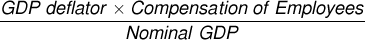
Yesterday's Graph #3 shows far greater similarity to inflation than either of the other graphs in the post. The reason is plain: The choice of a numerator, which is held to be the cause of inflation in the calculation model, is better in my graph than in the others.

But my graph does not show that anything is the cause of inflation. The calculation my graph uses for comparison to the price level is the standard equation that relates the price level to real and nominal GDP. As used on my graph, the calculation *must* produce a graph that looks just like the price trend, because I used a calculation that produces the price numbers. I faked it.

That is the reason I chose nominal GDP for the numerator. Not because it is "the most legitimate, well-respected data we could use" -- that's just silly -- but because it relies on the relation between nominal GDP, real GDP, and the price level. (That relation is reviewed in the two "related posts" provided yesterday.)

This doesn't mean my graph is better evidence. My graph isn't evidence at all. Neither are the other graphs. That was the point of yesterday's post: I was pretending to use the graph as evidence, to show that the ULC and MRTO are not evidence, either.


My graph provides a perfect match to inflation, not because growth is the cause of inflation, but because I use the well-defined relation between prices and real and nominal GDP. That's why I chose nominal GDP for the numerator. I knew what the outcome would be before I started, because using nominal GDP gave me the standard equation that produces the price trend.

If you take the standard equation, change the numerator, and make a graph, your graph may be quite similar to the price trend, but it will not be as good a match as you get from the standard equation. That is what we see in the ULC and MRTO graphs.

Those graphs provide pretty good matches to inflation, not because the evidence is solid, but because they use an equation similar to the standard equation. But they plug in labor costs or the quantity of money in place of nominal GDP. And that makes them less similar.

Labor costs and the quantity of money are both numbers that increase along with GDP and most everything else in the economy. It all moves up faster together, or slower together, or maybe even goes down together. So you can substitute labor cost or the quantity of money or some other variable in place of nominal GDP, and you will still get a reasonably good match to the path of inflation as long as the denominator still has inflation stripped away. This is all that Milton Friedman showed with his MRTO graphs, and this is what we see in the ULC graph.

None of yesterday's graphs show any cause of inflation. The similarity to inflation is manufactured by the calculation model they use.

Sunday, August 4, 2013

One could argue that growth is the cause of inflation ...


... but there would be better things to do with your time, unless you were trying to show just how really bad a certain sort of evidence can be.


I think many bits of parody and wit get lost online.


Like Newton inventing gravity, let us invent the notion that there is a cost associated with growth. Imagine that we can state this cost as a number and that we can work with it as others might work with, say, "Unit Labor Cost" data. We can call our number "Unit Growth Cost".

We can even model our new data series after the Unit Labor Cost series. Their source data is "total labor cost" data. Our source data should be something associated with economic growth. I think the most legitimate, well-respected data we could use is the GDP data itself.

Since we are most concerned with the cost of growth, we want to choose the variant of GDP that best expresses the cost involved. That variant would be actual (or "nominal") GDP, which measures the actual cost to purchase output.

So we have our numerator. As for the denominator, we would want to use the same valuable divisor that is used for the Unit Labor Cost calculation: inflation-adjusted (or "real") GDP.

Before we proceed, let's stop and review some of the other causes of inflation besides growth, and the evidence that has been put forth for those causes. There is of course the problem of labor, and the Unit Labor Cost evidence:

Graph #1: The GDP Deflator (red) as a Measure of Prices, and Unit Labor Cost (blue)

It is easy to see the similarity between the two lines. The red line is prices. The blue line is the labor cost measure. They are strikingly similar, unbelievably similar. So labor cost must be the source of inflation.

Unbelievably similar, and unbelievably significant. Matthew Yglesias says "my favorite indicator of inflation is 'unit labor costs'" (via SRW). Cullen Roche says "there is a very high correlation between inflation and labor costs in the USA... Higher labor costs coincide with higher wages." The Revision Guru says "Changes in unit labour costs (ulc's) are important in determining the underlying rate of inflation..."

But there is another cause of inflation, better known even than unit labor cost. It is Milton Friedman's "money relative to output" which we can show in a FRED graph:

Graph #2: The GDP Deflator (red) as a Measure of Prices, and the Quantity of Money Relative to Output
Again it is easy to see the similarity between the two lines. Friedman even points out that "there is nothing in the arithmetic that requires the two lines to be the same"

But the lines certainly are similar!

Now, to our superlative measure, the one that shows that growth is the true cause of inflation. Our measure is the blue line on Graph #3. Our calculation is actual GDP as a percent of output. The red line is prices:

Graph #3: The GDP Deflator (red) as a Measure of Prices, and GDP per unit of Output
Oh my God! This is an exact match! Friedman's graph was good, and the Unit Labor Cost graph was good, but this graph is spectacular! See how closely our blue line tracks the red "prices" line! This is unbelievable!

Perhaps we have discovered something here today.


Related post: These are the relations...
Also: Here's another formula you can rearrange...

Saturday, August 3, 2013

Fun with numbers


At BLS, after some pruning, we read:
What are "unit labor costs"?

Unit labor costs are calculated by dividing total labor compensation by real output...
That is, unit labor costs = total labor compensation / real output...

Unit Labor Cost (ULC) is the ratio of inflating labor cost to inflation-adjusted output. Here's the graph:

Graph #1: Unit Labor Cost for Non Farm Business (ULCNFB)
That's "total labor compensation" (in current dollars) divided by "real output" (in constant dollars). The labor number has inflation in it, and the output number does not. The arithmetic distorts the blue line upward along a path similar to inflation:

Graph #2: The GDP Deflator (red) as a Measure of Prices, and Unit Labor Cost (blue)
The blue line (unit labor cost) is similar to the red line (prices going up).

The ULC is an inflating labor number divided by inflation-adjusted GDP. If we multiply ULC by inflation-adjusted GDP, we get the actual (inflating) labor number back. Then we can divide it by the actual (inflating) GDP number to see the true relation:

Graph #3 Shows the True Relation: Total Labor Compensation Relative to GDP, Falling Since 1961
Now the blue line goes down, not up. And all we did was stop having inflation in only *ONE* of the two number series. When we have inflation in the labor number (see Graph #1), the labor number goes up like prices going up (see graph #2). When we have inflation in BOTH number series, the labor number goes DOWN. And all we did was stop doing sneaky things with price numbers.

The first two graphs leave inflation in the labor number and take it out of the GDP number, forcing the blue line to go up like the red line. The third graph leaves inflation in both the labor number and the GDP number, the way things are in the real world. It shows that labor costs have been falling for a long time.

But you probably knew that already.

Friday, August 2, 2013

Let me repeat that:


The whole purpose of using inflation-adjusted values is to see beyond the distortions that inflation creates. This purpose is defeated when an inflating value is divided by a so-called "real" value.

Thursday, August 1, 2013

The whites of their eyes


When there is a comparison of economic quantities, look at the one that comes after the words "relative to" or "per unit of" or "as a share of" or "as a percent of" or like that.

If the one that comes after is "real GDP" or even just "output" then you can with some confidence assume that the resulting values have inflation factored into them. With confidence you can bet that those values follow a path similar to the path of prices. And should those values be compared to the price level, and a causal relation is described, you may brush aside the claims of causality and ask questions to raise doubt about the validity of the evidence offered.

The only exception that comes to mind is if both economic quantities being compared have had the inflation stripped away, as when the growth of real output is considered. A ratio where both numbers are inflation-adjusted does not factor inflation into the result.

The whole purpose of using inflation-adjusted values is to see beyond the distortions that inflation creates. That purpose is defeated when an inflating value is evaluated relative to an inflation-adjusted value.

Wednesday, July 31, 2013

Arithmetic and Integrity


These are the relations between GDP, inflation-adjusted GDP, and prices:


That is a fact. So, what does the arithmetic tell us? It says

1. If you divide "nominal" GDP by "real" GDP, you get "prices".
2. If you divide "nominal" GDP by "prices", you get "real" GDP. And
3. If you multiply "real" GDP by "prices" you get "nominal" GDP.

The three series of numbers considered here are more closely tied than braided hair. You can always convert nominal GDP values to real, by dividing prices out. You can always convert real GDP values to nominal, by multiplying prices in.

Again: The relations between these series is such that if you divide NGDP by RGDP it gives you prices; if you divide NGDP by prices you get RGDP; and if you multiply RGDP by prices you get NGDP. These are the relations, and nothing can be done about it.


On Sunday I wrote:

Unit Labor Cost is Employee Comp multiplied by the price level...

They take numbers like Employee Compensation going down relative to GDP. They times it by prices to make the numbers go up. They say Look, look! Labor costs are going up! And they claim that rising labor costs are pushing prices up.

I don't know which employee cost data is used to figure Unit Labor Cost. I know I'm in the ballpark because the lines on the graph were very close. But that's not the point. The point is, they multiply the employee cost numbers by the price level to get the Unit Labor Cost numbers.

It is a point I've made before. In mine of 6 October 2012, I wrote:

Kaminska seems to think the graph shows labor cost. How does she describe it? "The labour cost attached to the production of one unit". Oh right, right: "One unit".

As I showed the other day, the Unit Labor Cost plot is almost identical to the price level plot:

Graph #2: Unit Labor Cost (blue) and the price level (red)

The similarity between ULC and the price level is so remarkable as to inspire disbelief. And well it should, for the red line is used to calculate the blue line. To calculate Unit Labor Cost, labor costs are multiplied by prices.

And then the graph is used to claim that Labor cost makes prices go up.

The first comment on that old post disputes my view:

I'm afraid you've got everything upside down. Unit labour costs are exactly as described, the cost of one unit of output. Normally when we say this, we mean nominal unit costs. Since labour costs account for most costs, as labour costs go up so do prices. It is therefore not remotely surprising that the labour cost line and the price line move together.

Labour costs are NOT multiplied by prices. They are a nominal variable which at least partially drive prices.

There is nothing about multiplying by prices involved. Nominal gdp does go up as prices go up or or as real gdp, which is nominal gdp divided by prices, goes up. It is the nominal gdp which is the directly observed measure.

The similarity between the two lines is "so remarkable as to inspire disbelief," I said. My anonymous commenter's view is that the similarity is not remotely surprising because "labour costs account for most costs". I had to laugh at the difference of opinion. I do think that someone with enough knowledge of math and economics could determine with certainty which view is closer to the truth. This one has an answer.

Meanwhile, I stand by my view. The two lines are inordinately, unjustifiably similar. More similar than can be accounted by labor's share of cost which, unlike prices, has been falling for 30 years. The similarity is artificial.

The similarity is created when labor costs are multiplied by prices.

That brings me to the second point in the comment: "There is nothing about multiplying by prices involved," my anonymous friend writes. "Nominal gdp does go up as prices go up or or as real gdp, which is nominal gdp divided by prices, goes up."

Real GDP is Nominal GDP divided by prices, he says. He's right about that. So if we are dividing something by Real GDP, we can instead divide by "Nominal GDP divided by Prices" and get the same result. The same result, and better transparency:


But we're dividing by a fraction here. Do you remember how to do that? "Invert and multiply." To divide by a fraction, invert the fraction and multiply. We can do that:


The fraction "Nominal GDP over Prices" becomes "Prices over Nominal GDP", and the "divided by" symbol gets replaced by a multiply. But now that we're multiplying, we can rearrange the calculation a bit more:


Now it is obvious that we are dividing our original number by Nominal GDP and multiplying by prices. This is the arithmetic: You can divide something by Real GDP, or you can divide it by Nominal GDP -- actual GDP -- and multiply by prices. Either way you get the same answer.

Either way, you get the same answer.

For figuring unit labor costs, the commenter says, "Labour costs are NOT multiplied by prices ... There is nothing about multiplying by prices involved." But Unit Labor Cost is total labor compensation divided by real GDP. And dividing by "real GDP" gives the same answer as dividing by actual GDP and multiplying by prices.


Actual GDP is GDP at the prices we actually paid to buy it. They call it "nominal".


If Real GDP was "the directly observed measure" then there would be nothing wrong with the Unit Labor Cost calc. But that's not the case. Real GDP is an artificial measure, created by stripping price changes out of actual GDP.

Or if they didn't multiply prices into labor cost, and compare the resulting numbers to prices (and discover an unbelievable similarity) then what they are doing might be okay. But the arithmetic is not okay, because they multiply prices into labor cost and create the similarity they pretend to discover.

When they choose to divide labor costs by "real" GDP rather than actual GDP, they are choosing to multiply labor costs by prices. So doing, they create the appearance of similarity between Unit Labor Cost and prices. To use this artifice as evidence that labor costs have been pushing prices up is an abomination.

Tuesday, July 30, 2013

Ohm's Law


"Eee equals eye are". That's it. That's Ohm's law. Or this way:

E=IR

Voltage equals current times resistance. It's the law.

If you take Ohm's law and divide both sides by R, this is what you get:

E/R=I

So if you know the voltage and the resistance, you can figure the current.

Or instead, if you take Ohm's law and divide both sides by I, you get this:

E/I=R

So if you know the voltage and the current, you can figure the resistance.

The nice thing is, you don't have to remember three different formulas. You only have to remember Ohm's law and be able to rearrange formulas. Pretty neat.

But you do need to know how to rearrange formulas. Maybe that escapes people, I don't know. It's not hard; you just have to do it a lot to have confidence in it. I did.


Here's another formula you can rearrange, from Tejvan Pettinger:


Take GDP at the prices we pay to buy it (that's called "nominal" GDP, for some reason) and divide it by what economists call "real" GDP (which is what GDP would have cost if prices never went up at all). You're left with a measure of the change in prices. (Then multiply by 100 so the numbers are not so tiny.)

Let me translate Pettinger's formula into the terms that FRED uses:

  • For "Nominal GDP" use GDP
  • For "Real GDP" use GDPC1
  • For the "GDP deflator" use GDPDEF

When I replace Pettinger's values with FRED's values, the formula looks like this:


The FRED graph of it looks like this:

Graph #1
The first title across the top of the graph is GDPDEF, which we have on the left side of the equal sign in the formula above. That's the blue line on the graph.

I made that blue line extra-wide, because FRED draws it first. So, when it draws the second line, the red line, you can still see the blue line behind it. You can see the two lines follow the same path. The two lines -- as our formula says -- are equal.

The second title across the top of the graph is same the calculation we have on the right side of the equal sign in the formula above.


We can rearrange the formula to get GDP ("nominal GDP") all by itself on one side of the equal sign, and all the calculation on the other side. Multiply both sides by GDPC1 ("real GDP"), and divide both sides by 100, to get GDP:


The FRED graph:

Graph #2
The expression on the left side of the equal sign in our formula is restated in the first title line of the graph, and appears as the blue line on the graph. The expression on the right side of the equal sign is restated in the second title line , and appears as the red line on the graph.

Again you can see the two lines are identical, confirming what the equal sign in the formula tells us.


So we've looked at the "GDP Deflator" by itself, and "nominal GDP" by itself. All that's left is "real GDP" or GDPC1. Again, we can rearrange the formula to get it. Starting with the formula just above Graph #2, to get GDPC1 by itself on the left side of the equal sign, we have to divide by GDPDEF. To make sure things left and right of the equal sign stay equal, we have to divide stuff on both sides of the equal sign by GDPDEF. Then, to get rid of the 100 and get GDPC1 by itself, we have to multiply both sides by 100. That gives us this:


And again, at FRED that looks like this:

Graph #3
The graph shows that our rearranged formula is correct. The two identical lines indicate that the quantity on the left of the equal sign is equal to the quantity on the right.


By convention, usually the complex calculation is shown on the right side of the equal sign, and the simple variable is shown on the left. It's sort of like the final step, when you're rearranging formulas. But it's not just a convention. It helps you understand what you're looking at, when you're figuring it out for yourself. I left it out, above. So really, the formula just above Graph #2 should look like this:


Rearranging formulas isn't hard. You just have to do it a lot to have confidence in it.

Sunday, July 28, 2013

It's cheating, but nobody seems to notice.


From yesterday's post, Employee Compensation relative to GDP:

Graph #1: Employee Compensation as a Share of GDP

If Employee Compensation is falling, how can Unit Labor Costs be rising?

Graph #2: Comparing Employee Compensation as a Share of GDP (blue) to Unit Labor Cost (red)

It's because Unit Labor Cost is Employee Comp multiplied by the price level:

Graph #3:  Multiply "Employee Compensation as a Share of GDP" by the GDP Deflator
and it starts to look just like Unit Labor Cost

Oh, they're not so blatant about it, of course.


The calculation for Graph #3 is crude. You can see that the GDP deflator is multiplied in. The deflator is a measure of prices, so you can see that prices are multiplied in. That's crude. But you can rearrange the formula and still get the same graph:

Graph #4: Divide "Compensation of Employees" by "GDP divided by the GDP Deflator"
and we get the same picture as in Graph #3

In this version, we don't multiply prices into the "Employee Compensation/GDP" ratio. Instead we divide prices out of GDP, and divide Employee Compensation by the result.


But the calculations are equivalent, so Graph #4 looks just like Graph #3.

But once we have the formula arranged this way, you might notice that the denominator, the Nominal GDP divided by GDP deflator part, is the calculation that gives what economists call "Real GDP". So you can use that instead:


It's shorter and cleaner, and it has the word "real" in it so everybody likes it. When you make the graph using Real GDP, it still looks just like Graph #3 and Graph #4:

Graph #5: Divide "Compensation of Employees" by "Real GDP" and we get the same picture again
because Real GDP is equal to "nominal" (actual price) GDP divided by the GDP Deflator

It's still the same picture. It's still the same calculation. It still has prices factored in, but now not even an economist can see it.

They'll tell you they are dividing by real GDP you know, but there is no such thing. Oh, the cars are real, and the houses, and the cups of coffee in the morning, those are very real, and the apples, and the oranges. All of it, all the pieces are real. But it's all apples and oranges. You can't add the values of all those things together, na, na, na, you can't figure the values of all those things in prices that never go up without doing complex calculations based on actual GDP, the so-called "nominal" GDP I mean, and the changes in prices.

There is no real GDP. There is only nominal GDP, actual GDP at actual prices. After that, it's all calculation. When they tell you they are dividing by real GDP, they are really dividing by estimates of actual GDP with price changes stripped away. Oh, they may have a series of numbers that's called "Real Gross Domestic Product" all right. And they may have incomprehensible stories about how real GDP is calculated. But if you factor price changes into their numbers you get "nominal" GDP. And if you take actual GDP and factor price changes out of it, you get their so-called "real" numbers.

No matter how you slice it, if you are dividing by "real GDP", you will get exactly the same result if you divide by actual GDP and factor price changes into the result. And the thing is, actual GDP is the actual one. "Real" GDP isn't.

They take numbers like Employee Compensation going down relative to GDP. They times it by prices to make the numbers go up. They say Look, look! Labor costs are going up! And they claim that rising labor costs are pushing prices up.

It's cheating, but nobody seems to notice.