Saturday, March 31, 2012
 Most days are good
On a good day I think the problem is excessive debt. I think civilization rises on the accumulation of wealth. But wealth becomes financial wealth -- debt -- and this brings the end of life as we know it. But conscious policy can solve this problem.
On a bad day I think the problem is excessive talk. I think civilization rose on the spoken word. But talk becomes bullshit and bullshit takes over, and that means the end of life as we know it. And I can't see any solution to this problem.
Friday, March 30, 2012
Hey Nonny No
Woke up thinking about Nixon closing the gold window, and the first oil spike three years later, and how near those events were in time. And the recent Anonymous comment:
You could say that Reaganomics started with Nixon , when he dismantled Bretton Woods , a keystone in the post-war economic foundation. Monetary policy was bad prior to Volcker , but maybe this was to be somewhat expected , given the new exchange rate regime and the oil shock. Burns was a total hack though , driven by political pressures to a scandalous degree.
The quadrupling of oil prices had a huge effect...
I'm wondering why Nixon dismantled Bretton Woods. Why he took the dollar off gold. What happened in the years before 1971 that forced his hand?
Obviously it has to do with the value of the dollar, and gold, and the quantity of money. I would argue that the expansion of private credit even then was the source of the troubles.
 |
| Graph #1: Percent Change in Base Money, Inflation, and Private Debt (before 1975) |
I would argue that the growth of debt increased the economy's need for money. You can see the blue line respond to that need after both the 1958 and 1960 recessions: Just a little bit after '58, but hugely after '60. There was already an imbalance in the money, in the 1960s. There was already excessive reliance on credit, then.
I would argue that the problem began long before 1971, and that policy finally acknowledged the problem in 1971 when Nixon dismantled Bretton Woods.
But it was the wrong solution. Nixon's solution allowed base money to increase without limiting the increase of credit use. Thus his solution failed to correct the monetary imbalance, failed to reduce the reliance on credit, and invited even more inflation.
Thursday, March 29, 2012
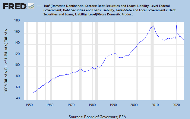
Private Debt 2012 (13): Per Dollar of Public Debt
| Graph #1: Dollars of Private Debt per Dollar of Public Debt, 1918-1970 |
 |
| Graph #2: Dollars of Private Debt per Dollar of Public Debt, 1952-2012 |
When the line goes up, times are good:
• 1920-1929, The Roaring Twenties
• 1947-1973, The Golden Age
• 1994-2000, The Macroeconomic Miracle
When the line is high, times are tough:
• 1929, start of the Great Depression
• 1974-1993, Small ups and downs here, suggesting only brief "good" periods.
When the line peaks there are problems:
• 1929
• 1974
• 2007
When the line falls dramatically there is Depression.

When the line goes up, times are good. But when the line is high, times are tough. This is the stuff cycles are made of.
The right remedy for the trade cycle is not to be found in abolishing booms and thus keeping us permanently in a semi-slump; but in abolishing slumps and thus keeping us permanently in a quasi-boom.
My idea is to use policy to keep the line flat, like 1974-1994, but to keep the flat at a much lower level, a level where the economy constantly wants to grow vigorously. We may not get Golden Age growth that way, but growth will be better that way than any other way. Sustainable growth.
Wednesday, March 28, 2012
Simon and Thomas: Simon
Reading Thomas Philippon's PDF Has the U.S. Finance Industry Become Less Efficient? the other day, I paused to review Simon Johnson's 2009 post The Nature of Modern Finance. This part struck me:
There is a great deal of research that finds finance is positively correlated with growth, but this work has a couple of serious limitations – if you want to derive any robust implications for policy.
First, it is about the amount of financial aggregates (e.g., money or credit, relative to GDP) rather than the share of financial sector GDP in total GDP. I know of no evidence that says you are better off with a financial sector at 8% rather than, say, 4% of GDP.
First, it is about the amount of financial aggregates (e.g., money or credit, relative to GDP) rather than the share of financial sector GDP in total GDP. I know of no evidence that says you are better off with a financial sector at 8% rather than, say, 4% of GDP.
Johnson raises other doubts about the relation between finance and growth, but I am focusing here on just the first of them.
A great deal of research in this area deals with financial aggregates, he says. Little or none deals with the size of the financial sector relative to GDP.
Thomas Philippon could have seen Simon Johnson's post and thought: Well let me see if I can fill that gap, for this is exactly what Philippon has done. But what Philippon does is not what I do.
I look at the monetary aggregates. But I don't prefer to look at money or credit, or total debt either, compared to GDP. People quite often tell me this is what I ought to be looking at. But my focus is elsewhere.
I compare money aggregates to money aggregates: Debt per dollar, for example. My graphs show the skewing within money, the stress and the cost within money that are created by thinning out a few dollars of base money into many dollars of debt.
GDP is not a result of the efforts of finance. The monetary aggregates are.
Tuesday, March 27, 2012
Simon and Thomas: Thomas
Thomas Philippon's 28-page PDF Has the U.S. Finance Industry Become Less Efficient? is an important analysis for anyone interested in understanding our debt-strapped economy. Philippon lays out his method and his conclusion in the Abstract:
I measure the cost of [financial] intermediation on the one hand, and the production of assets and liquidity services on the other. Surprisingly, the model suggests that the finance industry has become less efficient: the unit cost of intermediation is higher today than it was a century ago.
He gets to his evidence in the first paragraph:
The sum of all profits and wages paid to financial intermediaries represents the cost of financial intermediation. I measure this cost from 1870 to 2010, as a share of GDP, and find large historical variations. The cost of intermediation grows from 2% to 6% from 1870 to 1930. It shrinks to less than 4% in 1950, grows slowly to 5% in 1980, and then increases rapidly to almost 9% in 2010.
So before I'm two paragraphs in, I know how Philippon's story differs from mine.
The cost Philippon considers is the cost of wages and profits associated with finance and insurance. (The relevant statistics are often categorized as FIRE -- Finance, Insurance, and Real Estate -- but Philippon goes out of his way to exclude real estate.)
The PDF, basically, is an examination of wages and profits in the whole economy versus wages and profits in the financial sector alone. This is a reasonable approach, for the Statistical Abstract and other sources have long presented the numbers broken down into "Financial" and "Nonfinancial" categories.1 Philippon simply extends this breakdown to GDP itself.
In The Wealth of Nations, Book One, Chapter VI: Of the Component Parts of the Price of Commodities (summarized here), Adam Smith identified three categories that are today described simply as "land, labor, and capital." Smith wrote:
In every society the price of every commodity finally resolves itself into some one or other, or all of these three parts; and in every improved society, all the three enter more or less, as component parts, into the price of the far greater part of commodities.
The revenue derived from from labor is called wages. That derived from stock, by the person who manages or employs it, is called profit. The revenue which proceeds altogether from land is called rent, and belongs to the landlord. All taxes, and all the revenue which is founded upon them, all salaries, pensions, and annuities of every kind, are ultimately derived from some one or other of those three original sources of revenue.
From my perspective -- and Adam Smith's, I daresay -- the wages and profits of finance belong in the same categories as the wages and profits of the Nonfinancial sector, for they are payments to labor and to capital.
Philippon is doing good work. Exciting work, really, remarkable as that is in the field of economics. But he is looking at two of Smith's categories and for those categories he un-resolving the totals into separate subtotals. I do something completely different.
Money is a raw material of production, just as much as the oil or the soil; but it is not a product of nature, so it cannot be counted with land and its payment, rent. Nor is interest the same as profit or wages, as Adam Smith understood.
"The interest of money is always a derivative revenue," Smith said, derived from wages or from profit or from rent. In other words, interest is a cost different from wages and profits and rent, but evidently is one of the things that prices resolve into.
Wages, profit, and rent, are the three original sources of all revenue as well as of all exchangeable value. All other revenue is ultimately derived from some one or other of these.
Interest is not the same as wages. Nor is it the same as profit, as Smith points out. And it is not the same as rent as Smith used the term. So I am changing his definition, and counting "the interest of money" as a fourth original source of revenue.
In Smith's day there was an aristocracy, which owned the land; and there were laborers; and there was a growing business class. Three categories. Today little remains of the aristocracy. The growth of finance has created a new major cost category in the global economy. Thus it is counted in the statistics, and so it is considered on this blog.
Philippon considers as financial cost only the income to people working in finance. On my definition, Adam Smith's revised definition, this is not Financial cost. Just as wages are the payment to labor and profit is the payment to capital, interest is the payment to finance. And the payment to any sector is economic cost.
My approach to financial cost is completely unlike Philippon's. Both approaches matter. But if you are satisfied to think of the wages and profits in the financial sector as the full measure of the cost of finance, you are missing the bigger picture.
NOTES
1. In the 1970 edition of the Statistical Abstract, the first table in the Banking, Finance and Insurance section, Table 638, presents Flow of Funds accounts for "Financial and Nonfinancial Institutions".
But I searched the whole Banking and Finance section of the 1960 edition and turned up only one relatively minor table that separated out financial institutions: Table 582, Consumer Installment Credit, By Holder.
In the Business Enterprise of that 1960 edition, Finance is presented as one among several categories of enterprise, as in Table 620, Number of Firms in Operation.
The special treatment of Finance goes back at least to 1970, but not to 1960.
Monday, March 26, 2012
More than meets the eye
From Has the U.S. Finance Industry Become Less Efficient? (PDF, 28 pages) by Thomas Philippon:
One important point is that the model does not predict an income effect, i.e., just because a country becomes richer does not mean that it should spend a higher fraction of its income on financial services. Of course, income per capita is not a stationary variable, while the share of finance is bounded by definition. We can nonetheless look at long run changes in income and ask whether the share of finance tends to increase more when income growth is faster. Figure 4 shows that there is no mechanical relationship between the growth of income per capita and the share of finance. This rules out any theory that predicts that the finance share should mechanically increase with income.
And the Figure 4:
 |
| Source: Thomas Philippon |
I'm gonna want to say something about this graph, six months or a year from now maybe. Meanwhile I'm not sure what I want to say about it. Except this. Follow along with me from the end of the Roaring '20s and the start of the Great Depression:
Up at the very top of the graph, higher than anything else, we have 1930.
Drop straight down to the bottom, and a tad to the right, and we have 1940.
Go all the way over to the right and a tad up, and we have 1950.
Jump to the center of the graph and find 1960.
A little bit right from there, 1970.
Back to the center, 1980.
Up, to 1990.
Up again, to 2000. And we are back almost to where we started.
Since the 1970s, the trend has been up and to the left, toward the place we were at in the 1930s. And they say nobody saw it coming.
Sunday, March 25, 2012
On a scale of zero to four thousand...
...and against this background...
I quoted Ron Robins a year or so ago:
I just finessed that a little, and changed the 1.4 to 1.35. The following graph compares GDP and non-financial debt for the years through 1980:
...let us compare various measures of money:What must be noted is that for the thirty years prior to the late 1970s the credit-to-GDP ratio held steady around 1:1.4.
I just finessed that a little, and changed the 1.4 to 1.35. The following graph compares GDP and non-financial debt for the years through 1980:
 |
| Graph #1: GDP is red, Nonfinancial debt is blue |
AMBSL
 |
| Graph #2, comparing Base money |
M1SL
 |
| Graph #3, comparing M1 money |
M2SL
 |
| Graph #4, comparing M2 money |
M3SL
 |
| Graph #5, comparing M3 money |
MZMSL
 |
| Graph #6, comparing MZM money |
M1ASL
 |
| Graph #7, comparing M1A money |
M2ASL
 |
| Graph #8, comparing M2A money |
Yes, we have no conclusions.
Saturday, March 24, 2012
Dissecting Similarity
This is that Similarity graph from the other day, thru 1980:
|
| Graph #1: GDP is red, Nonfinancial debt is blue |
This is "Percent Change from Year Ago" for the same data, GDP and Domestic Nonfinancial Sector debt, for all the years:
 |
| Graph #2: This time GDP is blue, Nonfinancial debt is red. Oops. |
First, look at the low points: They're all blue. They're all GDP, the lows. GDP falls faster than debt. Debt does not fall as quickly as GDP. That's one thing that makes the debt/GDP ratio go up when it goes up (like during the Great Depression).
So if GDP almost always falls faster than debt, but the two lines travel together (as Graph #1 shows they do until 1980) then GDP must also rise faster than debt -- it must, or the two lines would veer apart.
And in the early years on this graph, before 1970 say, the high points are also blue. GDP did grow faster than nonfinancial debt.
But then in the 1970s, the red peaks are right up there with the blue peaks. And in the 1980s there is a gigantic red peak. And another, after 2000.
And in the 1990s, no peaks and no lows. "Moderation" they call that.
//
Summary:
Before 1970 there was balance.
In the 1970s, trouble was brewing.
In the 1980s, trouble arrived.
Friday, March 23, 2012
Less Similarity
Two days back I showed you a striking similarity between Nonfinancial debt and GDP, a similarity going back three decades before 1980:
|
| Graph #1 |
The similarity is somewhat less striking at the extremities when we compare Total debt and GDP for the same period:
 |
| Graph #2 |
Note that we are now comparing to 150% of GDP, not 135%.
You might want to say the two lines are still similar. But they are less similar. Now the blue line (debt) starts lower and ends higher than the red (GDP) line. Debt is growing faster. GDP is not keeping up.
Subtle? Sure. A subtle premonition of what was to come:
 |
| Graph #3 |
You might want to say there was no big difference between the lines until our economic policies changed in the 1980s. Well, okay. But I would remind you that those policies changed because there were problems already in the 1970s.
And I would point out that though the policies changed, there was no shift in the fundamental assumption that underlies policy: the assumption that we need credit for growth -- and more credit for more growth.
The only change in policy, really, was that we strengthened the urge to use credit. Since 1980, you don't have to zoom in, to see it.
Thursday, March 22, 2012
Private Debt 2012 (12): The Greek Problem
Paul Thomas Welty & Miriam Greenblatt, The Human Expression: World Regions and Cultures. fourth edition. Glencoe Division, Macmillan/McGraw-Hill, 936 Easewind Drive, Westerville, Ohio 43081-3374
Solon, who assumed power in 594 B.C., instituted both economic and political reforms. He canceled all land debts, freed those already enslaved because of debt, and placed a limit on the amount of land any one person could own. He also opened the Assembly, one of the two governing bodies of Athens, to all citizens rather than just landowners. Solon's reforms became a permanent part of Athenian government.
The period between Solon and Socrates includes the sixth and fifth centuries [B.C.], that is to say, the culmination and the end of the archaic age, and the finest flowering of the classical age.
In general, the lower classes were in a sorry plight; what their situation exactly was depends on some facts which cannot be regarded as clearly established. One thing we do know is that down to Solon, money economy hardly began to exert any influence at Athens. It was a question of land and its produce.
Solon seems to have given a law to prevent the unlimited accumulation of land...
We may still ask what caused the state of affairs in which a great many people had fallen into dependence... When a peasant tried to get help from a wealthy neighbour, it was quite common, as Solon expressly states, for the rich to make the most unfair use of their opportunities. Solon reproached them for 'avarice and arrogance', thus condemning on moral grounds what, he knows, was at the same time a grave social danger.
Solon was elected archon for the year 594-593 and was given full power. The foremost thing he did was to free the debtors and their land. He did this by cancelling all debts, and this was called seisachtheia, the 'shaking off of burdens'. It certainly was a radical measure, but the loss for the creditors did not touch the substance of their wealth. At the same time he forbade for the future all loans on the security of the person so that never again could a man, or his wife and family, be enslaved for debt. It is possible that he cancelled thereby a law of Dracon's....
Solon (638?-559? BC), Athenian statesman and legislator, considered the founder of Athenian democracy. Born of a noble family, as a young man he engaged in foreign trade, gaining valuable experience. During his lifetime, a crisis occurred in social and economic conditions in Greece. An agricultural depression had taken hold, and many free Athenian small farmers who could not pay their debts were sold into slavery. In 594 BC Solon was elected archon, or chief magistrate, to reform the oppressive conditions.
Solon immediately forbade borrowing on the security of the person of the debtor and canceled all current mortgages and debts.
Solon immediately forbade borrowing on the security of the person of the debtor and canceled all current mortgages and debts.
Wednesday, March 21, 2012
Similarity (addendum)
In a comment on my previous post, Anonymous wrote
The EU Commission has come up with an "Economic Scoreboard" that's supposed to help warn of developing macroeconomic imbalances. Interestingly , they've chosen a threshold of 160% debt/gdp for nonfinancial private debt :
http://www.europarl.europa.eu/registre/docs_autres_institutions/commission_europeenne/sec/2011/1361/COM_SEC(2011)1361_EN.pdf
I think this will turn out to be too high , since it's based on calculations derived from the period from 1994-2007 , i.e. , the boom years.
I think it is too high, too. I'm replying here so I can display a graph.
A threshold of 160% of gdp for nonfinancial debt.
No.
For nonfinancial private debt. Sorry. Okay. Under Domestic Nonfinancial (TCMDODNS at FRED) one finds
Household sector
Federal Government
State and Local Governments
Farm Business
Nonfarm Noncorporate Business
Nonfinancial Corporate Business
Gotta subtract Federal, State, and Local government debt to get private debt.
Okay, I can do that. But before I do...
Here it is. From a post that has not yet seen the light of day:
I always don't like it when big problems get talked down to little pieces. Take debt for example. The problem with debt is excessiveness. But people take debt and split it up into household debt, and corporate debt, and noncorporate debt, and financial debt, and government debt, and all of the pieces are pretty small, and the excessiveness seems to vanish, and then the problem seems to go away, but really nothing has been resolved, and I think it is nonsense.
So now I will go to FRED and find TCMDO DNS and subtract out the FG and SLG parts of it, and see what it looks like.
 |
| Graph #1: U.S. Nonfinancial Private Debt |
I know, the US is not the EU. But for the US, private nonfinancial debt at 160% of GDP was about two years away from the onset of crisis.
Why cut it so close? Why would we want to "warn of developing macroeconomic imbalances"? Why not just avoid them altogether? The whole graph shows chronic and growing imbalance. The only respite is the brief period from 1990 to 1993, which preceded and paved the way for the boom years that began in 1994.
Look at that graph again, the early years, to about 1965. That's a Golden Age economy, with minimal inflation. Then there's a kink in the trend and a slower increase during the Great Inflation.
I don't think the growth of debt slowed. I think the GDP number inflated up, and the faster-growing denominator gives us a slower-growing ratio.
What would be wrong with confining debt to the level it was at in the early 1960s? Before even the inflationary years. For I would gladly argue that the inflation resulted from the spending that was largely financed by all that debt.
I've been looking at the graph below for a few days, wondering what to say about it:
 |
| Graph #2 Financial debt as a percent of Nonfinancial debt (blue) Financial Debt as a percent of GDP (red) Nonfinancial debt as a percent of GDP (green) |
That first flat spot, thru the 1960s and '70s, sits at about 135% of GDP (as I showed earlier today).
The second flat spot, thru the 1990s, is well above 160%, at about 180% of GDP.
The third flat spot, in the current decade, rests at about 250% of GDP.
The numbers don't stop. It's not like we run out of numbers. We have to take the initiative ourselves and say No, not for our economy.
From a recent comment:
Another example of someone who doesn't quite get it - McKinsey :
http://www.businessinsider.com/us-debt-crisis-2012-3?op=1
They think it's just peachy that household debt/DPI is about to reach its long-term trend line , shown in Exhibit 7 , at about 100% debt/DPI.
That long-term trend line is , of course , upward sloping , implying that sometime in the future they will consider a 10,000% household debt/DPI just peachy too.
The decline we want is one that approaches that flat spot in the '60s -'70s.
That's what I'm sayin. But before the Great Inflation.
Similarity
I quoted Ron Robins a year or so ago:
What must be noted is that for the thirty years prior to the late 1970s the credit-to-GDP ratio held steady around 1:1.4.
I just finessed that a little, and changed the 1.4 to 1.35. The following graph compares GDP and non-financial debt for the years through 1980:
|
| Graph #1 |
Graph #2 shows the same picture, but it doesn't stop at 1980:
 |
| Graph #2 |
Assume for now that when we add Financial debt to the picture, even the similarity before 1980 is disturbed.
Tuesday, March 20, 2012
A Simple Test
Back on 2 January, Nick Rowe considered The 30 years non-war over the debt burden. "There are 4 possible positions to take on the debt," he wrote.
This is one of them:
3. Robert Barro/Ricardian Equivalence. 'The national debt is not a burden on future taxpayers (except for the deadweight costs of distortionary taxation) but only because ordinary people take steps to fully offset the burden on future generations by increasing private saving to offset government dissaving and increasing bequests to their heirs to offset the debt burden.'
Right away, or anyway by mid-March, I realized I could go to FRED and look at government dissaving and increases in private saving.
But I'm not sure what data series to use. GPSAVE, which FRED calls "Gross Private Saving" is nowhere close. I had to look at the annual changes in it to get anything close to Federal deficit numbers. Since the numbers are close, I went with that.
For the graph I corrected both the saving numbers and the deficit numbers for inflation, because there was an obvious hump during the Great Inflation and I thought it might distort the image of what was occurring.
For the Federal deficits I used FYFSD with a negative sign to make increasing deficits go up, and divided by 1000 to convert millions to billions.
I stopped the years at 2008 so that the gigantic deficit spike didn't shrink everything else down and hide the information.
 |
| Graph #1: Annual Change in Gross Private Saving (blue) and Federal Deficits (Inverted) Both adjusted for inflation |
Looks like the two time series traveled roughly together until about 1980. Dunno how the Barro hypothesis would stand up during that early period. Correlation aside, the two do seem to run flat together before 1967 and then climb together from 1967 to 1980. Even with the inflation removed.
But the similarity doesn't appear to stand up at all after 1980. Deficits were particularly high until about 1992, then fell dramatically during the budget balancing years, and then spiked up sharply again. None of this is reflected in the blue line that shows saving.
So, during the years that Ricardian Equivalence has been helping to guide policy, it seems *not* to be true that "ordinary people take steps to fully offset the burden on future generations by increasing private saving to offset government dissaving".
If this is the right measure of saving.
Now I don't know. I put Gross Private Saving (GPSAVE) in blue on Graph #2 below. And Personal Saving (PSAVE) in red. And the annual changes in Gross Private Saving, in green. The green one is the same shown on Graph #1 above in blue, which matched fairly well for a while.
 |
| Graph #2: Gross Private Saving (blue), Personal Saving (red), Changes in Gross Private Saving (green) |
What Graph #2 shows is that both GPSAVE and PSAVE are much larger than Federal deficits. And Graph #1 shows that the changes in GPSAVE have not been near in size to Federal deficits since we elected Reagan.
And just to give a bit of context to Gross Private Saving...
 |
| Graph #3: Gross Private Saving (blue) and all the spending money we have (red) |
... since around 1972, with very few exceptions, Gross Private Saving has been more each year than all the money we have for spending.
For what it's worth.
Monday, March 19, 2012
It's tough to fight human nature
Even my prefaces have prefaces.
Ran across these remarks the other day while trying to document something else. Maybe they make a good opening for where I want to go today.
Jazz said something about economic policy driving us "into depression, fascism, and neo-feudalism."
"And dark age," I added. "It's all part of the cycle of civilization."
To which Greg replied:
This cycle is not predetermined, rendering us helpless to stop it. It is all due to our choices, our policies, our (mis)understanding of human nature and our deference to authority figures who have no business being in charge. I cant go on believing we are stuck in a repeating cycle and are helpless to stop it. We simply need to lift the veil form our eyes and see what bad choices we've made in putting ourselves here. We CAN control where we want to go to a much greater degree than we give ourselves credit for.
I expressed strong agreement with Greg on that, but added:
However, given the fixity of human nature, continuation of the cycle is the most likely outcome.
As Arnold Toynbee observed, civilizations die by suicide.
For thoughts on the Cycle of Civilization, click the "label" on that topic in the sidebar. And in particular see these notes.
On the 14th I quoted Paul Mason but ignored this bit of the quote:
So what is "financial repression"? Put simply it is a combination of inflation and capital controls designed to erode the value of debts - and therefore of savings. It is overtly designed to prevent market mechanisms responding to inflation, leaving the price of borrowing too low and the return on savings too low.
I'm not sure that eroding debt must necessarily erode savings. Many people argue that "loans create deposits" and that banks do not need to have deposits in order to lend. If a bank doesn't need to have a supply of savings in order to lend money, the presumed strong connection between savings and debt comes into doubt.
So then it might be possible to reduce debt without reducing people's savings. And that's a good thing, because everybody thinks saving is a good thing and nobody wants to reduce their savings. Yet we must reduce debt.
The Paul Mason quote is from his article titled Repressionomics - can 'financial repression' solve debt crisis?
The word "repression" occurs twice in that title. Do you think he opposes the policy? You can bet he does.
What do we have in the excerpt?
• Capital Controls. This sounds like government control, and everybody hates government control.
• Inflation. And everybody hates inflation, except people who have already given up on economic policy.
• Erosion of Savings. And nobody wants that, not even the people who have given up on policy.
• The return on savings too low. And nobody wants that, not even the people who have no savings, because everybody wants to have savings.
And there is more in that little excerpt designed to get you opposed to "financial repression" -- It is overtly designed to prevent market mechanisms responding to inflation, for example.
Convinced yet? Paul Mason opposes financial repression. By definition.
Why? It's human nature, I think. He's got a little money stashed away, maybe, or wants to have. And he sees this policy that is an attempt to solve the severe economic problems that were exposed by the crisis, and he sees it as an attack on his savings or his potential savings. And he responds like a cornered coyote.
For the record, Paul, it's nice to start a definition with a little objectivity.
The way Paul Mason approaches his definition of financial repression is a full-bore assault.
Why? Human nature. He is defending his interest, defending his own.
It doesn't matter to him that his approach might be the approach that moves civilization closer to its demise rather than farther from it. It doesn't matter to him, I suspect, because he never even considers the possibility.
Why? Human nature. He is defending his interest, defending his own.
We can depend on people to defend their interests. The tougher times get, the more protective of their interests people become. It's human nature.
This is the reason civilizations die by suicide.
Paul Mason is right about one thing. Everybody who is not with him on this, is someone who thinks inflation is a solution to the debt problem. Everybody except me.
I think we can solve the problem of excessive debt not by means of inflation -- and we can slow the pace of inflation not by jacking up interest rates -- but by using tax incentives to accelerate the repayment of debt.
Two birds. One stone.
Sunday, March 18, 2012
Threepeat...
You cannot imagine what a relief it is for me to know that there is an actual economist who tells a story so similar to the story I tell.
It is also pretty weird to come home from work, have dinner, turn on my computer before dark on Wednesday, 14 March, and read a post by Steve Keen that was posted on Thursday, 15 March at 8:50 the next morning.
(As I write this it is still only 1:49 in the morning of the 15th. I woke up thinking about Keen's graph that I am about to show you.)
In Economics without a blind-spot on debt, Steve Keen writes
“Neoclassical” economists (who dominate both academic economics and policy advice to governments) have a blind-spot about the role of private debt in macroeconomics, yet despite the economy crashing once before because of it during the Great Depression, they continue to argue that it’s irrelevant now—during this latest crash.
Emphasis added. Keen continues:
Data on long-term private debt levels is difficult to find, but I’ve located it for both the USA from 1920 till today, and for Australia from 1880 (see Figure 1).
Wow. Glad to see I'm not the only one who uses the word "data" as if it were singular. Never sounded right to me to say "Data are..." I usually use "The numbers are..."
Anyway, Keen:
Figure 1

Clearly, there was a debt bubble before the Great Depression, and a plunge in debt levels during and after it (and Australian data also shows the same phenomenon during an earlier bubble and crash in the Depression of the 1890s; see Fisher and Kent 1999). The same process is clearly afoot again now.

Clearly, there was a debt bubble before the Great Depression, and a plunge in debt levels during and after it (and Australian data also shows the same phenomenon during an earlier bubble and crash in the Depression of the 1890s; see Fisher and Kent 1999). The same process is clearly afoot again now.
What woke me up is not that the process is afoot again now, but that the Australian
The 1890s, the 1930s, and today. That's three debt crises.
And you know what? The 1840s, too. Back last November Nick Rowe wrote a post called Why has (private) debt increased? In a comment on that post, Min wrote
The U. S. also had a run-up of private debt before the depression of 1837 - 1843. That was fueled by land speculation, not consumerism.
So: 1837-1843, the 1890s, the 1930s, and today. Four debt crises. Unfortunately, the numbers get harder to find as you go back in time.
Actually, it's pretty hard to find numbers on private or total debt, even today, even on the Internet.
But anyway, Keen has documented three debt crises. And I woke up remembering that Shiller has documented three:
A graph of Shiller's interest rate data going back to 1871 shows three longwave peaks. Not two:
The graph also seems to show "secondary" peaks at the lows: one in the neighborhood of 1894, and another at the time of the Great Depression.
 |
| Graph #1 |
Three peaks, as with Keen's graph. Plus secondary or minor peaks or hints of peaks that coincide with the debt crises that occur after the interest rate peaks.
Each time, the interest rate peak precedes the peak of debt. The years following the interest rate peak are -- I was going to say "years of increasing financialization" but that is not correct; almost all the years are years of increasing financialization.
The years between the interest rate peak and the debt peak are years of financial dominance and must therefore show a relative slowing of output growth (and more rapid growth of finance).
The years after the debt peak are years of decreasing financialization -- as we seem to be experiencing now. My Debt-per-Dollar graph shows one such peak during the FDR years, and the presumed beginning of another decrease in 2008.
My debt numbers don't go back far enough to show the third peak, the 1890s peak that Steve Keen points out. Interestingly, my graph does show a similar event (generated by policy) in the early 1990s. This strongly suggests that debt crises can be solved or even prevented by the appropriate use of policy. (One question remains: What is the appropriate policy.)
Here's an analysis of the 1990s event.
The graph below from mine of 2 December 2011 shows Debt-per-Dollar and part of the Shiller interest rate data. But this graph is short, and lacks the 19th-century peaks:
| Graph #2 |
Saturday, March 17, 2012
A Glitch in the Matrix
You're gonna want to actually do this.
Go to FRED, in the search box type TCMDO, and press ENTER. // Not case-sensitive.
Just below the graph, under the FRED logo, it says EDIT GRAPH. Click that.
See how the blue line, the line showing the TCMDO values, starts two or three years after 1950? But if you read the "Observation Date Range" two or three lines down, it says the numbers start in 1949.
Actually it says they start in October of 1949. So, that might look like 1950 on the graph rather than 1949. But it shouldn't look like 1952 or 1953.
Maybe in the early years the numbers are just so low that we don't see them?
On the "Observation Date Range" line, click once in the box that states the end-date for the graph. FRED gives you a calendar. Click the drop-down for the year, scroll up a bit, and click 1960. Click Close to close the calendar.
A few lines down, click Redraw Graph to redraw the graph. FRED gives you a new picture, and we are now zoomed-in on the early years. You can see that the numbers start in 1952 or late 1951, not in 1949 or 1950.
That's not a glitch. The numbers for TCMDO start with 1949, but those are annual numbers. The quarterly numbers start a bit later.
Now, down below the "Redraw Graph" button, find the gray bar that says Add Data Series and click that. By default, the option is selected to give you a "new line". That's good. Click in the blank input box on the next line down (between the words "Search" and "Browse"), type TCMDO and press ENTER. Now you get a new picture, like the first one you had, except the line is red this time.
Up a little bit, click on the gray bar for Line 1: Total Credit Market Debt Owed (TCMDO). On the "Observation Date Range" line, click Copy to All Lines to copy the dates we're using for the blue line, to the red line. Click Redraw Graph.
Now you get the zoomed-in view, but only one line is visible, in red, because the red and blue lines are identical and the red one is on top.
We can change that.
If you've been following along here, doing it at FRED, you're now looking at the "Line 1" information. A couple lines down from the "Observation Date Range", the "Frequency" line reports that the frequency is "Quarterly, End of Period". (Don't change that.)
At the bottom of the "Line 1" info is the "Redraw Graph" button, and just below that is the gray bar for Line 2: Total Credit Market Debt Owed (TCMDO). Click that.
Change the "Frequency" for Line 2 to Annual and click Redraw Graph.
Now you have two lines -- the blue one we couldn't see before, and a red one parallel to it, a bit higher and more to the left.
The red line is smoother because it shows annual rather than quarterly data. And the red line is more to the left because the annual numbers start in October, 1949.
On the "Frequency" line we're looking at, for Line 2, the frequency is given as "Annual" and to the right of that, the "Aggregation Method" is "Average".
Click the drop-down for "Aggregation Method", select Sum, and click Redraw Graph. The red line changes dramatically. It jumps way up as soon as the blue line starts, and rises faster than the blue line -- apparently because it adds each new value to the previous total. So that's "Sum".
Click once again the drop-down for "Aggregation Method" and this time select End of Period. Click Redraw Graph. The red line changes, and now looks like a smoother version of the blue line, again a bit higher and to the left.
But is it the same as the default, the aggregation method called "Average"?
Click on the gray bar for Add Data Series and on a new line put TCMDO once again. Click the gray bar for Line 1: Total Credit Market Debt Owed (TCMDO), on the "Observation Date Range" line click Copy to All Lines, and click Redraw Graph.
Now the new green line hides the original blue line, because both show quarterly data. We'll change the new line.
Click the gray bar for Line 3: Total Credit Market Debt Owed (TCMDO). Change the "Frequency" from "Quarterly, End of Period" to Annual.
To the right of that, the "Aggregation Method" appears, with the value "Average". That's fine, don't change it.
Click the Redraw Graph button.
Now you have three data lines, all pretty much parallel. The blue line is our original version of TCMDO, which shows quarterly data. The red line shows annual data using "End of Period" aggregation. And the green line shows annual data using the "Average" method.
Oh. In case you don't know: By default FRED uses blue for the first line you put on a graph, red for the second, and green for the third line. That's useful, because it helps you interpret the graph.
The next line we add will be orange, because it is line number four.
Now it gets interesting. Take another look at the graph before we continue: Three lines pretty much parallel, and a maximum value on the vertical axis of 800 -- 800 billion dollars.

Okay. Click the gray bar for Add Data Series and add one more new line, again TCMDO, same as before. When you hit ENTER, the graph is redrawn for you. But we have to fix the ending date again. Click the gray bar for Line 1 and (on the "Frequency" line) click Copy to All Lines. Click Redraw Graph.
Observe that Line 1 (the blue line which we can't see because the orange line covers it completely at the moment) has the frequency "Quarterly, End of Period". Change nothing.
Click the gray bar for Line 2 (the red line) and observe that it has "Annual" frequency and "End of Period" aggregation. Change nothing.
Click the gray bar for Line 3 (the green line) and observe that it has "Annual frequency" and "Average" aggregation. Change nothing.
Click the gray bar for Line 4 (the orange line). The frequency is quarterly, like the first line. (That's why the orange line hides the blue line.) I want to change the frequency and aggregation for the orange line.
Change the frequency to Annual.
The aggregation method, by default, is "Average". Leave it. Click Redraw Graph
I see four lines:

But I shouldn't see four lines. I should see three. The orange line shows "Annual" data and "Average" aggregation, exactly the same as the green line. The orange line should hide the green line. But it doesn't. This is a glitch, a FRED glitch. Wow.
Now, let's finish up. For Line 4 change the aggregation method to Sum and redraw the graph. I get spikes all over the place:

The green line has spikes. The orange line has spikes. And the red line has spikes. So, changing the aggregation method for Line 4 to "Sum" affected Line 4 and Line 3 and Line 2.
This is definitely a glitch.
Wow.
// UPDATE 21 March 2012
I notified the St. Louis Fed about this glitch. Monday they said they had replicated the error and were looking into it. Tuesday evening they said they got it fixed.
Your
Don't get all Hyper!
#1
At work we got notified by one of our suppliers of an impending price hike. Our reaction is to put a big order together ASAP, and buy that stuff for all the jobs we have and most of the jobs we hope to get.
Inflation accelerates spending.
#2
People say printing money causes inflation. But that's informal. Really, it isn't the printing that causes inflation. It's the spending.
Spending causes inflation.
#3
Spending causes inflation, and inflation accelerates spending.
That's why sometimes inflation becomes hyperinflation. It wants to be a self-reinforcing feedback loop.
Friday, March 16, 2012
The Freeman on Rent-Seeking
Here.
I've been looking for a definition.
I thought it was interesting, in the first note after the article they distinguish between rent and rent-seeking.
Thursday, March 15, 2012
Private Debt 2012 (11): The Economy Is Transaction
No matter what happens in the economy, it happens with money, or it happens for money, or both. So the cost of money is an absolutely crucial element of economic performance. If the cost of money is too high, it interferes with everything.
No, not just the interest rate. The interest rate is the cost of credit. The cost of money is the cost that arises from applying the interest rate once for every dollar of existing debt. In an economy with lots of debt, the cost of money must necessarily be high, no matter the rate of interest.
In an economy that cannot grow because "interest rates are at the zero bound" and cannot go lower, one can reduce the cost of money only by reducing the reliance on credit. By paying down debt. Or cancelling debt. Or somehow getting rid of debt.
 |
| When the crisis hit, the Federal debt (red) was 10% of Total (TCMDO) debt |
Wednesday, March 14, 2012
"Repressionomics"
At BBC News Business, Repressionomics - can 'financial repression' solve debt crisis? by Paul Mason:
It was economists Carmen Reinhart and Belen Sbrancia who, in March 2011, issued a ground breaking study of what "financial repression" means.
If we hear today the National Association of Pension Funds complaining that quantitative easing has placed a £90bn hole in the pension system, we can judge how rapidly the concept of "repression" is moving from theory to practice.
So what is "financial repression"? Put simply it is a combination of inflation and capital controls designed to erode the value of debts - and therefore of savings. It is overtly designed to prevent market mechanisms responding to inflation, leaving the price of borrowing too low and the return on savings too low.
Reinhart and Sbrancia pointed to the success of Western economies in "repressing" a mountain of debt after World War II - in a way that avoided fiscal austerity, and allowed a growth spurt, combined with inflation, to cancel out unsustainable debts.
No link, Paul?
The "mountain of debt after World War II" is not the same as today's mountain. After World War II it was a government mountain. The mountain of private debt that had created the Great Depression was gone, "eroded" by repayment, default, inflation, and the rocketing government debt of the second World War.
The mountain after that war was public debt; the mountain today is private debt.
And the "success" of Western economies in "repressing" debt after the war can be attributed largely to the economic growth that was made possible by the relative absence of private debt. But economic growth since the war was accompanied (and financed) by the growth of private debt.
Private debt grew until it hindered economic growth. Then government debt started growing again, and policies were put in place to encourage private credit use. But those policies failed to boost growth, because private debt was already excessive.
Reinhart and Sbrancia don't seem to see it that way:
Hoping that substantial public and private debt overhangs are resolved by growth
may be uplifting but it is not particularly practical from a policy standpoint. The
evidence, at any rate, is not particularly encouraging, as high levels of public debt appear to be associated with lower growth.
may be uplifting but it is not particularly practical from a policy standpoint. The
evidence, at any rate, is not particularly encouraging, as high levels of public debt appear to be associated with lower growth.
"High levels of public debt appear to be associated with lower growth." This is not true for the United States during the "golden" years after World War Two. High levels of public debt were associated with higher growth because private debt was low and did not interfere with private sector growth!
Related posts:
1. Debt Relatives
2. Debt Relatives: Uncle Sam
3. Debt Relatives: The Cousins
4. Debt Relatives: The Rise and Fall of the Non-Federal Relative
Tuesday, March 13, 2012
The analysis is incomplete
JW Mason links to Seven unsustainable processes, again? (short PDF) which contains two quotes that caught my attention. First:
Godley (1999) pointed to seven unsustainable processes which could harm U.S. growth prospects. In our view, a longer, deeper crisis was averted in 2001, without addressing the underlying growth problems, so that the next (current!) crisis was more severe.
Sure, okay. And the rest of that thought, too:
It follows that if the remaining imbalances are not addressed by appropriate policy measures, resuming growth under the same demand patterns will imply further instability.
Yeah. Except for one thing. This pass-the-buck approach to dealing with the longer, deeper crisis does not go back only to 2001. It goes back at least to 1974.
Second:
Some commentators put the blame on monetary policy for keeping interest rates too low, and therefore allowing an ever increasing level of debt.
In our view, low interest rates helped defer the crisis.
Again, sure... Low interest rates DID help defer the crisis. And low interest rates did contribute to the expansion of debt, or at least, did nothing to slow it.
Low interest rates postponed the inevitable and made it worse -- exactly as the PDF posits in the first quote.
It seems to leave us between the rock and the hard place: Jack up interest rates and suffer the consequences now, or leave 'em low and suffer worse, later. But the analysis is incomplete.
I insist: The analysis is incomplete.
Our assumptions so thoroughly permeate our thinking that we fail to see what we're doing wrong. We think we need credit for growth. So we see nothing wrong with increasing our reliance on credit, and increasing it more. And then increasing it more.
And then increasing it more.
But we don't need credit for growth, not so much. Certainly we do not need a volume of credit equal to three and one-half times GDP. One-fifth of GDP is probably twice what we need for growth.
Thing is, we don't just use credit for growth. We use credit for everything. And we don't pay it off. We let it accumulate. We use credit like money and let debt accumulate. We make financial crisis inevitable.
But it's not like we had a choice. It's policy. We use credit for growth because policymakers think credit is good for growth. And they set that in stone.
Oh, and the other thing: They think printing money causes inflation. So the cheap money, interest-free money, there's almost none of it around. But there is plenty of expensive money in use, as evidenced by the size of private debt.
And when the expensive money contributes to inflation, policymakers further restrict the quantity of cheap money, and make the expensive money more expensive. What they ought to do is encourage more rapid repayment of existing debt, to fight inflation.
Monday, March 12, 2012
Mason Rowe
JW Mason:
One of the things you hope students learn in a course like this is that money consists of three things: demand deposits (checking accounts and the like), currency and bank reserves. The first is a liability of private banks, the latter two are liabilities of the central bank. That money is always someone's liability -- a debt -- is often a hard thing for students to get their heads around, so one can end up teaching it a bit catechistically.
Nick Rowe:
...if the central bank money is not redeemable in anything, it's not really a liability...
Point Rowe.
Sunday, March 11, 2012
Prescience
There is no special reason to doubt that exceptional growth will continue...
From The Golden Age of Capitalism, by Stephen A. Marglin, page 39:

Saturday, March 10, 2012
"In Woodford (2011), the word 'debt' occurs just once."
Today's featured publication at the St. Louis Fed -- go to
and hover over Publications on the menu bar -- is The Federal Reserve Bank of St. Louis Review. The first item on the "In This Issue" list is Death of a Theory, a 20-page PDF by James Bullard, President of the St. Louis Fed.
He's sharp, Bullard is. I never read his stuff until I read David Andolfatto's What output gap?. But Bullard has a way of capturing in a single paragraph ideas I sometimes struggle with for months. Not saying I often agree with the guy, but he does come up with some very quotable quotes.
This is not especially one of them:
In Woodford (2011), the word “debt” occurs just once. This is because, within the setting analyzed there and in most of the literature, there is nothing special about government borrowing, as it indicates only that taxes will be collected in the future in such a way that the net present value of taxes and expenditures are equal. Debt might represent a problem only to the extent that it means that the proposed increases in government spending today are not being matched by taxes collected during the same period...
Notice that when Mr. Bullard uses the word "debt" here he is thinking specifically of "government borrowing" and "government spending" and "taxes". When he uses the word "debt" he means only the Federal debt.
When he uses the word "debt", he neglects 80% of debt.
Mr. Bullard, sir, I like ya, but you're never gonna see the problem if you refuse to look at the problem.
 |
| Gross Federal Debt (the big one) as a percent of Total Credit Market Debt Owed |
I count the words as you do, Mr. Bullard. But it's important to count the debt, too.
Fascination
Among the popular series listed at FRED at the moment:
M2 Money Stock 7 hours ago
M1 Money Stock 7 hours ago
So, I clicked M1.
 |
| Graph #1: M1, the quantity of spending-money or money in circulation |
 |
| Graph #2: Rate of change of M1 money, near 20% for some time now |
Hey, I don't make predictions. I'm not saying we *won't* get inflation. I'm not saying we will. What I am saying is that I think it's silly to grab one fact and start drawing conclusions.
One fact: M1 money has been going up.
So it has. Now, let's go get one more fact. Let's get GDP, and compare M1 money to the size of the economy, like this:
 |
| Graph #3: The size of circulating money, relative to the size of the economy, since 2008 |
Not yet. Because we're just looking at the crisis years. The unusual circumstances. Maybe this increase is altogether unusual. I need to know more.
I want to look at M1/GDP for all the years that FRED will show:
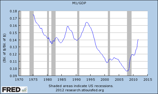 |
| Graph #4: The size of circulating money, relative to the size of the economy, since 1975 |
And if you look back to the left along the 14-cent line, you can see that we were at this level before. We were at this level in 1990, and also in the early 1980s just as Paul Volcker was bringing inflation down from those double-digit increases of the 1970s.
And then as inflation came down in the 1980s, the money/output ratio shows a small hump (before 1985) and a big hump (between 1985 and 1990) and another big hump starting around 1990 and peaking around 1994. And then the really big decline that takes us to the year 2000.
That big decline occurs at exactly the same time that the Federal budget came into balance during the Clinton years. Money was taken out of circulation by the Federal government, and used to pay down debt. So there was less M1, so the line goes down.
Before the early 1980s, the graph shows a decline from something over 17 cents of money per dollar's worth of output. But this graph only goes back to 1975.
To see farther back in time, I had to switch to a different data series. The M1NS series takes us back to 1959. And you can see that from 1959 to the early 1980s, there was a more or less continuous decline in the quantity of money relative to output -- 28 cents in 1959, half as much twenty years later:
 |
| Graph #5: The size of circulating money, relative to the size of the economy, since 1959 |
 |
| Graph #6: The size of circulating money relative to the size of the economy, and prices |
And over there on the far right, in the bottom corner, the money ratio finally fell below ten cents, and then we had the sudden crisis that nobody saw coming. And then policymakers decided to push the quantity of money back up to about where it was in 1980, apparently.
And despite all that, for the whole time, prices kept going up.
Subscribe to:
Posts (Atom)
