Friday, September 30, 2016
 Richard Vague has a great new article on debt
In Democracy: A Journal of Ideas, The Private Debt Crisis by Richard Vague. Best thing I've read in a long time.
They call it a 28-minute read (so you know).
Do I agree with it? Not with everything, no. Not with his solution and not with parts of his analysis. But most of his analysis and all of his observations are just right.
Recommended reading.
Wednesday, September 28, 2016
On the Size of those Debt Bulges
Looking at the second graph from the 25th, I wonder how the bulges got so big:
 |
| Graph #1: Public (red) and Private (blue) Debt Paths, with Path Average (dashed black) |
 |
| Graph #2:Red and Blue as a Percent of their Average from the Previous Graph |
In addition, I think I see a bulge now between the 1970 and '74 recessions. The blue and red lines didn't come together for the 1970 recession, but that doesn't mean there's no bulge after it.
So apparently the growth of debt in general has something to do with the size of the bulges. But that's not the only factor, because bulge size still varies. What could it be?
I'd like to say vigor, it's a measure of vigor, but that seems quite obviously wrong.
Hey, know what I just noticed? Look at just the blue line: It reminds me of the private-to-public debt ratio:
 |
| Figure 3: Non-Federal Debt relative to the Federal Debt |
Tuesday, September 27, 2016
Firming up my best guess
Yesterday's conclusion:
So what does this tell me? If I remove even one piece of data from the Bulge 3 calculation, the predicted date of recession could change substantially. Or if I do this calculation again after the next release of data, the predicted recession date could change substantially. I guess nothing can be done about that.
After I said that, I went on to guess what my graph would look like if I changed it. I made a guess about how soon the graph would predict recession... uh, I mean a guess about the soonest a recession could be predicted to occur based on changing the selection of data on which the prediction is based. If you get my drift.
I don't like guessing. So again I will start with Graph #6 from Sunday's post.
 |
| Graph #1: Predicting the Closing of the Current Bulge |
 |
| Graph #2: The Current Bulge |
The solid line shows Federal debt data from FRED (the series GFDEBTN) indexed to 1980 Q1, with each year's average of indexed Federal and Private debt subtracted out. It's a simple calculation, but I haven't been looking at it long enough yet to describe it easily in words.
No matter. What I want to do today is show a bunch of trend lines for different subsets of the data. and see how they compare to the dashed red line. If they curl down faster than the dashed line, it indicates the recession will occur sooner than the date I predict. If they curl down more slowly, it suggests the recession will occur later.
I anticipate that recession will occur where the dashed red line crosses the 100.0 level. That's about where the solid red line was the last time a recession started. So when we look at the trend lines I'll add, we should look at the 100.0 level, look straight down from there, and get the date from the x axis.
//
I'm not going to start by showing the trend lines. I'm going to start by looking at R-Squared values for different subsets of the solid red line. I'll get the value for all the data shown (2007Q1 to 2016Q1), then drop the first data item and get the value again, then drop the next data item, and repeat. My goal is to get both the highest R-Squared and the most data. But R-Squared is my higher priority.
I'm writing the R-Squared values in the spreadsheet linked below.
R-Squared reaches a peak of 0.99504834 in 2008 Q1. So I will use this as the start-date for the data on which the trend lines are based.
 |
| Graph #3: Finding the Start-Point for Trend Data Selection |
Now that I've got a starting point, I can select a bunch of different end-points and use these different subsets of the data to create different polynomial trend lines. There should be a lot of them when I'm done, and it would be too messy to identify each one. So I won't identify them on the graph. (You can pick thru the spreadsheet if you want.)
My objective is to get an impression from the several trend lines I'll create. I'll call this impression my best guess of what the trend line should be. That best guess will give me a start-date for our next recession. That's what I want to see.
//
Just reading this over. It's amazing how many times I say I "start":
• I will start with Graph #6 ...
• I'll start by eliminating the blue line ...
• I'm going to start by looking at R-Squared values ...
Now I'll start with the last available data (2016 Q1) and use the 2008Q1-2016Q1 period as the base data for my trend line. Then I'll drop the last data used, giving me a different subset, and add a trend line for that one. And I'll keep repeating the process until I get tired of it. Or till I discover something interesting.
//
Okay. Wrote a little VBA to delete and add trend lines for me, and make them second order polynomials. Here's the first bunch of trends I came up with:
 |
| Graph #4: Trendlines Based on 2008Q1 Start Date and 2011Q1 to 2016Q1 End Dates |
The wild hair is the trendline for the series that ends with 2011 Q1. As you can see on Graph #2, 2011Q1 is on the early part of the line labeled "Public", maybe just before the jiggies start. Continuing this trend line out till it reaches down to the 100.0 level would bring us to our next recession some time around 2050.
I know we'll have another recession long before 2050, so I'm going to throw the wild hair away.
Working our way down the right edge of the graph from that wild hair, the trend lines we come to (in order) are: 2011Q2, 2012Q1, and 2012Q2. After that they get pretty dense. I'm going to delete the six earliest-ending data series (2011Q1 thru 2012Q2) and look at what's left.
Hey, it looks better already. I also want to start the low value of the vertical axis at 100.0 because, when the trend line gets to that level, that's when I think the recession starts.
Plus I put some tick-marks on the x axis:
 |
| Graph #5: Trendlines Based on 2008Q1 Start Date and 2012Q3 to 2016Q1 End Dates |
Eh, I'll be dead by then.
// the Excel file
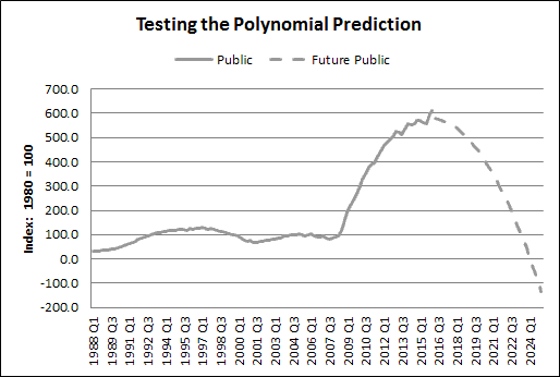
Monday, September 26, 2016
Testing a prediction
Yesterday I made a prediction about our next recession: It won't happen until 2022-2024. It's six years out, or more.
The accuracy of that prediction depends on many things, no doubt. But one of the things it depends on is how well the future paths of public and private debt conform to the paths predicted by Excel's trend lines.
There are things we cannot know, like future "shocks" that divert debt from the predictions. Such things are beyond the scope of prediction. I should say, though, that on yesterday's graph I see little evidence of shock-induced diversion in past data.
Apart from the unknowable, the accuracy of the prediction depends on whether the polynomial trend calculation that I used is suited to the behavior of the debt numbers. I mean, I didn't use the linear trend calculation (for example) because I don't expect debt to follow a linear path. Maybe it won't follow the polynomial path, either. In that case, my predicted timing of the next recession would be incorrect.
I can test for this. Here's Graph #6 from yesterday:
|
| Graph #1: Predicting the Closing of the Current Bulge |
 |
| Graph #2: A Look at Three Bulges |
Below is the same graph from FRED (modified from yesterday's Graph #3). It lacks the estimate of the future path of debt. But it shows when recessions occurred:
 |
| Graph #3: Public Debt, relative to Public & Private Average; Indexed Values |
Returning to the Excel graph, I show the first half of each bulge in red:
 |
| Graph #4: The Left Half of Each Bulge Is Indicated in Red. (I use the word "half" loosely.) |
Obviously the trend line for bulge 3 (the rightmost bulge) will match perfectly, because I used the same trend line yesterday to develop the dashed gray line.
The other two bulges provide the test. If the black trend lines match the gray data for the bulge of the 1990s and the bulge of 2001-2007, then my confidence is increased that the dashed gray line is a good estimate of the future path of debt. And if that is the case, my confidence is increased that my predicted date of our next recession is also a good estimate.
So here is the graph with the trend lines:
 |
| Graph #5: Polynomial Trend Lines Added |
For Bulge 3 (rightmost) the trend line is a perfect match (of course) because the dashed gray line was modeled on that trend line. So this one doesn't count.
Bulge 2 is a bit of a problem. The trend line runs higher than the gray half of the bulge.
But let me show you what happens if I make the red part of Bulge 2 longer by one piece of data:
 |
| Graph #6: Bulge 2 Trend Line Adjusted Trend Source Data Now Ends at 2005 Q3, not 2005 Q2 |
So what does this tell me? If I remove even one piece of data from the Bulge 3 calculation, the predicted date of recession could change substantially. Or if I do this calculation again after the next release of data, the predicted recession date could change substantially. I guess nothing can be done about that.
But I don't think there is anything in the red part of Bulge 3 that, if I play with data selection, would bring the predicted recession date to anywhere within the next three or four years. I think the soonest we could have that recession is around 2020. And I could only get that by ignoring data we have.
I'll stick with yesterday's prediction.
// the Excel file
Sunday, September 25, 2016
Bulges
A version of yesterday's graph where both series are quarterly:
 |
| Graph #1: Public (red) and Private (blue) Debt Path Comparisons |
I want to put a line right down the middle between the red and blue lines, like a centerline.
|
| Graph #2: Public and Private Debt Paths, with Path Average (dashed black) |
If I take the black line and subtract it from itself and show it on a graph, it will be a nice, flat line at the zero level. That makes sense, right?
If I take the red line and subtract the black line from it, I will keep the basic shape of the red line but transform it down so it runs somewhat above the zero line. If I do the same for the blue line, it will run a little below the zero line.
 |
| Graph #3: Indexed Public (red) and Private (blue) Debt with their Average Subtracted Out |
The text at the top of the graph was taking too much space, so I deleted the dashed black line. Couldn't see it anyway, as it was hidden by the horizontal axis.
I see something in #3 that I couldn't see in the earlier versions of the graph: There is a bulge between the 2001 and 2009 recessions. So that makes three bulges, not two.
And if you get a close-up of the graph, you can see a bulge between the 1974 and 1980 recessions, and a little one between the 1980 and '82 recessions. Lots of bulges, then. And what I said yesterday -- recessions come when the bulges close -- is confirmed.
Since it appears the bulge on Graph #3 is not going to close any time soon, I don't think we'll have a recession for another five years at least. Probably longer.
//
Upon close inspection I see no bulges before 1974. In other words, the bulge doesn't close for the 1970 recession. But the data (inexplicably) only goes back to 1966, so I can't talk about recessions before 1970.
The bulge doesn't close for the 1991 recession, either. But I might be able to explain that one: private debt growth slowed a lot between 1985 and 1992. This unusual debt behavior is probably somehow related to the unusual bulge behavior. Maybe I'll look into that... some other time.
For now, I must point out the obvious: the future is not guaranteed. But it seems to me that the bulge we are in right now is a bulge that will close with a recession, like the two bulges before it, and the non-bulge that ended in 1991, and earlier bulges going back to the 1974 recession.
I assume the current bulge will close. In other words I expect the blue line on Graph #3, over the next several years, to continue curving upward, making the sort of "bowl" shape that we have talked about before.
I also expect the red line, over the next several years, to continue curving downward, developing an inverted bowl. And I expect the two bowls, coming together, to pinch off economic growth and give us a recession. (That's just imagery. I'm not making a claim about causal relations here.)
Due to these expectations on my part, with some confidence I predict that our next recession will occur just as the two bowls are meeting. Therefore, I want to go to Excel and use second order polynomial trends -- my bowl maker -- to determine when the public and private debt trends will meet, pinching off the bowl we are in right now.
With a little work in Excel, I can put a date on the start of our next recession.
//
I know they're symmetrical, but I did 'em both anyway:
 |
| Graph #4: Future Path of Public Debt for Graph #3 |
 |
| Graph #5: Future Path of Private Debt for Graph #3 |
So I added those two estimates of future debt to a version of Graph #3 in Excel. Added a bunch of years to the right end of the graph. And deleted some years from the left end to make room. Here's what I got:
|
| Graph #6: Predicting the Closing of the Current Bulge |
Okay, so around 2024. This graph of debt relations predicts our next recession to start some time around 2024.
Ridiculous, you think? Maybe. But let me try to talk you out of that.
The dashed lines meet in the first half of 2024. But the recession might start a year or two before the lines actually cross. So, 2022 or 2023 perhaps. 2022 is only six years from now. Maybe that's a less ridiculous prediction.
That ignores years gone by. Our last recession ended in mid-2009, according to NBER dates at FRED. Seven years ago. And I've read articles written by people apparently hungering for recession, suggesting that after seven years of growth we are already due for another recession.
It could be. But the bulge on the graph screams disagreement.
And besides, the claim that we've just finished up seven years of growth and now a recession is due, it seems to me that's the ridiculous claim. Growth was, what? Half what it should have been? So don't call it seven years. Call it three and a half.
Add six or seven years more to that, and we get an expansion nominally ten years in length. Know what? The expansion of the 1990s lasted ten years. It's not a ridiculous number.
I want to say: "No recession before 2022." I just don't want to jinx it.
// The Excel file
Saturday, September 24, 2016
For its remarkable symmetry
 |
| Private Non-Financial Debt (blue) and Gross Federal Debt (red) both indexed to 1975 https://fred.stlouisfed.org/graph/?g=7oMk |
Friday, September 23, 2016
A long-run rate of roughly 2% per year, he says
Problems Unsolved and a Nation Divided (PDF):
Between the 1970s and the 1990s, the U.S. economy created private-sector jobs at a long-run rate of roughly 2% per year decade after decade.Here's my graph:
 |
| Graph #1: Decade Averages of Annual Growth Rates, PAYEMS at FRED |
"But the job growth rate began to decline around 2001" they add.
Taking liberties with the facts, at Harvard.
// The Excel file
Thursday, September 22, 2016
Those problems remain unsolved, he says
Harvard professor identifies the 'worst nightmare' in America right now:
“Despite the hope of finding reasons for optimism, the ‘recovery’ remains slow and uneven, largely because America’s competitiveness problems took root long before the downturn,” Porter writes. “Since those problems remain unsolved, it should not be surprising that the average annual economic growth (1.6%) during the current recovery is slower than during any recovery since the late 1940s.”
"Those problems remain unsolved".
So Porter, then, would not expect to see economic vigor appear out of nowhere, say two years hence.
This is good. If I'm wrong about vigor, maybe Porter is right. If I'm right about vigor, Porter is definitely wrong.
Wednesday, September 21, 2016
Employment and Productivity
 |
| Employment relative to Productivity |
When it's going up, employment is growing faster than productivity. When it's going down, employment is growing slower than productivity.
Tuesday, September 20, 2016
When does productivity go high?
Almost always during recessions. Almost no other time.
 |
| Output per Hour relative to Output |
Monday, September 19, 2016
Productivity without "recession effects"
Productivity goes high after a recession -- after every recession:
 |
| Graph #1: Productivity (Percent Change from Year Ago) |
So, what happens if we finally "solve the economic problem" and never have another recession? Low productivity forever??
//
Counting "recession effect" highs produces impressive but questionable productivity numbers. This graph from BLS says 2000-2007 had the best productivity growth since 1973:
 |
| Graph #2: Productivity as BLS sees it |
But how would you decide which spikes to cut off? I mean, sometimes there is only one spike and sometimes there are two in quick succession. Should we count the two as one spike and cut them both off? What if it's more than two spikes? Should we cut them all off?
Obviously, we need a better plan.
//
If you want to measure productivity in the good years, you have to know what you mean by "good years". Here's a thought: Let's look at productivity in the context of debt service.
This next graph shows productivity as "percent change" (not like Graph #1) together with household debt service. As you know, I find a relation between the two: Low debt service implies low productivity; rising debt service implies rising productivity.
 |
| Graph #3: Productivity in the Context of Debt Service |
 |
| Graph #4: Productivity at the Bottom of the Debt Service Bowl |
My definition of NOT GOOD years is the time of recession, plus the years after it when debt service is falling or running low. The good years, then, begin when debt service is rising from the bottom. And the good years continue to the start of recession.
Having what looks like a workable definition, I downloaded the FRED data for Graph #3 and set to work.
//
Brought the data in to Excel. Went back to FRED for a recession indicator. Added columns for "Bowl Drop" (for times when debt service is falling) and "Bowl Bottom" (for times it is running low). I'll just put a "1" in those columns, on the rows where Debt Service is falling or running low.
I made a new column to total up the Recession, Drop, and Bottom columns. I figure I'll graph the Totals column. That way I can just put "1" in the cells for Bad Years and watch the graph change while I'm working.
Instead of showing "recession bars" on my graph I want to show "bad years" bars. That's what the Totals column is for. My bars will be wider than FRED's recession bars, because I'm including the Drop and Bottom years.
To make this all work I had to dig up the old recession_bars.pdf from the St. Louis Fed. But I needed to use the right axis to make the bar display work. So I had to move Debt Service off the right axis and onto the left with Productivity.
The axis values are different for Debt Service and Productivity. Conveniently though, if I add 11 to the Productivity values, I get the same vertical scale values that Debt Service uses. Couldn't get much simpler than that!
//
The "recession bars" thing worked great (but I need a version of the PDF written for Excel 2010). This one from econ.duke.edu helped.
//
This is the graph I came up with:
 |
| Graph #5:Productivity and Debt Service with Good Years on White Background |
I didn't fiddle with the white area between the 1980 and 1982 recessions. Obviously there is a "recession effect" productivity peak between those two recessions. But the Debt Service data only starts in 1980, and I don't want to guess about any "bowl drop" action. Besides, if I gray out the productivity peak after the 1980 recession, there's almost no white left before the 1982 recession. So I just left that one alone.
My next objective is to get average productivity growth rate values for the areas on white background. I have in mind to compare these values to the numbers on the BLS graph above.
//
So that all worked out okay. I got my "recession, drop, & bottom" data all on gray background, and I figured average productivity rates for the "good years" on white background.
I was ready to compare my numbers to the BLS numbers and I suddenly realized mine are quarterly growth rates and theirs are annual. Their numbers are like four times the size of mine.
And then I realized I didn't know how to figure what FRED calls an "annual rate" for quarterly data. I don't think you just multiply by four. Maybe you do, I don't know. So I scrounged around the web and finally found Annualizing Data at the Dallas Fed.
So now I have my productivity numbers as annualized rates. Turns out that 1994-2001 is the period of highest "good years" productivity, not the 2000-2007 period that BLS shows.
As expected. But look how high the productivity number goes for the "bad" years from 2001 to 2004:
 |
| Graph #6: Productivity Growth in Good Years (white background) and Bad Years (gray background) |
Recession effects are not the same as a healthy economy. Not by a long shot.
// the Excel file
Saturday, September 17, 2016
Ergo vigor
"Debt Service" is interest payments plus repayment of principal. So you would expect to see some similarity between household debt service and household debt. That similarity might be reduced by changes in interest rates and changes in the repayment period. But the similarity is easy to find:
 |
| Graph #1: Showing Similarity between Debt and Debt Service |
My markups of the graph are nearly continuous except in two places: at the start, because Debt Service numbers before 1980 are unavailable; and in the years before the crisis.
The gap before the crisis is much bigger for the blue than for the red; this suggests that a lag developed (or lengthened) at that point. The gap in the red contains a downward trend in the data. The gap in the blue contains a comparable downward trend followed by a pretty severe uptrend in debt service. Crisis-related? No doubt.
//
I couldn't resist predicting similarity at the end, where the red line rises and I expect the blue to follow.
//
I went over the graph and wrote down turning-point dates for the red series and corresponding dates for the blue series. For each pair I subtracted the one date from the other, and came up with a "length of lag" number. I took the lag lengths and put them on a graph:
 |
| Graph #2: Length of Lags in the Debt Service Pattern |
I plan to take this lag information and apply it to my projection of vigor in GDP. Off the top of my head, I'll say household debt begins rising just where it crosses the debt service line, in 2012 Q1 on Graph #1.
If the lag is four or five years, we should see debt service start rising some time between early 2016 and early 2017.
That increase will be the right side of the bowl shape in debt service. And remember, when we are going up the right side of that bowl, that is when we expect labor productivity to increase.
Ergo vigor.
// the Excel file
Friday, September 16, 2016
What Keynes said
What Binyamin Appelbaum said:
Growth remains slow despite the Federal Reserve’s campaign to stimulate the economy. Predictions of faster growth, followed a few months later by disappointment, have become an annual ritual.
What Keynes said:
[We assume] the existing state of affairs will continue indefinitely, except in so far as we have specific reasons to expect a change.
What I said:
 |
| From yesterday's post: High GDP growth soon, using my lowest projection |
Thursday, September 15, 2016
Putting numbers on vigor (7: Developing GDP)
From Wednesday we have this:
 |
| Graph #1: GDP to Household Debt since 2005, and Five Projections |
I won't toss anything yet.
//
The graph shows GDP divided by debt. If I take those numbers and multiply them by the debt (household debt) I get GDP. Five projections of GDP out to 2025. These are predictions of a general trend. They do not predict recessions, which are disturbances to the general trend.
I'll take household debt and projections from Tuesday's spreadsheet. For now I'll just use the baseline estimate, the red line between the green and gold. Multiply Wednesday's data by Tuesday's, and we get estimates of GDP.
 |
| Graph #2: GDP and Projections to 2025 |
 |
| Graph #3: GDP and Projections (Red Poly omitted) |
In the legend, the projections are all called red. "Red" is a reference to the color of the baseline estimate on Tuesday's graph #1. The middle projection, based on the 2010-2016 numbers for household debt.
Right now I want to look at "percent change from year ago" numbers for GDP:
 |
| Graph #4: GDP and Projections (Percent Change from Year Ago) |
Once again, the projections are smooth while the blue line is jiggy. I'm thinking, to make them comparable I should show the Hodrick-Prescott for the whole thing. So: Keep the low projection, add a Hodrick-Prescott, and make the historical data faint.
|
| Graph #5: GDP with the Lowest Projection, and the H-P Trend |
To refresh your memory, this estimate of future GDP is based on present trends in household debt service, household debt, and the ratio of GDP to household debt.
// the Excel file
Wednesday, September 14, 2016
Putting numbers on vigor (6: Projecting GDP)
We now have a projection for household debt ten years into the future. Nine years, whatever. My idea is to look at the "household debt to GDP" ratio and see if I can predict that graph ten years out also, and then divide the debt out of it and end up with a prediction for GDP.
My first thought was to make a prediction based on a particular part of the debt-to-GDP ratio. Omit the early years when debt was particularly low. Omit the "Great Inflation" years when GDP was particularly high. And omit the "housing bubble" years when debt was particularly high. I'm left with the the years from 1986 to 2000, where the ratio runs straight and somewhat uphill.
 |
| Graph #1: Household Debt as a Percent of GDP |
Then I looked at the "GDP to household debt" ratio and it seemed a better choice. The general trend of the line is down rather than up. So the changes in recent years are smaller, rather than bigger. I felt I could make a better prediction because the recent changes are smaller. It's the same numbers, just B divided by A instead of A divided by B -- I know that, but I went with it anyway. The first (rightmost) four worksheets in today's Excel file develop this idea.
What I imagine looks something like this:
 |
| Graph #2: GDP as a Multiple of Household Debt |
//
I was not comfortable with the idea of using 15- to 30-year old data to predict future data values. But I went through the motions in a spreadsheet. It turned out that both the exponential and linear trend lines (based on the 1986-2000 period) ran quite near the most recent data.
I could explain that to myself (no Great Inflation, etc.) but I had no great confidence in the explanation. So I decided to set this work aside and take another crack, using a different approach.
I decided to see how the trends look if I use only the most recent data.

I was even more unhappy about using only three values than I was about using only the 1986-2000 data. So I was extra cautious. I figured I'd apply all of Excel's different trend line types to those three data points, and see what turned up.
The next five graphs show the three most recent values in red (at the right end of the blue line) and the older data in blue. The trend line based on the three red values is shown as a black line. The five graphs are the same except for the black line and its identifier in the legend.
Unbelievably, four of the five trend lines turned out good. That is, four of them are surprisingly similar to the red line on Graph #2, which was my previous best guess. I show all five.
 |
| Graph #3a: Exponential Trend |
 |
| Graph #3b: Linear Trend |
 |
| Graph #3c: Log Trend |
 |
| Graph #3d: Power Trend |
 |
| Graph #3e: Polynomial Trend |
In every case except the polynomial, the black trend line runs particularly close to the blue line in the 1986-2000 period that I first considered.
The linear trend line, my personal favorite, not only touches the last three values and clings tightly to the blue line for 1986-2000, but also meets the blue line in 1964. This line, in other words, is very much like my red line on Graph #2, only better.
With these results, I was no longer concerned that using only three data points was a problem. Instead, it appears that with these last three points the GDP-to-household-debt ratio has pretty well returned to its general trend. It looks like we are done recovering from the housing bubble.
//
To get data for my ten-year projection, I modified each of the five graphs #3 above as follows:
1. Remove the dates and date formatting from the x axis.
2. Reselect the data so that the first data used to figure the trend is the first data shown on the graph; for accuracy, increase the number of digits displayed in the trendline label.
3. Copy the equation from the trendline label, use it calculate data for the projection, and show the resulting data as a new line on the graph to verify that it matches Excel's trend line.
After modification, the linear trend graph looks like this:
 |
| Graph #4: Showing the Trend Calculation Developed and Tested |
//
After I developed and tested the calculations for all five trend lines, I gathered 'em up and put all five projections together on one graph:
 |
| Graph #5: GDP to Household Debt (blue) and Five Projections |
|
| Graph #6: GDP to Household Debt since 2005, and Five Projections |
//
Almost done.
// the Excel file
Tuesday, September 13, 2016
Putting numbers on vigor (5: A look at the Debt Projections)
I'm going back to the three projections we started with yesterday, the ones I decided to keep. I'll even keep the red, green and gold colors for the projections, as we won't be adding any more lines to the graph.
 |
| Graph #1: Household Debt and Three Projections to 2025 |
Here's a look at the growth of those numbers:
 |
| Graph #2: Percent Change from Year Ago, Household Debt & Projections |
I'll compare these projections to the bowl of the 1990s.
After 20 years of economic sluggishness, what did household debt look like when we were coming out of the bowl, transitioning to the "new economy" of the latter 1990s? It looked like this:
 |
| Graph #3: Percent Change from Year Ago, Household Debt 1988-1996 |
Okay, I changed my mind. I like those Graph #2 projections.
// the Excel file
Subscribe to:
Posts (Atom)
