Friday, October 31, 2014

Thursday's Child


Thursday's
graph shows the rate of base money growth (less the cost of growing it) in blue. And in red, the growth rate of Real GDP. I see similarity in the two lines, and I see differences that I can explain.

To that graph I added (in gray) the rate of base money growth with nothing subtracted from it.

Graph #1
I'd want to compare gray and red directly (without the interference of the blue) to say this with certainty, but looking at Graph #1 I don't see much similarity between gray and red. I don't see much similarity between base money growth (with nothing subtracted) and real GDP growth.

This graph only strengthens the visual similarity of Thursday's red and the blue.

// for completeness:

Just quickly, with the blue line removed:

Graph #2
Yeah, no, I don't think so. Maybe if we put inflation back into the red line?

Graph #3
It's your call.

Thursday, October 30, 2014

Base Money Growth less the Cost of Base Money, and Real GDP


Yesterday's graph showed the FedFunds rate minus the rate of Base Money growth. It went up before every recession. Now I want to turn that graph upside down. I'm taking the rate of Base Money growth, and subtracting the FedFunds rate. So now the blue line goes down before every recession.

Then I added the growth rate of Real GDP to the graph, in red:


There are a couple highs on yesterday's blue line (lows today) that don't lead to recessions -- one in the mid-1980s, and one in the mid-1990s. But looking at the red line here, you can see that real GDP growth actually did slow down in those periods (though in the mid-1990s, oddly, the real growth lows came first).

But more interesting than that...

Think of the blue line as "net" base money growth. Think of the red line as showing real economic growth. Until the mid-1980s, the best real economic growth (red) was well above the fastest base money growth (blue). After the mid-1980s, the best real economic growth is well below the fastest base money growth. (And the graph doesn't show Quantitative Easing!)

So before the mid-1980s, the economy was willing to grow even if base money growth was weak. But since that turning point, the economy has been unwilling to grow even when base money growth is strong.

I'd say that's a significant change. What could have caused a change like that?

My guess would be our growing reliance on credit. The increased use of credit required a faster growth of the monetary base in the late years. But the cost of accumulating debt hindered growth of the real economy. That would be my guess.

Wednesday, October 29, 2014

When the FedFunds rate is above the Base Money growth rate, we go to Recession


Let's suppose that base money growth follows bank money growth. That's what you think, right? Okay, let's go with that.

If the FedFunds rate rises above the rate of base money growth, recession looms.

Tuesday, October 28, 2014

Dystopia#Economics


Wikipedia's Dystopia#Economics:

Economics

The economic structures of dystopian societies in literature and other media have many variations, as the economy often relates directly to the elements that the writer is depicting as the source of the oppression. However, there are several archetypes that such societies tend to follow.

A commonly occurring theme is that the state plans the economy, as shown in such works as Ayn Rand's Anthem and Henry Kuttner's short story "The Iron Standard". A contrasting theme is where the planned economy is planned and controlled by corporatist and fascist elements. A prime example of this is reflected in Norman Jewison's 1975 film Rollerball. Some dystopias, such as that of Nineteen Eighty-Four, feature black markets with goods that are dangerous and difficult to obtain, or the characters may be totally at the mercy of the state-controlled economy. Such systems usually have a lack of efficiency, as seen in stories like Philip Jose Farmer's "Riders of the Purple Wage", featuring a bloated welfare system in which total freedom from responsibility has encouraged an underclass prone to any form of antisocial behavior. Kurt Vonnegut's Player Piano depicts a dystopia in which the centrally controlled economic system has indeed made material abundance plentiful, but deprived the mass of humanity of meaningful labor; virtually all work is menial and unsatisfying, and only a small number of the small group that achieves education is admitted to the elite and its work. In Tanith Lee's Don't Bite the Sun, there is no want of any kind - only unabashed consumption and hedonism, leading the protagonist to begin looking for a deeper meaning to existence.

Even in dystopias where the economic system is not the source of the society's flaws, as in Brave New World, the state often controls the economy. In Brave New World, a character, reacting with horror to the suggestion of not being part of the social body, cites as a reason that everyone works for everyone else.

Other works feature extensive privatization and corporatism, where privately owned and unaccountable large corporations have effectively replaced the government in setting policy and making decisions. They manipulate, infiltrate, control, bribe, are contracted by, or otherwise function as government. This is seen in the novels Jennifer Government and Oryx and Crake and the movies Alien, Avatar, Robocop, Visioneers, Idiocracy, Soylent Green, THX 1138, WALL‑E and Rollerball. Rule-by-corporation is common in the cyberpunk genre, as in Neal Stephenson's Snow Crash and Philip K. Dick's Do Androids Dream of Electric Sheep? (as well as the film Blade Runner, loosely based on Dick's novel).

Monday, October 27, 2014

Not "As if people were replicants." No.


Peter Dorman:

You may feel a gnawing discomfort with the way economists use statistical techniques.  Ostensibly they focus on the difference between people, countries or whatever the units of observation happen to be, but they nevertheless seem to treat the population of cases as interchangeable—as homogenous on some fundamental level.  As if people were replicants.
You are right.

Maynard Keynes:

In dealing with the theory of employment I propose, therefore, to make use of only two fundamental units of quantity, namely, quantities of money-value and quantities of employment. The first of these is strictly homogeneous, and the second can be made so. For, in so far as different grades and kinds of labour and salaried assistance enjoy a more or less fixed relative remuneration, the quantity of employment can be sufficiently defined for our purpose by taking an hour’s employment of ordinary labour as our unit and weighting an hour’s employment of special labour in proportion to its remuneration...

If Peter Dorman is rejecting homogenous treatment, he is rejecting Keynes. Come to think of it, he is also rejecting Adam Smith:

In that early and rude state of society which precedes both the accumulation of stock and the appropriation of land, the proportion between the quantities of labour necessary for acquiring different objects seems to be the only circumstance which can afford any rule for exchanging them for one another. If among a nation of hunters, for example, it usually costs twice the labour to kill a beaver which it does to kill a deer, one beaver should naturally exchange for or be worth two deer. It is natural that what is usually the produce of two days or two hours labour, should be worth double of what is usually the produce of one day's or one hour's labour.

Sunday, October 26, 2014

Simplicity


I drool over this crap, you know? I really do. It's far beyond what I can understand, to be sure. So I skip along the surface. I try to remember my limits, and always try to allow for the fact that there is more going on than I have figured out.

But look: If you can't explain it simply, you probably don't understand it.


I followed a Reddit link to Lies that economics is built on at Lars P. Syll.

Syll praises economist Peter Dorman and quotes a good chunk. Here's just a bit:

You may feel a gnawing discomfort with the way economists use statistical techniques. Ostensibly they focus on the difference between people, countries or whatever the units of observation happen to be, but they nevertheless seem to treat the population of cases as interchangeable—as homogenous on some fundamental level. As if people were replicants.

You are right, and this brief talk is about why and how you’re right, and what this implies for the questions people bring to statistical analysis and the methods they use.

I think that's crap. I think i//

Maybe I misunderstand completely, as Dorman writes of "statistical techniques" and it's a good bet I don't know what that is. But I think Dorman is attacking the macro in macroeconomics. Treating the population as "interchangeable" or "homogenous"...

I have no qualms about taking some total number -- debt or savings or output or whatever I happen to be looking at -- and dividing it by some other total number. If this other number happens to be population, then you could say I'm looking at debt or savings or output (or whatever) for the "average" person.

It doesn't invalidate the numbers simply because you can throw the word "average" at me. Dividing by a number is a way to provide context. That's what "GDP per capita" is, for crying out loud: GDP in the context of population. Or debt. I'm big on debt. So maybe I will look at debt per capita. You could say I'm looking at the average debt per person, and accuse me of high stupidity, and reject everything I've ever done because of it. But if you did, it would be YOU that was talking in terms of "the average" person. Not me.


Syll, by the way, presents a little cartoon graphic of somebody walking drunkenly on a busy highway, with this caption:

The state of the drunk at his AVERAGE position is alive

and this follow-up:

But the AVERAGE state of the drunk is DEAD

Don't just laugh at it. Try to figure out what it means. I think it's crap.


I followed Syll's link to Peter Dorman's Regression Analysis and the Tyranny of Average Effects. From Dorman's opening:
What follows is a summary of a mini-lecture I gave to my statistics students this morning.  (I apologize for the unwillingness of Blogger to give me subscripts.)

You may feel a gnawing discomfort with the way economists use statistical techniques...

You are right...

Our point of departure will be a simple multiple regression model of the form

y = β0 + β1 x1 + β2 x2 + .... + ε

where y is an outcome variable, x1 is an explanatory variable of interest, the other x’s are control variables, the β’s are coefficients on these variables (or a constant term, in the case of β0), and ε is a vector of residuals.  We could apply the same analysis to more complex functional forms, and we would see the same things, so let’s stay simple.

I'm all for simple. The subscripts work if you put <sub> before and </sub> after the text you want subscripted. As for Dorman's formula, he makes it simple until the end where he says

ε is a vector of residuals.

I don't know what that means. A set of error values maybe, one for each β? No matter, I'm not doing the calculation.

Here's a skip along the surface of the rest of Dorman's post:

What question does this model answer?  It tells us the average effect that variations in x1 have on the outcome y...

This model is applied to a sample of observations...

Now what is permitted to differ across these observations?  Simply the values of the x’s and therefore the values of y and ε.  That’s it...

Thus measures of the difference between individual people or other objects of study are purchased at the cost of immense assumptions of sameness...

So what other methods are there that make fewer assumptions about the homogeneity of our study samples?  The simplest is partitioning subsamples...

When should you evaluate subsamples?  Whenever you can...

A different approach is multilevel modeling.  Here you accept the assumption that y, the x’s and structural methods are the same for everyone, but you permit the β’s to be different for different groups...

Third, you could get really radical and put aside the regression format altogether.  Consider principal components analysis...

In the end, statistical analysis is about imposing a common structure on observations in order to understand differentiation...

Simple enough for ya?

It's not for me. I prefer the simplicity of Keynes:
The National Dividend, as defined by Marshall and Professor Pigou, measures the volume of current output or real income and not the value of output or money-income. Furthermore, it depends, in some sense, on net output... But it is a grave objection to this definition for such a purpose that the community’s output of goods and services is a non-homogeneous complex which cannot be measured, strictly speaking, except in certain special cases...

The difficulty is even greater when, in order to calculate net output, we try to measure the net addition to capital equipment; for we have to find some basis for a quantitative comparison between the new items of equipment produced during the period and the old items which have perished by wastage... The problem of comparing one real output with another and of then calculating net output by setting off new items of equipment against the wastage of old items presents conundrums which permit, one can confidently say, of no solution.

Thirdly, the well-known, but unavoidable, element of vagueness which admittedly attends the concept of the general price-level makes this term very unsatisfactory for the purposes of a causal analysis, which ought to be exact.

Nevertheless these difficulties are ... “purely theoretical” in the sense that they never perplex, or indeed enter in any way into, business decisions and have no relevance to the causal sequence of economic events, which are clear-cut and determinate in spite of the quantitative indeterminacy of these concepts. It is natural, therefore, to conclude that they not only lack precision but are unnecessary...

In dealing with the theory of employment I propose, therefore, to make use of only two fundamental units of quantity, namely, quantities of money-value and quantities of employment.

Now, that's more like it.

Thursday, October 23, 2014

Reading tealeaves


Beep...
Beep...
Beep...

I'm backing up. Back to Tuesday's post where I quoted Cullen Roche from comments below William Vickrey’s 15 Economic Myths Debunked at Prag Cap.

But hold on now. It's not Vickrey's 15 Myths. It's Vickrey's debunking. Just to be clear on that :)

Roche opens the post, dated 16 September 2014, with these words:

This is an oldie but a goodie. William Vickrey was a Canadian economist and Nobel Laureate. He was well known for being critical of most things out of the Chicago School of Economics. This piece on 15 economic fallacies has been largely ignored, but the lessons are important and certainly as relevant today as they were in 1996 when Vickrey wrote them.

"... Largely ignored ..."

In some circles, maybe. I want to point out that Vickrey's debunking was brought to our attention more an three years ago by our very own nanute:

... an interesting working paper from the late Bill Vickrey on economic fallacies... Pay close attention on what he has to say about inflation and employment.

Oh. Yeah, I'm sure Prag Cap has more readers than The New Arthurian Economics. No doubt Cullen made a bigger dent in the ignorance of Vickrey's work than we did here. But that only means that Prag Cap's readers should have been coming here first....

But, to the point: The oldest comment on Cullen's Vickrey post is from tealeaves who writes:
If we look at the monetary interest paid on debt as a percentage of GDP, we see that the total interest paid on debt is recent lows (currently at 15%). Monetary interest peaked in 80s at 30% (the series doesn’t start at that point). The drop in monetary interest fell to 15% largely because interest rates have fallen since the 80s. And this drop in in monetary interest occurred even though the aggregate debt levels as a percentage of GDP have risen. (TCMDO/GDP).

http://research.stlouisfed.org/fred2/graph/?g=lZV
Obviously when interest rates rise, this “steals” away from corporations future profits or from consumers disposable income. This situation is probably not a problem for a long while if rates are low (below the 4% range). But because TCMDO (total credit) increases as at faster rate then GDP, isn’t here a potential for “crowding out” by monetary interest stealing more and more of future production as rates and total debt rises?

Yes, absolutely, yes.

I've said many times that interest costs, profit, and wages compete with each other for dollars of income. A dollar that goes to wages doesn't go to profit. A dollar that goes to interest doesn't go to wages or profit. You just have to look at the economy as Adam Smith did in Book I Chapter VI: Of the Component Parts of the Price of Commodities. Look at shares of income.


I prefer to say interest "competes" with wages and profits. But "steals" does get the point across. And tealeaves' description of interest costs "crowding out" wages and profit is exactly right.

Now, how does Cullen Roche respond to tealeaves? He evolves a bit. Cullen starts out rejecting the idea:

Interest is just another form of income.

But then he thinks about it for a moment:

If interest rates rise substantially then someone is earning a high income from this and someone is paying a higher fee for holding money.

He's being honest with himself, and a detail slips into his brain. "This doesn't necessarily 'crowd out' anything," he writes,

but I guess it could if it causes undue pressure on any particular sector (like the household sector when housing prices began to decline in 2006).

Yes indeed: "undue pressure". I guess you could get undue pressure if there was excessive reliance on credit, say. Only, it's not "pressure". It's a shift of income out of wages and into interest. It's a shift of income out of the productive sector and into the financial sector.

Excellent work, tealeaves! You opened Cullen's mind.

Tuesday, October 21, 2014

"Interest is just another form of income."


In comments at Prag Cap, Cullen Roche:

Interest is just another form of income. If interest rates rise substantially then someone is earning a high income from this and someone is paying a higher fee for holding money. This doesn't necessarily "crowd out" anything, but I guess it could if it causes undue pressure on any particular sector (like the household sector when housing prices began to decline in 2006).

Interest is just another form of income.

Yeah, interest is the form of income that is paid to finance. As opposed to wages (paid to labor) and profit (paid to capital).

Gene Hayward asked me something a few days back... Geesh, like three weeks ago:

Is the "Capital" referred to by you and all the other sources only "Physical" capital or does it include "financial" capital or "finance" as you refer to it often?

Basically, the question is: What is capital?

That question rolled around the back of my mind for a while, and I think I finally have an answer.

If I take some of my income and spend it, that's not capital. Maybe I buy lunch with that money. It's a good lunch, and a fair trade. I got what I paid for. And I don't expect to get my money back. I am such a good consumer!

If I take some of my income and save it, that's not capital. Maybe I put it into a simple savings account. Maybe I put it in a more complicated savings account with a fancy name. Either way, I'm saving. I say my money's "in the bank". I don't know where the money is, really. But I do have a claim on it and I can get it back (perhaps only after a delay or after paying a "penalty" of some kind).

If I take some of my income and use it in a way that there's a good chance my money will come back to me, that's capital. This differs from saving because when I save I'm not using the money. It differs from what I called "spending" because when I spend I don't ever expect to get the money back.

//

If I put my money into saving of some kind, that's "finance". If I put it into productive activity of some kind, that's "capital". That's the difference.

Monday, October 20, 2014

One dumb SOB


Excerpts from What Really Ended the Great Depression by Stephen Moore:
In a previous column I unmasked the historical lie that Franklin Roosevelt’s New Deal programs ended the Great Depression. After seven years of New Deal-era explosions in federal debt and spending, the U.S. economy was still flat on its back, and misery could be seen on the street corners. By 1940, unemployment still averaged a sky-high 14.6 percent. That’s some recovery.

However, I’ve been deluged with the same question from readers: Ok, what did end the Great Depression? Again, the history books get this chapter of history wrong. Most history books tell us that it was government spending on steroids to mobilize for World War II after the Japanese attacks on Pearl Harbor on Dec. 7, 1941.

In the 1940s, government spending did indeed surge. The federal share of gross domestic product (GDP) rose from less than 12 percent in 1941 to more than 40 percent in 1943-45. In other words, almost half of everything that was produced in the nation was to fight the war. Domestic spending on many FDR New Deal programs in education, training and social services dropped more than 90 percent.

The real issue is what caused the economy to surge after the war was over.

Here’s what happened. Government spending collapsed from 41 percent of GDP in 1945 to 24 percent in 1946 to less than 15 percent by 1947. And there was no “new” New Deal. This was by far the biggest cut in government spending in U.S. history. Tax rates were cut and wartime price controls were lifted. There was a very short, eight-month recession, but then the private economy surged.

Here are the numbers on the private economy. Personal consumption grew by 6.2 percent in 1945 and 12.4 percent in 1946 even as government spending crashed. At the same time, private investment spending grew by 28.6 percent and 139.6 percent.

The less the feds spent, the more people spent and invested. Keynesianism was turned on its head. Milton Friedman’s free markets were validated.

In sum, it wasn’t government spending, but the shrinkage of government that finally ended the Great Depression. That’s what should be in every history book — but isn’t.

Yeah, there was a lot of government spending during World War Two. Just like there is a lot of government spending now, okay, fine, sure.

Yeah, the government spending fell like crazy in the transition to a peacetime economy. Just like Stephen Moore wants government spending to fall like crazy now.

Stephen Moore would have us believe that the fall of government spending is what really ended the Great Depression. Stephen Moore is an ass. Do you want to know what happened, that prepared the economy for a generation of vigorous growth? It's very simple. Let me show you:


Sunday, October 19, 2014

It must be true...


I read it on the internet: How to calculate the growth rate for a series of numbers, like a FRED series.

I can do it with my VBA code. But that only works in Excel, and that's not always convenient. So I've been doing it by guessing a rate and tweaking it, and watching the numbers change in Excel, and getting close that way. It's easy enough. But recently I noticed an error in that. A discrepancy. So I wanted to find the right way to do it and write it down somewhere.

Looking for that, I found How to Calculate Growth Rate at wikihow. It figures a couple different scenarios, including the one I needed:

Part 2 of 2: Calculating Average Growth Rate Over Regular Time Intervals

It's got a sample dataset:


It explains everything, and then it's got this great graphic:


It shows the formula a couple different ways, and it even gives an example based on the sample dataset. What more could you want?

Well, you could want it to be right, I guess.


In their graphic, where they use "n" as an exponent, they should be using "n-1". And where they use "1/n" as an exponent they should be using "1/(n-1)".

Now maybe I can remember the formula.

Wednesday, October 15, 2014

Thin Ice and Asset Swaps


Oilfield Trash wrote:

QE is nothing more than an asset swaps between the Fed and the Private Sector. With the FED merely swapping assets they are not actually "printing" any new money.

Auburn Parks wrote:

I'm confused, why would shifting already existing bank balances between different types of Govt bank accounts (reserves and securities) lead to inflation...?

I don't know. I don't know if "Quantitative Easing" is anything more than "asset swaps" or not. But I'm leery of statements that explain things I don't understand in terms of things I don't know about.

I would rather not know things, than know things that are wrong. If you have one wrong thing in your chain of argument, your conclusions are questionable. I prefer to keep my chains short.


I was driving home from work the other day, and something just popped into my head about "reserves and securities". Let's see if I can capture that thought.

A "security" is for example a Treasury Bond issued by the government. Maybe I buy the bond. I get the "security" and the government gets my money. For me it's like saving. For the government it's like borrowing.

The "security" is an "asset". It earns me income. And I can sell it if I want, so it has "liquidity".

If the central bank buys my security it does so using newly created money. The Fed gets the security and I get the new money. This is the exchange that is denigrated as "just an asset swap"

Cullen Roche, 9 August 2010:

The Fed simply electronically swaps an asset with the private sector.  In most cases it swaps deposits with an interest bearing asset.  They’re not “printing money” or dropping money from helicopters as many economists and pundits would have you believe.  It is merely an asset swap.

"Electronically"? Does that clarify things?

Here's the thought I had driving home: The Fed is buying up securities, and the former security-holders are seeing increases in the bank accounts that we call "reserves".

Do I have that right? I'm going with it.

So this "swap" leaves assetholders (the Fed aside) with a lot less securities and a lot more reserves. That seems to be the way it has worked.


There are two kinds of debt.

Oh, I know, three kinds of debt, Minsky types. I know. But I'm not talking about that. I'm talking about something else. Two ways to create debt: the kind created by direct borrowing, and the kind created by fractional-reserve borrowing.

Direct borrowing: You have a dollar and I want a candy bar. I borrow your dollar. No new money is created.

Fractional-reserve borrowing: You are a bank. I borrow a dollar. New money is created.

This was my thought:

When assetholders hold securities, the assets may support direct borrowing but they do not support fractional-reserve borrowing. But when assetholders hold reserves, the assets do support fractional reserve borrowing.

I know I'm on thin ice here. I'm just trying to figure this out.

When assetholders hold securities, the assets cannot generally be used to create new money. But when assetholders hold reserves, they hold assets you are required to have as part of the process of new-money creation. (Please don't explain to me that the reserves are not required until after the new money is created.)

The "swap" is an exchange of assets that cannot be used to create new bank money, for assets that can be used for that purpose. So I think the "it's just an asset swap" idea misses something very important.

Tuesday, October 14, 2014

I don't like that second reading


The first part of yesterday's graph:


The first two readings are zero. Then it jumps up. But by the second reading, the Great Depression was already a year old. It doesn't seem right that the lag was still zero -- not if the lag was a result of the Depression, surely.

Here's the thing. I can only measure lags by looking for similar changes that occur in both the data series I'm looking at. I look for turning points, highs and lows, peaks and dips. And I look for relative size. Big peaks in one series go with big peaks in the other, small peaks go with small ones. It's not rocket science.

In the opening years of the "Tedium" graph we've got a big dip that bottoms out around 1921. The red and black versions of that dip start together, bottom out together, and end together. Oh, maybe the turning points are a year apart. But that's nothing.

Graph #1: No Lag
Okay, well, it was my first look at those turning points. It might be interesting to look at monthly data and see if we can finesse the analysis a bit. But that's for later, or for you to do. The turning points are close enough, I can call it zero lag for now.

But anyway, after that big "vee" that bottoms out and rises again, the red and black lines run downhill together from the early 1920s to the separation that occurs in 1930. There are some small ups-and-downs in that downhill run. And I suppose you could argue that the first two small black peaks lead the first two small red peaks by a year or so. I guess you could say the lag is a year at that point, then.

Even so, follow the downhill run until the yellow highlighting runs out, and there's not much else to go on. There's not much else to be said about what's leading, or what's lagging, or by how much. So at that point, at the end of the yellow highlight, I called the lag zero. And that's what shows up second vertical bar on my bar graph.

Then we get into the 1930s and the red line falls while the black line rises. Only after a delay of more than two years does the red line rise, finally mimicking the black. By that point, a lag has definitely opened up.

You know, when I thought to write this post, I wanted to say the lag was probably developing during that downhill run in the 1920s. But looking at the graph, I just don't see it.

I still don't like that second reading, but I stand by it.

Monday, October 13, 2014

A Look at a Lag


I gathered up dates and lags from yesterday's post and put them into a Zoho:


The dates are not properly spaced, but that's for another day. What's important here is that the lag arose, increased in size, and then decreased in size. The lag was like a response to some kind of disturbance. Of course -- to the Great Depression... But causes also have causes, and I might be tempted to argue that the Great Depression was a disturbance created by excessive financialization of the economy of the time.

Gasp.

Sunday, October 12, 2014

Tedium


I want to look at each of the images used for yesterday's animation sequence. Each of the similarities, I mean. But I'm having a hell of a time getting started with the writing. So I'm gonna just start.

Image #1: No lag... Similarity: January 1919 - November 1930

Graph #1: No Lag
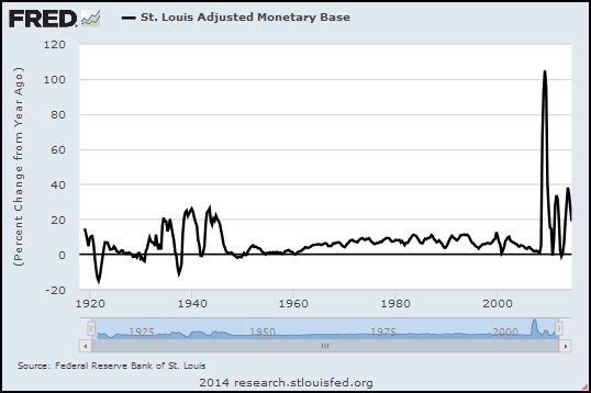
I'm using another FRED graph, monthly data, same two series shown in the animation sequence, to see the dates of similarity. Maybe that'll move the writing along.

I will describe a "lag" in terms of how many months I have to offset the Base Money (black) graph to the right to obtain a highlightable period of similarity. I will describe a "similarity" using the dates of the Inflation (red) graph, the one that doesn't move back and forth thru time.

The similarity highlighted in Graph #1 ends suddenly in late 1930, when it appears the Federal Reserve suddenly decided to do something about the Great Depression. Just after the yellow highlight ends, base money (black) shoots up while the rate of inflation falls for six months more (till June 1931) and then drags bottom at -10% till March 1933.

That separation of the lines shows the lag developing.

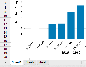
Image #2: Lag 29 months... Similarity March 1933 - March 1934

Graph #2: Base Money Lagged Two Years
During the similarity highlighted on Graph #2, base money (black) increased from November 1930 to October 1931 -- a period of eleven months. The rate of inflation (red) increased from March 1933 to March 1934 -- twelve months. So the lag itself was a month longer at the end of the similarity than it was at the start.

At the start of that similarity the lag (November 1930 to March 1933) was 28 months. By the end of that similarity, it was 29 months. I'll call it 29 months.


Image #3: Lag 50 months... Similarity March 1934 - May 1937

Graph #3: Base Money Lagged Four Years
On Graph #3 the similarity starts with the peaks that end Similarity #2. The lag this time is clearly visible as a downtrend that's twice as long for the red as for the black, followed, then, by a more hesitant red uptrend. The similarity ends with rather modest peaks in both the red and black lines.

Note -- This image has been revised. Originally I showed one yellow stripe of highlight, running through those modest peaks. (You can see that version in yesterday's post.)

Incidentally, the peaks that end Similarity #2 no longer appear aligned because on Graph #3, base money (black) is shifted two additional years to the right. (If that doesn't make sense, go fiddle with the interactive experiment graph again.)

The end of this similarity is the highlighted peak of the black line in March 1933. And for the red line, in May 1937. The difference -- the time the black line is lagged -- is 50 months.

Image #4: Lag 63 months... Similarity May 1937 - October 1938

Graph #4: Base Money Lagged Five Years
Number four is a brief similarity. I'm figuring that it runs from the end of Similarity #3 to the start of the highlighted jiggles just before the black line skyrockets.

For the black line it starts with the end of Sim #3 (March 1933) and ends in July 1933.

For the red line it starts with the end of Sim #3 (May 1937) and ends in October 1938.

It's a challenge to get the dates right on these graphs, what with these images lagged (but not providing pop-up info windows) and the FRED graph providing the info windows (with nothing lagged). It's making my head spin. Hey, if you see anything that looks like a mistake, let me know.


Image #5: Lag 92 months... Similarity October 1938 - March 1951

Graph #5: Base Money Lagged Seven Years
For this one the similarity will start with the jiggles where the previous similarity ended. So July 1933 for the black line, and October 1938 for the red, these dates mark the start.

Where to end this similarity? For the black line I'm gonna go with the high point in the third tall spike in the group of three, so July 1943

For the red line I'm gonna stop it at the top of the third red spike of three, March 1951.

The highlighting is a bit off from these dates that I'm choosing now. It's a little bit arbitrary, choosing the dates. If you know a better way to figure it, do let me know.

(It's completely arbitrary.)

Image #6: Lag 74 months... Similarity March 1951 - March 1955

Graph #6: Base Money Lagged Six Years
We reached a maximum lag of 92 months (between 7 and 8 years) with Graph #5. On graph #6 the lag begins to recede. I'm calling the dates for this similarity as follows: For the black line, start at November 1944 and end at September 1949.

For the red line, start at March 1951. And end at, I'll say March 1955

For the red line, I start Similarity #6 where #5 ended. For the black line I'm leaving a little gap. Number six starts at the black peak where the yellow highlight starts. But number five ended at the nearby, higher, slightly earlier peak. So there is a brief gap between similarities at that point.

Note that other than this brief gap, and the dis-similarity described under Image #1, there are no gaps where one similarity ends and the next one begins. Granted, this is all by eye, and arbitrary. But these "similarities" are nothing but short sections of the overall graph, short enough that we can compare them and describe them.

But if the similarities connect like railroad cars, then what we're seeing is that the pattern of the red graph and the pattern of the black graph are actually quite strikingly similar. The main difference between the two lines is nothing more than a lag -- a long and variable lag. And I'm thinking that the best way to show similarity would be with an "accordion axis" if I knew how to make such a thing.

I'm also thinking that this accordion axis would essentially be a standard axis modified by a calculation that shortens or lengthens the time units in an irregular pattern. I want to create such an axis, because I want to take that calculation and see what it looks like as a normal graph. If it has a familiar look, if it reminds us of something, then perhaps we will have found a major component of the rise and fall of this lag.

Image #7: Lag 60 months... Similarity March 1955 - May 1960

Graph #7: Base Money Lagged Five Years
On Graph #7 the lag recedes again. I begin Similarity #7 where similarity #6 ended: September 1949 for the black line and March 1955 for the red. I end the red one in May 1960. And I end the black one at May 1955. We end with a five-year lag.


I figured these start- and stop-points by looking for similarities in the patterns. Tomorrow I'll graph the lag lengths.

Saturday, October 11, 2014

The Ridges on the Rocks


Maybe you need an accordion axis. Or maybe the lag amounts mean something.

There is a story I like very much, told by Lionel Ruby in "How the Scientist Thinks":
Darwin and a fellow scientist were searching for fossils in the north of England. They were not aware of the glacial theory at the time. Years later Darwin revisited the area, and he was now astonished to discover how clearly marked were the glacial ridges on the rocks. He had not noticed them on his earlier visit because he was not looking for them.... Darwin was able to appreciate the glacial markings only after he became aware of the glacial theory.


Sure: If the glacial theory was wrong, knowing about it and looking for it would still have led some people to see it in the rocks. But that's the trade-off, isn't it. If the glacial theory is right, and you don't know about it, you may not see it even if it is clearly marked in the rocks. Even if you are Darwin.

Me? I'm just lookin at the economy.


From the interactive experiment I captured some images with different lag values. On each image I highlighted in yellow the the part where I think the two graphs match. Some are obvious. Some may be a stretch. It's all by eye anyway; this is conceptual economics. But hey, it can't be any worse than the stuff that passes for "mainstream".

Slide your mouse back and forth across the Animation Bar below the graph:

Lagged Effects of Base Money: an Animation

Zero Year  Lag Two Year  Lag Four Year  Lag Five Year  Lag Seven Year  Lag Six
Year  Lag 
Five Year  Lag 

Now I want to show you the ridges in the rocks. I want to show you what I see.

First, notice that the red line does not move when you drag the mouse across the Animation Bar. The red line is the same in every frame because inflation is a resultant and because the history of inflation is what it is. As your eyes pass over the red line from left to right, you are simulating the passage of time.

Second, notice that the yellow highlight moves from left to right as you drag your mouse from left to right across the Animation Bar. The yellow highlight directs your focus to "similarities" between the red and black plot lines on the graph. The similarities are highlighted left to right because I tend to read graphs from left to right, again simulating the passage of time.

To my mind, the similarities offer a way to measure lag: Slide the Base Money graph over the Inflation graph until you find similarity. Then observe the distance you moved the graph. On our horizontal axis, that distance is a measure of time. It is the time it takes for the pattern of the one graph to show up on the other. We are measuring lag.

Third, notice that the black plot line, the Base Money plot, moves as you drag your mouse from left to right across the Animation Bar. At each step, the black line is offset a number of years from chronological time; this offset is the lag.

Granted it's all done by eye, and the annual steps are large and ungainly. Still, we are only attempting to observe similarities between two data sets -- and this is no more than common practice. What's odd is that the similarities show themselves separated by "large and variable" lags.

In order to see the similarities we need to develop an "accordion axis". For if you observe the movement of the black line as you move the mouse across the Animation Bar, you will notice that the black line moves first from left to right and then from right to left. The "similarities" depend at the start on an increasing lag, and, by the end, on a decreasing lag.

I am arguing that an increasing lag is associated with a slowing economy and that a decreasing lag is associated with a recovering economy. I am preparing to argue that the size of the lag is proportional to the severity of the economic slowdown.

Friday, October 10, 2014

I'm gonna agree with Milton Friedman on this...


From JSTOR's Friedman on the Lag in Effect of Monetary Policy by J. M. Culbertson:


I'm thinkin', like when you make the water hotter, in the shower, and nothing happens, so you turn it up more, and all of a sudden it's too hot. But whether it gets too hot or not depends on other things, too: Did the water heater just finish a duty cycle, or is it almost ready to start?

I think we can relate the size of the lag to the pace of new credit use, or in particular, to the size of new credit use relative to the size of something -- GDP, or base money, or base plus Federal deficit spending, something. I don't need to resolve this immediately.

I do think we can predict can calculate approximately the relative lag between a change in base-money growth and a corresponding change in inflation. Look, I'm not making any promises. But this is what I want to explore.

Wouldn't it be nice to have a better idea how "lags" work?

Thursday, October 9, 2014

An Interactive Inflation Experiment


If you're worried (or not) about inflation resulting from the Quantitative Easing of Base Money since the crisis, you might want to be looking at the rate of inflation:

Graph #1: The Rate of Inflation since 1913
and at the rate of Base Money growth:

Graph #2: The Rate of Base Money Growth since 1918
The money numbers go back to 1918 -- the year my father was born, God rest his soul -- and the price numbers go back even farther, to 1913. The numbers for both are monthly (so there's a lot of data) but for today's graphs I'm using quarterly values and showing "percent change from year ago". Maybe that's more than you wanted to know. If not, you can click either of the above graphs to go to its FRED source page.

Graph #3: Rate of Inflation, 1918-1960, #MQp

Graph #4: Base Money Growth, 1918-1960, #MQo
I reduced the range of dates on both graphs so they start on 1 January 1918 and end on 1 July 1960. These dates center the Depression-era Quantitative Easing on Graph #4, and allow ten years or more before and after that QE, where cause or consequence might show up on the graph of inflation. Oh, and I erased the background and border of the Base Money graph to make it see-through. So now we can put the base-money graph on top of the Inflation graph and see the two plots together.

Plus, I figured out how to use buttons to move the one graph relative to the other.

You can use the buttons to look for patterns in inflation that match or don't match patterns in base money growth. The "zero year" button aligns the dates of the two graphs, 1930 atop 1930, 1940 atop 1940, and so on. The "1 year" button shows money growth lagged one year; the "2 year" button shows money growth lagged two years; and so on.

The "10 year" button aligns 1930 on the base money graph (black) with 1940 on the inflation (red) graph. You can check the x-axis dates to see what the buttons do.

Even before you click a button, notice that the two lines match pretty well in the early years (up to 1930). After that it's a jumble. So, click some buttons and look for pattern similarities, and have some fun with this thing.

bottom image
top image
Graph #5: Base Money Growth (black) Overlaid on the Inflation Rate (red)
Click a Button to Lag the Base Money Graph by the Number of Years Indicated.


NOTE: If the buttons don't work for you, try this post instead.

Here's what I see: When base money is lagged seven years, the three major increases in base money (1934-1946, black) align remarkably well with three inflationary peaks (1940-1953, red). With a seven year lag.

As I observed yesterday, it is now just six years since quantitative easing began, in September 2008.

During the Great Depression, it took seven years for the unusual pattern of base money growth to be echoed in the inflation pattern. It took seven years, in other words, for inflation to arise as a result of base money growth in the 1930s.

In this post I offer one conclusion: It is still too early to say no inflation will arise from the quantitative easing of our time.

Wednesday, October 8, 2014

Bragging Writes


The Writers versus the Signatories


At Bloomberg:
Signatories of a letter sent to then-Federal Reserve Chairman Ben S. Bernanke in 2010 warning of the risks associated with the bank’s policy of quantitative easing are standing by their claims -- even as the biggest U.S. companies are flourishing, inflation is muted and holding Treasuries has been one of the best trades out there.

In the word "even", you can read the position taken by the writers of that story:

Signatories stand by their prediction of inflation even as the economy improves.

The position taken by the writers is that the economy is doing better, and the improvement is evidence that inflation will not come, so the signatories were obviously wrong.

You see a lot of that lately: the idea that we have not had inflation yet, so we're not gonna get it. And yes, at some point you do have to say "The waiting period is over. A final outcome can now be determined." I'm just not sure we're there yet.

The writers continue:
The Nov. 15, 2010, letter signed by academics, economists and money managers warned that the Federal Reserve’s strategy of buying bonds and other securities to reduce interest rates risked “currency debasement and inflation” and could “distort financial markets.” They also said it wouldn’t achieve the Fed’s objective of promoting employment.

Four years later, members of the group, which includes Seth Klarman of Baupost Group LLC and billionaire Paul Singer of Elliott Management Corp., are facing a different economy. U.S. companies now boast low debt, big cash piles and record profits. They’re creating jobs at the fastest average pace since 2005 and unemployment has dropped to 6.1 percent from 9.8 percent when they wrote the letter. The recovery has underpinned an almost 200 percent gain in the Standard & Poor’s 500 Index since March 9, 2009.

Four years have passed, the writers point out. And, judging by that last paragraph, the economy is doing very well.

So, what do you think?

The economy is not doing well at all. Not the economy I know. But it is doing better than it was. And that is when the threat of inflation can become real -- when things pick up. The writers, laughing at the signatories and thinking we have not had inflation so we will not, those writers are on thin ice. That's what I think.

Inflation is held down by a depressed economy. If inflation picks up, it will happen when the economy picks up. Now, I'm not predicting inflation. But the view that says "the economy is doing better, so inflation is not a threat" is just exactly wrong. I can't see how people who write about the economy can pretend to believe it.


The question of timing remains. The writers point out that four years have passed since that letter was written, and the economy is doing fine. The implication is that if we were going to get inflation, we'd have got it by now.

What do you think? Is four years enough time? How about six years? It's four years since the letter, but it's a full six years since the start of Quantitative Easing. The quantitative easing that troubles the Signatories started in September 2008:

Graph #1: Percent Change, Base Money, Monthly Data: 2004-08-01 to 2014-08-01
August 2008 marks the end of relatively tame money growth. September 2008 marks the start of aggressive money growth. September 2014 marks a full six years of aggressive money growth. And yet two different price indexes both show that inflation since September 2008 has been milder than it was in the period before that date:

Graph #2: CPI (blue) and PCE (red) Inflation Measures, Monthly, 2004-08-01 to 2014-08-01
We've had less inflation since QE began than we had in the years before QE. And we want the threat of inflation to be gone. Doesn't that count for something?

Not much. No.

Tuesday, October 7, 2014

"He seemed completely unable to grasp that I was talking about the conventional use of words..."


From Names Are Conventional at La Bocca della Verità:
Is Pluto a planet?

Pluto itself simply is what it is, and does what it does, regardless of what we call it. The question "Is Pluto really a planet?" is confused: The real question is, "Is our classification system more helpful to us if we classify Pluto as a planet, or if we do not?"

Astronomers recently decided that the right answer is: "Not." Given I am not an astronomer, I trust them, and suspect they made the right decision. But the question is completely different from one such as, "Does Pluto have an iron core?" or "What is the period of Pluto's orbit of the sun?" The latter two questions are about Pluto; the former question is about how we want to structure our language to make it the most useful to us.
 
Is this about the economy? Sure, because we talk about the economy, too.

Recommended reading.

Monday, October 6, 2014

Stiglitz: "Any theory of deep downturns has to answer these questions"


From NBER, from the free teaser page that wants $5 for a PDF...

From the abstract (I presume) of Reconstructing Macroeconomic Theory to Manage Economic Policy by Joseph E. Stiglitz (NBER Working Paper No. 20517):
The paper argues that any theory of deep downturns has to answer these questions: What is the source of the disturbances? Why do seemingly small shocks have such large effects? Why do deep downturns last so long? Why is there such persistence, when we have the same human, physical, and natural resources today as we had before the crisis?

Gotcha covered, Joe.

  •   What is the source of the disturbances?

Financial cost.

  •   Why do seemingly small shocks have such large effects?

Debt accumulates slowly, and the cost of accumulated debt grows gradually.


As the rising cost becomes a problem, people compensate by increasing the amount they borrow. So, for a long time, the growing debt seems to have no harmful effects at all. Then one day, a straw breaks the camel's back. When that happens, the full weight of accumulated debt becomes a problem, and large effects follow from the seemingly small shock.

  •   Why do deep downturns last so long? Why is there such persistence, when we have the same human, physical, and natural resources today as we had before the crisis?

We have the same human, physical, and natural resources now as we had before the crisis. We have very nearly the same debt, also. Recommend a policy focused on reducing financial cost by reducing the accumulation of debt, and people will find a million reasons why it cannot and should not be done.

Our deep downturn could have been brought to an end quickly if a conscious effort had been made to reduce debt by a significant amount -- cut in half, say. But since we insist on letting the problem resolve itself, the downturn could last twenty years or more.

Sunday, October 5, 2014

Employment


Unemployment has been awful since the crisis. Things are getting better now, at least by some accounts. But it's easy to doubt such accounts, because demographic changes pull the rug out from under them. Or they seem to, anyway. It's all very confusing.

So here's a simple look at "employment" -- the number of workers in our economy. Instead of just raw numbers, I'm looking at the percent change in employment. I'm using quarterly data, not monthly, to make the graph less jiggy and easier to read:

Graph #1: Percent Change in the Total Employment
The trend for the past 30 years has been downhill -- from about one percent, to about half a percent. That is, from 4% annual job growth, to 2%. Now, I'm not averaging the recession years into this eyeball estimate. I'm looking at the typical growing economy. The trend of the good years has been downhill for 30 years.

And if you look at the trend line I threw in there, it looks like employment since mid-2010 has been right on trend. Maybe a pixel or two above trend. So I have to say it's not Obama or the Crisis or George W. Bush alone that is the source of the problem. I have to say the problem goes back at least to the 1980s. That means Reagan, and Bush the Father, and Bill Clinton are also part of the problem.

But I don't like to blame people. I like to blame policies. What I usually say (and I stand by it now) is that the problem goes back probably another 20 years before the 1980s. What that means is the problem is not unemployment.

The problem is Problem X. What we see on the graph -- declining employment since the 1980s -- was a "solution" to Problem X.

Is declining employment a problem? Well, sure. But it's not the problem. Declining employment was a solution to the problem. So our solution is a problem, yes. But again, it's not the problem. I hope this is making sense to you. I don't know how to say it any better.

Do I think I know what Problem X is? Of course: Excessive debt. Excessive finance. Financial "deepening". These are all the same. But don't think the problem started with Obama, or with Bush the Younger, or Clinton, or Bush the Elder, or even with Reagan. It would be more accurate to say the problem was already a problem the last time Lee Harvey Oswald fired his rifle.


I have to say the problem goes back at least to the 1980s. But then, doubt recurs. Demographic changes come back to haunt me. So I took the total number of employees and divided it by the total population, to get the working share of population, and looked at the percent change in that. Again, quarterly:

Graph #2: Total Employment Relative to Total Population, Percent Change
As with Graph #1, #2 shows moderation for the last 30 years. Moderation and decline. Again, my trend line shows the trend of the growing economy and ignores the big, sub-zero Vee shapes associated with recession and recovery.

The trend is consistent, too. Granted, I just sketched in a straight line. But a lot of jiggles cling to that trend, in the 1980s and again in the 1990s and again in the 2000s. In comparison to this trend line, job growth for the past three years has been good (odd as that is to say). If this trend line is right, employment is well above the trend of the last 30 years. Clearly it is the last 30 years for which unemployment has been a problem, not the last three.


I found a quarterly, seasonally adjusted dataset at FRED for Working Age Population: Age 15 and Over for the United States. Starts at 1955. Maybe that's a better context than the whole U.S. population?

The Working Age Population series counts persons... The Employment series counts thousands of persons... I'll multiply the Employment number by 1000 to convert it to persons so the units match. I probably don't need to do that if we're looking at percent change numbers. But what the heck.

Again, a look at percent change:

Graph #3: Total Employment Relative to Working Age Population, Percent Change
I still say it looks like 30 years downhill. And that's for the good years.


For the Working Age Population data, FRED wants the source cited:
Working Age Population: Aged 15 and Over: All Persons for the United States©
OECD descriptor ID: LFWATTTT
OECD unit ID: STSA
OECD country ID: USA

All OECD data should be cited as follows: OECD, "Main Economic Indicators - complete database", Main Economic Indicators (database),http://dx.doi.org/10.1787/data-00052-en (Accessed on date)
Copyright, 2014, OECD. Reprinted with permission.
Source: Organisation for Economic Co-operation and Development