Showing posts with label standard deviation. Show all posts

Sunday, September 1, 2013

Pin the Tail on the Donkey


I came to Lars Christensen's Markets are telling us where NGDP growth is heading by way of Examining the Case for NGDP Targeting by Unlearning Economics, at Pieria

Unlearning writes:

I copied this method of estimating NGDP expectations from Lars Christensen, a market monetarist. Christensen seems to take this graph as confirmation of his views, but in fact it shows the opposite of what he wants it to show.

I see neither confirmation nor its opposite in the graphs these guys show. I think it's funny that Christensen's Market Indicator has already been used as proof and disproof, and I'm still just checking the arithmetic. Funnier yet, I think the arithmetic is bad. I had my doubts about it since I first noticed that odd fudge-factor subtraction in Lars Christensen's calculation.

But the clincher is the reverse-order thing...


Reverse engineering some grade-school arithmetic


Pick a number

10

Subtract 4

10 - 4 = 6

Divide by 3

6 / 3 = 2

Good. Now let's get the original number back. Last time we subtracted 4 and divided by 3. This time we'll add 4 and multiply by 3. Start with our final answer

2

Add 4

2 + 4 = 6

Multiply by 3

6 * 3 = 18

And there is our original number, restored. Oh, wait a minute! We started with 10 and we ended up with 18. That's not right. That's not right. What happened?

What happened is, we tried to backtrack and we reversed the steps, but we did not also reverse the sequence of those steps.

The first time we subtracted, and the second time we added. The first time we divided and the second time we multiplied. That's good.

But the first time, we subtracted first and divided second. When we backtrack we have to start with the last step and backtrack it first. The first time, we divided by 3 last. This time we have to multiply by 3 first. And then we can add 4.

2 * 3 = 6

6 + 4 = 10

And that gives us the number we started with.

Off topic, but this exercise shows how easy it is to screw up the math when you don't actually *DO* the math. That's what's wrong with those math-like models economists come up with all the time, that they never actually work out in a spreadsheet.


Here's a copy of Lars Christensen's spreadsheet with some notes I made in it.

Lars starts out by gathering his data.

Next, he "standardizes" each dataset by subtracting the dataset average and dividing the result by the standard deviation of the dataset. This is the stuff that fascinates me.

Then he takes one of his standardized datasets and subtracts it from another. He calls the result an "index". (But if you look at the spreadsheet, you may notice that the index column is NO LONGER STANDARDIZED. The column average is still zero, but the column standard deviation is now about 1.46. It is not equal to 1 because of the subtraction which in my opinion is done at the wrong time.)

After that comes his Market Indicator calculation. He takes the index and adds to it the average of the NGDP dataset, to center the index on the NGDP dataset.

Oddly, then, from that sum he subtracts the arbitrary value 1.5. This subtraction will move the Market Indicator off-center and make it a bit low relative to the NGDP data.

The resulting value he then multiplies by the standard deviation of the NGDP data, and divides by the standard deviation of his index data. It gets a little gummy and confusing here in this final bit of the Market Indicator calculation. Lars is dividing the standard deviation (of the index) out of the index and out of the NGDP average and out of the arbitrary -1.5. That seems wrong to me, to divide the SD of the index out of anything other than the index just doesn't seem right. (But hey, it's Lars's Market Indicator.)

Then he multiplies by the standard deviation of the NGDP data. (As I pointed out before, it is really NGNP data.) Multiplies it into the index value, and into the NGDP average (now, this has to be wrong!) and into the constant that he is subtracting. Awfully gummy stuff.

This is Lars Christensen's Market Indicator we're looking at here. Lars can figure it any way he wants. I don't mean to say he has anything "wrong". But there are some things that don't make sense to me, things that look like mistakes to me. Things that Unlearning Economics apparently didn't pick up when he used Lars's market indicator.

The thing that seals the deal for me is the "order of operations" problem. The Market Indicator calculation must be in error. I'm sure of it.

He begins beautifully, subtracting the average value first, and dividing by the standard deviation second.

He ends terribly, adding the average value first, and multiplying by standard deviation second. He has reversed the operations, but he has not reversed the order of operations. He adds the average value (and a fudge factor) first, and multiplies by the standard deviation value afterwards. This is one gummy mess.


Suppose I take a time series graph from FRED, one that has the numbers up pretty high, not down near zero. I'll go with Capacity Utilization:

Graph #1: Total Capacity Utilization
Suppose we want to take the blue line and move it down so that what's 80 now becomes zero, and what's 85 becomes 5, and like that. It's easy to do: All we have to do is subtract 80 from the original numbers. The formula in the upper border of the graph below shows this subtraction:

Graph #2: Total Capacity Utilization Moved Down from 80 to Zero
The graph still looks the same. But the numbers on the vertical scale are different. Everything is 80 less than it was before.

Now suppose we notice that the blue line is almost entirely contained between the values 10 and -10 and lets say we want to change that. If we divide everything by 10, the line will be almost entirely contained between the values 1 and -1:

Graph #3: Total Capacity Utilization Moved Down 80, then Divided by 10
But the blue line still  looks the same.

That's the important thing. We didn't change the pattern of Total Capacity Utilization. We just moved it, and scaled it down some. There are reasons for doing such things, as Lars Christensen has shown.

The trouble with what I did here is that it's entirely arbitrary. I picked the value 80, basically because on Graph #1 there was a line at that level. I thought it would be neat to make that the zero level. And then after that, conveniently, the numbers 10 and -10 showed up on the vertical axis, so I just divided by 10.

Lars does something a little more sophisticated. Instead of subtracting 80, he figures the average value of the data points, and subtracts that value from the data. And instead of dividing by 10 because 10 is a nice round number, he figures the standard deviation of the data points and divides by that. Now you might say it's still arbitrary to do what Lars does, but if it is, it's arbitrary with principles.

And I don't think it's arbitrary. The average value tells us where the activity is taking place, and the standard deviation tells us how wide-ranging the activity is, but the pattern itself is completely independent of both those things -- as you noticed in the graphs above.


Now consider what happens when we reverse the operations but fail to reverse the order of operations. Adding 80 and then multiplying by 10 pushes the Total Capacity Utilization number up to around 800. That's a lot of utilization:

Graph #4: Reversal of the Graph #3 Calcs in the Wrong Order (blue)
Reversal of the Graph #3 Calcs in the Correct Order (green)
Original Data for Comparison(red)
The red line down near 100 on the graph is the original data. The green line, hanging low with the red one, shows the result of correctly reversing the order of operations. The calculation for the green line is in the third line of the upper border. The first and fourth steps raise and lower the value by 80; the second and third change it by a factor of ten.

Reversed correctly, the numbers return to their original values, so the green and red lines overlap. (I made the red line a little wider than the green line so you can see both of them.) Here's the link to the FRED page for this graph, size large.


After figuring out what was bothering me, I went through Christensen's spreadsheet carefully. I ended up inserting a few columns into it and showing the calcs that make sense to me right there alongside the existing calculations. I recreated Lars's graph with an extra line that displays the result of my version of Lars's calculation.

Graph #5: Lars's Graph Recreated, with my Version Added
Blue is the NGDP (or really, NGNP) data. Red is Christensen's calculation. Orange is his calculation with my modifications. Orange and red run close for the most part except briefly around 2003 and -- interestingly -- in the latter 1990s.

However, Christensen's calculation makes use of a fudge factor. As noted above, he subtracts the arbitrary value 1.5 before the multiplication. (And oh, yeah, he has the order of operations wrong.) Removing that arbitrary value from his calculation gave me this graph:

Graph #6: Graph 5 Repeated, with Lars's Fudge Factor Eliminated
Now Lars's Market Indicator (the red line) is significantly higher than both my version and the NGNP data.

Wednesday, August 14, 2013

Going thru the motions


This is the graph I created at FRED to gather the data I needed in order to duplicate Lars Christensen's simple index calculation:

Graph #1: The FRED Source Data, from mine of the 12th

To simplify my life I'll chop off all the years before 1990 and just look at data since 1990 the same as Christensen did.

Graph #2: Same Data, Since 1990 Only

Now I can apply the calculations that Lars applied to the data. I have the average value for each series and the standard deviation for each series in the Excel file I've been using for the past few posts.


The first step of Christensen's calculation was to subtract the series average value from each data value, for all the datasets. I'll just do that in FRED:

Graph #3: For Each Series, Subtract the Series Average Value
The most obvious change on Graph #3 is that the white plot window is not as wide as on Graph #2. There's a lot more description for the vertical axis, and it crowds the plot window. But the relevant change is that each line is now centered on the zero level. And that means all the lines are centered on each other.

They're all a little lower as a result. You can tell, because the highest value on the vertical axis is now 40 instead of 50.


The second step of Christensen's calculation is to divide by the standard deviation of each series. This is where the amplitude, the up-and-down variation of each series gets reduced, and they all get similarized.

This impresses me. The greater the amplitude variation of a line, the greater the standard deviation, and the more the variation is reduced by the division. You can tell by the way people use standard deviation all the time, that it must be pretty important. But this is the first time I ever saw it used in a significant way ...that I could understand, anyhow.

Graph #4: For Each Series now, Divide by the Standard Deviation

Now the vertical axis values have been reduced to a high of 3 and a low of -5. That is far less than in the previous graphs. The orange and green lines no longer travel to the extremes we saw in the previous graphs. The lowest value on Graph #4 is actually in the red line. Quite a difference.

Tuesday, August 13, 2013

I have to look at the spreadsheet (2)

Picking up where we left off yesterday...

I wanted to use a Zoho spreadsheet, so you could click on cells in the sheet and look at the formula bar to see what the calculations are. But the Zoho sheet makes the Blogger screen jump down to the spreadsheet, and as a blogger I won't stand for that.

My next choice was to use Google Drive. But the series values are quarterly, and that sometimes means there are too many pieces of information for the Google Drive spreadsheet to handle. The graphs don't come out right.

So Excel it is. That means I can show you the graphs, and I can show you images of cell calculations if it comes to that, but if you want the live-action of a spreadsheet, you'll have to download the Excel file and get into it yourself.

Or you can read the story I tell here and take my word for it.


I don't have Excel on the computer where I do my blogging. I've been using Open Office Calc, which can read and write Excel files. But Open Office messes up the x-axis labeling on Excel graphs, and I prefer not to manipulate Excel-created graphs on this computer because of it.

And I have some nice Visual Basic routines I've been developing to format my Excel graphs, to standardize the size and appearance of those graphs. But those routines don't work in Open Office. I don't know how to make them work in Open Office.

So again, Excel it is.

Working in Excel on the old computer, I tried to duplicate Lars Christensen's graph from memory. From the FRED data, using what I understood of Christensen's calcs from looking at it on the blogging computer.

In Excel, my first step was to look at the FRED data. It should look the same as the FRED graph in yesterday's post:

Graph #1

If it didn't, I would want to check my work for errors. I was happy with it. So the next step was to duplicate Lars Christensen's graph:

Graph #2: Lars Christensen's Graph

Graph #3: My Version of Christensen's Graph
Oh, I should make my horizontal gridlines faint.

The two graphs are a pretty good match. Christensen gets more vertical than I do -- the space between his horizontal gridlines is near twice what mine is. Mine got squeezed between the title and legend, above, and the x-axis labels, below the plot area. No amount of multiplying by the series standard deviation can make up for that. But you can see, on both graphs, the one line is pretty well centered upon the other. And the overall up-and-down offsetting is about the same, red versus blue, on both graphs.

But I'm leaving things out of the story. The first time I tried to duplicate Christensen's graph I was way off. For some reason I thought I had to "standardize" the NGDP values the same way Christensen was standardizing the other values. So all my lines were centered on the zero level. And that didn't look like the graph I was trying to duplicate. So I had to go over it again before I got it right.

I had to do it on the old computer. I had to look at Christensen's file in Excel and see which numbers he used in the graph, before I got it right. He takes his "index" value -- "standardized" S&P 500 less "standardized" Dollar Index -- and to it adds the average value of the NGDP series. This brings the index numbers up, centering them on the NGDP numbers. It gets the numbers away from the zero level.

There are additional adjustments: Christensen subtracts 1.5 from the index-plus-NGDP-average, for even better vertical alignment of the two series. Then he multiplies this centered number by the NGDP standard deviation and divides by the "index" standard deviation, to scale the index numbers to about the same size as the NGDP numbers.

He ends up with an index he calls the NGDP Market Indicator, which has about the same up-and-down range of values as NGDP and is centered on NGDP, for greatly improved visual comparison.

Okay, I get it. Lars is centering and scaling his index numbers, so that he may better see similarities and differences between the index and the NGDP numbers. He sees the size and the location of the up-and-down pattern as separate from the pattern itself.

And you know what? I did have to look at the spreadsheet!

Monday, August 12, 2013

I have to look at the spreadsheet.

Picking up where we left off yesterday...

UE links to an article by Lars Christensen. "To try to illustrate the connection between the markets and NGDP," Christensen writes, "I have constructed a very simple index to track market expectations of future NGDP." He describes the index, shows a graph, and links to a spreadsheet.

The spreadsheet is great. For me, if I want to understand what the calculation is, I have to look at the spreadsheet. (So you know where this post is going.)

Christensen's spreadsheet is a FRED download Excel file containing "percent change from year ago" values for GNP, for the S&P 500 Stock Price Index, and for the Real Trade Weighted U.S. Dollar Index.

Oh that's funny, he used Gross National Product instead of GDP -- but labels it Nominal GDP. I wonder if that affects his graph. Shouldn't be much difference, but it might be worth a look. If I get to it.

Anyway, the first four columns of the spreadsheet look to be direct from FRED. Christensen has relabeled the columns, which makes sense: "USD Index" does sound a lot better than "TWEXMPA_PC1". And it's clear (at least, if you're familiar with the FRED Excel format, it is clear) which data is which.

I like it. Maybe I'll start relabeling that way. Thanks, Lars!

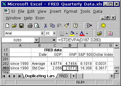
Down at the bottom of those first four columns, except the date column, Lars figures the average value for each dataset, and below that, for each dataset the Standard Deviation, using the STDEVPA() worksheet function. That function "Calculates the standard deviation based on the entire population," according to the OpenOffice help.

I found myself checking the range of values provided to the AVERAGE( ) and STDEVPA( ) functions, doing the Thomas Herndon thing, making sure there were no obvious dumb errors on the sheet. Christensen's spreadsheet looks okay to me.

In the next three columns Christensen calculates "standardized" values. (This is what interests me. How these calcs are done, what effect they have, and why I might want to do the same thing sometimes.)

Lars figured each standardized value as the original value less the dataset average value, with the difference divided by the dataset standard deviation value.

If I have the dataset [1,2,3] the average value is 2. If I subtract 2 from each value in the dataset I get [-1,0,1] and I have centered the dataset on the zero level.

(I'm wondering why Christensen's graph doesn't show values that are centered on the zero level. Maybe that will become clear later on.)

If I then divide each number in [-1,0,1] by some value, I make the numbers in the dataset smaller, but they stay in proportion. (They also stay centered on the zero level, unless I'm having a brain fart.)

That's Lars Christensen's standardization calculation. Pretty simple. I can remember it. But what does it look like? ...I'm getting to that.

I assembled the data for download from FRED. All quarterly data.

Graph #1: The FRED Source Data
The red line is percent change from year ago, GNP. All of 'em are percent change from year ago. The red line almost entirely hides the blue line, which is GDP. Yeah, not much difference there.

The green line is the S&P 500. The orange line is the Dollar index. The GNP and GDP values start in 1948. The S&P 500 values start in 1958. The Dollar Index values start in 1974. Christensen's graph starts in 1990. (If I have the chance to victimize Christensen for anything, it will likely be for chopping off the early years.)

Actually I'm always on the lookout for changed behavior on graphs. For if finance was once small but is now large, one ought to be able to see evidence of that change and its consequences on lots of graphs. And as Christensen's graph in particular shows "a very simple index to track market expectations of future NGDP" -- and as expectations are perhaps a more significant force now than in the past -- we might be able to see the rise of expectations as a transition toward greater similarity in more recent times. This would be a neat thing to see.

You can see on Graph #1 that the green line has about twice the up-and-down spread that the orange line has; and that both have a great deal more spread than the red and hidden blue lines. I think dividing these series, each by its own standard deviation, will similarize the up-and-downs of the different series. I think that was Christensen's reason for dividing by the standard deviation number.

So I have some things to look at, and some things to look for. Tomorrow, we look.

Sunday, August 11, 2013

The crisis is results.


UE has a brief criticism of NGDP Targeting and links to the article at Pieria. Too many wrong vowels in that name, somehow.

In the Peoria article UE writes that "the theoretical case behind NGDPT is quite weak". I agree. UE writes:

NGDPT could be vulnerable to a ‘Lucas Critique’ style criticism, where an attempt to exploit the observed relationship between RGDP and NGDP results in a breakdown, as happened in the 1970s, and we create stagflation. In other words, an increase in MV may just lead to an increase in P, not Y.

Yeah, that's my objection. Not the "lucas critique" part, screw that. The we just get inflation part. There's no clear connection between increasing the Q of M and increasing real output. These market monetarists must have Milton Friedman turning in his grave. The Sumnerian thought is that real growth is always and everywhere a monetary phenomenon.

That's my objection, not UE's. UE thinks "It may simply not be the case that an increase in the ‘available’ stock of money translates into an increase in income at all ... [A]ttempts to increase the quantity of money in circulation will simply end up increasing bank reserves."

Okay, that's a good argument, supported by the evidence. But UE's objection is relevant only to the time of crisis. Mine is relevant to the time we're NOT in crisis. UE recognizes the difference. He writes:

In normal times, the central bank can influence the cost of money and therefore indirectly affect PY (by affecting which activity is profitable or feasible), but in times of crisis, monetary policy cannot ‘flog a dead horse’ and resurrect a stagnant economy.

I always argue from the normal economy, not the crisis economy. Everybody else always argues from the crisis economy. I know, it's the crisis that brought the economy to everyone's attention. But you can't look at the crisis and solve the problem, because the problem existed before the crisis. The problem created the crisis. The crisis is results.