Thursday, April 30, 2015

John Munro: The chief object of debasement


From Professor John Munro's archive page:

c) Why did medieval princes debase their coinages?

i) A commonly given answer is to increase their money supplies in times of precious metal scarcities: i.e. to make a given or reduced quantity of gold and silver go farther, by striking more coins from that metal. But the evidence for such a conscious and deliberate monetary policy to achieve such goals is virtually absent; and debasements cannot be correlated with specific times of coinage or precious metal scarcities.

Also, off the top of my head, in times of precious metal scarcities, a given quantity of gold and silver coin will go farther because prices are lower due to the scarcities. So I'm not sure that this "commonly given answer" makes any sense at all.

ii) Most medieval contemporaries thought that the prime motivation for coinage debasement was to increase mint revenues or 'profits' for the prince.

Munro links that thought to this footnote:
See the comment of Nicholas Oresme (ca. 1390), a monetary advisor to King Charles VI of France (and to the dukes of Burgundy): 'I am of the opinion that the main and final cause why the prince pretends to the power of altering the coinage is the profit or gain he can get from it; it would otherwise be vain to make so many and so great changes....

So since medieval times, at least, it has been commonly thought that governments debase currency for their own gain. Otherwise (says Oresme) it would be pointless to debase the currency so frequently.

That's not really a strong argument, Oresme's argument. It's like people today who say "The only explanation is..." and then tell you their favorite explanation. People say that kind of thing all the time, but that doesn't make it a good argument.

iv) The chief object of debasement, when this fiscal motive was present, was to encourage merchants, foreign and domestic, to bring more gold and/or silver bullion to the prince's mints (rather than to foreign mints); and debasements did so by offering such merchants themselves a profit by returning to them more coins of the same face value and current purchasing power (though with a reduced precious metal content) than they would receive from bullion minted by the former coin standard.

People since medieval times thought debasement was common because governments did it for their own profit. Professor Munro presents a different motive: to enhance the profit of the merchants.

This is quite an interesting thought, if the reason for debasement was to enhance the local economy, not just the princely greed.

Wednesday, April 29, 2015

I think I'm just finessing an idea


I only know what I know. Perhaps it is only ignorance that allows me sometimes to object to the wisdom of people who know more than I. So be it, then.

I liked immediately the archive page I found the other day, John Munro's page.

I liked it -- I still like it -- but I stumbled on this, on "The Different Means of Payment in the Medieval and Early-Modern European Economies":

At the same time, you must realize that coined money was not the sole medium of exchange in medieval Europe, the sole means of effecting payments. You must avoid the common pitfall of supposing that actual coins were used merely because the transaction was recorded in monetary terms in some account book or register. These notations represent merely the 'standard of value' function of money.

Actual payment, Munro says, may have occurred by barter or by credit.

And don't make the common mistake of believing in a mythical 'rise of a money economy' that displaced barter transactions. There was always, from Greco-Roman times, some form of a 'money-economy' utilizing coinage; and conversely, barter transactions continued on into modern times, even in sophisticated economies. Thus the following, still popular, stage theory of economic development, advanced by 19th-century German economic historians (in particular Bruno Hildebrand), deeply influenced by current evolutionary theories, is patently unhistorical:

Barter Economy ... Coined-Money Economy ... Credit Economy ...

According to John Munro,

The "stage theory" of economic development ...
BARTER -> COINED MONEY -> CREDIT
... the stage theory is "patently unhistorical".

But things lead to other things. Things have consequences, and things have causes. I'm not afraid to say it. Oh, most people say it, sure. But they leave it at that.

When things lead to other things, sequences arise and patterns emerge. In particular, if human nature changes little, then we are likely to find repeating sequences and repeating patterns throughout history.

I think if somebody saw a barter -> coined money -> credit sequence in history, well, that fits with things I already know about the cycle of civilization, so I am willing to accept that that sequence probably did happen. I don't reject it outright, as Munro seems to do.

Of course barter continues in modern times. Of course there was coinage in use in the age of barter. Of course. We don't stop using money because it's the age of barter. We'll be glad to use money, if we can get our hands on it. But if we can't, well, there is still barter.

We don't rely less on money because it's the age of barter. It is the age of barter because we rely less on money.


So anyway, I was going to leave it at that. But I can't, because I kept reading Professor Munro's archive page and I came upon this:

c) Factors Producing the New Silver (and then Gold) Coinages:

i) greater commercialization of the economy with a vastly increased volume of money payments, transactions demand for money;

See? After the age of barter, there was "a vastly increased volume of money payments". Less barter, more coin. There was a change in emphasis, a move away from barter, a move toward coined money.

And this:

e) Reasons for the resumption of Gold Coinages in the West

i) the vast increase in the volume of money payments and transactions demand for money...

Professor Munro confirms the view that there was a transition from a less coined money economy, to a more coined money economy.

Later, of course, there was the transition from mostly coined money to mostly credit.

Tuesday, April 28, 2015

From the archives of John Munro


There are two fundamental causes of madness amongst students: sexual frustration and the study of coinage.

Monday, April 27, 2015

Finance and the ceteris paribus economy


While reading Kenneth Rogoff's VOX piece on the debt supercycle I noticed in the sidebar a link to A historical look at deflation with Claudio Borio's name attached. I've looked at Borio's work on financial cycles before, so I was interested. Finishing up my response to Rogoff, I dove into the deflation article.

Here are the opening paragraphs:
Concerns about deflation – falling prices of goods and services – have loomed large in recent policy discussions (see e.g. Cochrane 2014, Muellbauer 2014, The Economist 2015). The debate is shaped by the deep-seated view that deflation, regardless of context, is an economic pathology that stands in the way of any sustainable and strong expansion.

However, the almost reflexive association between deflation and economic weakness is not so obvious. Seen as a symptom, deflation need not only arise from an aggregate demand shortfall, but also from greater supply, which would boost output. And seen as a cause, while it may be damaging – by pushing up real wages and unemployment, raising the real value of debt (debt deflation), or inducing consumers to delay spending – it may also be beneficial, by raising real incomes and wealth and making export goods more competitive. The cost of deflation is ultimately an empirical question.

Five words went off in my brain like fireworks: making export goods more competitive. I don't know, really, how that works: If deflation makes the dollar stronger, that affects exchange rates and makes US exports more expensive. I'm sure there are trade-offs, but they use those five words as if there can be no question that deflation makes exports competitive.

But before I confused myself with the exchange-rate consequences of domestic deflation, before that unfinished thought diffused itself like a puff of smoke, there were those five words and the fireworks in my head. When costs are falling, Borio et al. say, that's good for exports. By extension then, when costs are rising that's bad for exports.

The mind goes to Adam Smith, to Of the Component Parts of the Price of Commodities, to Smith's look at factor costs and the principles that regulate them. The mind goes to the cost of finance, a cost that competes with Smith's wages and profits and rent.

Imagine a stable economy, a ceteris paribus economy where nothing changes other than the size and scope of finance. Consider a period of time during which the size and scope of finance begin at a low level, but grow persistently, so that by the end of the period finance has grown very large.

Ceteris paribus, it takes just as many hours after that time period, as many as it took before, to produce an apple, to produce an automobile, to produce a skyscraper. It takes just as much capital consumption, just as much raw material, just as much managerial oversight. The only thing that has changed is the cost of finance.

But because the cost of finance increased among producers, profits fell and prices rose. Because the cost of finance increased among consumers, there is a chronic shortfall of demand. These changes have consequences.

Chronic shortfall aside, when the cost of finance increases as a share of output cost, it drives up the price of output. It makes the "basket of goods" more expensive. It makes exports more expensive.

I make that argument: that the rising cost of finance in the US economy increased the prices of US exports, putting the US at a disadvantage and contributing much to our unfavorable balance of trade. I make that argument.

That was the fireworks in my head, when I read those five words.


The U.S. balance of trade was really pretty stable until after the 1974 recession.

Graph #1: U.S. Balance of Trade since 1950
Some people attribute our trade imbalance to Nixon breaking the link to gold. Could be. Nixon took us off gold in 1971.

But Milton Friedman says it was the economic policy of the 1960s -- "the Kennedy and Johnson administrations" -- that ultimately forced us off gold. Nixon had to do something because "the situation had become very critical in 1971", Friedman says.

According to Friedman, then, even if our trade imbalance was created by breaking the link to gold, the underlying causes go back a decade before the link was broken.

At least a decade, I should say.

Sunday, April 26, 2015

Rogoff, debt cycles, and optimism


The name Ken Rogoff ring a bell? How about Reinhart and Rogoff? Or maybe you remember the notion that once central government debt reaches 90% of GDP, economic growth falls off -- you remember that one, right? And the name Thomas Herndon too, maybe?

Reinhart and Rogoff, Growth in a Time of Debt:

Our main result is that ... median growth rates for countries with public debt over roughly 90 percent of GDP are about one percent lower than otherwise; average (mean) growth rates are several percent lower.

You might expect Ken Rogoff to be a man of principle (not a man of science). You might expect his economic analysis always to come up heads for the right and tails for the left. If so, you might be surprised by his recent article at VOX. Rogoff writes:

... there has been far too much focus on orthodox policy responses and not enough on heterodox responses that might have been better suited to a crisis greatly amplified by financial market breakdown. In particular, policymakers should have more vigorously pursued debt write-downs ...

That's downright Arthurian.


From Rogoff's article:
Has the world sunk into ‘secular stagnation’, with a long future of much lower per capita income growth driven significantly by a chronic deficiency in global demand? Or does weak post-Crisis growth reflect the post-financial crisis phase of a debt supercycle where, after deleveraging and borrowing headwinds subside, expected growth trends might prove higher than simple extrapolations of recent performance might suggest?

I will argue that the financial crisis/debt supercycle view provides a much more accurate and useful framework for understanding what has transpired and what is likely to come next.

All in all, the debt supercycle and secular stagnation view of today’s global economy may be two different views of the same phenomenon, but they are not equal. The debt supercycle model matches up with a couple of hundred years of experience of similar financial crises. The secular stagnation view does not capture the heart attack the global economy experienced; slow-moving demographics do not explain sharp housing price bubbles and collapses.

It's an important topic. And because I think in terms of debt-as-cause-of-problem and problem-that-fits-a-cycle-of-civilization, Rogoff's "debt supercycle" catches my eye.


In the introductory paragraph above Rogoff's VOX article, we read:

Unlike secular stagnation, a debt supercycle is not forever.

I like the clarity in that. "Secular stagnation" is long term stagnation. By contrast, we expect a "cycle" to have its ups and downs.

The introductory continues:

After deleveraging and borrowing headwinds subside, expected growth trends might prove higher than simple extrapolations of recent performance might suggest.

So if we think in terms of a cycle, or no, but if the economy actually moves in a cyclic pattern of sorts, then we have reason for optimism, Rogoff says, simply because of the cyclical pattern: Good times are bound to return.

Secular (unexplained) stagnation offers no reason for optimism. Unexplained? Yes. Rogoff observes "the view that the world is suffering from long-term secular stagnation due to a chronic shortfall of demand." Well that's circular, for sure. A shortfall of demand *IS* stagnation.

But if the problem is a debt supercycle it's the pattern that's circular, not the argument. And if it is a debt supercycle, then we can be pretty sure the problem arose with debt -- with "overall economy-wide debt", to use Rogoff's phrase. He's knocking at my door.

But one doesn't adopt cyclical thoughts because they allow for optimism. Good grief!


Have we reason for optimism? "Again," Rogoff writes,

the US appears to be near the tail end of its leverage cycle

Near the end of the leverage cycle? I don't think so. Look at the start- and end-levels for the previous (blue) and current (red) depression-scale peaks of private debt on this graph:

Graph #1: Comparison of Debt Growth around the 1929 and 2008 Debt Peaks
See my Decline from Peak Debt (2015 Update) spreadsheet on Google Drive.
Previous version of this graph: 17 December 2012
Private debt rose much more quickly in the 2000s than in the 1920s. But the deleverage was much less in the recent period. This time, private debt has been reduced almost not at all.

It's not that the period of deleveraging is almost over. It's that the deleveraging never really got under way. That leaves little room for baseless optimism.

Wednesday, April 22, 2015

An interesting detail


I quoted from some of the notes on FRED series for yesterday's post. I didn't need this part from the Small Time Deposits - Total series yesterday, but it is too significant to pass up:

The small-denomination time deposit component of M2 excludes individual retirement account (IRA) and Keogh balances at depository institutions because heavy penalties for pre-retirement withdrawals make them too illiquid to be included in the monetary aggregates.

They are "too illiquid to be included" in the M2 measure of money.

Tuesday, April 21, 2015

The Components of M2 Money


One more time.

I just want to be comfortable with the FRED datasets on savings, so I feel like I know what they show. If one is a stock and I think it's a flow, obviously I have something wrong. I want to be able to talk about these datasets without wondering what I have wrong. So I look.

I Googled total savings. The first hit was Total Savings Deposits at all Depository Institutions - FRED .... FRED's Notes on that graph say

The savings deposits component of M2 consists of passbook-type savings deposits as well as MMDAs at banks and thrifts.

That got my attention. I started looking at economic data in the late 1970s. I started with the Bicentennial Edition of the Historical Statistics. That was before a lot of the financial innnovation. So they didn't have the money measure MZM and other, newer measures, and they didn't have retail money funds and other, newer things to do with money. At least, I don't think they had those things yet.

But I don't know, maybe they did. Maybe I was just trying to simplify things enough to understand the economy. I know they had the M1 and M2 money measures. M1 counted money people spend. M2 counted money people have whether they spend it or save it. The distinction was between money people ordinarily spend and money people ordinarily don't spend. It still is. FRED's Notes on M1 say "M1 includes funds that are readily accessible for spending." M2 starts with M1 and adds things like "Total Savings Deposits at all Depository Institutions".

Anyway, when I read the notes on that savings series and saw them describe it as "The savings deposits component of M2" I had a thought: If I can find this component of M2 money, maybe I can find the others also. So I went to FRED for the Notes on M2:

M2 consists of M1 plus: (1) savings deposits (which include money market deposit accounts, or MMDAs); (2) small-denomination time deposits (time deposits in amounts of less than $100,000); and (3) balances in retail money market mutual funds (MMMFs).

Here are the FRED series I came up with:

  •  M2SL for M2 Money;
  •  M1SL for M1 Money;
  •  SAVINGSL for savings deposits;
  •  STDSL for small-denomination time deposits; and
  •  RMFSL for retail money market mutual funds.

(I started with FRED's SAVINGS series but switched to SAVINGSL when I noticed the other four end with the letters "SL".)

For the record, the STDSL series notes say

The small-denomination time deposits component of M2 includes time deposits at banks and thrifts with balances less than $100,000.

and the RMFSL series notes say

The retail money funds component of M2 is constructed from weekly data collected by the Investment Company Institute...

So both these series are at least in the ballpark if we're looking for components of M2 money.

Here are those series all shown separately:

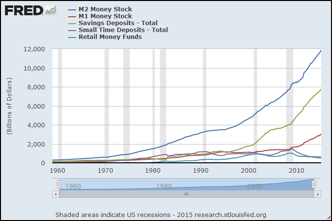
Graph #1: M2 Money (dark blue) and Components
A bit messy.

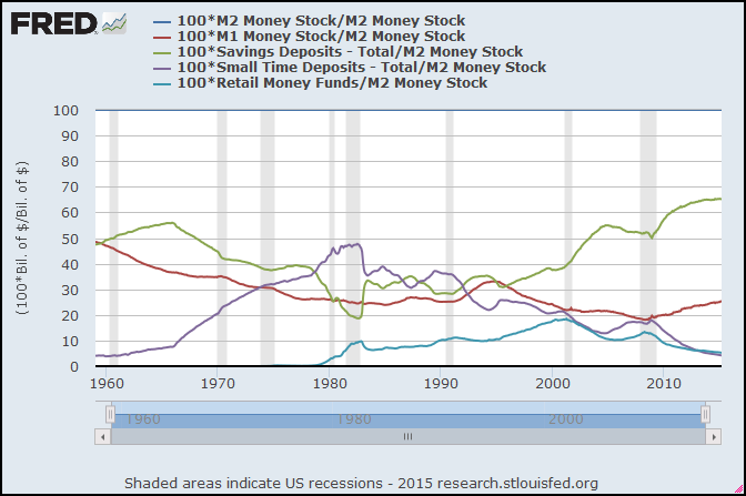
Same data series, shown as percent of M2:

Graph #2: Components as Percent of M2
Oh, that's not any better.

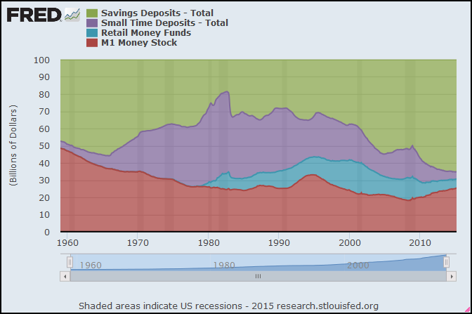
Get rid of the M2SL series, and look at the components-as-percent on a stacked area graph:

Graph #3: Components of M2 Money
A little easier to see now.

Monday, April 20, 2015

How much money is in savings?


Sunday, April 19, 2015

Historical Federal Workforce


Googling payroll of the Federal government turned up a link to a table of Total Government Employment Since 1962 from the U.S. Office of Personnel Management. Shows Executive branch civilians, Uniformed military personnel, Legislative and Judicial branch personnel, and a Totals column.

That Google search also turned up this hit


which I didn't bother to click. The era of big government has returned with a vengeance, in the form of the largest federal work force in modern history, it says. I had already seen the table of Federal employment numbers: 5.4 million employees in 1962, 4.2 million in 2013.

So I grabbed the Federal employment numbers and stuck 'em in a spreadsheet. Then I went to FRED and got the numbers for Total US Population, and stuck that in there too. Then I made a graph of Total Federal Employment as a percent of Total US Population:

Graph #1: Federal Employment, Trending Down since before the VietNam War, is now below 1.5%

Saturday, April 18, 2015

Still looking for Savings


The other day I wrote:

Do we have a vast quantity of savings stored up? You know we do.

I don't like that. I don't like pretending innuendo is evidence. Maybe it bothered you, too. (I hope so!) I wanted to show vast savings on a graph. But that wasn't as easy to find as I thought. That day, I skipped the graph.

I looked on Friday, but did not find. I'm looking again today, and today I will take a different approach to the problem. I will wander from FRED. I will see what other people have to say.

I remember Steve Roth a while back offering a definition of "money":
I’ve bruited the notion in the past that “money” should be technically defined, as a term of art, as “the exchange value embodied in financial assets.”

In this definition, counterintuitively relative to the vernacular, dollar bills aren’t money. They’re embodiments of money, as are checking-account balances, stocks, bonds, etc. etc...

If this definition is safe, then the stock of money (I hate the term “money supply,” which suggests a flow) equals the total value of financial assets. Forget the endless wrangling about monetary base, M1, M2, divisias, and all that. Add up the value of all financial assets, and that’s the money stock.

I wasn't happy with that definition of money, then. But maybe I can use it now. It's a very very "broad" definition of money -- and when you're pondering savings, a broad measure is the right one to use.

Roth shows graphs of Total Assets as a proxy for the stock of broad money. I like that approach. It gives me numbers to work with.

It's also the biggest money measure that comes to mind. That's why I want to use it here. From it I want to subtract the portion of money that is commonly used for transactions -- the part that I see as "money" -- and consider the rest to be savings. By this method I may arrive at a measure of savings, the biggest measure of savings that I can come up with. You know: vast savings.


I found a few links to estimates of total accumulated savings. Most of 'em, unfortunately, are like this:


Gross savings (plural) figured as the part of Gross Domestic Income that we don't spend. That's a flow, dammit. STF might call it Gross saving [singular]. We were looking at Gross savings in yesterday's post, trying to trust that it is a stock, without success. Maybe now we know why.

Here's a World Bank link on Gross Savings. Shows the same definition as the indexmundi clip. Their Gross Savings numbers for the U.S. are $2.38 Trillion (2010), $2.45 Trillion (2011), $2.7 Trillion (2012), and $2.91 Trillion (2013).


The useful "Total Assets" links I found are shown next, in date order:

Rutledge Capital - May 24, 2009: Total Assets = $188 Trillion as of 2008Q4.

Yahoo Finance - October 22, 2013: Total Assets = $225 Trillion as of 2012Q3.

Wikipedia - April 17, 2015: Total Assets = $269.6 Trillion as of 2014Q1.

That's about it, really. Maybe you can find more?

Hey, since we can now draw lines on FRED graphs, I'm gonna show GDP and add this Total Asset data to the graph!

Graph #1: GDP (blue) and Total US Assets (red)


HEY!!!

Friggin Wikipedia!

At the Financial position of the United States page that I linked above, among the graphs on the right side is a green one, Assets of the United States as a fraction of GDP 1960-2008. Clicking that brings up a bigger image along with related data.

The graph is by Equilibrium007, who would get the Arthurian Prize of the Day, if there was one.

I clicked More Details. Below the graph is a Summary section, where the Description includes a link to the source data. Clicking that brings up a page of the Fed's Data Download Program -- somewhere I've never been before. There is a package of 16 data series there, for download or review.

See how easy it was, to find all that data!!!


But, you know, I'm not so sure now that I want to take Total Assets, or even Total Financial Assets, and say that it's a good proxy for vast accumulated savings.

A lot of financial assets, most of 'em maybe, were not created by saving. They were created by borrowers and lenders reaching agreements that create money from nothing.

It doesn't worry me that they create money from nothing. But we surely cannot then turn around and say the assets were created by acts of saving.

If I go to the bank and borrow $1000, and the bank creates the money by depositing it in my account, there was certainly no saving that accumulated to $1000 so that I could borrow it. Maybe it's true, I think it is quite definitely true, that after I borrow the money and spend it, it soon finds its way into savings. So there is going to be a relation between savings and assets like loans, anyway. And that might be a useful relation to look at. But I don't think it's correct to look at assets and say there was that much accumulated savings -- nor even that there is going to be that much accumulated savings. It just doesn't sit right.

My attempt to use Total Assets as a measure of accumulated savings was wrong-headed.

Friday, April 17, 2015

Looking for something definite


STF left a concise statement a while back at Winterspeak:


I thought that was great. "Saving" is a verb. It is something we can do. "Savings" is a noun. It is something we might have.

"Saving" (singular) is the act of putting money away for later. "Savings" (plural) is the accumulation of money you have put away. "Saving" (singular) is the flow of money into a stockpile of "Savings". This all works. I adopted STF's terminology right away.

And now ... four and one-half years later ... I'm still trying to figure out if FRED adheres to the clear and simple standard that STF laid out in that brief comment.


Here is FRED's Savings [plural] Deposits, Total:

Graph #1
Savings, plural, the noun, something we might have . This graph shows the accumulated stock of savings. Maybe. So then if I were to show Change, Billions of Dollars -- or if I make it annual and show Change from Year Ago, Billions of Dollars -- that would be the flow variable, or "saving" in the singular form. If I'm looking at what I think I'm looking at.

How can I tell if I'm looking at what I think I am?

For this dataset at FRED, the Notes say in part

The savings deposits component of M2 consists of passbook-type savings deposits as well as MMDAs at banks and thrifts.

So. The graph shows a portion of M2 money, and M2 is a stock of money (not a flow of money). If the graph shows a portion of a stock, the portion it shows is a stock also (not a flow); I'm confident of that. So that corresponds to "Savings [plural]". And now I think I'm on the right track if I show the blue line as Change from Year Ago and compare it to some measure of "Saving [singular]".

Ah! I found Gross saving [singular] as a percentage of gross national income. And I found Gross National Income for United States, in Current Dollars. This will work. I can figure Gross saving from it.

If "Gross Saving" is "GS" and "Gross National Income" is "GNI" then FRED's  "Gross Saving as a Percent of Gross National Income" looks like this:


To get the Gross Saving number from what FRED gives me, I only have to multiply by GNI and divide by 100:


Working backward from FRED's number, I get GS, Gross Saving, singular.

I want to compare these GS numbers to the Change from Year Ago, Billions of Dollars version of Graph #1. If they are the same, or similar even, then I will be confident that the series shown in Graph #1 is the stock variable and is correctly plural. I will also be confident that the GS numbers I calculated from the "Gross saving [singular]" series is correctly singular. I will have learned something.

I looked into this a few times before (at least twice on the blog, as I recall) without ever making this much progress. So I'm doing good today. Here's the result:

Graph #2
Not even close.

We have not learned that Graph #1's blue savings (plural) shows a stock and Graph #2's red saving (singular) shows a flow. We have not learned that FRED follows STF's singular/plural rule.

Have we learned anything? Nothing definite. But now I want to think that Graph #1 (since it doesn't show a stock) shows a flow of deposits into savings. But I don't see how that can be, given FRED's Note that we looked at above.

Maybe we learned that the singular/plural rule does not apply to the words "deposit" and "deposits". And maybe we learned that Gross and Total don't mean the same thing.

Oh, well here is something. Dividing by 1000000000 (on Graph #2) converts the red line from "current dollars" to "billions". Now you can't say you've never seen anybody do that!

Thursday, April 16, 2015

He thinks he's grumpy?


In a recent post, Cochrane says all money should be interest-bearing. His view is a concession to the world as it is today, when most (but not quite all) money is interest-bearing.

The cost of interest is the central, underlying problem in the world today. But not because interest rates are so low. No, that was a solution, remember? The cost of interest -- the accumulated cost of interest -- is a problem because there are so many dollars already that are interest-bearing.

The problem, in other words, is that there is too much debt. There is so much debt that, even at the zero bound, the cost of finance holds the economy down.


Cochrane's opening talks up government debt: "I propose a new structure for U. S. Federal debt. All debt should be perpetual, paying coupons forever with no principal payment..."

Then he gets into it, quoting himself:

Economists have long dreamed of interest-paying money. It fulfills Milton Friedman’s (1969) optimal quantity of money without deflation. Paper money is free to produce, so the economy should be satiated in liquidity...

Mmm. "Economists have long dreamed of interest-paying money." Well, we have that. Every dollar of debt -- public and private -- is a dollar that somebody put into circulation, and is paying interest on, to keep in circulation.

The problem is not that there's not enough interest-bearing money around. The problem is that most of the money we borrowed and spent into circulation and are still paying interest on, most of that money is now sitting in somebody's savings account collecting interest. We are paying interest on money we spent into circulation, but that money has already settled out of circulation and somebody is collecting interest on it. Oh, and the banks are making money at both ends of that arrangement.

Meanwhile, that arrangement does nothing to help the real economy.


Cochrane quoting Cochrane:

Our economy invented inside interest-paying electronic money in the form of money market funds, overnight repurchase agreements, and short-term commercial paper, and found it useful. But that money failed, suffering a run in the 2008 financial crisis.

Yeah, that money failed. It gave us the 2008 financial crisis.

Wednesday, April 15, 2015

It ain't Sociology 101


I found a chart recently, a table comparing the ideas of different economists. Can't find it now, dammit. One column in the chart was for Adam Smith. One item under Adam Smith said his thinking was class-based.

Well, I didn't like that much, and I went on to other things. So, now, when I want to link to that table, I can't find it.

So it goes.


Maybe Adam Smith's thought is considered "class-based" because he focused on the differences among three groups: the owners of natural resources, the workers, and the owners of man-made resources. Land, labor, and capital.

Maybe Smith's thought is considered class-based for other reasons. I don't know anything about that. So I want to evaluate just the one notion, that Smith's focus on "land, labor, and capital" is class-based.

I begin with Schumpeter's thought, that if we do not make distinctions, we shall never be able to say any more than that everything depends upon everything.

Adam Smith looked at the world around him and he saw the aristocracy, and he saw the commoners. And he saw a rising new "class" or category, those people who make money by doing business. It didn't start out as business, you know? It started out as "busyness". But it grew in importance. And Adam Smith caught it on the up-swing.

Does that make his work class-based? Maybe -- if you don't look into what he says.

Smith made distinctions, because if you don't make distinctions you can't say anything interesting. But the distinctions he made were realistic. They were based on the world of his day. And he didn't focus on classes of people. He focused on types of income.


I don't like looking at things in terms of us and them -- the 99% and the 1% and like that. I prefer to think in terms of categories of income, not classes of people. So Adam Smith makes sense to me.

As Smith put it, writing of wages, profit, and rent:

When those three different sorts of revenue belong to different persons, they are readily distinguished; but when they belong to the same they are sometimes confounded with one another, at least in common language.

Classes separate people. But Smith pointed out that any one person can receive income of various types. So for him, income was not distinguished by class of person. It was distinguished by type of income. He also identified different regulating factors for each type of income. These regulating factors were what made one type of income different from another. Smith's thinking was not class-based. It was income-based.

That's why we remember him as an economist, not a sociologist.

Tuesday, April 14, 2015

Alternate Ending


I hope the ending of yesterday's post wasn't confusing.

I don't like the "inequality" argument. Oh, I think it's an easy argument to make, sure. But I don't know how to deal with the "class warfare" rebuttal. Yes, you can deny you're engaging in class warfare. But denial is a weak argument.

That's what the other guys want, you know: They want you to keep making weak arguments.

I prefer to avoid that approach altogether.


This preference for the future of which Hendrickson writes -- How could it have developed?

Not suddenly. It started with the first dollar of savings. It grew gradually and for a very long time, along with savings. Eventually it began to have economic effects. In the early days of capitalism, accumulated savings was large enough to effectively drive capitalism forward. And because of that, it seemed to be true that supply creates its own demand. I think it likely was true, for a time.

But savings continued to grow. Savings grew beyond the point where it only contributed to economic growth: grew to the point where it started undermining economic growth as well.

At that point there would have been some measure of slowdown in economic growth. Policymakers would have wanted to fix that problem.

Policymakers' experience had taught them that the increase of savings is good for growth. So they did their best to create policies to enhance the growth of savings.

But the economy had already changed. Savings had already grown beyond the point where it only contributed to economic growth. And further increase in savings could only enhance the ineffectiveness of savings as a device for obtaining growth.

Savings, of course, is provision for the future. A vast accumulation of savings is a vast provision for the future. Once the accumulation of savings becomes great enough, the focus on the future overrides the focus on the present and becomes the dominant focus. At that point, Hendrickson's conclusion applies.

All of this happens by the natural process of saving money, something that everyone wants to do. Let that process continue until it begins to harm the economy, then enhance that process in the mistaken belief that this will reverse the damage done, and eventually Hendrickson's conclusion is the inevitable conclusion.

Inequality?

Sure: Apply inequality to the process I describe, and you speed up the process.

Monday, April 13, 2015

Josh Hendrickson asks a good question


At The Everyday Economist, Josh Hendrickson asks What Does It Mean for the Natural Rate of Interest to Be Negative?

It's a good question. It's a How can this be? question. I like his post already.

Hendrickson points out that "Talk of the zero lower bound has permeated the debate". He brings it into focus:

Specifically, the argument holds that if the market rate of interest is higher than the natural rate of interest then monetary policy is too tight.

He has a few questions, and soon gets to the important one: "Why is the natural rate of interest negative?" He says it's not easy to imagine such a thing. He defines it...

I will define the natural rate of interest as the real rate of interest that would result with perfect markets, perfect information, and perfectly flexible prices

...and he sets up a model. I'm just gonna skip right over the model and look at the conclusion Hendrickson pulls out of it, and where it takes him:
Since the supply curve is horizontal, the real interest rate is always equal to the rate of time preference. So this brings me back to my question: How can we explain why the natural rate of interest would be negative?

You might look at the equilibrium conditions and think “sure the natural rate of interest can be negative, we just have to assume that the rate of time preference is negative.” While, this might mathematically be true, it would seem to imply that people value the future more than the present.

Okay. Models are not my thing. I like to look at ideas and see if they make sense. So, does Hendrickson's conclusion make sense? Or (since I chopped off the rest of his conclusion) does the part I quoted make sense? Does it make sense in our "zero lower bound" state, if that's where we are, to say that people value the future more than the present?

Yeah, it does. But I need to tweak his wording just a bit.


When Hendrickson asks

Are we really to believe that the the zero lower bound is a problem because the general public’s preferences change such that they suddenly value the future more than the present?

he has turned "people" into "the general public". It doesn't need to be that way. The 99% may still value the present more. Maybe it's only the 1% that values the future more. If 1% of the people have most of the money, their preferences predominate. And then what happens depends not on what the majority of the people want, but on what the people with the majority of the money want.

That doesn't invalidate Hendrickson's conclusion. Makes it more likely than not, I'd say. It's the trends of the money, not the opinions of the many, that make the world go round. When a few people make the decisions for most of the money, it might be easier to get into a situation where interest rates tell us that "people" value the future more than the present.

So let's say we restate Hendrickson's view, to accommodate the the kind of inequality that allows a handful of people to accomplish things that the general public cannot.

And suppose we take the "suddenly" out of his sentence. For it may not be that we "suddenly value the future more than the present". It may be something that creeps up on us quietly for a long time, before it reaches the tipping point that makes everyone take notice.

Hendrickson's question is essentially unchanged:

Are we really to believe that the the zero lower bound is a problem because the predominant preferences change such that they come to value the future more than the present?

I can live with it in this form.


Let me answer a question with a question: How might we show that we value the future more than the present?

That's easy: Saving is provision for the future. If you don't spend a dollar today, you're preparing to be able to spend it in the future. So if people value the future more than the present, we would expect to see a vast quantity of savings stored up.

Do we have a vast quantity of savings stored up? You know we do.

Is this vast savings widely and equitably distributed? Or is the bulk of it in few hands, so that the great shares they hold are greater even than we comprehend? If the latter, are the bulk of those funds in so few hands that a consensus could develop among the few? -- a consensus on a new and different economic view, such that their valuation of the future takes precedence over our valuation of the present?

You know it could.

But there need be no consensus, no conspiracy, no particular agreement. The Few have shared interests simply because of their financial standing. Each of the Few on his own may arrive at this new and different economic view that values the future more highly than the present. And as their savings accumulate, their view is strengthened.

If we had sudden luck and found ourselves financially among those Few, in us would naturally arise the same preference for the future, as in the others.

Sunday, April 12, 2015

Inflexible Trends


When you make a graph at FRED, the first series you use establishes the start- and end-dates for the default display.

Maybe you start with a series that runs from 1947 to 2014. Then you add another series and divide the one by the other. But the new one you added only starts in 1967 maybe. So the computer cannot figure the first 20 years anymore, because it's a number you have, divided by a number you don't have. So they just leave that out.

But the default dates don't change. (That's probably a good thing.) So you are left with a plot area that starts at 1947, and a plotted line that only starts in 1967. The first 20 years of your graph show blank white space.

If you look at FRED graphs people have made, you'll often find those big white spaces in the starting years. You can find it on a lot of my FRED graphs, for sure. Maybe you never noticed. But now that you know about it, you'll see it all the time.


I started with a FRED graph showing Total Financial Assets (FRED's TFAABSHNO). The data runs from 1949 to 2014. Then I added the M1ADJ series (M1 Adjusted for Retail Sweeps) which runs from 1967 to 2013. So of course the plot area was blank for the years 1949-1966. Then I added a trend line to the graph. That's a new feature at FRED. Here's what I got:

Graph #1
The blue line, showing my calculated data, starts at 1967. But the red line, FRED's trend line, is shown on the graph starting at 1949.

What happened? The guys that added the trend line routine to the FRED code forgot to check where the data starts. They just went with the default start-date. And so that's what the graph shows.

This is funny stuff.

I knew about the reverse-order thing that I described above. So I created the graph again, from scratch. But this time I started with the series that starts in 1967, then added the series that starts in 1949. So by default, there is no blank white space. The years before 1967 are simply not shown.

Then I added the trend line again, and here's what I got:

Graph #2
I had a good laugh at that. Then I noticed that the red line is exactly the same on both graphs, and had another good laugh.

Then I noticed that the trend line is good for maybe the first dozen years and for the last few, and otherwise it is way the hell off from where it should be.

And then I noticed that they don't even do a trend calculation. The red line starts at the first value of the blue line, and ends at the last value of the blue line. And what they call a "trend line" is really just a straight line from the first blue point to the last blue point.

That's embarrassingly bad, I think.


But hey, don't take my word for it. Let's see what Excel gives us.


That's more like it.

Cross Posted at On the Death of FRED

Saturday, April 11, 2015

Excessive savings and cluelessness


Below, the opening lines from a post titled Excessive savings[!] and Keynesian economics by Steve Kates.

See if you can find an argument in the excerpt.

Excessive savings[!] and Keynesian economics

Posted on 7:38 pm, December 29, 2014 by Steve Kates

There was a comment on my previous post, Krugman’s Keynesian cluelessness reaches new heights, that got me to thinking. Here is the comment put up by Rich, for which I am very grateful:

I was looking up the “broken window fallacy” in comments at the link that Steve Kates provided about Skousen’s Gross Output… the words that were a howler to me was the concept of “excessive savings.”

Excessive savings!

Insane, right? Who could believe such idiocy that our central economic problem is too much saving? Completely ridiculous and beyond bizarre. Utter nonsense! How stupid would you have to be to believe such stuff!

Friday, April 10, 2015

So much focus on expectation, so little on evidence at hand


Came upon this by Jonathan Finegold:

Keynes’ point is that expectations are not past-oriented thoughts, but future-oriented thoughts. As such, past expectations are largely irrelevant...

In the same post, Finegold writes

The current stock of equipment, of course, embodies past expectations.

So the current stock of equipment is largely irrelevant? Finegold makes my head spin.

Here's Keynes:
The considerations upon which expectations of prospective yields are based are partly existing facts which we can assume to be known more or less for certain, and partly future events which can only be forecasted with more or less confidence.

It would be foolish, in forming our expectations, to attach great weight to matters which are very uncertain. It is reasonable, therefore, to be guided to a considerable degree by the facts about which we feel somewhat confident, even though they may be less decisively relevant to the issue than other facts about which our knowledge is vague and scanty. For this reason the facts of the existing situation enter, in a sense disproportionately, into the formation of our long-term expectations; our usual practice being to take the existing situation and to project it into the future, modified only to the extent that we have more or less definite reasons for expecting a change.

In practice we have tacitly agreed, as a rule, to fall back on what is, in truth, a convention. The essence of this convention — though it does not, of course, work out quite so simply — lies in assuming that the existing state of affairs will continue indefinitely, except in so far as we have specific reasons to expect a change.

Thursday, April 9, 2015

Also...

(following up on yesterday's thought)

It seems to me that for the inflation-adjustment of debt -- maybe for all 'real' calculations, but definitely for 'real' debt calculations -- you want to have the base year at the start of the dataset, not at the end of it.

The 'real' calculation removes the effects of inflation. Inflation is prices going up. If you remove the increase in prices, your numbers get lower. To show the "lower" you have to put the base year at the start of the series. So it just makes sense to do it. (See also mine of 5 April.

Coincidentally (or not), using the first year as the base year solves the starting-year problem that I discussed yesterday. Come to think of it, when I did inflation-adjusted debt calcs a while back I wrote about a "floating" base year.

Wednesday, April 8, 2015

The 'ending year' is a problem


I like writing. It's like private time. I get to block out the world and play with things in my head. (I don't even listen to the radio in the car. That's how much an introvert I am.) But sometimes the world interferes: Too many dogs demanding attention... too much going on at work, demanding attention... and the wife, demanding attention. Eh, that's all just excuses.

I like writing regularly and keeping the blog alive and reading the responses to the things I say. I like being right, and I like being corrected when I'm not, and I like being forced to think about things (so, thank you). Still, sometimes it's hard to write.

I have a problem with Gene Callahan. One of us is an asshole, him or me. The thought that it might be me makes it hard to write. Why? I don't know. It just does.

I have a bigger problem with my 'inflation adjustment of debt' stuff. (That's what this post is about. It's not always easy to tell I guess.) There was one problem, pointed out in two anonymous comments a couple weeks back. That was a good criticism, excellent in fact. I resolved that one pretty well I think.

But along the way there was another comment, this one from Jim:

I would have expected that 70 years of inflation adjustment would inflate the debt a lot more than the graph indicates.

Yeah, I would have expected that, too. But Jim hit me with it too soon. I was still getting acclimated to the other adjustment to the calculation. Things soak into my brain at their own speed, there's nothing I can do about that.

Like Jim, I expected a different result on the graph. But unlike a lot of people, I am willing to accept what graphs show me, and fit my thinking to that.

But then, if there is a mistake in my calculations, I really want to direct my attention to the mistake rather than fitting my thinking to it. Wow. You know, the lumber yard burned down the other day. Nothing left. I don't know why this comes to mind now. Anyway...

I wanted to look at the difference between 'real' and 'nominal' debt measures... when inflation "erodes" debt things get better for debtors and (equally) worse for creditors. I wanted to look at interest paid on debt, and see how well it fills the gap between the real and nominal debt measures. Things like that fascinate me.

I laid out a plan using some made-up numbers to clarify (for myself) what I wanted to do with the numbers. That part was easy. It was much more difficult, for some reason, fitting actual numbers to the plan. Attention-demanding.

But as I worked it out, it became obvious to me that the debtor is only "responsible" (I use the word loosely) for the creditor's loss during the time that the debtor owes the creditor. If you have a dollar and you hang on to it for ten years, and there is inflation during that ten years, hey, it's your loss.

If I borrow that dollar and pay you back five years later, then if during that five years there is inflation, the erosion of value contributes to the gap between 'real' and 'nominal' debt totals. (I am not saying debtors should make up the difference. I am trying to clarify how big the difference is, to get a better feel for the growth of debt.)

And when I pay back the creditor and I don't have his dollar any more, if there is inflation after that it's on him.

That's the key concept.

If I want to see the size of the erosion of debt in 2009, say, then I have to do my funky year-by-year calculation, breaking 2009's total outstanding debt into the yearly additions that accumulated, and for each of those years figuring the erosion of debt for that year's addition to debt, from that year to 2009. And that should be exactly right.

But if I want to see the size of the erosion in 2010 instead, I have to adjust for inflation from the year of borrowing to the ending year 2010, not 2009.

Here's the problem. I was an idiot. I was using 2009 for the ending year, to figure all the values, because I was using a GDP Deflator that has 2009 for its base year. So all the years before 2009 on the graphs I did for these post, all the years before 2009 show the gap bigger than it really was, and all the years after 2009 show it smaller that it really was.

The outcome, or what I expect the outcome to be, is that Jim was right. I expect to see 'real' debt peel away from 'nominal' debt, faster and higher than my previously corrected graphs show.

My graph that was wrong showed the faster and higher thing. I thought that was right. That's why I needed the anonymous help to fix my mistaken start-value calculation.

But I think when I fix the ending-value calculation, using inflation from the earliest data to 1960 for the 1960 calculation, from earliest data to 1961 for the 1961 calculation, from earliest to 1962 for the 1962 calculation, and leaving 2009 out of the calculation except in the year 2009, I think the graph will show something more like what Jim and I were expecting to see.

But I still have to work it out.

I'm just gonna post this and run. I'm already late to work, and the dogs are still out. But I'm pretty sure when I did the 'inflation adjustment of debt' thing a year or two ago, I did the ending calculation correctly, I mean, what I'm saying now is the correct calculation. I didn't check that, but I think that's right.

So anyway, now that I've laid out my confusion and I hope made it less confusing, maybe I can get back to writing and doing the calcs I need to do.

Thanks for listening.

Sunday, April 5, 2015

Mendacity at FRED, a tangent


Since 21 March I have been mostly looking at the inflation-adjustment of debt. The effect of inflation can be calculated, and it can then be removed from the debt numbers. But the calculation is less straightforward for debt than, say, for GDP.

GDP is a "flow" variable, where each year's number represents only that year's activity. Debt, on the other hand, is a "stock" variable. Any one year's debt number includes all the outstanding debt from prior years in addition to the new debt accumulated during the year under consideration.

The accumulation of "many years" in each debt number means that to remove the effects of inflation, each year's accumulated debt number must be split up into separate amounts for each year debt was added to the accumulation, so that each year's inflation can be removed from that year's piece of the debt. After that, the adjusted numbers can be totaled up to get an accurate measure of accumulated debt with the effects of inflation stripped away.

If that all sounds a little confusing... Well, it is. Perhaps that's why we often see people inflation-adjust debt the same way they inflation-adjust GDP. But it is certainly wrong to do that. The inflation-adjustment is incorrect, and it leads to incorrect conclusions about our economic problems. This is no small matter.

//

To strip inflation out of any one year's GDP, you just divide that GDP number by the price number for the same year.

Here's how dividing works: If you have a lot of company and you divide a pie into 10 pieces, all the pieces are small. But if you only have a few people over and you divide the pie into 4 pieces, all the pieces are big! When you divide by a big number, the result is small. And when you divide by a small number the result is big.

Since prices were going up let's say continuously from World War Two until the 2009 recession, old price numbers are smaller than new ones. So dividing by an old price number is like dividing by a small number. And dividing by new price number is like dividing by a big number.

If you have a series of numbers (like GDP numbers, say) and you divide each year's GDP number by that year's price number, the older numbers come out bigger and the newer numbers come out smaller. That's why when you see a graph that shows actual GDP (with prices going up) and "real" GDP (with the price changes stripped away), the old real numbers are higher and the new real numbers are lower. Red is real:

Graph #1: GDP in Recent Years, at Actual Prices (blue) and with Inflation Stripped Away (red)
For the years before 2009, the red line is higher than the blue line. For the years after 2009, the red line is lower than the blue line. The old real numbers are higher and the new real numbers are lower than the numbers we started with.

That remains true even when you look at all the years in the data set:

Graph #2: GDP since 1947, at Actual Prices (blue) and with Inflation Stripped Away (red)
The blue line goes up faster than the red line, because the blue line shows prices going up and the red line does not. And the lines cross in 2009 because 2009 is the "base" year.

Again, the red line is calculated by dividing the price increases out of the blue line. For the next graph I got rid of the red "Real Gross Domestic Product" series and in its place I show the blue line again (now in red) divided by the price numbers. So you can see the calculation:

Graph #3: GDP at Actual Prices (blue) and with Inflation removed by Calculation (red)
Graph #3 looks just the same as Graph #2, when you look at the red and blue lines. But comparing the titles (across the top of the two graphs), you can see the calculation that gives you "Real Gross Domestic Product". The change is also evident in the left-border labels.

Of course, the same calculation has been used for things other than Gross Domestic Product. Here's Disposable Personal Income:

Graph #4: Disposable Personal Income (blue) and the Inflation-Adjusted version (red)
Looks almost the same as Graph #3, doesn't it?

We can do the same thing with Median Household Income, too:

Graph #5: Median Household Income (blue) and the Inflation-Adjusted version (red)
Now this one looks a little different! There are a few reasons. It only goes back to the mid-1980s, for one thing. So you don't see as much up-slope as on the previous graphs. And then, there just isn't as much up-slope. And this time the lines cross at 2013 rather than 2009. That's a big difference. But it is only because the red line is shown in "2013 dollars". Prices were higher in 2013 than any prior year, so it took more dollars that year than it took in, say, 2009 to buy the same stuff. And since the red line is shown in 2013 dollars (when it took the most dollars of any year, to buy stuff), all the years seem to show a lot of dollars. That's why the red line is so high.

Come to think of it, using "2013 dollars" was a pretty slick trick because it makes Median Household Income look high. You weren't fooled by that, were you?

It's easy enough to change it. I can divide all the red line's numbers by the red value for 2009, and multiply by the blue value for 2009. That will shift the red line down so the two lines cross in 2009 -- same as the first four graphs today.

The graph at FRED shows a value of 54,059 dollars for the red line in 2009. It shows a value of 49,777 for the blue line in 2009. I'll use those numbers, and you will be able to see them in the title text across the top of the graph:

Graph #6: Median Household Income (blue) and Inflation-Adjusted to 2009 base (red)
Now, you see, the two lines cross in 2009. But heck, we can push the red line down even more. I'll redo it now using the FRED values from 1991:


We can make that sucker look flat!

But remember, we didn't flatten the red line. It was already flat. We just moved it down some. Now we can see it. Now we can see something other than how high FRED has it.

Saturday, April 4, 2015

How do you measure success?


I suppose you could use the Karl Urban standard:

He is best known for playing Éomer in the second and third installments of Peter Jackson's The Lord of the Rings trilogy, Dr. Leonard "Bones" McCoy in Star Trek and Star Trek Into Darkness, Cupid and Julius Caesar in Xena: Warrior Princess, Kirill in Bourne Supremacy, Vaako in The Chronicles of Riddick and Riddick, and Judge Dredd in the 2012 film Dredd.

(cough)

I count it a success when I see something like this in my browser:


It means I successfully deleted something that interrupted me to get itself updated.

Friday, April 3, 2015

Working interest into the mix


Suppose I borrow $10, to be repaid as a lump sum after five years, with one dollar interest to be paid annually.

Year 0Borrow $10
Year 1Pay Interest $1
Year 2Pay Interest $1
Year 3Pay Interest $1
Year 4Pay Interest $1
Year 5Pay Interest $1 Principal $10

I pay back a total of $15 for $10 borrowed.

The graphs I've shown recently, comparing "nominal" to "real" Federal debt to GDP ratios, consider only the principal amounts. Not the interest. Now I want to consider the interest payments as well as principal.

Specifically, I want to see how well interest payments fill the gap between nominal and real on my graphs. Does interest make up the shortfall created by inflation? Does it more than make up for the shortfall? Or does a shortfall remain?

Suppose I borrow $10, to be repaid after five years pass, with one dollar of interest paid annually, and with inflation that reduces the dollar's value by ten cents each year. The "real" value of the dollar would be:

Year 0:$1.00
Year 1:90 cents
Year 2:80 cents
Year 3:70 cents
Year 4:60 cents
Year 5:50 cents

In year zero, when a dollar was worth $1.00, I borrowed $10. I received the value $10.

In year one, when a dollar was worth 90 cents, I paid $1 interest. I paid a year-zero value equal to 90 cents.

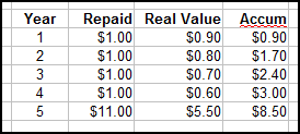
In year two, when a dollar was worth 80 cents, I paid $1 interest. I paid a year-zero value equal to 80 cents. The lender has received from me a total of $1.70 of year-zero value. Here, I don't need to type it all out:


Oh look at that. Open Office doesn't like the way I shortened the word accumulation.

So in this example, the  lender is repaid $8.50 out of $10 "real" value dollars. A better way to say it may be that, when we consider principal and interest and inflation, the lender received back 85% of the value lent out.

All of this of course assumes that it is reasonable to expect to be repaid at equal value rather than an equal number of dollars. In an inflationary world, that assumption may not be reasonable.