Wednesday, December 31, 2014
 Repeating that last part
The trouble with QE was not that it bought the wrong assets. Asset-buying by the Federal Reserve is the wrong solution no matter what they buy. The trouble with QE was that it took the assets out of the economy and left the liabilities in. It was the liabilities that created the problem to begin with, excessive liabilities -- liabilities created by the unsustainable growth of debt.
The Fed decided to buy up assets when the one thing that would have solved the problem quickly would have been to pay off the liabilities. The asset-holders would have got their money just the same. But we would have found some relief from the costly burden of excessive debt. And that is the key that would have allowed economic growth to resume with vigor.
But no. The supply-side mindset puts all the focus on the asset side, with not a wisp of concern for the liability side of things. Therein lies the problem.
Tuesday, December 30, 2014
With not a wisp of concern
At Moneyness:
... let's say that QE was not irrelevant and can be held responsible for a large chunk of the rise in equity prices over the last few years. Even then, the real economy, and therefore the poor, would have been equal beneficiaries of QE. As I pointed out in my previous post, financial markets are not black holes. Newly-created money, insofar as there is an excess supply of the stuff, cannot stay 'stuck' in financial markets forever. For every buyer of a financial asset there is a seller, and that seller (or the next seller after) will choose to do something 'real' with the proceeds, like buying a consumption good, investing in real capital, or hiring an employee—the sorts of purchases that benefit the poor...
In the post Koning is considering stories that he doesn't find satisfying. I want to be careful not to say anything that sounds like I think he accepts those explanations. But in the above excerpt, it is the "QE was not irrelevant" story that is not his. The rest of that excerpt *is* Koning, the "the poor would have been equal beneficiaries" part, and the repeating what he said in his previous post, and all that.
Koning writes:
For every buyer of a financial asset there is a seller...
I hate that. It's such a wrong thing to say. It implies that the number of buyers is equal to the number of sellers, when obviously it is the number of buyings and the number of sellings that are equal.
In a world skewed by inequality it is likely that there are sometimes many buyers and few sellers, sometimes many sellers and few buyers.
"For every this there is a that" is a terrible, terrible argument. It confuses the truth. But that's not the worst of the worst. Koning writes:
... and that seller (or the next seller after) will choose to do something 'real' with the proceeds...
In other words, Koning says nobody hoards money. The Fed Q-ease new money into existence, and the first recipient spends it on something real. Or the second recipient.
But if things ever did work that way, they don't any more. We just don't want to spend anymore. That's what the change was, back when things suddenly changed. You know. It happened at the same time that the money multiplier stopped working. People don't spend money they have, and people don't borrow to spend money they don't have. That was the change. Yet Koning says no one hoards money.
So, what does Koning's graph show? Oh -- no, nothing. Koning doesn't show a graph. Here, use mine:
 |
| Graph #1: The sudden change in the blue line was the Fed's response to the sudden increase in hoarding. |
Graph #1 compares spending-money to total Federal Reserve assets. Used to be, for every $800 of Fed assets there was about $1200 of spending-money. The red and blue lines ran side-by-side, roughly parallel, the blue line low. But with Quantitative Easing, that all changed. The Fed started increasing its assets (blue) and has been increasing its assets ever since.
Fed assets jumped from being less than M1 money, to being more than M1 money. From about two thirds, to about four thirds of M1 money. And the difference is even greater now. People don't hoard? What was Koning thinking?? Obviously, whoever has the newly-created money is in no great rush to turn it into spending-money.
NOTE:
FRED's title for the dataset shown in blue is All Federal Reserve Banks - Total Assets, Eliminations from Consolidation. It would have been simpler if they just called it All Federal Reserve Banks - Total Assets. The word "eliminations" in there makes it seem that the blue line must show less than the total. I don't think that's the case. I think they add up (or consolidate) the holdings of the dozen Fed banks and then eliminate some items to avoid double-counting. Net instead of gross. Something like that.
FRED's title for the dataset shown in blue is All Federal Reserve Banks - Total Assets, Eliminations from Consolidation. It would have been simpler if they just called it All Federal Reserve Banks - Total Assets. The word "eliminations" in there makes it seem that the blue line must show less than the total. I don't think that's the case. I think they add up (or consolidate) the holdings of the dozen Fed banks and then eliminate some items to avoid double-counting. Net instead of gross. Something like that.
One more bit from the Moneyness quote above, before we move on:
... that seller (or the next seller after) will choose to do something 'real' with the proceeds, like buying a consumption good, investing in real capital, or hiring an employee—the sorts of purchases that benefit the poor...
Please don't call me "poor".

Almost done. In the same post, Koning writes:
Say we change where central banks inject new money. Instead of conducting QE with a select group of banks, central banks now purchase directly from the populace. And instead of buying financial assets, they bid for stuff that regular folks own, like cars, houses, and wedding rings...
No.
The trouble with QE was not that it bought the wrong assets. Asset-buying by the Federal Reserve is the wrong solution no matter what they buy. The trouble with QE was that it took the assets out of the economy and left the liabilities in. It was the liabilities that created the problem to begin with, excessive liabilities -- liabilities created by the unsustainable growth of debt.
The Fed decided to buy up assets when the one thing that would have solved the problem quickly would have been to pay off the liabilities. The asset-holders would have got their money just the same. But we would have found some relief from the costly burden of excessive debt. And that is the key that would have allowed economic growth to resume with vigor.
But no. The supply-side mindset puts all the focus on the asset side, with not a wisp of concern for the liability side of things. Therein lies the problem.
Koning seems to have missed it completely.
Monday, December 29, 2014
"No government in history has been known to evade this pattern."
Governments, if they endure, always tend increasingly toward aristocratic forms. No government in history has been known to evade this pattern. And as the aristocracy develops, government tends more and more to act exclusively in the interests of the ruling class -- whether that class be hereditary royalty, oligarchs of financial empires, or entrenched bureaucracy.
- Frank Herbert, Children of Dune
(From Frank Herbert Quotes at GoodReads.)
Do me a favor. Take it as forewarning, not prediction.
Sunday, December 28, 2014
"... enabling him to pile up claims to enjoyment which he does not intend to exercise at any definite time."
From the conclusion of Chapter 10:
Ancient Egypt was doubly fortunate, and doubtless owed to this its fabled wealth, in that it possessed two activities, namely, pyramid-building as well as the search for the precious metals, the fruits of which, since they could not serve the needs of man by being consumed, did not stale with abundance. The Middle Ages built cathedrals and sang dirges. Two pyramids, two masses for the dead, are twice as good as one; but not so two railways from London to York. Thus we are so sensible, have schooled ourselves to so close a semblance of prudent financiers, taking careful thought before we add to the “financial” burdens of posterity by building them houses to live in, that we have no such easy escape from the sufferings of unemployment. We have to accept them as an inevitable result of applying to the conduct of the State the maxims which are best calculated to “enrich” an individual by enabling him to pile up claims to enjoyment which he does not intend to exercise at any definite time.
Saturday, December 27, 2014
"How Monopoly-Finance Capital Produces Stagnation and Upheaval"

The image and the post title are from a book review by David Fields at Naked Keynesianism. The book is The Endless Crisis: How Monopoly-Finance Capital Produces Stagnation and Upheaval from the USA to China, by John Bellamy Foster & Robert W. McChesney.
Fields writes:
... As such, what has taken place is an historical transformation towards the process of financialization. With an inability to absorb effectively economic surpluses, concerning the promotion of rising wages along with productivity, NFCs, or non-financial corporations, are coerced to paying a larger share of their internal funds, specifically via debt leveraging (including consumers), to financial institutions. These financial institutions, which are increasingly concentrated in the hands of fewer and fewer people, have become some of the most powerful actors...
Borrowers borrow. Savers save. When borrowers repay, some (perhaps most) of the payment stays in finance. Fewer funds circulate. More borrowing is required -- more than before -- just to sustain the same level of economic activity as before. The natural pattern that arises is that money accumulates in finance until the economy can no longer sustain economic growth. And then we have a problem.
Thursday, December 25, 2014
Getting new hardware is like having a lobotomy
i managed to put microsoft office on this new computer as i had it on the piece of shit unusable netbook.
found a site with instructions
http://superuser.com/questions/606149/how-do-i-transfer-excel-from-one-computer-to-another-w-o-installation-cd
it sent me to get the free PRODUKEY utility
and it gave me a download site
the download wanted the product key
and accepted the info I took from PRODUKEY
we're in.
Tuesday, December 23, 2014
RGDP less the Employment ∕ Population Ratio
This is the third graph from yesterday:
 |
| Graph #1:Real GDP (red) and the Employment/Population Ratio (blue) |
I couldn't figure how to have FRED do that because showing "percent change" is FRED's last step. I need one more step after that, the subtraction. So, download the values and do it in a spreadsheet. Why God gave us the Internet.
Then, change the graph to make both series quarterly and download the data again. Rename the file and upload it to Zoho, again. And discover the Wrap Text button.

Delete the first few rows where the Employment/Population Ratio has no data. Delete the last row, where there's as yet no data for the last three months of 2014. Press CTRL+HOME, insert 5 columns and 20 rows. The graph will go in the upper-left of the sheet, and the calculations that support it will go on rows below the graph.
Maybe fewer new rows.
The dates in the FRED download file are always formatted as 1953-01-01 (YYYY-MM-DD). I always want them as 1953Q1 (Year and Quarter Number). I always forget the calculation. I always have to work it out again.

There it is. But I won't remember next time. I'll have to work it out again. Good thing it's simple. Anyway, here's the graph:
Well, I have to look at that one for a while.
Monday, December 22, 2014
One, Two, Three
Take the Employment/Population graph from 21 December and show all the years:
 |
| 1 |
 |
| 2 |
|
| 3 |
Sunday, December 21, 2014
Appears to flatten before onset of recession
.PNG) |
| Graph #1: PAYEMS divided by POP. FRED # V3m |
Does that mean it will necessarily happen again, the next time? No.
But is it interesting? Yes.
Is the uptrend flattening now? No.
Is that interesting? Yes.
Saturday, December 20, 2014
Like a digital signal turning off
.PNG) |
| Graph #1: The Ratio of Required Reserves to Total Reserves |
(The shutdown occurs between August and November of 2008.)
I was shocked when I first saw that graph -- as I hope you are. But when I caught my breath I realized what it shows is a change in policy. It doesn't show that the whole economy changed in an instant. It only shows the impact of a single policy decision.
Or so I think. If you look at economic data (Industrial Production, for example) you see a more gradual change. Graph #2:
 |
| Graph #2: The Ratio from Graph #1 (blue) and the Industrial Production Index (red), 2002-2014 |
Friday, December 19, 2014
Thursday, December 18, 2014
Feynman on assumptions
Whenever you see a sweeping statement that a tremendous amount can come from a very small number of assumptions, you always find that it is false. There are usually a large number of implied assumptions that are far from obvious if you think about them sufficiently carefully.
Wednesday, December 17, 2014
Feynman on discovery
The chance is high that the truth lies in the fashionable direction. But, on the off-chance that it is in another direction — a direction obvious from an unfashionable view of field theory — who will find it? Only someone who has sacrificed himself by teaching himself quantum electrodynamics from a peculiar and unfashionable point of view; one that he may have to invent for himself.
Tuesday, December 16, 2014
Feynman on uncertainty
People search for certainty. But there is no certainty. People are terrified — how can you live and not know? It is not odd at all. You only think you know, as a matter of fact. And most of your actions are based on incomplete knowledge and you really don't know what it is all about, or what the purpose of the world is, or know a great deal of other things.
Monday, December 15, 2014
Velocity: NBER 14144 and Satisfaction
This is one of those posts where I don't so much have something to say as I have something to see for myself. I didn't think it through before I wrote it. I just had an idea and started investigating, making notes along the way. These are those notes. So if the thing is unreadable, don't say I didn't warn you.
If you can't read it, skip to the end to check out the graphs. I'm happy how they worked out. My suspicions were not unfounded.
This is new to me: using NBER data to chase down an answer.
The most interesting of the FRED Velocity series is the one that goes back into the 1800s. From the Notes on that series:
The three "d..." links look to me to be database, data, and documentation. I clicked doc and found this:
Oh.
Okay...
I backed out of that and did another search, this time for MONEY STOCK. I found "U.S. Velocity of Money Stock 1869-1966" again, and then "U.S. Money Stock" series m14144a. This time, the doc file captured my attention. Here's the body of it:
Currency plus Demand Deposits plus Time Deposits... Friedman and Schwartz... four variables... data back to 1867 and forward to 1969... I can use this. I backed out of the doc and clicked the dat. Three columns of data: year, month, and value. In a textfile. Should be importable into a spreadsheet.
Firefox let me save each dat page easily and//... Oh, there are only three 14144 pages, and nothing going back into the 1800s. Hm.
I searched around a bit. No luck. Well that's disappointing. Okay. I'll go with what I found.
OpenOffice opened the DAT file in Writer. Crap. Maybe I can copy and paste it to the spreadsheet?
Nope, not in a useful way. I need import...
Maybe Insert sheet from file??? Fixed width... Detect special numbers... OK...
YES!
Rename the worksheet before importing the others...
Okay, got 'em all. That went quick. Now document the data. (There is no header info in the NBER DAT files.) Copy a few lines from the NBER page... Paste to the Blogger "Compose" editor...
... the thing comes out as a fully formatted table. Sweet. Sometimes stuff just works. I gave it the border and white background to dress it up.
I don't think I need the "m14144b" file; the other two are both seasonally adjusted, and "b" doesn't say it is. Anyway file "a" takes me from 1907 to the end of 1946, and file "c" picks up at the beginning of 1947 and goes to 1969. Hm, I started my senior year in college, 1969.
Damn. I wish I had the numbers back to 1867.
File m14144a. How to get annual data from these monthly numbers? Move the file to Excel and use VBA? No.
Why do I care? Can I use monthlies? No. The GDP data will be quarterly or annual.
Just do some calculation that pulls out annual numbers.
... Okay, that works. I figured the average of 12 monthly values to get an annual number. Then I just added 12 to the starting row-number to to figure the next year's annual value. I used the same method to calculate my year values. If I didn't get nice round year-numbers, I'd know I had something wrong. Everything came out okay.
Now do the same for file C...
... I did it for file B also. Hey, you never know. I might need it. Okay, now I want to copy the three sets of annual data all onto the same worksheet, and then go round up some GDP data so I can calculate Velocity and compare it to FRED's Velocity of Money Stock for United States.
NBER's "A" file (blue) and "C" file (red) fit together and cover the whole 1908-1968 period. There's a gap between the two lines because the blue ends in 1946 and the red starts in 1947. That gap'll disappear when I treat the two datasets as one data series.
NBER's file "B" (dashed green) starts in 1955 and follows the same path as the red data. I don't need the "B" data.
I divided MeasuringWorth's US GDP numbers by NBER's money stock numbers to figure velocity in red on Graph #2. For comparison I took FRED's velocity that goes back to the 1800s, in blue:
The red one looks like my gold one yesterday, the Historical Statistics M2 Velocity, the one where I said
I think I was right about that.
On the research.stlouisfed.org page, down near the bottom there's a bunch of links for My Account and About and Services and more. Among the links for Research is Monetary Aggregates. If you follow that link you find these notes:
FRED probably revised the NBER data to make it "consistent".
The NBER numbers are older; FRED's were revised in 2012. So I wanted to see FRED's numbers relative to NBER's, to see how the numbers were changed.
High and dry until the Depression; then the FRED velocity starts falling away.
We're looking at velocity numbers, GDP divided by money stock. To make velocity fall (taking GDP as a given) we'd have to increase the money number. So Graph #3 shows FRED's money numbers are higher than NBER's.
If you can't read it, skip to the end to check out the graphs. I'm happy how they worked out. My suspicions were not unfounded.
This is new to me: using NBER data to chase down an answer.
The most interesting of the FRED Velocity series is the one that goes back into the 1800s. From the Notes on that series:
Data Were Computed From Wartime Current Prices Divided By Money Which Had Been Centered To June 30 For Each Year. Source: Simon Kuznets, NBER
This NBER data series a14187 appears on the NBER website in Chapter 14 at http://www.nber.org/databases/macrohistory/contents/chapter14.html.
NBER Indicator: a14187
I clicked the "Chapter 14" link, and came to a whole page of NBER links on Money and Banking. Searched for "a14187". Found one:This NBER data series a14187 appears on the NBER website in Chapter 14 at http://www.nber.org/databases/macrohistory/contents/chapter14.html.
NBER Indicator: a14187
The three "d..." links look to me to be database, data, and documentation. I clicked doc and found this:
"c           VAR 0075      14187 VELO TY 1R 869-966               MD= 1E-37   "
"c           REF 0075         LOC  636 WIDTH  9             DK  10 COL 71-79  "
"c                                                 EXP DEC=  3                "
"c                                                                            "
"c              VELOCITY OF MONEY STOCK                                       "
"c              -----------------------                                       "
"c                                                                            "
"c              NBER SERIES:  14187                                           "
"c              AREA COVERED:  U.S.                                           "
"c              UNITS:  RATIO                                                 "
"c              ANNUAL COVERAGE:  1869-1966                                   "
"c              QUARTERLY COVERAGE:  NONE                                     "
"c              MONTHLY COVERAGE:  NONE                                       "
"c              SEASONAL ADJUSTMENT:  NONE                                    "
"c              SOURCE:  SIMON KUZNETS, NBER                                  "
"c                                                                            "
"c              NOTES:  DATA WERE COMPUTED FROM WARTIME CURRENT PRICES        "
"c              DIVIDED BY MONEY WHICH HAD BEEN CENTERED TO JUNE 30 FOR EACH  "
"c              YEAR.                                                         "
"c                                                                            "
"c              CHECKED MANUALLY; NO CORRECTIONS NECESSARY.                   "
"c                                                                            "
"c           ...............................................................  "
Oh.
Okay...
I backed out of that and did another search, this time for MONEY STOCK. I found "U.S. Velocity of Money Stock 1869-1966" again, and then "U.S. Money Stock" series m14144a. This time, the doc file captured my attention. Here's the body of it:
MONEY STOCK, COMMERICAL BANKS PLUS CURRENCY HELD BY PUBLIC,
SEASONALLY ADJUSTED
-----------------------------------------------------------
NBER SERIES: 14144
AREA COVERED: U.S.
UNITS: BILLIONS OF DOLLARS
ANNUAL COVERAGE: NONE
QUARTERLY COVERAGE: NONE
MONTHLY COVERAGE: 05/1907-12/1946
SEASONAL ADJUSTMENT: SEASONALLY ADJUSTED BY NBER
SOURCE: DATA ARE COMPUTED BY NBER FROM THE SUM OF SERIES
14125 (CURRENCY HELD BY THE PUBLIC) AND SERIES 14145 (DEMAND
DEPOSITS ADJUSTED AND TIME DEPOSITS ALL COMMERICIAL BANKS);
SEE FRIEDMAN AND SCHWARTZ, MONETARY STATISTICS OF THE UNITED
STATES (NBER, 1970).
NOTES: SERIES 14144 IS PRESENTED HERE AS FOUR
VARIABLES--(1)--SEASONALLY ADJUSTED DATA, 1867-1906
(2)--SEASONALLY ADJUSTED DATA, 1907-1946 (3)--ORIGINAL
DATA, 1955-1969 (4)--SEASONALLY ADJUSTED DATA, 1947-1969.
DATA ARE FOR THE WEDNESDAY NEAREST THE END OF THE
MONTH.
Currency plus Demand Deposits plus Time Deposits... Friedman and Schwartz... four variables... data back to 1867 and forward to 1969... I can use this. I backed out of the doc and clicked the dat. Three columns of data: year, month, and value. In a textfile. Should be importable into a spreadsheet.
Firefox let me save each dat page easily and//... Oh, there are only three 14144 pages, and nothing going back into the 1800s. Hm.
I searched around a bit. No luck. Well that's disappointing. Okay. I'll go with what I found.
OpenOffice opened the DAT file in Writer. Crap. Maybe I can copy and paste it to the spreadsheet?
Nope, not in a useful way. I need import...
Maybe Insert sheet from file??? Fixed width... Detect special numbers... OK...
YES!
Rename the worksheet before importing the others...
Okay, got 'em all. That went quick. Now document the data. (There is no header info in the NBER DAT files.) Copy a few lines from the NBER page... Paste to the Blogger "Compose" editor...
| db | dat | doc | m14144a | U.S. Money Stock, Commerical Banks Plus Currency Held By Public, Seasonally Adjusted 05/1907-12/1946 |
| db | dat | doc | m14144b | U.S. Demand Deposits, Adjusted Time Deposits, All Commericial Banks, Plus Currency Held By the Public 01/1955-09/1969 |
| db | dat | doc | m14144c | U.S. Demand Deposits, Adjusted Time Deposits, All Commercial Banks, Plus Currency Held By the Public, Seasonally Adjusted 01/1947-09/1969 |
... the thing comes out as a fully formatted table. Sweet. Sometimes stuff just works. I gave it the border and white background to dress it up.
I don't think I need the "m14144b" file; the other two are both seasonally adjusted, and "b" doesn't say it is. Anyway file "a" takes me from 1907 to the end of 1946, and file "c" picks up at the beginning of 1947 and goes to 1969. Hm, I started my senior year in college, 1969.
Damn. I wish I had the numbers back to 1867.
File m14144a. How to get annual data from these monthly numbers? Move the file to Excel and use VBA? No.
Why do I care? Can I use monthlies? No. The GDP data will be quarterly or annual.
Just do some calculation that pulls out annual numbers.
... Okay, that works. I figured the average of 12 monthly values to get an annual number. Then I just added 12 to the starting row-number to to figure the next year's annual value. I used the same method to calculate my year values. If I didn't get nice round year-numbers, I'd know I had something wrong. Everything came out okay.
Now do the same for file C...
... I did it for file B also. Hey, you never know. I might need it. Okay, now I want to copy the three sets of annual data all onto the same worksheet, and then go round up some GDP data so I can calculate Velocity and compare it to FRED's Velocity of Money Stock for United States.
 |
| Graph #1: The NBER MONEY STOCK Data |
NBER's file "B" (dashed green) starts in 1955 and follows the same path as the red data. I don't need the "B" data.
I divided MeasuringWorth's US GDP numbers by NBER's money stock numbers to figure velocity in red on Graph #2. For comparison I took FRED's velocity that goes back to the 1800s, in blue:
 |
| Graph #2:FRED's A14187USA163NNBR (blue) and NBER's m14144 series (red) in Velocity Calculations |
To my eye the gold and blue are very similar, as if the blue line was produced in part by revising the gold line.
I think I was right about that.
On the research.stlouisfed.org page, down near the bottom there's a bunch of links for My Account and About and Services and more. Among the links for Research is Monetary Aggregates. If you follow that link you find these notes:
We often receive requests for monetary aggregates data that cover time periods prior to January 1959, the beginning date for the Board of Governors currently published monetary aggregates. Various data are available for these years, but not all data are consistent with the current definitions of the Board's monetary aggregates. This section discusses available data. The problem is not one of finding data; the problem is one of constructing monetary aggregates that are consistent with currently published definitions.
FRED probably revised the NBER data to make it "consistent".
The NBER numbers are older; FRED's were revised in 2012. So I wanted to see FRED's numbers relative to NBER's, to see how the numbers were changed.
 |
| Graph #3: FRED's number as a share of NBER's number |
High and dry until the Depression; then the FRED velocity starts falling away.
We're looking at velocity numbers, GDP divided by money stock. To make velocity fall (taking GDP as a given) we'd have to increase the money number. So Graph #3 shows FRED's money numbers are higher than NBER's.
Sunday, December 14, 2014
Velocity 1870-2013
Jim's graph, here,
 |
| Jim says, "M1 Velocity trends downward after its peak in 1981 if you use M1 adjusted for sweeps as the money stock." |
FRED has that name wrong. The "adjustment" (which begins in 1994) was a change in the definition of M1 money. FRED's version of M1 Velocity (shown on my graph yesterday) is based on the measure of M1 that is defined differently before and after 1994. Jim's version of M1 Velocity uses a definition of M1 that is the same before and after the 1994 date. It's FRED that's using "adjusted" numbers, FRED and me. (For more on this, see mine of 14 November.) Jim's graph is conceptually better than the graph I showed yesterday. But it is also satisfying.
Satisfying, because Jim's red line trends downward from the 1981 peak, same as the green line does. That just makes sense. What I said yesterday wasn't wrong; the different lines measure different quantities of money. What I said wasn't wrong, but it wasn't satisfying.
Thank you, Jim.
I changed all the data series to "annual" on Jim's graph at FRED, and downloaded the data.
I went to my old Google Drive files, dug up M1 and M2 (annual) from the Historical Statistics (Bicentennial Edition, series X414 and X415) and Nominal GDP (annual) from MeasuringWorth (Samuel H. Williamson, 'What Was the U.S. GDP Then?', August 2013). Using these series I calculated M1 Velocity and M2 Velocity for the 1915-1970 period.
Chronologically by start date we have six different datasets:
| Line | Dates | Measure | Source |
|---|---|---|---|
| BLUE | 1870-1966 | "MONEY" | FRED |
| RED | 1915-1970 | M1 | HS70 |
| GOLD | 1915-1970 | M2 | HS70 |
| GREEN | 1959-2013 | M2 | FRED |
| PURPLE | 1959-2013 | MZM | FRED |
| BROWN | 1967-2013 | M1ADJ | FRED |
Table Style by TextFixer.com
I put it all together on one graph:
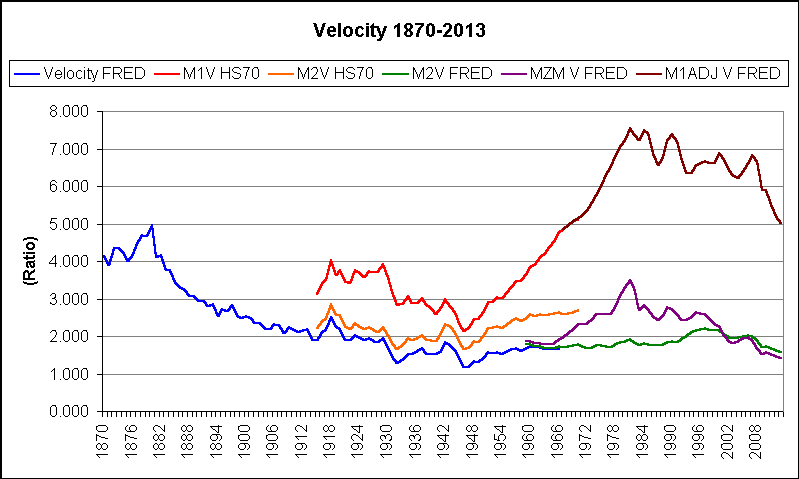 |
| Graph #2, Velocity: Data Revision and Clear Trends |
To my eye the gold and blue are very similar, as if the blue line was produced in part by revising the gold line. Could be. Data for the gold line is from the Historical Statistics published in 1975. Date for the blue line is from FRED and was last updated in 2012, some 46 years after the last data item in that series.
So anyway, what I'm looking at now is a repeating peak-and-decline, with peaks in 1880 and 1981. Not exactly a hundred-year cycle, but not far off.
// Source File: Velocity 1870-2013.xls at Google Drive.
// See also my Another one from Glasner's About page
Saturday, December 13, 2014
Velocity -- the Long Run, and What Counts
The Federal Reserve has a limitless supply of money just waiting to be issued into the economy. Why don't we count that money when we figure Velocity?
Because it's not in the economy, that's why.
The same is true of the money we in the private sector accumulate but do not spend. It's not in the economy. It ought not be counted when we figure Velocity.
This is what FRED has on Velocity, 1869 to 2014:

Look at the older data first. There is a peak a few years after 1875, followed by a long, sweeping downtrend that gradually flattens, then finally explodes in the colors of the newer data.
There is a small peak shortly before 1925, a small decline shortly after 1925, and an up-down-up wiggle just before 1950. Those three are World War One, the Great Depression, and World War Two. It is true that, compared to nearby tiny changes in the purple line, those three are significantly large. But in the big picture, they are not big events.
Compared to general trends, Depressions and World Wars are trifles. For Velocity at least, this is the case. For the economy as a whole, I think.
The newer data begins in 1959. We have a choice. We can focus on the blue line, which seems to continue the flattened trend, stretching it to the whole of the 20th century. Or we can focus on the green line, which seems to continue a repeating, wavelike pattern of peak-and-decline.
The red line, odd man out, just doesn't seem to fit. Still, it shows a pretty definite increase (until the crisis) so maybe it speaks on behalf of the green line and the wavelike pattern. But then, after 1981, the green line falls while the red rises to a new and more extreme peak. It's not tidy.
It's not inexplicable. The lines show different things. They consider different pools of money. The blue and green lines measure much larger pools of money than the red. They include all the money measured by the red line, and other money besides. When you divide by these bigger numbers to get Velocity, the Velocity number comes out on the low side. Divide by the smaller number that the red line uses, and the Velocity number is on the high side.
But remember: We're measuring velocity, a measure of how often a dollar is spent. We spend the dollars in our pockets. We don't spend the dollars in our piggy banks. The velocity of piggy-bank money is zero. Does it really make sense to include the money we don't spend when we're figuring how often the average dollar is spent? When we figure average driving speed, do we include parked cars in the calculation?
The velocity of the money we actually spend is much higher than the number we get by including the money parked in savings in our calculations. Much higher, as the red line is much higher than the green and blue.
It matters, because some people have no savings.
Friday, December 12, 2014
This should come as no surprise
I'm starting to like Larry Summers. I went out of my way this morning to read one of his at VOX: Reflections on the new 'Secular Stagnation hypothesis' from this past October.
Summers writes of the FERIR -- the "full employment real interest rate". A decline in that rate, Summers says, "coupled with low inflation could indefinitely prevent the attainment of full employment."
John Bull can't stand 2 percent, I guess. Anyway, Summers writes:
Laubach and Williams (2003) have attempted to estimate the FERIR – using data on actual real interest rates and measures of where the economy is relative to its potential. While many issues can be raised with respect to their calculations, Figure 4 illustrates their estimate of a substantial long term decline in the FERIR.
Figure 4. US natural rate of interest

Sources: Thomas Laubach and John Williams “Measuring the Natural Rate of Interest”
Figure 4. US natural rate of interest

Sources: Thomas Laubach and John Williams “Measuring the Natural Rate of Interest”
And, Summers writes of the IMF:
They have reached conclusions similar to the ones I have reached here – that the FERIR has likely declined in recent years. This observation, together with the observation that lower US inflation – and in Europe declining rates of inflation – make it more difficult than previously to reduce real interest rates. This in turn suggests that the zero lower bound and secular stagnation are likely to be more important issues in the future than in the past.
Okay. A low FERIR is a problem because of the difficulty of lowering it further. (This sounds like an unsustainable strategy, no?) So, could something be done to push the FERIR to a higher level?
Well, look at the Figure 4 graph. It wanders, but it wanders on a downhill trend. The two largest increases occur, one in the early 1960s and one in the mid- to late-1990s. Gee, in both of those periods, the economy was strongly improving. Okay, well, this supports Summers' contention that a falling FERIR is a problem.
But look at that second increase. See when it occurs? It comes just after the downtrend in the debt-per-dollar ratio, and just when that ratio starts rising again:
 |
| Graph #1: Accumulated Total Debt per Dollar of Spending-Money |
Thursday, December 11, 2014
Boiling it down a little too much
 |
| Image Source: Dr. James G. Wellborn |
Marc Thoma, via Lars P. Syll:
It’s the time of year when analysts and pundits begin “marking their beliefs to market” – telling us what they got right or wrong in the previous year. In that spirit, here are some of the things I got wrong about the Great Recession...
The lesson for me is that if you want the inflation rate to increase, demand has to increase. That requires more than simply creating a bunch of reserves that sit idle in banks.
The lesson for me is that if you want the inflation rate to increase, demand has to increase. That requires more than simply creating a bunch of reserves that sit idle in banks.
//
Listen carefully to Milton Friedman in Free to Choose:
When a country starts on an inflationary episode, the initial effects seem good. The increased quantity of money enables whoever has access to it -- nowadays, primarily governments -- to spend more without anybody else having to spend less. Jobs become plentiful, business is brisk, almost everybody is happy -- at first. Those are the good effects. But then the increased spending starts to raise prices...
Catch that last bit? It is spending that influences prices, not the existence of money. That's what Friedman said.
If anybody thought inflation was caused by printing money, I guess they boiled the idea down a bit too much.
Wednesday, December 10, 2014
"this event"
JW Mason:
Monday, December 8, 2014
The Future of Monetary Policy, according to Paul Krugman, Elizabeth Warren and Me
I will be speaking at this event tomorrow. I'll post video if/when it becomes available.
The Future of Monetary Policy, according to Paul Krugman, Elizabeth Warren and Me
I will be speaking at this event tomorrow. I'll post video if/when it becomes available.
Pretty good company, that. The link takes you to the Economic Policy Institute, EPI. The "event" is Managing the Economy: Main Street, Wall Street and the Federal Reserve. Here's the blurb:
Today, pressure is building on the Federal Reserve to use monetary policy to raise short-term interest rates, a move that could short-circuit a still far from complete economic recovery. Proponents of this move argue it is needed to avert wage and price inflation and prevent excessive risk-taking in the financial sector. But there are serious questions about this argument, and there are new tools available to the Fed to influence Wall Street and the wider economy. These tools and better economic analysis could allow the Fed to better target specific concerns regarding Wall Street financial risk-taking while minimizing unnecessary drag on the Main Street economy.
Stop, dammit. Don't take a side. Work out the problem.
Let's say the blurb is right: pressure is building on the Federal Reserve to use monetary policy to raise short-term interest rates, a move that could short-circuit a still far from complete economic recovery.
Let's say we don't short-circuit the StillFarFromCompleteEconomicRecovery by raising short-term interest rates. So then, presumably, the expansion of credit-use continues. And economic growth continues gaining momentum. And the growth of accumulated total debt continues gaining momentum...
See the problem?
If an excessive accumulation of debt hinders economic growth, then the expansion of credit-use (which boosts economic growth) undermines economic growth because accumulated total debt remains at an excessive level -- and increases even more.
More from the blurb:
Proponents of this move argue it is needed to avert wage and price inflation and prevent excessive risk-taking in the financial sector.
Let's say we set those concerns aside. Let's say we think a little more inflation might be a good thing. (I don't think that, but let's say.) And let's say we for some reason are not concerned about ExcessiveRiskTakingInTheFinancialSector. Let's set these concerns aside. Are we then free to leave interest rates low, encouraging growth by encouraging credit use?
We are not free to do so, because encouraging credit use in our experience leads to the growth of accumulated debt, leads to growing financial cost, undermines our standard of living, undermines profit and productivity, and destroys economic vigor.
The history of our economy in the last 60 years is a history of encouraging credit use. Our policies encourage the use of credit and accelerate the accumulation of debt. Our policies fail to accelerate the repayment of debt. As a result, private sector debt grew to unprecedented levels; and as a result of that, public sector debt grew enormously.
The EPI blurb mispresents our options clearly: Shall we keep interest rates low to promote growth? Or shall we raise interest rates to prevent inflation and excessive risk?
No.
The interest rate discussion is a discussion about positions on the Phillips Curve. But the Phillips Curve has moved from a good place to a bad place. There are no more good places on the Phillips Curve. It is pointless to fight over our place on the Phillips Curve when there is no good place to be had. The better fight, the better discussion is to point out that it was the growing accumulation of debt that pushed the Phillips Curve to a bad place... that by reducing the accumulation of private sector debt we can bring the Phillips Curve to a better place... that we can reduce the growth and accumulation of debt simply by creating policies that encourage the repayment of debt... and that accelerating the repayment of debt is a way to prevent inflation and reduce risk.
Accelerated repayment of debt is an alternative to raising interest rates. A policy that accelerates the repayment of debt will allow us to keep interest rates low enough to get the economic growth we need.
// Related posts
Sumner engages the crystal ball
An Arthurian Future
Tuesday, December 9, 2014
A blind eye
Barkley Rosser:
In none of these, 1945-46, 1982-83, or 2007-10, did we see either deflation or wage declines. However, in one of them there was only a very brief downturn, one quarter at the end of WW II; one of them there was a pattern that resembled 1921, a sharp fall in output with sharply rising unemployment, followed by a rapid rebound, the Reagan recession, and then the deep fall followed by the slow recovery in the most recent episode. What differentiates these? Well, monetary policy.
At the end of WW II, in contrast to the end of WW I, there was no tightening of monetary policy...
In the Reagan recession, this clearly was brought on by the extremely tight monetary policy of Volcker that had been put in place to crack entrenched inflation...
Finally, why the slow recent recovery? Well, I think there is more going on, but some of it has indeed been the inability of the Fed to provide much stimulus...
Anything else different?
 |
| Graph #1: Accumulated Total Debt as a Multiple of GDP |
 |
| Graph #2: Accumulated Total Debt as a Multiple of Spending Money |
 |
| Graph #3: Accumulated Total Debt as a Multiple of Base Money |
 |
| Graph #4: Accumulated Total Debt |
I don't read lots of Barkley Rosser. Maybe when he says "Well, monetary policy" he is referring not only to money and interest rates, but also to credit growth and accumulated debt. If so, then I have my title wrong.
But I don't see any differentiation of money from credit in Rosser's remarks. I don't see anything about accumulated total debt. I see "no tightening". I see "extremely tight". And I see "the inability of the Fed to provide much stimulus". The last of those is a reference to the idea that interest rates are at the zero bound, so that the Fed cannot lower interest rates enough to get us out of a tight money situation.
Everybody knows the phrase "tight money". So nobody has to stop and think about it. Well, I want you to think about it, just for a minute. Think about this:
Tight, relative to what?
Judge the tightness of money by comparing money to accumulated total debt.
Sunday, December 7, 2014
19
"Net interest and miscellaneous payments on assets" is a measure of all the interest that is in GDP. Okay. Suppose we take it out of GDP:
.PNG) |
| Graph #1: GDP (blue) and GDP with Net Interest taken out (red) |
Of course it is. It's "net".
By the way, we saw two measures of "net interest" as a percent of GDP last Thursday:
 |
| Graph #2: "Net interest and miscellaneous payments on assets" as a Percent of GDP |
On day 18 I looked at the effective mortgage interest rate. A year and more back I looked at the effective interest rate on Federal debt. The next graph shows those two rates together. They share a path:
 |
| Graph #3: Effective Interest Rates: Federal (red) and Mortgage (blue) rates |
"Effective" rates are calculated by working backward from dollars of interest paid and dollars of debt owed.
My numbers are not on the high side. Reproduced here, Steve Waldman's effective Federal rate peaks at 7.5%; my number matches his. And Mason and Jayadev (2012) show household debt peaking above 12.5%; my mortgage rate peaks at less than 11%.
A creditworthy government typically pays a lower interest rate than businesses do. A homeowner typically pays more than a business. So I want to take the average of the Federal rate and the Mortgage rate, and use that number as a ballpark estimate for the effective rate of interest on business debt.
 |
| Graph #4: The Effective Nonfinancial Business Interest Rate (green), an Estimate |
There ya go. The green one is my estimate of the Effective Business Interest Rate.
Now we've got an interest rate for business debt. And we can get numbers for the level of business debt from FRED. So I can
I will exclude financial debt. As a rule, I never exclude any piece of debt. But surely there must be some double-counting if we count both financial and non-financial debt. I'll exclude financial. And I'll exclude government debt and household debt. That means we're excluding the mortgage debt that seems to be a large part of the interest that is counted in GDP, as we discovered yesterday.
According to my old shopping list, that leaves us with the debt of
1. farm business,
2. nonfarm noncorporate business, and
3. nonfinancial corporate business.
At FRED I find
1. Farm Business; Credit Market Instruments; Liability (FBTCMDODNS)
2. Nonfinancial Noncorporate Business; Credit Market Instruments (NNBTCMDODNS)
3. Nonfinancial Corporate Business; Credit Market Instruments (NCBTCMDODNS)
Item 2 there, nonfinancial noncorporate business debt, NNBTCMDODNS, that used to have a different name. Yeah yeah, well, it used to be called "debt" and now it isn't; now it's called "Credit Market Instruments; Liability". Yeah. But something else. The "NN" in "NNBTCMDODNS" stands for nonfinancial noncorporate. Back when they called it debt rather than liability, the NN stood for nonfarm noncorporate. I think that's odd.
I had trouble finding the Farm Business series. But I was trying to document my claim there that NN used to be "nonfarm noncorporate"... couldn't find even a suggestion of it on the internet... but in my old FRED downloads I found an Excel file dated 2 July 2013, containing the original FRED download worksheet and this header information:

That got me the Farm Business series name FBTCMDODNS. It documents that the NCB-, the NNB-, and the FB-prefix TCMDODNS series are all "domestic nonfinancial" series (as if the DNS suffix wasn't evidence of that). And it shows that FRED once used the NNB prefix to mean "Nonfarm" Noncorporate Business. That was satisfying.
So we can look at the debt of corporate and noncorporate nonfinancial business and farm business, tally up the debt, figure the interest paid on that debt at the estimated effective rate, and come up with a number for gross interest paid by nonfinancial business. Now we're getting somewhere.
Number one, I want to compare that to the "net interest" number, to see if net interest is more than just a joke. Number two, I want to compare it to GDP, to see the true cost of embedded business interest and its effect on prices.
So here are the three portions of nonfinancial business debt:
 |
| Graph #5: The Debt of Nonfinancial U.S. Business: Corporate, Non-corporate, and Farm |
.PNG) |
| Graph #6: Mortgage Debt (green), Gross Federal Debt (red) and Nonfinancial US Business Debt (blue) |
The red shows the same Federal debt used to figure the Effective Federal Interest Rate in Graph #3 and #4 above. The green shows the same Mortgage debt used to figure the Effective Mortgage Interest Rate, shown on #3 and #4 in blue.
Now if I take these debt series and multiply each one by the appropriate "effective interest rate" I'll see the interest paid on each measure of debt. The Federal interest will be the actual number, as I am just reversing a calculation done for Graph #3. Same with the Mortgage interest number. The business interest number is an estimate, based on the estimated effective interest rate for business debt figured in Graph #4.
 |
| Graph #7: Mortgage Interest Paid (green), Federal Interest Paid (red), and Estimated Nonfinancial Business Interest Paid (blue) |
Remember, the red line includes Federal interest but not state and local government interest. The green line includes mortgage interest but no interest on auto loans, student loans, and credit cards. And the blue line includes interest on nonfinancial business debt, but no interest on financial business debt.
If I take the number for domestic nonfinancial business debt (the blue line on Graph #6) and multiply by my estimated Effective Business Interest Rate (the green line on graph #4), I can get an estimate of gross business interest expense. Let's see how that looks as a percent of GDP:
+and+Net+(red)+US+Nonfinancial+Business+Interest+as+a+%25+of+GDP+(crap).PNG) |
| Graph #8: Gross Nonfinancial Business Interest Expense (blue) and Net Interest(red) as % of GDP Gross is Less than Net, because Net includes Home Mortgage Interest |
Okay, I'm gonna tie this one off.
I learned two things from this exercise. I learned that mortgage interest is a big number. And I learned that FRED is not designed for calculations of this complexity. (Not that it is a complex calc.)
Look at all the text in the title! Look at all the text in the vertical axis label! These are just ridiculous.
It would be bad enough if this was done before March 2014 when FRED went haywire. Back then, they used the series ID code in the graph title, rather than the series ID name. So you would have "NNBTCMDODNS" in the title, rather than "Nonfinancial Noncorporate Business; Credit Market Instruments; Liability, Level". When you've got several series all in the same calculation, the title becomes incomprehensible using series ID names.
FRED is not designed for calculations of this complexity. I think Clopper Almon's G7 might be much more useful. I could add up the three components of domestic nonfinancial business debt, think of it as a variable, and give it a nice short name. And then I could just re-use the short name later in the calculation and in other calculations. I think that would work. I think that would be a real benefit.
A short incomprehensible name is much easier to comprehend than a long incomprehensible description.
Saturday, December 6, 2014
Day 18
Andrew Kliman identifies "consumer credit" as "all household borrowing except for home mortgages". I like that kind of clarity. Specifics. Now, at FRED, if I search for consumer credit I get seven pages of results, including these four from the first page:
.PNG) |
| Graph #1: Four Measures of Consumer Credit, all tracing the Same Path |
 |
| Graph #2: CMDEBT (reaches 14,000 billion) and the Four Measures of Consumer Credit |
.PNG) |
| Graph #3: Home Mortgage Debt |
Could be. Home Mortgage Debt peaks near 11,000 billion. Subtract 11,000 from 14,000, you get 3000. Consumer credit (Graph #1) approaches that level.
That means we owe three to four times on our homes what we owe on our credit cards and our student loans and our installment loans and our car loans and personal loans, all of that together. Does that seem reasonable?
Dunno. Debt is excessive, so nothing is reasonable.
I'll go with the numbers.
Clopper Almon says the NIPA series "Net interest and miscellaneous payments on assets" is a measure of all interest that is in GDP.
He says "interest paid by business less interest received by business" is "all the interest that is included in GDP".
He says interest on consumer credit is not part of GDP, but "interest on home mortgages is included because home owners have been converted into a fictional business in the NIPA".
Don't fret about the "why and wherefore" of that. Just look at it.
We know the amount of interest that's included in GDP. We know part of that is mortgage interest from those "fictional businesses", but we don't know how much. But FRED does give us "Monetary interest paid: Households: Owner-occupied housing". That series is my best guess for "mortgage interest paid", which is what we need.
I looked at that series, compared to mortgage debt, to calculate a mortgage interest rate. That's the blue line on the graph below:
.PNG) |
| Graph #4: Effective Mortgage Interest Rate (estimated) (blue), and the 30-year Conventional Mortgage Rate, Copyright 2014, Freddie Mac (red) |
Okay, so we can use FRED's "Monetary interest paid: Households: Owner-occupied housing" (W498RC1A027NBEA) as a measure of interest paid by the "fictional businesses" that is counted in GDP. And we have "Net interest" as a measure of all the interest that is counted in GDP. Compare those two:
 |
| Graph #5: Mortgage Interest (blue, in GDP) and Net Interest in GDP (red) |
So be it. I still want to see mortgage interest as a percent of the net interest number:
 |
| Graph #6: Home Mortgage Interest as a Percent of the Interest Counted in GDP |
Subscribe to:
Posts (Atom)
