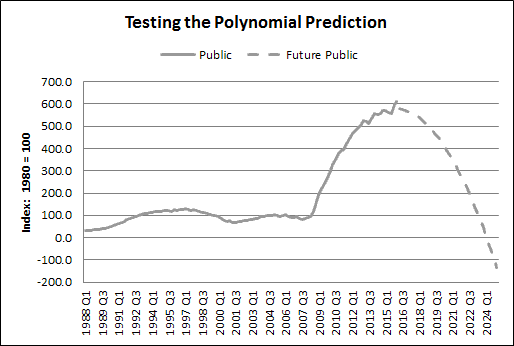
Yesterday I made a prediction about our next recession: It won't happen until 2022-2024. It's six years out, or more.
The accuracy of that prediction depends on many things, no doubt. But one of the things it depends on is how well the future paths of public and private debt conform to the paths predicted by Excel's trend lines.
There are things we cannot know, like future "shocks" that divert debt from the predictions. Such things are beyond the scope of prediction. I should say, though, that on yesterday's graph I see little evidence of shock-induced diversion in past data.
Apart from the unknowable, the accuracy of the prediction depends on whether the polynomial trend calculation that I used is suited to the behavior of the debt numbers. I mean, I didn't use the linear trend calculation (for example) because I don't expect debt to follow a linear path. Maybe it won't follow the polynomial path, either. In that case, my predicted timing of the next recession would be incorrect.
I can test for this. Here's Graph #6 from yesterday:
 |
| Graph #1: Predicting the Closing of the Current Bulge |
 |
| Graph #2: A Look at Three Bulges |
Below is the same graph from FRED (modified from yesterday's Graph #3). It lacks the estimate of the future path of debt. But it shows when recessions occurred:
 |
| Graph #3: Public Debt, relative to Public & Private Average; Indexed Values |
Returning to the Excel graph, I show the first half of each bulge in red:
 |
| Graph #4: The Left Half of Each Bulge Is Indicated in Red. (I use the word "half" loosely.) |
Obviously the trend line for bulge 3 (the rightmost bulge) will match perfectly, because I used the same trend line yesterday to develop the dashed gray line.
The other two bulges provide the test. If the black trend lines match the gray data for the bulge of the 1990s and the bulge of 2001-2007, then my confidence is increased that the dashed gray line is a good estimate of the future path of debt. And if that is the case, my confidence is increased that my predicted date of our next recession is also a good estimate.
So here is the graph with the trend lines:
 |
| Graph #5: Polynomial Trend Lines Added |
For Bulge 3 (rightmost) the trend line is a perfect match (of course) because the dashed gray line was modeled on that trend line. So this one doesn't count.
Bulge 2 is a bit of a problem. The trend line runs higher than the gray half of the bulge.
But let me show you what happens if I make the red part of Bulge 2 longer by one piece of data:
 |
| Graph #6: Bulge 2 Trend Line Adjusted Trend Source Data Now Ends at 2005 Q3, not 2005 Q2 |
So what does this tell me? If I remove even one piece of data from the Bulge 3 calculation, the predicted date of recession could change substantially. Or if I do this calculation again after the next release of data, the predicted recession date could change substantially. I guess nothing can be done about that.
But I don't think there is anything in the red part of Bulge 3 that, if I play with data selection, would bring the predicted recession date to anywhere within the next three or four years. I think the soonest we could have that recession is around 2020. And I could only get that by ignoring data we have.
I'll stick with yesterday's prediction.
// the Excel file

No comments:
Post a Comment