Friday, March 31, 2017

"... is usually interpreted as ..."


From The Fed's Dual Mandate: Lessons of the 1970s, a message from James Bullard:

When the U.S. Congress amended the Federal Reserve Act in 1977, it essentially gave the Fed a dual mandate: to promote maximum sustainable employment and price stability. Price stability is usually interpreted as low and stable inflation...

Price stability may be "interpreted" that way, but low and stable inflation is NOT the same as price stability.

Thursday, March 30, 2017

"Trumped-up expectations"


Mosler's words.

"Seriously trumped up consumer expectations continue," he says. But if Mosler was going for the pun the "T" should have been capitalized, unless he was trying to show disrespect.

Mosler shows a graph to go along with his words. I eyeballed-in some trend lines:

Graph #1 Source: The Center of the Universe
The trend shows an upward drift (straight line) to January 2015, a downward drift until May 2016, and an upward acceleration (curved line) since May. We have acceleration now, not drift.

The "retail sales" (gray bars) show sharp increase since August 2016.

The election was in November. By Mosler's graph, the improvement takes hold three to six months before the election. A year or two from now, everyone will be saying Trump is making things better. Everyone will be wrong.

A year ago, in We are at the bottom now, ready to go up, I wrote:

This is not going to be your typical anemic recovery. This is going to be the full tilt, rapid output growth, rapid productivity growth, high performance boom. I can't promise you it'll last long, because the level of debt is already very high. But it'll be a good one while it lasts.

Mosler's graph is early evidence that the prediction was right.


I do think that the bold, persistent experimentation of the Trump Administration will generate a measure of economic improvement, even if the policies are dead wrong, because expectations count for something. Look what happened under Reagan:

Let us not forget that real GDP growth in 1984 was 7.3 percent; the next-highest value since was just 4.7 percent in 1999.

One year of healthy growth. That's what Reagan got us. One good year. So don't expect much from expectations.

Expect much from improved monetary balances.

Wednesday, March 29, 2017

“If you abolished the government, would America be more or less equal?”


Angus Deaton:
Someone asked me the other day when I was giving a talk a really interesting question. They said, “If you abolished the government, would America be more or less equal?” Because there’s all the equality that comes from redistribution but there’s all the inequality that comes from rent-seeking. And it’s not clear to me which one.

But when you abolish government, governments arise.

In Europe:
The fall of the Roman Empire plunged Europe into the Dark Ages and decentralized the region. The Imperial system in Rome was replaced with a loose-knit group of kings and princes throughout Europe.

In Great Britain:
By convention, the Heptarchy lasted from the end of Roman rule in Britain in the 5th century, until most of the Anglo-Saxon kingdoms came under the overlordship of Egbert of Wessex in 829...

If you abolish government, governments arise, but not necessarily better ones. Myself, I think we should keep the government that was designed and built in the Age of Reason. Instead of throwing away the good stuff, we should sit down and think about the thing that went bad: Think about the economy. Because, obviously, the fix we've been using for the last forty years has not worked. Obviously there is something wrong with our plan.

Dump the bath water. Keep the baby.

Tuesday, March 28, 2017

Something else


Syll quotes Wren-Lewis:

If we really think there is no relationship between unemployment and inflation, why on earth are we not trying to get unemployment below 4%? We know that the government could, by spending more, raise demand and reduce unemployment. And why would we ever raise interest rates above their lower bound? …

There is a relationship between inflation and unemployment, but it is just very difficult to pin down. For most macroeconomists, the concept of the NAIRU really just stands for that basic macroeconomic truth.


Okay. And Syll quotes Daniel Kahneman:

I have had several occasions to ask founders and participants in innovative start-ups a question: To what extent will the outcome of your effort depend on what you do in your firm? This is evidently an easy question; the answer comes quickly and in my small sample it has never been less than 80% … They are surely wrong: the outcome of a start-up depends as much on the achievements of its competitors and on changes in the markets as on its own efforts …

There's a relation between "the outcome of your effort" and "what you do in your firm". Asked the question, anyone with an ego would find it a strong relation. But Kahneman suggests that people tend to overlook other strong relations such as the outcome of competitors' efforts, and market saturation.

Your own efforts are not the only thing, Kahneman says. There is something else: the environment in which you operate.

//

There's a relation between unemployment and inflation. It's a strong relation. Simon Wren-Lewis that this relation is "difficult to pin down". Syll quotes him again:

The concept of the NAIRU, or equivalently the Phillips curve, is very basic to macroeconomics. It is hard to teach about inflation, unemployment and demand management without it. Those trying to set interest rates in independent central banks are, for the most part, doing what they can to find the optimal balance between inflation and unemployment.

Syll has a lot more trouble with this quote than I do. For me it is an opportunity to point out that achieving "the optimal balance between inflation and unemployment" may depend on something other than inflation and unemployment.

Monday, March 27, 2017

Economic Potential and the Growth of Debt


Private Non-Financial debt, PNF for short. Total in billions. It goes up:

Graph #1: Private Non-Financial Debt, Total


Change from previous quarter, in billions. It goes up:

Graph #2: Quarterly Change in Billions, Private Non-Financial (PNF) Debt


The change as a percent of the accumulation. It doesn't go up:

Graph #3: Private Non-Financial Debt, Percent Change (Quarterly Data)
That should tell you something.


With inflation stripped away, it goes down. The boost to growth goes down:

Graph #4: Real PNF Debt Growth (Quarterly Growth at Annual Rate)


The trend line shows how it goes:

Graph #5: Real PNF Debt Growth plus Trend Line
It goes down. Note, however, what happens in the '90s: It goes up. It is up at the same time that productivity is up and the economy is good. But then the debt increase of the early 2000s, which looks exactly like that of the latter 1990s, ends in disaster.

Of course, as Graph #1 shows, the increase of the early 2000s was not exactly like the increase of the latter 1990s.

Still, this last graph does show what it takes to make the economy good. It takes an adequate growth of credit, without an excessive accumulation of debt. And it shows what it takes to achieve that goal: It takes a sufficient decline in the growth of credit, as we had after 1985.

Was the decline of 2008 sufficient? Time will tell. To me it looks promising. But I'm not looking at the accumulation.

//

Economic Potential and the Growth of Debt.xls for the inflation adjusted graphs.

Sunday, March 26, 2017

Some history of interest


Richard Werner:

... the charging of usury (interest), which until about 300 years ago was illegal in most countries, including throughout Europe.

I didn't know that. How could I not know that?

I did know that at least two major religions that grew up after the fall of Rome did not look kindly on lending at interest. I always thought of this as evidence that debt and interest were at the time held to be responsible for the fall.

Couple tidbits from Wikipedia...

Usury is, as defined today, the practice of making unethical or immoral monetary loans that unfairly enrich the lender. Originally, usury meant interest of any kind.

I'm thinking usury was always thought "unethical or immoral". In other words, charging "interest of any kind" was unethical and immoral, back when. And I'm thinking it was not the ancients but the moderns who changed the meanings of words so that "interest" was generally okay, and that only the extreme we now call "usury" served to "unfairly enrich the lender."

This tidbit supports that view:

Public speaker Charles Eisenstein has argued that the pivotal change in the English-speaking world seems to have come with lawful rights to charge interest on lent money, particularly the 1545 Act, "An Act Against Usurie" of King Henry VIII of England.

Oddly, the law that made it legal to charge interest on money was called an act against usury. It seems the meaning of the word "interest" had become benign already by the year 1545.

There is a "[clarify]" note attached to that sentence at Wikipedia, but it's pretty clear to me: The change in the meaning of the word made interest acceptable, and that was the first step in the rise of financialization. Legal interest was the birth, no, was the moment of conception of capitalism.

About 300 years before Henry VIII,

In 1275, Edward I of England passed the Statute of the Jewry which made usury illegal and linked it to blasphemy, in order to seize the assets of the violators.

Edward I was "Longshanks" in the movie Braveheart.

I read one time that King so-and-so of England was the first to use money to pay the people who worked for him. That seems a real break with the feudal tradition of exchanging labor for protection, and I still remember a fragment of what I read. Looking it up now, at A Comparative Chronology of Money -- nice site! -- I find this:
1159 Scutage tax introduced by Henry II in lieu of military service
The annual 40 days service owed to him by his tenants-in-chief and their retainers is commuted into cash payments and with the proceeds he is able to establish a permanent army of mercenaries or professional soldiers as they commonly became known after this time from the solidus or king's shilling that they earn.

So Henry II chose to receive payments in money rather than service, and he used the money to pay his troops. Circular flow, a hundred years or so before Edward.

Some 300 years before Henry, Charlemagne set up a new monetary standard, as did King Offa of Mercia. "Charlemagne applied the system to much of the European Continent, and Offa's standard was voluntarily adopted by much of England."

I like the way the pieces fit to a timeline:

Step one: Set up a monetary system people can use. Wait 400 years.
Step two: The government itself adopts this monetary system. Wait 400 years.
Step three: Money changes the culture. Interest is no longer a bad thing. Wait 400 years.
Step four: Debt and interest cause the fall of civilization.

300 years ago, charging interest was illegal almost everywhere. Today the global economy is constipated by debt.

Saturday, March 25, 2017

"History Doesn't Repeat Itself, But It Rhymes"


"there seems evidence that interest rates follow nominal GDP"


The title is a quote from Richard Werner.

If I have it right, he means that interest rates follow the growth rate of nominal GDP. Now I have a problem, because the growth rate of nominal GDP is a bullshit measure. When you are looking at economic growth you look at inflation-adjusted values, not nominal values. Always.

So maybe Werner is not looking at economic growth?

Clearly. But say he has a reason for using nominal values. What then? Then of course interest rates follow GDP, because when inflation makes nominal GDP go up, the Fed responds by making interest rates go up. And then, when high interest rates bring inflation and nominal GDP growth down, the Fed responds by bringing interest rates down. So interest rates follow nominal GDP growth on the way up, and interest rates follow nominal GDP growth on the way down, because that is the way monetary policy works.

Richard Werner seems not to know this. He sees the way monetary policy works, and he says interest rates follow GDP, and therefore (he says) interest rates cannot be the main tool of monetary policy:

Thus instead of the central banking narrative that lower rates lead to higher growth, the empirical and verifiable reality is that higher growth leads to higher rates and lower growth leads to lower rates. If rates are the result of growth, they cannot be the cause.

Monetary policy works by raising rates when inflation raises (or threatens to raise) nominal GDP growth. That's how it works. Werner sees interest rates following nominal GDP and says because they follow, rates have no influence on growth. I have to say it again: bullshit.

So much for nominal. Here's what happens with interest rates and real GDP growth:

Graph #1: RGDP Growth (blue), the Interest Rate (red), and High-Side Trends
Not much "following" going on there, is there.

Friday, March 24, 2017

The Federal Funds Rate and Economic Growth


"By lowering rates, central banks accelerate growth and by raising rates, they slow it". That's standard practice. But Richard Werner says central banks have it all wrong.

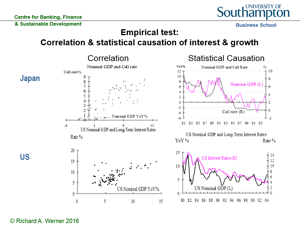
Werner says central bank policy depends on a negative correlation between interest rates and economic growth. It doesn't work that way, he says. "If you plot the nominal GDP growth rate against nominal interest rates, say, a scatter plot, you will find a positive correlation." A positive correlation, he says, not negative. If Werner is right, this is a major conceptual shift.

I watched a Werner interview two weeks ago, and did some reading. Every day since, I've been drawing his scatterplot. It fascinates me. I've started writing about it half a dozen times. Until now, my response has died every time. It is a difficult response to write, due to both the "major conceptual shift" and the "if Werner is right".

For starters, Werner's choice of data troubles me. If you plot the nominal GDP growth rate and nominal interest rates, you see both going high during the Great Inflation because of the great inflation. You see both going low after the financial crisis because of the financial crisis.

Nominal GDP grew rapidly during the Great Inflation, because of inflation. At the same time, policy (and creditors) pushed interest rates up to very high levels because of inflation. Inflation caused both growth and interest rates to rise to high levels, and then to fall when inflation receded. Movement in the same direction. That's a positive correlation.

More recently, a different set of special circumstances arose. The financial crisis and the Great Recession drove economic growth to unusually low levels. In response, our central bank dropped interest rates to the floor. Again, unusual circumstances created a positive correlation -- this time, low growth and low rates.

These positive correlations arise from sources other than the relation between economic growth and interest rates. If you mix such times with normal times, in a single picture of the economy, you distort the norm and create a hotbed of doubtful GDP/interest rate correlations. To add an overall trend line to such a mix of data would be absurd.

To be sure, I don't see Richard Werner showing trend lines on his scatterplots. But I do see him proclaim

the scatter plots on the left-hand side of the graph show a distinct positive correlation.

I do see him proclaim

The positive correlation of both curves is obvious.

And I do see him proclaim

instead of the proclaimed negative correlation, interest rates and economic growth are positively correlated.

Werner doesn't need to show a trend line. The positive correlation is obvious, he says. He doesn't need to show the trend line to see it. But he does not by his power of vision manage to escape the absurd.

Me? Yeah, I show the trendlines.

Does a positive correlation exist in the "normal" economy? Perhaps. But if we're going to look into it, we should exclude the data since the financial crisis, and we ought to strip inflation out of the numbers we will be looking at. For starters.

Now you know what we're doing today.


I thought I might be confused about what Werner is saying, so I checked: He is not speaking of what people in general think about central bank operations. He refers explicitly to the views expressed and the actions taken by central bankers:

Recently, central banks have been lowering rates, while proclaiming that this is a measure to stimulate the economy.

He disputes their story:

To the contrary, empirical evidence shows that ... interest rates and economic growth are positively correlated.

Werner uses a scatterplot to show correlation. Oddly, however, his scatterplot of U.S. data does not use the short-term interest rate that our central bank uses to influence the economy. Werner uses a long-term rate in his scatter. To test the idea that central banks influence growth by changing rates, it seems to me the scatterplot should use the same short-term rate that is used by the Fed.

Granted, the scatterplot might show a positive correlation for any interest rate you pick. But if you're going to challenge the Federal Reserve on interest rate policy, shouldn't you use the same interest rate that the Federal Reserve uses?

For my scatterplot data, then, I will use Real GDP and the inflation-adjusted FedFunds rate. My inflation-adjusted FedFunds calculation is similar to Bill McBride's from a dozen years back. I'll use the Effective Federal Funds Rate less "percent change from year ago" of the CPI:

Graph #1: FEDFUNDS (blue) and Inflation-Adjusted FEDFUNDS (red). Quarterly Data
The area between the red and blue lines, that's all inflation
These days the Fed prefers PCE to CPI. But I'll be cutting "these days" off the chart. And the Fed only switched from the CPI to the PCE in 2000. My scatter data goes back to the 1950s. I'm sticking with CPI for this calculation.

Here, then, is the source data for my scatter plot:

Graph #2: Quarterly Growth of RGDP (blue) and the Inflation-Adjusted Federal Funds Rate (red)
The graph runs from 1953 (before the FEDFUNDS data starts) to the end of 2008. I'll trim it down a little more in Excel when I can see the data.

On second thought, I'll grab all of the data for download, in case I have a use for it.


To see the path of the data but eliminate the jiggies, I'm figuring Hodrick-Prescott values for the two data sets. My objective is to preserve the "shape" of the data but make that shape more readable. So my smoothing constants are low, non-standard values. Here are the smoothed data (red) and the original values (gray):

Graph #3: Smoothing the Real FEDFUNDS data
Graph #3 shows the interest rate. The source data is gray. The smoothed data is red. The value of the smoothing constant is 4, as the legend indicates. The same details apply to Graph #4:

Graph #4: Smoothing the RGDP data
I put the two smoothed series together in a scatterplot, with GDP on the horizontal and interest on the vertical. Tried to make the dots pretty. Connected them with thin gray lines. And added a linear trend line, in black. Here is the result:

Graph #5: RGDP and the Real FedFunds Rate with a Linear Trend Line (smoothed data)
The RGDP values shown on the horizontal axis are for quarterly data. The center of the dot cluster (call it the average growth rate) appears to be somewhere between 0.5 and 1.0. It's a low number because it is a quarterly rate. Annual rates would be, ballpark, four times bigger. That would give an average real growth rate between 2% and 4% per year, which sounds about right.

The straight black trend line tilts upward to the right. Doesn't look like much, but it probably slopes more than you think. The trendline formula says the slope is 0.4876. That's almost 0.5. If the slope was 0.5, Y would go up by half of X, and the trend line would go up six inches for each foot it goes to the right. That's almost as steep as a flight of stairs. Steeper than it looks.

For some reason whenever I see a trend line on a scatterplot, the trend line is straight. A glance at the scattered dots should tell you there's no chance the trend is a straight line. But straight-line trends are commonly used on scatterplots. Maybe that has to do with the way economists think.

I made a copy of Graph #5 and changed the trend line to something other than a straight line, just to see how it looks. It looks like Poirot's moustache:

Graph #6: RGDP and the Real FedFunds Rate with a Polynomial Trend Line
The trend line is in the same place, and it still slopes up to the right. But along the way, it curves up and down. I can't tell you much of what those curves might mean, but I can tell you the trend is not a straight line.


I wanted a better look at changes in the scatterplot trend. I thought I might split the cluster down the middle, and get a trendline for each half. Then I got bold and decided to split economic growth into four overlapping subsets so I could see four overlapping trend lines.

I inserted four new columns into the spreadsheet, alongside the smoothed data. I used formulas to put values into these columns, based on growth rate limits I picked for each subset. This gave me the values in chronological order, with blank cells where the values were outside the limits.

Then I made a scatterplot, and it was garbage. Excel doesn't do what I expect when there are blank cells intermixed with the values. But I didn't know that yet. So I tried again. This time I subsetted the interest rate data instead of the growth rates.

This time, all the blank cells were interpreted as zero values. I got a whole lot of dots at the zero level, and I couldn't get rid of them. That's when I figured out the blank cells must be the problem.

The question then was how to convert one column of numbers into four columns based on specified value limits, without having blank cells mixed in with the data. The answer of course was VBA.

I wrote a routine to arrange the data in a way that satisfied both Excel and myself, and at last I got a look at the trends of the subsetted data:

Graph #7: The Scatter Data split out as Low Growth, High Growth, and Intermediate Levels
I got four overlapping trend lines. These lines occupy the same general location as the overall trend line shown on Graph #5. The trend lines, taken together, show a positive correlation similar to the overall trend: lower on the left, higher on the right. However, three of these four trend lines are downsloping. They show negative correlation. They contradict the overall trend, and they contradict Richard Werner.


After a pointless argument with myself that lasted much too long, I decided to write more VBA, to subset the scatter data on interest rate values this time rather than growth rate values.

The code writer complained that he already did the work and why should he have to do it again. The econ hobbyist pointed out that the central bank changes the interest rate on purpose, so the interest rate subsets must be more informative than the growth rate subsets and the code writer should have known which data to subset the first time around. The code writer gave us the finger. But he eventually admitted that his outrage was no more than a way to postpone the inevitable. The matter was finally settled when the blogger pointed out that he had to stop blogging so that the code writing could commence.

I looked at Graph #7 and divided up the vertical axis to make four overlapping groups. Then I copied the code I used to make Graph #7 and tweaked it for #8. The code revision took less time than the argument.

Here's what I got:

Graph #8: The Scatter Data split out as Low, High, and two Intermediate Interest Rate Ranges
This time, three of the four subsets show positive correlation. One shows negative.

I don't know, though. Take the high and low trendlines on Graph #8 and throw them away. Keep the two in the middle. They point up. The space between these two trendlines appears to be the same space where we find all four trendlines of Graph #7. But three of those four trendlines are pointing down. It looks like you could get any result you want, if you pick the right dots.

Something is wrong here. The trend is what it is. We must be doing something wrong if we can make the trend slope this way and that. We must be doing something very wrong.


I think I know what the problem is: The trends we've created here are long-run trends. They reduce  more than half a century to only "up" or "down". (The correlation is positive, not negative, Werner says.) Yes, we cut off the data at the crisis. Yes, we stripped away the inflation. But too much variation remains in our fifty-plus years of dots and data. Too much for one trend line. We still have the golden age, early on. And though we removed inflation, we still have the multiple recessions that occurred at the time of the Great Inflation. Then we have the changes in policy that began around 1980, and the change in the trend of interest rates from uphill to downhill. And we have the gradual but persistent slowing of economic growth for the full extent of our fifty-plus years. These factors and others throw monkey wrenches at our scatterplot trend.

I think we need shorter trends. We need to evaluate shorter time periods. To answer the obvious questions (How short? Where shall we start them and stop them? How can we justify our choices?) consider the data we are evaluating: It is economic growth, and the interest rates which may or may not affect that growth. It makes sense, I think, to base our time periods on the business cycle.

No, you know what? Between one recession and the next there is sometimes a low point of growth. Sometimes more than one low point. To shorten and simplify trend segments in the scatter, our subsets can stop at every low point. So let's not say business cycles. Let's say growth cycles instead -- or, not even cycles, but loops. Growth loops. That's it, growth loops.

I dug up an old spreadsheet and plugged in the data we've been developing here. Changed a few graph titles and some range names. Put Xs in the MinGrowth column at the low points of growth. And clicked a couple buttons to get some graphs. Here is the first one:

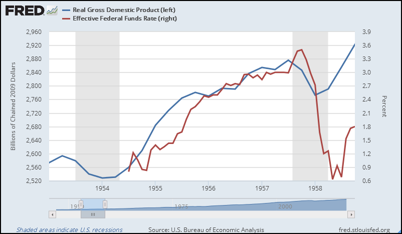
Graph #9: The Business Cycle of 1957-1960
Against a background showing the whole scatterplot, the graph highlights the data points of the period identified in the subtitle line. The first dot of the series is green and the rest are red. Red lines connect the highlighted dots in chronological order.

The black trend line for the highlighted dots shows a positive correlation (higher on the right) as Richard Werner says. But, oddly, what happens with the dots seems to contradict Werner. After the first three dots (green, red, red) the dots start to go higher, meaning the interest rate was rising. The horizontal distance between the dots gets smaller, meaning increases in the growth rate are getting smaller. Then, after the rightmost red dot, the RGDP growth rate falls as the dots step to the left.

Based on the data values shown here, interest rate increases after the third quarter of 1958 appear to have caused economic growth to slow. The story these dots tell matches the central bank narrative that Richard Werner rejects.

The trend line displays the positive correlation that Werner points out, but the dots behave as the central bank describes. The dots are saying that Werner's positive correlation is not relevant.

By the way... The same RGDP and the same real interest rate for the same dates we see on Graph #9, but without the smoothing the HP calculation provides, looks like this:

Graph #10: Same Data as Graph #9, but Without the Smoothing
A growth loop of sorts is still visible here, in red. But it's not the same. The smoothed data definitely makes the shape more visible. But if you want to say that I have not preserved the shape of the unsmoothed data, I refer you to Graphs #3 and #4.

The trend line for this unsmoothed data is high on the right, as for the smoothed data.What the dots have to say is less clear. But at low interest rates growth is increasing; rising rates put a halt to the increase; and high interest rates leave us with reduced growth. The dots reiterate the central bank narrative, despite the positive correlation shown by the trend line.


Not every smoothed growth loop has a trend line that agrees and dots that disagree with Werner, as the first one does. Many of them show small clusters or tight groups, and are difficult to read at all. Some of these might make better sense if combined with an adjacent growth loop. I didn't look into that.

I made 16 subsets of the "smoothed data" scatterplot. The subsets run from low to low of the smoothed RGDP growth rate, with the lows sometimes at recessions and sometimes between recessions. On each graph, the green dot indicates the start of the subset. The last of the red dots, then, becomes the green dot of the next graph. Here are all 16 subsets:

Graph #11: The 16 Subsets (MinGrowth to MinGrowth) of the Scatter
I could tell less by looking at the graphs than I expected. So I made a table listing the start date, end date, and slope of each subset, noted some features for each subset, and got total counts for each feature. Here's the table:


Sixteen subsets total. Half of them slope up to the right (positive correlation) and half slope down to the right (negative correlation). The average of all 16 slope values is -0.342, an overall negative correlation that stands in contradiction to the positive correlation Richard Werner finds in his scatter plots.

(Note that the positive correlation Werner finds in his scatterplots, like the trend line he does not draw, is based on the whole set of dots, not on sequential subsets of the dots. A trend line based on the whole collection by design ignores the economic forces that put any one dot in a different position than the preceding dot. It ignores economic forces, while pretending that economic forces are best described by the data set as a whole.

This problem arises not only here, but also with the Phillips curve and Okun's law. Anyone who bothers to look will discover the shapes and behaviors visible in sequential subsets of these datasets.)

The average of the negative slope values is -1.391, about twice as far from zero as the average of the positive slope values, which happens to be 0.707. (Oddly, too, the slope of the 1997Q4-2001Q2 period is 1.414.)

For the whole 16 subsets, I count nine that support the central bank narrative, where a rising interest rate is associated with slowing economic growth. The relation is sometimes concurrent and sometimes sequential. For the whole 16 I count five that contradict the central bank narrative, either a falling interest rate associated with slowing growth, or a rising rate with rising growth. I count two subsets which neither support nor contradict the narrative.

Of the nine subsets that support the central bank narrative, four show a positive and five a negative trend slope. Of the five that do not support the narrative, three show positive and two show negative slope.

I could not resist splitting the 16 subsets into "first 8" and "last 8". The first half ends and the second half begins with 1980Q2. The first half runs 22½ years, if my fingers were up to the counting of it, and the second half 26½ years. From start to finish, each half has nine growth minimums. Okay, that makes sense, as the subsets begin and end at growth minimums.

For the first half, the average slope of the trend lines is 0.265. For the second half, -0.949. For the first half, there are six positive and two negative slopes. For the second half, just the reverse. For the first half, a rising interest rate leads to slowing growth 6 times out of 8. For the second half, 3 times. For the first half, a rising interest rate leads to rising growth once. For the second half, a falling interest rate leads to slowing growth four times.

That's all the stats I have.

Conclusion? Policy may not be as simple as "By lowering rates, central banks accelerate growth and by raising rates, they slow it." But central banks surely do not have it all wrong.


// Files

RGDP and Real Fedfunds.xls for graphs 3 thru 8

Looking for Loops in RGDP and Real FedFunds.xls for graphs 9 and 11

Looking for Loops (omit smoothing).xls for graph 10

Thursday, March 23, 2017

How could I say such a thing?


Couple weeks ago I showed this graph:

Graph #1
I said

"Growth definitely slowed when the interest rate went up. Growth slowed because the interest rate went up."

Commenting on the post, Jim quoted me and said

I can't understand how you can look at that graph and make such a statement. It seems pretty obvious to me that Fed interest rates are lagging behind GDP which suggests the correct conclusion is that the economy is driving Fed interest rates.

Well...

Graph #2, Recreated from Scratch to Match Graph #1, and marked up

Like that.

Blue accelerated out of the 1954 recession. Red noticed, and went up faster in early 1955.

Blue slowed slightly then, but not enough. Red went up faster again in the second half of 1955.

Blue slowed more, and ran parallel with red until 1957.

Growth definitely slowed when the interest rate went up. Growth slowed because the interest rate went up.

Wednesday, March 22, 2017

When did the Federal Reserve switch from CPI to PCE?


PCE and CPI Inflation: What’s the Difference? at the Federal Reserve Bank of Cleveland:

The Federal Reserve, however, states its goal for inflation in terms of the PCE.

//

Two Measures of Inflation and Fed Policy by Jill Mislinski:

The Fed is on record as using Core PCE data for its primary inflation gauge.

//

I say CPI, you say PCE by Phil Davies. At the Federal Reserve Bank of Minneapolis:

The Fed switched from the CPI to the PCE in 2000.

//

Now we know.

Saturday, March 18, 2017

Notes on the Measurement of Unemployment


The Persistence of Memory

i saw...
somebody said the calculation of unemployment has not changed.
they said it vaguely, so that it wasn't quite a lie.
but it is not true.
3:16 AM 3/16/2017
a couple days ago I saw it.

// Here it is:

The White House Takes Its Attacks On Jobs Data To A New (And Dangerous) Level
by Ben Casselman at five thirty eight
filed under Data Integrity
:)

https://fivethirtyeight.com/features/the-white-house-takes-its-attacks-on-jobs-data-to-a-new-and-dangerous-level/

"(When pressed by Tapper, Mulvaney acknowledged that he didn’t think the Bureau of Labor Statistics had changed the way it collected jobs data since Trump took office.)"

"... there is no conspiracy here. Obama didn’t change the definition of unemployment, which has been essentially unchanged for decades."

The words "essentially unchanged for decades" link to
https://www.bls.gov/cps/faq.htm#Ques12

Ques12 is "Have there been any changes in the definition of unemployment?"

The answer is
"The concepts and definitions underlying the labor force data have been modified, but not substantially altered, even though they have been under almost continuous review by interagency governmental groups, congressional committees, and private groups since the inception of the Current Population Survey."

So yes, there have been changes. But the answer is not specific as to what those changes were.

If memory serves, under Clinton they added the condition that if you stop looking for work, you are no longer counted as unemployed. Clinton or Reagan, I forget. I think Reagan changed the inflation calculation and Clinton changed the unemployment calc.

Here you go:
"Yes, there have been modest shifts through the decades in how unemployment is defined, the last ones in 1994." -- Justin Fox at Bloomberg

Clinton.

What I can't figure out is why there is no discontinuity in the data at 1994. Can't see one on a graph. I've looked.

//

The Bloomberg article starts out very interesting, then drops off to asking
"Does this mean that the unemployment rate is some sort of “big lie” or “hoax...?”
(Can't you just deal with the economics? If you are addressing the question of the 'big lie' then you are NOT doing economics)
Then it gets interesting again.

The article challenges my memory:
"And when the U.S. government finally started measuring unemployment on a monthly basis in 1940 it was with a similar understanding that you didn’t count as unemployed unless you really wanted to work."

The "similar understanding" is a reference to "men who would have liked to work if they could have found a job that paid as much as they had been earning before."

But no, that's not really the same as no longer looking for work...

Recommended reading: What's Really Wrong With the Unemployment Rate by Justin Fox at Bloomberg. It gets specific about those changes in the unemployment calculation.

But I remember that NY Times article I read back in the '90s...

Friday, March 17, 2017

Suddenly it's the 1870s again


Justin Fox at Bloomberg on Carroll D. Wright in the 1870s:
As David Leonhardt explained in a great New York Times column in 2008, this all started in the U.S. with Carroll D. Wright, who as head of the Massachusetts Bureau of the Statistics of Labor during the economic hard times of the 1870s set out to measure joblessness while excluding people he considered malingerers:

The survey asked town assessors to estimate the number of local people out of work. Wright, however, added a crucial qualification. He wanted the assessors to count only adult men who “really want employment,” according to the historian Alexander Keyssar. By doing this, Wright said he understood that he was excluding a large number of men who would have liked to work if they could have found a job that paid as much as they had been earning before.
Wright went on to become the first commissioner of what is now the BLS.

...if they could have found a job that paid as much as they had been earning before.

Yeh.


Maynard Keynes in 1936:

If, indeed, it were true that the existing real wage is a minimum below which more labour than is now employed will not be forthcoming in any circumstances, involuntary unemployment, apart from frictional unemployment, would be non-existent. But to suppose that this is invariably the case would be absurd.

... if they could find a job that paid less, they would take it. They wouldn't prefer it, but if nothing else was available...


Scott Sumner in 2015:

I think they were unemployed because of sticky wages, and that if workers collectively accepted lower wages then we would have had full employment in 1936.

... they refused to work for less...

Thursday, March 16, 2017

Why the sudden change?


Central Bank Assets as a Percent of GDP:

Graph #1: Running Close to 5% Until the Big Surprise
(Annual data. Last date shown is 2014.)
The first question has to be Why? Why the sudden change?

My answer: The central bank suddenly felt the need to "catch up".

The line runs flat
Central bank assets ran flat from 1960 to 2008: a little higher at the end, a little lower in the middle. Central bank assets ran flat because the Fed was controlling things. The big surprise in 2008 was the discovery that they were not controlling the right things. And suddenly, there was a lot of catching-up to do.

You should be asking: Catching up to what?

Good question. The purpose of controlling central bank assets is to put a limit on the availability of money. And, from 1960 to 2008, they kept the limit around 5% of GDP. But that doesn't mean the money supply was 5% of GDP, because the money supply expands above the base provided by the central bank -- like dough rising to make bread.

The money supply increases when we borrow money. So you can imagine our borrowings must have some relation to the Central Bank Assets graph.

Note that our borrowings continue to exist until we pay back the borrowed money. The accumulation of borrowings is called "debt". So you may imagine that our debt must have some relation to the Central Bank Assets graph.

Yeah:

Graph #2: Central Bank Assets (blue) and Private Non-Financial Borrowings (red)
Our accumulated borrowings increased more or less continuously, all the while the central bank was "controlling" things. Then suddenly, something snapped. Borrowings started to fall. And the central bank had to make a quick adjustment to bring its assets back in line with borrowings.

The problem (in case you missed it) is that the central bank was keeping its assets in line with GDP but what we really needed was to have those assets more in line with our borrowings. Here is assets relative to borrowings:

Graph #3: Central Bank Assets relative to Private Non-Financial Borrowings
This one looks a lot like the first graph except, if you notice, the "flat from 1960 to 2008" is now a decline. In 1970, central bank assets were around 6% of our borrowings, the same level you see on graph #1 for assets relative to GDP. But by the time of the crisis, that asset level had fallen to not much more than 3% of accumulated borrowings. Half as much.

This graph starts near the 6% level. But if the data was available, I expect you'd see the ratio much higher in the 1950s. That would make the recent high look less daunting. And you would see that the central bank "backing" behind private bank assets was quite high early on, but fell over the years to a low in our moment of crisis. Then in 2008 the central bank suddenly seemed to discover something it should have known all along, and started pushing its assets up, relative to private borrowings.

This next graph uses different data to tell the same story. And it goes back to the 1950s, so you can see the ratio was much higher then:

Graph #4: Fed Holdings of Federal Debt relative to Private Borrowings
On this graph the debt measure is bigger because it includes financial as well as non-financial debt. And the central bank asset measure is smaller, as it includes only the central bank holdings of Federal debt. But the downtrend since 1970 is visible just the same. And the early years show an even bigger downtrend from an even higher level. The ratio was much higher in the 1950s than it is at present.

The Fed was "controlling" things all along. But it was looking at the wrong things. It was looking at assets relative to GDP. It should have been looking at assets relative to the private-sector money that was built upon those assets. It should have been looking at its assets relative to private sector debt.

To prevent the decline that ended in disaster, the Fed would have had to increase its assets faster than it did since the 1970s, or reduce the growth of private sector debt. Since the 1970s or earlier. But nobody likes either of those options. Increasing the assets is associated with inflation. Decreasing private borrowing is associated with economic stagnation.

What to do, what to do.

We need a judicious combination of the two options. A well-designed policy could have increased central bank assets and restrained private debt growth to keep the ratio as stable as the ratio we saw on graph #1. Policymakers do have the ability to keep such ratios stable. They just don't know which ratio to stabilize.

With less borrowing, we'd have less growth. But with more central bank assets we'd have more growth.

With more central bank assets, we'd have more inflation. But with less borrowing, we'd have less inflation.

Meanwhile, there would be less private debt in our economy. There would be less financial cost competing for dollars with wages and profits. Finance -- or "rent" as people call it -- would be reduced. So the cost of our output would include less financial cost. Our output would be a better bargain as a result: more value per dollar. This would allow wages and profits to rise. And it would make us more competitive in world markets.

See how it works? It's a "euthanasia of the rentier" thing. But you knew that.

Wednesday, March 15, 2017

From 40% of GDP to 140%


Stock market capitalization as a percent of GDP:

Graph #1: "Total value of all listed shares in a stock market as a percentage of GDP."
This series used to run close to 40% of GDP. These days, the swings are 40% of GDP.

Tuesday, March 14, 2017

A wish


The most that the natural-rate hypothesis can tell us is that if an economy is operating at its natural rate of unemployment, monetary expansion cannot permanently reduce the rate of unemployment below that natural rate. Eventually — once economic agents come to expect that the monetary expansion and the correspondingly higher rate of inflation will be maintained indefinitely — the unemployment rate must revert to the natural rate.

I wish economists would stop focusing on "monetary expansion" and start focusing on the ratio of accumulated debt to circulating money. Because changing that ratio changes the natural rate.

Or, to change the wording a bit and use Richard Werner's wording:

I wish economists would stop focusing on "monetary expansion" and start focusing on the ratio of accumulated debt to the quantity of credit creation. Because changing that ratio changes the natural rate.

Monday, March 13, 2017

Worth repeating


In Stuart Dreyfus on Richard Bellman, Dynamic Programming, Quants and Financial Engineering, David Glasner quotes Dreyfus, and considers the quote:
The place that [dynamic programming] is used the most upsets me greatly — and I don’t know how Dick would feel — but that’s in the so-called “quants” doing so-called “financial engineering” that designed derivatives that brought down the financial system. That’s all dynamic programming mathematics basically. I have a feeling Dick would have thought that’s immoral. The financial world doesn’t produce any useful thing. It’s just like poker; it’s just a game. You’re taking money away from other people and getting yourself things. And to encourage our graduate students to learn how to apply dynamic programming in that area, I think is a sin.

Allowing for some hyperbole on Dreyfus’s part, I think he is making an important point, a point I’ve made before in several posts about finance. A great deal of the income earned by the financial industry does not represent real output; it represents trading based on gaining information advantages over trading partners. So the more money the financial industry makes from financial engineering, the more money someone else is losing to the financial industry, because every trade has two sides.

1. Finance is non-productive.
2. To reduce financial cost, reduce the size of finance.

Glasner's view that it represents trading based on gaining information advantages is superfluous, diversionary, and irrelevant. I'm not repeating that part.

Actually, saying that financial income comes from unfair information advantages is the same as saying finance guys are cheaters. A lot of people probably like that thought. A lot of people complain that not enough finance guys were put in jail for creating the financial crisis. I think it's a waste of time to focus on people. We need to focus on what the problem really is, on why the problem arises, and how to stop it from arising.

Sunday, March 12, 2017

Another dim-witted criticism of Peter Navarro


http://www.businessinsider.com/peter-navarro-trade-op-ed-wall-street-journal-2017-3


#1
"Thing is, the trade deficit is far from the most important part of GDP. According to the Bureau of Economic Analysis, the 2016 trade deficit was about $500 billion. That's a lot, but it's a fraction of the other main components of GDP, like the $3 trillion of private investment and the $12.8 trillion in consumption last year."

Well, yeah. But last year's trade deficit doesn't go away. It accumulates to a trade debt, just like the Federal deficit accumulates to the Federal debt. The trade debt could be measured in terms of not "keeping American assets in American hands." I don't think we measure it, though.

On the other hand last year's GDP doesn't accumulate to anything. It was consumed and/or depreciated. It's gone (or it will be, soon).

The article suggests that the trade deficit is not big. The analysis is extremely shallow.


#2
"As for the importance of a trade deficit as a measure of how healthy your economy is, note that during the Great Depression, the US had a trade surplus."

If the US had a trade surplus, the rest of the world had a trade deficit. A trade surplus, like a trade deficit, is an imbalance. The imbalance is a problem. Or rather, the imbalance tells us there is a problem.

The article suggests that the trade deficit is not a problem because we had a trade surplus the last time our economy was this bad. The argument is ridiculous.


#3
"Navarro's article opens with an incomplete premise, that US GDP growth comes from 'only four factors: consumption, government spending, business investment and net exports (the difference between exports and imports).'"

and

"Two main factors for GDP growth — the trade deficit not among them — are accepted by economists pretty much the world over: labor-force growth and labor-force productivity."

Yeah, I know. The two acceptable factors appear in the Solow growth model. The four unacceptable factors appear in the C+I+G+NX identity. And, yadda yadda, an identity is always true but it doesn't tell you how things happen. I know. I've heard it before.

You can't swing a dead cat these days without hitting somebody saying labor-force growth and labor-force productivity.

But it is one thing to speak of getting higher growth because immigrants added to our population. It is quite another to say we should increase immigration so that we can increase growth. The first of those two things is perfectly reasonable. The second isn't, because immigration is not an economic policy.

Anyway, if we do boost the size and/or the productivity of the U.S. labor force, and we do increase economic growth and GDP, then guess what? The unacceptable sum C+I+G+NX will also increase. So really, Navarro isn't necessarily wrong. Maybe he's just simplifying differently.

//

If you really like President Trump, every argument that supports him seems like a good argument. If you really don't like him, every argument that shoots him down seems like a good argument.

Most of those arguments are garbage.

Saturday, March 11, 2017

The way economics is done


I'm lookin into Richard Werner's scatterplots, creating my own version. It helps me think. But I got this far and I have to stop, because something from a few days back keeps popping up in my head.

Graph #1
I made the graph taller than usual. But it's still not tall enough. The space between zero and one on the horizontal axis is still bigger than the space between zero and two on the vertical. This graph needs to be twice as tall as it is, and more. Or half as wide, and less. In case you, Roger Farmer, want to say something about the trend line, like it is "closer to being horizontal than vertical".

Try this on for size:

Graph #2
Here, the distance between zero and two is about the same on both axes. Now you can discuss the slope of the trend line.

But if ya druther, it's easy to make the graph show what you want:

Graph #3
Now we've got it. Now the trend line is "closer to horizontal than vertical." Now the evidence matches up with your story, Roger. Now we're good.


Oh, man. I was watching TV and the girl was so pretty. And I looked her up on the internet and she's not pretty and she's fat.

Ouch.

A lot of girls are like that. A lot of graphs are like that, too. Real pretty when they show it to ya. A real dog when you see it with your own eyes.

Friday, March 10, 2017

A weird coincidence


So I was writing my "The impact of private debt on economic growth", early morning. Visited the Eesti Pank homepage along the way. Saw the picture of "collector coins dedicated to Hanseatic Tallinn". Said to self oh, the Hanseatic League. Tallinn must have been a city in the Hanseatic League.

So I finished up my post and talked to the wife when she got up. She left for work at 5:30. Then I fed the dogs and gave them their treat and let them out and went to sit outside myself with a cup of coffee. The weather was really nice for the first of March. I'm chatty today, huh.

Sittin' out there, thinking about what I'd do (it being so nice outside and all). Then I got up and started my yard work right then -- still before six in the morning.

Couple hours. I came in (along with the one dog that was still out) just before eight. Gave the canary some lettuce. And figured I'd watch The Girl With the Dragon Tattoo for a while. The Swedish-language one on Netflix. (It has subtitles.) The third one. "The Girl Who Played With Fire". I watched most of it the other day. Less than 20 minutes left.

Lisbeth Salander has Sandström tied up to get information out of him. She has him scared for his life.

"Who's Zala?" Lisbeth asks.

"I don't know."

"You've done well so far. Don't blow it."

"I don't know. The journalist you shot asked me the same thing. If I knew, I swear I'd tell you. I once spoke to a man on the phone who called himself Zala."

"Why?" Lisbeth asks.

"He told me to bring in a carload of amphetamines from Tallinn."

Whoa! I said. I've heard of Tallinn before! I jumped out of my chair to check that, and here we are now.

Alternative facts


Arguing with Nick Rowe, Scott Sumner said

I had no idea that the late 1970s and early 1980s were “peak investment”, especially given the poor performance of the economy.

The economy performed poorly in the late 1970s and early '80s.


Arguing with Karl Smith, Scott Sumner said

during the 1970s we had normal (3.2%) growth

The economy performed normally in the 1970s.


Arguing with Paul Krugman, Scott Sumner said

I am not denying that growth in US living standards slowed after 1973, rather I am arguing that it would have slowed more had we not reformed our economy.

The economy performed poorly after 1973.

Thursday, March 9, 2017

How to prevent inflation without preventing growth


On the dashboard at the Fed, there is one knob. That knob controls the interest rate.

With investors already banking on the Federal Reserve lifting interest rates next week, attention has shifted to whether the central bank has fallen behind in its quest to keep inflation from rising too quickly.

You could read that a thousand places. Everybody knows interest rates have to go up to prevent inflation. Otherwise, interest rates will be going up to deal with inflation.

Everybody knows it. Nobody has to stop and think about it. And that's a problem, because nobody ever stops to think about other ways we could prevent inflation. There is no second knob.

If you distinguish between "a higher level of debt" and "higher credit growth" you will see that raising interest rates reduces credit growth. But it does not reduce the level of debt.

Higher credit growth is associated with higher GDP growth. So raising interest rates reduces GDP growth. And that's not a good thing.


On any particular day, some people are trying to borrow money while other people are trying to pay down debt. Raising interest rates discourages people who are trying to borrow money. And before long, it can hinder people who are trying to pay down debt. That's not good.

Let's not hinder people. Don't raise rates. Instead, why don't we help the people who are trying to pay down debt? Create some tax breaks to encourage early repayment. I call this idea the Accelerated Repayment Tax, or ART for short. You heard it here first.

Accelerating the repayment of debt is a way to fight inflation.

We need policy to accelerate debt repayment, because we don't pay off debt fast enough. That's how we got into this mess in the first place: too much debt. Accelerated repayment will help us reduce debt. And it is a way to fight inflation.

If we pay off debt fast enough, we don't ever have to have too much debt again. But we do need policy to make it happen. Because everybody wants to get out of debt, and almost nobody can do it. BTW, that's not a character flaw. It is a macroeconomic problem. The whole economy goes bad when there's too much debt. We need policy that will solve this problem.


The Fed needs a dashboard with two knobs: one to control the interest rate, and one to control the acceleration of debt repayment. With those two knobs, policy can fix the economy.

It's not quite so simple, really. Low interest rates are not the only inducement to borrow. Just about every economic package Congress has ever put together is an inducement to borrow, in one form or another. That's the real reason debt grew to such an insane high level. Those policies should be abandoned or, better, turned into policies that encourage repayment of debt rather than maintenance and accumulation of debt. So when I say a second knob on the Fed's dashboard, reality may require a change of thinking in Congress.

But you know, if we have policies that encourage borrowing, and we don't have policies that accelerate the repayment of debt, then our policies are the reason we got into this mess, and the reason we can't get out. It's not a question of bad character. It's a question of bad policy.

There is a simple way out. We need to set the one knob so we use enough credit to keep the economy growing, and set the other knob so we pay off debt fast enough that total private debt gradually declines. If we can get things set up like that, then all we have to do is wait. The economy will get better every day.


Maybe you're thinking that if debt gradually declines, there won't be enough money in the economy. There is a way around that problem. That's what government-issue is for.

Richard Werner says banks’ lending creates 97% of the money supply. There is no reason bank-issue has to be such a large percentage.

The accelerated repayment of debt will reduce the quantity of money created by bank lending. Fed policy, or Federal deficit spending combined with monetization of debt by the Fed, will make up for the loss of bank-issue and assure an adequate supply of money.

Personally, though, I think we have way more Federal debt than we need to make this idea work. This "two knobs" plan is not an excuse for more Federal deficits. It is just a simple adjustment to existing policy.