Showing posts with label Hover Craft. Show all posts

Thursday, November 1, 2012

Too much?

Slide your mouse pointer along the Number Bar below Graph #2 to see subsets of the data, with breakpoints at X-Axis minimums.

Couple weeks back, I showed a graph with real GDP growth on the Y-Axis and percent changes in the ratio of total debt to nominal GDP on the X. This graph:

Graph #1: Change in Real GDP (left) vs Change in the Debt/GDP Ratio (bottom)
Click graph for FRED source page, Graph #bLT

Jerry's idea, more or less.

The general trend (I said at the time) seems to run from upper-left to lower-right: From large increases in growth and small changes in the debt/GDP ratio, to minimal increases in growth and large changes in the debt/GDP ratio. Most of the connecting lines between the "blueberries" seemed to tend in that direction.

Well, you just know I had to look at it.

I moved the numbers into Excel, identified minimums and maximums in the ratio of total debt to GDP, and wrote some VBA code to process the information. You can see the results below.

Slide your mouse pointer back and forth on the number-bar below the graph to see subsets of the data.

Graph #2: RGDP Growth versus the Change in "Total Debt relative to NGDP

0 0
0 1
0 2
0 3
0 4
0 5
0 6
0 7
0 8
0 9
1 0
1 1
1 2
1 3
1 4
1 5
1 6
1 7
1 8
1 9
2 0
2 1
2 2


If you're game, you can view the Excel spreadsheet via Google Docs, or Google Drive or whatever they call it now. Viewing the thing won't do much for you, but you can download it from there, and play.

Saturday, September 8, 2012

On Trends

Slide your mouse pointer along the Number Bar below the graph to see different trend lines fitted to the plot of real GDP growth.

Suppose you take a good long series of numbers, graph it, and then go looking for trends. It is easy to use turning points that suit one's own point of view. Where you place a turning point can make a downtrend look like Reagan's fault, for example, or make it look like a problem that Reagan fixed! Or Obama, even.

I happened to remark to Jerry that

sometimes I try to think of a way to let the computer compare short ranges and longer ranges, and let it search for turning-points in trends. I would have to set parameters, like a five-year or N-year minimum period length. And maybe use least squares to compare various ranges.

A few days later he got back to me:

This turns out to be surprisingly hard to do.

Jerry is the same who created the "Stimulus Watch" gadget on my sidebar, one of the "Debt Accumulation" models, and the "Random Eyes" browser for FRED graphs.

Recently, he got back to me again, with a "gui" version that was so simple even I could use it. Below is a "hover craft" display of trends on FRED data for real GDP growth.

Slide your mouse pointer back and forth on the number-bar below the graph to see computer-generated breakpoints and trends.

Graph #1: Real GDP Growth and Computer-Generated Trend Lines

1 Trend Line2 Trend Lines 3 Trend Lines 4 Trend Lines 5 Trend Lines 6 Trend Lines 7 Trend Lines 8 Trend Lines 9 Trend Lines 10 Trend Lines 11 Trend Lines 12 Trend Lines

Monday, September 3, 2012

Volcker broke it. Greenspan surfed it. Bernanke ends up holding the bag.


Interest rates have been trending down since the early 1980s:

Graph #1: Collected Interest Rates
Click for FRED source page

We need a concept that accounts for why interest rates trend up for long periods and then down for long periods. But anyway, this is the FedFunds rate since the '50s:

Graph #2: The Policy Rate

The long trend is up, to the Volcker Peak (1981) and down thereafter. The rate went above 19% in January and again in June of '81. Since then it has fallen to nothing. And what has this done for economic performance?

If a fall of interest rates is good for economic growth, then rates falling to zero must be very good for growth, right? You would think.

Graph #3 shows the percent change ("change from year ago") of nominal GDP with the percent change ("change from year ago") of the FedFunds rate subtracted out of it. What it shows is this: For the sake of boosting economic growth, interest rates have been allowed to fall for 30 years. Growth withered all the while.

This does not mean interest rates should be pushed up. What it means is that, whatever we had before that gave us growth, well, Volcker broke it.

Graph #3: The Urge to Grow

Before Volcker, the economy wanted to grow.

After Volcker, not so much.

Next: What's in Bernanke's bag?

Saturday, November 19, 2011

Phase Shift


Earlier this month, jim offered some technical knowledge regarding the use of moving averages:

In digital signal processing (DSP) the moving average is classified as a low pass filter (tends to attenuate high frequency components in the data). The moving average is sometimes called a "boxcar" filter.

In DSP the issue of where you reference the input and output time stamp is referred to as causality. If you only use the most recent past input data points to create the current output data point the filter is causal. If you use data points ahead of the current output it is not causal.

If the output current sample point is the middle of the input sample points the frequency response of the filter is said to be "zero phase".

So... If the moving average is plotted at the last year of the years averaged, the result is "causal". If the moving average is plotted at the middle year of the years averaged, the result is "zero phase". The difference is significant enough that people invented names for the different versions.


Graph #1 shows the Federal Funds rate -- monthly numbers in blue, and annual numbers in red -- from the St. Louis Fed:

Graph #1

For Graphs #2 and #3 below, I'm using annual numbers. Because it's easier.

The vertical blue bars on the graphs below show the Federal Funds rate. The thin red line shows the moving average.

You can make the moving average move by sliding your mouse back-and-forth across the number bar below the graph.

Graph #2 is a "causal" representation. Each point on the red line shows the average of the previous N years:


Graph #2: A "Causal" Moving Average

1 YEAR DATA2 YEAR AVG 3 YEAR AVG 4 YEAR AVG 5 YEAR AVG 6 YEAR AVG 7 YEAR AVG 8 YEAR AVG 9 YEAR AVG 10 YEAR AVG

You can see the peaks mellow and drift to the right as you move the mouse rightward over the number bar. They mellow because they get averaged down, blended in with lower numbers. They drift to the right because each point on the red line is plotted at the last year of the years averaged. You can see the same rightward drift in the start-point, the left end of the red line as you wave the mouse back and forth.

It is as if the mouse pulls the red line rightward, then allows it to spring back to its original shape.


Graph #3 is a "zero-phase" representation. Each point on the red line is plotted in the middle of the period averaged. The average value plotted at the average year, so to speak:


Graph #3: A "Zero Phase" Moving Average

1 YEAR DATA3 YEAR AVG 5 YEAR AVG 7 YEAR AVG 9 YEAR AVG 11 YEAR AVG 13 YEAR AVG 15 YEAR AVG

Move your mouse back-and-forth across the number-bar below Graph #3. Again you can see the peaks mellow as you move to the right. But this time the mellowing peaks remain centered on the rigid peaks of the blue bar graph.

The "zero phase" version of the moving average makes more sense to me, for the things that I look at. It puts high points where the high points are, rather than dragging them off to the side.

Both versions are useful, no doubt. But the "causal" version appears to be more common; it's the way Excel does moving averages, for example. And the dragging-off-to-the-side thing is an important thing to know, if you plan to work with moving averages.

The red line itself is the same in both versions. Compare the 7-year Causal to the 7-year Zero Phase, or the 5-year Causal to the 5-year Zero Phase, for example. The red lines on the two graphs are identical. Only the location of that line against the background graph is different.

Friday, August 5, 2011

Playing with output


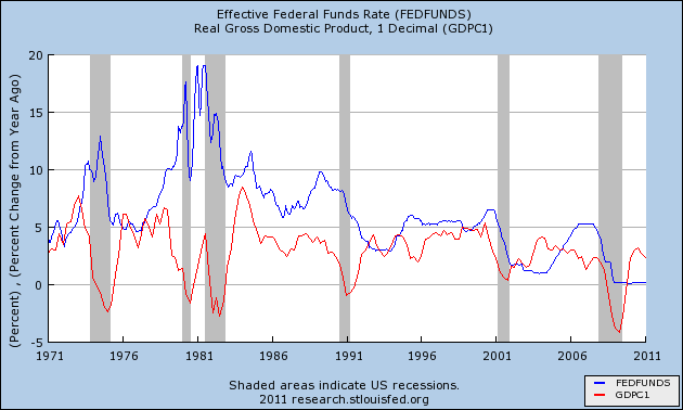
Below is a FRED graph showing the FEDFUNDS interest rate (blue) and the "percent change from year ago" of GDP. These are the same time series used by Rodger Mitchell, as noted in my two previous posts.

By moving the mouse onto the graph, you change the red GDP line to "real" or inflation-adjusted GDP. By moving the mouse off the graph, the line changes back to show nominal GDP again.


Having had a chance to compare both "real" and "nominal" output to the Federal Funds rate via the hover mechanism, I should say that the overall trend of the red line is shaped by inflation into a pattern quite similar to that of the interest rate. But the individual ups and downs that concern Rodger in his post are not so much affected. That is, the "ups" for the most part remain "ups" and the "downs" remain "downs". So, while he uses bad numbers, that choice probably does not affect his argument.


Clearly, Rodger's graph looks different after 1984 than it appears before. Yet, looking again at the graph for the years after 1984, I note that the blue line tends to rise until the red line starts to fall, and then the blue line rises a bit more before itself beginning to fall. This is the same pattern that occurs before 1984: Rising interest rates tend to slow the increase of growth, and lead to recessions.

This pattern occurs around 1984, and again around 1988, and again around 1995, and again around 2000, and again around 2007. Each time, the rising blue interest rate line continues to rise while the rising or flat red line showing GDP turns and starts to fall. Each time, interest rates rise until growth slows down, and often there is recession.

Rising rates reduce growth at lower and lower levels in the years since 1984. This is part of the reason the graph looks different in these years. Nevertheless, falling interest rates still induce growth, and rising rates still hinder growth.


The Growth of Real GDP

In the years before 1984, growth very often achieved moments at or above a 7½% rate. In the years after 1984, growth never managed to reach even 5% except during the "macroeconomic miracle" of the late 1990s. This is the reason the graph looks different in the more recent period. It is not that high interest rates no longer hinder growth. The problem more accurately is that low interest rates do not result in the kind of growth they formerly did. (And this, I think, explains why policy allowed interest rates to fall since the early 1980s: It was an effort to obtain growth.)
It likely also explains why Rodger writes: "The history of Fed rate cuts, as a way to stimulate the economy, is not a good one."
Nonetheless, low interest rates do encourage growth and high interest rates hinder it, not only before 1984 but after as well. I cannot accept Rodger's claim that this pattern does not hold.

The difference, the reduction of peak growth since 1984, is a result of our greater reliance on credit and on the cumulative cost of that change.

Wednesday, June 15, 2011

No fate but what we make

LET ME PREFACE THIS BY SAYING THAT THE WAY I DO ECONOMICS IS TO JUST KEEP THINKING ABOUT THINGS UNTIL THEY MAKE SENSE TO ME.. IT HELPS THAT I AM PERFECTLY HAPPY TO POSTPONE REACHING CONCLUSIONS.. I FIGURE THE CONCLUSIONS ARE THERE, WAITING FOR ME.. MY OBJECTIVE IS TO UNDERSTAND LITTLE THINGS ALONG THE WAY.

THE REASON I BRING THIS UP IS THAT THIS POST DISCUSSES ''EQUILIBRIUM'' IN ECONOMICS.. I ALWAYS JUST FIGURED ''EQUILIBRIUM'' MEANT SOMETHING LIKE ''EVERYTHING BALANCES OUT'' AND I PAID IT NO MIND.. THEN ONE DAY I CAME ACROSS ZEN BABU'S MACRO CUBE.. THE POST PRESENTS A CUBE UPON WHICH ARE ARRANGED A BROAD COLLECTION OF ECONOMIC THEORIES, IN A REMARKABLE EFFORT TO ORGANIZE THEM.

THE THREE AXES OF ZEN BABU'S CUBE ARE MONETARY POLICY, FISCAL POLICY, AND EQUILIBRIUM ANALYSIS.. NOW FOR YEARS I HAVE CONSIDERED THAT MONETARY AND FISCAL ARE THE TWO TOOLS OF ECONOMIC POLICY.. SUDDENLY, THE NOTION OF EQUILIBRIUM BECAME ELEVATED IN IMPORTANCE IN MY MIND.. YET IT REMAINED ESSENTIALLY UNDEFINED.

SO I HAVE HAD EQUILIBRIUM IN THE BACK OF MY MIND FOR THE PAST YEAR AND A HALF OR SO, AND NOW (WITH THIS POST AND THE PREVIOUS TWO) THE TERM IS STARTING TO MAKE SENSE TO ME.. AND THAT'S WHY I HAVE TO WRITE THIS PREFACE.

WHAT I THINK ''EQUILIBRIUM'' IS MAY NOT BE WHAT ANYBODY ELSE THINKS IT IS, INCLUDING (OR ESPECIALLY) ECONOMISTS.. BUT I HAVE TO SAY IT, SO THAT I KNOW WHAT I'M STARTING TO THINK.

I'M THINKING, EQUILIBRIUM IS SMOOTH SAILING, STEADY-AS-SHE-GOES.. IN EQUILIBRIUM, IF THE ECONOMY'S NOT GROWING, IT'S STATIC.. IF GROWING, THERE ARE NO IMBALANCES -- NO INFLATION, NO DECLINING CAPACITY UTILIZATION, AND NO PERPETUALLY ACCUMULATING DEBT, FOR EXAMPLE.

''EQUILIBRIUM'' IS THE TREND ECONOMISTS USE TO PREDICT THE FUTURE.. THEY USE IT, IGNORING INFLATION, DECLINING CAPACITY UTILIZATION, AND PERPETUALLY ACCUMULATING DEBT.


After I finished writing yesterday's post, I came upon this from the conclusion of a Steve Keen post:

I doubt that Kuznets would have been surprised by the failure of equilibrium-oriented attempts to build dynamic multisectoral models of economic growth, since he argued long ago that dynamics had to be different to statics, and in particular that the fetish with equilibrium had to be abandoned:

According to the economists of the past and to most of their modern followers, static economics is a direct stepping stone to the dynamic system, and may be converted into the latter by the introduction of the general element of change… According to other economists, the body of economic theory must be cardinally rebuilt, if dynamic problems are to be discussed efficiently…

the static scheme in its entirety, in the essence of its approach, is neither a basis, nor a stepping stone towards a proper discussion of dynamic problems. Kuznets, S. (1930, pp. 422-428, 435-436; emphasis added)

Yet the static approach—masquerading as dynamics via word games such as using the moniker “Dynamic Stochastic General Equilibrium” to describe bastardized Ramsay-Solow equilibrium growth models—still dominate economics, even after the continuing disaster of the crisis of 2007...


A static economy may be seen in any simple picture of the economy that imagines producers and consumers, and sets the thing in motion but eliminates growth for the sake of simplicity, as in this flow diagram from Wikipedia (via Worthwhile Canadian).

If you take that picture and toss it into the air, you have "the static approach—masquerading as dynamics," as Keen put it. As the picture goes up into the air, the uptrend of it is growth.

Not a good economic model, you're saying? That's not the half of it. After a moment the picture stops rising, and starts falling to the ground.


These graphs, which yesterday I admitted were interesting, are from Mark Thoma:


On the left is what Thoma calls the "natural rate" model, and on the right, the "plucking" model. The blue line on both graphs represents "the ceiling/trend", Thoma says in his post. The red lines represent two versions of how we think actual growth fits the ceiling slash trend.

Why and how actual growth can rise above the ceiling, I cannot say. But I observe that the same relation exists between actual and potential output.

Thoma's graphs are repeated below, as an overlay using the ikedim hover.


Default Graph = "Plucking" ... Hover Graph = "Natural Rate"

By moving the mouse on and off this graph, you can see that the blue line or ceiling trend is essentially identical in the two graphs. The blue line is a reference line or benchmark against which actual growth may be compared. As Thoma writes:

Notice that the size of the downturn from the ceiling from a→b (due to the "pluck") is predictive of the size of the upturn from b→c that follows taking account of the slope of the trend... In a natural rate model, there is no reason to expect such a correlation.

(Isn't it interesting?)

The thing is, Thoma and others want to use the blue line (and whichever red line they like better) to make predictions about future economic growth. Again, the title of Thoma's post is "Will the Economy Return To the Old Normal?" And his opening statement is "There's been some pushback against the statement I made ... that the economy would *eventually* return to the trend rate of growth it has displayed since at least 1870." And Thoma says, "I don't pretend to have as good a forecasting staff sitting in my Harvard office as the CEA has."

It's all about predicting the future; that's what makes it interesting.

Doesn't matter. Thoma's blue line there, if it is more that simply conceptual, is a record of past performance. It shows the past. It does not show the future.

But economists like to think of that blue line as an equilibrium trend that exists apart from policy and politics. Like Thoma, economists want to put it into graphs and use it to talk about the future. As though the future and the past are equally certain.

If you throw the static picture up, it goes up. Then it falls. There is no straight-line trend. But Thoma's blue line never falls.


When I imagine making a model of the economy, I see myself using a spreadsheet. I label my columns for my important categories of aggregate numbers. And I plug some reasonable numbers into the first row or two of data.

Then for the remaining rows, the numbers have to be calculated from the numbers on the previous row or couple of rows, and from other numbers on the same row. That's it. Where we are now depends on where we were yesterday, and on what we're doing now. There is no trend. There is no perpetual "equilibrium" extending into the future.

I think my concept of a model of a dynamic economy is more like Keen's than Thoma's. In mine, there is no trend. The new conditions simply emerge. And yes, looking back on it, as long as we're not hit by an asteroid, and unless policy destroys it, the emerging series of outcomes could look like a trend. But that does not mean that tomorrow will be bigger and better than yesterday. It only means we must choose wisely, today.

Saturday, April 30, 2011

Playtime!


I visited News from 1930 a while ago, where ikedim has a nifty sidebar graphic that changes when you move the mouse over it. So I looked at his page source to see how he did it. And now I finally found a use for the technique, as a way to compare graphs.

DESCRIPTION
At right is John Taylor's graph. (I got it from Krugman.) It shows an "inverse" relation -- downsloping to the right -- between investment and unemployment. Unemployment is high when investment is low, unemployment is low when investment is high; thus, an inverse relationship. Just like the Phillips curve.

At Noahpinion, Noah doesn't think Taylor's graph is like the Phillips curve. He thinks it is a Phillips curve. Part of Noah's evidence is that, like a Phillips curve, when you enhance the graph by adding dots for more years, the dots on Taylor's graph are widely scattered, just like the dots on a Phillips curve.

Below is the first enhancement of the graph, showing red and blue dots. The blue are the same as in the graph I got from Krugman. The red dots show additional years. Most of those red dots are within or well above the blue band of dots.

When you put the mouse over this graph, it changes to show the second enhancement. Both enhancements, by the way, are from Justin Wolfers at Freakonomics.


What catches the eye first is red dots changing to blue. It's nifty, all right. But what I want you to see is down near the bottom, about in the middle of the graph. A whole blue cluster appears and disappears as you hover the mouse over the graph and move it off again.

When the graph is red-and-blue, the blue are the same as in the first graph above, showing points for the years 1990-2010. The red dots are points for the years 1970-1989. The red dots are much less orderly, and generally much higher, than the trend of the blue band.

When you move the mouse onto the graph, the blue dots remain, the red dots turn blue, and more blue dots appear. These new dots are points for the years 1948-1969. Most of these dots show investment in a mid-range, 14 to 16, and unemployment low, around 3 to 5 percent.

These new dots, showing low unemployment despite middling investment, are from the "golden age of postwar capitalism."