Monday, October 31, 2011
 "Feet" is not the same as "Feet per Second"
One guy was talking about a pellet gun that shoots pellets at 1200 feet per second.
The other guy said, "1200 feet! That's two football fields. That's pretty far."
I said nothing, because I don't know. But the pellets don't go 1200 feet.
If gravity pulls the pellet down at 16 feet per second, and if you are holding the gun about four feet above level ground (and shooting level) then the pellet will be in the air only about a quarter of a second. So it will travel about 300 feet.
Sunday, October 30, 2011
Easier the Second Time
I got this from Billy Mitchell:
 |
| Graph #1 |
I threw some trends on Billy's graph, and Jazzbumpa threw them back at me.
I want to do more with trends, using this same graph as a sample. So now I need the numbers. I found this graph at the BLS link Billy provides:
 |
| Graph #2 |
BLS provides the data in an Excel file. Pretty nice: It goes back to 1939. Monthly numbers. Funny thing, though: Each year is on its own row, with one column for each month. Just like the Consumer Price Index file I got the other day.
So it was another opportunity to practice my transposing skills, to get all those 12-cell rows turned and moved and properly aligned with all the data in one column so I can more easily use it for graphs and calculations.
I did it this time in Excel, rather than Open Office Calc. I did the same thing as before, inserting columns at the left and doing my work there.

1. In Excel I typed Jan 1939 and when I hit ENTER, it got translated into Jan-39. So Excel recognized it as a date. After I entered the next two months of 1939, I grabbed all three cells and dragged 'em down, and Excel filled in the whole column for me with all the dates I needed.
Perhaps in Open Office if I explicitly formatted the cell as a date, it would have filled in all the dates for me when I tried dragging the group of three cells (see steps 8 and 9 of yesterday's early post).
//
I notice it is much easier to keep track of what I'm doing with this source data, because this time the file does not have the blank line every fifth year.
//
I also noticed the rhythm of the process. First, select a dozen cells and press CTRL-C. Then:
Click a temporary destination and press CTRL-V and then CTRL-X
Click a permanent destination and press CTRL-V and then CTRL-C.
Click a temporary destination and press CTRL-V and then CTRL-X
Click a permanent destination and press CTRL-V and then CTRL-C.
Click a temporary destination and press CTRL-V and then CTRL-X
Click a permanent destination and press CTRL-V and then CTRL-C.
and like that to the end. Except at the end, you don't need the last CTRL-C, because there are no more years to copy.
But it's symmetrical: The CTRL-C that's missing from the end of the sequence appears at the start!
//
Anyway, the whole rearranging-the-data thing took less than half an hour. And that's for all the years since 1939. It goes quick.
//
Spending that much time with the numbers, it occurred to me how unusual it is that the numbers don't keep rising. Economic numbers always go up. But not these numbers.
Saturday, October 29, 2011
Results
After getting my ducks all in a row, or all in a column actually, I made a graph of the CPI-U numbers:
 |
| Graph #1 |
Not very inspiring. That's okay. The exercise is its own reward.
The point of the exercise, though, was to look at prices during the Great Depression. Going back a few days, I had quoted a Futurecast post:
The 8% price inflation that afflicted the Depression-ravaged economy through the first six months of 1937 after four years of New Deal monetary inflation occurred despite unemployment rates in excess of 14%.
And Jazz said
bullshit
so naturally I had to look. But it's hard to see the Great Depression from here. So I looked at a smaller chunk of the CPI:
 |
| Graph #2 |
Starts out at 10. Was 100 sometime around 1983. Where is it now? Around 225 by the first graph. So prices went up ten-fold between 1913 and 1983, and have roughly doubled since. A little more than doubled.
Tenfold in 70 years. Doubled in say 23 years. For what that's worth.
23 once: doubled.
23 twice: Four-fold in 46 years.
23 three times: Eight-fold in 69 years, call it 70.
So we have done a little better since 1983, an eight-times increase as opposed to a ten-times increase in prices, based on ballpark numbers and 70-year trends.
Not really very good at all, is it?
Anyway, the Federal Reserve is gonna be 100 years old pretty soon, and I think you should be nice to it. I do. Yeah, they can do better, but only if they know how.
Meanwhile, the Great Depression. No no, not this one. The other one, 1929. Here's inflation for 1913-1945 again, this time show as a rate rather than a level: percent change from year-ago numbers:

Starts at 1914 actually, seeing the change from 1913.
Well, I don't see any 8% inflation rate in any month of the Great Depression. Five percent max, and that only briefly. Jazz was right.
Exercise
A bit off-topic. But you might find this handy if I happen to know things about Excel that you don't. Then again, if you know an easier way to do something I have done here, please do let me know.
Jazz recently provided a great link for CPI numbers going all the way back to 1913. Monthly numbers, from a strong source: the Bureau of Labor Statistics.
Trouble is, each year's numbers are all on one row. All 12 months, and two year-values besides. Then the next year's numbers are on the next line. This is not a useful format for graphing, in my experience. I want the numbers all in one column.
This post is about what I came up with to put all those CPI numbers into one column, in order, with the minimum amount of repetitive work and the minimum risk of error.
I did all this in OpenOffice Calc, which is free, which is why I have it. It has its own quirks, but it does work a lot like Excel. What I've done here will work in Excel, if you've got it.
1. I went to the BLS link and saved the page. (In Firefox, on the Firefox menu, click Save Page As.... Firefox wants to save the page as a text file, which is fine.)
2. I saved it to the desktop. (I save everything to the desktop. Everybody laughs when they see how littered my desktop is. You can save it wherever you want. But when you can't find it, I'll laugh at you.) I right-clicked on the file and from the pop-up menu (I use Windows) clicked Open With, and from the sub-menu OpenOffice.org Calc. (Something similar should work if you have Excel installed. Worst case, open Excel, click FILE:OPEN, change the file type to include TXT files, and select the BLS file. (Filename = cpiai.txt). Something like that.)
3. I had to fiddle with the Text Import window that opened up. But I got exactly what I wanted on the third try: The CPI data from BLS, with a year on each row and a column for each month. Not what I wanted for a final product, but what I wanted to start with.
4. Remember to save the file as an Open Office spreadsheet, or an Excel spreadsheet. Don't leave it as the default type, a text file, because you will lose all your improvements when you save and close the thing.
This doesn't sound like economics at all, does it. Sounds like my other passion, fiddling with computers. While Rome burns.
In Open Office (or Excel. Whatever) now you have a copy of the BLS CPI data. All you have to do now is make it useful. This is where the power of a spreadsheet can really save you some work.
5. I renamed the worksheet Source and and made a copy of the sheet to make my changes in. (Yeah it is easy enough to go get the thing again, but is is easier just to make another copy of the Source sheet if I need it.)
6. I narrowed down the columns so I could fit more on my screen. (My monitor is turned 'portrait' so typically I can see a lot of rows and not a lot of columns.)
7. I inserted four columns to the left of column A, making some blank space at the left side of the worksheet. I left a couple blank cells at top (just out of habit; often, they come in handy). In cell A3 I entered Date and in cell B3 CPI-U.
8. Now the fun begins. You know, the repetitive part. And figuring out how to minimize the repetition. In cell A4 (one row down from the cell where I typed Date) I entered Jan 1913 which is of course where the BLS numbers start. Below it I typed Feb 1913 and below that Mar 1913. Then I selected those three cells and dragged'em down the screen, expecting it to automatically fill in Apr 1913 and the rest of the months of 1913, and beyond.
9. It didn't work. So I typed in the rest of the months for 1913, always using 3-letter abbreviations (for no reason, except I thought it might be good to keep the lengths all the same. Turned out, it was).
10. When I got to January 1914 I stopped. Obviously there had to be a better way than typing every month-and-year for a hundred years' worth of months.
11. With the cursor sitting in cell A16, I looked the situation over. I knew I wanted the letters JAN from cell A4, and a space, and the yearvalue from cell A4 with 1 added to it. And actually, I wanted that in every cell from here on down. Not JAN, but the month-name from 12 rows up, and the yearvalue from 12 rows up with 1 added to it.
12. I can do that. Actually, I couldn't, because Open Office Calc wants semicolons between the numbers, where Excel wants commas as I recall. But the help was helpful and I figured it out long before I would have been done typing the next ten years of numbers manually, and it worked. You can see the formula I used in the image below.
13.

14. In cell A16 I typed an equal sign (which tells the computer it will be doing a calculation) followed by LEFT(A4;4) (which tells the computer to take the first 4 characters from the left end of the text in cell A4).
Next I hit the SPACEBAR once and then SHIFT-7 for the ampersand (&) and the SPACEBAR once again. Pretty sure I need spaces there. It might work without them, but I don't have to care about that. What the ampersand does is sticks chunks of text together. What it will do for me is stick the three letters JAN and the fourth character, a SPACE, into cell A16, followed by whatever I put after the ampersand. Which I didn't tell you about yet.
See how I am taking the LEFT 4 characters here? And because I was clever enough to use all three-letter month names, the 4th character will always be a SPACE. And as a matter of fact, the 5th character will always be the first number of the four-digit year value. And (as you might have guessed) the year value is what comes next in the formula.
By the way, this may seem like a lot of work. But it is a lot less work than typing in all those month names and year numbers by hand.
So. After the ampersand we want the yearvalue. But in cell A16 I want the next year after the yearvalue in cell A4. I want 1914, not 1913. So (as you can see in the formula in the image above) after the ampersand I put a 1 and a plus sign. That will add 1 to something. So now all I have to do is grab the yearvalue from cell A4 and I'll be done.
To get the yearvalue from cell A4 I typed MID(A4;5;99) (Remember, semicolons between the numbers if you're using Open Office Calc.) What that does is it starts somewhere in the MIDdle of cell A4 -- with the 5th character, actually, because that's what I asked for -- and gives me the next 99 characters or less. I use 99 as a rule, because it is easier than counting the maximum number of characters I might possibly need. Though in this case that number would I suppose be four. But 99 works. And I don't have to worry about what else might work.
So that's it. That's the whole formula. Now I enter the formula into cell A16 (by hitting the ENTER key)((boy this is really LCD isn't it?)) and make sure it gave me the result that I want: JAN 1914.
15. Now it gets easy. With the cursor in cell A16, type CTRL-C to copy the formula. Then press the down-arrow and type CTRL-V to past a copy of the formula into cell A17. FEB 1914. Try a few more to make sure it works. Then select a whole lot of cells in column A and press CTRL-V to past the formula into all of 'em at once.
16. Bingo. The date-values are done.
17. Heh. That was the easy part.
18. I worked out a way to copy the CPI numbers, too, but I didn't get it right away with the 1914 numbers. But to simplify this story, we will pretend that I did.
19. Go up to the top of the spreadsheet again. Click on cell B4, which is just below the text CPI-U that you typed in step 7. Just to the left of the selected cell it should say JAN 1913. With the mouse pointing at cell B4, click and hold down the left mouse button and drag the mouse down until you are pointing at cell B15. Just to the left of that cell it says DEC 1913. And release the mouse button.

So what you have done is, you have selected the 12 cells where you want to put the CPI values we got from the BLS, which should be over to the right and maybe a few rows down from the selected cells.
20. The selected cells are stacked one above the other in a column. The numbers we want are all next to each other in a row. What we have to do is transpose them.
21. This probably sounds like a lot of work. To transpose one row at a time. Yeah, don't worry about it. Spreadsheets are useful tools.
22. With those dozen cells selected, type an equal sign (again, telling the computer that it will have to figure something out) followed by the word TRANSPOSE and SHIFT-9 for the open-parenthesis character. Now (with no mouse buttons pressed) find the BLS numbers for 1913. Point the mouse to the CPI value for January 1913, then press and hold down the left mouse button. Slowly drag the mouse over to the right (holding the mouse button down) until the mouse is pointing at the CPI value for December 1913. Release the mouse button. Press SHIFT-0 (that is, SHIFT-ZERO) to type the close-parenthesis character. Now DO NOT PRESS ENTER.
23. With the CPI numbers for 1913 all selected and the closing parenthesis typed in, press and hold down the CTRL key and the SHIFT key at the same time, and while holding them down press ENTER once. Then release all the keys.
24. If you look back at your column B, cells B4 through B15 now contain the CPI values, transposed from the original where they were all in a row.
25.

IMPORTANT NOTE: In the formula shown in this image, you can see "curly braces" -- the "{" and "}" characters -- before the equal sign and after the closing parenthesis. YOU DO NOT HAVE TO TYPE THEM IN. In fact, YOU SHOULD NOT TYPE THEM IN. The computer puts them in there automatically when you hold down CTRL and SHIFT and press ENTER. The curly braces are not "characters". They are "code". They are special information that tell you that your formula was entered the special way, and that it applies (in this case) not to a single cell but to a dozen cells.
In the Formula Bar, you can read that I am transposing cells on row 21. Specifically, I am using cells F21 through Q21. But that's just pot luck. If I inserted an extra blank row at the top, I'd be using cells F22 through Q22. And if I stuck another column at the left, I'd be starting with cell G22, not F22. The important thing is that I selected the cells containing the BLS numbers for the 12 months of 1913, and plugged them in to the 12 cells for 1913 in column B.
26. Where was I?
27. What we have just done is to capture the BLS numbers for 1913 and put them into a useful form. Before we do the numbers for 1914, there is one more thing to be done.
28. With cells B4 through B15 still selected, click in the formula bar. (Notice that the curly braces disappear! That's okay.) Now with the arrow keys (or maybe the mouse) move the cursor so that when you type, what you type will appear immediately after the open-parenthesis character and immediately before the F of F21. (Note, however, that you might not have "F21". You might be transposing numbers from a different cell. That is perfectly okay.)
29. Type SHIFT-4 to put a dollar-sign after the open-parenthesis character. Now use the arrow keys to move the cursor to the right so that the next character you type will come immediately after the ":" and immediately before the "Q21" (or whatever cellname you have). Type SHIFT-4 again to put another dollar sign immediately after the ":". NOBODY SAID TO PRESS ENTER YET. Do *not* press ENTER. Not yet.
30. The dollar sign before the "F21" makes it so the "F" will not change. The dollar sign before the "Q21" makes it so the "Q" will not change. That's what we want, because the BLS numbers we are using start in column "F" (for January) and end in column "Q" (for December). If the explanation doesn't make sense, stick with me anyway. It'll make sense when you see it happen.
31. Now that you have typed in the two dollar-signs, we are done modifying the formula. DO NOT PRESS ENTER. As before, you have to press and hold down the CTRL key and the SHIFT key. With those keys pressed, press and release the ENTER key, then release all the keys. Your curly braces should come back.
32. Now we need to do 1914. So -- with cells B4 through B15 still selected, press CTRL-C to copy the formula. Then click on cell C5 -- one row down and one column to the right of the transposed January 1913 number. With cell C5 selected, press CTRL-V to paste the formula we copied.
33. You can check your work, if you want. But if you do, make sure not to change which cells are selected.
34.

In this image, you can see that we are using CPI values from cells F22 through Q22. There are dollar signs there, so what you see is "$F22" and "$Q22". Actually, those start- and end-cells are one row down from F21 and Q21 where the 1913 numbers are. That's good. That means we got the 1914 CPI numbers.
35. Now, without changing the selection of cells, press CTRL-X to cut them out of column C. Click on the cell in column B that is next to JAN 1914 in column A, and with that one cell selected, press CTRL-V to paste the CPI values for 1914 in place where we want them.
36.

Oh, I just noticed: For the first image I used the CPIAI.ODS file I started with. But for the rest of the images I used the TEMP CPIAI.ODS file that I'm using to help me write this post. Oh well.
37. Again, do not change the selection of cells. Press CTRL-C to copy the formula that gives you the 1914 values. Point to the cell that is one row down and one row to the right of the January 1914 CPI value. (In my example, point to cell C17.) Click on that cell and press CTRL-V to paste in the formula for the 1915 values. Now (without changing the selection) press CTRL-X to cut out the formula. Click on the cell that will hold the January 1915 value, and press CTRL-V to paste the formula into all the months of 1915.
38. At this point, it has become easy to transpose the next line. (Read item 37 again if you missed it.) But there is one more consideration before you finish transposing your data.
39. In the original BLS data, there is a blank line after 1915. There is a blank line every five years, after 1915 and 1920 and 1925 and so on. So when you copy the 1915 formula to create the 1916 formula, you don't point to the cell that is one down and one to the right. You point to the cell that is two down and one to the right. By going down two, you skip the blank line.
40. And that's it. CTRL-C, CTRL-V, CTRL-X, CTRL-V. The left hand barely moves. The right hand selects cells with the mouse. It goes quick: Much quicker than writing this post, for example.
41. By the way, if you mess up, just delete the cells that are wrong, select the most recent year's numbers that are right, and get back into the loop.
It seems there is an easier way for you to get the CPI numbers all in one column: You can use the file I used.
I checked it over, as much as I could stand, and I don't see any errors in it.
The workbook contains three pages:
Source: the original BLS textfile, imported to the spreadsheet.
Monthly: all the data transposed into one column
CFYA: Change From Year Ago values, calculated from the CPI-U values
If I forgot to delete it, there is also a page named "monthly prelim" which you can ignore.
I stored the files at Google Docs. Three versions:
1. The Google Docs version.
2. The Open Office Calc spreadsheet.
3. An Excel version (created by Open Office).
Hope this was a useful post.
Friday, October 28, 2011

Manufacturing Employment Trends
"US manufacturing employment (thousands) since 1939":
 |
| Source: CES3000000001 at BLS |
This time I eyeballed-in four separate trends.
// Related post:
The Skills Shortage, and Reading a Graph
Following up with Alvin C Warren
On Wednesday I quoted Alvin Warren from the Yale Law Review:
The unlimited deduction for corporate interest payments originated in 1918 as a temporary measure designed to equalize the effects of the World War I excess profits tax.
I thought that was interesting. So I went back to the JSTOR page and found this footnote:

"Congress thought it was 'only fair' that interest
on corporate indebtedness be fully deductible."
It's not the Federal Reserve that messed up our economy. It's Congress.
And the level of their economic analysis is: it's only fair.
Don't blame the Fed for our economic troubles. Blame Congress.
Thursday, October 27, 2011
No, sir!
Three in a row, yesterday. All pointing out the debt bias created by the tax code. Specifically, created by the corporate interest deduction. A total of four articles considered, all of them showing debt bias as a problem.
But here's something. In the noon post I quote James Surowiecki: companies can write off all the interest on their debt, but not things like dividend payments.
I complained that Surowiecki "seems to hint that maybe corporations should be able to write off both their dividend payments and their interest payments", and I rejected that option.
For this post I went back and reviewed his article, looking for more such hints, but found none. So that made me happy. It's a good article. Here's the link again.
In the four o'clock post I quoted Alvin C. Warren, who points out that "no deduction whatsoever is permitted for dividend payments." Sounds to me like another hint.
Look: Dividend payments are profit. Profit is the only part of business income that is taxed. That's bad, because it skews the playing field in favor of business spending. (And spending is the device that can generate inflation. Think about that the next time your utility company gets a price increase approved.) But it's also wrong, because the rule is that profits are taxed. You don't get to wiggle out of the rule by comparing dividends to interest costs, pretending they're the same, and coming down on the side of eliminating taxes on dividends.
That's changing the subject. The subject is corporate interest costs are not taxed, and the growth of debt that results from this and similar tax advantages. Focus on interest costs. We'll talk about dividends later.
I don't know if Alvin Warren says any more about relieving corporations of the burden of paying tax on their profits. JSTOR provides only the first page of his paper.
Also in my four o'clock I looked at Pete Davis's post. Just double-checked it now. He doesn't say anything that sounds to me like he's trying to get another tax break for corporations. He's got a good clean statement on the problems created by a tax code that allows deductions for interest costs. Here's the link again.
And that leaves Waldman. My 8 AM post.
I have trouble reading Waldman because his paragraphs are too long to fit the space between my ears. After the part that I quoted yesterday (from his first paragraph), Waldman writes, "Here's the case-in-brief." (See, I thought the case-in-brief was the part I quoted yesterday.) And then he presents us with four long paragraphs and some medium-length ones besides.
Wading through that, I get the impression Waldman is making the case *for* the corporate interest cost tax-deduction:
Creditors and equityholders are fundamentally the same...
Large-scale investment is crucial to a modern economy, and getting investors to trust strangers enough to give them their money is hard... To overcome some of the trust issues, the most nervous sort of investor, bondholders, are given the business equivalent of a doomsday device to enforce their claim on timely payments. If, of malice or misfortune, a firm fails to pay out as promised, bondholders can force a firm into bankruptcy...
Fundamentally, the right of bondholders to enforce their claims via bankruptcy is... a legal convention we've developed to encourage socially useful risk-taking that partially externalizes the downside risks for some investors.
The existence of enforceable debt financing is a very good thing. It's an essential element of the constellation of institutions by which we are able to fund large-scale capital-intensive projects without coercion.
Thankfully, Waldman also says
But... any state meddling in capital structure ought to tilt the scales towards equity rather than debt financing.
Oooh, and this I like. Well said:
When firms pay stockholders, every dollar an investor receives drops off the firm's balance sheet. But when a bondholder receives the same dollar, a US firm pays as little as 65¢. The other 35¢ is paid for by Uncle Sam, in the form of a tax deduction.
Again, that's not altogether on point, not for this post. But I can't resist including it. It's just that good.
And so we arrive at Waldman's last paragraph -- thankfully, a short one -- and the "Note" that follows it.
"So, here's my proposal," Waldman writes:
Put payments to stockholders and payments to bondholders on a level playing field. Eliminate the tax deduction for business interest payments. I'm not sure how much extra revenue this would net the Treasury, but by ending a perverse incentive for firms and eliminating a large subsidy to the wizards of debt, it would pay off hugely in the form of a more stable corporate and financial environment.
Stop after the second sentence. Here's Waldman's proposal:
Put payments to stockholders and payments to bondholders on a level playing field. Eliminate the tax deduction for business interest payments.
You might think that eliminating that deduction would bring extra revenue to the Treasury. But that's not our topic, is it. Anyway, the point here is to look at how the interest cost deduction twists and skews the natural economic forces and helps produce an economy burdened with debt, an economy whose most successful industry is finance, an economy that cannot avoid the crisis that comes when everyone suddenly realizes we have just too much debt.
I don't care about bringing extra revenue to the Treasury. Plus, it's off-topic.
The topic is not how big to make government. Nor is the topic the Federal debt and deficit, not whether those are beneficial or harmful. The topic is the corporate interest deduction and how it skews the economy.
So, Waldman says Eliminate the tax deduction for business interest payments.
And then, in the Note, Waldman says
Another way to level the playing field between debt and equity financing would be to eliminate corporate taxation entirely. I'd be cool with that too...
See? Now he's writing in favor of the corporate interest cost tax-deduction. He is willing to trade the "debt bias" for an enhanced supply side bias.
Perhaps Waldman doesn't really understand that accumulating debt is the problem. He's "cool" with accumulating debt. And rather than focusing on the debt bias, he drifts again to revenue considerations:
...as long as it was accompanied by a tax increase elsewhere...
and then he complicates matters, raising a veil of confusion:
...whose incidence is at least as progressive as the corporate tax.
He ends his Note by skewing the reader's heart:
And really, if we are going to socialize the costs of our financial meltdown, shouldn't we socialize it disproportionately to the people who gave it to us?
If you want to understand the economy, keep your damn feelings out of it.
But anyway, I'm with Waldman on this: Eliminate the tax deduction for business interest payments.
Wednesday, October 26, 2011
And one from page five.
From the fifth page of Google results (see my two previous posts):
How the tax code encourages debt : The New Yorker
The article is The Debt Economy by James Surowiecki. It starts with a quote from John Kenneth Galbraith, one I think I recognize from A Short History of Financial Euphoria. So I felt like I had an "in" with the author, and I liked the article before I got past the first sentence. Oh, well.
Here's just a small piece of Surowiecki's article:
Debt didn’t get dangerously out of scale because the system was broken. It got out of scale, in part, because the system worked.
The government doesn’t make people go into debt, of course. It just nudges them in that direction. Individuals are able to write off all their mortgage interest, up to a million dollars, and companies can write off all the interest on their debt, but not things like dividend payments. This gives the system what economists call a “debt bias.”
Agreed.
But this excerpt seems to hint that maybe corporations should be able to write off both their dividend payments and their interest payments. No. Leave dividend payments as they are; that's not the problem.
And make corporate interest payments taxable. That will reduce the accumulation of private sector debt. And that is what must be done in order to restore growth.
And third in the Google search results...
Third on the list returned by Google (see my earlier post for numbers 1 and 2) was Interfluidity :: Eliminate the business interest tax deduction.
Steve Waldman writes:
Eliminate the tax deductibility of interest payments by businesses. Debt financing externalizes the risks of business activity and magnifies social costs, while equity financing concentrates risk among stockholders who signed up to bear it. Yet under current rules, taxpayers literally pay firms to get rid of stockholders and take on ever more debt.
Well said, sir.
"Financial Crisis Was Rooted In The Corporate Income Tax Interest Deduction"
Good title. I borrowed it from CapitalGainsandGames. Pete Davis. Here's what Davis wrote:
The corporate income tax deduction for interest produced a -6.4% tax rate on debt financed investments, while the double taxation of equity income (dividends and capital gains) produced a 36.1% tax on equity financed investments according to this 2005 Congressional Budget Office study.
Borrow and spend to grow your business, and you make money by paying your taxes. Use equity to grow your business, and taxes cost you more than 36%. Something like that. I can be sloppy as hell with the numbers and you can still see the difference.
Oh. There was something else.
From the Yale Law Journal, July 1974. JSTOR makes the first page available here. A paper by Alvin C. Warren, Jr.
Alvin Warren writes:
While interest expense is currently deductible in full from corporate income, no deduction whatsoever is permitted for dividend payments. The unlimited deduction for corporate interest payments originated in 1918 as a temporary measure designed to equalize the effects of the World War I excess profits tax. Before 1918, only limited offsets against corporate income were granted for interest payments...
Just to point it out, the deduction for corporate interest payments is not something that was created by the Federal Reserve. It was an act of Congress, skewing the playing field.
Ironic, isn't it? that Congress did the study pointing out the problem that Congress created. The more so, since Congress never bothered to fix the problem. I guess they are too busy pointing the finger at the Fed.
// Googling corporate interest deduction brought up these links.
Tuesday, October 25, 2011
The Skills Shortage, and Reading a Graph
I absolutely agree with Billy that the skills shortage is a "ruse".
Let me condense a piece of his post. Billy quotes the Skills Gap Report:
Think of it this way: as many as 600,000 well-paying jobs are going unfilled while the national unemployment rate hovers around 9%.
Well I would think about it this way, Billy says:
600,000 thousand workers at the current productivity level in manufacturing would create a lot of output. That output, apparently, is not being produced but could be if there were workers available if the Skills Gap Report is to be taken literally.
That would represent a very large volume of unfilled orders sitting on the companies order books... If there was that frustrated demand some firm would work out a way to satisfy it and thus gain market share.
The fact is that no survey reveals that level of unmet demand (that is, consumers or firms with cash to spend who systematically cannot purchase goods because the firms have said they cannot supply them because of labour shortages.
I thought that was really good.
On an unrelated note, Billy presents this graph of "US manufacturing employment (thousands) since 1939":
|
| Graph #1 |
If you were to look for overall trends in his graph, what you see might look like this:
 |
| Graph #2 |
However, when I look for overall trends in Billy's graph, what I see looks like this:
 |
| Graph #3 |
The Economics of the Past 40 Years
Driving to work, I stop at the "tee" and make the left. But there is a pothole right there that's hard to miss. So I got in the habit of looking for the edge of the pothole and staying to the left of it, every morning.
And then one morning I didn't see the edge. I thought it odd that I missed it. The next day I noticed they patched the pothole. So, the odd thing was not that I didn't see the pothole, but that it was gone, and I didn't even notice!
But I wasn't looking for the pothole, you know? I was looking for the edge.
That minor event reminded me of the Darwin story related by Lionel Ruby in How the Scientist Thinks. I wrote of it before:
Darwin and a fellow scientist were searching for fossils in the north of England. They were not aware of the glacial theory at the time. Years later Darwin revisited the area, and he was now astonished to discover how clearly marked were the glacial ridges on the rocks. He had not noticed them on his earlier visit because he was not looking for them.... Darwin was able to appreciate the glacial markings only after he became aware of the glacial theory.
We see -- or maybe, don't see -- what we're looking for. But we can easily overlook things we're *not* looking for.
We know there is a relation between money and inflation. So that's what we see. That's what we see even when it isn't money that is causing inflation. That's what we see, even if we have to jigger the numbers like Friedman did to see it.
But if, for example, there is also a relation between credit use and inflation, and we are not looking for that relation, then we are very likely to overlook it.
Monday, October 24, 2011
Big V
Velocity
Velocity is the "miles per hour" of the economy. It is spendings per dollar, or how many times the average dollar was spent. Easy, right? But which money? And what spending? Let's start with MZM money.
FRED says
Velocity is a ratio of nominal GDP to a measure of the money supply.
and for MZM they figure it as GDP divided by MZMSL:
the ratio of quarterly nominal GDP
(http://research.stlouisfed.org/fred2/series/GDP)
to the quarterly average of MZM money stock
(http://research.stlouisfed.org/fred2/series/MZMSL).
Graph #1 shows percent change from year ago for the velocity of MZM money, for the quantity of MZM money, and for GDP -- in other words, for the velocity ratio and the two components of that ratio:
 |
| Graph #1: MZM Velocity and Components |
After the tall red spike, there are five more significant peaks by my count. Each red line peak is matched by a sag in the blue line. As the quantity of money rose, the velocity of money fell. This graph shows the pace of those changes.
The same mathematical fact (the quantity of money is the denominator of the Velocity ratio) holds true before the 1982 recession, though it is less clear from the graph. But you can see between the 1974 and 1980 recessions an up-and-down in the red line corresponding to a down-and-up in the blue. Same thing between the 1970 and 1974 recessions. And again, though smaller, one can see the same thing between the near-recession of 1966 and the recession of 1970.
Before 1966 we seem to lose it, but those numbers are all made up anyway. (MZM is a fairly recent invention.) Still, for a brief span in the 1960s, MZM growth appears as a flat red line. So the Velocity of money (the blue line) varies in proportion to spending (the green line). During those years the blue line and the green line move in parallel.
Graph #2 is just like Graph #1 except based on M1 money rather than MZM:
 |
| Graph #2: M1 Velocity and Components |
In the years after 1980 it is again very clear that the red and blue lines tend in opposite directions. There is no magic to it, only simple arithmetic: The money number is the denominator of the ratio, so the money number and the ratio value tend to move in opposite directions.
I should point out that if there is any difference between the red uptrends and the blue downtrends, that difference must be because of the changes in GDP (the green line).
Note that in the years before 1980 the green line is the highest of the three on Graph #2. (That was not so obvious on Graph #1). Thus before 1980 the green line plays a larger role on #2, creating greater differences between the red and blue lines.
To finish the exercise, a look at M2 velocity and its components:
 |
| Graph #3: M2 Velocity and Components |
If you change the elapsed time of your drive to work, and there is no change in the distance traveled, then as the driving time increases your average speed must decrease. It cannot be helped. That is the way the ratio works.
If you increase the quantity of money, and assume no change in spending, then as the quantity of money increases the velocity of money must decrease. It cannot be helped. That is the way the ratio works.
If quantitative easing increases the quantity of money, we should expect to see a slowdown of velocity. Unless spending increases faster than the money.
Sunday, October 23, 2011
Free Bird
Below find a few excerpts from the unambiguously titled Independence + Accountability: Why the Fed Is a Well-Designed Central Bank (PDF) by Christopher J. Waller. I liked the paper. I have rearranged the excerpts to provide continuity in the shortened form presented here. I used the paper's conclusion as an intro, and the abstract as a conclusion :)
I have removed footnotes and references to sources. And I have broken up long paragraphs in to shorter ones, to better fit my attention span.
Hover over the first few words of each paragraph, and a note will pop up identifying the page number where it can be found in the PDF, which runs from page 293 to 301.
Note: the original PDF provides a "balanced" view that may be lacking from my post. Don't blame the Fed if my presentation is one-sided.
The PDF itself is 8 or 9 pages long. Not too much to read, even for me. If you were not already studying the economy before Robert Lucas got famous, I suggest that you read it to get some perspective.
Used with permission of the St. Louis Fed.
To the uninformed observer, the Fed’s structure is in many ways mind-boggling. In particular, it seems counterintuitive that, in a democracy, the central bank should have independence from Congress. Yet, this independence is the result of Congress trying to avoid making monetary policy mistakes for political gain.
Of course, accountability of public policymakers is a fundamental principle in a democracy. It is the tension between independence and accountability that led to the design of the Federal Reserve, and it has been an everpresent force in U.S. monetary policy for the past century.
Of course, accountability of public policymakers is a fundamental principle in a democracy. It is the tension between independence and accountability that led to the design of the Federal Reserve, and it has been an everpresent force in U.S. monetary policy for the past century.
The willingness of governments to force their central banks to print excessive amounts of money, or put in place policies that lead to higher inflation rates over time, has been termed the “inflation bias” of discretionary monetary policymaking. To minimize this bias, many governments have decided to give their central bank legal independence (CBI).
But do countries with independent central banks also have lower inflation? To answer this question properly, it’s necessary to calculate country-specific measures of central bank independence. Many economists have constructed measures of CBI from a variety of legal indicators, many of which are discussed in this article.
In a now famous article that was published in 1993, Alesina and Summers (1993) found that developed countries with high levels of central bank independence also experienced lower average levels of inflation for the period 1955-88. Figure 1 is derived from a figure in their paper, which clearly shows this negative relationship.

It has always been important that central bankers be independent of the political process to ensure that they cannot be manipulated by elected officials. However, having such great power means that central bankers have to be accountable to the electorate in some fashion, and accountability requires the central bank to behave in a transparent manner.
Over the years, there have been changes in the Fed’s structure to improve its independence, credibility, accountability, and transparency.
The tricky issue is that accountability means being subject to some political oversight, which weakens the perception that the central bank is independent.
The recent recession and financial crisis were, in many respects, the worst since the 1930s. In response, some economists and policymakers have begun to examine the Fed’s policies prior to and during the financial crisis to see whether its goals, responsibilities, or institutional structure should be changed to help prevent another financial calamity.
In response to the financial crisis and recession, some people argue that power should be further consolidated in Washington, D.C., to avoid another financial calamity. However, as St. Louis Fed president James Bullard and other Federal Reserve officials and private-sector economists have pointed out, moving the levers of monetary policy even closer to the hub of politics could lead to an erosion of the Fed’s independence ...
In 1913, Congress purposefully created the Federal Reserve as an independent central bank, which created a fundamental tension: how to ensure the Fed remains accountable to the electorate without losing its independence.
Over the years, there have been changes in the Fed’s structure to improve its independence, credibility, accountability, and transparency. These changes have led to a better institutional design that makes U.S. policy credible and based on sound economic reasoning, as opposed to politics.
In times of financial and economic crisis, there is an understandable tendency to reexamine the structure of the Federal Reserve System. A central bank’s independence, however, is the key tool to ensure a government will not misuse monetary policy for short-term political reasons.
Excerpts from Independence + Accountability: Why the Fed Is a Well-Designed Central Bank by Christopher J. Waller.
Federal Reserve Bank of St. Louis Review, September / October 2011
Saturday, October 22, 2011
A (brief) Kind Word for Shiller
So I thought I ought to google the phrase "irrational exuberance", having used it a couple hours ago. Turns out Robert Shiller has a book of that title.
Shiller also has a web page on the origin of the term and his use of it. Interesting stuff.
I have no clever title for this post. No words, either.
 |
| Source: History Commons |
 |
| Source: Today's paper |
//UPDATEs from Google News


Nanute, this is why I usually ignore politics. Guess I had a moment of irrational exuberance when I saw today's paper.
A Shower of Gold
From Anything But Arm's Length Bailouts at Bread and Butter. Ohm writes:
When a company screws up on its finances and business model, throwing a lifeline at it with additional tax breaks or Government purchases, most of all Bailout dollars, does not imply the company will add employment. It adds employees when there is additional money that its target customers have that it can win by selling more of its products and services. Getting a money shower from above makes it unnecessary for the company to fight more in the market with more employment.
Friday, October 21, 2011
Like Cracker Jack
I was looking for something on the history of China, back when they first had paper money, to find out whether the business cycle arose in China at that time. Somehow I found the Futurecasts Journal of August 2011. I'm providing the link, but you don't have to use it.
The Futurecast thing starts out with an attack on Keynesian policy. It is a broad, sweeping attack, rather than a pointed one, so it's not too painful to read a little of it. And I found a prize in there:
The 8% price inflation that afflicted the Depression-ravaged economy through the first six months of 1937 after four years of New Deal monetary inflation occurred despite unemployment rates in excess of 14%. Those who criticize the monetary and budget policies that caused the 1937 relapse and its 19% unemployment rate somehow never seem to mention the 8% price inflation that forced those moves.
I don't recall ever seeing a discussion of inflation during the Great Depression. Well, I've seen one now.
Thursday, October 20, 2011
A second glance
From yesterday, base money during the Quantitative Easings:
 |
| Graph 1: Base Money |
Well, you'd think something must have happened because of all that QE money, right?
Something did happen. The money got added to excess reserves. Graph #2 shows base money in blue, as above, and excess reserves in red:
 |
| Graph #2: Base Money and Excess Reserves |
Or again, base money in blue. And in red, base money with excess reserves removed:
 |
| Graph #3: Base Money less Excess Reserves (in red) |
Base money less excess reserves shows a gradual uptrend. Almost like normal growth.
Finally, for the same period, excess reserves as a portion of base money:
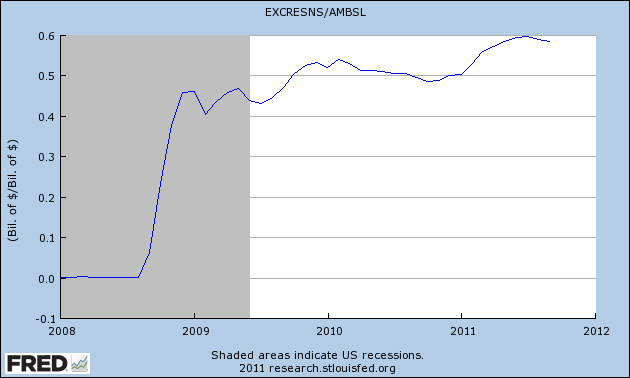 |
| Graph #4: Excess Reserves relative to Base Money |
The more they expand base money, the more it sits idle.
Wednesday, October 19, 2011
Just a Glimpse
From mine of the 10th, with comments about the blue line on the graph:
In the U.S since 2008, base money has tripled...
Actually, Ben, it looks like you thought you could double the money and be done with it (in 2008) but then you waited and it didn't work, so you tried another 50% in 2009 and waited to see if that worked, and when it didn't you tried another 50% boost in 2011. That's sure how it looks to me.
 |
| Graph #4, Source: Paul Krugman |
Actually, Ben, it looks like you thought you could double the money and be done with it (in 2008) but then you waited and it didn't work, so you tried another 50% in 2009 and waited to see if that worked, and when it didn't you tried another 50% boost in 2011. That's sure how it looks to me.
From John C. Williams, the dates of quantitative easing:
From late 2008 through March 2010, the Fed bought $1.7 trillion in such instruments. Then, in November 2010, we announced we would purchase an additional $600 billion in longer-term Treasury securities by the end of June 2011.
From FRED, three graphs. I've added the QE dates from John Williams.
|
| Graph 1: Base Money |
 |
| Graph 2: Prices |
 |
| Graph 3: Interest Rate |
Tuesday, October 18, 2011
Capital Gains, Coherence Loses
I love it: The first sentence of the following excerpt says that capital gains are taxed, just like other forms of income. The rest of the excerpt then shows that capital gains are taxed, but not just like other forms of income.
The second sentence says that short-term gains "are taxed at a higher rate" [than other forms of income]. And then it modifies that statement to say that those gains are taxed at the "ordinary" rate, while long-term gains are taxed at a lower rate.
By the end of the excerpt, we are being told that a tax of 0% is still a tax.
From Wikipedia:
In the United States, individuals and corporations pay income tax on the net total of all their capital gains just as they do on other sorts of income. Short-term capital gains are taxed at a higher rate: the ordinary income tax rate. The tax rate for individuals is lower on "long-term capital gains", which are gains on assets that had been held for over one year before being sold. The tax rate on long-term gains was reduced in 2003 to 15% (for individuals, whose highest tax bracket is 15% or more), or to 5% for individuals in the lowest two income tax brackets (whose highest tax bracket is less than 15%) (See progressive tax). The reduced 15% tax rate on eligible dividends and capital gains, previously scheduled to expire in 2008, has been extended through 2010 as a result of the Tax Increase Prevention and Reconciliation Act signed into law by President Bush on May 17, 2006, which also reduced the 5% rate to 0%. Toward the end of 2010, President Obama signed a law extending the reduced rate on eligible dividends until the end of 2012.
Wikipedia has something on the history of capital gains tax here. It includes the following, which contrasts nicely with today's view that "over one year" is the long term:
From 1934 to 1941, taxpayers could exclude percentages of gains that varied with the holding period: 20, 40, 60, and 70 percent of gains were excluded on assets held 1, 2, 5, and 10 years, respectively.
Monday, October 17, 2011
The Fed on Shadow Banking
Did you know the phrase "shadow banking" originated with Paul McCulley (formerly of PIMCO)?
 |
| Graph #1: Shadow Bank vs. Traditional Bank Liabilities Source: Federal Reserve Bank of St. Louis |
Sunday, October 16, 2011
Money Measures in Context
A recent remark by Ashwin points out that
Too much "innovation" has happened and the Fed's control of money supply has essentially vanished.
I agree with that, certainly. We are all Kosh. I just don't agree that the situation is "irretrievable."
Graph #1 shows the various money measures since 1959. Base money is the blue line at bottom.
 |
| Graph #1 |
 |
| Graph #2 |
All the money measures got squashed down substantially to make room for the debt. But what Graph #2 does not show is any sort of proportional relation between debt and the money measures. I rectify that in Graph #3:
 |
| Graph #3 |
Development Notes & Methodology for Graph #3:
I want to think of base money as the minimum, and total debt as the maximum. And I want to look at the quantity of money (M1, MZM, M3, whatever) within that range.
I had to fiddle with sample numbers on a spreadsheet to see how to do this. (Keep in mind, I have no idea whether the numbers will turn out to show what I expect them to show. I'm coming at it blind.)
I want to put total debt across the top of my graph, and base money across the bottom. So the range of values, the up-and-down dimension for my graph, will be the difference between total debt and base money. If there is one dollar of base and ten dollars of debt, the range-value is 9 and I will have to stretch or compress it to fit the graph. If (in a different year) there is $5 of base and $500 of debt, the range value is 495 and again I will have to stretch or compress it to fit the graph.
So the range value will be part of my calculation.
Also, I know that the baseline for the graph is the base money number. Base money is not zero, of course. But I want to show it at the zero location (across the bottom of the graph). So I know I will have to subtract the base-money number from whatever value I plot.
For base money, this will give me zero-values. That's right. And for total debt, it will give me a value equal to the range (total debt minus base money) which is 100% of the difference, which is also right.
(It is easier to do math with numbers than with words. You may find the spreadsheet less confusing than this description of my process.)
Anyway, that is all there is to the calculation. For each year figure a range-value (max less min, or total debt less base money). Then figure a factor-value (100 divided by the range-value). This determines how much each value will have to be stretched or compressed so that the maximum will come out at the 100% level on the graph.
Finally, for any money-value, subtract the base money number for that year from it, and multiply by the factor-value. That's it.
So, if B is the base-money number and T is the total-debt number and N is the money-value you want to plot, the calculation is: (N-B)*(100/(T-B))
The sample values I used to work out the calculation ended up looking nothing like I expected. There's no reason they should, for my sample values for base money used "add one to get the next value". And my sample values for total debt were "square the base-money number and add one". And like that.
The Excel spreadsheet.
Subscribe to:
Posts (Atom)
