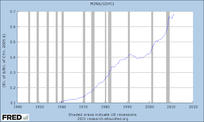
If you take any old Velocity graph -- I'll use the one from earlier today -- and invert it, what you get is the quantity of money, relative to output. Milton Friedman's graph.
But guess what:
 |
| Graph #1: The Quantity of Money Relative to 60% of GDP (100% of GDP would show the same pattern.) |
It is NOT similar to the long-term trend of prices.
But Friedman said the quantity of money relative to output IS similar to the price trend.
But it is not similar to the trend of prices. In order to make it similar, we have to do what Friedman did. We have to multiply by a price index. We have to cheat:
 |
| Graph #2: Like Graph #1, but with the price-level factored in |
Or you could be slick about it, and factor prices OUT of output as the first step, and THEN divide M2 money by that. That's how Milton Friedman did it:
 |
| Graph #3: Milton Friedman's form of the calculation |
To make it seem more legitimate, you can take the inflation-adjusted output you're using, and call it "real" output. Then, no one will even question your work.
In order to make "money relative to output" look like the price trend, you have to factor the price trend into the ratio. This is what Friedman did. It was a total scam. And everybody bought it.

2 comments:
Is there a link to the original Friedman paper? This may well be worth going after!
Definitely!
The book is Money Mischief by Milton Friedman. See Chapter 8, "The Cause and Cure of Inflation". I link to a footnote where Friedman identifies the data used for his graphs.
Go get'em!
Post a Comment