Saturday, July 18, 2015

Sticky notes


Scott Sumner:

The entire AS/AD model makes no sense without some form of wage or price stickiness. We generally assume wages and prices are sticky in terms of the medium of account.

Roger Farmer:

Leijonhufvud pointed out that the assumption that The General Theory is about sticky prices is central to this orthodox interpretation of Keynesian economics, but it is not a central argument of the text of The General Theory.

Friday, July 17, 2015

Hoodwinked by Indexing

Tweaked a little, this is a re-post from 14 September 2014.


Back in February 2014 I came across this graph at The Current Moment:

Graph #1
Also this one, which they called "Doug Henwood's Graph":

Graph #2
Both graphs show productivity. The one graph compares productivity to compensation; the other compares it to wages. Wages and compensation both lag productivity. But compensation lags less than wages, because compensation (as the source site explains) is wages plus benefits.

I find it useful when people provide background information like that. But that's not what caught my eye. It's the difference in separation points that caught my eye: On Graph #1 the "wages" line breaks away from the productivity line suddenly, just around 1974. On Graph #2 the "compensation" line breaks away from the productivity line gradually, but much earlier -- possibly as early as 1960.

This difference fascinates me. For if the failure to keep up with productivity is a problem, these graphs show it is a problem that became obvious around 1974, but began much earlier.

If it is a problem we want to solve, then we must be clear on the causes. Clearly, those causes were operative before the 1970s. If we only look in the 1970s for the causes, we will likely find false causes.


I did notice that the first graph is indexed "relative to 1970" while the second is "rebased to 1960". In other words, by design, the lines on Graph #1 meet at 1970 and the lines on Graph #2 meet at 1960. The indexing (or the choice of a "base year") influences the location of the break-away point on the graphs and changes the impression we get from the graphs. I think we are hoodwinked by the indexing.

On Graph #1 in particular, between 1955 and 1975, it's pretty clear that the orange line is going up faster than the red line. If you could take the whole red line and just move it down a little bit, you might make the two lines meet at just one point. That point might be 1956. If you looked at that version of the graph, you would see real wages falling behind productivity since 1956.

I don't know which is more disturbing -- the 1956 start, or the false impression created by indexing.

The second graph, Henwood's graph, seems to show compensation falling behind productivity since about 1960. But since it doesn't show earlier data, it leaves the door open. 1956 could still be the more accurate date.

I followed the Current Moment link back to Doug Henwood's and liked what I found there. I emailed Henwood:
Hi. I recently came upon an old page (2001) at Left Business Observer

http://www.leftbusinessobserver.com/Stats_earns.html

I'd like to use your "productivity and compensation" graph on my blog. The page says I should get permission first, so I'm asking.

All the similar graphs that I've seen focus on the separation beginning mid-1970s. Your graph shows the separation beginning much earlier. It was eye-opening for me.

"Heavens," Henwood replied. "I have much more recent versions of that - let me find one for you tomorrow." He did, too:

Graph #3
"Here's the latest," he wrote. "Haven't updated it since November, but it's through the third quarter of last year. 'Compensation' includes fringe benefits - since much of that is health insurance, much of the real value is eaten up by medical inflation. Direct pay is pay without fringe benefits. All are inflation-adjusted and indexed so the base year = 100."

The three lines on this graph combine the three different series shown on the first two graphs above. In addition, on Graph #3 the series are indexed to 1964. And -- don't you know it! -- the break-away point this time looks to be 1964 at the latest.


A little over a week ago -- it seems much longer -- I was reading a discussion at Reddit. The topic was "What might actually be holding back workers’ wages".

Somebody blamed Reaganomics. One guy, I'll call him Joe, rejected that idea: "Your idiotic blaming of Reaganomics would be dependent on Reaganomics traveling back in time a decade and starting the trend in the mid 70's," Joe said.

I love it. That's one of my themes: You can't just blame the guy you don't like, especially if the things you're blaming him for happened before his turn at bat. Reminds me of a Mike Kimel quote that Jazzbumpa has in his sidebar:

#15 Time moves in a single direction.

No doubt.

Anyway, Joe provided a link to a "productivity and real wages" graph -- the same graph from The Current Moment that I have as Graph #1 above. Small world.

I complimented Joe on the graph. But then I went off-topic, so much that Joe had to disagree with me. I pointed out that the graph is indexed "relative to 1970". I said: If the graph was indexed relative to 1956 we would see the slowing of wages begin in the mid-1950s, then see the gap widen more quickly since the mid-1970s.

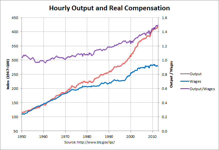
Joe replied: "That is not how the graph would change changing the index year at all. Here is one indexed to 1947. There is still a trend starting at 1970 where wages and output are decoupled."

He showed this graph:

Graph #4: http://www.econdataus.com/wagegap12.png
Note that the blue line is above the red in the mid-1950s,
but has fallen below the red by the early 1970s!

Yes, the red and blue lines are comparable to those in the graphs above. Yes, the base year is 1947 this time. And yes, the red and blue run much closer before 1974 than after. However, the trend of hourly output increases faster than wages since the mid-1950s on Joe's graph. The failure of wages to keep up with productivity begins in the mid-1950s.

This graph has a third line -- the purple line -- that shows a ratio of the red and blue. Nice! I was going to show the ratio.

The purple line shows how productivity ("hourly output") is changing relative to wages. If you look at the purple line you can see the trend changes from downward to upward around 1956 or 1957. That means productivity started gaining on wages around 1956 or 1957. I think Joe was hoodwinked by the indexing on Graph #1.

Wages started falling behind productivity around 1956 or 1957. So if you want to blame Reaganomics... or if you want to blame Jimmy Carter or Gerald Ford or Richard Nixon or Lyndon Johnson -- or John F. Kennedy for that matter -- to do it you will have to make time go in the wrong direction. You'll be breaking Rule #15.

The failure of wages and compensation to keep up with productivity is a problem that began in the 1950s.


Yesterday, at The State of Working America I found this graph from the Economic Policy Institute:


It is similar to the graphs above. Since the 1950s, the dark blue "productivity" line goes up faster than the light blue "compensation" line. But the indexing has the two lines tangled together early, so you don't notice compensation falling behind until the mid-1970s.

This graph is important because it comes with this data. (Excel XLSX, 37KB) So of course I took the file, uploaded it to Zoho, and customized it for on-line use.

The on-line spreadsheet let you "take the whole red line and just move it down a little bit". All you do is pick the year that you want to see the lines meet, and enter that four-digit year into the yellow cell on the spreadsheet. The graph changes so that the lines meet at the year you specify.

I'm deleting the on-line Zoho spreadsheet from this post because it makes the screen jump. Instead of showing you the blog page from the top, it jumps straight to the spreadsheet. They fix that bug every time I tell 'em about it, but the bug keeps coming back. I give up.

The spreadsheet is available in the original (Sept 2014) post. Here's what it looks like:


Thursday, July 16, 2015

The Origins of Specie


Dunno why these things fascinate me. Maybe it's because I've spent so many years working. At work, any little inane detail is interesting if it's a distraction from the work.

Hey, I do my best to strengthen what I call "discipline". That means I try to focus on the work despite all the inane distractions. But it doesn't always happen. I often find myself (and I suppose you often find me) focused on the inane.

(Well, that makes at least one of us laugh.)

Anyway, I used the phrase "chew the fat" the other day. Then (a few days later) I thought I ought to look it up, to make sure I used it right.

Wikipedia gives me this:

Chew the fat

Although some sources attribute the phrase "chew the fat" to sailors, who during a period of resting and conversing, or while working together, would chew on salt-hardened fat, there are no reliable historical recordings of this practice. It has even been suggested that the phrase is derived from a practice by North American Indians or Inuit of chewing animal hides during their spare time, and even of British farmers chewing on smoked pork, but again, there remains to be no evidence supporting these claims, and would require accepting a great deal of uncertainty in connecting the phrase from nautical origins to its modern metaphorical use.

There are also claims that the phrase is synonymous with the action of chewing fat, or simply an allusion to the movement of the mouth during chewing. Noting that fried fat is appealing in taste, it was regarded as a treat that someone could chew on for as long as possible to gain the most out of it.
According to the Oxford English Dictionary, "Chew the fat" first appeared in 1885 in a book by J Brunlees Patterson called Life in the Ranks of the British Army in India. He implied it was a kind of general grumbling and bending of the ears of junior officers to stave off boredom, a typical part of army life. Patterson also uses "chew the rag" in the same sentence he used "chew the fat", but it is not the oldest occurrence. Prior to the adoption of metallic cartridges, most ammunition was composed of powder and a ball wrapped in paper or cloth soaked in animal fat, which was bitten open during musket drill. Soldiers were known to chew on these ends to pass the time and reduce nerves, and in some cases to stave off cravings for chewing tobacco. Though long-since replaced by 1885, the idea of biting or chewing on fat-soaked rag ends may well have entered military parlance in this fashion prior to Patterson's recording.

Yup, I used it right.

It's odd, though: We're talking about a phrase that is common today (and apparently of fairly recent origin) but nobody really knows where it came from. That's the main thing I got from the excerpt.

What I think? Probably all of those origins noted by Wikipedia, all of them contributed to making the phrase "chew the fat" part of the language. All of them. But none are relevant to what the phrase means today.


Now here's the thing. Here's why I quoted Wikipedia and told you what I thought of the quote: People sometimes talk about "what money is". And in order to define what money is, they go back to the "origin" of money. David Graeber maybe. Many people. And they draw conclusions from these stories.

But the origin of money is from a time way, way before "chew the fat". And we don't even know the origin of "chew the fat". So how can we possibly know about the origin of money in such fine detail and with such fine confidence? I don't think we can.

And even if we did know all the details about the origin of money, none would be relevant to "what money is" today.

Wednesday, July 15, 2015

"The bigger the existing accumulation of debt, the larger must be any new credit use before it provides a boost to the economy."


Interest costs relative to GDP for the Federal government and the whole U.S. economy:

Graph #1: Federal (blue) and Everybody's (red) Interest Cost as a Percent of GDP

I extended the trend of the red line back so you can see what low looks like.

The vertical line of black dots show the year 1992. That's the year Ross Perot wrote:
Today we have a $4-trillion debt. By 2000 we could well have an $8-trillion debt. Today all the income taxes collected from the states west of the Mississippi go to pay the interest on that debt. By 2000 we will have to add to that all the income tax revenues from Ohio, Pennsylvania, Virginia, North Carolina, New York, and six other states just to pay the interest on the $8 trillion.

If you live in one of those states, take a look at the IRS payroll deduction that reduces your next week's take-home pay. Your money is going just to pay interest on this debt, which in 1993 will amount to $214 billion. During the first 152 years of our nation's existence, we spent less than $214 billion to operate the entire government of the United States! ...

And let me repeat: that $214 billion we'll pay next year is interest only. Interest doesn't buy a thing...
From United We Stand by Ross Perot

Perot was talking about the Federal debt, the blue line in this picture. The low line.

The interest on private debt doesn't buy anything, either. The red line.

Tuesday, July 14, 2015

Shame on me


Shame on me. The other day I wrote:

When the reliance on credit is relatively low (as in the U.S. after World War Two, or in the BRICS today) credit costs are also low. So it doesn't take much "extra" credit to offset those costs. But when the reliance on credit is relatively high (as in the U.S. since the 1970s) credit costs are also high. So then it takes a lot of credit use just to offset accumulated credit costs.

I said that, but there's not a graph to be seen in that post from the 12th. I want to fix that.

When I said credit use was low early and high lately in the U.S., I had in mind my debt-per-dollar graph:

Graph #1: Dollars of Total (Public and Private) Debt, for Each Dollar of Spending-Money

But you could as easily see the same thing in a long-term picture of debt relative to GDP:

Graph #2:Dollars of Total (Public and Private) Debt, for Each Dollar of GDP

That's not the shameful part. The shameful part is that I said stuff about the BRICS and I don't really know. I have an inkling, but I don't know.

This is the inkling: The BRICS are the BRICS because they are successful "developing" nations. Maybe the word "developing" no longer even applies to them, I don't know. But they've been doing well, or we wouldn't call them the BRICS and we certainly wouldn't be paying attention to them as we are.

And if they've been doing well, I expect they've been accumulating a lot of debt. Because that's the way we get growth. It's the thing economists know about, using credit to get growth. For some reason they always think about that part -- the "use credit for growth" part -- and they never think about the consequences of sticking to that policy. Economists never think about the "what happens when debt accumulates to an excessive level" part. That's how the economy gets into trouble.

But the BRICS, they're not in trouble yet. So that tells me they don't really have a lot of debt, not yet. I know their debt must have been increasing, because they've been doing well -- and I figure they use the same "use credit for growth" rule as everybody else, to do well. So their debt must be high, relative to what it was say 20 years ago. But it evidently hasn't reached its limit yet, for they are still doing well. So their debt cannot be as high as ours. Theirs is maybe like ours was in the 1990s, the Clinton years, the Goldilocks years. This is my inkling.

Oh, by the way, Graph #2 is from an old post titled Debt-To-GDP Chart "Wrong," US Debt Levels Fine at Business Insider.

"Debt levels are fine". That's what I'm talking about. Debt levels are *not* fine. Is it any wonder we cannot solve the economic problem? We refuse even to look at the problem! Not "we". "They". They refuse to look at the problem. Me? I'm there. Try looking into that place where you dare not look, you'll find me there staring back at you.


By "the reliance on credit" I mean how much credit we have in use. This is something that can be measured. The amount of credit we have in use is what we call "debt". No no, not the Federal debt: That's only how much credit the Federal government has in use. It ignores the rest of our debt.

It is at about this point that many people say, "Oh, well it's the Federal debt that is the problem. Our debt isn't a problem." And that's so cute. No single raindrop believes it is to blame for the flood. I know. It wouldn't matter, if they were doing what I'm doing here -- if they were stopping to check and see whether they are right or not. But they don't have to stop and check. They already have the answer they want. And that's all that matters, apparently.

Wow, I'm getting off-topic.

So, the BRICS. How much debt do they have?

From Swarajya:

Graph #3: Government Debt of the BRICS

But that's just government debt. Doesn't count private debt, which is a cost to the private sector and thus a hindrance to growth.

What's that? Did you say Private debt also creates income to the private sector -- is that what you said? Well, yeah, it's true. Trouble is, it's financial income. And financial income tends to stay in the financial sector. It's not spent back into the productive sector, so it undermines growth. That's why excessive debt is a problem.

Yeah, I know: Debt is not just a liability. It is also an asset. It is still a problem, even so. I didn't forget. I didn't forget debt is an asset. But just for the sake of comparison, the U.S. Federal debt is up around 100% of GDP. The numbers on Graph #3 range from 13% to 67% for the BRICS, on average probably less than 50% -- half the U.S. number. The BRICS number has room to go up.

//

At FT, David Mann points out that China's debt-to-GDP number grew in five years from 155% of GDP to "a relatively high 251 per cent of GDP", then stabilized in mid-2014. So:
1. This is not government debt; Graph #3 shows China's government debt is 22.4% of GDP. So I'm saying David Mann's numbers are for "total" debt, comparable to the U.S. number (350%) shown on Graph #2.
2. China's total debt increased dramatically for a five-year period. Since economists and policymakers rely on the "use credit for growth" model, the dramatic increase in debt means there must also have been a period of dramatic growth. You know there was.
3. If the debt limit is somewhere around 350%, and China is down around 250%, China's total debt could grow for another five years at the same rapid rate as the last five years. That's just a comparison of numbers, not a prediction. Still, China's total debt ratio is low, compared to ours. And they are a young and strong economy, and we are not. But they don't need to keep growing at that rate; their economy is already bigger than ours.

Yeah.

So maybe China is today where the U.S. was at the end of the 1990s: optimistic, and with lots of room yet for the expansion of debt. Compared to where China was in  Nixon's day, China today has a lot of debt. But compared to where the U.S. was at peak debt, China isn't even close.

//

One more item: Russia. At 21st Century Wire, Moody’s Downgrades Russia’s Debt to ‘JUNK’ Status Just as BRICS Bank is Ratified:
Yesterday we reported on the huge news of Russia’s government ratifying the BRICS Development Bank and suggested that the West would seek to respond in some way. That response emerged just hours later.

Moody’s, the same ratings agency that failed to see the 07/08 crisis coming by rating toxic assets as AAA, has put Russia’s debt into the ‘Junk‘ zone. The agency cites an ‘expected’ continuing depression in Russia, suggesting a ‘decline in confidence’ in the country means growth will not be possible.

Moody’s attempt to paint Russian debt as ‘Junk’ is yet another obvious propaganda stunt aimed at continuing the current demonization campaign against the country. Anybody who would trust the ratings of an agency that framed toxic assets as ‘AAA’ rated should have both their character, and intentions, questioned.

This is not the first incident where Moody’s has weaponized, geopolitically speaking, its dubious rating system to advance US foreign policy interests. 21WIRE reported back in June 2013, when Hong Kong authorities would not honor U.S. requests to arrest and hand over the fugitive Edward Snowden, only to discover that Moody’s had downgraded 9 major Hong Kong banks the following day.

Wow.

Tell ya what: With Russian government debt at a low 13.41% of GDP, it is easy to buy the 21WIRE story.

Monday, July 13, 2015

It's a mindset


Background:
1. NDB is the New Development Bank, set up by five BRICS nations: Brazil, Russia, India, China, and South Africa.
2. KAMATH is President of the New Development Bank.

Okay, once again, third in a row from the BRICS Bank post in the Hindustan Times, the one I won't link to:
Asked whether the NDB would consider lending to non-member countries, Kamath said: "We will primarily lend to member countries. In due course, we will look at opening membership, in the next few months."

Specifically asked whether NDB could consider helping Greece which is in financial crisis, Kamath said: "I have no mandate to help any non-member... Beyond BRICS, I have no mandate."
I think that's exactly right. It would be very nice if the New Development Bank were to step in and help Greece out, no strings. But it's kind of a wet dream.

Kamath was asked to comment on a view that the BRICS bank has been set up to undermine the Dollar as it will lend in local currencies.

"I will put it like this. In developing countries, particularly BRICS, there are pools of capital which can be tapped and lent. Local currency financing is what we will look at in addition to hard currency finance. We will look at all pools of capital in addition to hard currency," he said.

He went on to add that local currency credit will protect the BRICS countries from currency fluctuations and volatility and "it is critical that we do it".

Again, exactly right. The New Development Bank is going to do things that develop the economies of the member states nations states. That's what the bank was set up to do, and that is its mandate.

It's not complicated. It would be very nice if the bank did some other things that need to be done. And the bank would probably be willing to do such things, if those things were mandated. But since those things are only "very nice" they're not going to get done.

Now as for undermining the Dollar: Notice that Kamath responded to that by talking about things that are part of his mandate.

You may think -- and I may think -- that the mandated things are, yes, going to undermine the U.S. dollar. And you may think, as I do, that this is a very serious problem for the United States. However, Kamath is correct.

Kamath is focused on the mandate he was given. He is going to do things to help member countries, even if those things undermine the U.S. dollar. He is not doing those things because they undermine the U.S. dollar.

He is doing things to help develop the BRICS. If those things happen to undermine the U.S. dollar, that's a shame -- but so it goes.

The lesson here is extremely simple and should be obvious: If the United States is concerned about the U.S. dollar, it is up to the United States to figure out what's wrong with U.S. economic policy, and to replace existing policy with something better. It is up to the U.S. to make the U.S. economy so strong and so appealing that other nations will choose *not* to do things that reflect badly on the United States, *even though* those things might be in their own self-interest.

It's a mindset.

Sunday, July 12, 2015

"Credit is what we are looking at"


From the same BRICS bank to lend in local currency by April article that I didn't link yesterday:
[New Development Bank (NDB) President KV Kamath] said the NDB, with a capital of $100 billion, will look at various instruments of credit to the member countries -- Brazil, Russia, India, China and South Africa - which require huge resources for development.

"Basically, credit is what we are looking at. Various instruments of credit that we are looking at," said Kamath ...

Credit is also what I look at on this blog -- but you knew that!

I don't like to make predictions because I'm always wrong. But I can't see any outcome other than success for the BRICS bank. Yeah they want to expand credit, and yeah excessive reliance on credit is a problem. But here's the thing: We are the ones with excessive credit, not BRICS. That's why we can't get good growth. The BRICS and them, they don't have excessive debt. Not yet. That's what President Kamath and NDB see as the problem they can fix. They want to fix that problem, because what's excessive debt to a debtor is an abundance of assets to a creditor, and a source of income for banks.

//

We get growth by expanding the use of credit. That's not the only way to get growth, but it's the only method we use. (I think we want a good alternative, like greater reliance on government-issue coupled with reduced incentives to rely on bank-issue. But that's not the topic today.)

We get growth by expanding the use of credit. But credit has costs -- costs that expand along with the reliance on credit. When the reliance on credit is relatively low (as in the U.S. after World War Two, or in the BRICS today) credit costs are also low. So it doesn't take much "extra" credit to offset those costs. But when the reliance on credit is relatively high (as in the U.S. since the 1970s) credit costs are also high. So then it takes a lot of credit use, just to offset accumulated credit costs. This means that the next new use of credit will have to be large before it begins to have a positive effect on growth.

The bigger the existing accumulation of debt, the larger must be any new credit use before it provides a boost to the economy. This is the reason we get downtrends in the marginal productivity of debt.

In the United States, the existing accumulation of public and private debt was so large, at the time of the crisis, that the massive, emergency-level deficits of 2009-2012 produced hardly any boost to growth. Sure, those deficits prevented a big decline. But they didn't give us growth.

And either way you look at it -- decline prevention, or the failure to grow -- what you see confirms the analysis that an excessive accumulation of debt hinders growth.

Saturday, July 11, 2015

Interesting times


From the Hindustan Times...

I'll provide the URL for purposes of documentation. But the site opened a pop-up window on my machine and I don't like that, so I'm not formatting it as a link and I'm not saying you should go there.

http://www.hindustantimes.com/business-news/brics-bank-to-lend-in-local-currency-by-april-new-development-bank-chief-kv-kamath/article1-1367770.aspx

From the article:

BRICS bank to lend in local currency by April: KV Kamath


The New Development Bank (NDB), set up by five BRICS nations including India, will lend in local currency by April 2016 and member countries will be the focus of credit facility, its chief KV Kamath said on Friday.

Kamath said a decision to open membership for other countries will be taken in the next few months by the bank's board of governors.

What was the old board game called? Risk. That's it, yeah.

Source: Wikipedia

Looks like BRICS bankers are doing the same as the EU has been doing, the same as we all like to do, and the same as Ben Franklin and Alexander Hamilton and them did back in the day: playing a game of global domination. Only these bankers don't call it global domination. They call it opening membership.

Reminds me of the EU in the 1990s. Everything you read and everything you heard about it in the media back then was the promise of a better economy. Again, here, with the BRICS bank: All they need do is open membership, and it will be like flies to honey.

And when the promise of a better economy fails to pan out for some, well, that's just their own fault. Just like poor people in America. And we all hop on these bandwagons and toast the toast and cheer the cheer. We're social animals, not smart ones.

It's a curse, you know -- "May you live in interesting times."

Friday, July 10, 2015

"data that will assist in understanding how a vehicle's systems performed"


From the Owner's Manual for my new car. Page 20:

Event Data Recorders


This vehicle is equipped with an event data recorder (EDR). The main purpose of an EDR is to record, in certain crash or near crash-like situations ... data that will assist in understanding how a vehicle's systems performed. The EDR is designed to record data related to vehicle dynamics and safety systems for a short period of time, typically 30 seconds or less. The EDR in this vehicle is designed to record such data as:

  •  How various systems in your vehicle were operating;
  •  Whether or not the driver and passenger safety belts were buckled/fastened;
  •  How far (if at all) the driver was depressing the accelerator and/or brake pedal; and
  •  How fast the vehicle was traveling.


These data can help provide a better understanding of the circumstances in which crashes and injuries occur. NOTE: EDR data are recorded by your vehicle only if a non-trivial crash situation occurs; no data are recorded by the EDR under normal driving conditions and no personal data (e.g., name, gender, age, and crash location) are recorded. However, other parties, such as law enforcement, could combine the EDR data with the type of personally identifying data routinely acquired during a crash investigation.

To read data recorded by an EDR, special equipment is required, and access to the vehicle or the EDR is needed. In addition to the vehicle manufacturer, other parties, such as law enforcement, that have the special equipment, can read the information if they have access to the vehicle or the EDR.

The data belongs to the vehicle owner and may not be accessed by anyone else except as legally required or with the permission of the vehicle owner.
-- (c) 2012 Honda Motor Co. Ltd. All Rights Reserved.