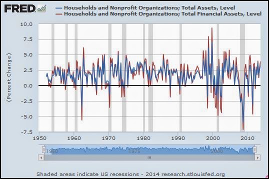
This graph shows percent change from the previous quarter of household assets, with blue for total assets, and red for financial assets:
 |
| Graph #1: Percent Change in Total Assets (blue) and Total Financial Assets (red) Quarterly Data |
Assuming "total" assets is the sum of financial and non-financial assets, the graph tells me that the difference in volatility would be even more if we compared financial assets to non-financial assets.
To do that, look at financial assets and (total assets less financial assets):
 |
| Change in Total Financial Assets (red; same as Graph #1) and Total Non-Financial Assets (blue) |

No comments:
Post a Comment