One thing leads to another.
I found a really good post on productivity slowdown by Jared Bernstein.
"It’s hard to know what drives productivity trends up and down," Bernstein says,
but I’ve got a couple of theories. Investment in productive capital is a known driver of productivity growth, and its slower growth rate in recent years shows up as one reason for productivity’s deceleration.
Every time I read something like that, I want to go to the graphs. Soon enough. First, though, let me finish reading Bernstein's paragraph:
But that just begs the question: why the slowdown in investment? (My other theory is that there’s a full employment productivity multiplier—full employment drives firms facing higher labor costs to find efficiencies they otherwise didn’t need to maintain profits. I won’t get into that here but it suggests what I believe to be an important linkage between productivity growth and persistently weak labor demand.)
"Full employment drives firms facing higher labor costs to find efficiencies", he says. Interesting thought. Reminds me of something Matias Vernengo said:
In Jeon and Vernengo (2008) we suggest that labor productivity is endogenous, explained essentially by the expansion of demand ...
Labor productivity increases with growth, Vernengo says. Bernstein and Vernengo are on the same page here. Vernengo:
... it is the weak recovery ... that explains the poor performance of productivity.
J.W. Mason has more:
Now, whether demand actually does matter in the longer run is hotly debated point in heterodox economics...
Which brings me to this recent article in the Real World Economic Review. I don't recommend the piece -- it is not written in a way to inspire confidence. But it does make an interesting claim, that over the long run there is an inverse relationship between unemployment and labor productivity growth in the US, with average labor productivity growth equal to 8 minus the unemployment rate. This is consistent with the idea that demand conditions influence productivity growth, most obviously because pressures to economize on labor will be greater when labor is scarce.
Seems to me an important idea that is too slowly gathering steam.

Soon enough? Jared Bernstein says
Investment in productive capital is a known driver of productivity growth, and its slower growth rate in recent years shows up as one reason for productivity’s deceleration.
So I went to FRED looking for productive capital and its slower growth rate.
 |
| Graph #1: Capital Stock in 2005 Dollars, 1950-2011 |
Suppose we put the Graph #1 data on a log scale. That way the slope of the line more accurately represents the growth of the capital stock:
 |
| Graph #2: Capital Stock (in 2005 Dollars) on a Log Scale, 1950-2011 |
On Graph #1 the line seems to be generally curving upward until the flattening after 2008. But Graph #2 shows a trend of slower increase for a much longer period. The line runs along a straight path until the mid-1970s. Then it flattens somewhat and runs uphill at a slower pace until 2008, where it flattens more.
So let's get serious and look at the year-on-year growth of capital stock:
 |
| Graph #3: Capital Stock (in 2005 Dollars) Year-on-Year Growth |
I downloaded the numbers, trimmed off the opening drop, and put a Hodrick-Prescott curve on the graph in red.
 |
| Graph #4: Capital Stock Growth Rate, with H-P Trend |
Hold on now. Hodrick-Prescott is quirky. In an old one at Stephen Williamson's, Angelo remarks:
The HP filter's estimate of the trend is not very reliable at the endpoints of the sample.
Williamson replies:
Yes, exactly. I know some people make an endpoint adjustment to counter this ...
I've run into that problem myself, as have others. But it's not just an endpoint problem. It's also a problem at trend changes. More subtle and harder to find, but no less of a problem.
The H-P calculation smooths out a line and shows the trend of that line. I find it very useful, sometimes. Sometimes not so much. On Graph #4 I trimmed off the opening drop because if I didn't, the red line started high, dropped quickly, and turned slowly. It took till around 1958 (maybe after, I forget) for the red line to get back where it is in the version shown here. That one anomalous data point in 1951 took the uptrend out of the whole 1952-1965 piece of the red line.
More generally, each data point on the red line is figured from several of the nearby data points on the blue line. The red line is like a moving average. (Maybe it *is* a moving average, I'm not sure.) When you're near the start or end of the data series, data points are missing. The data before the start and the data after the end are missing. That throws off the H-P line. That's the endpoint problem.
If there is a distinct trend change somewhere in the middle, between start and end, you have a similar problem. The data from one trend is missing, because there's a different trend after the change. The values from the two trends get "moving averaged" together. The H-P calculation gives you one nicely smoothed line. But if you should be looking at two distinct trends, the H-P doesn't show it.
Everybody that talks about productivity talks about the good years of the 1990s. Those years stand out from the rest because they were so good. They stand out because the trend was different in those years. But you can't see that on Graph #4, because the two trends are merged together by the H-P calculation.
Here's that last graph again, revised to show two separate H-P trend lines. I ended the one trend and started the other in 1992. If there was a long slow moldering of capital growth, followed by a brief revival in the 1990s, it would look something like this:
 |
| Graph #5: Better: Capital Stock Growth Rate, with Two H-P Trends |
 |
| Graph #6: Capital Stock Year-on-Year Growth, with Two Linear Trend Lines |
Just for the heck of it now, I'm adding my debt-per-dollar ratio to that last graph:
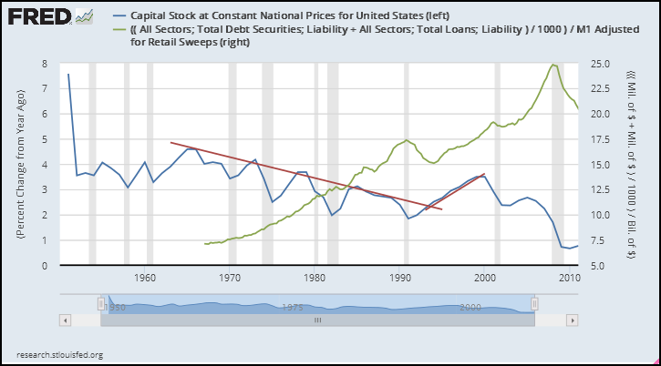 |
| Graph #7: Capital Stock Year-on-Year Growth, and the Debt-per-Dollar Ratio |
It was the brief decline in debt-per-dollar that gave impetus to capital stock growth.
"Investment in productive capital is a known driver of productivity growth," Jared Bernstein says. So, "why the slowdown in investment?"
In a handful of graphs I have taken you from a picture of slow capital growth in recent years, to a long-term decline interrupted by recovery in the 1990s. We have looked at this decline in some detail. And I have offered an explanation for the decline and the brief recovery.
Jared Bernstein's "other theory" has to do with labor cost. My theory has to do with the cost of the medium of exchange, financial cost deeply and widely embedded in the economy. For both of us, cost is key.

8 comments:
There's always a problem at trend changes - at least if you want to nail down the moment it happened.
Despite that, I see 4 definable regions in your set of graphs. Even graph 4 gets at it, since there is a change in direction in the H-P line around '91.
1 - clearly an uptrend until '64-67-ish.
2. Down until early in the 90's. Even without drawing parallel channel boundaries, I can clearly see that trend channel. You can say for sure that a trend is over when the data set makes a convincing break through the channel wall.
3. It's mid 90's before that happens, but the new uptrend is unmistakable, even if its origin point is tough to define. Sadly, it ends before there is detail to build a channel with.
4. it's hell in a hand basket after 2000.
Coming at it another way, Graph 6 shows a bottom at every recession. The V bottoms become generally broader and less sharp as you move left to right. What makes the 90's stand out is the first higher high in 30 years, though the slope coming out of the bottom is shallower. Still, that killed the old downward trend. Then the next two recessions have even shallower recoveries - essentially nil for the most recent one. We're clearly in the 4th trend down, and it looks like a death spiral.
Too bad it ends in 2011. Maybe there's some more recent better news.
Cheers! [maybe]
JzB
Art
"It was the brief decline in debt-per-dollar that gave impetus to capital stock growth."
So have you form a hypothesis on what cause the decline in your debt-per-dollar metric.
Have you done any thinking about real interest rates? and the impact it has on the capital stock growth?
O T
Not much of a trend here, and if there is one, it's counter-intuitive.
https://research.stlouisfed.org/fred2/graph/?g=3bfk
Cheers!
JzB
Jazz, on graph 3bfk, data series 2 has Moody's AAA interest rate divided by the Consumer Price Index. The units are (percent) / (i=Index 1982-1984=100)
Is that right?
I expected to find the CPI expressed as "percent change from year ago", and to see the CPI rate subtracted from the Moody's rate.
But then (to answer Oilfield's question) I have done no thinking about real interest rates.
Art -
It's right. That's the way I thought about it, but it might be screwed up.
On further review, it does seem screwed up.
JzB
Easy enough change to make.
Now it's just a blob with some outliers.
https://research.stlouisfed.org/fred2/graph/?g=3bJA
Cheers!
JzB
Curiouser and curiouser!
J W Mason:
"The economic historian Gavin Wright — author of the classic account of the economic logic of the plantation — just sent me a piece he wrote a few years ago on the productivity boom of the 1990s. As he said in his email, his account of the ‘90s is very consistent with the suggestions I make in my Roosevelt paper about how strong demand might stimulate productivity growth."
Post a Comment