Showing posts sorted by date for query STANDARD DEVIATION. Sort by relevance Show all posts

Tuesday, July 18, 2017

A Greater Moderation


While making my recent graphs of RGDP per Capita trends, I noticed that the trend line after 2007-2009 completely hides the data from the 2009-2016 period. First I was worried about creating confusion because the data points were not visible. Then I started thinking about "volatility".

I avoided the confusion (I hope!) by bringing the data line to the foreground and making it dotted. But I was left thinking about the volatility. So now I'm making the dotted line continuous again and putting it back behind the red lines where it is partly hidden by them.

I also made the black line thicker this time so you can see it behind the red:

Graph #1
You can see white space between the black and red in the early years. Not so much white between them since the 1970s. None since the mid-1980s. And then after the 2007-2009 gap in the red lines, the black would completely disappear behind the red if the black line wasn't thick. After 2007-2009, the volatility is gone!

//

Using quarterly data for RGDP per Capita, selecting subsets for effect, and looking at the standard deviation of the subsetted data, yes: Volatility has decreased more, since the crisis:

Graph #2
Not sure why people think moderation of economic growth is a good thing.

Thursday, July 6, 2017

Real GDP per Capita growth: Three Trends


The previous post shows Real GDP with lines that represent growth trends for three different time periods. The topic of the post was the relation between economic growth and population growth.

But come to think of it, RGDP varies when population varies, and a change in population growth would change the trend of RGDP. So I want to take another look at the changes in Real GDP growth trends, this time excluding the changes in population. To do it, I'll look at Real GDP per Capita.

I'll make some other changes, too. Rather than using "billions of 2009 dollars" and showing the numbers on a "log scale", I'll get "log values" from FRED and plot them normally. That eliminates the Log Scale Axis Labels problem I had last time. And because the values are logged, the trends will be straight lines rather than exponential curves. So I can use Excel's "linear" trendline option and keep things nice and simple.

I'll use annual values instead of quarterly, to reduce the work involved. The purpose of the graph is to get a general idea about how the trends have changed, and the annual values are good enough for that. Annual frequency with "end of period" aggregation because, for GDP, it just seems right.

Here's my data source:

Graph #1: Natural Log of Real GDP per Capita, 1947-2016
In order to define trend regions, I divided the dataset into three sections. The break points between sections are so arbitrary they made me hesitate -- hesitate enough to miss a day's posting. But then, missing a day's posting got me working again, "arbitrary" be damned.

I'm ending the first section at 1973 and starting the second at 1974. I'm ending the second section at 2007 and starting the third at 2009. In each case the section ends at a relative high value and the next section begins at a relative low. To be consistent, I started the first section at the relative low in 1949.

Because of these decisions, not all the data points are used to determine the trends. The data points not used are shown in black on the following graph; the points that are used create three separate red lines which represent the source data for the three trend calculations:

Graph #2: Subsetting the Data for Determination of Trends
Once the data was split up into subsets, adding trend lines was easy.

For the next graph, the data not used is not shown. The data that is used is shown in black. And the trend lines are red. The year values are not shown, as adding those values messes up the trendline equations:

Graph #3: Determining the Trends
This one's a little hard to read because the trend lines are too long. I'll fix that, below.

The equation for the first period (1949-1973) shows a slope of 0.024, indicating 2.4% annual growth. For the second period (1974-2007) the equation indicates 2.1% annual growth. And for the third period (2009-2016) the equation indicates a 1.34% annual growth rate.

For both the second and third periods the R-Squared value is 0.9889, pretty close to 1.0. For the first period, R-Squared is somewhat lower, at 0.9571. As I understand it, this means the first-period trend line is somewhat less accurate than the other two. The trend line doesn't match the data as well.

I want to suggest a reason for the mismatch: The first period was not part of the so-called "Great Moderation". The Great Moderation was a time of moderate variability in the data. (The "standard deviation" was less.) With less variability in the source data of the later periods, the trend line should be a better match. And we find that it is. So I think the lower R-Squared of the first period is a result of the fact that the data values varied more in that period, and not that there is something wrong with the trend.


I took the three trendline equations from Graph #3 and changed them to display more decimal places, for greater accuracy when I use those equations to create my own lines. Making my own lines to show the trends gives me greater control over where the lines start and end. Also, I can show the years on the x-axis without messing up the trends.

Graph #4: Three Trends of RGDP per Capita
This graph looks lot like the "three trends" graph for Real GDP in the previous post. But this graph shows that even when the changes in population are set aside, long-term decline of economic growth is evident.

// The Excel file

Thursday, April 28, 2016

Hamilton's find and the Phillips Curve


James Hamilton recently looked at Macrofinancial History and the New Business Cycle Facts (PDF, 55 pages). According to Hamilton,

Source: James Hamilton, from
Jorda, Schularick & Taylor
The authors find that as economies have become more leveraged, the standard deviation of output growth has become smaller, consistent with a phenomenon that has been described as the Great Moderation in the United States since 1985.

Well that's sort of a big deal. It implies that as debt grew, debt influenced GDP growth and resulted in the Great Moderation. Furthermore,

They also find that the skewness of GDP has become more negative– big movements up have become more subdued relative to downturns.

In other words, the Great Moderation wasn't really so "great". The volatility ("standard deviation") of GDP was less simply because we stopped getting the "big movements up".

Graph #1: The Great Moderation -- Output Growth No Longer Breaks the 5¼% Barrier
I think everybody knew as much. Still, it is nice to see it documented.


Remember Okun's law? When output growth doesn't go up, employment doesn't go up:

Graph #2: The Great Moderation -- Employment Growth No Longer Breaks the 3% Barrier
So Hamilton's find tells us that debt growth pushed unemployment up. Think of the effect of this on the original Phillips curve: Debt growth caused a change in the horizontal axis values. It pushed unemployment higher and farther from the origin. It shifted the curve and it raised the "natural" rate of unemployment.

To be sure, I'm the one describing a cause-and-effect relation. Hamilton quotes from the PDF that

as economies have become more leveraged, the standard deviation of output growth has become smaller

They describe correlation, not causation. And again when Hamilton quotes from the conclusion:

our core result– that higher leverage goes hand in hand with less volatility

Higher leverage only goes "hand in hand" with reduced volatility and lower growth, they say. They don't claim that excessive debt "caused" the changes.

So I'll say it: Excessive accumulated debt caused the changes: The lower growth. The reduced volatility. The increase in "house prices" since 1950. The "more severe tail events". And the shift in the Phillips curve.

Wednesday, March 26, 2014

The relation between productivity and growth


From Why Have the Dynamics of Labor Productivity Changed? (PDF, 26 pages) by Willem Van Zandweghe, an economist at the Kansas City Fed:

In recent years, the U.S. economy has undergone a change in the behavior of productivity over the business cycle. Until the mid-1980s, productivity growth rose and fell with output growth. But since then the relationship between these two variables has weakened, and they have even moved in different directions.

Thought I'd take a look at that. Here are "percent change from year ago" patterns for inflation-adjusted GDP and Total Factor Productivity at constant prices:

Graph #1: Growth Rates of RGDP (blue) and TFP (not blue)
Wait a minute... RGDP is quarterly, TFP is annual. That makes the blue line more jiggy. It throws off the comparison. I can't make TFP quarterly, but I can show RGDP as annual values:

Graph #2: Annual-to-Annual, Growth Rates, RGDP (blue) and TFP
Wow. That's better. The similarity really stands out now. But I don't know about what Willem Van Zandweghe said. It's pretty easy to see productivity growth rising and falling with output growth. It's not so easy to see a change in that pattern since the mid-1980s.

Hey! I know what to do:

Subtract from Series A the average value of Series A, and then divide by the standard deviation for Series A, and then multiply by the standard deviation for Series B, and then add the average value of Series B.

I used OpenOffice Calc on data from 1951 thru 2011 to figure the average and standard deviation values:


Then I retrieved Graph #2 and plugged in the numbers. Not bad. I got a couple "mismatched parentheses" errors along the way, but FRED and I survived the ordeal. Here's the Christensen-fitted comparison graph:

Graph #3: The blue line (RGDP) Christensen-Fitted to the not-quite-red TFP line
The two lines are a close match. At a glance, they move up and down together. And I don't see any movement in different directions since the mid-1980s. So I don't know what Willem Van Zandweghe was talking about.

Okay -- next, I subtracted the Total Factor Productivity number from the fitted RGDP. Just by inspection, I don't see any obvious errors in it; I think the new FRED is coming around. As for the graph itself:

Graph #4: Christensen-Fitted RGDP less TFP
Looks like RGDP growth is declining relative to total factor productivity. Maybe that's the "different directions" thing Van Zandweghe wrote about.

What the last graph shows is that even when productivity is good, GDP growth is not as good as it used to be: Even when productivity is good, GDP growth is not as good as it used to be.


Related Posts
August 11, 2013"the theoretical case behind NGDPT is quite weak"
August 12, 2013dividing these series, each by its own standard deviation, will similarize the up-and-downs of the different series
August 13, 2013He sees the size and the location of the up-and-down pattern as separate from the pattern itself.
August 14, 2013The first step of Christensen's calculation...
August 31, 2013some nifty stuff with averages and standard deviations, to "fit" one line to another on a graph
September 1, 2013Christensen's Market Indicator has already been used as proof and disproof, and I'm still just checking the arithmetic.
September 2, 2013Lars's numbers are ridiculously large and obviously in error.
March 18, 2014FRED must use a calculation very much like this to scale and shift the right-axis numbers, when two axes are used on a graph.

Tuesday, March 18, 2014

I can picture what I want to do. Now I have to find the words...


Here's the second graph from 4AM yesterday, Troy's graph tweaked:

Graph #1: Percent Change from Year Ago, Employment (blue) and Consumer Debt (red)
I said it shows "two lines that run pretty close together except in the 1960s and the 1990s". So I started thinking about subtracting the one line from the other, to look at where the differences arise. You never know if something like that will turn out to be interesting.

That's what makes it so interesting.

Yeah, two lines close together. Except they're on two different axles. Two different axes. The lines are pretty close together, but the numbers themselves are not. Where the blue line is zero, the red line is seven. Where the blue line is 10, the red line would be 23. The numbers are not usefully close. But the patterns are teasingly similar -- and yet intriguingly different during the 1960s and 1990s, the two decades of above-average economic performance. Intriguing.

Then I remembered a technique I learned from Lars Christensen. It goes something like this:

Subtract from Series A the average value of Series A, and then divide by the standard deviation for Series A, and then multiply by the standard deviation for Series B, and then add the average value of Series B. At that point no further adjustment should be needed for comparing A and B.

That set of calculations I call "Christensen-fitting" the data. I don't know if it's a standard technique (and if so, what the name of that technique is) or if Lars Christensen invented it. But I like it.

So I downloaded the data from FRED and set to work.

I went right back to FRED then, changed the monthly PAYEMS series to quarterly so it matched the debt series, and downloaded the data again.

The CMDEBT data was intermittent before 1952Q4, so I deleted the data for both series before that date. Then all I had to do was find a spreadsheet with the calcs Christensen used, and duplicate the calcs. He used the STDEVPA() and AVERAGE() functions, so I did the same. Here are the numbers I came up with:


Next, I went back to FRED and plugged in the numbers for the Christensen-fit. Here is the result:

Graph #2: The Christensen-Fitted Version of Graph #1
This graph looks very much like Graph #1 above. The difference is that now both datasets use the left axis. The PAYEMS numbers have been scaled and shifted to match the CMDEBT numbers.

(Hm. FRED must use a calculation very much like this to scale and shift the right-axis numbers, when two axes are used on a graph.)

Okay. Now that I have the employment numbers fitted to the debt numbers, I can subtract the one set from the other and see the difference:

Graph #3: "Fitted" Employment Growth Date Less Debt Growth Rate
Now it's getting interesting. Uptrend to about 1966. Downtrend to about 1980. Uptrend next, but not as rapid as before. Or maybe it's a low plateau in the 1980s and a higher plateau in the 1990s. And then a big drop -- but the big drop occurs about a decade before the crisis. Now that's interesting.

I subtracted the debt growth rate from the employment growth rate. So where the line is below zero, debt growth is the bigger number. Again, where the line is below zero, the debt growth rate was faster than the employment growth rate... Well, I have to be careful here. The debt growth rate is always faster than the employment growth rate. If I go back to the first graph and put everything on the left axis, it looks like this:

Graph #4: Not Fitted, and On the Same Axis, Debt Growth (red) Is Way Faster
The debt growth rate is always a lot faster than the employment growth rate, except there at the end, after the crisis.

Well, yeah. That's why I fitted the one series to the other. So we could compare them. But I have to be careful how I talk about it. So let me try again:

On Graph #3, I subtracted the debt growth rate from the "fitted" employment growth rate. So where the line is below zero, debt growth is the bigger number. That is, where the line is below zero, the debt growth rate was faster than the "fitted" employment growth rate.

Where Graph #3 is below zero, the debt growth rate is relatively faster than the employment growth rate. Where Graph #3 is above zero, the employment growth rate is relatively faster than the debt growth rate.

Where Graph #3 shows a trend of increase (before 1967), the trend favors employment. Where it shows a trend of decrease (1967-1980) the trend favors debt growth.


I downloaded the "fitted" data from FRED, put it into Excel, and added a Hodrick-Prescott trend line to it:

Graph #5: Same as Graph #3 (blue) with a Hodrick-Prescott Trend (red)
(I'm repeating this graph in tomorrow's post. If you have any comments on my "lambda" value, save them up for that post!)

The trend favors employment till about 1967, then debt till 1980, employment till the mid-1990s, then debt again since maybe 2003 ...

The trend favors employment till about 1967. That's interesting, I think. I have it in my notes that Scott Sumner identifies the years 1952-1964 as a big debt surge. But despite surging debt, employment grew more. Can that be right?

Graph #6
No, of course not. Debt always increases faster than the number of jobs.

But look at it this way: From 1952 to the mid-1960s, employment was winning in a race of go-karts. At the same time debt was losing in a race among dragsters. Then from the mid-1960s to 1980 employment was losing among go-karts and debt was winning among dragsters. That's what Graph #3 and Graph #5 show, the Sumner debt surge of 1952-1964 notwithstanding.

Now look at it this way: The employment growth of 1952-1966 was faster, compared to employment growth of the whole 1952-2013 period, than the debt growth of 1952-1966 compared to debt growth of the whole period.

Debt growth in the early years was only moderate, as debt growth goes, while employment growth in those same years was very good, for employment growth.

Yeah, that's it.

Monday, September 2, 2013

Unscheduled stop


Hold everything. I was right.

I went thru the motions yesterday for this morning's post. As described, I got the FRED TCU data and plugged into Lars Christensen's spreadsheet in place of, actually in place of his S&P500 data. Excel picked up that data, reworked the numbers, and adjusted the lines on the graph to agree with the revision I made. All very nice, and the error that I claimed would appear on the graph did not appear. So I had my tail between my legs then, and tried to make the best of it with a funny post title.

But just now, or about 20 minutes ago really, it occurred to me: it is the NGDP series average that Lars adds in to his Market Indicator in the wrong sequence. Not the S&P500 series average. I went running upstairs, turned on the old computer, made another copy of Lar's spreadsheet with my notes (from 1 September) and plugged in the Total Capacity Utilization data in place of Lars's NGDP data. Here is the resulting graph:

Graph #1: The Red Line is Lars Christensen's Erroneous Calculation
The blue line is the original source data, in this case the TCU data. The orange line tangled up with it is my version of Lars's calculation. The red line up high is Lars's market indicator with the TCU numbers plugged in, in place of the NGDP numbers.

My numbers are down near the source data, where they are supposed to be. Lars's numbers are ridiculously large and obviously in error.

This is what I expected to show earlier today. Lars's calculation adds the TCU series average to his index number first, and multiplies by the TCU standard deviation after. His sequence of operations pushes his market indicator line way up high, as expected.

//

Here's the spreadsheet. It contains my VBA code for formatting my graphs. But you can disable that, as it is not used in any calculations and the graph is already done.

The donkey was me


Following up on yesterday's analysis...

I showed a series of graphs yesterday, and the only condition for my choice of data was that "the numbers [must be] up pretty high, not down near zero." The reason I imposed that condition was to make obvious the result I got in the fourth graph of the series -- to show that the incorrect sequence of operations magnifies the big number, making it ridiculously large and obviously an error.

It worked out well, for that series of graphs.

For today's post I thought I'd take Lars's spreadsheet, the one with my extra columns in it, and leave his calculations and mine untouched, but replace one of his data series with one that has the numbers up pretty high, not down near zero. I thought the result would show a similar ridiculous, obvious error. That's not what happened.

I used the same Capacity Utilization numbers as in yesterday'a graphs. But what with subtracting the average value and whatever else he does in his calc, both Lars's calc and my version put the "processed" Capacity Utilization numbers in about the same place our Market Indicator numbers were in yesterday's Graph #5. In the right place, or nearly so.

So here's the story, then: I am really pleased that I figured out the four-step sequence:
1. Subtract the series average from the Series A data.
2. Divide the resulting data by the Series A standard deviation.
3. Multiply the resulting data by the Series B standard deviation. And
4. To the resulting data add the Series B average.
I think this is a magnificently clever way to make two datasets visually comparable. And I have Lars to thank for it.

But that's all I got from his spreadsheet. Whatever else he did escapes me. Apparently it's not a mistake. It's just some complex calculation that I couldn't disentangle.

Sunday, September 1, 2013

Pin the Tail on the Donkey


I came to Lars Christensen's Markets are telling us where NGDP growth is heading by way of Examining the Case for NGDP Targeting by Unlearning Economics, at Pieria

Unlearning writes:

I copied this method of estimating NGDP expectations from Lars Christensen, a market monetarist. Christensen seems to take this graph as confirmation of his views, but in fact it shows the opposite of what he wants it to show.

I see neither confirmation nor its opposite in the graphs these guys show. I think it's funny that Christensen's Market Indicator has already been used as proof and disproof, and I'm still just checking the arithmetic. Funnier yet, I think the arithmetic is bad. I had my doubts about it since I first noticed that odd fudge-factor subtraction in Lars Christensen's calculation.

But the clincher is the reverse-order thing...


Reverse engineering some grade-school arithmetic


Pick a number

10

Subtract 4

10 - 4 = 6

Divide by 3

6 / 3 = 2

Good. Now let's get the original number back. Last time we subtracted 4 and divided by 3. This time we'll add 4 and multiply by 3. Start with our final answer

2

Add 4

2 + 4 = 6

Multiply by 3

6 * 3 = 18

And there is our original number, restored. Oh, wait a minute! We started with 10 and we ended up with 18. That's not right. That's not right. What happened?

What happened is, we tried to backtrack and we reversed the steps, but we did not also reverse the sequence of those steps.

The first time we subtracted, and the second time we added. The first time we divided and the second time we multiplied. That's good.

But the first time, we subtracted first and divided second. When we backtrack we have to start with the last step and backtrack it first. The first time, we divided by 3 last. This time we have to multiply by 3 first. And then we can add 4.

2 * 3 = 6

6 + 4 = 10

And that gives us the number we started with.

Off topic, but this exercise shows how easy it is to screw up the math when you don't actually *DO* the math. That's what's wrong with those math-like models economists come up with all the time, that they never actually work out in a spreadsheet.


Here's a copy of Lars Christensen's spreadsheet with some notes I made in it.

Lars starts out by gathering his data.

Next, he "standardizes" each dataset by subtracting the dataset average and dividing the result by the standard deviation of the dataset. This is the stuff that fascinates me.

Then he takes one of his standardized datasets and subtracts it from another. He calls the result an "index". (But if you look at the spreadsheet, you may notice that the index column is NO LONGER STANDARDIZED. The column average is still zero, but the column standard deviation is now about 1.46. It is not equal to 1 because of the subtraction which in my opinion is done at the wrong time.)

After that comes his Market Indicator calculation. He takes the index and adds to it the average of the NGDP dataset, to center the index on the NGDP dataset.

Oddly, then, from that sum he subtracts the arbitrary value 1.5. This subtraction will move the Market Indicator off-center and make it a bit low relative to the NGDP data.

The resulting value he then multiplies by the standard deviation of the NGDP data, and divides by the standard deviation of his index data. It gets a little gummy and confusing here in this final bit of the Market Indicator calculation. Lars is dividing the standard deviation (of the index) out of the index and out of the NGDP average and out of the arbitrary -1.5. That seems wrong to me, to divide the SD of the index out of anything other than the index just doesn't seem right. (But hey, it's Lars's Market Indicator.)

Then he multiplies by the standard deviation of the NGDP data. (As I pointed out before, it is really NGNP data.) Multiplies it into the index value, and into the NGDP average (now, this has to be wrong!) and into the constant that he is subtracting. Awfully gummy stuff.

This is Lars Christensen's Market Indicator we're looking at here. Lars can figure it any way he wants. I don't mean to say he has anything "wrong". But there are some things that don't make sense to me, things that look like mistakes to me. Things that Unlearning Economics apparently didn't pick up when he used Lars's market indicator.

The thing that seals the deal for me is the "order of operations" problem. The Market Indicator calculation must be in error. I'm sure of it.

He begins beautifully, subtracting the average value first, and dividing by the standard deviation second.

He ends terribly, adding the average value first, and multiplying by standard deviation second. He has reversed the operations, but he has not reversed the order of operations. He adds the average value (and a fudge factor) first, and multiplies by the standard deviation value afterwards. This is one gummy mess.


Suppose I take a time series graph from FRED, one that has the numbers up pretty high, not down near zero. I'll go with Capacity Utilization:

Graph #1: Total Capacity Utilization
Suppose we want to take the blue line and move it down so that what's 80 now becomes zero, and what's 85 becomes 5, and like that. It's easy to do: All we have to do is subtract 80 from the original numbers. The formula in the upper border of the graph below shows this subtraction:

Graph #2: Total Capacity Utilization Moved Down from 80 to Zero
The graph still looks the same. But the numbers on the vertical scale are different. Everything is 80 less than it was before.

Now suppose we notice that the blue line is almost entirely contained between the values 10 and -10 and lets say we want to change that. If we divide everything by 10, the line will be almost entirely contained between the values 1 and -1:

Graph #3: Total Capacity Utilization Moved Down 80, then Divided by 10
But the blue line still  looks the same.

That's the important thing. We didn't change the pattern of Total Capacity Utilization. We just moved it, and scaled it down some. There are reasons for doing such things, as Lars Christensen has shown.

The trouble with what I did here is that it's entirely arbitrary. I picked the value 80, basically because on Graph #1 there was a line at that level. I thought it would be neat to make that the zero level. And then after that, conveniently, the numbers 10 and -10 showed up on the vertical axis, so I just divided by 10.

Lars does something a little more sophisticated. Instead of subtracting 80, he figures the average value of the data points, and subtracts that value from the data. And instead of dividing by 10 because 10 is a nice round number, he figures the standard deviation of the data points and divides by that. Now you might say it's still arbitrary to do what Lars does, but if it is, it's arbitrary with principles.

And I don't think it's arbitrary. The average value tells us where the activity is taking place, and the standard deviation tells us how wide-ranging the activity is, but the pattern itself is completely independent of both those things -- as you noticed in the graphs above.


Now consider what happens when we reverse the operations but fail to reverse the order of operations. Adding 80 and then multiplying by 10 pushes the Total Capacity Utilization number up to around 800. That's a lot of utilization:

Graph #4: Reversal of the Graph #3 Calcs in the Wrong Order (blue)
Reversal of the Graph #3 Calcs in the Correct Order (green)
Original Data for Comparison(red)
The red line down near 100 on the graph is the original data. The green line, hanging low with the red one, shows the result of correctly reversing the order of operations. The calculation for the green line is in the third line of the upper border. The first and fourth steps raise and lower the value by 80; the second and third change it by a factor of ten.

Reversed correctly, the numbers return to their original values, so the green and red lines overlap. (I made the red line a little wider than the green line so you can see both of them.) Here's the link to the FRED page for this graph, size large.


After figuring out what was bothering me, I went through Christensen's spreadsheet carefully. I ended up inserting a few columns into it and showing the calcs that make sense to me right there alongside the existing calculations. I recreated Lars's graph with an extra line that displays the result of my version of Lars's calculation.

Graph #5: Lars's Graph Recreated, with my Version Added
Blue is the NGDP (or really, NGNP) data. Red is Christensen's calculation. Orange is his calculation with my modifications. Orange and red run close for the most part except briefly around 2003 and -- interestingly -- in the latter 1990s.

However, Christensen's calculation makes use of a fudge factor. As noted above, he subtracts the arbitrary value 1.5 before the multiplication. (And oh, yeah, he has the order of operations wrong.) Removing that arbitrary value from his calculation gave me this graph:

Graph #6: Graph 5 Repeated, with Lars's Fudge Factor Eliminated
Now Lars's Market Indicator (the red line) is significantly higher than both my version and the NGNP data.

Saturday, August 31, 2013

FPI and Christensen-Fitted Debt


Couple weeks back I looked at the calculations behind Lars Christensen's Market Expectations Index. He did some nifty stuff with averages and standard deviations, to "fit" one line to another on a graph, to make visual comparison easier.

I saw an opportunity to practice that calculation, to compare the movements of TCMDO debt to Fixed Private Investment.

But first I took the easy way out, and in Graph #3 of the 25th I "fitted" TCMDO to FPI by eye. After looking at the unfitted graph, I wanted to scale the debt numbers up by a factor of 3. Then after seeing the result of scaling, I decided to subtract 20 from the debt numbers to shift the debt line down and get it close to the FPI line.

But it was all just ballpark.

So I downloaded the numbers from FRED for Graph#2 of the 25th, sat down to work, and applied Christensen's calculations to the debt numbers.

Graph #1: TCMDO Debt (red) Christensen-Fitted to Fixed Private Investment (blue)

For comparison, here's the "no finesse" graph I showed on the 25th:

Graph #2: TCMDO Debt (red) Fitted by Eye to Fixed Private Investment (blue)

Pretty good, for no finesse.

Funny thing. When I was doing the "no finesse" graph and writing that post, I was careful not to talk about the one line being "higher" than the other. It's okay to talk about something happening first in the one line and later in the other. And it's okay to observe the one line changing more rapidly than the other. But you can't say one is "higher" or "lower" or even that it changes from higher to lower (or the reverse) because the relative positions, higher and lower, depend on how much you subtract as part of the "Christensen Fit" calculation.

Actually I was disappointed when I sat down to do the calculation Lars's way. I had forgotten that Christensen's calculation includes an arbitrary up-and-down adjustment term. That term puts the same ambiguity into his calc that I had in my finesse-free version: It makes the relative positioning of the two lines completely arbitrary.

That may be necessary when the calc combines two datasets for comparison to one, as Christensen's does. I don't know. But intuition tells me that if I take just one dataset (like TCMDO) and tweak it by the average and the standard deviation values for that dataset, then I shouldn't also need an arbitrary up-and-down adjustment.

I'm not linking to my spreadsheet this time, because the calc isn't clear in my head. Maybe I've got a mistake in it, that looks okay because of the up-and-down adjustment I made. I have to work through this calc and get more familiar with it.

Meanwhile, I still think it's an interesting technique.

Wednesday, August 14, 2013

Going thru the motions


This is the graph I created at FRED to gather the data I needed in order to duplicate Lars Christensen's simple index calculation:

Graph #1: The FRED Source Data, from mine of the 12th

To simplify my life I'll chop off all the years before 1990 and just look at data since 1990 the same as Christensen did.

Graph #2: Same Data, Since 1990 Only

Now I can apply the calculations that Lars applied to the data. I have the average value for each series and the standard deviation for each series in the Excel file I've been using for the past few posts.


The first step of Christensen's calculation was to subtract the series average value from each data value, for all the datasets. I'll just do that in FRED:

Graph #3: For Each Series, Subtract the Series Average Value
The most obvious change on Graph #3 is that the white plot window is not as wide as on Graph #2. There's a lot more description for the vertical axis, and it crowds the plot window. But the relevant change is that each line is now centered on the zero level. And that means all the lines are centered on each other.

They're all a little lower as a result. You can tell, because the highest value on the vertical axis is now 40 instead of 50.


The second step of Christensen's calculation is to divide by the standard deviation of each series. This is where the amplitude, the up-and-down variation of each series gets reduced, and they all get similarized.

This impresses me. The greater the amplitude variation of a line, the greater the standard deviation, and the more the variation is reduced by the division. You can tell by the way people use standard deviation all the time, that it must be pretty important. But this is the first time I ever saw it used in a significant way ...that I could understand, anyhow.

Graph #4: For Each Series now, Divide by the Standard Deviation

Now the vertical axis values have been reduced to a high of 3 and a low of -5. That is far less than in the previous graphs. The orange and green lines no longer travel to the extremes we saw in the previous graphs. The lowest value on Graph #4 is actually in the red line. Quite a difference.

Tuesday, August 13, 2013

I have to look at the spreadsheet (2)

Picking up where we left off yesterday...

I wanted to use a Zoho spreadsheet, so you could click on cells in the sheet and look at the formula bar to see what the calculations are. But the Zoho sheet makes the Blogger screen jump down to the spreadsheet, and as a blogger I won't stand for that.

My next choice was to use Google Drive. But the series values are quarterly, and that sometimes means there are too many pieces of information for the Google Drive spreadsheet to handle. The graphs don't come out right.

So Excel it is. That means I can show you the graphs, and I can show you images of cell calculations if it comes to that, but if you want the live-action of a spreadsheet, you'll have to download the Excel file and get into it yourself.

Or you can read the story I tell here and take my word for it.


I don't have Excel on the computer where I do my blogging. I've been using Open Office Calc, which can read and write Excel files. But Open Office messes up the x-axis labeling on Excel graphs, and I prefer not to manipulate Excel-created graphs on this computer because of it.

And I have some nice Visual Basic routines I've been developing to format my Excel graphs, to standardize the size and appearance of those graphs. But those routines don't work in Open Office. I don't know how to make them work in Open Office.

So again, Excel it is.

Working in Excel on the old computer, I tried to duplicate Lars Christensen's graph from memory. From the FRED data, using what I understood of Christensen's calcs from looking at it on the blogging computer.

In Excel, my first step was to look at the FRED data. It should look the same as the FRED graph in yesterday's post:

Graph #1

If it didn't, I would want to check my work for errors. I was happy with it. So the next step was to duplicate Lars Christensen's graph:

Graph #2: Lars Christensen's Graph

Graph #3: My Version of Christensen's Graph
Oh, I should make my horizontal gridlines faint.

The two graphs are a pretty good match. Christensen gets more vertical than I do -- the space between his horizontal gridlines is near twice what mine is. Mine got squeezed between the title and legend, above, and the x-axis labels, below the plot area. No amount of multiplying by the series standard deviation can make up for that. But you can see, on both graphs, the one line is pretty well centered upon the other. And the overall up-and-down offsetting is about the same, red versus blue, on both graphs.

But I'm leaving things out of the story. The first time I tried to duplicate Christensen's graph I was way off. For some reason I thought I had to "standardize" the NGDP values the same way Christensen was standardizing the other values. So all my lines were centered on the zero level. And that didn't look like the graph I was trying to duplicate. So I had to go over it again before I got it right.

I had to do it on the old computer. I had to look at Christensen's file in Excel and see which numbers he used in the graph, before I got it right. He takes his "index" value -- "standardized" S&P 500 less "standardized" Dollar Index -- and to it adds the average value of the NGDP series. This brings the index numbers up, centering them on the NGDP numbers. It gets the numbers away from the zero level.

There are additional adjustments: Christensen subtracts 1.5 from the index-plus-NGDP-average, for even better vertical alignment of the two series. Then he multiplies this centered number by the NGDP standard deviation and divides by the "index" standard deviation, to scale the index numbers to about the same size as the NGDP numbers.

He ends up with an index he calls the NGDP Market Indicator, which has about the same up-and-down range of values as NGDP and is centered on NGDP, for greatly improved visual comparison.

Okay, I get it. Lars is centering and scaling his index numbers, so that he may better see similarities and differences between the index and the NGDP numbers. He sees the size and the location of the up-and-down pattern as separate from the pattern itself.

And you know what? I did have to look at the spreadsheet!

Monday, August 12, 2013

I have to look at the spreadsheet.

Picking up where we left off yesterday...

UE links to an article by Lars Christensen. "To try to illustrate the connection between the markets and NGDP," Christensen writes, "I have constructed a very simple index to track market expectations of future NGDP." He describes the index, shows a graph, and links to a spreadsheet.

The spreadsheet is great. For me, if I want to understand what the calculation is, I have to look at the spreadsheet. (So you know where this post is going.)

Christensen's spreadsheet is a FRED download Excel file containing "percent change from year ago" values for GNP, for the S&P 500 Stock Price Index, and for the Real Trade Weighted U.S. Dollar Index.

Oh that's funny, he used Gross National Product instead of GDP -- but labels it Nominal GDP. I wonder if that affects his graph. Shouldn't be much difference, but it might be worth a look. If I get to it.

Anyway, the first four columns of the spreadsheet look to be direct from FRED. Christensen has relabeled the columns, which makes sense: "USD Index" does sound a lot better than "TWEXMPA_PC1". And it's clear (at least, if you're familiar with the FRED Excel format, it is clear) which data is which.

I like it. Maybe I'll start relabeling that way. Thanks, Lars!

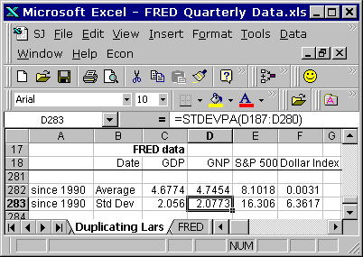
Down at the bottom of those first four columns, except the date column, Lars figures the average value for each dataset, and below that, for each dataset the Standard Deviation, using the STDEVPA() worksheet function. That function "Calculates the standard deviation based on the entire population," according to the OpenOffice help.

I found myself checking the range of values provided to the AVERAGE( ) and STDEVPA( ) functions, doing the Thomas Herndon thing, making sure there were no obvious dumb errors on the sheet. Christensen's spreadsheet looks okay to me.

In the next three columns Christensen calculates "standardized" values. (This is what interests me. How these calcs are done, what effect they have, and why I might want to do the same thing sometimes.)

Lars figured each standardized value as the original value less the dataset average value, with the difference divided by the dataset standard deviation value.

If I have the dataset [1,2,3] the average value is 2. If I subtract 2 from each value in the dataset I get [-1,0,1] and I have centered the dataset on the zero level.

(I'm wondering why Christensen's graph doesn't show values that are centered on the zero level. Maybe that will become clear later on.)

If I then divide each number in [-1,0,1] by some value, I make the numbers in the dataset smaller, but they stay in proportion. (They also stay centered on the zero level, unless I'm having a brain fart.)

That's Lars Christensen's standardization calculation. Pretty simple. I can remember it. But what does it look like? ...I'm getting to that.

I assembled the data for download from FRED. All quarterly data.

Graph #1: The FRED Source Data
The red line is percent change from year ago, GNP. All of 'em are percent change from year ago. The red line almost entirely hides the blue line, which is GDP. Yeah, not much difference there.

The green line is the S&P 500. The orange line is the Dollar index. The GNP and GDP values start in 1948. The S&P 500 values start in 1958. The Dollar Index values start in 1974. Christensen's graph starts in 1990. (If I have the chance to victimize Christensen for anything, it will likely be for chopping off the early years.)

Actually I'm always on the lookout for changed behavior on graphs. For if finance was once small but is now large, one ought to be able to see evidence of that change and its consequences on lots of graphs. And as Christensen's graph in particular shows "a very simple index to track market expectations of future NGDP" -- and as expectations are perhaps a more significant force now than in the past -- we might be able to see the rise of expectations as a transition toward greater similarity in more recent times. This would be a neat thing to see.

You can see on Graph #1 that the green line has about twice the up-and-down spread that the orange line has; and that both have a great deal more spread than the red and hidden blue lines. I think dividing these series, each by its own standard deviation, will similarize the up-and-downs of the different series. I think that was Christensen's reason for dividing by the standard deviation number.

So I have some things to look at, and some things to look for. Tomorrow, we look.