Tuesday, December 31, 2013

Started with the Pope. All downhill from there.


Well, ya know, we're all talkin bout it now, inequality, as if we were always in the game, just waitin for someone to listen...

SRW is on the case:

I have no idea whether inequality is the “defining challenge of our time”. That’s a meaningless trope. But Klein takes the phrase from a speech by President Obama and turns it into a question in order to knock inequality down a few pegs from the economic priority list. He does a very dishonest job of it.

A "dishonest" job? Wow.

SRW quotes Ezra Klein:

Economist Jared Bernstein has been worrying about inequality since way before worrying about inequality was cool.

SRW doesn't like that, but I'm sympathetic. Inequality has become a "cool" topic lately. (See my opening line.) What fascinates me most about all of this is the rapidity with which inequality moved from side issue to center stage. Oh, it'll last a month or two, I expect, then fade away again.

In a footnote, his update history, SRW adds:

Added context that the phrase “defining challenge of our time” comes from President Obama’s speech, and reworked that sentence.

I finished the read and went to empty the dishwasher with that footnote still in my head. Decided that the attribution needs to be clarified. Here's what President Obama said on 4 December:

So the basic bargain at the heart of our economy has frayed. In fact, this trend towards growing inequality is not unique to America’s market economy; across the developed world, inequality has increased. Some -- some of you may have seen just last week, the Pope himself spoke about this at eloquent length.

Important to get the etymology right. The Pope made inequality a pop topic.

(To be sure, SRW does put Pope Francis and concern about inequality together in the same sentence, in his earlier post.)


At the very bottom of the "all downhill" thing, we have the following:

James Pethokoukis at AEIdeas: Study: No economy in the world rewards smart, skilled workers more than America’s

"A new study adds another interesting wrinkle to the debate about income inequality in the United States," Pethokoukis writes:

I find particularly interesting the finding that (a) the return to skills is highest in America and lowest in Nordic-land, and (b) returns are higher in economies with more open, private-sector based labor markets. Wouldn’t this seem to argue that higher US inequality — based on pre-tax, pre-transfer market incomes — reflects 21st century market forces rewarding ability rather than some sort of breakdown in social norms?

Man, does he really think our exaggerated income inequality is just reward for ability? But then, it wouldn't be the first time some asshole said people are poor because they deserve to be poor.

Pardon my French. What offends me most in all of that is that Pethokoukis ignores the growing extremes of income inequality, which (come to think of it) mirror the growing extremes of political polarization in this country today.

The second bottom-of-the-barrel post on income inequality comes from Don Boudreaux at Cafe Hayek: A “Barrier” to Reducing Income Inequality??

Bourdeaux quotes from an AP story:

Fully 20 percent of U.S. adults become rich for parts of their lives, wielding outsized influence on America’s economy and politics...

The new rich have household income of $250,000 or more at some point during their working lives, putting them — if sometimes temporarily — in the top 2 percent of earners….

The new research suggests that affluent Americans are more numerous than government data depict, encompassing 21 percent of working-age adults for at least a year by the time they turn 60. That proportion has more than doubled since 1979.

Mmm, more than doubled since 1979. That's a result of supply side economics. And he tries to make it sound good, but it's just increasing income polarization. You know: inequality.

Boudreaux writes:

If I’m reading this report correctly (and if the reporter has interpreted the data correctly), fully 20 percent of Americans are, for at least some portion of their working lives, in the top two percent of income earners in America...

... these people (the “new rich”) are themselves, each and everyone of them, personally working at – and succeeding at – reducing income inequality.

Yeah, no. Increasing the extremes of income disparity is not the same as "reducing income inequality."

Unbelievably, Boudreaux adds:

... if the middle-class in America is disappearing, it’s chiefly because more and more Americans are becoming rich.

Yeah, yeah, this is just complete idiocy. And wouldn't you know it, Boudreaux links that particular excerpt to the inimitably bad Mark J. Perry. At the link (which you won't get from me) Perry shows this graph:


The graph shows percent of population grouped within some arbitrary divisions. If instead of showing population it showed the amounts of money received by those arbitrary populations, the dark blue segment on the right would extend increasingly far to the right as the decades go by. But of course Perry fails to show that graph.

Bottom of the barrel, bud.

Monday, December 30, 2013

I probably shouldn't, but I will


Reading Ellen Brown's Amend the Fed: We Need a Central Bank that Serves Main Street (as noted yesterday). I don't usually read Ellen Brown, and I'll tell you why. I probably shouldn't, but I will.

She irritates me when she says things like this:

The Federal Reserve Act was drafted by bankers to create a banker’s bank that would serve their interests. It is their own private club, and its legal structure keeps all non-members out. A century after the Fed’s creation, a sober look at its history leads to the conclusion that it is a privately controlled institution whose corporate owners use it to direct our entire economy for their own ends...

That's not economics. It's just political trash talk, a clit tingler. I know, I know, it probably helps boost her readership. I don't care. It's still garbage.

I have to say, the facts do not lead me to Ellen Brown's conclusion, and I'm sober at least half the time.


The trash didn't turn up till the next-to-last paragraph, so I did read almost the whole article. And (so you know) it's not the trash talk that inspires this post. It's something good that Brown wrote, some economics she wrote before she got to the trash. She wrote:
A Helicopter Drop That Missed Its Target

All this is far from the helicopter drop proposed by Ben Bernanke in 2002 as a quick fix for deflation. He told the Japanese, “The U.S. government has a technology, called a printing press (or, today, its electronic equivalent), that allows it to produce as many U.S. dollars as it wishes at essentially no cost.” Later in the speech he discussed “a money-financed tax cut,” which he said was “essentially equivalent to Milton Friedman’s famous ‘helicopter drop’ of money.” Deflation could be cured, said Professor Friedman, simply by dropping money from helicopters.

But there has been no cloudburst of money raining down on the people. The money has gotten only into the reserve accounts of banks. John Lounsbury, writing in Econintersect, observes that Friedman’s idea of a helicopter drop involved debt-free money printed by the government and landing in people’s bank accounts. “He foresaw the money entering the economy through bank deposits, not through bank reserves...”

The ideas that underlie my thinking are:

1. There's too little circulating money, relative to GDP; and
2. There's too much total debt, relative to circulating money.

The solution to the problem as I see it is to increase the quantity of debt-free money in people's bank accounts. So I have to say Ellen Brown has this exactly right.

Quoting (or possibly paraphrasing) Lounsbury further, Brown writes:

The helicopters dropped all the money into a hole in the ground (excess reserve accounts) and very little made its way into the economy.

Yeah, that's pretty much exactly the right criticism of monetary policy since the crisis.

Brown goes on to talk of the legal options and how things need to change so that what needs to be done is legal. I don't know about any of that. I presume she's right. That's fine, but it's not my focus. I focus on what's wrong with the economy and what in the economy must change to fix the problem. And I have to say that in this article, Ellen Brown has it exactly right.

Sunday, December 29, 2013

(delayed response)


In comments on mine of 16 November I wrote:

Using credit boosts the economy, but it also creates debt, and debt tends to undermine the boost.

Using credit to counteract the drag from debt can work, but it means an ever-bigger new use of credit is required to obtain a boost.

For the past five years the central objective of the Federal Reserve has been to get people borrowing again, because using credit boosts the economy.

They seem not to realize that the longer they postpone the payback, the bigger the payback must be...

Jim responded:

What the Fed has done is maintain the growth of bank deposits in spite of the fact that there has been no growth in bank loans. Apparently bank loans are not the only way to create deposits.

It also appears to me that the Fed's influence on interest is not the only influence it has on bank lending. The Fed has considerable regulatory powers to ensure banks make safe and sound loans. I'm not seeing any evidence of loose policy in this area.

All that makes me wonder how you came up with the notion that the Fed's entire focus has been "to get people borrowing again"?

Well, the above comes to mind because I'm reading Ellen Brown's Amend the Fed: We Need a Central Bank that Serves Main Street. Brown writes:

At an IMF conference on November 8, 2013, former Treasury Secretary Larry Summers suggested that since near-zero interest rates were not adequately promoting people to borrow and spend, it might now be necessary to set interest at below zero. This idea was lauded and expanded upon by other ivory-tower inside-the-box thinkers, including Paul Krugman.

I don't care about negative interest rates and ivory towers. I don't care about Paul Krugman and Larry Summers and Ellen Brown. I just want to answer the question How did you come up with the notion that the Fed's entire focus has been "to get people borrowing again"?

My answer is that people, important people, say things like near-zero interest rates are not adequately promoting people to borrow and spend.

See?

Saturday, December 28, 2013

"Potential growth" is real. We just don't know the number.


At The Case For Concerted Action, Ramanan quotes from Wage-led Growth by Marc Lavoie and Engelbert Stockhammer:

A standard objection to the consideration of the underconsumption thesis or the consideration of problems related to the lack of effective demand is that long-run growth – the trend rate of growth, also called the potential growth or the natural rate of growth – is ultimately determined by supply-side factors... Yet, since the advent of the global financial crisis, government agencies and central banks in many industrialized countries have lowered their forecasts of long-run real growth, thus demonstrating clearly that weak aggregate demand does have an impact on potential growth.

But a "forecast of long-run real growth" is not the same as "potential growth".

The lowering of forecasts does not demonstrate that weak aggregate demand has an impact on potential growth. It only demonstrates that forecasters are willing to contradict their own theories in order to push their predictions down where the actual numbers turn out to be.

Friday, December 27, 2013

I don't so much like the "wealth & income disparity is the cause of our troubles" argument.


I don't so much like the "wealth & income disparity is the cause of our troubles" argument. Bring it up, and somebody is bound to accuse you of stirring up class warfare. You're not, of course. Or I don't know, maybe you are. I do know that I can make the disparity argument without a trace of class concern. So you can, too, I'm sure. But it doesn't matter if our motives are pure. It only matters if our motives have been impugned. Bring up the disparity argument, and your motives are sure to be impugned. So I don't like the argument. I avoid the argument.

For me, though, it doesn't matter so much how other people respond. What matters is how the argument holds up in my own mind. Here again, though, I avoid the argument. For I am not certain I can separate the economics of the disparity argument from the social aspects of that argument. And economics, my economics, has no social aspects.

//

At the Businomics blog, Bill Conerly asks
Should Economists Talk About Redistribution?

An economist has as much right to express statements about value as anyone else does. However, the economist is not doing so from a position of professional expertise. [Rebecca] Blank being an expert on poverty does not mean that she is an expert on the morality of using force to solve social problems. In fact, I doubt that we should grant anyone “expert” status on such philosophical positions.

I like that a lot. But this next quote, I can disagree with:

Economic policy cannot derive strictly from economics. Economics is a set of if-then statements: if this occurs, then that happens. It’s a collection of statements about the way the world works, or at least a world of people. There is nothing within the body of economic thought that, by itself, dictates what policy is best.

I don't know if it's "within" the body of economic thought, but clearly the policy that's best is the one that sustains life as we know it... or, life as we knew it before things started going bad.

Let too few people accumulate too much wealth, and they come to have a new vision of the world, a vision in which nation-states are no longer necessary...

Thursday, December 26, 2013

A simple subtraction


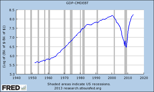
Subtract consumer debt from GDP:

Graph #1: GDP less Consumer Debt
I know, it's a flow minus a stock. A flow minus a stock. But I'm not drawing any conclusions here, except it's a surprising picture.

Same graph, but log of values:

Graph #2: Natural Log of (GDP less Consumer Debt)
How straight those trends are!

Wednesday, December 25, 2013

Speaking of models...


Via Bill C at Twenty-Cent Paradigms:
The Reserve Bank of New Zealand has a neat animation of Bill Phillips' famous hydraulic computer, which illustrates the stocks and flows of national income with tubes, tanks and gurgling noises.

Go there.

Scroll down and click   TURN IT ON >

Give it a moment. An image of The Moniac will appear.

Click   TURN IT ON !

You can hover over parts of the machine and descriptions will pop up.

Find options buttons in the upper-right corner.


Merry Christmas.

Tuesday, December 24, 2013

Dirk Ehnts and the Holodeck


Dirk Ehnts in Models as abstractions of the real world are useful:

A student, explaining why abstract models are useful, makes a very nice analogy. If you want to go from one campus of the Berlin School of Economics to the other (by car or public transport), then you need not a description of the world as it is but a description of the world in an abstract form that allows you to get there.

A map. You need a map.


Ehnts gets to the point:

The same goes for macroeconomics. It is not necessary to understand and know how every entity behaves. You can use abstractions and you will be fine. Income (GDP) equals consumption, investment, government spending and net exports, and maybe this is all you need to figure out how to go from Weak economy to Strong economy.


Maybe that's all you need, Ehnts says. I can't believe he says it. We had that formula, didn't we, before the Crisis and the Great Recession? I'm sure we had it then. But it didn't prevent the Crisis, and it didn't prevent the Great Recession. Apparently it wasn't all we needed.


In Star Trek: Next Generation, when they had a problem they couldn't figure out, they'd take it to the Holodeck and run a simulation. As a fan, I was supposed to believe the computer could figure out things the people couldn't. I never bought that. The computer only does what you tell it.

If you write an economic model for the Holodeck based on Y=C+I+G+NX then the Holodeck economy will be based on consumption and investment and government spending and net exports. But if the real economy is based on a different formula, your model won't model the real economy. You might as well use a road map without intersections. No no, that map might still get you where you want to be.


Maybe if economists focused less on the models and more on the economy, they would figure out how the economy really works. Maybe then they wouldn't leave private debt and credit use out of their calculations.

Monday, December 23, 2013

Following up


On Saturday I showed consumer debt on a log scale. It showed pretty much a straight-line increase.

Then I said the log scale graph provided no context for consumer debt, and that in context the graph would show much less of a straight-line increase. So I showed a graph of consumer debt relative to GDP, consumer debt in context. And sure enough, the graph showed much less of a straight-line increase.

Something's been bothering me for two days now. I remember Stuart Staniford saying it's hard to read changes in small growth rates on a log graph. And I'm concerned that my first graph hides changes because it's a log graph. I'm concerned that my second graph shows much more deviation from the straight-line increase because it's *not* a log graph.

So I went back to FRED and looked at "consumer debt on a log scale" again. And this time I put "consumer debt relative to GDP" on the same graph. And I made sure to show the log values of the second line this time.

Graph #1: "Consumer Debt" on a Log Scale (blue) and Log of the "Consumer Debt to GDP" ratio (red)
Consumer debt on a log scale shows a straight-line increase. Consumer debt in the context of GDP does not show a straight-line increase, and this is true even when Log values are shown.

So yes: "Consumer debt relative to GDP" fails to show the straight-line increase because of the context variable: because of GDP. It's the context that distorts the picture.

(At FRED, when you have the ratio of two series, you cannot show the values "on a log scale". To get the same effect you have to take the Log of the values. I'm not sure why that is, really. But I did look into it. The two methods are equivalent.)

Sunday, December 22, 2013

Impressions


Consumer debt relative to total credit market debt:
Graph #1: Consumer Debt relative to Total Credit Market Debt

Gross Federal debt relative to total credit market debt:
Graph #2: Gross Federal Debt relative to Total Credit Market Debt

Financial debt relative to total credit market debt:
Graph #3: Financial Debt relative to Total Credit Market Debt

Saturday, December 21, 2013

Between the surges


Yesterday I said it's obvious from the up-trend on the graph that debt was a developing problem already in the 1950s.

Graph #1: Consumer Debt (on a Log Scale)
What I meant was: If debt became a problem because debt got so big, then the problem arose not after debt got big, but when the increase first started.

It's obvious, I think.


See that flat spot in the recent years, in the upper-right corner of Graph #1? That's when the growth of debt finally slowed. That's when people decided they had enough. It caused quite a disturbance in the economy, that slowing of debt growth.

Here's how it looks to me: The debt growth slowdown created big problems because debt plays such a big role in the economy. I don't know the numbers, but suppose 80% of our spending involves debt. Now, imagine that the debt growth slowdown happened much earlier instead -- in the 1960s maybe -- when perhaps only 20% of our spending involved debt. The effect of the debt growth slowdown would have been much less.

It's obvious, I think.


Graph #1 shows consumer debt, the log of consumer debt. It shows no ratio. It provides no context for the debt. In context, there would be more variation in the uptrend. It wouldn't just go up and up. In context, it looks like this:

Graph #2: Consumer Debt in Context (Relative to the Size of the Economy)
It's not just up-and-up on Graph #2. It's up and down and wiggle around, that's true. But you know, Graph #1 shows a pretty consistent up-trend. And Graph #1 doesn't show anything but consumer debt. It shows consumer debt, and you can see a consistent up-trend in that debt.

Graph #2 doesn't show the same uptrend. But Graph #2 doesn't only show consumer debt. It also shows the size of the economy as given by GDP. And, you know, if consumer debt shows a consistent uptrend, and consumer debt in context does not, then maybe the disturbance of the trend comes from the context data. Not from the consumer debt data.

The changes in GDP throw off the ratio and make it look like consumer debt doesn't have a consistent up-trend. But it's GDP that's throwing it off. It's the context that distorts the picture.

It's obvious, I think.


Scott Sumner looked at a graph like my #2 here, a while back. Here's what he said about the graph:

What do you see? I suppose it’s in the eye of the beholder, but I see three big debt surges: 1952-64, 1984-91, and 2000-08.
Okay. But remember, he's looking at a disturbance imposed on the up-trend by a context variable.

If you look at the same data, total consumer debt relative to GDP, and also at the change in consumer debt relative to GDP, a more complete picture emerges:

Graph #3: Consumer Debt relative to the Size of the Economy (blue) and
Change In Consumer Debt relative to the Size of the Economy (red)
Scott Sumner identified three "debt surges" on the graph. I've emphasized in heavier red the two intermissions between those surges. The first I show from 1965 to 1983, and the second from 1992 to 1999. Both intermissions match up with relatively flat spots in the blue line, the flat spots between Sumner's surges.

During the second intermission, the red line is relatively low. The change in debt is relatively low, relative to the size of the economy. This intermission, then, seems to support Sumner's view that there was no debt surge in the 1992-1999 period.

The first intermission is more problematic. Yes, there is a low spot in the red line just before the 1970 recession. (The blue line is actually going down at that time.) But after the 1970 recession there is a peak at least as big as any earlier peak in that red line. And after the 1974 recession is an even bigger peak. This peak rivals the one at the start of Sumner's second surge; it rivals the mid-1980s peak. But the blue line shows only a very mild increase during the post-1974 peak, not a strong increase like the one in the mid-1980s.

Why this discrepancy?

The behavior of the context data is the key to this puzzle. That flat spot in the blue line from 1965 to 1983, that flat spot corresponds to the time called the Great Inflation, the time that prices were rising rapidly. Incomes were rising, too. And yes, new additions to consumer debt were growing also as prices climbed. But the old, existing debt did not grow with inflation. Your mortgage payment was the same month after month and year after year. Meanwhile, your paycheck increased along with prices, because of the inflation.

Each year's inflating prices helped to enlarge the new increases of consumer debt. But each year's inflating paychecks made existing consumer debt smaller in context.

It is the rapid, inflationary increase in the context data, the GDP data, that distorts the picture of debt growth during the Great Inflation. Despite the large increases to consumer debt through the 1970s, the increases to paychecks and incomes and GDP made consumer debt growth look like it slowed significantly.

Consumer debt growth slowed almost not at all during the Great Inflation. If you strip away the effects of inflation, consumer debt in context (relative to the size of the economy) shows a strong up-trend, comparable to Graph #1 above.

Graph #4: Consumer Debt In Context, like Graph #2 (blue) and
Consumer Debt In Context with Inflation Stripped Away (red)
Okay, there is a bit of a slowdown in debt growth during the Great Inflation. But only a bit, and really not like it looks on the second graph. It is not a slowdown that merits exclusion from "surge" status. We had rapid debt growth, camouflaged by inflation.

It's obvious, I think.

Friday, December 20, 2013

Oh, Daniel


At Crooked Timber, Daniel says "there is a lot of rewriting of the recent past" in the secular stagnation view of "why we’re in the mess we’re in".

Basically, the thesis is that since about the mid-1990s, it has been the case that it has only been possible to achieve anything like full employment in America during periods when the private sector has been chronically over-consuming and increasing its debt levels.

Daniel doesn't buy it:

They got a structural increase in personal sector debt because they wanted one and set policy in order to create one. There’s no good calling it a “bubble” or a “puzzle” now that the shit’s hit the fan.

Amen, brother.

I liked the article. I don't like that the "thesis" only goes back to the mid-1990s. But that's not Daniel's version, of course. Daniel takes us back to when "China starts to industrialise and NAFTA is passed." I don't know about China, but NAFTA came into force in 1994, according to Wikipedia. So, mid-1990s.

Daniel does refer to "the entire period in question" as “The Greenspan Years”, which gets us back to 1987. Nothing before that, that I noticed.

For more or less the entire period in question (call them “The Greenspan Years”), the growth of consumer spending, financed by increased consumer debt, was the main instrument of policy.

Sure. In comments, Robert Waldmann replies:

A wish is not a plan. Greenspan, Clinton and Bush might have wished for consumers to borrow and spend, but they had no way of forcing people to.

Okay. But policy doesn't "force" people to do things. Policy induces people to do things. And anyway, consumer debt was increasing anyway:


See how the dramatic increase begins right there in the mid-1990s? No...

No, I mean right there in 1987? No...

No. Debt was going up from the start.

To be clear, I do like Daniel's summary of events since the late 1980s. Those were all contributing factors, surely. And I very much like where he's coming from:

... in describing the growth in debt as if it was a purely exogenous phenomenon, due to nothing other than animal spirits and irrationality, there’s a really dangerous kind of mistake being made.

It was policy!

Absolutely, it was policy. Either we encouraged debt, or we failed to discourage it, or both. (Actually, both.) But here's the thing, Daniel. You don't go back to the time when a problem became obvious, and point to that time and say, "There's the problem."

Things don't happen instantly in the economy. Things develop.

The debt that became a problem in 2008 was already a problem for people in the 1990s. The debt that was a problem in the 1990s was already creating problems in the 1970s. And the debt that was a problem in the 1970s was already a developing problem in the 1950s.

It's obvious. Just look at that up-trend on the graph.

Thursday, December 19, 2013

A disputed statement is a weak link in a chain of argument


At The Economist, R.A. quotes from an earlier column:

Another theory holds that high savings reflect a cramping of consumption due to rising inequality of incomes. The share of income earned by the top 1% began climbing in the early 1980s and now stands close to the record set in 1928. Rich households save more than poorer ones. A paper published this year by Barry Cynamon of the St Louis Fed and Steven Fazzari of Washington University in St Louis estimates that prolific saving by the top 5% has been suppressing demand since the mid-1980s. That squeeze was mostly offset by increased borrowing by the bottom 95%, they find. America and Britain, unlike Germany and Japan, saw rapid growth in private debt in the 2000s...

The assertion that

Rich households save more than poorer ones.

is something that makes perfect sense to me, but apparently is unsupported by evidence. Of course, Cynamon and Fazzari disagree.

Like Krugman, I’d like to agree. Unlike most everybody with a stick in this fire, I don't know enough about it to contradict anybody. For the sake of this post, however, let's suppose Krugman is wrong, Cynamon and Fazzari are right. So here's where we stand:

[P]rolific saving by the top 5% has been suppressing demand since the mid-1980s. That squeeze was mostly offset by increased borrowing by the bottom 95% [as evidenced by the] rapid growth in private debt in the 2000s.

Let's consider these two groups, the 5% and the 95%. Let's presume income inequality was stable from World War Two until 1980. For simplicity, assume that the income of the 95% was just equal to the income of the 5% before 1980; each group received half of GDP. After 1980 let's suppose income shifts by 1% of GDP each year -- the income of the 95% falls by 1% of GDP and that of the 5% rises by a like amount.

Sounds like an economic model to me. After 25 years of 1% transfers from the 95% to the 5%, half of the 95%'s annual income has shifted allegiance.

But I still don't like the disputed line "Rich households save more than poorer ones." Disputed lines don't make strong arguments.

In a post I didn't recommend, Larry Summers put the five-versus-ninety-five thing in terms I like much better, when he referred to "high-spending debtors" and "low-spending creditors." In such terms, one need not quibble over evidence.

Wednesday, December 18, 2013

"Secular Stagnation" strikes again


On 12 December 2012 I showed this graph:

Stages of the slowdown in real growth

On 15 December 2013 Larry Summers wrote Why stagnation might prove to be the new normal.

You can see the "new normal" in my graph. Twice.

(Not a recommendation to read the linked post.)

Tuesday, December 17, 2013

Worst-Case Unemployment and the Output Gap

Part six in a series that starts here.

A while back I looked at The Myth of 'Jobless Recoveries', Okun's law, and Hodrick-Prescott calculations.

The Hodrick-Prescott calc can be used to smooth out a data series like GDP or the unemployment rate. It smooths out the ups and downs of the business cycle so you can see the underlying trend.

Okun's law says there is a consistent relation between unemployment and output. It says when output drops one percent below trend, unemployment rises half a point above trend. When output rises one percent above trend, unemployment falls half a point below.

These "trends" that are part of the Okun's law calculation -- you can use the Hodrick-Prescott calculation to get them.

Now... Here is what I did, a while back, in a follow-up post, after first vehemently denying that such calculations are reasonable:

I took the unemployment numbers from FRED and figured the HP trend for unemployment. Then I set the original unemployment numbers aside.

I took the Real GDP numbers from FRED and figured the HP trend for Real GDP. Then I subtracted the trend from the original numbers. This gave me a measure of how far Real GDP was off its trend.

Then I took those off-trend numbers and divided them in half. In half, because Okun's law says what happens to unemployment is half as big as what happens to output. So I just scaled the off-trend output values down to fit the unemployment rate.

Then I took those scaled-down output values and added them to the underlying trend for unemployment, the Hodrick-Prescott trend. Subtracted maybe, I forget.

Then I took these unemployment-trend-plus-off-trend-output numbers and put them on a graph along with the original unemployment numbers. The idea -- which I got from the Myth of Jobless Recoveries post, was that if the two lines turned out similar, it was evidence that there is a strong, reliable relation between unemployment and real GDP.

The two lines turned out similar. Despite my initial objections, I was forced to admit the arithmetic was good, and I learned of the strong, reliable relation between unemployment and real GDP.


Here's what I'm thinking: If there is a strong, reliable relation between unemployment and real GDP, then we should be able to compare gaps. We should be able to look at the gap between official unemployment and "worst-case" unemployment, and look at the gap between real and potential GDP, and maybe see something interesting in the two gaps. I'm thinking we can use the output gap and the unemployment gap to establish whether those calculations are valid.

At the start, I was thinking I could use those gaps to establish that at least one of the data series is not valid. Maybe to show that the revised-down version of Potential GDP is wrong. That would be interesting. But I'm no longer sure I could pull that from the numbers.

I need some time with this. I want to set this topic aside for a while and come back to it later. I've been sitting down to write the next posts in series, but end up writing other things. It's just not there, yet.

Meanwhile, if anyone else is looking into this, do let me know.

Monday, December 16, 2013

Figuring Worst-Case Unemployment

Part five in a series that starts here.

Graph #1: Actual and Hypothetical Unemployment
Source: Erceg and Levin, via John Taylor
By "worst-case" unemployment I don't mean the worst that one can possibly imagine. I mean the worst we can reasonably expect, based on estimates and projections made by BLS and other agencies engaged in that sort of thing.

Anyway, my intent here is not to tell another discouraging story. My intent is to look at one of the discouraging stories that's out there, so as to better understand it. So as to get a feel for the validity of that story, or the lack of validity.

To duplicate the worst-case unemployment graph I need to rework the Labor Force Participation Rate. Rather than letting it fall rapidly, as it has, I want it to fall slowly, as the November 2007 BLS projection anticipated. I'm trying to mimic the negligible decline of unemployment shown in the red line on Graph #1 here, and I think the BLS number will help me get there.


A plan finally came together in my head, an overview of what I want to do:

First, use the Labor Force Participation Rate and the 2007 BLS projection to come up with numbers showing how big the labor force was expected to be, before things fell apart. Call it the Hypothetical Labor Force Participation Rate.

Second, work backwards from there to get numbers for the Hypothetical Labor Force.

Third, subtract the number of employed people from the Hypothetical Labor Force, to get the hypothetical number of unemployed persons. Use this number to determine the Hypothetical Unemployment Rate.

That's the plan.

Step One


I went back to FRED for quarterly data on the three series used to generate the graph for Friday's post:

• Civilian Labor Force (CLF16OV)
• Civilian Noninstitutional Population (CNP16OV)
• Civilian Labor Force Participation Rate (CIVPART)

and uploaded the file to Google Drive.

The November 2007 BLS projection (which we looked at yesterday) predicted an annual growth rate of -0.1 percent for the 2006-2016 period. A very slight decline.

I figured a quarterly growth rate that would give an annual rate of -0.1 percent. Then I took the first quarter 2006 value and, starting from there, applied my quarterly growth rate to generate the numbers.

Checking my work: BLS projected a participation rate number of 65.5% for 2016. I got 65.43% for first quarter 2016, 65.38% for fourth quarter. So I tweaked my quarterly growth rate to get the same 65.5% number that BLS got. I'm calling this number the Hypothetical Labor Force Participation Rate.

Check my work.

Step Two


To figure the Labor Force Participation Rate (LFPR) you take the Civilian Labor Force (CLF) as a percent of the Civilian Noninstitutional Population (CNP):


You can rearrange that formula to see CLF in terms of population and participation rate:


Now I just use the Hypothetical Labor Force Participation Rate in place of the official version. The hypothetical is a significantly higher number, so it produces a significantly higher Civilian Labor Force. I am calling this number the Hypothetical Civilian Labor Force.


Check my work.

Step Three


Okay. Now I need some more data. I need the number of people employed, so I can calculate the Hypothetical Number of Unemployed Persons. Then, using that number and the Hypothetical Labor Force I can figure the Hypothetical Unemployment Rate. And I will need the official unemployment rate, for comparison to the hypothetical number. These are numbers we looked at on Saturday.

I went back to FRED for the relevant numbers, quarterlies, and put 'em in a new spreadsheet along with my Step Two results.

The number of people in the labor force, less the number working, is the number of people out of work. Or in this case, the Hypothetical Labor Force less the number Employed equals the number of Hypothetical Unemployed.

And then, the number of Hypothetical Unemployed, as a percent of the Hypothetical Labor Force, equals the Hypothetical Unemployment Rate.


Graph #2
Check my work

I think I duplicated their graph!

Sunday, December 15, 2013

Preparing to figure Worst-Case Unemployment

Part four in a series that starts here.

On Thursday I took a first look at worst-case unemployment, what the unemployment rate would be if everyone who was expected to stay in the labor force actually stayed in the labor force (and if people who were expected to enter it, entered it.)

When people who are looking for work give up, when they stop looking, they are no longer in the labor force. So the labor force gets smaller. Then the number in the labor force who are not working becomes a smaller percentage of the total labor force. So the unemployment number goes down.

The unemployment number goes down, not because there are more jobs, but because there are fewer people trying to get a job. This is what John Taylor and others have been pointing out.

Taylor showed a graph comparing the official unemployment number and what unemployment would be if everyone who was in the labor force, stayed in the labor force.

Well, I took an interest in that graph, and decided I wanted to see if I could duplicate it. The numbers I used on Thursday I don't think were the right versions. That's why I did all that double-checking on Friday and Saturday, finding number series where the ratio is a good match for the Labor Force Participation Rate and the number of persons unemployed and the number employed.

Now that I have the right numbers, maybe I can duplicate the worst-case graph.


In his post of 23 November 2013, John Taylor links to a paper by Christopher Erceg and Andrew Levin: Labor Force Participation and Monetary Policy in the Wake of the Great Recession. I couldn't get to that paper at SSRN. But Taylor has an older post that links to an earlier version of Erceg and Levin's paper (PDF, 50 pages).

Erceg and Levin refer to a BLS forecast of the Labor Force Participation Rate from back in November, 2007 -- "just prior to the onset of the recession," they note.

At BLS I found Labor force projections to 2016: more workers in their golden years (PDF, 20 pages), from the Monthly Labor Review of November 2007. Table 3 in that PDF gives civilian labor force participation rates for 1986, 1996, 2006, and a 2016 projection. The annual growth rate is projected to be -0.1 percent for the 2006-2016 period. Only a slight decline in the Labor Force Participation Rate was anticipated.


I'm thinking that is where Erceg and Levin got the forecast they show on this graph:

Graph #1 (Source: John B. Taylor)
Yes: On page 49 of the Erceg and Levin PDF, they plot several subsets of the Labor Force Participation Rate projection, and refer to the November 2007 issue of the Monthly Labor Review.


I see Bill Mitchell is on a related topic.

Saturday, December 14, 2013

Number of Persons Employed and Unemployed

Part three in a series that starts here.

I'm trying to back into numbers that other people calculate, so I can know what numbers they use to get the numbers they get.

From yesterday, I know the Civilian Labor Force (CLF16OV) is the number used to calculate the Labor Force Participation Rate. So I know CLF16OV is the right number to use to figure out how many people are working, and how many are looking for work.

I thought I'd use FRED's UNRATE to figure the "working" and "looking" numbers. When I saw the name of the series -- Civilian Unemployment Rate -- my confidence improved, because it's another "civilian" series. Probably in the right ballpark, I thought.

So I multiplied the Labor Force by the unemployment rate and divided the hundred out of it. That gave me a count of unemployed persons (or actually, thousands of unemployed persons).

But what to compare it to? I searched FRED a bit and found the bluntly-named series Unemployed (UNEMPLOY). I put it on the graph with my calculation. Another good match:

Graph #1: Calculating the Number of People Unemployed

After that, then, I could subtract the number of people unemployed from the Civilian Labor Force to get the number of people employed.

But -- again -- what to compare it to? How about Civilian Employment?

Graph #2: Calculating the Number of People Employed

Nice.

Friday, December 13, 2013

How to calculate Labor Force Participation Rate


Ask.com had a good answer:
The Labor Force Participation rate is the percentage of people who are 16 and older who are employed or looking for employment. The LFP rate formula: Take the number of people employed and looking and divide it by the entire population that are not in institutions (school, prison or military.) Multiply this number by 100 to get the percentage of people participating in the labor force.

And this note:
The Labor Force Participation Rate = Civilian Labor Force / Total non-institutionalized civilian population.

I went right to FRED, found Civilian Labor Force (CLF16OV) and Civilian Noninstitutional Population (CNP16OV), took the ratio, multiplied by 100, and put Civilian Labor Force Participation Rate (CIVPART) on the same graph. Good match:

Graph #1: The Calculation that gives the Civilian Labor Force Participation Rate

Thursday, December 12, 2013

Worst-case Unemployment


From Philip Greenspun's Weblog:
Unemployment rate adjusted for labor force participation

Illustrating the magic of choosing one’s statistic carefully, today’s New York Times front page carries a story about how the jobless rate has fallen to a five-year low of 7%. Investor’s Business Daily, however, calculates unemployment at nearly a modern-day high of roughly 12% by holding labor force participation constant at the 2007 level (66% of working-age adults actually working). See “Labor Force Exodus Hides Nearly 40% of Hiring Shortfall”.

Well I ran into this the other day at John Taylor's, and here it is again today.

I have to look at the numbers for myself. What does the excerpt give me? The "labor force participation" rate, and "working-age adults".

From About.com
Question: What is the Labor Force Participation Rate?

Answer: The labor force participation rate is the percentage of working-age persons in an economy who:

• Are employed [or]
• Are unemployed but looking for a job

Typically "working-age persons" is defined as people between the ages of 16-64. People in those age groups who are not counted as participating in the labor force are typically students, homemakers, and persons under the age of 64 who are retired. In the United States the labor force participation rate is usually around 67-68%.

Okay, if we have the labor participation rate

Graph #1: Labor Force Participation Rate
then we know (for example) that in 2007, about 66% of working-age persons were either employed or looking for a job. And today, about 63% are either employed or looking.

And if we have working age population for the 2007-2013 period

Graph #2: Working Age Population, 2007-2013
then we can see the working-age population increased from about 231 million to about 246 million during that period.

So we can estimate (crudely) that in 2007, about 66% of 231 million people were either working or looking for work. That's about 152.5 million people, working or looking.

And in 2013, about 63% of 246 million people were ditto. That's 155 million people.

If the participation rate didn't fall from 66% to 63%, in 2013 we'd be looking at 66% of 246 million, or about 162.4 million people. If the labor force participation rate remained at 66% -- an unreasonable proposition, I think, if you judge by Graph #1 -- we'd be looking at 162.4 million instead of 155 million people in the labor force in 2013.

The number of people working being what it is in 2013, the number *not* working would be several millions more, if we use the 162.4 number. So the unemployment rate would be higher. That's the scam they're running with this line of argument.

Now if we have the unemployment rate for 2007-2013

Graph #3: The Unemployment Rate, 2007-2013
we can say unemployment was about 4.5% in 2007, and is now about 7%.

If 4.5% of the labor force was unemployed in 2007, then 95.5% was employed.

The labor force in 2007 was 152.5 million. 95.5% of 152.5 million is 145.6 million. So in 2007, 145.6 million people were working.

If we have 7% unemployment today, then we have 93% employment.

The labor force now is 155 million people. 93% of 155 million is 144.15, so today we would say 144.15 million people are working.

Now, if the labor force participation rate had stayed at the 66% level, the labor force would be 162.4 million people. If 144.15 million are working, then the employment rate is 88.76%, and the unemployment rate is 11.24%.

(Off topic, but this is the second weak spot in the "unemployment is worse than we think" argument. They do all the calculations that I'm doing, and I'm sure they do them better. (This is my first look at these figures, after all.) But they justify all their hard work on the assumption that if all the people who left the workforce in the last five years started looking for work again, nothing else would change. You know: ceteris paribus.)

(Oh -- No, I have no idea what would change. But then, it is not my assumption.)


Okay, Investor's Business Daily came up with 12%. I got eleven and a quarter. That's close, considering how crude my estimate is. But wait -- What did John Taylor have?

Graph #4: Actual and Hypothetical Unemployment
Eleven, eleven and a half, right in there.

Wednesday, December 11, 2013

The least we can do


Graph #1: The Federal Minimum Wage Rate Since 1955
The Google Drive Spreadsheet

Tuesday, December 10, 2013

Supply and demand. Imagine that!


From a recent post:

Graph #1: Treasuries Held by the Fed (black) and the Fed Funds Rate (inverted)
The graph compares the rate of change in US Treasury Securities held by the Fed to the effective Fed Funds rate... with the Fed Funds rate inverted on the graph. The two series seem to show a lot of similarity -- enough to draw me back for another look.

Graph #1 starts in January 2009, not long after the Federal Reserve announced its intent to start paying interest on reserves. Essentially, the graph shows the time that the Fed has been paying interest on reserves.

Makes me wonder how these series compare in the time before interest on reserves.

Graph #2: The Black Line from Graph #1, and the Historical Record
The two peaks that begin during the Great Recession, visible in black on Graph #1, are also clearly visible on Graph #2.

Number 2 shows in blue the same series we see in black on Graph #1 -- but the full extent of it, back to 2002. In red, the graph shows a similar series that goes back to 1970 and which, as it happens, we looked at before.

I will use the red line, Federal Debt Held by Federal Reserve Banks, in a new graph that extends the Graph #1 comparison back in time to 1970 or before.

I show the red line as a Percent Change from Year Ago number. And I extend it to the years before 1970 by using the older, discontinued version of the same "debt held" data, also shown in red.

Graph #3: Debt Held by the Fed (red) and the Fed Funds Rate
This graph extends Graph #1 back to the 1950s.

On Graph #1 the two lines follow a similar path. On Graph #3 for the same period (since 2009) they do not. That is because the numbers shown here in red are massively larger than those shown in blue. That size difference is masked on Graph #1 by putting the interest rate on the right-hand scale.

It is important to observe the similarity of pattern that Graph #1 shows. It is also important to realize that we are comparing very large and very small numbers. Now I will take Graph #3 and cut off the years we saw on Graph #1, at the end where the red line goes wacky. That way we can begin to look at the years ignored on Graph #1, numbers that are comparable in size.

Graph #4: Debt Held and Fed Funds BEFORE the Crisis
Now I need to flip the Fed Funds rate upside down like it is on Graph #1. I'm doing this because on Graph #1 the flipping let us more easily see the similarity of pattern. (For the record, I don't see anything in Graph #4 but a jumble.)

Graph #5: Same as #4, with the Interest Rate Inverted
Can you see any similarity there? Maybe. The low point of the blue line (really, the high point of interest rates in the early 1980s) might correspond to three lows in succession in the red line. The three lows I'm looking at, the middle one lines up with the low point of the blue, between the 1980 and '82 recessions.

Again on the blue line, working both ways from the low point, there are some humps in the blue line that may match up to humps in the red line. Two humps before the 1980 recession, punctuated by the 1970 and '74 recessions. And two or three humps after the 1982 recession, with echoes in the red line. But this is all rather vague, and seems to depend on me pointing out humps and emphasizing them. So I wouldn't say there is any strong relation visible on Graph #5.

Still looking, let me tweak the blue line to show "percent change from a year ago", as the red line shows. I have high hopes...

Graph #6: Same as #5, except Percent Change for the Blue Line

Ha! Well, what can we do with this? Maybe move the red line to the right-hand scale?

Nah, I won't waste your time with that one. I'm gonna crop off early years of the blue line, to get rid of those high points and zoom in on where the red and blue are closer together.

Graph #7: Zooming In on Graph #6
For Graph #7 I cut off all the years before 1970. Also, I had to leave the red line on the right scale to make it big enough to see anything.

Okay, maybe this is our first result. I had to enlarge the red line in order to see it. The red line here is the "debt held" line, Federal Debt Held by Federal Reserve Banks.

On Graph #1 I had to enlarge the Fed Funds line to see anything. On Graph #7 I enlarged not the Fed Funds, but the other line. It is as if, on Graph #1 (since 2009) the interest rate is the smaller number. (You know, down near the zero bound.) But on #7 (before the crisis) the "debt held" number was the smaller number, changes in debt held.

That's true, too. The changes in Debt Held only got big since the crisis, as Graph #2 shows.

Okay, this is a good result. It tells us that interest rates are low since the crisis, and Debt Held is high. This isn't news. These are things we already know. But at least our graph agrees with what we know.

//

On Graph #7 low points in the blue that occur at the same time as the high points (or high periods) in the red line. I want the take the interest rate, the blue line, and take the minus sign out of it. I want to un-invert the line.

No.

I switched the blue line back to Percent (rather than Percent Change of Percent). The next graph compares Debt Held (red) to the Fed Funds interest rate, since 1970. The interest rate is still inverted:

Graph #8: Debt Held (red) and the Inverted Fed Funds Rate
There seems to be some correspondence here. Red and blue both bottom out between the 1980 and '82 recessions. And it seems in general that high goes with high, and low goes with low. This is the same result we got from Graph #1: With the interest rate inverted, we see pattern similarity.

After the mid-1990s the red and blue seem to pull away from each other. Interest rates were falling (but on this graph, rising, because they are inverted) and Debt Held, while still spiking up, seems to be drifting down.

Oddly, though the lines drift apart, those late spikes in the red line seem to match up with high spots in the blue line.

And finally, let me take the minus sign off the interest rate:

Graph #9: Debt Held, and the Fed Funds Rate

Red lows match blue highs in 1981 and 1984 and 1989 and 1996 and 2000. Red highs match blue lows in 1971 and 1976 and 1987 and 1994 and 1997 and 1999 and 2003.

The opposites thing isn't perfect. Red highs match blue highs in the 1980 recession and just before the '74 recession. And the two lines look nothing like each other -- they show nothing like the symmetry visible in the years since 2009, as we saw in Graph #1.


In summary, it seems safe to say this: Given the demand for base money, there appears to be an inverse relation between supply and price. When the supply goes up, the interest rate tends to go down; and when the supply goes down, the interest rate tends to go up.

Imagine that!