Sunday, October 30, 2016

Bruegel and the the maximum acceptable level of private debt


Via Reddit, Private sector debt matters, and better data means better policy by Alexander Lehmann, 27 October 2016 at Bruegel. The opening sentence:

Private debt is emerging as a central concern in EU policy.

This is October 2016, more than eight years since Lehman Brothers hit the skids. Now they're getting concerned about private debt? Now? In my third post on this blog, 22 March 2009, I was talking about a solution to the problem of "too much debt" in the private sector. And just about continuously since that time.

So Bruegel says the EU is starting to get concerned about private debt. Why?

... private debt can quickly morph into public debt ...

So really, what is their concern? Are they concerned that private debt is a problem for the economy? or are they only worried that private debt may ultimately become public debt? If the latter, their focus is surely wrong. For by the time there is a threat that private debt may "quickly morph" into public debt, the problem is no longer newborn, no longer a baby, no longer a child. The problem is maturing. There is no easy way to deal with it at that point.

Despite that, and in the same paragraph with the words "quickly morph", we read:

The debt overhang has far-reaching consequences: lower household spending and weaker corporate investment and hiring. This leads to a vicious circle, where low growth and price deflation aggravate debt distress further.

That's extremely well said. Then they go back the other way again, thrashing and flailing about, and hitting all the wrong points:

Private debt is one of the 14 indicators examined annually in the EU’s Macroeconomic Imbalances Procedure. This process flags risks where a country’s consolidated non-financial corporate and household debt relative to GDP rises into what has been the top quartile of the historical EU wide distribution. Based on 2014 data, the latest Commission reports found the threshold of 133 per cent of GDP was breached by 13 member states ...

Okay, so they see private debt as a problem. And they're doing something about it. They define a limit for acceptable debt. The limit they define is based on "the historical EU wide distribution." In other words, based on recent pre-crisis experience. To define a limit, they look at how much debt they had just before they got in trouble. And they say if you're over 75% of that much debt, it's no good.

Where does this arbitrary nonsense come from? Why do they think the level of debt they had in 2006 was okay, and 75% of it is good? It's the blind leading the blind.

And it's not only the EU. According to the IMF (back in 2013):

Much of the empirical work on debt overhangs seeks to identify the ‘overhang threshold’ beyond which the correlation between debt and growth becomes negative. The results are broadly similar: above a threshold of about 95 percent of G.D.P., a 10 percent increase in the ratio of debt to G.D.P. is identified with a decline in annual growth of about 0.15 to 0.20 percent per year.

No. As I asked at the time, Do we really want to wait till things are that bad?

The focus of state-of-the-art economics is to find the point where adding one more dollar of debt stops making GDP go up and starts making GDP go down. What possible advantage could there be in that? It can only be so that we might manage to come as close as possible to the threshold without crossing it.

That may be state of the art, but it's not the state of the Arthurian. Debt productivity has been declining for a long time. The increase in GDP we get for each new dollar of debt has been declining for a long time.

Increasing debt makes economic performance decline. If this is true, then why would we want to get close to the limit where "the correlation between debt and growth becomes negative"? This is actually saying "Adding more debt is not okay if it takes away even a tiny bit of GDP, but it is okay as long as it adds to GDP, no matter how little it adds." Well, it's not okay with me.

We need to stop debt accumulation when it starts to hinder growth; this is how to define the maximum acceptable level of finance for our economy.

//

Even banks and bankers these days call for limits on finance. Beware! The limits must be placed not at the point where the financial sector starts to be hurt by finance, but at the much lower point where the non-financial sector starts to be hurt by it.

Saturday, October 29, 2016

Premonitions of Recession


... Employment Growth Declines Before a Recession

Friday, October 28, 2016

Not a Pretty Picture


Unemployment:  Red = At Bottom.  Black = Recession.  Pretty Reliable.  But ...

Thursday, October 27, 2016

Donald Trump makes me laugh and shake my head


Hillary just makes me shake my head.

Wednesday, October 26, 2016

Taylor's Laundry


John B. Taylor:
Because the economy has grown from the start of this recovery at a pace no greater than the prerecession trend, it has left a vulnerable gap of unrealized potential that can and should be closed with faster economic growth. In several key ways the US economy resembles an economy at the bottom of a recession, ready for a restart, even though the unemployment rate has reached 5 percent.

The US economy resembles an economy at the bottom of a recession, Taylor says. Pretty much, yeah. I don't know if it's in my notes or on the blog ...

Here it is. I wrote:
Our last recession ended in mid-2009, according to NBER dates at FRED. Seven years ago. And I've read articles written by people apparently hungering for recession, suggesting that after seven years of growth we are already due for another recession.

[But] the claim that we've just finished up seven years of growth and now a recession is due, it seems to me that's the ridiculous claim. Growth was, what? Half what it should have been? So don't call it seven years. Call it three and a half.

John Taylor is calling it zero years. He's a little bolder than I am.


Note Taylor's phrase "even though the unemployment rate has reached 5 percent." He is pointing out the evidence people have for saying we're well along in the recovery. Taylor of course is saying we are really not well along in the recovery. (The title of his PDF is Can We Restart the Recovery All Over Again?.)

One could undermine the "5% unemployment" argument by pointing out the decline in the labor force participation rate, as Taylor does. Correcting for that decline would increase the labor force by five percent, he says. I'm thinking that would raise the unemployment number to 10%. That's no recovery.


I agree with Taylor's observation of our lack of recovery. But I don't agree with his prescription. My argument is always the same: The problem is excessive reliance on credit in the private sector. Taylor does not have that kind of focus. He is all wack-a-mole with tax reform, and regulatory reform, and entitlement reform, and monetary reform, and free trade agreements. Taylor doesn't have the cause of the problem. He has a laundry list.

Tuesday, October 25, 2016

Here's a question answered


Search FRED for ophnfb -- output per hour, non-farm business -- a measure of labor productivity. Three series turn up: OPHNFB, PRS85006092, and PRS85006091. But only sometimes. Sometimes you get a list with only one item on it: OPHNFB. For some reason they design software these days to give inconsistent responses. Maybe the reason is some kind of corner-cutting to save money. But it seems to me the reason is just pure stupidity.

Well that's out of the way. I hope it's not my stupidity!

It took me fifteen minutes to duplicate the list with three results so I could write this post. When you're old as I am, 15 minutes is a big chunk of Time Remaining.

The three series offer the data as an index (2009=100), as Percent Change at Annual Rate, and as Percent Change From Quarter One Year Ago. If I start with the index, I can get "Percent Change From Quarter One Year Ago" easily. I can also get "Percent Change" (though not at an annual rate). Usually I just use the index in whatever form I need, without a thought.

Today for some reason, there was a thought: I can compare the "Percent Change at Annual Rate" series to the index in its "Percent Change" form. And I can see whether they just multiply by four or if they do something more complicated to get the "at Annual Rate" thing.

So I divided the "Percent Change at Annual Rate" series by the "Percent Change" form of the index:

Graph #1
Nope: Not just multiplied by four. They do something more complicated.

Of course, it's close to four. It would have to be. And maybe you could multiply by four and no one would ever know the difference, but it wouldn't be right.

Okay. The Dallas Fed has a page that shows the calculation: Annualizing Data.

I printed the Dallas Fed page as a PDF file (two pages) and made it available for download.

Monday, October 24, 2016

Some gossip about Alan Greenspan


From Thoughts on “Teaching Economics After the Crash” at medium.com by Karl Whelan, Professor of Economics at University College Dublin:
Greenspan’s “Model”
Alan Greenspan was not an academic. He was a consultant who leveraged his substantial Washington connections into an appointment as Fed chairman. And his positions on economics were very far from the mainstream.

I worked for Alan Greenspan from 1996 to 2002 and met him quite a few times. He is a man of many talents but it’s an understatement to say that his approach to economics was idiosyncratic. It was an interesting combination of obsessive analysis of high frequency economic data and extreme right-wing views picked up from his time as part of Ayn Rand’s “inner circle.” Hard to believe as it may be, the most powerful economist in the world held views that were very far from those taught in mainstream economics degrees.
 

From Is Yellen Starting a Civil War at the Fed? by Monetary Watch:
Greenspan more or less ruled the FOMC with an iron fist. As recounted by Frederick Sheehan in his book Panderer to Power, Greenspan himself controlled everything about the FOMC’s messaging and he drafted the FOMC statements that were to be issued after the meeting — without any input from the committee. Even Yellen herself, who had served on the committee in the 1990s, said being a Fed governor was “a great job, if you like to travel around the country reading speeches written by staff.”

Sunday, October 23, 2016

Change in debt and change in GDP


If you take the ratio of two "change in" values, the change in this divided by the change in that, usually you get a graph with a few very large spikes, and everything else too small to see. I try to avoid graphs like that. But sometimes you have to look.

Here is the change in TCMDO debt relative to the change in GDP, from FRED:

Graph #1: Change in Debt relative to Change in GDP
Doesn't show me anything but one tall spike.

I've been thinking about using the Hodrick-Prescott filter to soften the changes in two "change in" series, so I can look at the ratio of filtered values.

Can't do Hodrick-Prescotts at FRED. I brought the numbers into Excel. It's quarterly data but for extra smoothing I used the bigger smoothing constant that's a default for monthly data. Here's what I got:

Graph #2
I still have that tall spike. But instead of being a momentary phenomenon it looks like it lasted 20 years. That's a little silly. What's interesting, though, apart from the spike, is that there seems to be a persistent upward trend from the 1950s to the present day. Apart from the spike and some possible wiggles.

I reduced the smoothing to a low number and took another look:

Graph #3
The spike is still there, now spread over only a few years. And there are lots of little ups and downs probably related to recessions.

Look how small the wiggle is, between 2006 and 2009. That's the crisis.

That tall spike of 2001 is really something of an anomaly. Looks like there was a particularly small increase in GDP and a good size increase in debt at the same time. In the source data I have the value 2.53 for the second quarter of 2001, 665.07 for the third quarter, and 9.25 for the fourth quarter. That third quarter number is a fluke.

I deleted the third-quarter value and left the cell blank in the spreadsheet. (The HP function reads it as zero.) And I changed the smoothing factor back to the number I started with. Here's how the graph came out this time:

Graph #4
Now we're getting somewhere. There is a definite up-trend with some wiggle to it for the whole period shown. There are exceptional lows centered on 1991 and 2009.

You will recognize the 2009 event as our crisis and the Great Recession, even though the smoothing factor pushes the peak back before 2003. Maybe we could say that the smoothing merged a normal wiggle (the 2001 recession?) with the large decline of the Great Recession. Just a thought. I try to be flexible, reading these things.

The other low, 1991, I think I know what that one is. There was a general slowdown in the growth of debt that lasted from the mid-1980s to the early 1990s. I looked at that slowdown before.

Note the rapid increase following the 1991 low. That increase was made possible by the big decline that preceded it. And the rapid increase in Debt-to-GDP provided the funds that allowed the growth of spending that created the good years of the 1990s.

So, why have we not had comparable good years after the 2009 low? I don't know yet, but I have some thoughts to explore.

1. The uptrend after 2009 starts at a much higher level. There's a lot more debt now than in the 1990s.
2. The uptrend after 2009 is less steep. So there is more of a delay before the good years this time, and those years might not be as good.
3. The uptrend after 2009 has not yet reached its peak. There is still time; the good years may yet come.


// The Excel file

Saturday, October 22, 2016

Unexplained


Friday, October 21, 2016

Unexpected


Thursday, October 20, 2016

At least Congress could say their hands are clean


At Wall Street on Parade: The Fed Has Been Winging It for Eight Years; It’s Time for Congress to Step Up.

"Since the Wall Street crash in 2008", the article says, things have not been good. They point out that capacity utilization is lower now than it was in 2007, and they mention the "sharp decline since November 2014." They show this graph, to which I've added a bright red line:


Since 2008? I think they miss the bigger picture.


Here's the opening paragraph:

Since the Wall Street crash in 2008 crippled the U.S. economy, Congress has played the role of a spectator at a big league baseball game – munching on popcorn and licking its greasy fingers soiled with corporate campaign loot – as the real players on the field, the Federal Reserve, controlled the action.

And the final paragraph:

It’s long past the time for Congress to wash off those greasy fingers and do its job.

But other than the washing of hands, there is no specific suggestion as to what should be done. The best I can suppose is that the article calls for a change of emphasis from monetary policy to fiscal. Yet as they point out

Since the crash, the Federal debt has doubled to $19.4 trillion

so I'm not sure what they have in mind.

Perhaps they are saying you can tell by current conditions that the doubling was clearly insufficient. Yeah. I think they mean the Federal debt has only doubled to $19.4 trillion, while the "balance sheet of the Fed has more than quadrupled". I guess they want the Federal debt to double again, to get it up in the quadruple range too.

But then, Scott Sumner would say you can tell by current conditions that the quadrupling of the Fed's balance sheet was clearly insufficient. So maybe people will soon be calling for an octupling of debt and balance sheets. And after that, a 16-tupling maybe.

Myself, I think fixing the economy requires a little more finesse of thought.

Wednesday, October 19, 2016

What if we tax corporate interest expense?


This is the effective corporate income tax rate:

Graph #1: Effective Corporate Income Tax Rate
We looked at it recently. The graph today shows annual (not quarterly) data.

This is the money corporations paid out as interest expense:

Graph #2: The Cost of Interest to Corporations
Interest is a tax deductible business expense. What if it wasn't? If interest wasn't tax deductible, the corporations would have to pay tax on the money they spend paying interest. How much would the tax have been? To find out, we can multiply the interest cost shown on Graph #2 by the tax rate shown on Graph #1:

Graph #3: Additional Tax Paid by Corporations if Interest Was Not Deductible
For the most recent year, the tax rate is a little over 25%, the interest expense is a little over $800 billion, and the tax on that amount comes to a little over $200 billion. Assuming that everything else stays the same.

What if we take this additional tax that corporations would have paid, and see what happens to the Federal deficits when the extra revenue is added in:

Graph #4: Actual Deficit (red) and Deficit Reduced by Taxing Interest Expense (blue)
Assuming that everything else stays the same, the Federal budget goes to surplus in the 1970s. It goes to surplus in the 1980s. It goes to surplus in the 1990s. It even goes to surplus in the 2000s.

Of course, everything else would not stay the same. Corporations would borrow less. Adjustments would have to be made. Perhaps there would be fewer mergers and acquisitions. Perhaps policy would be forced to shift away from the reliance on credit.

I can't tell you specifically what would change. I can tell you, though, that there would be less debt, and less credit use. And I can tell you that our economy can function on less credit. There was far less credit in use in the 1960s, for example, than there is today. And the economy was good.

Tuesday, October 18, 2016

The Corporate Tax Burden


What does everybody complain about all the time? Taxes.

This graph shows the corporate income tax, in red:

Graph #1: Corporate income tax in red, and corporate interest cost in blue.
Corporate income tax in red, and corporate interest cost in blue.

And what do they complain about? Taxes.

Monday, October 17, 2016

The Personal Income Tax


Back to SOI for more Statistics on Income.

Table 8: Personal Income per National Income and Product Accounts (NIPA), and Taxable Income and Individual Income Tax per Statistics of Income (SOI), 1950-2012.

The file is histab8.xls. It gives personal income, taxable income, and taxable income as a percent of personal income. It gives the total income tax in billions, and as a percent of personal income, and as a percent of taxable income.

I'm just looking for those last two.

Yesterday we looked at the corporate income tax as a percent of taxable corporate income (profits) and as a percent of gross corporate income. I want to do the same now for personal income.

Graph #1
The tax amounts to about 10% of gross personal income, or about 20% of taxable.

The personal tax is lower than the corporate tax, as a percent of taxable income. But the personal tax is much higher than the corporate as a percent of gross.

Graph #2
Now you know.


// The Excel file

Sunday, October 16, 2016

The Corporate Income Tax


Take the taxes paid on corporate income. Divide by corporate profits before tax. This gives a measure of the effective corporate income tax rate.

Graph #1: The Effective Corporate Income Tax Rate
This graph is comparable to the one at Wikipedia. Both show, for example, the rise during the first half of the 1980s and the fall around 2000.

The effective rate runs from a high around 50% in 1951 to a low around 25% today. You want to remember, though, that the corporate income tax is a tax on profits, not gross income. Corporate profits, essentially, are the part of gross income that is not spent. Corporations don't pay income tax on the income they spend. That's why businesses always collect receipts for their spending: They document that spending so they can subtract it from their taxable.

The corporate income tax only applies to corporate income that is not sunk back into the business. I'm probably making tax accounts' heads explode by saying this, because it's a crude generalization. But it gives you the idea.


The spending corporations do is about twice the size of GDP.

The gross income of U.S. corporations is the total of the income they spend plus the income they don't spend. We can estimate this gross income by taking GDP, multiplying by two, and adding corporate profits. Roughly, then, this graph shows taxes paid on corporate income as a percent of gross corporate income:

Graph #2: The Effective Income Tax Rate on Gross Corporate Income
Roughly, 1% of gross income since the 1980s.

Suppose we make it easier to compare Graphs #1 and #2 by putting the two lines together on one graph:

Graph #3: Corporate Income Tax as a Percent of Profit (blue) and Gross Income (red)
The red line shows the tax as a percent of gross corporate income. The blue line shows the tax as a percent of taxable corporate income.

Saturday, October 15, 2016

The extent of business "total receipts"


Note than in the data file I've been using they list both "total receipts" and "business receipts" for businesses. Categories of receipts. They also list different forms of business, including "all businesses" and "corporations".

I want to avoid confusion between "business receipts" of corporations and the receipts of "all businesses". I think it makes best sense to put the category of receipts first, and the form of business last. This is what I get:

  •  total receipts of all businesses
  •  business receipts of all businesses
  •  total receipts of corporations
  •  business receipts of corporations

Just to avoid confusion.

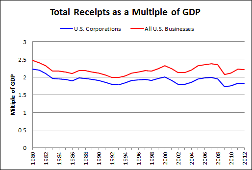
So anyway, I took "total receipts" for the two forms of business and put them together on a graph:

Graph #1
For corporations the 1980-2012 average is 1.9 times the size of GDP. For all businesses the average is 2.2 times GDP.


// The Excel file

Friday, October 14, 2016

Something I did not know


Stable at 90% thru 1995. Decline thereafter.

Something in the tax code?

Thursday, October 13, 2016

Getting corporate tax data is like pulling teeth

Notes to self

Google tax deductions of corporations historical data

Click SOI Tax Stats - Corporation Tax Statistics - IRS.gov

Click Integrated Business Data

Click the link for Table 1 because it shows the most years. Clicking this link lets you open or save the XLS file.

Note, at irs.gov the color of the link text is the same whether you've visited the link or not. Just makes it a little extra difficult to see how you got to where you got to.

//

The file I got is called 12otidb1.xls. One worksheet for the years 1980-2012, annual data. Just now I'm interested in the total receipts of corporations.

Note that some of the cells contain formulas. If you copy part of the sheet to work on, make sure you copy all of the necessary cells.

Wednesday, October 12, 2016

I finally figured out how to show Quarterly and Monthly Data on the Same Excel Chart


Quarterly Data from FRED. Monthly Data from Macroeconomic Advisers

Make it a scatter plot, not a line chart.

Tuesday, October 11, 2016

Mian and Sufi


From How high debt leads to income inequality (an excerpt from Atif Mian and Amir Sufi's book on the Great Recession):

The fundamental feature of debt is that the borrower must bear the first losses associated with a decline in asset prices. For example, if a homeowner buys a home worth $100,000 using an $80,000 mortgage, then the homeowner’s equity in the home is $20,000. If house prices drop 20%, the homeowner loses $20,000—his full investment—while the mortgage lender escapes unscathed.

The homeowner loses his full investment, while the lender escapes unscathed.

The irony is that it's the growing accumulation of debt that drives home and asset prices up, and later drives them down. Don't lose sight of that.

Monday, October 10, 2016

Spurious correlation in Robert Lucas's "Prize lecture"


By chance the other day I came across Spurious correlation at the FRED Blog. They write:

Relationships between macroeconomic time series are not usually straightforward enough to establish with a simple graph. The problem is that almost all time series tend to grow in the long term as an economy grows... Because time series can exhibit a common trend, it becomes difficult to interpret whether there is a relationship between them beyond that common trend. We call this spurious correlation.

By chance just now I came across an old one of mine containing an excerpt from Robert Lucas's Nobel Prize lecture. This excerpt:

Figure 1, taken from McCandless and Weber (1995), plots 30 year (1960-1990) average annual inflation rates against average annual growth rates of M2 over the same 30 year period, for a total of 110 countries. One can see that the points lie roughly on the 45-degree line, as predicted by the quantity theory. The simple correlation between inflation and money growth is .95.

For Robert Lucas, 110 spurious correlations on one graph is good evidence.

Sunday, October 9, 2016

Creatures of habit


I do a lot just by habit: getting dressed in the morning, brushing my teeth, even sitting down at the computer. Habit is more effective than memory when you have a memory like mine.

//

At my old job, before I retired, we did a lot out of habit. Whenever we got a new project to work on, the first question was always "What similar project did we do before?" We relied on previous projects to answer "How did we solve that problem?" questions for new projects.

It was a so-so technique. It did answer a lot of questions, but making improvements was almost impossible.

//

Sometimes I wonder if the Federal Reserve makes decisions out of habit. When a problem arises do they ask "How did we solve that problem before"? It sure looks that way: Need to promote growth? Lower interest rates. Need to fight inflation? Raise interest rates. Need to promote growth? What'd we do last time? Lower interest rates. Already at the zero bound? Lower rates anyway, even if you have to go negative.

They don't go negative on the idea of lowering interest rates, no no. They make the interest rate negative, because habit tells them they must. No matter that interest rates don't go negative. Habit wins the contest. They're not going to change their method. They do what habit tells them.

Over at the legislative branch, they do things out of habit too. Everything they do is designed to boost growth. There is some disagreement about the right way to boost growth, yes, but the goal is always to boost growth. They never have to stop and think about that. And when confronted with inflation, their habit is to turn to the Fed.

//

I showed this graph before:

Graph #1: Growth Rate of the Monetary Base
See the two red circled areas? The one is just before the Great Depression. The other is just before the Great Recession. Lightning never strikes twice, right?

What problem could they possibly have been solving when they looked back at the Roaring '20s and let the same thing happen again in the first decade of this century?

//

Now look just to the right of those red highlights. See the big spikes? Short, fat ones after the first red circle. Tall, skinny ones after the second. Spikes both times.

We know what problems they were trying to solve with the big spikes. They were trying to solve the problems they created by letting base growth fall for a decade. Twice.

//

That's an old graph, #1. Doesn't show what happens after the big spikes. Last time yes, base growth went down below zero and created the 1948 recession. This time... Well, here's the new graph:

Graph #2: Growth Rate of the Monetary Base
This time, after the big spikes, base growth went down below zero again. It looks like they are trying to create another recession.

Saturday, October 8, 2016

Where do we stand with RGDP?


2 October 3:29 am, downloading the MacroAdvisers' monthly GDP dataset. Data now thru July 2016. Last I looked was thru May. Where do we stand now?

Graph #1
The blue is the monthly data. The red is the Hodrick-Prescott. As you can see, in 2014 and 2015 the blue was mostly above the red, pulling it up; and in 2016 the blue has been mostly below the red, pulling it down.

The red line on Graph #1 uses a large "smoothing constant", so the line is smoothed a lot. Not only does the smoothing temper the jiggies of the past few years; it also takes out most of the Great Recession and much of the initial recovery. The H-P calculation for this graph does too much smoothing to suit me.

The value 14400 is a "standard" smoothing constant for monthly data. (I got it from trubador at the E-Views Forum.) I use it as a starting point, but it doesn't always give me the smoothing I want for a particular graph.

The standard for quarterly data is 1600; the smaller number provides less smoothing:

Graph #2
In Graph #2 the red line follows the general path of the blue somewhat better than #1. Unfortunately, the downtrend of recent months is worse looks worse. In Graph #1, the blue jiggies vary over a red trend line that is nearly flat. In #2, the trend line takes more slope from the jiggies. If it was an up-slope we'd be ecstatic. But it's a down-slope, and it is discouraging.

Blithely moving on, then, let's add some more jigginess to the trend. This time I'll use the constant that's a standard for annual data:

Graph #3
Now the red line follows the blue into the depth of the Great Recession and the peak of the initial recovery. And throughout the graph the red line shows what appears to be a good centerline, the central path for the blue. If we were looking at 50 years of data this graph might have too much jigginess in the red line. But we're looking at only a few years. The red line provides useful information.

Unfortunately, the trend is still definitely down since 2015. But I think I see the down-trend slowing in #3, where it was picking up speed in #2.

Over the last six months or so, the blue line shows a pretty well-formed "W" shape. The trend of the "W" would certainly be flat. It would be low (lower than the red for most of the last several years) but more flat. Not so much downhill. That's a plus.

For what it's worth, there is more hope of economic improvement in Graph #3 than in #1 or #2. But you know, the blue line is the same for all three graphs. It displays the source data that is used by all of the red lines. So you can pick whichever trend you prefer, and tell whatever story you want about the future, but it is only a story. And it won't be the story that the source numbers tell.

The source numbers don't tell us about the future. They only tell us about the past. Our fascinations lead us to tell stories about the future. Our attitudes color those stories.

If I reduce the smoothing still further, I can show you the red line flattening out in the last few months:

Graph #4
Now you could draw a flat line, extending the red line out to the right. Or, for that matter, you could extend the red line by continuing the curve upward, similar to what happened after the mid-2011 low and the early 2013 low.

You could even make the red line curve down more, I suppose. It's mostly attitude.


There is a subset of people who happen to think that what happens in the economy depends on what happens with money. I'm in that group, for sure. A subset of that subset thinks that what happens with money depends on what happens with base money. At the Federal Reserve, it's their job to be in that group.

It's easy enough to add base money to the graph we've been looking at. So that's what I did. Base money in black:

Graph #5
RGDP growth, red or blue, is mostly in the neighborhood of 2%. Base money growth, black, is mostly in the neighborhood of 20% (on the right-hand scale). Base goes high around the Great Recession (near 100%) and RGDP goes low.

I'm going to say that the ups and downs of the black line on Graph #5 have something to do with the policy called Quantitative Easing. I want to test for a relation between those ups and downs and the growth of RGDP.

On #5, RGDP (look at the red line) bottoms out in early 2009, just as base money growth (black) is peaking. The red line bottoms out again in mid 2011. Again the black line peaks at the same time.

The red line bottoms out for the third time in early 2013. This time the black peak comes later, in late 2013. Looks like it tried to peak when the red line was bottoming out, but events must have required additional quantitative boost from the Fed.

After that third and final peak in the black line, base money growth tapers off.

The path of the black line shows the Quantitative Easing policy being applied in response to economic conditions. This is the reason the peaks in the black align so well with lows in the red.

So much for policy's response to the economy.


What about the economy's response to the policy? To see that, we have to lag the black line, the policy line. If I lag it 15 months, the red and black peak together:

Graph #6
I like to think this shows that it took the economy 15 months to respond to the Fed's first quantitative easing.

But if you look at the second black peak on #6, the 15-month lag is too much. The graph shows the black line peaking after the red. When I reduce the lag to eight months, these two peaks align:

Graph #7
I like to think that the economy took 15 months to respond to the first black peak, but only 8 months to respond to the second. The second lag was only half as long. This would mean that the "metabolism" of the economy was picking up and the economy was improving. If I was the Fed, I would have said QE is working.

Look at the low point before the second black peak. It lines up well with the low in the red line. So the same 8-month lag applies at that low as at the second peak -- and presumably during the rise to the second peak as well.

But now look at the decline from the second peak. The black line appears to bottom out a couple months before the red. This suggests that the economy's "metabolism" had slowed again. That is plausible, as the decline of the red is itself an indication of slowing.

Perhaps that unexpected reversal is responsible for the wiggle of the black line visible in the early months of 2014 on #7. It looks as if the Fed had already decided to bring the increase to a peak in those early months, but suddenly the Fed changed its mind and pushed the black line up again, to a higher peak.

The same wiggle appears in the same place, on the red line. But it look longer for that wiggle to play out in red. Again, this indicates a growing lag.

Of course, the black line on Graph #7 is shown with an eight-month lag. So those early-2014 wiggles actually occurred about 8 months apart.

The third and final peak in the black line comes well before the third red peak on #7. The alignment is better with a 15-month lag, as shown on Graph #6.

The longer lag implies a slowing economy.

This brings us to the final down-slopes shown on the graph: It looks like the downtrend in RGDP growth has been encouraged by the downtrend in base money growth. Let's look at that.


After the third and final peak, the black line trends down. The red does the same. After the red line ends, the black line continues downward to the end. The lagged data lets us imagine the future of RGDP:

Graph #8: The same data as Graph #6. Our window on it is different.
If the downtrend in RGDP growth is related to the downtrend in base money growth, then we should expect RGDP growth to trend downward for another 15 months. That can't be good.

// The Excel file. This file contains VBA code.

Friday, October 7, 2016

The relation between money and economic activity changed in the mid-1980s


From the opening paragraph of Monetary Cycles, Financial Cycles, and the Business Cycle, a New York Fed Staff Report by Tobias Adrian, Arturo Estrella, and Hyun Song Shin:
A traditional view in monetary economics is that interest rates are transmitted via the money demand function, and that the level of interest rates affects real consumption and investment. However, beginning in the mid-1980s, the relationship between money and economic activity became highly unstable as rapid changes in the financial system started to change the nature and composition of monetary aggregates.

The relation between money and economic activity changed in the mid-1980s.

The authors continue:
As a result, theories of monetary transmission that explicitly include quantities have lost prominence. Instead, attention has turned to expectations-based channels of monetary policy, which emphasize the expectations theory of the yield curve and the role of expected future short term interest rates in determining the long-term interest rate.

In this paper, we re-examine the transmission of monetary policy to the real economy ...

And that's as much as I read of that.

The relation between money and economic activity changed. "As a result," they say, the quantity theory has lost prominence and expectations have gained in importance. In the paper, the authors focus on the changed relation.

I have to go to their conclusion to make sure I know what they are talking about. Here's their last sentence:
Liquidity matters---but, in our framework---liquidity should be defined as the growth rate of assets on key intermediary balance sheets, not the quantity of money.

After the change, they say, the quantity of money still matters; but the money itself is different.


What do I say all the time? We use credit for money. In the good old days we used money for money, but now we use credit for money.

I ran into Positive Money the other day describing the UK economy:

97% of the money in the economy today is created by banks, whilst just 3% is created by the government.

Government money is money. Bank money is credit.

It's a simplification, but imagine that government money has no interest cost and bank money has a 5% interest cost. In an economy with 100% government money we start with zero interest cost. In an economy with 100% bank money we start with an interest cost equal to 5% of the quantity of money.

As time goes by, money goes into savings and money goes out of the economy. The money gradually disappears, but the debt still exists. The economy needs more money. People need more money, and borrow more. And then there is more debt than money.

Time goes by for 30 years or so, and then there is a lot more debt than money. Eventually, this changes the economy -- as the paper describes. Time goes by for another 30 years or so, and people can no longer afford the debt. And then you have a crisis.


What's wrong with that New York Fed paper? What's wrong is that the relation between money and economic activity changed in the mid-80s, and the authors don't consider that to be the problem.

Thursday, October 6, 2016

Exactly


Hussman quotes Mises:
"The fact that each crisis, with its unpleasant consequences, is followed once more by a new ‘boom,’ which must eventually expend itself as another crisis, is due only to the circumstances that the ideology which dominates all influential groups - political economists, politicians, statesmen, the press and the business world - not only sanctions, but also demands, the expansion of circulation credit."

"... not only sanctions, but also demands, the expansion of circulation credit"

Wednesday, October 5, 2016

What's wrong with the new Richard Vague article


Not much is wrong with it. Vague's The Private Debt Crisis is very good. But I do have a few remarks. Richard Vague writes:

Both private debt and government debt matter, and both will be discussed here, but of these two, it is private debt that has the larger and more direct impact on economic outcomes, and addressing the issues associated with private debt is the more productive path to economic revival.

Exactly.

I get complaints from tards sometimes when I look at Federal debt. Yet as Richard Vague says: "Both private debt and government debt matter". He adds: "it is private debt that has the larger and more direct impact". Yup.

When too high, private debt becomes a drag on economic growth.

Yup. He explains it well, too. Except he says

... consumers are in fact carrying 13 percent more debt as a percent of GDP than they were in 2000, the moment before the ill-fated private debt boom that led to the 2008 crisis ...

I'm a little uncomfortable with this sentence because it suggests that the increase of debt-to-GDP is a problem, period. Me, I don't know that it's a problem if the increase is gradual. I think it is, but I can't prove it to my own satisfaction.

I've looked at this before:

Graph #1: Private Debt as a Percent of GDP
I draw a trend line. Richard Vague draws a horizontal at the current level. I'm not sure my trend line has merit, but I'm sure his horizontal has none.

In that vein, his Chart 3 shows private debt to GDP for the six nations that "have accounted for roughly 50 percent or more of global GDP since the Industrial Revolution." The chart goes back to 1740.

The lines go up. As Vague puts it, "the general trend is toward higher levels of debt." He presents the chart as evidence of "the path from low leverage to overleverage". And that's what I think it is, too. But I can't accept the argument Richard Vague makes, that it's a problem. For as he points out,

The benefit of increasing leverage from low levels has played a central role in the miraculous gains in incomes over the 200-plus years since the Industrial Revolution.

What looks to us like "low levels" of leverage looked like high levels to people at the time. See the problem?


Something else: "Overcapacity".

As mentioned, short bursts of runaway growth in private debt have often led to crisis—the United States in 2008 and Japan in 1991 to name just two. That is because so much lending occurs that it results in overcapacity: Far too much of something is built or produced—housing and office buildings are two examples—and too many bad loans are made.

I'm not at all comfortable with that statement.

The goal is not just to tell a story that makes sense. The goal is to understand the economy. It is too easy in economic studies to come up with a story that sounds good, and build on it. Decades later, the story that was assumed to be correct turns out to be wrong -- but it has become part of the foundation supporting forty years' work, and no one is willing to dismantle enough of that work to remove the few bad bits.

Even if people were willing, and even if the mistake did get fixed, we're dealing with the mindset of a generation here. More than a generation. All those people would have to change their minds, and that's never going to happen. Science advances one funeral at a time.

That's where econ is today, by the way. I want no part in repeating such an error.

Anyway, 60 to 70 percent of assets are financial assets, as opposed to productive assets. Two thirds of our assets produce nothing but income. They don't contribute to "capacity". They contribute only to the cost of the output produced by non-financial assets.

Richard Vague says we end up in crisis "because so much lending occurs that it results in overcapacity ... and too many bad loans are made." It's a great story. But the problem is not that the lending creates overcapacity. The problem is that the lending creates debt.

When you get "too many loans" (too much debt, really) you get too much financial cost for the non-financial sector to bear. That's how "bad loans" arise. The non-financial sector starts defaulting, and the financial sector starts to worry. And when the financial sector starts to worry, the economy is in trouble.

Overcapacity? The borrowed money had to go somewhere! Besides, if finance wasn't worried today, they'd still be lending and we'd still be adding to capacity (so to speak) and we wouldn't be calling it "overcapacity".

I think Vague's argument here is just wrong.


Richard Vague repeats his "overcapacity" story in regard to China:

In its rush to grow, China has simply built far too many buildings—witness the many ghost towns—and produced far too much steel, iron, and other commodities—and made far too many bad loans in the process. Its overcapacity is so pronounced that it will take years for true demand to catch up with this oversupply.

No. If less income was taken by the financial sector, the productive sector could afford to put those buildings to use, and to put the steel and iron and other commodities to use, and the loans would not have gone bad.

Loans go bad because finance is drawing too much profit from the productive sector. The productive sector withers for decades, until the feedback effect makes the financial sector start to go sour. Then everything fails at once.

That's my story, and I'm sticking to it.

Tuesday, October 4, 2016

The Great Moderation


The more a man is imbued with the ordered regularity of all events the firmer becomes his conviction that there is no room left by the side of this ordered regularity for causes of a different nature.

Monday, October 3, 2016

Some gossip about David Ricardo


From Crisis Chronicles: The Crisis of 1816, the Year without a Summer, and Sunspot Equilibria at Liberty Street Economics, by Jim Narron and Don Morgan:
1816: The Year without a Summer
The financial and economic difficulties associated with the end of the Napoleonic wars were exacerbated by extremely cold, dark weather across northern Europe and the northeastern United States in 1816. The poor weather was caused by the eruption in the Dutch East Indies (Indonesia) of Mount Tambora, which spewed smoke and ash into the atmosphere, obscuring the sun. So severe was the weather that snow was recorded in Albany, New York, and in cities in northern Europe—in July. The cold and dark caused widespread crop failures and severe famine across the Northern Hemisphere, and 1816 became known as the “Year without a Summer” and the “Poverty Year.” People were observed eating “bread” of sawdust and straw. Lord Byron commemorated the calamity with a poem, “Darkness.”

     The famine caused many German and Swiss residents to flee certain starvation by traveling to Russia and the Americas, while Italians flocked to the cities. Hundreds of thousands died from the combined effects of typhus, exposure, and starvation. Food prices increased dramatically by 1817 and this led to one of the first direct public interventions in failed markets, as local governments coordinated food imports to feed the starving. However, not all were in favor of public aid. British political economist David Ricardo argued that funds raised for employing destitute people were wastefully diverted from “other productive employment.”

Sunday, October 2, 2016

I'll take it in cash, please


I have my problems[1][2][3] with Scott Sumner. But at least he has an idea, what I would call an original idea (though I don't really know enough to say) and he keeps pushing that idea and testing it.

More pushing than testing; that's one of the problems I have with him. But anyway, this one I like: Got a blister on your pinky? Let’s amputate your right arm.
There is a rising chorus in the economics community calling for the abolition of cash. The argument is that cash is the cause of the zero bound problem—the fact that nominal interest rates cannot be cut (very far) below zero. And, so it is claimed, this causes weak growth in aggregate demand.

Actually, the severe recession of 2008 had nothing to do with the zero bound, as interest rates were still above zero. It was caused by tight money.

If you have the economic analysis wrong and you run with it, your conclusions are very likely to be wrong as well. And you see it often: the focus on the zero-bound problem. Once you decide that the zero-bound problem is the problem, everything that comes after is related to solving the zero-bound problem. But as Scott says, the 2008 recession "had nothing to do with the zero bound". Rates went to zero in response to the recession.

Deciding that we should eliminate cash is a bizarrely wrong conclusion to a very bad analysis of the state of the economy.

Saturday, October 1, 2016

Thomas Palley on NIRP


From Why ZLB Economics and Negative Interest Rate Policy (NIRP) are Wrong: A Theoretical Critique
NIRP draws on fallacious pre-Keynesian economic logic that asserts interest rate adjustment can ensure full employment. That pre-Keynesian logic has been augmented by ZLB economics which claims times of severe demand shortage may require negative interest rates, which policy must deliver since the market cannot... Worst of all, NIRP maintains and encourages the flawed model of growth, based on debt and asset price inflation, which has already done such harm.