Saturday, July 10, 2010
 Two from My Budget 360
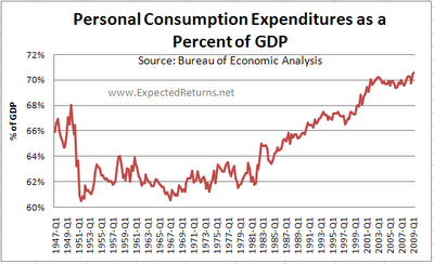
I want to point out that this graph, from the post American middle class slowly disappearing under mounds of debt...
I want to point out that if you follow along the 62% line, it looks like Personal Consumption Expenditures are stable at that level from around 1950 until 1979 or 1981 or so. And that the dramatic rise probably starts then, not around 1967 as it may appear at first. And the increase is steep when you see it starting around 1980, much steeper than it appears if you think the increase started back in '67.
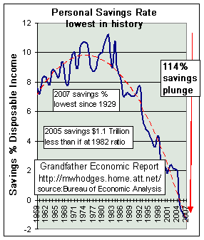
And I want to point out that this graph -- Grandfather Hodges' graph, also from the My Budget 360 post -- shows pretty much the same turning point, around 1979 or 1981. The dotted red line on the graph (not my red line, this time!) has the peak a little earlier, mid-1970s or so. But that's too early, I think.
To see this trend-line work backwards. Start on the right, with the newest numbers, and picture a straight line up to the high point right around 1983. That's the kink. From there, go left to the early years of the graph with another straight line that goes down below the "8" there.
Both graphs show a turning point around 1980.
Just two more graphs that display the Keynes/ Reagan Shift.
Labels:
The K-R Shift
Subscribe to:
Post Comments (Atom)


No comments:
Post a Comment