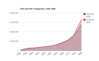
I got some satisfaction from yesterday's comparison of GDP and GHP. My GHP, Gross Hypothetical Product, looks to be very close to GDP for the period 1955-1973. Which it must be if my arithmetic is good, for the GHP trend is based on those years.
But here's a view of the period on which the trend is based:
I checked the numbers in the spreadsheet. In every case for the 1955-1973 period, every GHP value is less than the corresponding GDP value. I think that's wrong. I think the GHP trend should be centered on the GDP numbers. That how the R-squared gets minimized. As I said in the first of this series,
The two lines cross each other repeatedly, as though the exponential is centered on the actuals.
That's what I'm expecting to see in numbers based on the exponential calculation. But in today's graph, the lines don't cross.
Here -- here's the first graph from that earlier post:
 |
| GROSS FEDERAL DEBT AS A PERCENT OF GDP and EXPONENTIAL DECLINE |
You can see that the red and blue lines appear to be intertwined, in that 1955-1973 range. Now I'm thinkin maybe that's an optical illusion? But it's not:
This close-up shows clearly that the lines cross repeatedly.
I must have got something wrong in the other calculations somewhere. I'll get back to ya if and when I find it. Otherwise, I have to set this topic aside.


No comments:
Post a Comment