Suppose we look at the part of the Federal debt that is counted in Total Credit Market Debt Owed...
 |
| Graph #1: The Federal component of TCMDO |
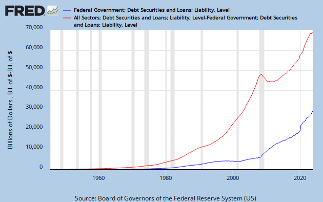
Yup, goes up. It's not the big one, though. Here's how that Federal debt -- the blue line -- compares to everybody else's debt...
 |
| Graph #2: The Federal component, and the rest of TCMDO |
The red line, private debt, our debt makes public debt look small by comparison.
I'm not saying the Federal debt is small. I'm saying private debt is really big.
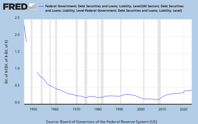
But Graph #2 does not show us much, apart from raw numbers. I want to compare the two debts mathematically. Simple division. The Federal debt divided by the rest of the debt. I want to see what happened.
 |
| Graph #3: The Federal component divided by the rest of TCMDO |
Graph #3 compares the Federal debt to Private debt. It shows the blue line from Graph #2, divided by the red line from Graph #2.
Basically, the Federal debt does not look any bigger now than it was in 1970, when you compare it to everybody else's debt. But of course the Federal debt is bigger now. That's the point.
Everybody's debt is bigger now.

1 comment:
Does size matter? Most women say no. That is all.
Post a Comment