At Interfluidity an older post, from January of this year: Inequality and demand. Steve Randy Waldman quotes from Paul Krugman's Inequality and Recovery and opens the "haranguing" with these thoughts:
Let’s start with the obvious. The claim that income inequality unconditionally leads to underconsumption is untrue. In the US we’ve seen inequality accelerate since the 1980s, and until 2007 we had robust demand, decent growth, and as Krugman points out, no evidence of oversaving in aggregate. Au contraire, even.
Waldman contradicts Krugman, provides links showing "evidence of oversaving in aggregate", and asks
how do we reconcile the high savings rates of the rich with the US experience of both rising inequality and strong demand over the “Great Moderation”?
Debt is how we reconcile those things, he says. Those at the less fortunate end of the inequality scale made up for their shortfall of income by borrowing more. Waldman presents a graph in evidence of this.
Then his post takes an interesting turn. He writes:
Rather than arguing over the (clearly false) claim that income inequality is always inconsistent with adequate demand, let’s consider the conditions under which inequality is compatible with adequate demand. Are those conditions sustainable? Are they desirable?
Long story short, he points out the conflict between the economy's need for more lending and the "microeconomic evaluations of solvency" that might limit the lending, limit the demand, and limit the growth. His conclusion includes this thought:
If we had any sense at all, we’d relieve our harried bankers (the poor dears!) of contradictory imperatives to both support overall demand and extend credit wisely.

All well and good. I liked the post. I liked the graphs. I liked the perspective. I liked all of it. I have just one problem. It's a small problem. I don't think it affects Waldman's argument. It's just a detail. So, why do I bring it up? What does it matter anyway? I'll get to that.
Waldman writes:
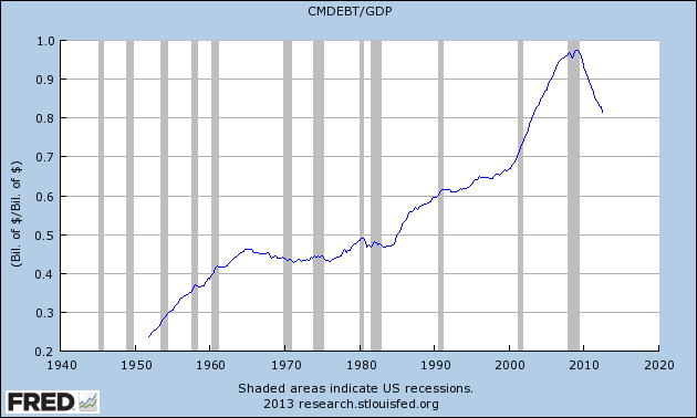
I would pair Krugman’s chart with the following graph, which shows household borrowing as a fraction of GDP:
Household borrowing represents, in a very direct sense, a redistribution of purchasing power from savers to borrowers. So if we worry that oversaving by the rich may lead to an insufficiency of purchases, household borrowing is a natural place to look for a remedy. Sure enough, we find that beginning in the early 1980s, household borrowing began a secular rise that continued until the financial crisis.
 |
| Includes both consumer and mortgage debt, see “credit market instruments” in Table L.100 of the Fed’s Flow of Funds release |
My problem is that Waldman shows a graph of debt and says it shows borrowing. Debt and borrowing are not the same thing. Debt is a stock; borrowing is a flow. Debt is the accumulation of borrowings. Reminds me of what STF succinctly noted at Winterspeak some time back:
Saving = flow
Savings = stock
Here's the thing: Waldman glances at the graph and says, "beginning in the early 1980s, household borrowing began a secular rise that continued until the financial crisis."
Easy to see it on the graph, isn't it? But it is an illusion.
The graph shows debt, not borrowing. And ending in the early 1980s was a Great Inflation that whittled debt down by whittling down the dollar, boosting income and inflating GDP. Waldman's graph shows an increase in debt that begins after the early 1980s when inflation was suppressed, because inflation was suppressed, because the denominator of Waldman's CMDEBT/GDP ratio stopped increasing at such a highly inflated rate.
Look at the change in debt -- annual additions to the accumulation -- and you'll see a different picture than Waldman shows:
.png) |
| Graph #2: Quarterly Change in Debt (same debt as Waldman shows) in Billions |
Moreover, the secular increase in borrowing does not begin in the 1980s. It begins in the late 1970s... or the early 1970s... or the late 1960s... or the early 1960s, maybe. The secular increase goes back as far as the eye can see. The increase is much more "secular" than Waldman indicates. Much longer-lasting that since the '80s implies.
Another look:
.png) |
| Graph #3: Percent Change from Year Ago (same debt as Waldman shows) |
Oh, sure: You can attribute those rising peaks of the 1970s to inflation. People had to borrow more because prices were going up, sure. But also, prices going up (or, more precisely, incomes going up) made all the previously existing debt easier to bear. And that happened year after year after year while the Great Inflation persisted.
Inflation made the debt easier to bear. Inflation reduced the size of existing debt relative to GDP. Because of inflation, the GDP number went up about as fast as the debt number went up. It was this increase in GDP due to inflation that made accumulated debt run flat on Waldman's graph. But only until the end of the Great Inflation. Only until the early 1980s. Beginning in the mid 1980s, falling inflation created what looks like of a sudden surge in the growth of debt on his graph. It was not a surge of debt.
On Graph #3 you can see a pretty substantial increase of debt in the 1980s, an increase comparable to that of the latter 1970s. Only the 1980s increase is visible on Waldman's graph. But clearly, the two spikes are near the same size. Clearly, borrowing rose about as fast in the latter 1970s as in the 1980s. Clearly, the secular increase in household borrowing began before the 1980s.
One more graph: Graph #4 shows the same debt as Waldman's graph, but with a different denominator, a different measure of income.
| Graph #4: New borrowing always occurs in dollars of the current moment. But once you take out a loan, you have a debt that is stated in the dollars of that fleeting moment. After that moment, any and all inflation reduces the burden of the existing debt. |
Waldman's graph shows the burden of accumulated debt reduced by inflation, like the blue line on Graph #4. The red line on Graph #4 shows the same accumulation, adjusted to eliminate the effects of inflation.
On Waldman's, the trend is flat in the 1970s, because existing debt was eroded by inflation. On mine, the trend of the red line is steeply upward in the 1970s, because new borrowing increased at a rapid pace.
When Steve Randy Waldman shows you a graph of debt and identifies it as a graph of "borrowing" he is in error. And when he says a secular increase in borrowing began in the early 1980s, he is seriously mistaken.
I said at the top that I like Waldman's argument and that, in the context of the Interfluidity post, the errors are minor. Now, having worked through things, I'm not so sure the argument is good. Waldman says two things:
- "In the US we’ve seen inequality accelerate since the 1980s..."
- "beginning in the early 1980s, household borrowing began a secular rise..."
Put the two together, and it sounds like they're related. Actually, that is the argument Waldman makes in the post: those of us at the short end of the income inequality scale made up for a shortfall of income by increasing our borrowing. Despite my objections to the post, Waldman's argument makes sense to me. Still makes sense to me.
But there must be something else going on. For it is not true that household borrowing began a secular rise in the early 1980s. That increase began much earlier. So there was no sudden offset to compensate for the changing inequality. Something else must have made up the difference.
Perhaps it is as simple as a slowdown of GDP growth. Growth has been slower since the early 1980s, and slower yet in the new millennium. Growing inequality, insufficiently offset by increases in new borrowing, might have caused this slower growth.
Thus we may enhance Waldman's argument. It feels right to me. Certainly, I was uncomfortable with Waldman's set-the-stage claims that "until 2007 we had robust demand [and] decent growth" and again, that "demand remained strong" in those years.
// Tomorrow: What does it matter anyway?
// For more on Graph #4 see this post.

6 comments:
hi,
lots of good points here, and you are right, the CMDEBT/GDP graph is insufficient to tell much of the story (as is the net savings rate graph Krugman musters).
among the many problems that you point to, a huge problem (with both graphs) is the hazard of trying to tease distributional answers out of aggregate data. it would be perfectly possible, for example, for the broad story to be true -- poorer households must increasingly borrow to maintain aggregate consumption -- and yet for aggregate borrowings to decline over the period. suppose that wealthy boomers pay down high-value mortgages faster than poor households ramp-up borrowing? we don't, of course, observe a decline in CMDEBT, and if we did we might have a hard time reconciling this story with low aggregate savings rates. things are not simple. but ultimately what is required is some measure of borrowing that distinguishes the behavior of wealthier from poorer households, data that directly addresses distributional questions.
if you have not, do check out the follow-up which highlights some of the very little research i've been able to find on the question:
http://www.interfluidity.com/v2/3972.html
thanks as always for your careful parse.
Thanks Steve. My most important Q4U is: how did you add the black (Effective household debt interest rate) line to the FRED graph? I would have to eyeball it in, using Paint or a similar graphics program.
Yes, I was disappointed in my ability to find "distributional" data. Glad it's not just me.
I am not so far along with my economics that I think in terms like "the question of why individuals would undermine their own solvency in ways that sustain aggregate spending". I focus more on why policymakers let it happen, and, more than that, on which monetary balances are problematic.
Waldman was quoted as saying:
"Household borrowing represents, in a very direct sense, a redistribution of purchasing power from savers to borrowers."
Yeah sure, if you believe in fairy tales.
Borrowing expands purchasing and saving reduces purchasing. If the two happen to be equal at some point in time that might lead one to a superstitious belief that there is some connection between the borrowing and the saving.
But in the long run there is no evidence to support that belief. Borrowing and saving are almost never equal. When one is up the other is often down. That is what creates the credit cycles that drive economic booms and busts.
Also, all income levels live in households. If you have no information on the wealth/income demographics of household borrowing how can jump to any conclusions about what household credit expansion (or contraction) of household borrowing means in regard to wealth and income distribution? If you include all debt (financial, corporate and small business) and apportion the debt to the household who own those entities, there is no contest - The vast majority of debt is attached to the wealthy.
Art I think that you are correct to assume something else is going on.
Haha, thanks Jim.
I should say, however, that I removed a footnote mark from the quote you point out. The text was like this:
Household borrowing represents, in a very direct sense, a redistribution of purchasing power from savers to borrowers. [1]
and the footnote reads:
[1] Readers might object, reasonably, that since the banking system can create purchasing power ex nihilo, it’s misleading to include the clause “from savers”. But if we posit a regulatory apparatus that prevents the economy from “overheating”, that sets a cap on effective demand in obeisance of some inflation or nominal income target, then the purchasing power made available to borrowers is indirectly transferred from savers. The banking system would not have created new purchasing power for borrowers had savers not saved.
I can't evaluate that, Jim, but I bet you can!
hi,
i added the line as you would, graphically in photoshop, but taking some care to match the scales and not distort the curve.
"Transferred from savers" to borrowers doesn't explain much.
It means either the amount would remain the same and never change,
or
it makes it sound like savers create the money that borrowers borrow
when in fact
Borrowers create the money that savers save.
Post a Comment