Jim's graph, here,
 |
| Jim says, "M1 Velocity trends downward after its peak in 1981 if you use M1 adjusted for sweeps as the money stock." |
FRED has that name wrong. The "adjustment" (which begins in 1994) was a change in the definition of M1 money. FRED's version of M1 Velocity (shown on my graph yesterday) is based on the measure of M1 that is defined differently before and after 1994. Jim's version of M1 Velocity uses a definition of M1 that is the same before and after the 1994 date. It's FRED that's using "adjusted" numbers, FRED and me. (For more on this, see mine of 14 November.) Jim's graph is conceptually better than the graph I showed yesterday. But it is also satisfying.
Satisfying, because Jim's red line trends downward from the 1981 peak, same as the green line does. That just makes sense. What I said yesterday wasn't wrong; the different lines measure different quantities of money. What I said wasn't wrong, but it wasn't satisfying.
Thank you, Jim.

I changed all the data series to "annual" on Jim's graph at FRED, and downloaded the data.
I went to my old Google Drive files, dug up M1 and M2 (annual) from the Historical Statistics (Bicentennial Edition, series X414 and X415) and Nominal GDP (annual) from MeasuringWorth (Samuel H. Williamson, 'What Was the U.S. GDP Then?', August 2013). Using these series I calculated M1 Velocity and M2 Velocity for the 1915-1970 period.
Chronologically by start date we have six different datasets:
| Line | Dates | Measure | Source |
|---|---|---|---|
| BLUE | 1870-1966 | "MONEY" | FRED |
| RED | 1915-1970 | M1 | HS70 |
| GOLD | 1915-1970 | M2 | HS70 |
| GREEN | 1959-2013 | M2 | FRED |
| PURPLE | 1959-2013 | MZM | FRED |
| BROWN | 1967-2013 | M1ADJ | FRED |
Table Style by TextFixer.com
I put it all together on one graph:
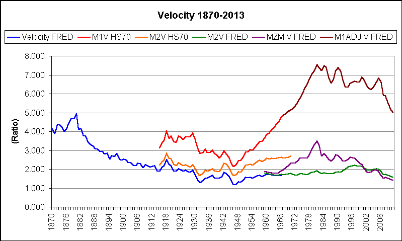 |
| Graph #2, Velocity: Data Revision and Clear Trends |
To my eye the gold and blue are very similar, as if the blue line was produced in part by revising the gold line. Could be. Data for the gold line is from the Historical Statistics published in 1975. Date for the blue line is from FRED and was last updated in 2012, some 46 years after the last data item in that series.
So anyway, what I'm looking at now is a repeating peak-and-decline, with peaks in 1880 and 1981. Not exactly a hundred-year cycle, but not far off.
// Source File: Velocity 1870-2013.xls at Google Drive.
// See also my Another one from Glasner's About page

2 comments:
The reason that FRED changed the way M1 was calculated was because starting around 1980 there was an increasing amount of bank savings that was being included in M1. This made it appear that velocity of M1 was trending down when in fact it seemed like it should be going up. That is to say the change was made in response to the question "Does it really make sense to include the money we don't spend when we're figuring how often the average dollar is spent?"
FRED considers M1 a better measure of the money used for payments than M1adj.
If you want a better measure of velocity it could be a ratio of Output to required reserves. The purpose of required reserves is to ensure that the payment system works and is safe and sound. Required reserves are calculated as a fraction of the money used for payments (i.e. 10% of net transaction accounts).
Looking at a graph of GDP/Required-Reserves you can see that velocity was increasing at about the same exponential rate as output up until the end of 2008 (assuming that required reserves is an accurate stand-in for money stock used for payments).
Here is the graph of GDP to Required Reserves
http://research.stlouisfed.org/fred2/graph/?g=UsS
Post a Comment