According to the Notes tab of FRED's MZMSL money page, the difference between M2 money and MZM money is that if you start with M2, subtract out small denomination time deposits, and add in institutional money funds, you get MZM money.
According to the Notes tab of FRED's M2SL page, M2 money includes M1 money and some measures of saving.
According to the Notes tab of FRED's M1SL page, "M1 includes funds that are readily accessible for spending."
If I start with M2 money and subtract out M1, then add in institutional money funds, I'll have a measure of accumulated savings.
 |
| Graph #1: A Measure of Savings |
The M1 and M2 numbers go back to 1959 at FRED, but the Institutional Money Funds number goes back only to 1974. When I add the Institutional to the others, everything gets chopped off at 1974. On the assumption that before 1974 the Institutional number was a legitimate zero (and not simply an unknown) I could extend the data back in time in an Excel graph. If it irritates me enough, I will.
Based on Sumner #31387 that I've been looking at lately, the big chunk of M1 money that is currency really ought to be subtracted from M1 and added to savings as well. "I can assure you that the vast majority of currency is held for saving purposes, not transactions", Sumner says. I might experiment with that change at some point, but not today. Meanwhile, my "savings" number is a conservative estimate.
 |
| Graph #2: Circulatings Relative to Savings (monthly data) |
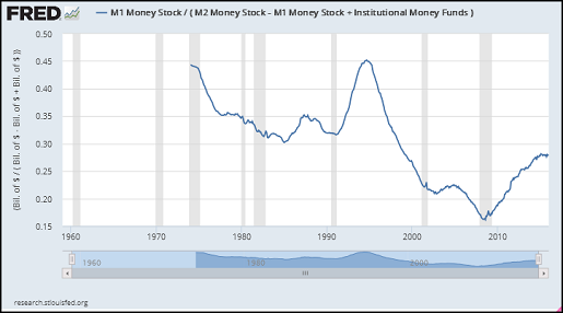
The graph starts high (circulatings a bit less than half the size of savings) in 1974, falls by a third by the mid-1980s, rises back to its starting level before the mid-1990s, and falls by two thirds before the crisis.
The graph gives the impression that this ratio is all over the place. It isn't. The downtrend from 1974 to 1984 is the last leg of a downtrend that began in the 1940s, at the end of the Second World War. What remains visible here is really quite deceiving.
The sharp rise to peak in the early 1990s is the same increase of circulatings relative to savings, of narrow money to broad, that I show over and over again in the Debt-per-Dollar graph and elsewhere. That's the increase that allowed the economic growth of the latter 1990s to be unexpectedly good.
Everybody says it was computers that made the economy good in the latter 1990s: It was IT. Well, if the economy is good, there has to be some sector that is doing quite well, don't you think? It was time: The technology was ready, and people were ready. But the thing that allowed it to happen was the change in monetary balances during the early 1990s. Without the big increase in circulatings relative to savings, there could have been no tech boom. We would have seen tech muted, as the whole economy had been muted since 1974.
//
 |
| Graph #3: Circulatings Relative to Savings, 1915-2013 (annual data) |
See the high spot in the red line just before 1995? That line rises to about 0.45, exactly as we see on Graph #2. Same data on both graphs.
The ratio falls from a peak in the 1940s, as I said above. The red line isn't "all over the place". It is low and muted, below 1.00 for its whole length. Circulatings amount to less than savings for the whole extent of the red line.
The blue line is older data. The two lines don't match up. That's probably why FRED doesn't provide the older data. I got it from the Historical Statistics, Bicentennial Edition.
By the older numbers, circulatings were as much as four times the level of savings. By the newer numbers, circulatings were never greater than savings.
When there's not a lot of circulating money, there's not a lot of money that can be used to pay interest on savings. That's when the economy becomes crisis-prone.
But nobody wants to have less savings. That's why the economy cannot recover.
//
I inverted the ratios. The next graph shows savings relative to circulatings:
 |
| Graph #4: Savings relative to Circulatings, 1915-2013 |
Policy hint: The economy was good between 1947 and 1966.

1 comment:
I looked for savings before, but came up empty. I like what I came up with this time.
//
Unrelated: how my thinking differs from other people. When I went looking for savings before, I quoted Steve Roth defining money:
"I’ve bruited the notion in the past that 'money' should be technically defined, as a term of art, as 'the exchange value embodied in financial assets.'"
Making up his own definition to suit his own purposes.
What I did in today's post is just the opposite of that. I took all the pieces that are normally defined as "money" and used them as a place to start.
I always thought it was better to try to understand what our forebears have learned, than to throw it all away and invent something from scratch that suits the purpose at hand.
I think you will see that in everything I do.
Post a Comment