I expect Debt Service soon to climb from its current low level, bringing vigor to the U.S. economy just as it did in the mid-1980s and then again in the latter 1990s. I keep an eye on debt service.
I noticed that the most recent debt service data at FRED looks different from the previous "vintages" of that data. So I went to ALFRED and put the five most recent vintages together on a graph:
 |
| Graph #1: This Story Has Two Different Endings |
Here is a close-up view of the last few years:
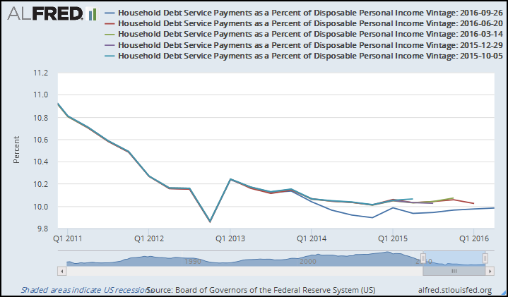 |
| Graph #2: The Five Most Recent Vintages of Household Debt Service Data |
For all the earlier versions, it appears that only the last value from the last time was changed. But the most recent version changes everything, all the way back to 2013.
How does this change affect the likely future path of debt service? What do the Excel trendlines show?
 |
| Graph #3: Polynomial Trends based on 2013 Q1 thru Last Available Data |
These polynomial trendlines, as I read them, predict growth and vigor for our economy. Growth and vigor, beginning soon. But the polynomial is not the only type of trendline Excel offers. The other types all show continuing sluggishness:
 |
| Graph #4: Not All the Predictions Are Optimistic. |
I stand by my prediction: Growth and vigor, becoming obvious in 2018.
// The Excel file

3 comments:
Hi Art
You are ignoring the most significant feature in the debt to income graph.
That feature is the sudden increase in debt to income that happened in Q1-2013. That jump in debt to income was the result of the tax increase that occurred Jan 1 2013. The jump however is greater than the magnitude of the tax increase alone can account for. This suggest that one of the effects of the tax increase was to force households into more debt so that they could get by. The fact that the trajectory of deleveraging was permanently changed after Jan. 1 2013 also suggest that households were no longer able to deleverage as fast as they wanted to and were able to before 2013. It seems obvious to me that the debt to income ratio would have fallen much lower had there not been that tax increase in Q1-2013. The graph would have continued going down
on the previous trend line instead of going mostly sideways.
Here is my prediction:
Trump is going to hit the ground running.
The first thing he will do is implement some provisional tax cuts.
probably it will come in the form of sending tax rebate checks like Bush did in 2008. Anything else will be way too slow for Trump's temperament.
The effect of sudden tax cuts will be a sudden drop in debt to income ratio something like the Q1-2013 jump in reverse and not only that the trajectory of the graph will resume closer to the course it was on at the end of 2012. In other words, a lot of the reduction in taxes will be used to reduce debts and thus reduce the cost of debts going forward.
Of course, at some point the deleveraging will hit bottom and reverse. But looking at Japan as a guide that could take a long long time.
Thanks Jim. I knew there had to be an explanation for that sharp jog at 2012Q4 & 2013Q1, but I didn't know what it was.
So you are saying the shape of the graph is a result of tax changes, not preferences, and the uptrend & vigor I predict are probably not in the cards.
You may be right. I can see in the graph the changes you are talking about. I guess we'll have to wait and see.
Who knew economics could be so exciting!
"So you are saying the shape of the graph is a result of tax changes, not preferences, and the uptrend & vigor I predict are probably not in the cards."
I think your prediction is mostly correct but the timing may be different due to the changes in disposable income as a result of changes in taxes.
What I'm saying is there are 2 different trends. The one before Jan. 1, 2013 and the one after. Treating them as if they are one trend is going to throw off the prediction.
I think the uptrend and vigor might already have happened by now if the deleveraging had been allowed to continue at the pace it was going at the end of 2012. When it reaches bottom more quickly it will turn around more quickly also. On the other hand if the trend after 2013 continues on as it is, it will reach bottom and turn around much slower than you are predicting.
As I said, I predict there will be another jog in the graph that is coming soon that will send the graph downward for at least a little while. Reaching bottom faster would make the turn around faster.
Post a Comment