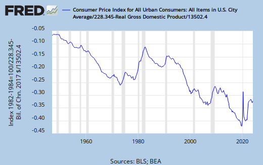
That FRED graph from yesterday caught my eye as I reviewed the post. When I see a graph showing two lines and there is presumed to be some relation between the two lines, often I want to see the relation rather than the lines.
So I got the data from FRED again, this time quarterly data for both series. And I looked at the numbers in a spreadsheet to get normalizing values. I'm sticking with third quarter 1953, which is what I used to normalize both graphs yesterday. For this graph, I divided each series by its normalizing value, then subtracted the output number from the price number.
Basically, I took Graph #2 from yesterday and subtracted the blue line from the red line. Here is the result:
 |
| Graph #1: Normalized Prices less Normalized Output (Normalized at 1953) |
The graph shows a downtrend to the mid-60s, as real output grew faster than prices went up. Then, perhaps, there is a brief flat spot (suggesting that prices and output increased at about the same rate). Then up and up it goes, showing that prices have increased faster than output since the early 1970s.
There seems to be a kink at the 1982 recession. The line goes up faster before the kink, and not quite so faster after. Still, the trend for 40 years has been that prices increase faster than real output.
There is no reason that I can see, to expect this 40-year trend to suddenly change if we switch from "Inflation Targeting" to "NGDP Targeting". Rather, I expect the line to go up faster again, if we take our eye off prices.
// UPDATE
Two more views of the same comparison of prices and real output:
 |
| Graph #2: Normalized at 1980 |
 |
| Graph #3: Normalized at 2012 |
And one more view, not normalized at all:
 |
| Graph #4: A Simple Ratio |
Graph #4 tells this story: The level of prices, as compared to the level of real output, begins at a middling value. Over the next 15 years or so it falls, as real output increases faster than prices.
Then it seems to hit bottom, bounce once, and skyrocket -- climbing twice as far as it fell. This was the Great Inflation.
Since the end of the 1982 recession, the ratio has remained high, as if bumping up against a ceiling. The level of prices, relative to output, has changed little. Real output increases no faster than prices.

3 comments:
To the extent that my skepticism of your normalization is valid, this graph might be a significant distortion.
I like this a lot better.
http://research.stlouisfed.org/fred2/graph/?g=7G4
Or, consider this. The space between the lines is an artifact of index year.
http://research.stlouisfed.org/fred2/graph/?g=7G5
Cheers!
JzB
Hi Jazz. Thanks, I could certainly use more eyes on this calculation!
Your first link, 7G4, I've looked at many times. I suspect we both have. But I was looking for a way to see inflation as a multiple of real growth, or real growth as a multiple of inflation, and I don't see how to get that from 7G4.
OH. By normalizing at 1953, I make those two values identical on the graph. So the closeness of the twl lines before the Volcker years is artificial (I'm thinking of the Google Docs graph from the previous post).
But the separation is valid... The change from before-Volcker to after-Volcker is accurately represented. I am willing to say that inflation after Volcker was three times more than what it was before the Great Inflation, relative to real growth. And I think that is a pretty amazing claim, given all that has been said of inflation and the greatness of moderation and all...
"The space between the lines is an artifact of index year."
Definitely, yes.
See update.
Yeah, this needs some work. But the line is definitely lower in the early years, higher later.
Post a Comment