Disappearing the Output Gap
.png)
The high and low lines, blue and orange, together show the output gap that developed since 2008. The red and green lines show the output gap, after reworking the numbers.
Click on the graph for a larger view at ALFRED. Click here for the backstory.
So much for brief.
A comparison of the current estimate of Potential Output with one from January 2005:
.png) |
| Graph #1: Estimates of Potential GDP from 2005 (blue) and 2013 (red) |
Oh -- it's a base-year thing. The red line is given in 2005 dollars, and the blue line is given in dollars from 2000. I have to fix the base-year, again.
Here are price-index numbers for the GDP Deflator.
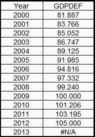
I'll convert everything to 2009 dollars:
.png) |
| Graph #2, Potential GDP: 2005 Estimate (blue) and 2013 Estimate (red) in base 2009 Dollars |
Now let me add to the graph two series for Real GDP. I'll add the most recent data, which is already in 2009 dollars. And I'll add the last data before the Comprehensive Revision of 2013, converting it from 2005 dollars to 2009 dollars.
.png) |
| Graph #3: RGDP Before Revision (orange) and After Revision (green) added to Graph #2 |
Here. I cropped off everything before 1990, made the lines heavier, and made the text smaller:
|
| Graph #4: Enlarged Detail from Graph #3 The Blue and Orange Lines Show the Output Gap Before the Numbers Were Revised The Red and Green Lines Show the Output Gap After the Numbers Were Revised |
The orange line shows RGDP before the revision -- but in 2009 dollars. The green line shows RGDP after the revision, also in 2009 dollars. The revision pushed RGDP up just enough to make it line up with the new, lower estimate of Potential GDP (red).
The high and low lines, blue and orange, together show the output gap that developed since 2008. The red and green lines show the output gap, after they reworked the numbers.

No comments:
Post a Comment