I got a bunch of numbers from FRED -- the GDP deflator, and some measures of debt. All annual values, so the "additions" noted in the post title are annual additions. The debt numbers are "end of period" values, presumably the greatest accumulation debt reached each year. The deflator is the average of the year's values.
The FRED graph doesn't look like much, but it got me lots of numbers to work with. I took those numbers, selected from them half a dozen different measures of debt and, for each, I figured each year's change from the previous year in billions of dollars, took the inflation out of that number, and plotted the result:
 |
| Graph #1: Inflation-Adjusted Additions to Debt |
I thought maybe looking at annual percent change for the above graph might be useful. Silly me:
 |
| Graph #2: Percent Change from Prior Year for the Values Shown in Graph #1 |
 |
| Graph #3: A Close-Up of Graph #2 |
So I gave up on that approach. I decided to look at the Hodrick-Prescott paths of the data-sets shown in Graph #1, the annual change (in billions of inflation-adjusted dollars) for each debt category:
 |
| Graph #4: The Hodrick-Prescott Values for the Data Shown in Graph #1 |
One thing clear on Graph #4 is a simplified picture of the size of Federal deficits, the orange line. It increases until about 1986, then decreases until about 1998, then goes up again. FWIW.
Above, we looked at the additions to debt in billions (Graph #1) and then at the percent change in those numbers (Graph #2). And the second graph was not very useful. Same here. Graph #4 looks at the H-P paths of the additions to debt in billions. Graph #5 shows the percent change in these numbers. It doesn't look useful:
 |
| Graph #5: Annual Percent Change in the Hodrick Prescott Values from Graph #4 |
Oops, I forgot to move the dates down out of the way.
In Graph #6 I zoom in on Graph #5, like before, to get a better look at the general activity.
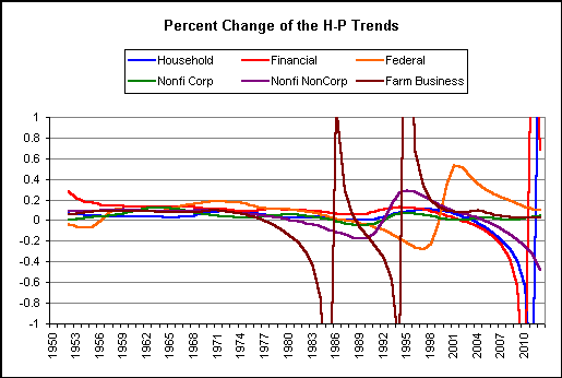 |
| Graph #6: A Closeup of Graph #5 |
 |
| Graph #7: A Closeup of Graph #6 |
The red line goes down until the end of the 1980s, then up for a few years, then falls. The brief up-disturbance reminds me of the 1990-93 disturbance in my Debt-per-Dollar graph. The red line is Financial debt.
Household debt (blue) perhaps follows the same pattern, but it would be pretty easy to call the trend "flat" until just before the disturbance. The blue line is also lower, suggesting a slower rate of debt growth than seen in the red line.
The orange line -- based on the annual change in Federal debt -- peaks around 1971, then falls dramatically, dropping off the graph in 1995, during the latter years of Clinton.

No comments:
Post a Comment