 |
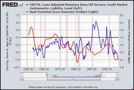
| Graph #1: Growth Rates, Potential GDP (red) and Base Money as a Percent of Total Debt |
The red line generally trends downward. In other words, the potential in potential output diminishes over time.
The one remarkable, large and sustained, actual increase in base-relative-to-debt occurs on the blue line between 1989 and 1996. In the midst of that increase, potential output turns and trends upward for a decade. This is a significant change in the pattern of decline shown by potential output.
The only other significant change in the decline of potential output is the uptrend that occurs between 1955 and 1967. Remarkably, this trend corresponds even more clearly to an uptrend in the base-to debt ratio.
Conditions were different in the 1990s and the 1950s. The changes in the blue line look different on the graph. But both periods show uptrend in the base/debt ratio. And both show uptrend in potential output.
If you think we need better growth, look at money and total debt.

No comments:
Post a Comment