Back in September of 2011 at Business Insider, Doug Short looked at The Incredible Shift From Manufacturing To Services In America:
I spent some time this morning studying a topic I've occasionally mentioned: The shift in the United States from a manufacturing to a services economy.
The Department of Labor's Bureau of Labor Statistics has monthly data on employment by industry categories reaching back to 1939. The first chart below is an overlay of the compete series of employment numbers for the two major categories, manufacturing and services.
When I say major, I'm referring to the complete domination of the labor market by these two industries. To illustrate this fact, I've also included the total of the two categories and a dotted line showing total nonfarm employment.
An impressive chart. Manufacturing is the red line down at the bottom. Services is the blue line up near the top. The dotted gray line is manufacturing and services together. And the green is all employment. Scarcely any room between green and gray. Most jobs are either in manufacturing or in services.
Most of them in services, according to the blue line. Not much going on with manufacturing, dragging along the bottom there, red with embarrassment.
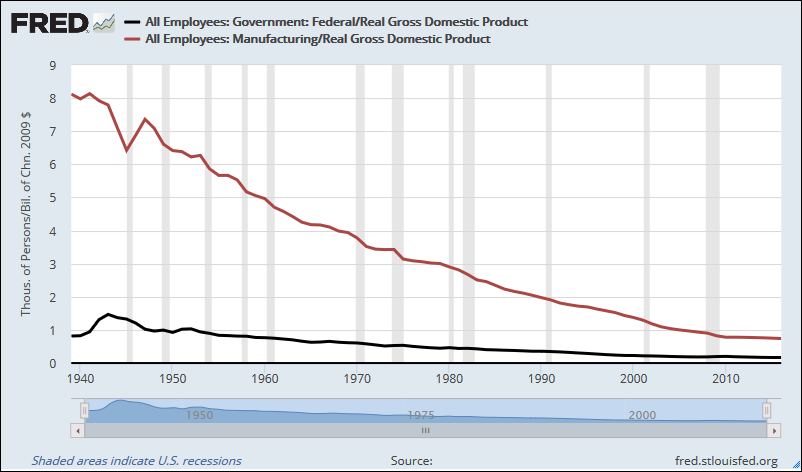
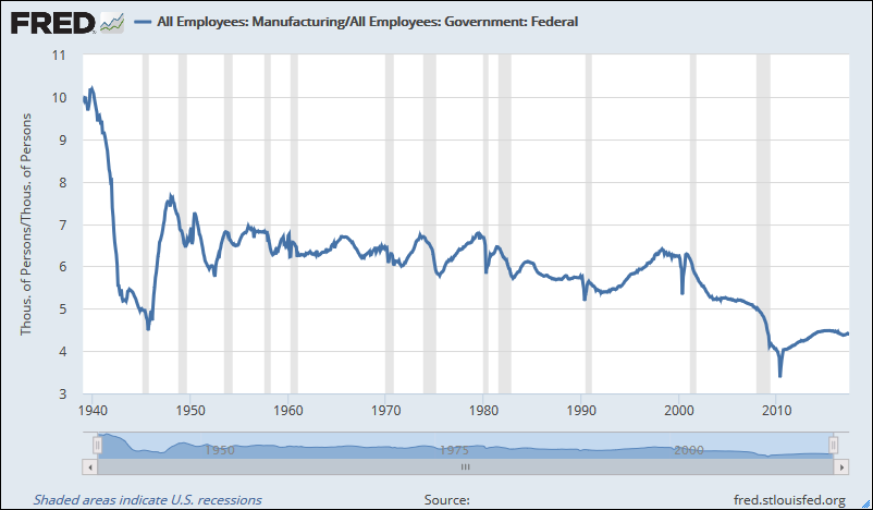
I got wondering how the Federal employment numbers compare to manufacturing employment. Both are shown relative to the size of the economy, same as I showed yesterday. Have a look:
 |
| Graph #2: Manufacturing (red) and Federal (black) Employment-to-RGDP Ratios |
 |
| Graph #3: Manufacturing Employment relative to Federal Government Employment |
Manufacturing employment has fallen significantly faster than Federal employment since 2001, the graph shows. But for the whole second half of the 20th century, it was almost neck-and-neck. Manufacturing employment and Federal employment fell at almost the same rate. So where Doug Short speaks of an "incredible shift" away from manufacturing, we could as easily speak of an incredible shift away from Federal employment. But no one speaks of such things.
Remember, too, that Graph #3 shows the ratio running largely between 6 and 7. That means manufacturing employment was 6 to 7 times the size of Federal government employment, consistently, until the 21st century.

It was pretty easy to duplicate Doug Short's graph at FRED. I even tried to make the colors match. Then I added a dashed black line to show Federal employment. It runs way down at the bottom, a mere fraction of manufacturing (red) employment. If I didn't point it out, you might not even notice it:
 |
| Graph #4: Federal Employment (dashed black) Barely Above Zero |
Compare the lowest line to the highest line: Compare Federal employment (dashed black) to All employment ("Total Nonfarm Payrolls", green):
 |
| Graph #5: Federal Employees as a Percent of All Employees |
Two percent of the workforce is employed by the Federal government today. Four and a half percent of it, give or take, was employed by the Federal government in the 1950s and '60s, back when our economy was good. If there is a problem with our economy, that problem cannot be the excessive size of the Federal government. The problem lies elsewhere.

1 comment:
Oddly, Bill McBride at Calculated Risk is also looking at employment numbers today.
He writes in part: "The public sector grew during Mr. Carter's term (up 1,304,000), during Mr. Reagan's terms (up 1,414,000), during Mr. G.H.W. Bush's term (up 1,127,000), during Mr. Clinton's terms (up 1,934,000), and during Mr. G.W. Bush's terms (up 1,744,000 jobs)."
Okay. But total population also grew during those terms, and so did total employment, and so did Real GDP.
Post a Comment