
Wednesday, October 8, 2014
 The Writers versus the Signatories
At Bloomberg:
Signatories of a letter sent to then-Federal Reserve Chairman Ben S. Bernanke in 2010 warning of the risks associated with the bank’s policy of quantitative easing are standing by their claims -- even as the biggest U.S. companies are flourishing, inflation is muted and holding Treasuries has been one of the best trades out there.
In the word "even", you can read the position taken by the writers of that story:
Signatories stand by their prediction of inflation even as the economy improves.
The position taken by the writers is that the economy is doing better, and the improvement is evidence that inflation will not come, so the signatories were obviously wrong.
You see a lot of that lately: the idea that we have not had inflation yet, so we're not gonna get it. And yes, at some point you do have to say "The waiting period is over. A final outcome can now be determined." I'm just not sure we're there yet.
The writers continue:
The Nov. 15, 2010, letter signed by academics, economists and money managers warned that the Federal Reserve’s strategy of buying bonds and other securities to reduce interest rates risked “currency debasement and inflation” and could “distort financial markets.” They also said it wouldn’t achieve the Fed’s objective of promoting employment.
Four years later, members of the group, which includes Seth Klarman of Baupost Group LLC and billionaire Paul Singer of Elliott Management Corp., are facing a different economy. U.S. companies now boast low debt, big cash piles and record profits. They’re creating jobs at the fastest average pace since 2005 and unemployment has dropped to 6.1 percent from 9.8 percent when they wrote the letter. The recovery has underpinned an almost 200 percent gain in the Standard & Poor’s 500 Index since March 9, 2009.
Four years later, members of the group, which includes Seth Klarman of Baupost Group LLC and billionaire Paul Singer of Elliott Management Corp., are facing a different economy. U.S. companies now boast low debt, big cash piles and record profits. They’re creating jobs at the fastest average pace since 2005 and unemployment has dropped to 6.1 percent from 9.8 percent when they wrote the letter. The recovery has underpinned an almost 200 percent gain in the Standard & Poor’s 500 Index since March 9, 2009.
Four years have passed, the writers point out. And, judging by that last paragraph, the economy is doing very well.
So, what do you think?
The economy is not doing well at all. Not the economy I know. But it is doing better than it was. And that is when the threat of inflation can become real -- when things pick up. The writers, laughing at the signatories and thinking we have not had inflation so we will not, those writers are on thin ice. That's what I think.
Inflation is held down by a depressed economy. If inflation picks up, it will happen when the economy picks up. Now, I'm not predicting inflation. But the view that says "the economy is doing better, so inflation is not a threat" is just exactly wrong. I can't see how people who write about the economy can pretend to believe it.

The question of timing remains. The writers point out that four years have passed since that letter was written, and the economy is doing fine. The implication is that if we were going to get inflation, we'd have got it by now.
What do you think? Is four years enough time? How about six years? It's four years since the letter, but it's a full six years since the start of Quantitative Easing. The quantitative easing that troubles the Signatories started in September 2008:
 |
| Graph #1: Percent Change, Base Money, Monthly Data: 2004-08-01 to 2014-08-01 |
 |
| Graph #2: CPI (blue) and PCE (red) Inflation Measures, Monthly, 2004-08-01 to 2014-08-01 |
Not much. No.
Tuesday, October 7, 2014
"He seemed completely unable to grasp that I was talking about the conventional use of words..."
From Names Are Conventional at La Bocca della Verità:
Is Pluto a planet?
Pluto itself simply is what it is, and does what it does, regardless of what we call it. The question "Is Pluto really a planet?" is confused: The real question is, "Is our classification system more helpful to us if we classify Pluto as a planet, or if we do not?"
Astronomers recently decided that the right answer is: "Not." Given I am not an astronomer, I trust them, and suspect they made the right decision. But the question is completely different from one such as, "Does Pluto have an iron core?" or "What is the period of Pluto's orbit of the sun?" The latter two questions are about Pluto; the former question is about how we want to structure our language to make it the most useful to us.
Recommended reading.
Monday, October 6, 2014
Stiglitz: "Any theory of deep downturns has to answer these questions"
From NBER, from the free teaser page that wants $5 for a PDF...
From the abstract (I presume) of Reconstructing Macroeconomic Theory to Manage Economic Policy by Joseph E. Stiglitz (NBER Working Paper No. 20517):
The paper argues that any theory of deep downturns has to answer these questions: What is the source of the disturbances? Why do seemingly small shocks have such large effects? Why do deep downturns last so long? Why is there such persistence, when we have the same human, physical, and natural resources today as we had before the crisis?
Gotcha covered, Joe.
• What is the source of the disturbances?
Financial cost.
• Why do seemingly small shocks have such large effects?
Debt accumulates slowly, and the cost of accumulated debt grows gradually.

As the rising cost becomes a problem, people compensate by increasing the amount they borrow. So, for a long time, the growing debt seems to have no harmful effects at all. Then one day, a straw breaks the camel's back. When that happens, the full weight of accumulated debt becomes a problem, and large effects follow from the seemingly small shock.
• Why do deep downturns last so long? Why is there such persistence, when we have the same human, physical, and natural resources today as we had before the crisis?
We have the same human, physical, and natural resources now as we had before the crisis. We have very nearly the same debt, also. Recommend a policy focused on reducing financial cost by reducing the accumulation of debt, and people will find a million reasons why it cannot and should not be done.
Our deep downturn could have been brought to an end quickly if a conscious effort had been made to reduce debt by a significant amount -- cut in half, say. But since we insist on letting the problem resolve itself, the downturn could last twenty years or more.
Sunday, October 5, 2014
Employment
Unemployment has been awful since the crisis. Things are getting better now, at least by some accounts. But it's easy to doubt such accounts, because demographic changes pull the rug out from under them. Or they seem to, anyway. It's all very confusing.
So here's a simple look at "employment" -- the number of workers in our economy. Instead of just raw numbers, I'm looking at the percent change in employment. I'm using quarterly data, not monthly, to make the graph less jiggy and easier to read:
 |
| Graph #1: Percent Change in the Total Employment |

And if you look at the trend line I threw in there, it looks like employment since mid-2010 has been right on trend. Maybe a pixel or two above trend. So I have to say it's not Obama or the Crisis or George W. Bush alone that is the source of the problem. I have to say the problem goes back at least to the 1980s. That means Reagan, and Bush the Father, and Bill Clinton are also part of the problem.
But I don't like to blame people. I like to blame policies. What I usually say (and I stand by it now) is that the problem goes back probably another 20 years before the 1980s. What that means is the problem is not unemployment.
The problem is Problem X. What we see on the graph -- declining employment since the 1980s -- was a "solution" to Problem X.
Is declining employment a problem? Well, sure. But it's not the problem. Declining employment was a solution to the problem. So our solution is a problem, yes. But again, it's not the problem. I hope this is making sense to you. I don't know how to say it any better.
Do I think I know what Problem X is? Of course: Excessive debt. Excessive finance. Financial "deepening". These are all the same. But don't think the problem started with Obama, or with Bush the Younger, or Clinton, or Bush the Elder, or even with Reagan. It would be more accurate to say the problem was already a problem the last time Lee Harvey Oswald fired his rifle.
I have to say the problem goes back at least to the 1980s. But then, doubt recurs. Demographic changes come back to haunt me. So I took the total number of employees and divided it by the total population, to get the working share of population, and looked at the percent change in that. Again, quarterly:
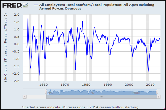 |
| Graph #2: Total Employment Relative to Total Population, Percent Change |
The trend is consistent, too. Granted, I just sketched in a straight line. But a lot of jiggles cling to that trend, in the 1980s and again in the 1990s and again in the 2000s. In comparison to this trend line, job growth for the past three years has been good (odd as that is to say). If this trend line is right, employment is well above the trend of the last 30 years. Clearly it is the last 30 years for which unemployment has been a problem, not the last three.
I found a quarterly, seasonally adjusted dataset at FRED for Working Age Population: Age 15 and Over for the United States. Starts at 1955. Maybe that's a better context than the whole U.S. population?
The Working Age Population series counts persons... The Employment series counts thousands of persons... I'll multiply the Employment number by 1000 to convert it to persons so the units match. I probably don't need to do that if we're looking at percent change numbers. But what the heck.
Again, a look at percent change:
 |
| Graph #3: Total Employment Relative to Working Age Population, Percent Change |
For the Working Age Population data, FRED wants the source cited:
Working Age Population: Aged 15 and Over: All Persons for the United States©
OECD descriptor ID: LFWATTTT
OECD unit ID: STSA
OECD country ID: USA
All OECD data should be cited as follows: OECD, "Main Economic Indicators - complete database", Main Economic Indicators (database),http://dx.doi.org/10.1787/data-00052-en (Accessed on date)
Copyright, 2014, OECD. Reprinted with permission.
Source: Organisation for Economic Co-operation and Development
Saturday, October 4, 2014
Business Sector: Labor Share
This is the FRED graph:

This is what seems to bother most people:

This is what bothers me:
.PNG)
Friday, October 3, 2014
Velocity: Percent Change
Last April, under the title Velocity and the Great Moderation, I showed this graph of percent change in the velocity of M1 money:
 |
| Graph #1: Percent Change from Previous Quarter, M1 Velocity |
But I was looking at that graph just now, feeling sorry for myself because the velocity of M1 only goes back to like 1960. Suddenly I had a brain fart:
 |
| Graph #2: By using two series I get data all the way back to 1869!!!!! |
 |
| Graph #3: Percent Change in Velocity, Annual Data |
On Graph #3, shortly after 1875, there is a period of a decade or more where the percent change in velocity almost continuously negative. Below zero. It was a time of rapidly falling velocity, as you can see on Graph #2.
It was also a time of deflation following the Panic of 1873, which Marcus Nunes describes as a ‘nonevent’. Marcus writes: "in the 1870s and 1880s the economy performed robustly in spite of a drawn out fall in prices".
Deflation, associated with a consistently negative rate of change in velocity.
The other thing happened just about a hundred years later, around 1975, when for a decade or more the percent change in velocity was almost continuously positive. Above zero. It was a time of rapidly rising velocity, as Graph #2 shows.
It was also a time of inflation. It was the time of the so-called Great Inflation.
That's interesting, I think: Two divergences from the norm, in opposite directions. There must be some kind of rule that goes along with this.
Thursday, October 2, 2014
The Other Side of That TFP Coin (and something unrelated)
Yesterday I took a quote from a conversation at ResearchGate. I won't give you the link again, because every time I go there ResearchGate pops up a window asking me to "join for free". I close the window and it doesn't bother me again, and it doesn't seem to damage my computer, far as I can see. But still.
However, I do want to look at some of the stuff from that conversation. John Ryding, whom I quoted yesterday, links to the download page for a paper by Charles R. Hulten, who writes:
Economists have long recognized that total factor productivity is an important factor in the process of economic growth. However, just how important it is has been a matter of ongoing controversy. Part of this controversy is about methods and assumptions. Total factor productivity growth is estimated as a residual, using index number techniques. It is thus a measure of our ignorance ...
Ignorance, yeah. What I said yesterday:
Total Factor Productivity is the contribution to economic growth that's left over, after we subtract the contributions to growth that we understand ... It is the contribution to growth that we do not understand.
At ResearchGate, Hak Choi agreed with John Ryding, saying "For me, TFP is merely residue."
Residue. Something left over. Yeah. That's how it is calculated, according to several sources (including the Bank of England). Total Factor Productivity is a statistical discrepancy with a fancy name.
And then, at ResearchGate, Fabrizio Pompei offered a "contradictory" view:
Actually, TFP as mere residual is only one way to observe total factor productivity. Generally, TFP is a productivity measure involving all factors of production.
Yeah, I don't need to read a sweeping generality to know that the part of economic growth which is not explained by capital, and not explained by labor, must be explained by everything else.
I think economic growth is important, and restoring economic growth is important, and I think we need to know more than that "everything" is responsible for growth.
Fabrizio's contradictory view included the mention of the book An Introduction to Efficiency and Productivity Analysis, a 331-page PDF by Timothy J. Coelli and three other writers.
I knew I shouldn't look at it, but I did, and sure enough, it shut down my tirade against Total Factor Productivity.

Dominating, isn't it?
Now... It's over 300 pages long, so I don't expect to read it. But I was looking it over this morning before work, and it did look interesting. Of course, my options were to keep reading, or to go to work.
I want to say one last thing about TFP. I only read a few pages out of the book, so I don't know. But it looks like the book is an investigation of four different ways to measure efficiency and productivity, with "total factor productivity" among them. What it does not appear to be is an investigation of the relation between TFP and efficiency. That relation seems to be assumed. But like I said, I read very little.
In the introduction of the Efficiency and Productivity Analysis book I got severely distracted. They present a graph to show the difference between efficiency and productivity. The graph shows a hypothetical firm's inputs on the X axis, and its outputs on the Y axis:
.PNG)
From this discussion, we conclude that a firm may be technically efficient but may still be able to improve its productivity by exploiting scale economies.
If they move from Point A to Point B they produce more. But if they move from Point B to Point C they get maximum output per unit of input.
As I see it, the optimum size of that hypothetical firm is at Point C.
I talk about the "Laffer limit" sometimes: Doing more of something gives better and better results for a while. But after the Laffer limit is reached, it gives worsening results.
This first occurred to me back in maybe the early 1980s when I used to get the Kiplinger letter -- a B-size sheet of paper, 11"x17", folded in half to make a four-page A-size paper, 8½"x11", with four pages of Kiplinger info, for far too much money, even back then.
Anyway I was reading the Kiplinger letter one day, they were talking about agribusiness as I remember, and they said that agribusiness was growing "beyond its economies of scale". That floored me. It was so big that it was losing money. Its growth was driving its rate of profit down.
Why would anybody do that? My answer is: the tax code. The business income tax gives you a tax break for growing your company. So you grow, to get the tax break. And even if you grow beyond your economies of scale, the government gives you a tax break that more than makes up the difference.
So businesses grow, and big ones buy up little ones, and we lose competition that way, but the growing businesses get a tax break, so to them it's worth it. And at some point they find their profit rate is not as high as it was when they were smaller, but hey, they get those luscious tax breaks. So the government gets less revenue, and businesses merge and consolidate, and the economy is distorted by growth beyond economies of scale, and you can't keep this up or your economy will turn to shit.
And then policymakers strengthen the incentives, thinking that merger and consolidation is the same as growth.
There was a little more in Chapter 2:

The figure 2.1 is similar to 1.1, but annotated differently. And the authors are explicit, defining a "point of optimal scale", meaning scale of operations specifically. And their graph shows plenty of room for a company to grow beyond its economies of scale.
So, we're not talking Total Factor Productivity anymore. I'll come back to that eventually. But I couldn't let this go.
Wednesday, October 1, 2014
The Calculation of TFP
One of the problems with economic models is that they seem to be based on imaginary conditions. So, when I found a PDF titled "Creating a Macroeconomic Model Using Real Economic Data" I judged that book by its cover (so to speak). I liked it right away.
That PDF is SolowProjectNotes.pdf, from the archives of Professor Rodney Smith at the University of Minnesota.
The PDF shows a calculation for Total Factor Productivity. For me that's useful, because I've been wondering for a while now how they calculate TFP. Hey, don't be intimidated by this:

See the equal sign? All that big mess of stuff on the right side of the equal sign is equal to TFP at some time t. I know this because I see TFPt on the left side of the equal sign.
I know. I know. It's not the stuff on the left side of the equal sign that's intimidating. It's all the stuff on the right. But parts of that are familiar. Take the first part:

"Y" is output. "t" is time. Yt is output at some particular time t.
Yt-1 is output at the time just before time t. For example: If "t" is the year 1995, then "t-1" is 1994. And if you take output (or Y) for the year 1995 and subtract the output for 1994, then you get the change in output from 1994 to 1995. That's what this is:

Then if you divide that "change" number by Yt-1, the output for 1994, you get the percent change number. I guess you'd have to multiply by 100 and stick a percent sign after the number to make it a percent, but that's just formatting.
And then if you look at the equation again, you've got that "Y minus Y divided by Y" thing there, percent change in Y. And you've got two other things just like it, except one of them has K instead of Y, and the other has L instead of Y:

So you've got "percent change" calculations three times -- once for Y, which is output... once for K, which is capital... and once for L, which is labor. I didn't make those up, K is for capital and all that. It's in the PDF somewhere. But it's pretty easy to remember.
I guess C is for "consumption" so you can't use C for capital. That'd be my guess.
Going back to the complete equation again...
we've got TFP (for some year "t") equals the percent change in output, minus something times the percent change in capital, minus one-minus-something times the percent change in labor.
It's kind of nice that everything we've figured out so far is "percent change" numbers. Because subtracting "percent change" from "percent change" seems pretty reasonable. It's not like trying to subtract number-of-employees from gross-domestic-product. (You can't do that!)
The only other things in that equation are the "something" and the "one-minus-something". That's how "labor share" and "capital share" are distributed. I'm not sure why it's reasonable to do that the way they do. But it seems like it might be. Anyway, the "something" is capital share, and the "1" is 100% of what is shared, and 100% minus capital share is labor share. So there ya go.
In broad stroke then, TFP is what's left when you take output and subtract the contribution of capital and labor from it. As the formula is written, it is figuring the "percent change" in TFP, because it is subtracting percent change values from percent change values and what's left must also be percent change values.
But GDP is GDP, whether you look at it in billions of dollars or as percent change values. And the same is true of TFP.
In broad stroke, TFP is what's left when you subtract from output the contribution of capital and labor. That's not me talking. It's the SolowProjectNotes.
Anjaree says it too: "TFP growth rate = growth rate of output - growth rate of factors of production."
At Researchgate, John Ryding of RDQ Economics says it too: "total factor productivity ... is the growth of output that cannot be explained by the growth of the inputs (labor, capital etc.)"
Even the Bank of England says it, if not in so many words. In the PDF titled Measuring total factor productivity for the United Kingdom, in the appendix, they show "The formula used to calculate TFP growth":

Now, this doesn't look much like the equation from the SolowProjectNotes. But there are key similarities. On the right side of the equal sign we start with Y -- output. We subtract some messy thing that ends with K -- capital. And we subtract some other messy thing that ends with L -- labor. Total Factor Productivity is calculated by taking output and subtracting, very precisely and carefully, some number arising from capital and some number arising from labor. This is exactly the same as in the SolowProjectNotes.
Total Factor Productivity is the contribution to economic growth that's left over, after we subtract the contributions to growth that we understand -- the contributions from labor and capital. Total Factor Productivity is the discrepancy. It is the contribution to growth that we do not understand.
Don't you want to open that black box and see what's in there? I do.
Subscribe to:
Posts (Atom)
