Thursday, June 30, 2016

"to keep inflation from accelerating"


Syll has a really great Keynes quote (28 June), on the "belief that there is some law of nature which prevents men from being employed". Unreferenced, so I looked it up. Ended up at Wikipedia's Full employment page. They attribute the quote to "J.M. Keynes in a pamphlet to support Lloyd George in the 1929 election." With that out of the way now ...

The wiki page opens with these words:
Full employment, in macroeconomics, is the level of employment rates where there is no cyclical or deficient-demand unemployment. It is defined by the majority of mainstream economists as being an acceptable level of unemployment somewhere above 0%. The discrepancy from 0% arises due to non-cyclical types of unemployment ...

And then comes the part where bells go off in my head:
Unemployment above 0% is seen as necessary to control inflation in capitalist economies, to keep inflation from accelerating, i.e., from rising from year to year. This view is based on a theory centering on the concept of the Non-Accelerating Inflation Rate of Unemployment (NAIRU) ...

This is why the bells were ringing: When I got my three credits in macro, back in the late 1970s, I was taught that one of the goals of economic policy was price stability. But since I've been internetting, the universally accepted current version of that goal seems to be inflation stability. As opposed to price stability.

The reason for this change became suddenly obvious to me as I read the wiki words: "This view is based on a theory centering on the concept of the Non-Accelerating Inflation Rate of Unemployment (NAIRU) ..."

The NAIRU got somehow turned around and used as the basis for saying that inflation is okay, even though accelerating inflation is not. There is no logical argument for that conclusion, that I can see. But the NAIRU is the only explanation I have found for the change from "price stability" to "inflation stability".

So if you are in favor of a little inflation or maybe a little more inflation as economic policy, let me just point out that the full force and power of the NAIRU stands behind your thinking.

That should make you think again.


My view? The goal remains price stability. I recognize that inflation can "erode" debt, in a manner of speaking. I recognize that inflation can have "beneficial" effects for the economy. But I do not and cannot accept the notion that we can or should or might use inflation as a policy tool. The ends do not justify the means.

In all my internet years, the only person I've seen say anything comparable to the view I express is John Cochrane:

The Fed currently interprets "price stability" to mean 2% inflation forever. A CPI standard could enforce 2% inflation. But why not establish a price-level target instead? The CPI could be the same 30 years from now as it is today, and long-term contracts could carry no inflation risk.

I don't know how good his math is. If a CPI standard could enforce 2% inflation, then it could enforce 0% inflation. And that would give you price stability without specifically establishing a "price-level target". I don't know: Maybe he just phrased it that way for emphasis. If I can do the math in my head, I'm sure he can.

Maybe this one is better:

The euro is the unit of value, as the hour is the unit of time and the meter is the unit of value. You could engineer a one-time boost by fiddling with the hour, the meter, the kilo and the euro. Until people catch on ...

Anyone for a drink?

Yeah, me.


Farther from topic: John Cochrane asks why we don't go with zero inflation, rather than two percent. The answer, John, is that we would have to replace inflation with some other policy that helps keep private debt down and provides some of the other good effects as well.

Nobody seems to know what that policy might be. So I'll say it again: We have to start eliminating the policies that encourage credit use and debt accumulation. We have to start creating policies that encourage credit use and the repayment of debt. It's not a big change. It wouldn't be difficult to do. The difficulty lies, not in the new ideas, but in escaping from the old ones, which ramify, for those brought up as most of us have been, into every corner of our minds.

omg


Wednesday, June 29, 2016

How Groups Work


I looked into how groups work a long time back. There's something there, though I'm not sure it's in my grasp.

Steve Randy Waldman writes

Functional nation states generally try to reduce the salience of socioethnic difference in favor of a national identity.

That's the crux of it. A successful group, a successful nation, is successful because non-members want to become members. Not like the UK leaving the EU, and not like Scotland leaving the UK.

I'm pretty sure the way to get people joining your group is to have the best economy.

Tuesday, June 28, 2016

Spite


Bloomberg:
German Chancellor Angela Merkel warned the U.K. to have no illusions about life outside the European Union, hardening her stance ahead of Prime Minister David Cameron’s first meeting with fellow EU leaders since triggering the political earthquake that’s shaken the bloc’s foundations.

Merkel, in her toughest response yet to last week’s British vote to quit the 28-nation EU, said that the U.K. can’t expect favored treatment once it leaves and that there will be no informal talks on a new relationship before the government in London files its application for divorce.

“There shouldn’t be the slightest misunderstanding about the conditions laid out in the European treaties for a case like this,” Merkel said in a speech to Germany’s parliament in Berlin on Tuesday. “My only advice to our British friends is: Don’t delude yourself about the necessary decisions that need to be taken.”

Merkel won applause from German lawmakers ...

Yeah Merkel got the spite down all right, but she missed the comic sensibility.

A metaphor for the economy


The dogs want to go out at three in the morning. I don't want to let the one out because yesterday he didn't come when it was time to go in. (I'm setting policy based on recent experience.)

Then I remembered: He didn't come yesterday because he wasn't out. He was still upstairs, asleep. (So really, I was setting policy based on misunderstanding recent experience.)

Monday, June 27, 2016

In lieu of patriotism, a disclaimer


Walmart online:

Important Made in USA Origin Disclaimer: For certain items sold by Walmart on Walmart.com, the displayed country of origin information may not be accurate or consistent with manufacturer information.

Hiccup.

Sunday, June 26, 2016

¿EZ Catastrophe? and ¿¿Generational Melodrama??


Ja notice how every tiny little bit of televised reaction to the successful "Brexit" vote was horror and the prediction of catastrophe? I wonder which side scripted that news. Reading Scott Sumner was a refreshing change.

Sumner:
Some see it affecting Britain's economy by disrupting trade, whereas it actually hurts the eurozone more ...

British stocks are down around 4% as I write. But French and German stocks are down 7% to 8%. The markets in southern Europe are down 10% to 15%. Brexit's most powerful effect is to make the eurozone crisis worse, by increasing doubts as to whether the eurozone will stay together.

I don't want to overstate things; the level of equity prices in the US is still quite high---and thus the markets currently do not seem to be forecasting a recession.

BTW, there are some very good arguments in favor of Brexit ...

I couldn't have said it better myself. Except the part about equity prices. I don't know anything about equity prices.

Of course, I don't beam over to Sumner's all-too-predictable conclusion: "The single most useful reform at this moment would be a global shift toward level targeting."

You had to see that one coming. And then there's this:
Three in four young voters wanted to remain. They will have to live with the consequences. There is a sense in which the older UK voters stabbed their children in the back (Yes, that's a bit melodramatic, but there's a grain of truth.) When the older voters die off, will Britain rejoin the EU, or will the young get more nationalistic as they age?

... and Robert's response:

As far as young voters, do you feel that younger voters are better or less informed on the underlying issues as older voters? Are younger voters more cynical and less influenced by propaganda than older voters?

You know those models economists use all the time? Simple two-generational models, where, I don't know, the one generation is working and the other is retired, and there is some interaction between the two that the model uses to prove some ridiculous claim? Those models? Well, let's apply a two-generational model to Brexit preference.

As the older voters die off and the young age, the latter's view will become more firm and less liable to change. But there will be a new young generation that has grown up knowing Great Britain as a sovereign state. The generational disagreement will die out with today's young voters, in their old age.

//

Today, older voters remember Great Britain as a sovereign state. Younger voters think of Great Britain as like New Jersey: nothing sovereign about it. All the TV coverage yesterday relied on the argument that "Remain" is "good for the country" or "good for the nation". Yeah, but for which nation? For Great Britain, which already exists more in memory than in fact? Or the nation of Europe?

"Leave" is good for Great Britain. "Remain" is good for Europe.

Younger voters prefer to remain because they have no real memory of their nation as a nation. Older voters prefer to leave because they have that memory of the nation known as Great Britain.

The result of the vote was political, not economic. It was the right choice, because the creation of the European Union was also political. The creation of the EU was a political solution to economic problems. It was sold to the voters as a solution to economic problems. It would make the economy better, the voters were told.

And the Brexit:Leave decision is the voters' way of saying the European Union is an economic plan that didn't work.

Saturday, June 25, 2016

David and Goliath


Oh, for crying out loud. Nothing is going to happen any time soon.

Here -- I put this up once before:
Article 50 of the Consolidated Treaty on European Union:

1. Any Member State may decide to withdraw from the Union in accordance with its own constitutional requirements.

2. A Member State which decides to withdraw shall notify the European Council of its intention. In the light of the guidelines provided by the European Council, the Union shall negotiate and conclude an agreement with that State, setting out the arrangements for its withdrawal, taking account of the framework for its future relationship with the Union. That agreement shall be negotiated in accordance with Article 218(3) of the Treaty on the Functioning of the European Union. It shall be concluded on behalf of the Union by the Council, acting by a qualified majority, after obtaining the consent of the European Parliament.

3. The Treaties shall cease to apply to the State in question from the date of entry into force of the withdrawal agreement or, failing that, two years after the notification referred to in paragraph 2, unless the European Council, in agreement with the Member State concerned, unanimously decides to extend this period.

4. For the purposes of paragraphs 2 and 3, the member of the European Council or of the Council representing the withdrawing Member State shall not participate in the discussions of the European Council or Council or in decisions concerning it.

A qualified majority shall be defined in accordance with Article 238(3)(b) of the Treaty on the Functioning of the European Union.

5. If a State which has withdrawn from the Union asks to rejoin, its request shall be subject to the procedure referred to in Article 49.

Here are three points made by Article 50:

--> The EU shall set out the arrangements for a member state's withdrawal

--> The withdrawal agreement shall be negotiated by the Council, after obtaining the consent of the European Parliament. In other words, if the Parliament does not consent, there can be no withdrawal agreement and evidently no withdrawal.

--> "The Treaties shall cease to apply to the State in question" -- that is, the withdrawing state is no longer a member of the EU -- as soon as the withdrawal agreement takes effect, or, "failing that", two years after the state notifies the union of its intent to withdraw, unless the European Council decides to extend this period.

 
Nothing's going to happen any time soon. Maybe never. It evidently depends on the European Parliament. Athens didn't let member states quit the Delian League. Lincoln didn't let member states quit the United States. And I question the European Parliament's willingness to allow Great Britain to leave the EU. It would be a sign of weakness, after all, and it puts the Euro at risk.


Congratulations to the people of a great nation for doing a great thing.

All the best.

Friday, June 24, 2016

In a credit-addicted society, you need a hell of a lot of inflation to get debt going down


Came across an old (2011) Krugman post the other day. Here's the opening:
Richard Koo has another paper on balance sheet recession out (pdf), with good charts for a number of countries. I still have some differences with him over monetary policy — I still don’t understand why he doesn’t see debt-eroding inflation as something helpful in dealing with debt overhang — but his view of the sources of our Lesser Depression is completely right.

I heard of Richard Koo and the balance sheet recession. But I never read Koo and I know nothing about the B.S. recession. That's okay, maybe I'll read the paper Krugman linked if I'm still interested later.

Anyway, Krugman has "differences" (plural) with Koo, but identifies only one:

I still don’t understand why he doesn’t see debt-eroding inflation as something helpful in dealing with debt overhang

It's been five years. Hopefully there has been an answer by now. I'll tell you my answer first, then maybe go look for other answers.

//

Q: Why doesn't Richard Koo see erosion of debt by inflation as a way to reduce debt?

A: Oh, that's easy! In a credit-addicted society, you need a hell of a lot of inflation to get debt going down. And actually, inflation doesn't make debt go down. It only makes NGDP go up faster than debt ... unless the rate of debt growth goes up.

Here's the thing. Inflation -- as long as incomes keep up with it -- makes existing debt easier to bear. But inflation makes new additions to debt bigger. So it's not all neat and tidy.

//

I threw together a spreadsheet so you can experiment with debt growth and inflation rates. Here's a screen cap:


The red line is debt. The blue line is GDP, actual ("nominal") GDP. The yellow cells contain numbers you can change to change the graph. The NGDP level and the Debt level both start at 100, for convenience and to make comparison of changes easier. The rates of growth of debt and inflation-adjusted ("real") GDP and the rate in inflation, the rates shown are averages for the 1950-2015 period. (The FRED data is included in the file, and period averages are shown to the right of the graph.)

If I leave the starting levels unchanged and leave the growth rate of RGDP at 3.3% and Debt at 8.0%, then in order to get the blue line a bit above the red line -- in order to make the Debt-to-GDP ratio fall -- I have to increase the rate of inflation from 3.2% (shown) to 5%, as the following graph shows:

Graph #2: The Effect of 5% Inflation
Huh, that's less inflation than I thought. Still, at 5% inflation, prices double in less than 15 years. Quadruple in 30 years. If you ain't big on globalism, if you want a strong nation, you need the nation's money to hold its value. It's very simple really.

//

For the record, the patterns shown on Graph #1 are a pretty good match to the patterns of actual data shown of this FRED graph:

Graph #3: Actual (not calculated by me) Data for GDP (blue) and TCMDO Debt (red)
A pretty good match. The blue line on Graph #3 lags behind a little. That's because debt hinders growth, but that's off-topic today.

And for the record, the whole "inflation erodes debt" argument depends on the assumption that disposable incomes keep up with prices, an unreliable assumption.

And by the way, it isn't that inflation erodes debt. It is that inflation erodes the value of the dollar, which pushes up new spending but not old debt. I used to like Krugman's term "erosion". I'm starting to think it is as deceptive a term as "real" (as in "real GDP").

And anyway, inflation is not a solution. Inflation is a problem. The fact that inflation can sometimes help to keep debt down (relative to GDP) does not mean inflation isn't a problem.

Thursday, June 23, 2016

"The EU ... is a politically undemocratic and economically dysfunctional club whose rules and procedures have caused serious economic decline in Europe, and are feeding the racist and separatist forces that are driving Europe apart."


-- Steve Keen

Wednesday, June 22, 2016

Water valves and personal savings


I looked at water shut-off valves a week ago and here they are while I'm trying to do econ.


Google will be pestering me with that shit for six months. Anyway, you can see that personal saving differs from the saving of a business or organization. Seeing as much was the point of this exercise.

I wonder if FRED has anything on business saving.

Tons. Here are three:


The "net private saving" of domestic business and the "undistributed corporate profits" portion of it run close together. The "gross" private saving of domestic business is about three times as big.

But wait... Gross saving? Net saving? Saving is saving, no? Either you save a dollar, or you spend it, right?

Here is something:


Not exactly what I was looking for, but useful. And then, in other results on that page I see the words "Here's gross private saving minus gross private investment — the ... deficit reduction will only intensify the problem of excessive savings relative ..." from Paul Krugman from 2011:
Let me just focus on the United States. Here’s gross private saving minus gross private investment — the private-sector financial surplus:


This huge move into surplus reflects the end of the housing bubble, a sharp rise in household saving, and a slump in business investment due to lack of customers.

Okay. So I'm thinking that

Gross Saving minus Gross Investment equals Net Saving

Gross Investment returns 3650 series at FRED. But no series name that begins with the words "Gross investment".

Tuesday, June 21, 2016

"The exploration of space will go ahead whether we join in it or not"


Couple notes from Chapter 9: Nixon's Decision in SP-4221 The Space Shuttle Decision:
If Nixon had wished to emulate Kennedy by supporting a new push in space, he could have endorsed the September 1969 report of the Space Task Group, with its recommended focus on a piloted mission to Mars. Nixon did no such thing. He did not even respond to this report in a timely fashion...

John Kennedy, while in the White House, had repeatedly spoken of space flight with the ring of a clarion call, and it is appropriate to note the contrast. Here is JFK, speaking at Rice University in September 1962:

The exploration of space will go ahead whether we join in it or not, and it is one of the great adventures of all time, and no nation which expects to be the leader of other nations can expect to stay behind in this race for space.

Similarly, here is Nixon in his statement of March 1970, which amounted to a most uncertain trumpet:

Having completed that long stride into the future which has been our objective for the past decade, we now must define new goals which make sense for the Seventies.... We must also realize that space expenditures must take their proper place within a rigorous system of national priorities.

Nixon's statement specifically supported his budget for FY 1971, which continued a policy of cuts in appropriations that dated to 1966. In 1970, NASA was still in retreat, and this statement underscored this march to the rear.

We started cutting NASA budgets in 1966. We hadn't even got to the moon yet, in 1966.

That was fifty years ago.

We've been trying to bring the budget into balance for fifty years. Our efforts have not worked. Everybody says our leaders are not trying hard enough. I say we're going about it the wrong way.


I didn't have the sense to take notes, but I read in the preface to Arthur C. Clarke's 3001: The Final Odyssey that when Clarke wrote 2001: A Space Odyssey (published 1968) he thought, given the progress we'd made in space, that 2001 was a reasonable date for the events of that novel.

What with our continuing Federal budget strategy, we are more distant from 2001 today than we were in 1966. Maybe it is time to try a different approach to the problem of the Federal budget.

Monday, June 20, 2016

I hope you like the ending


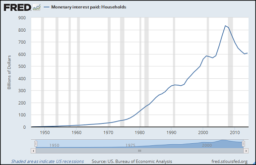
Yesterday's "interest paid" graphs are shown in billions of dollars. An earlier post shows the same cost as a percent of GDP. That's why yesterday's lines show increase, but in the older post the cost of interest runs pretty flat at about 5% of GDP.

The older graph, comparing the cost of oil and the cost of interest, goes back only to 1980 because that's where the oil numbers start. Me, I go back to 1949 and I like my graphs to go back at least that far. The household interest data at FRED goes back farther than I do:

Graph #1: Household Interest Paid as a Percent of GDP
Relative to GDP, the interest number is pretty flat since 1980, except for the big whoops! at the end. But it is not so flat from the 1940s to the 1980s. If this graph starts in 1980 it creates the wrong impression.

What caught my eye is that the line goes up rapidly till 1965, then has a sudden intermission, then picks up steam after the 1974 recession. (Isn't that more interesting than Flat, the line runs flat?)

I know what it is, that sudden intermission. It's a reaction of the graph to the Great Inflation. It is not that interest rates fell and remained low for ten years after 1965:

Graph #2: Interest Rates on the Rise
And it's not that household debt flat-lined after 1965. Debt (the red line) shows persistent increase:

Graph #3: Household Debt in Billions (red) and as a Percent of GDP (blue)
The blue line does show intermission beginning in 1965, similar to that shown on Graph #1. Note that these both show the data as a percent of GDP.

It is not that household debt and household interest cost suddenly slow after 1965. It is GDP that brings the intermission to the data. The reason, of course, is that inflation changes the dollar amount of GDP (and new credit use) but doesn't change the dollar amount of previously existing debt.


Anyway: What caught my eye on Graph #1 is that 'household interest paid' goes up rapidly relative to GDP, until 1965, then has an intermission because of the Great Inflation. I started wondering where the Interest-to-GDP line would have gone if not for the inflation. So I brought the data into Excel and put a trend line on it:

Graph #4: Household Interest Paid as % of GDP and 1947-1965 Trend
I took the data from FRED and showed it in blue. I took the same data, for 1947 to 1965 only, and showed it in red. Then I had Excel create a trend line based on the red line.

I was pleased with the result. The data from 1995 to the crash pretty well fits the same trend as the data before 1965. In the 30 years between, we see the blue line run low (because of the inflation) and then high (because of the

Sunday, June 19, 2016

The more pervasive cost

I looked at this quickly the other day, but it needed more time.

Index mundi provides "United States Crude Oil Consumption by Year" as graph and data from 1980 thru 2013. The numbers are "Thousand Barrels per Day". I'll take their numbers and multiply by 365 to get Thousand Barrels per Year.

FRED provides crude oil prices for WTI crude (since 1986), Brent (since 1987), and APSP (since 1980). The three run close except during 2011-2013. I'll use APSP as it starts in 1980. The APSP crude oil price numbers are Copyright © 2016, International Monetary Fund. The units are Dollars per Barrel.

Using these two sources I can calculate the total cost per year of crude oil consumed in the United States.

Graph #1

FRED turns up a couple dozen series under the heading "Monetary Interest Paid". If I understand this, it is monetary interest as opposed to imputed interest -- monetary interest being interest actually paid.

One of the series FRED offers is Monetary interest paid: Households. Looks like this:

Graph #2
The cost of interest is an actual cost, just like the cost of crude oil. Here are the two together on one graph:

Graph #3
Hard to believe, isn't it? Oil gets all the attention. And again, the red line is only household interest. Doesn't count interest on the Federal debt. Doesn't count the interest paid by businesses, that they deduct from their taxable. Only household interest.

If you want a better idea of the extent of finance in the U.S. economy I can take Graph #3, swap out household interest, and swap in total interest paid:

Graph #4
And that doesn't include "imputed" interest.

Here's my spreadsheet.

Saturday, June 18, 2016

Interest-ing


Notes from Wikipedia


Interest differs from profit, in that interest is received by a lender, whereas profit is received by the owner of an asset, investment or enterprise. (Interest may be part or the whole of the profit on an investment, but the two concepts are distinct from one another from an accounting perspective.)

Interest differs from profit. Interest is to the financial sector what profit is to the productive sector.

//

In the late 19th century, Swedish economist Knut Wicksell in his 1898 Interest and Prices elaborated a comprehensive theory of economic crises based upon a distinction between natural and nominal interest rates. In the 1930s, Wicksell's approach was refined by Bertil Ohlin and Dennis Robertson and became known as the loanable funds theory.

Loanable Funds backstory.

//

The first attempt to control interest rates through manipulation of the money supply was made by the Banque de France in 1847.

Note the method by which interest rates are controlled.

Friday, June 17, 2016

The Cost of Oil and Interest


I scratched around for data and redundant data, and did the graph a couple times. I think it is accurate:

Interest Paid by Households (red) Compared to the Cost of Crude Consumed in the U.S.
And that's only household interest.

Thursday, June 16, 2016

Wages and Productivity: U.S. and U.K.


US Real Wages and Productivity
(1947 Q1 = 100)
 Graph #1, Source = Noah Smith

Graph #2, Source = CPS Think Tank

By the way, Noah thinks graphs like these are irrelevant.

Wednesday, June 15, 2016

Reading Phillip Inman


At The Guardian, Five threats to American prosperity tie the hands of its banker-in-chief by Phillip Inman:

In the seven years of what, in many economics textbooks, would be considered a strong recovery, the Fed has raised rates just once – by a quarter-percentage point to 0.5%, in December last year.

A strong recovery?


Graph #1: Growth Rate of Real GDP, with Averages for Different Periods
Click Graph to Enlarge
That blue line on the right -- the average since 2010 -- that's the "strong" recovery.

Average RGDP growth before 1980 was just below 4% annual. Average growth since 2000 is half that: just below 2%.  And the so-called strong recovery since 2010 is higher than the "since 2000" average, by the thickness of a line.

Phillip Inman ends the "Five Threats" article by saying he hopes the Fed does not raise interest rates, not yet. So it seems he doesn't accept the textbook analysis that says we've had a "strong recovery" since 2010. Well that's good. But really, why even include such a ridiculous view? And why let it stand till the end of the article? Somebody could quote it and try to create the meme that the economy is better than we thought.

Tuesday, June 14, 2016

Puzzle pieces that don't go together: "Using debt" ... "wisely and in moderation"


"Debt is a two-edged sword," says Stephen Cecchetti.1 "Used wisely and in moderation, it clearly improves welfare. But, when it is used imprudently and in excess, the result can be disaster."

Mm. I've had a lot of people tell me debt was not a problem before the early 1980s. So debt was used wisely I guess, or at least in moderation, in the 1950s and '60s and the '70s and early '80s:

Graph #1: Comparing a Stock to a Flow
From the look of it, debt was used even more moderately from the mid-'60s to the early '80s than before. Let's put some lipstick on this pig:

Graph #2: First Quarter 1952, Fourth Quarter 1964, First Quarter 1984.
Suppose we look at the period that begins Q1 1952 and ends Q4 1964. Debt was low, back then. Welfare was improved, Stephen Cecchetti says. Suppose we look at the trend as defined by those start- and end-dates. Something like this:

Graph #3: The Red Line Shows the Debt-to-GDP Trend based on the Q1 1952 to Q4 1964 Period.
The graph shows that if we continued to use debt at the rate we were using debt in those early years we would have had more debt than we actually had, in all the years after 1964. So maybe that's the problem? Maybe we're not using enough debt?

No, I don't think so.

Hm. Maybe we should look at the second period -- from Q4 1964 to Q1 1984 -- where the line is more flat.

You can see for yourself that the new trend line would be lower than actual, in all the years since 1985. I don't need to show you that line. Instead, let me show you why the trend was more flat.


During the period in question -- almost 20 years -- the debt/GDP ratio increased only about 16%. Debt increased about 550% (meaning it got 5.5 times bigger) and GDP increased about 460%. The two measures of prices each increased about 200%, from 100.0 to about 300.0. Prices, in other words, tripled during those years.

During those years, GDP increased from about $700 billion to about $3900 billion. But prices had tripled. 1984 GDP in 1964 dollars would be about $1300 billion, not $3900 billion. The $2600 billion difference is due entirely to inflation. That's why economists call those years "the Great Inflation".

Now consider how inflation changed debt and the debt-to-GDP ratio. Rather than reducing the 1984 number to its 1964 value as we did above, this time I will increase the 1964 numbers to their 1984 values.

In Q4 1964 the debt we're looking at (total private non-financial debt, copyright (c) BIS) was $591 billion and change. About $600 billion, but call it $500 billion. It's an easier number to work with.

During the years in question, prices tripled. To buy in 1984 the things we could buy in 1964 with $500 billion would have cost $1500 billion. It would have cost us $1000 billion more if we bought that stuff in 1984. Because of inflation.

In Q1 1984 we had $3854.611 billion of private non-financial debt. If the 1964 stuff cost us $1000 billion more, we would have had $4854.611 in Q1 1984. That's 124% of GDP. Instead of having private non-financial debt that was less than GDP in 1984, debt would have been more than GDP.

And that considers only the debt we had in 1964. To be accurate in our numbers, we would have to take the 1965 addition to our 1964 debt and increase it to account for the change in prices between 1965 and now. And we would have to increase the value of our 1966 addition to that debt, and 1967, and all the other years.

We don't. We don't figure debt that way. And that's fine. But you have to realize that the thing that kept the debt-to-GDP ratio low was inflation. It wasn't that between 1964 and 1984 we were such wise and cautious borrowers. It was inflation that kept debt down and the ratio low.

So much for wisdom and moderation.


// Note
1. Stephen G. Cecchetti, M. S. Mohanty and Fabrizio Zampolli, in Achieving Growth Amid Fiscal Imbalances: The Real Effects of Debt.

Monday, June 13, 2016

Why "economists pay no attention to private debt"


Steve Keen in Economics in the Age of Deleveraging, 28 January 2012:

Australian private debt is still rising (though more slowly than nominal GDP), whereas US private debt has been falling in absolute terms, and the UK has fluctuated between rising and falling debt.

Non-economists might expect professional economists to pay great heed to these indicators—after all, surely private debt affects the economy? However, the dominant approach to economics—known as “Neoclassical Economics” —ignores them completely, on the a priori grounds that the aggregate level of private debt doesn’t matter ...

Economists say private debt doesn't matter.


Steve Keen in Get ready for a recession by 2017, 22 March 2016:

conventional economists ... ignore private debt as just a “pure redistribution”, to quote Ben Bernanke.

Economists say private debt doesn't matter.


Stephen G. Cecchetti, M. S. Mohanty and Fabrizio Zampolli in Achieving Growth Amid Fiscal Imbalances: The Real Effects of Debt

For a macroeconomist working to construct a theoretical structure for understanding the economy as a whole, debt is either trivial or intractable. Trivial because (in a closed economy) it is net zero—the liabilities of all borrowers always exactly match the assets of all lenders.

Economists say private debt doesn't matter. It's the same explanation Steve Keen uses all the time.


Finally, I found another explanation.

Patrizio Lainà in Dynamic Effects of Total Debt and GDP: A Time-Series Analysis of the United States, 2011:

Interestingly, mainstream economists have given warnings about the public debt to GDP ratio (see e.g. Sargent & Wallace 1981), but at the same time they have almost completely neglected the private debt to GDP ratio. This might be due to Fama's (1965 & 1970) widely used efficient market hypothesis, which simply implies that private debt does not matter because it is always on the “right” level and no economic imbalances, such as bubbles, should occur. This, in turn, indicates that there is no need to study private or total debt.

It's the EMH.

Sunday, June 12, 2016

Misinterpreting Minsky


Let us consider an out-of-context excerpt from Dynamic Effects of Total Debt and GDP: A Time-Series Analysis of the United States, Patrizio Lainà's master's thesis.

Presenting the theoretical framework of his thesis, Lainà begins with the financial instability hypothesis of Minsky:
Minsky (1982 & 1986) presents the process of financial instability as follows:

1. The process starts from a situation where the real economy is healthy and growing. Firms and financial institutions are, nevertheless, cautious and try to avoid risky investments due to a crisis in the recent past.

2. However, low-risk investments keep on succeeding and economic growth accelerates. Positive development of balance sheets inspires the firms and investors to take more risk as it tends to be clearly profitable. More finance is needed and the banking sector loosens its lending terms. In this situation both debtors and creditors see a bright future.

3. A self-reinforcing cycle is born as new debt money increases the demand for financial assets, housing and other investments. Financial institutions loosen their lending terms more and, for that reason, hedge, speculative and Ponzi borrowers appear on the market. First, there appear the hedge borrowers. They can make debt repayments, covering interest and principal, from the cash flows the investment produces. After the hedge borrowers, speculative borrowers will appear. They can service the debt, that is, make interest payments, but they must regularly roll over the principal. Finally, the Ponzi borrowers will appear. They found their investment strategy on the assumption that asset values will keep on rising. Ponzi borrowers cannot make sufficient payments on interest or principal from the cash flows the investment provides, but they refinance the debt with the appreciated asset value.

My title -- Misinterpreting Minsky -- is not offered as a critique of Patrizio Lainà's summary. On the contrary, I quote Lainà's summary because is is a very clear presentation of the only interpretation ever offered of Minsky's financial instability hypothesis. To the world, it will be my interpretation that is the misinterpretation. To me it is not Patrizio Lainà who misinterprets Minsky, but the world.

Let me begin by summarizing Lainà's summary. He presents three steps:
1. the real economy is healthy and growing, which leads
2. firms and investors to take more risk, until finally
3. a self-reinforcing cycle is born.

These are not so much separate steps as phases of a gentle, continuous transition. The continuity is evident in Lainà's presentation even though he creates and numbers three separate paragraphs.

It is this clearness in Lainà's presentation that induced me to quote him.


Lainà's three numbered paragraphs describe one smooth, continuous transition. But consider now paragraph number three. I repeat it below in shortened form:
Financial institutions loosen their lending terms more and, for that reason, hedge, speculative and Ponzi borrowers appear on the market. First, there appear the hedge borrowers... After the hedge borrowers, speculative borrowers will appear... Finally, the Ponzi borrowers will appear.

See how cut and dry this is? First, second, third. One, two, three.

Within the third paragraph, Lainà describes three unique and independent steps in the rise of instability. In his presentation, the three numbered paragraphs present one continuous transition. But the last of those paragraphs presents three separate and distinct steps.

It is not only Lainà who presents Minsky in this manner; so also does the world. I think the presentation of independent steps is incorrect. As I said, one of us is misinterpreting Minsky -- perhaps me, perhaps the world. You know what I would say about that.


Let me go back and fetch from Paragraph 3 some things omitted from the shortened form. We have first

the hedge borrowers. They can make debt repayments, covering interest and principal, from the cash flows the investment produces.

Second, the speculative borrowers:

They can service the debt, that is, make interest payments, but they must regularly roll over the principal.

Third, the Ponzi borrowers:

Ponzi borrowers cannot make sufficient payments on interest or principal from the cash flows the investment provides

The first group or category can cover both interest and principal from the income generated by the investment. The second can cover interest, but not principal. The third can cover neither interest nor principal from the generated income. These are not groups. They are categories of distress. They are categories of financial distress originated by Minsky to describe the changes within a continuum.

Lainà and the world present hedge, speculative and Ponzi as separate groups, arising in chronological sequence. I see them as stages of distress in the development of financial instability. It is not important that we call one "hedge" and another "Ponzi". What is important is to see the deterioration of income that arises from the continued growth of finance.

Saturday, June 11, 2016

Peak finance


At Project Syndicate, A Tale of Two Debt Write-Downs by Adair Turner. Opening paragraph:
At the end of 2015, Greece’s public debt was 176% of GDP, while Japan’s debt ratio was 248%. Neither government will ever repay all they owe. Write-offs and monetization are inevitable, putting both countries in a sort of global vanguard. With total public and private debt worldwide at 215% of world GDP and rising, the tools on which Greece and Japan depend will almost certainly be applied elsewhere as well.

An advanced economy by definition contains a well-developed financial sector. Like a mill turning grain into flour, a bank can turn one dollar of money into ten or twenty or even thirty dollars of credit. The more well-developed the financial sector, the more credit it can create from a dollar of money. The more credit and the more debt it can create.

When the economy reaches peak finance we get a financial crisis. If we're lucky debt implodes, reducing the level of debt and opening the door for a new period of credit-based growth. If we're lucky, the implosion happens on someone else's watch.

After the Great Depression we learned how to prevent the implosion. When the U.S. reached peak finance around 1974, it was implosion time. We avoided the implosion by, among other things, increasing the public debt:

Graph #1: The Federal Debt
We avoided the implosion. If debt was a burden on the economy, the burden was not relieved because there was no implosion. As a result, productivity fell and remained low for twenty years.

During most of that time, total debt grew apace with government debt. We had nearly five dollars of total debt for every dollar of Federal, and the ratio remained at that level until the latter 1980s.

Graph #2: All the Debt as a Multiple of the Federal Debt
By the early 1990s the ratio had fallen to about four dollars total per dollar Federal. Suddenly, then, there was "the new economy". The economy grew, and the Federal budget was balanced, and private debt grew. Soon the ratio was back up to $5 and the economy got sluggish again.

//

If write-offs and monetization solve the problem for Greece and Japan and around the globe, it will be because private debt has been reduced relative to government debt.

The trouble is, our finance industry knows how to take a government dollar and instantly mill it into a cloud of new debt. The trouble is that we have a sophisticated and advanced financial sector. The trouble is peak finance.

Friday, June 10, 2016

One from the coloring book


The growth of debt versus the growth of output:


Thursday, June 9, 2016

R the 2nd

My previous R post was a month ago.

The dogs wanted to go chase deer at 3:30 this morning. I always get up when they wake me up because I don't know if it is wildlife or some bodily function that is the source of their urgency. Now it's four o'clock -- in the morning -- and I have no urgent needs of my own. Nothing greater than a second cup of coffee.

I avoid Reddit, leaving my mind clear while my own thoughts float to the surface: "Let's look for Getting started with R." Okay.

Ooh, RStudio, an integrated development environment. I have luck with IDEs. But, later.

Ooh, a wiki. Yeah. From York University in Toronto. Lots of links. "Print a copy of Tom Short's R reference card" catches my eye, but www.rpad.org/Rpad/R-refcard.pdf isn't working.

Then "if you're an experienced programmer just getting starting with R you might really enjoy The R Inferno by Patrick Burns". The word "enjoy" causes hesitation, but I consider myself an experienced programmer, so I click.

126 pages. Oh, well.

Some one-line examples on page 11 (the text starts on page 9 so that's not bad). I start R and try the examples. Same results as shown in the PDF. Good start.

Short chapter. That's good.

Next chapter opens showing three ways to do one task. Interesting -- interesting to me, anyway -- but I don't want to get into this now. I want to get started before I start picking the best way to do something. I want to find Tom Short's R reference card.

Got it.

PDF, four pages, dense. Perfect.


Notice that most of these commands (like help and apropos and str) are followed by parentheses and
that there is often something inside the parentheses That tells me these commands are functions,
like in C. You give the function information. The function uses that information to figure something,
and when done it returns a value to you. The info you provide goes inside the parentheses.

When you are learning a language, the main thing you need is the words and their meanings. That's what reference cards are for. Read the whole reference card a couple times, then put it aside and think about other things. Eventually there is some calculation you need to work out, a simple one, and you say: Maybe I can do this in R. Two or three words from the card pop into your head and you arrange them in order like a sentence and you say Yeah this'll work. You're on your way.

Might not be the best way if this is the first time you're learning a language. But I always needed simple tasks to start with. My first project in Assembler was to clear the screen on my Commodore-64. In VBA, to open a file.

I print the card. Print first to doPDFv7 (which creates a PDF, not a paper printout) to see if it is landscape and to make sure nothing is cut off. All good, so I send it to my printer.

Error.

I keep the first two pages and print the last two from the doPDF output PDF. That works.

It's always somethin.

Could be the most useful thing I've printed in years.

//

The dogs lie patiently while I prepare their breakfast, waiting to lick my finger while waiting for me to finish. When I put the spoon in the can and set the can down they get up, knowing that breakfast is ready. How do they know?

Wednesday, June 8, 2016

Brief follow-up on Glasner on Trade


David Glasner:

buying less from foreigners means that they will buy less from us for the simple reason that they will have fewer dollars with which to purchase our products.

Glasner's statement assumes that trade deficits tend to zero. This need not be the case. It is not the case for the U.S. We buy more and more from foreigners, increasing our trade deficit endlessly.

In addition, if I have it right, we typically run surpluses with some nations and deficits with others. This also contradicts Glasner's claim.

Tuesday, June 7, 2016

Hayek and Keynes


The question of trade brings up the matter of independent national economies, which gives rise to the notion of globalization and the supranational state.

David Glasner, What’s So Bad about the Trade Deficit?:
It almost seems tedious to do so, but it apparently still needs to be pointed out that buying less from foreigners means that they will buy less from us for the simple reason that they will have fewer dollars with which to purchase our products.

Thus, even if reducing imports increases employment in industries that compete with imports, it must also reduce employment in export industries.

If you are a globalist, if you like the idea of sacrificing national sovereignty at the altar of an as yet undefined universal state, perhaps the trade deficit is no problem for you.

If you'd prefer to preserve the nation-state, you probably think more domestic employment on domestic production, and less on exports, is a good trade-off.


From The Road to Serfdom:
An international authority which effectively limits the powers of the state over the individual will be one of the best safeguards of peace. The international Rule of Law must become a safeguard as much against the tyranny of the state over the individual as against the tyranny of the new super-state over the national communities. Neither an omnipotent superstate nor a loose association of "free nations" but a community of nations of free men must be our goal.

Hayek approaches the question from a political point of view, placing the individual above both state and superstate. Hayek would not support the European Union.


Keynes approaches the question from an economic point of view. From The General Theory of Employment Interest and Money:
I have pointed out in the preceding chapter that, under the system of domestic laissez-faire and an international gold standard such as was orthodox in the latter half of the nineteenth century, there was no means open to a government whereby to mitigate economic distress at home except through the competitive struggle for markets. For all measures helpful to a state of chronic or intermittent under-employment were ruled out, except measures to improve the balance of trade on income account.

Thus, whilst economists were accustomed to applaud the prevailing international system as furnishing the fruits of the international division of labour and harmonising at the same time the interests of different nations, there lay concealed a less benign influence; and those statesmen were moved by common sense and a correct apprehension of the true course of events, who believed that if a rich, old country were to neglect the struggle for markets its prosperity would droop and fail. But if nations can learn to provide themselves with full employment by their domestic policy (and, we must add, if they can also attain equilibrium in the trend of their population), there need be no important economic forces calculated to set the interest of one country against that of its neighbours.

Keynes, like Hayek, had no need of the European Union.

Just looking


Total Credit to Private Non-Financial Sector, © BIS, quarterly change in billions of dollars:

Graph #1
I marked it up a little. Comparing the current situation to the early 1990s. Circled two spots where change-in-credit starts rising from zero. To me the two increases from zero are similar. And I expect the similarity to continue. Thus, I expect the economy in the next few years to be vigorous, as in the 1990s.

In both cases after the increase from zero there is a leveling off. It was higher in the 1990s, this leveling, than at present. But not much.

Look at it a different way. I put "Total Credit to Private Non-Financial Sector" in billions on a graph twice. I indexed the blue one to equal 100 at First Quarter 1991, which is the first date circled on Graph #1. I indexed the red one to equal 100 at Second Quarter 2011, the second circled date. The new graph compares the two periods of growth:

Graph #2
The more recent period (red) shows a bit slower growth.

Then what the heck, credit use is good for growth, right? So I made a similar graph, indexing the same two dates. But instead of looking at credit, this time we look at real GDP:

Graph #3
As goes credit use, so goes real GDP.

The gap between red and blue is bigger on the GDP graph than on the Credit graph. This suggests that GDP grows more slowly than credit. To confirm that, compare the two blue lines. Both start at 100. By the end, credit has climbed to 170, while real GDP to less than 140.

I expect the economy in the next few years to be vigorous, but it looks to be less vigorous now than the 1990s.

Sunday, June 5, 2016

Creating debt is a way to stretch base money


A second look at a Bloomberg story by Rich Miller, Risky Reprise of Debt Binge Stars U.S. Companies Not Consumers.

Miller:

Consumers were the Achilles’ heel of the U.S. economy in the run-up to the last recession. This time, companies may play that role.

I bring it up because this:

Graph #1: Household Debt relative to Total Private Non-Financial Debt
The graph shows household debt as a portion of private non-financial debt. The other portion, other than household debt -- it's not government debt, because we're looking at private debt here -- is business debt. The same that Rich Miller is looking at.

When household debt goes up on the graph, business debt goes down. And when household debt goes down, business debt goes up.

Household debt has been trending down since 2010 or so. So Miller is right: Companies, not consumers, are running up debt "this time".

But that also happened for ten years starting in the mid-1960s, when we had a lot of inflation. It happened in the early 1980s, when we had a lot of recessions. And it happened in the latter 1990s, when we actually had some good years. So it is not obvious that "companies running up debt" is a clearly defined problem.

////////////

I'm doing it again. I just said

it is not obvious that "companies running up debt" is a clearly defined problem.

And the other day, considering Miller's article, I said

Rich Miller sees debt going up, and takes it as a warning sign. He seems to assume that a high level of debt (in dollars) is the cause of the problem.

Sounds like I'm saying debt is not a problem. But that is NOT what I'm saying, certainly not. Private debt is a problem. Private debt is the problem. Private debt.

Looking at the graph, though, you can see that household debt typically stayed between 45% and 55% of private non-financial debt. Except after the year 2000, when household debt went high (and business debt went low).

For the last few years, though, the household portion has been coming down. It is now back in the normal range, between 45% and 55%. Still on the high side, but in the normal range. That means the business portion is on the low side, but also back in the normal range.

What I'm saying is, you can't just look at companies running up debt for the last few years and conclude it's going to be a problem.

On the other hand, household debt remains at a high level. If business debt is getting back into the normal range relative to household debt, then business debt is getting high, too. And total private debt is going up.

That could be a problem.

But you can't just look at total private debt going up and conclude that it's going to create a problem. You have to look at debt relative to other things. The thing that's most relevant, the best context, is base money. Because creating debt is a way to "stretch" base money and make the money support more spending.

When I look at debt relative to base money, I don't see a problem. I see economic vigor in the years ahead.

Friday, June 3, 2016

Imagining the Future


Gray: "percent change from year ago" of Real GDP.
Red: The Hodrick-Prescott of the Gray line.
Black: A fifth order polynomial trend line placed by Excel. Yeah, I don't know what a fifth order polynomial is, either. But it seems to fit the red line pretty well.

Graph #1
Imagine the Future: Copy the black line and paste it onto the end of itself. RGDP growth peaks at 2.3% in 2022, and eventually falls below zero. Shown below in green:

Graph #2. Click Graph for Larger Image
In case you were wondering: I used Excel's trend line formula to calculate values for the green line. Subtracted 2 from the first calculated value to get the first predicted value and repeated that calc for each subsequent value.

I originally increased the Excel calc to 12 decimal places, but the accuracy was off quite a bit. So I went with 20 decimal places. Now the green line matches the black from 1948 to 2016.

If the RGDP growth trend falls as much in the next 68 years as it has in the last 68, the growth trend will be below zero. To me this says the decline we have had is more troubling than I thought.

// The Excel file

Wednesday, June 1, 2016

Fear of debt

Not investment advice.

At Bloomberg, Risky Reprise of Debt Binge Stars U.S. Companies Not Consumers by Rich Miller, 31 May 2016:

Among the warning signs: rising debt, lagging profits and mounting defaults...

“Companies have been adding to their debt and their debt has been growing more rapidly than their profits,” said John Lonski, chief economist of Moody’s Capital Markets Research Group in New York.

The similarities between the pre-recession debt binge by consumers and today’s burst of borrowing by companies are striking.

Rich Miller's focus is on debt in dollars. Debt in dollars is going up. Ergo problemo, says Miller. But debt in dollars is always going up -- except when there's a problem. Apart from 2008-2010, debt was always going up:

Graph #1: Debt in dollars is always going up -- except when there's a problem.
This graph shows total credit market debt, public and private.
Rich Miller sees debt going up, and takes it as a warning sign. He seems to assume that a high level of debt (in dollars) is the cause of the problem. It looks to me that the lesson Rich Miller took from the crisis and recession was

    1. Debt was high in the years after 2000.
    2. We had a recession in 2008.
    3. Debt is going high again now.
    4. So we will have another recession.

Miller's concluding paragraph confirms this four-step summary. He writes

Lonski of Moody’s said it’s premature to predict that the U.S. is heading into a recession because the labor market is still strong. But the squeeze on companies is “a risk factor that’s worth watching.”
We're going to have a recession, he says, because debt is going up. But debt in dollars is always going up, except when there's a problem. The problem occurs when debt stops going up. Keep that in mind when you look at debt.


Miller's focus is debt in dollars. Did he miss the Fed's response to the crisis and recession? Did he miss all the quantitative easing??

No. More likely, Miller doesn't know what purpose QE served. A lot of people thought QE was the wrong response to the problem. Hey, I guess I did, too. But that's what we got, we got QE. And QE changed the numbers. You have to work those numbers into the mix to see the situation today.

I'm thinking Rich Miller hasn't looked at the changed numbers. Hasn't looked at debt in the context of those changed numbers. That's what I want to look at now.

I want to point out first that quantitative easing was the solution chosen by people who know a lot about this sort of thing. They know more than most of us. Just because everybody hates the government doesn't mean the smart guys at the Fed were wrong. And anyway, QE is the solution we got. Might better have a look at those numbers.

If we take base money -- the money that increase directly as a result of QE -- it goes up. I'll show it in red on a graph, along with the same debt we looked at above:

Graph #2: Total Debt (blue)(Same as on Graph #1) and Base Money (red)
Yeah... (Tongue in cheek.) Base money really went up.

You've heard of stretching a dollar, right? The red line shows the number of dollars of money created by the government. The blue line shows how far those dollars were stretched by the banking system.

The vertical gray bar at the right, just before 2010, that's the 2008 recession. During that recession is when the quantitative easing started. You can see the red line go up. That was QE.

Now let me take that debt and that base money, and divide the one by the other:

Graph #3: Total Debt relative to Base Money
This graph shows how many dollars of total debt there are for each dollar of base. You can see the number peaked at over sixty dollars of debt for each dollar of base money, when the 2008 recession was starting. By the end of the recession the number had fallen by half. Since then it has fallen intermittently, and now there's about $15 in total credit market debt for each dollar of base.

That decline from $60 to $15 was due mostly to quantitative easing. So yes, base money really did go up. I was funnin' you before when I suggested it didn't.

Now let me take the data from Graph #3 and plug it into Excel.

The blue line on Graph #4 is the same "debt relative to base money" data that we saw on #3. I showed the last part of it red, the part since the last quarter of 2008. Then I had Excel put a trend line on that part of it, in black, and extended that trend line out to 2020.

Graph #4
The trend line bottoms out in the first quarter of 2016 -- just a few months ago. The trend shows increase since that time.

Like Rich Miller said, it's going up. Yeah -- but my graph shows it just starting to go up now, after a very big drop. Miller looked at debt in dollars. I'm looking at debt in context -- and the context is the quantity of money that was adjusted by some pretty smart guys.

This trend line turning upward -- this is a big deal. If you read economic history in terms of debt relative to base, you know that when the trend bottoms out and starts to go up, economic growth gets vigorous.

This is the part nobody believes -- that our economy is going to be very good for the next few years. But it's right there on the graph.

Actually, it's there on the graph twice. Once, the black line, which shows the economy getting good right now. And before that, the blue line bottoms out in late 1993 and starts to go up again. By 1995 we had what they call "the new economy". The vigor lasted several years. Attribute those good years to technology or what you will. The fact is, we didn't get those good years until after the debt-to-base ratio bottomed out and started climbing.

And before that, though it didn't make the graph, the ratio bottomed out in 1946, then started increasing. You can see most of that increase on the graph in the 1950s and the '60s and the early '70s. Those years are considered a "golden age".

And before that, the ratio bottomed out in 1920, then trended upward for a decade. We call that one "the Roaring Twenties".

So look: 1920, and 1946, and 1993... and 2016. Four bottoms, each followed by some years of a healthy and vigorous economy. Something to think about, surely.


// See also mine of 3 March, 25 April, and 4 May.

// Download the Excel file for Graph #4