Saturday, October 15, 2011

A couple more glances


Graph #3 from 9 October (repeated here as Graph #1):

Graph #1: MULT back to 1959

Around 1974 there is a sudden drop in the blue line that reminds me of the end of the golden age. Forgive my color confusion, but I am repeating part of that blue line in red on Graph #2, below:

Graph #2: MULT from 1959 to 1980

That sudden drop occurs during (and immediately before) the 1974 recession. In red.

The blue line on Graph #2 shows annual rate of change of the red line, and you can see a steep drop in the blue that occurs at the time of the sudden drop under discussion.

On this graph you can also see a short flat spot in the red line at -2 on the left scale (though really, the right scale applies to the red line, and the number is 3.3). This flat spot occurs as the blue line jumps up from negative 3% growth to zero, for two or three years after the near-recession of 1966-67. I point it out because it's the only spot on the graph where the red line isn't trending down. It's the only spot where the blue line isn't averaging somewhere around -1% or less.


So then I got thinking about the bumps of the 1980s and '90s:

Graph #3: MULT from 1980 to 2000

They stand out, don't they? The tall blue peaks beginning around 1985 and again around 1992 show the rate-of-change associated with the bumps in the red MULT line.


A different look. The blue line on Graph #4 below is MULT (the M1 multiplier) for 1959-2011, trending down continuously except at those bumps we just looked at.

(The blue line here shows the same info as the blue-and-red line of Graph #1 above. And the same as the red lines shown on Graphs #2 and #3. More color-confusion on my part.)

Graph #4: MULT for M1 and MZM
The blue line, the M1 multiplier, is more or less centered on the level 1.0. The red line here, the MZM money multiplier, is pretty well centered on the level 2.0.

These are log values (as the vertical axis indicates), meaning this graph shows growth or relative growth. So I will say MZM money growth was faster than the rate of M1 money growth for the 1959-2007 period. (I was tempted to say "twice as fast" but that is not correct. MZM growth was about 30% faster than M1 growth during the 1980s, by my calculations.) Also, the MZM growth trend was not declining for the period before the crisis. The M1 growth trend clearly was.

I briefly mentioned the other day, that I think M1 was the "financial innovation" of the years before the Great Depression, and MZM the innovation of the years before the Current Depression. I think this graph supports that view, though I 'm not prepared to explain myself.

Maybe I should say that M1 and MZM are not themselves the innovations, but rather are tools created for the purpose of measuring the results of financial innovation.

Friday, October 14, 2011

Echoes


Seems like an appropriate time to repeat something I showed back in May:


The monetary base as measured by FRED AMBSL, percent change from year ago. With red circles on the 1920-1930 decline and the 2000-2010 decline.

Thursday, October 13, 2011

This guy doesn't


A comment by Ashwin at the Slack Wire:

There are a few problems with going back to the Golden Age - for one, the financial system we had back then was just a stroke of good luck and is irretrievable as Minsky recognised. Too much "innovation" has happened...

Irretrievable? Is that what Minsky said? I never read the guy.

This guy thinks like I think


A comment by David Merkle at EconomPic:

... As the private sector delevers, this correlation should fall. If we get back to a low leverage environment like 1941-1984, it should disappear.

Nuts and Bad Words


I don't know how I ended up writing several in a row on the money multiplier and its components. (As I said, I woke up thinking M1>GDP in Japan and Base>M1 in the USA. By the time I had Blogger on-screen I had four posts in my head. I love mornings like that.) Anyway, I would say I don't give a sh*t about the money multiplier, except I don't use the word sh*t.

A while back, I looked at what Bill Mitchell and Steve Keen said about the money multiplier. Mitchell said the money multiplier is

not even a slightly accurate depiction of the way banks operate in a modern monetary economy characterised by a fiat currency and a flexible exchange rate.

Keen called the money multiplier

completely inadequate as an explanation.

I don't give a sh*t.

The money multiplier is a number, not "an explanation". Not a "depiction of the way banks operate". It is a ratio that shows how much M1 money there is, for each dollar of base money in the economy. It is a number, and it changes. Obviously.

Keen and Mitchell (see my old post) both review in excessive detail the process of figuring out how much money can be created from one new dollar. There is an easy way to figure that out, as I showed at the time. And it gives a true and accurate result. But remember: That result does not tell you how much money *is* created from each new dollar. It tells you the absolute maximum amount of money that *can be* created from a dollar. It depends entirely on the reserve requirement. It's simple arithmetic.

The purpose of that story, as I recall, is to convince people new to economics that money is created by the act of lending. That's the concept that I had trouble with when I was new to economics. And it was an explanation identical to the one that Mitchell and Keen use, that convinced me that lending creates money. But it was the easy way to figure it, that really convinced me. Simple math.


The fact is, the calculation (how much money can be created from one dollar) only sets the theoretical maximum. Sort of like a speed limit. But how much money is actually created is another matter altogether. Sort of like driving.

The best story I've seen on this topic is Matt Rognlie's peanut-butter machine story.

Actually, just the peanut-butter machine story. Pay no heed to the rest of Rognlie's post. He starts out misinterpreting the phrase the breakdown of the standard money multiplier. John Williams uses that phrase to mean the ratio no longer behaves as expected. Rognlie does a straw-man interpretation. What's significant is that the multiplier number has changed.

Yeah, and skip over the part where Rognlie says that having a reserve requirement costs banks money. Get over it, Rognlie. That's just part of the cost of doing business. It's a service charge -- 0.4% each year in Rognlie's example -- for the right to use and inflate the standard of value established by the U.S. government. A service charge for legalized counterfeiting, essentially. Not that there's anything wrong with that. But the cost should have been a much higher, and fixed, and permanent policy.

So, just the peanut story. You'll love it.

Wednesday, October 12, 2011

Nope. It wasn't all downhill.


So, I was sayin...

AMBSL goes back to 1918. M1SL only goes back to 1959. In the Historical Statistics, M1 goes back to 1915, and you could get a really long-term view of MULT using that. Maybe it wasn't *all* downhill...

Here ya go:


The ratio reaches a peak in 1929, drops ever so slightly in 1930, then falls to a bottom in 1934. A momentary peak (1937) is followed by another bottom in 1940. The up-hill leg of that "V" peaks in 1943, with minor drops in 1944 and '45. Then, a relaxed climb to the 1959 peak, and a gradual decline to 1985. Then the two bumps that always catch my eye, and deep decline.

The Google Docs spreadsheet, after you click once on the graph, will pop up little windows to help you gather information such as in the paragraph above. You don't get that, of course, with the image I captured for posting.

First reactions:

The sharp drop and double-dip associated with the Great Depression comes as no surprise. The relatively high, relatively stable numbers that occur during the "golden age" (1947-1973) also come as no surprise.

I am surprised by the coincidence that the FRED data starts in 1959, and that the local peak also occurs in 1959. You wouldn't know, by looking at the FRED data, that the M1 multiplier had been trending upward for almost 20 years before 1959. I am surprised and I want to point it out, because I see no reason to ignore data as FRED ignores M1 before 1959. And I don't think people should be satisfied with that, great as FRED is.

What else? Oh! This is a big deal: Immediately prior to the Great Depression, the Mult ratio was trending upward at a good clip. In stark contrast, the ratio was trending down immediately before the current Depression. And it had been trending down for half a century. Why the difference?

I think it has to do with financial innovation. That's just a guess, a first reaction, but I can imagine that in the 1920s, M1 money was the financial innovation of the day. The debt that is always associated with financial innovation was, in the years before the Great Depression, associated with M1 money. Therefore an increase in debt was associated with an increase in M1 money. Today we have MZM and other, even more debt-like "near money" innovations that increase with debt, while M1 money falls by the wayside.

In our time, M1 is no longer an innovation. It is not thought of as debt, but as the money of normal use. At least, that's how I still think of it. (Thus I use M1 as the denominator of my Debt-per-Dollar graphs.) Debt in our time has had to find more innovative outlets, and has found them. Thus in our time M1 has declined while base money perhaps had to expand to support other, more debt-like forms of money.

Methodology:
Simple ratios: M1 money (in billions) divided by Base money (in billions).
Annual data.

Sources:
1. Base money: FRED AMBSL, 1918-2010
2. M1 money: Historical Statistics thru 1970, 1915-1970
3. M1 money: FRED M1SL, 1959-2010

Google Docs spreadsheet. Allow a moment for the graph to appear.

Tuesday, October 11, 2011

AMBSL goes back to 1918


FRED gives us this for base money (annual data):

Graph #1

That ought to make you uncomfortable. Even if you know better.

Here's a log look at the same data:

Graph #2

I'm not sure what the numbers on the Y-axis mean. But Graph #2 shows the growth of base money. Slow growth until 1930. Rapid growth from 1930 to 1945. Slow from 1945 to 1962. Moderate growth from 1962 to 2007 (with a little droop at the end of it). And then, more-than-rapid growth after 2007, the Bernanke fix.

So I'm thinkin... Suppose the kink at 2007 is like the kink at 1930, the start of a Depression. And suppose the 1930-1945 money growth was the solution to the Depression. The question, then, is: How much more will the Bernanke fix have to increase Base Money, if a proportional increase is required now?

We know from experience that there was a large increase in the quantity of base money and we (Ben Bernanke and I) think we know that the increase of base money was what fixed the economy and ended the Depression. So Ben is orchestrating a comparable increase of base money now. I want to know what will happen to the money supply if it increases by the same multiple now as it did during the Great Depression.

You with me?

In 1930, the level of base money was $5.879 billion. In 1945, it was $31.685 billion. That's more than a five-fold increase. The multiple is 5.39.

So. Suppose we take our base money from 2007 and multiply it by 5.39. That will give us an increase comparable to the increase we think fixed the Great Depression.

In 2007, FRED has base money at $850.529 billion. That's before the quantitative easings began. Now, take that number and multiply by 5.39 to see how much base money we might need to end this Depression: $4584.35 billion.


The last base-money number shown on Graph #1 above is just over $2000 billion. That's as of 1 January 2010. The most recent number from FRED is $2656.691 billion, for September 2011. So the number is still going up like crazy. And the number is still about two trillion dollars short of what we might need to end this Depression.

I gotta tell ya, Ben, I don't like where you're going:

Graph #3: Projection

And I gotta say, the alternative is to reduce private-sector debt.

Monday, October 10, 2011

Dear Ben,


I woke up thinking how in Japan, the quantity of M1 money is now greater than GDP...

Graph #1

And how, here in the U.S., the quantity of base money is greater than M1...

Graph #2

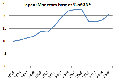
And wondering if base money in Japan is higher than GDP...

Graph #3, Source: Paul Krugman

According to Krugman, it is not.

Since 1995, the quantity of Japan's base money has doubled. In the U.S since 2008, base money has tripled...

Graph #4, Source: Paul Krugman

Actually, Ben, it looks like you thought you could double the money and be done with it (in 2008) but then you waited and it didn't work, so you tried another 50% in 2009 and waited to see if that worked, and when it didn't you tried another 50% boost in 2011. That's sure how it looks to me.

This is a completely unnatural situation, and dangerous for the dollar no matter what Krugman says. But besides than, Ben, it's not working. Even Krugman agrees with that.

Ben, listen to me. You're doing the wrong thing. You're trying to fix things the wrong way. I'm not one of those people who went into a panic when you started doubling the quantity of money. I'm not. But you tripled the money, and it barely had any effect! You're starting to remind me of Norm Peterson and Cliff Clavin.

There was an episode of Cheers where Dr. Crane brought his rat machine into the bar. You know, where the rat pushes a lever and gets either a treat or a shock, depending which lever he pushes. Norm and Cliff were playing with this machine, trying to get it to give them a treat. But they kept pushing the wrong lever...

It's not working, Ben. You're still worrying about deflation. You're still worrying about recession. You're still worrying about the level of home prices. You're in the same boat you were in three years ago. Your plan isn't working. You're pushing the wrong lever.

I know, buddy, you have to do something. I know. And I think you don't know what else to do. But that's no excuse, Ben. Ignorance is no excuse.

Sunday, October 9, 2011

Why'd they do that?


At FRED, the default view of MULT (the M1 money multiplier) starts at 1984:

Graph #1: FRED's MULT

And that's the earliest start you can get, for the MULT data. The earliest start I can get. But I was looking at my Desperate Measures post the other day, and it shows a FRED graph of M1 money and the money base, both going back to 1959:

Graph #2: The Components of MULT

So FRED has the data it needs, to show MULT back to 1959, anyway. Why did they only go back to 1984, I wonder.


This comes up, because while I was looking at Graph #2 -- and knowing that MULT is the ratio of the blue line to the red -- I again noticed the bumps in M1 money and I wondered why they didn't stand out on the MULT graph.

I guess they do, if you're thinking about them. But with the older data cut off like that, there's no prior trend to indicate that the bump is actually a bump. From what we can see on the MULT graph, the ratio might always have been choppy like that, before 1995. You just can't say. So I made my own version of MULT:

Graph #3: MULT back to 1959

The bumps *do* stand out.

The blue line starts in 1959, ends in 2011. I overlaid FRED's MULT on top of it (in red) and you can see it's a good match.

You can also see the ratio wasn't always choppy before 1995. It was only choppy during those M1 bumps in the 1980s and 1990s. Other than that, it was all downhill.

Actually, AMBSL goes back to 1918. M1SL only goes back to 1959. In the Historical Statistics, M1 goes back to 1915, and you could get a really long-term view of MULT using that. Maybe it wasn't *all* downhill...