From Why Have the Dynamics of Labor Productivity Changed? (PDF, 26 pages) by Willem Van Zandweghe, an economist at the Kansas City Fed:
In recent years, the U.S. economy has undergone a change in the behavior of productivity over the business cycle. Until the mid-1980s, productivity growth rose and fell with output growth. But since then the relationship between these two variables has weakened, and they have even moved in different directions.
Thought I'd take a look at that. Here are "percent change from year ago" patterns for inflation-adjusted GDP and Total Factor Productivity at constant prices:
 |
| Graph #1: Growth Rates of RGDP (blue) and TFP (not blue) |
 |
| Graph #2: Annual-to-Annual, Growth Rates, RGDP (blue) and TFP |
Hey! I know what to do:
Subtract from Series A the average value of Series A, and then divide by the standard deviation for Series A, and then multiply by the standard deviation for Series B, and then add the average value of Series B.
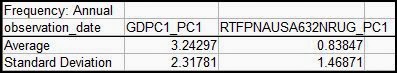
I used OpenOffice Calc on data from 1951 thru 2011 to figure the average and standard deviation values:
Then I retrieved Graph #2 and plugged in the numbers. Not bad. I got a couple "mismatched parentheses" errors along the way, but FRED and I survived the ordeal. Here's the Christensen-fitted comparison graph:
 |
| Graph #3: The blue line (RGDP) Christensen-Fitted to the not-quite-red TFP line |
Okay -- next, I subtracted the Total Factor Productivity number from the fitted RGDP. Just by inspection, I don't see any obvious errors in it; I think the new FRED is coming around. As for the graph itself:
 |
| Graph #4: Christensen-Fitted RGDP less TFP |
What the last graph shows is that even when productivity is good, GDP growth is not as good as it used to be: Even when productivity is good, GDP growth is not as good as it used to be.

Related Posts
| August 11, 2013 | "the theoretical case behind NGDPT is quite weak" |
| August 12, 2013 | dividing these series, each by its own standard deviation, will similarize the up-and-downs of the different series |
| August 13, 2013 | He sees the size and the location of the up-and-down pattern as separate from the pattern itself. |
| August 14, 2013 | The first step of Christensen's calculation... |
| August 31, 2013 | some nifty stuff with averages and standard deviations, to "fit" one line to another on a graph |
| September 1, 2013 | Christensen's Market Indicator has already been used as proof and disproof, and I'm still just checking the arithmetic. |
| September 2, 2013 | Lars's numbers are ridiculously large and obviously in error. |
| March 18, 2014 | FRED must use a calculation very much like this to scale and shift the right-axis numbers, when two axes are used on a graph. |

16 comments:
The only thing I can speculate is that Van Zandweghe is using some different measure of output, rather than GDP.
What could that be?
I would have expected him to be right, until your numbers showed otherwise.
Another way of stating what graph 4 shows is that in graph 3 the blue line tends to run above the red line until the late 80's, and since then they've switched.
This is disturbing. How can GDP growth lag productivity growth? I think it's because the finance sector is collecting such large rents that the entire economy is schlepping a dead weight loss.
JzB
On second thought, I'm not sure the subtraction is valid. Christensen-fitting gives a way of making the two series visually comparable by scaling and adjusting to a common midpoint. This distorts the series that is being manipulated.
I tried a different approach - looking for the productivity growth to GDP growth multiplier.
Very clearly, that changes in the early 80's and has been trending down since.
One set of consistent observables is that the ratio hits a min at each recession, and a max between recessions.
I'll still go with the rentier explanation.
JzB
"Christensen-fitting gives a way of making the two series visually comparable by scaling and adjusting to a common midpoint. This distorts the series that is being manipulated."
Not so much "distorts" I'd say as "scales and centers" the one on the other. I really like the calc -- not that I have any authoritative explanation for why it is valid.
You turned thumbs-down on a graph I did a while back, where I compared one log-scale trend to one not-log-scale trend. That one, I agree, distorted the one series relative to the other. But this graph isn't like that.
Scaling one series to the other is like using weighted values, something that is done often; and centering one series on the other helps with visual- and difference-comparisons. Granted, I've not been using the Christensen-fit calculation long, and have not read many critiques of it, but I do like it.
I also definitely like your rentier explanation. There has to be some outside factor (besides output and productivity, I mean) to drive the one down relative to the other. Financial cost? Yeah, that would do it.
//
Peaks of your FRED uBa graph fall by almost half (from "over 4" to "over 2"). That's pretty significant. It shows high peaks not only in the 1960s,but also the 1970s... despite what people say about the 1970s being a time of slow growth. (Creating recessions to fight inflation, or for any reason, does not mean that the economy's innate growth tendency had fallen.)
Oh, I like the Christensen scaling. It's a pretty neat way of making a relative comparison. But after the rescaling, I don't think you can do an absolute comparison, which is what the subtraction requires.
That's my objection.
In addition to the rentier aspect, of course, there is also the debt burden, which [as a pct of GDP] really took off in the mid 80's, after being flat for 20 years.
http://research.stlouisfed.org/fred2/graph/?g=uHQ
Cheers!
JzB
So... You don't object to Graph #3, where I do a visual comparison, but you have a problem with graph #4 where I subtract Graph-3-Series-A from Graph-3-Series-B. I thought I was just getting a better look at the difference shown on Graph #3.
(#3 shows similarity of pattern; #4 shows difference of pattern.)
Milton Friedman divided NGDP by the price level, then divided the Q of M by the result, then compared this to the price level and claimed to discover similarity. The problem is not that he divided NGDP by the price level, but what he did with it afterwards.
Maybe I could use the Christensen fit to do something equally wrong, but I can't see that many steps ahead.
Maybe I could use the Christensen fit to do something equally wrong, but I can't see that many steps ahead.
We jazz guys just improvise. In my case, I seldom know where that leads.
Cheers!
JzB
You've been looking a the Christensen fir for a while now. Do you have a link to where you first found it, and what he was doing with it at the time?
Cheers!
JzB
Yeah. The anonymous Unlearning Economics linked to his article at Pieria: Examining the Case for NGDP Targeting.
UE said: "Christen seems to take this graph as confirmation of his views, but in fact it shows the opposite of what he wants it to show."
I first looked at UE's post on 11 August. On 1 September I had a reaction: "Christensen's Market Indicator has already been used as proof and disproof, and I'm still just checking the arithmetic."
But I never really got into what Christensen was doing with his calculation.
Oh, something I was thinking about doing, anyway: I'm adding a "related links" update to the post.
Thnx. I remember that commentary now. I'll check the link.
Meanwhile - when's your birthday? I have an early present for you - quarterly tfp data from the SF FED. It's far more current too. Last entry is Q3, 13. Check it out.
It's data labeled "dtfp" in column L in the "quarterly" page of the "download latest dataset" file linked at the bottom of the page.
http://www.frbsf.org/economic-research/total-factor-productivity-tfp/
You're welcome,
JzB
At one point, it looked like you agreed with my criticism of subtraction of Lars-fit data.
From your post of 3/31/13
http://newarthurianeconomics.blogspot.com/2013/08/fpi-and-christensen-fitted-debt.html
When I was doing the "no finesse" graph and writing that post, I was careful not to talk about the one line being "higher" than the other. It's okay to talk about something happening first in the one line and later in the other. And it's okay to observe the one line changing more rapidly than the other. But you can't say one is "higher" or "lower" or even that it changes from higher to lower (or the reverse) because the relative positions, higher and lower, depend on how much you subtract as part of the "Christensen Fit" calculation.
Actually I was disappointed when I sat down to do the calculation Lars's way. I had forgotten that Christensen's calculation includes an arbitrary up-and-down adjustment term. That term puts the same ambiguity into his calc that I had in my finesse-free version: It makes the relative positioning of the two lines completely arbitrary.
Lars is looking for relative motion, leads and lags. I think that is what it is good for, and good at.
Cheers!
JzB
Jazz, I am starting to get your meaning on this. I went back and re-read Lars Christensens original post. He develops his "market indicator" to forecast NGDP.
Forecasting. So yes, as you say: He uses it for leads and lags. But let me go back to your first comment, above. You say
Another way of stating what graph 4 shows is that in graph 3 the blue line tends to run above the red line until the late 80's, and since then they've switched.
I thought it was good, the way you said it. Then you had second thoughts in the follow-up comment:
I'm not sure the subtraction is valid. Christensen-fitting gives a way of making the two series visually comparable by scaling and adjusting to a common midpoint. This distorts the series that is being manipulated.
But it doesn't distort the series by making the latter years falsely low. It magnifies *all* of the ups and downs equally. It exaggerates (or understates) the whole pattern of one series to make it more easily comparable to another series.
Visual inspection is one way to make the comparison; subtraction is another. I guess you'd say a visual inspection for leads and lags is a relative comparison, and the subtraction is an absolute comparison.
I understand that the numbers on graph 4 are not real-world values in any sense (because the one set is scaled-up). Is that your objection? I dealt with this problem following Graph #3 in mine of 18 March. On the pattern I developed there, I would describe Graph #4 above this way:
RGDP growth, measured by the standard set by RGDP growth, was worse after 1980 than productivity growth measured by the standard set by productivity growth.
Does this still give you agita?
I'm leaving soon and will be gone all day. I need to give all of this more thought.
One set is rescaled and translated to match the other in mean and St Dev. This is intended to make them comparable. But which comparisons are valid? I'm up in the air on the subtraction.
Gotta run. Meanwh8ile, I sent you a couple e-mails.
Cheers!
JzB
(after a long delay)
My conclusion was: "I don't see any movement in different directions since the mid-1980s. So I don't know what Willem Van Zandweghe was talking about."
But now I see that the Van Zandweghe PDF considers labor productivity. My graphs look at total factor productivity. My confusion of the two measures of productivity is probably the reason I didn't get results that match what Mr. Van Zandweghe got.
In a comment at Twenty-Cent Paradigms, Bill C shows that labor productivity equals total factor productivity plus the capital and labor inputs. Which, come to think of it, is another way of saying that TFP is the residual or the discrepancy or the error term, the part the Solow growth model can't calculate.
The opening quote from Willem Van Zandweghe regarding "a change in the behavior of productivity" is reiterated at Zero Hedge: "A historic secular shift: productivity - a core component of GDP, is no longer procyclical."
I have to look at this again.
And also Circuit's comment & link at Naked Keynesianism
http://nakedkeynesianism.blogspot.com/2014/12/the-mystery-of-productivity-what-mystery.html
Circuit: "On a related point, Robert Gordon argues that productivity may no longer be procyclical."
http://economics.weinberg.northwestern.edu/robert-gordon/The%20Demise%20of%20Okun%27s%20Law_NBER.pdf
try this link for the robert gordon pdf
http://crei.cat/conferences/changeslabor/Gordon.pdf
Post a Comment