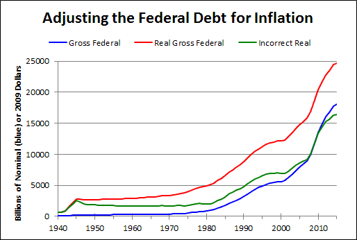
Some people use an incorrect inflation adjustment of debt and produce a line like the green one on this graph:
 |
| Graph #1: Federal Debt (blue) and Its Inflation Adjustments, Right (red) and Wrong (green) |
It's the wrong calculation. The green line is wrong. The red line correctly shows inflation-adjusted debt. Debt started going up in the 1950s, not the 1980s.
Look, I don't want to argue the point. I just want you to think about it. If you were making decisions and setting economic policy, would it matter if you thought debt started going up in the 1980s but it really started going up in the 1950s?
Would it matter? Answer that question first. If you think maybe it would matter, then maybe you should look into whether the green line really is wrong, as I say.

No comments:
Post a Comment